Warning: Image is too big to fit on screen; displaying at 67%

This graph shows a comparions of the leading causes of deaths in 2004 from the LLC. It shows
the increase of deaths between the two graphs, I am unsure of which graph is higher, or if
there is only one graph to compare by.
Warning: Image is too big to fit on screen; displaying at 67%
Warning: Image is too big to fit on screen; displaying at 67%
This handmade chart shows the relationship between cause of death and YLL in 2004. I have
no idea what these terms are and how to interpret this chart.
Warning: Image is too big to fit on screen; displaying at 67%
Warning: Image is too big to fit on screen; displaying at 67%
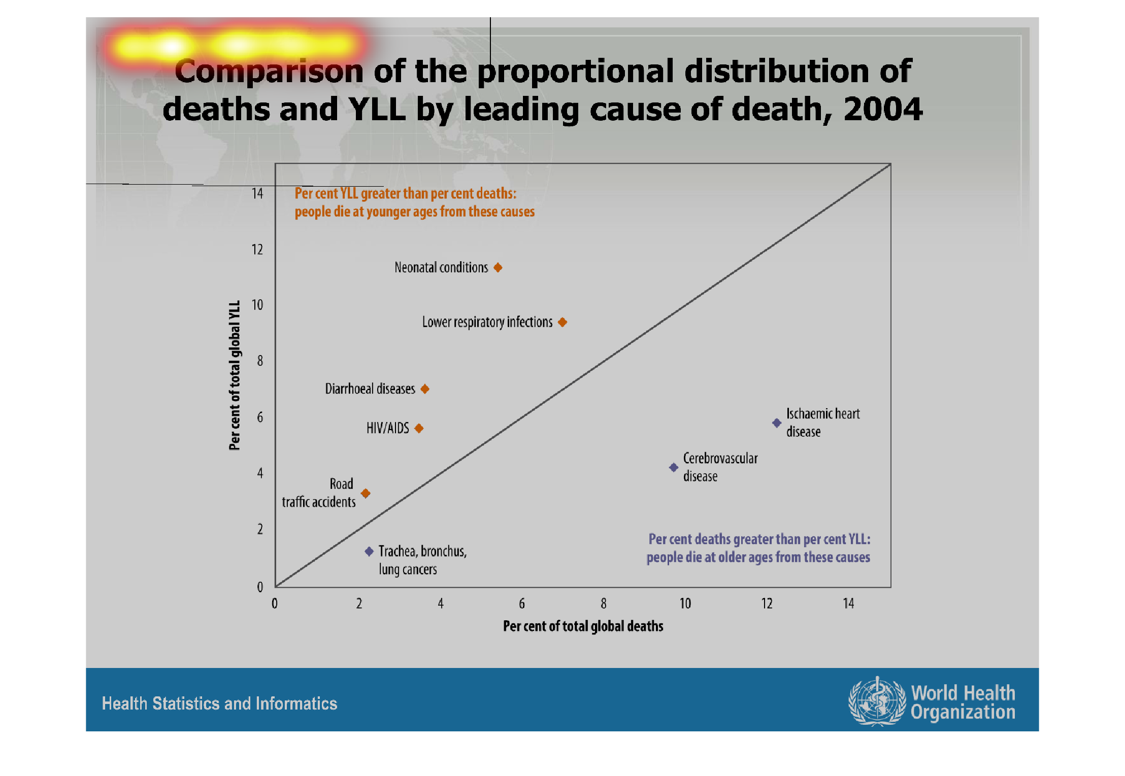

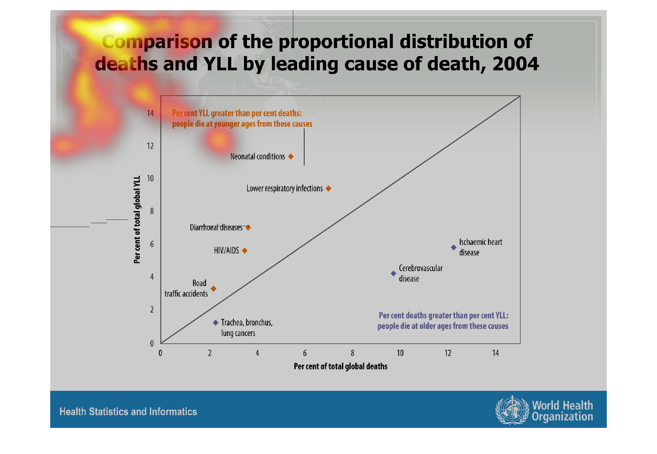
This graph shows the comparison of the proportional distribution of deaths and YLL by leading
cause of death, 2004. Respiratory infections and neonatal conditions are among the highest.
Warning: Image is too big to fit on screen; displaying at 67%
Warning: Image is too big to fit on screen; displaying at 67%
This chart shows the comparison of proportional distribution of deaths and YLL by leading
cause of death in 2004. The categories include Traffic death, Trachea, Bronchial and lungs
cancer
Warning: Image is too big to fit on screen; displaying at 67%
Warning: Image is too big to fit on screen; displaying at 67%
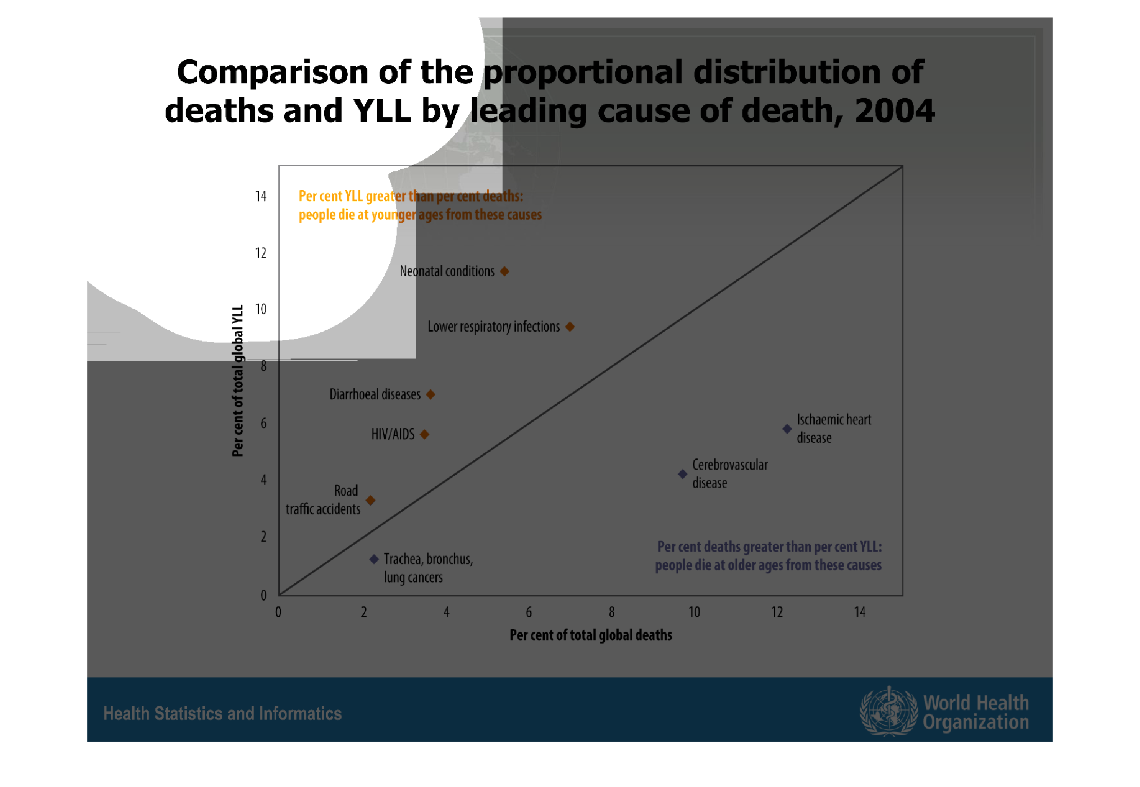
This is a graph that shows the leading causes of death. The graph focuses on deaths in 2004.
It shows how prevalent these deaths can be and that in general they are in the rise.
Warning: Image is too big to fit on screen; displaying at 67%
Warning: Image is too big to fit on screen; displaying at 67%
This chart shows a comparison of the proportional distribution of causes of deaths in 2004.
This was a very difficult chart to comprehend when not able to see the entire chart at once.
The diagonal line is useful but this chart requires full vision.
Warning: Image is too big to fit on screen; displaying at 67%
Warning: Image is too big to fit on screen; displaying at 67%
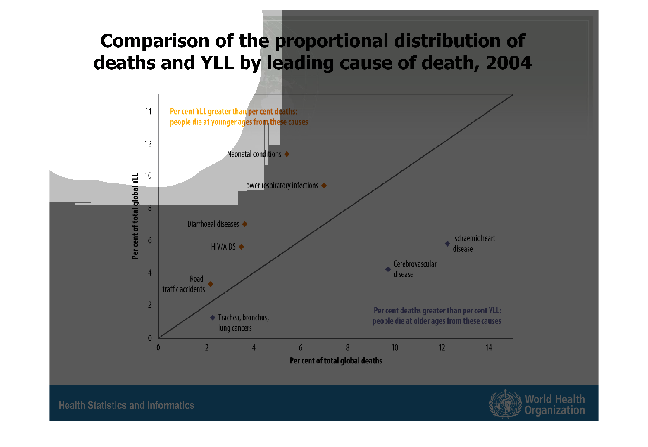
Descriptive graph of total death by type and area in the year 2004.  The split is stated in
a way to be  easily understood and usable in many situations.
Warning: Image is too big to fit on screen; displaying at 67%
Warning: Image is too big to fit on screen; displaying at 67%
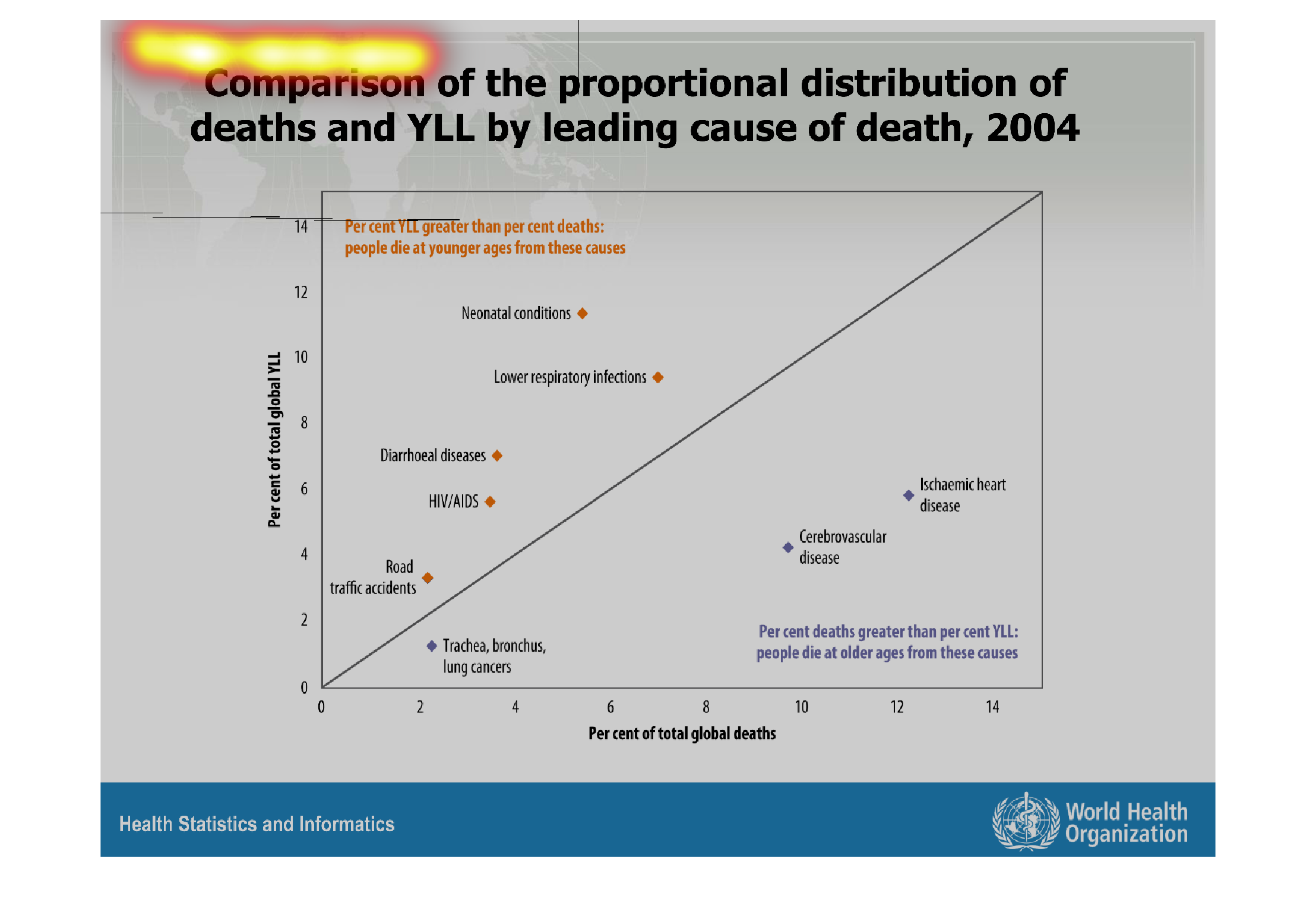
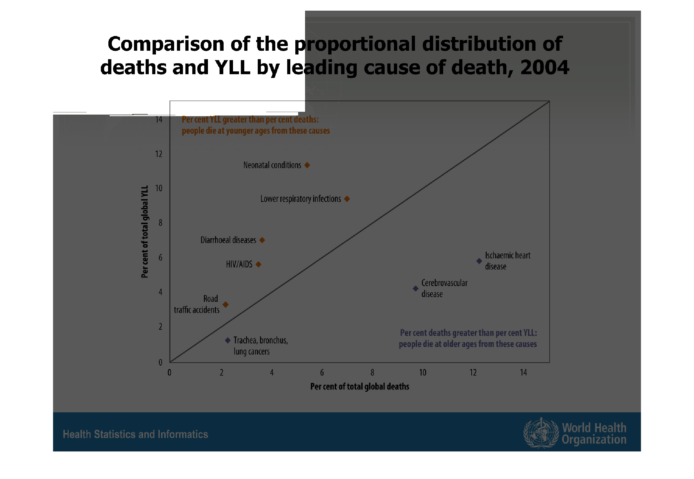
This chart describes comparison of the proportional distribution of deaths and YLL by leading
cause of death for the year 2004. Categories include lower respiratory infections.
Warning: Image is too big to fit on screen; displaying at 67%
Warning: Image is too big to fit on screen; displaying at 67%
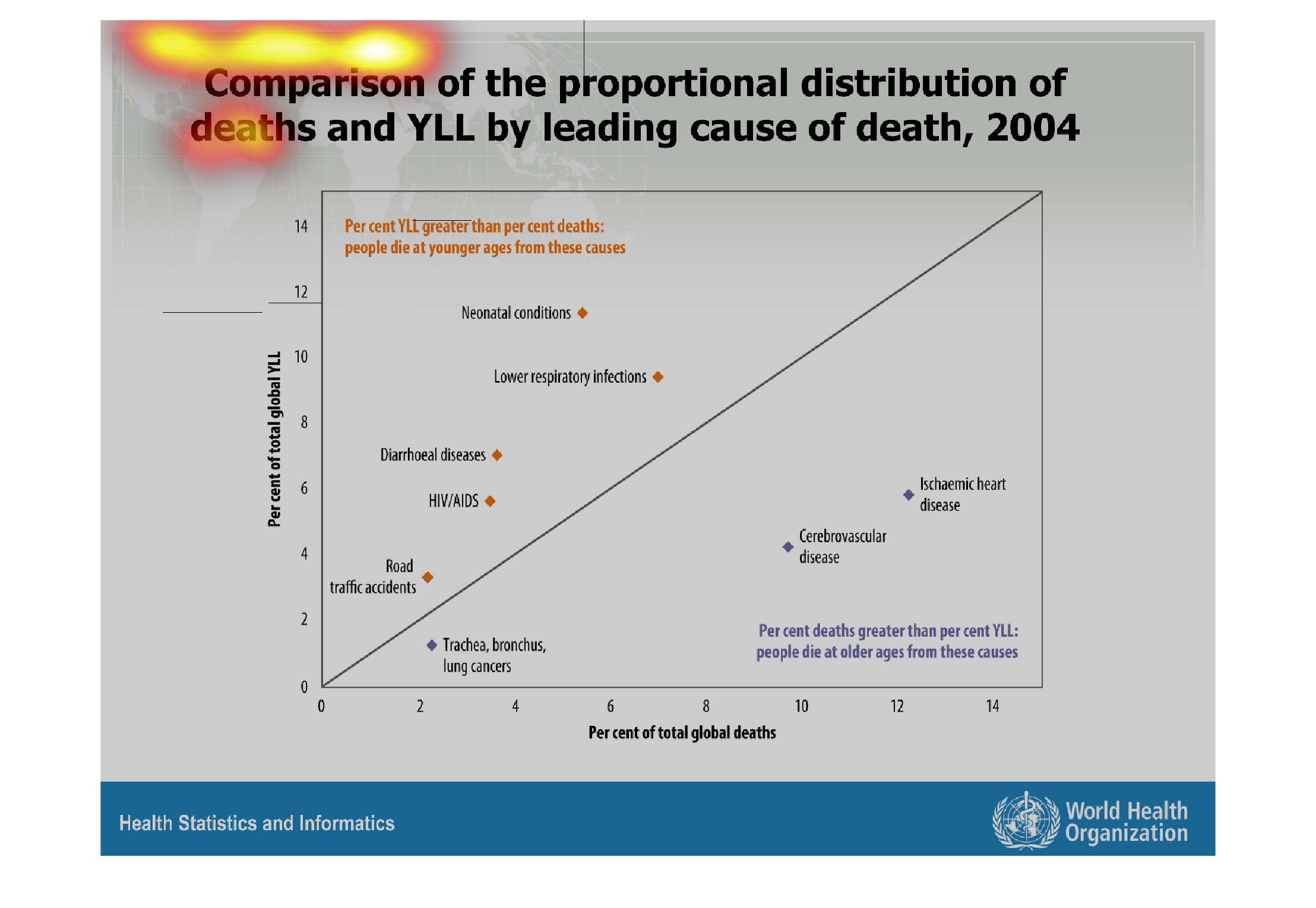
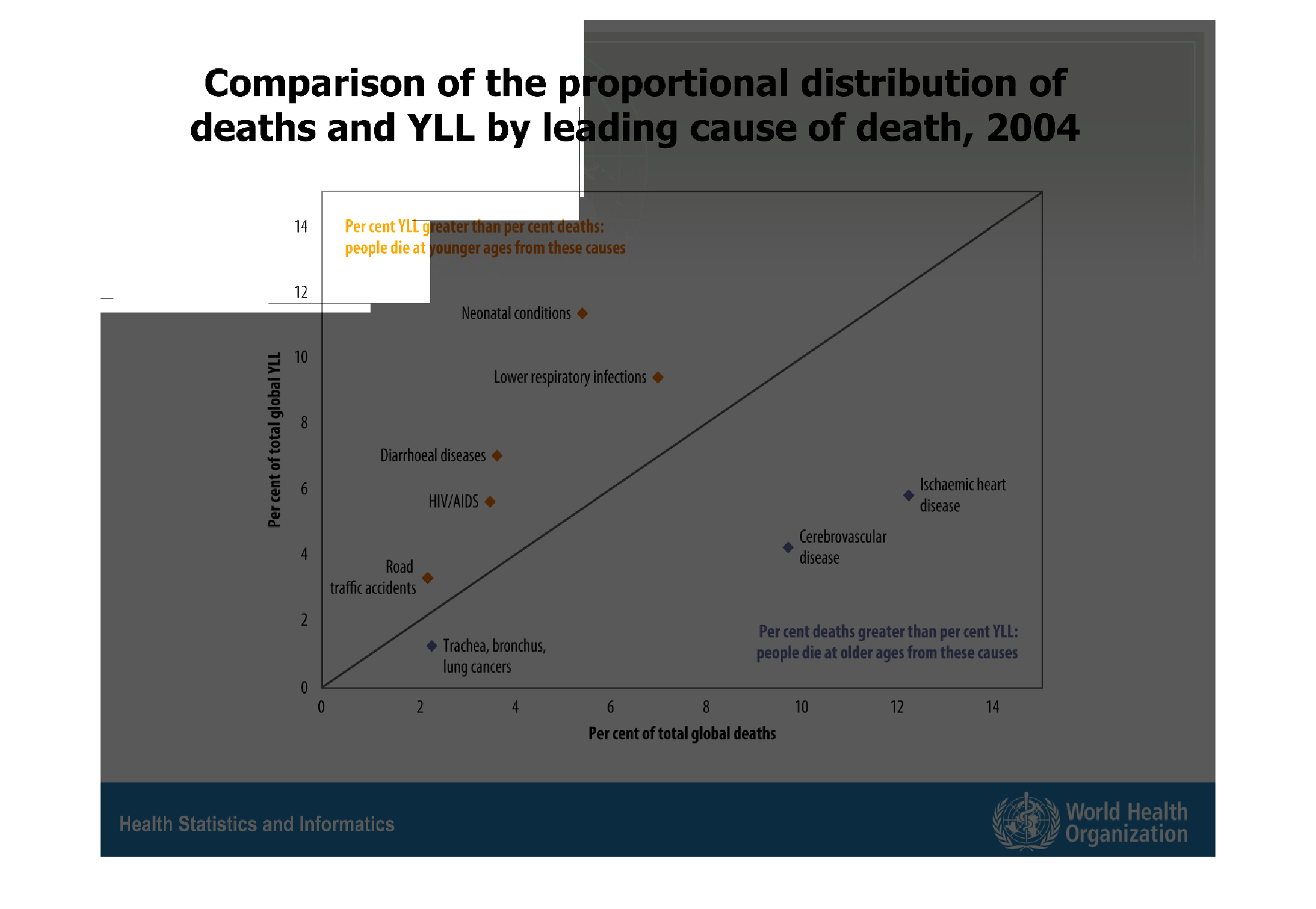
This chart describes comparison of the proportional distribution of deaths and YLL by leading
cause of death, for the year 2004. Categories on the chart include HIV/Aids.
Warning: Image is too big to fit on screen; displaying at 67%
Warning: Image is too big to fit on screen; displaying at 67%
This shows the proportional distribution of deaths and YLL by leading causes of deaths. Causes
include traffic deaths,respiratory deaths, and HIV/AIDS.
Warning: Image is too big to fit on screen; displaying at 67%
Warning: Image is too big to fit on screen; displaying at 67%

This chart shows the comparison of the proportional distribution of deaths and YLL by leading
cause of death, from 2004. Percentage runs the vertical axis, and percentage of global deaths
spans the horizontal. Each factor is plotted as a point in a scatter plot, and a trend line
runs through it going up.
Warning: Image is too big to fit on screen; displaying at 67%
Warning: Image is too big to fit on screen; displaying at 67%
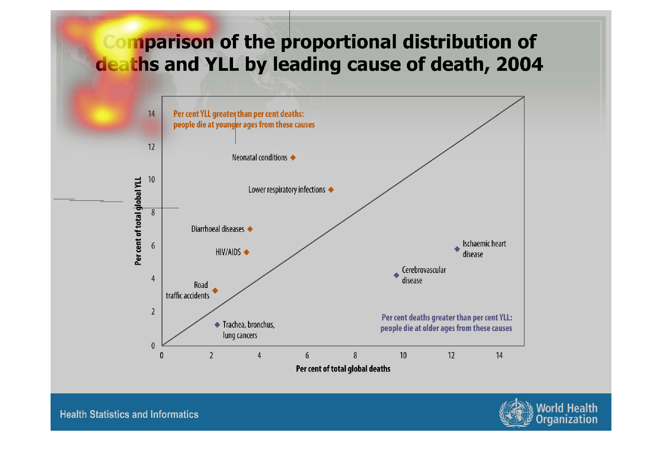
This graph compares the proportional population of deaths by leading cause of death in 2004.
Lung cancer was the lowest group, followed by road traffic accidents. Neonatal conditions
is among the top of the graph.
Warning: Image is too big to fit on screen; displaying at 67%
Warning: Image is too big to fit on screen; displaying at 67%
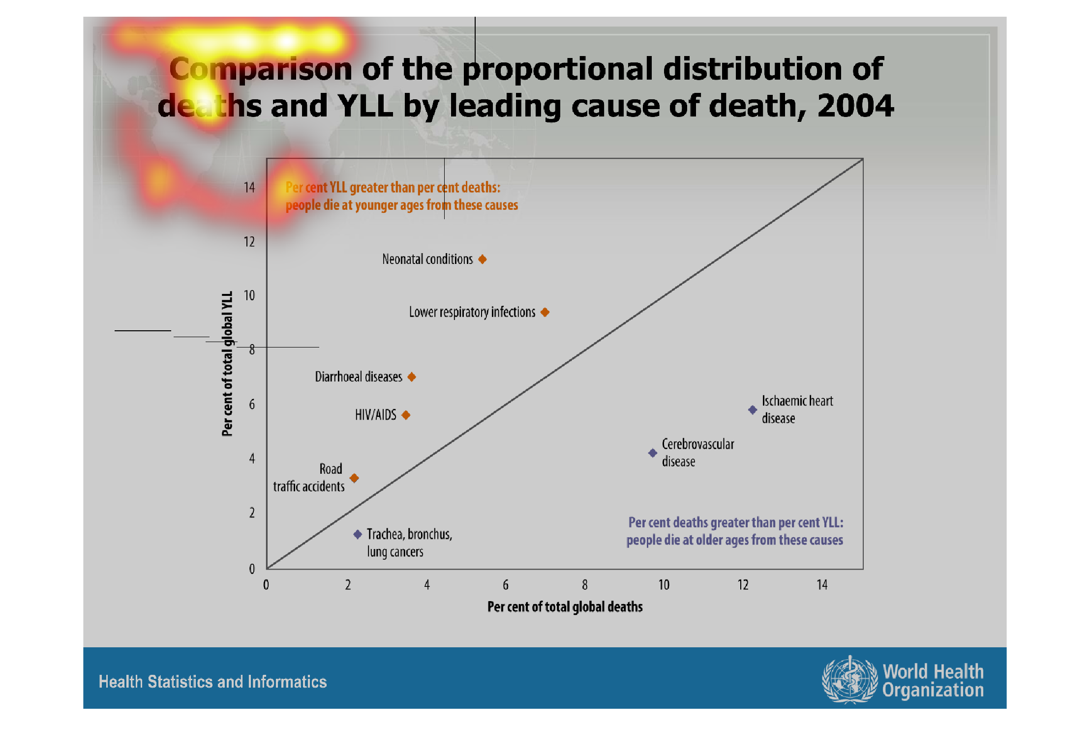
This shows at what rate people die of certain causes. Some of the causes include bronchitis,
lung cancer and old age. This information is also give by the world health organization and
reflects information from 2004
Warning: Image is too big to fit on screen; displaying at 67%
Warning: Image is too big to fit on screen; displaying at 67%