Warning: Image is too big to fit on screen; displaying at 67%
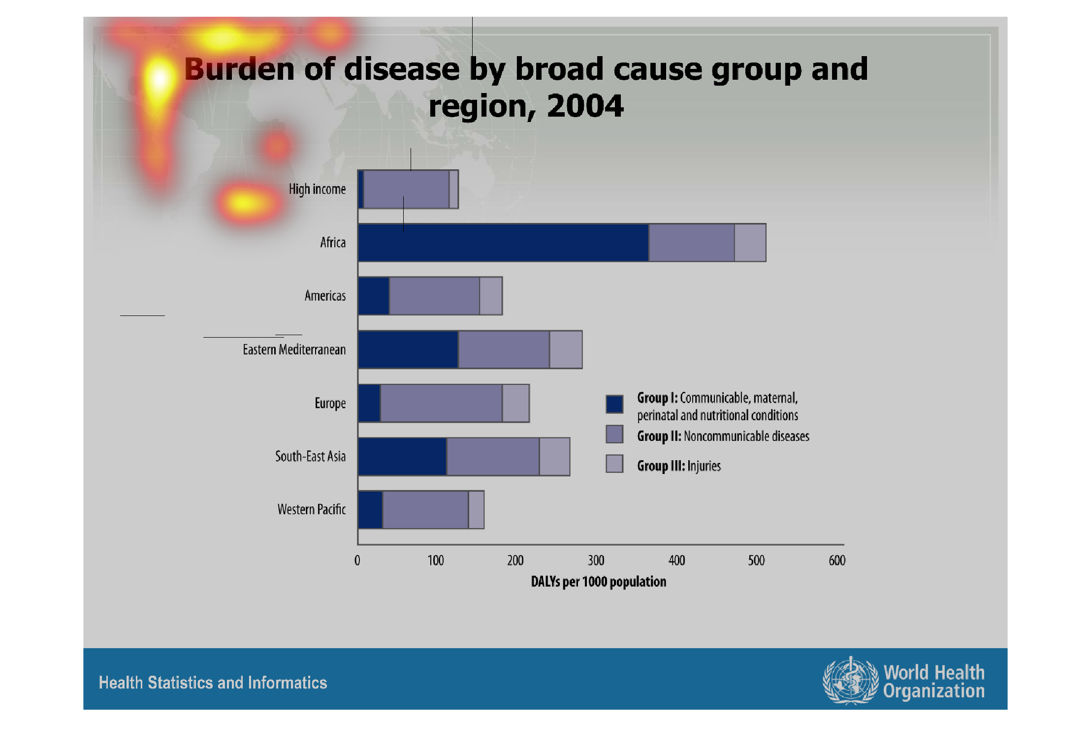
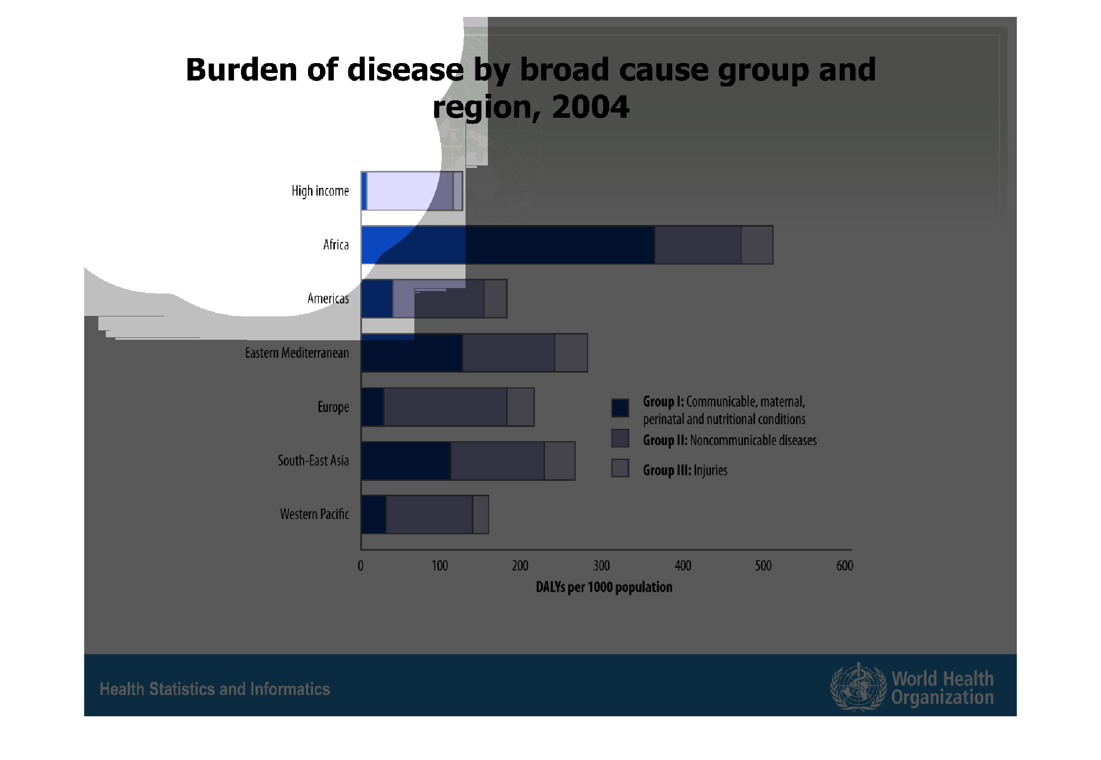
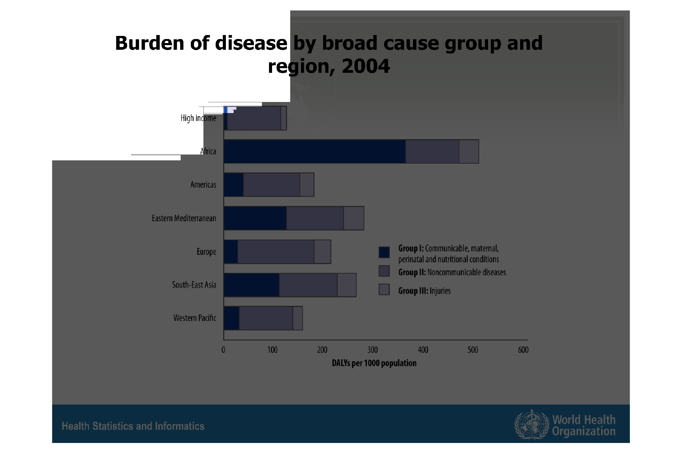
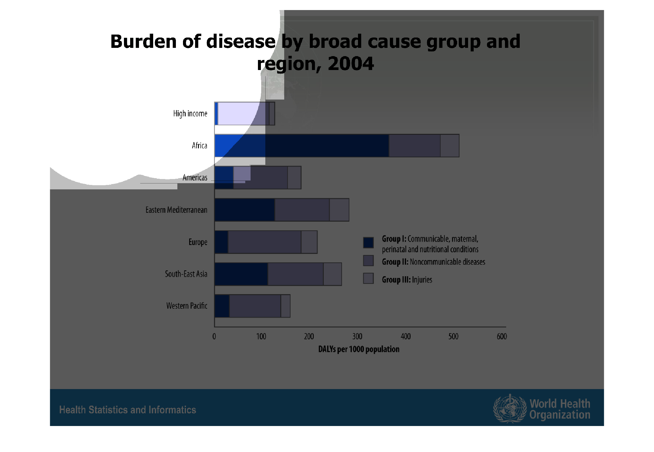
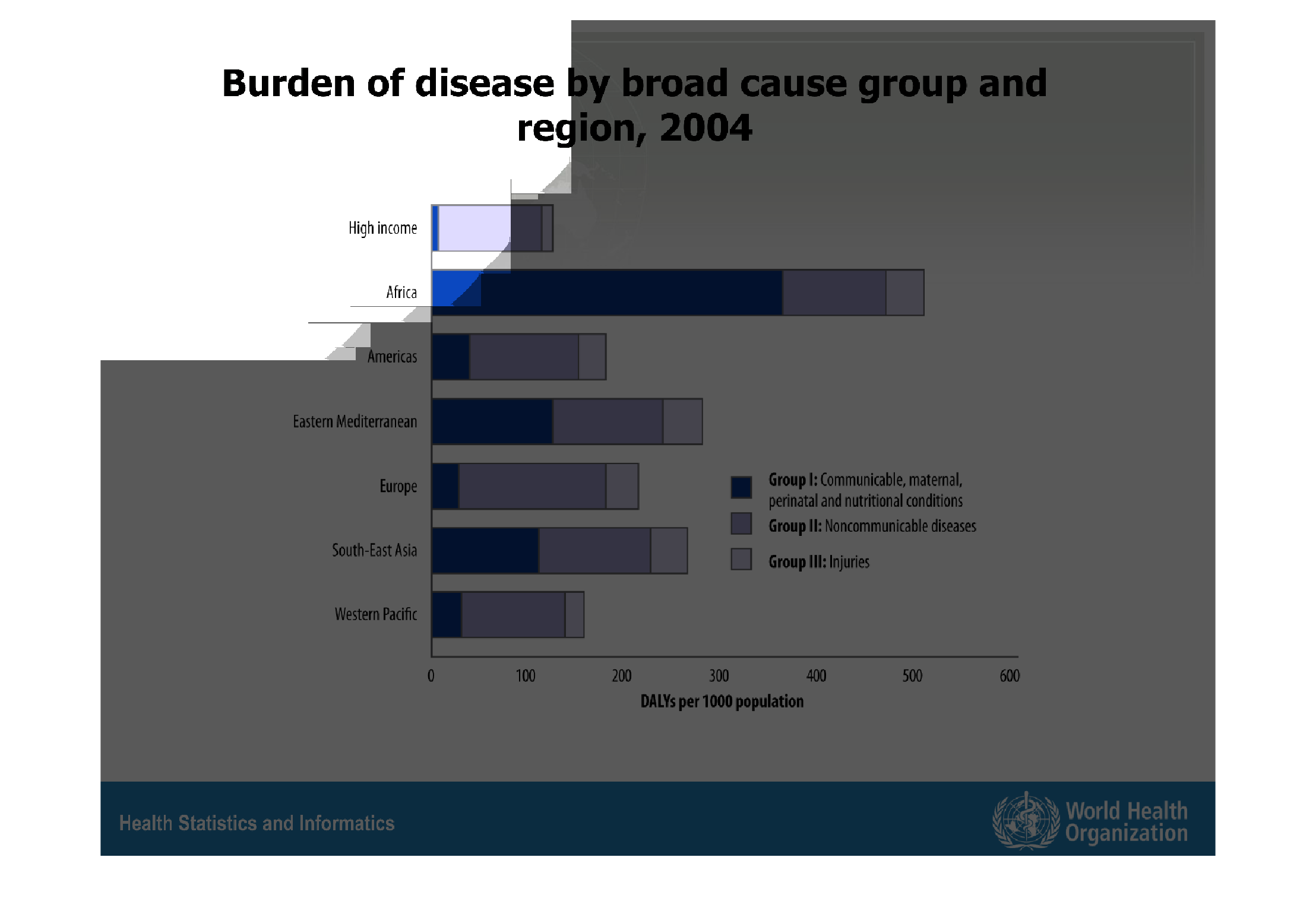
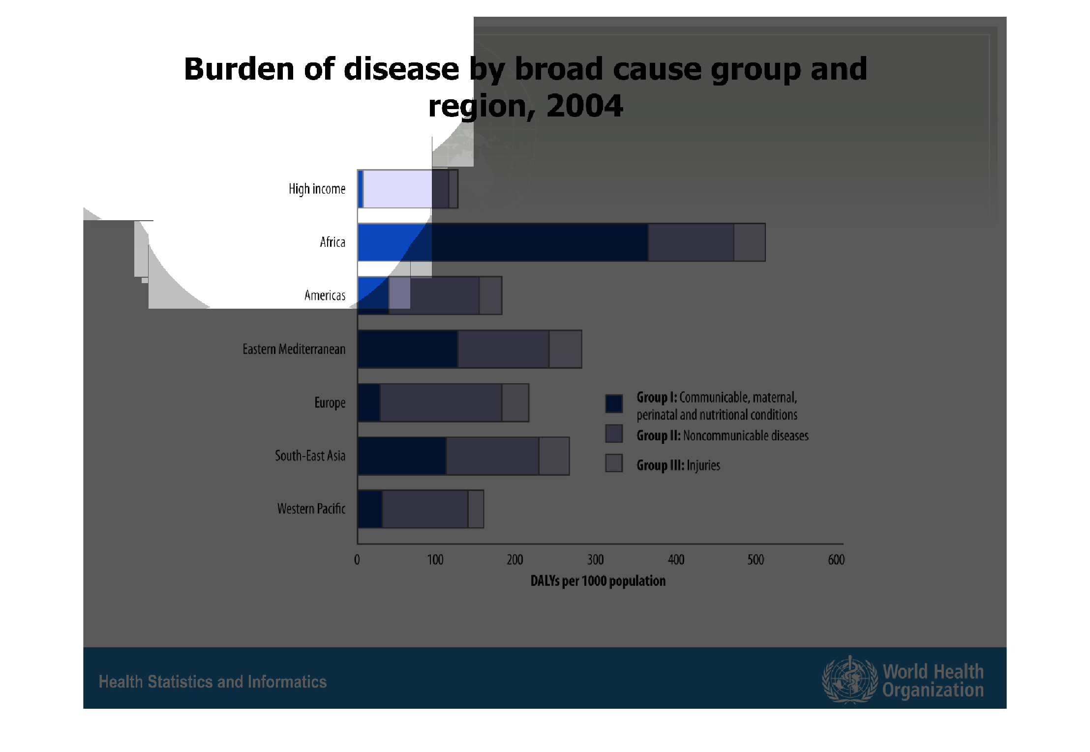
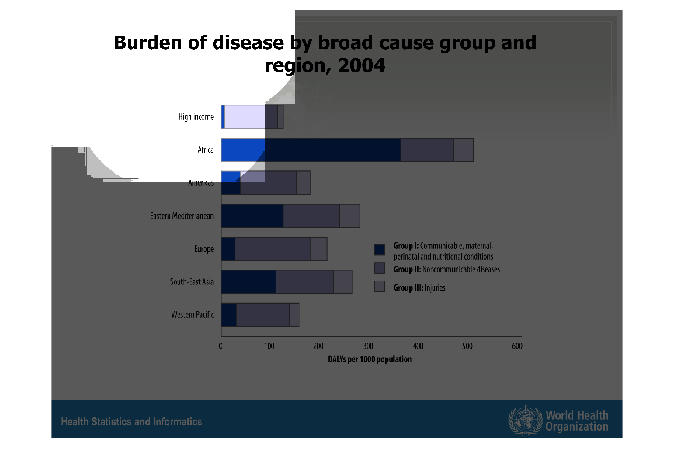
The graphic shows the number of diseases by broad case group and region for year 2004. There
are 3 groups of disease considered such as communicable, material and nutritional disease,
noncommunicable and injures. Speaking of the regions it looks like Africa got the biggest
number of 1st group diseses when Europe got the least, Europe and America have the biggest
number of diseases of 2nd group and the level of injures is more or less the same. The high
income group got the least number od diseases of 1 and 3 groups though the number of noncomminicable
disease still remains pretty high.
Warning: Image is too big to fit on screen; displaying at 67%
Warning: Image is too big to fit on screen; displaying at 67%
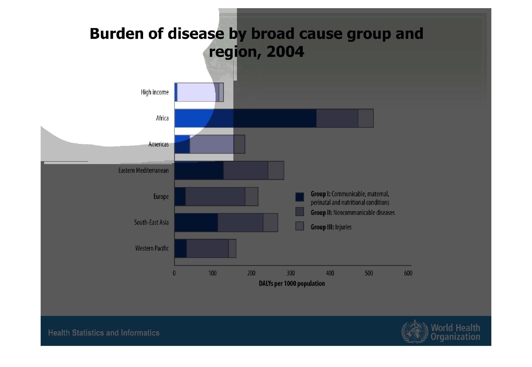
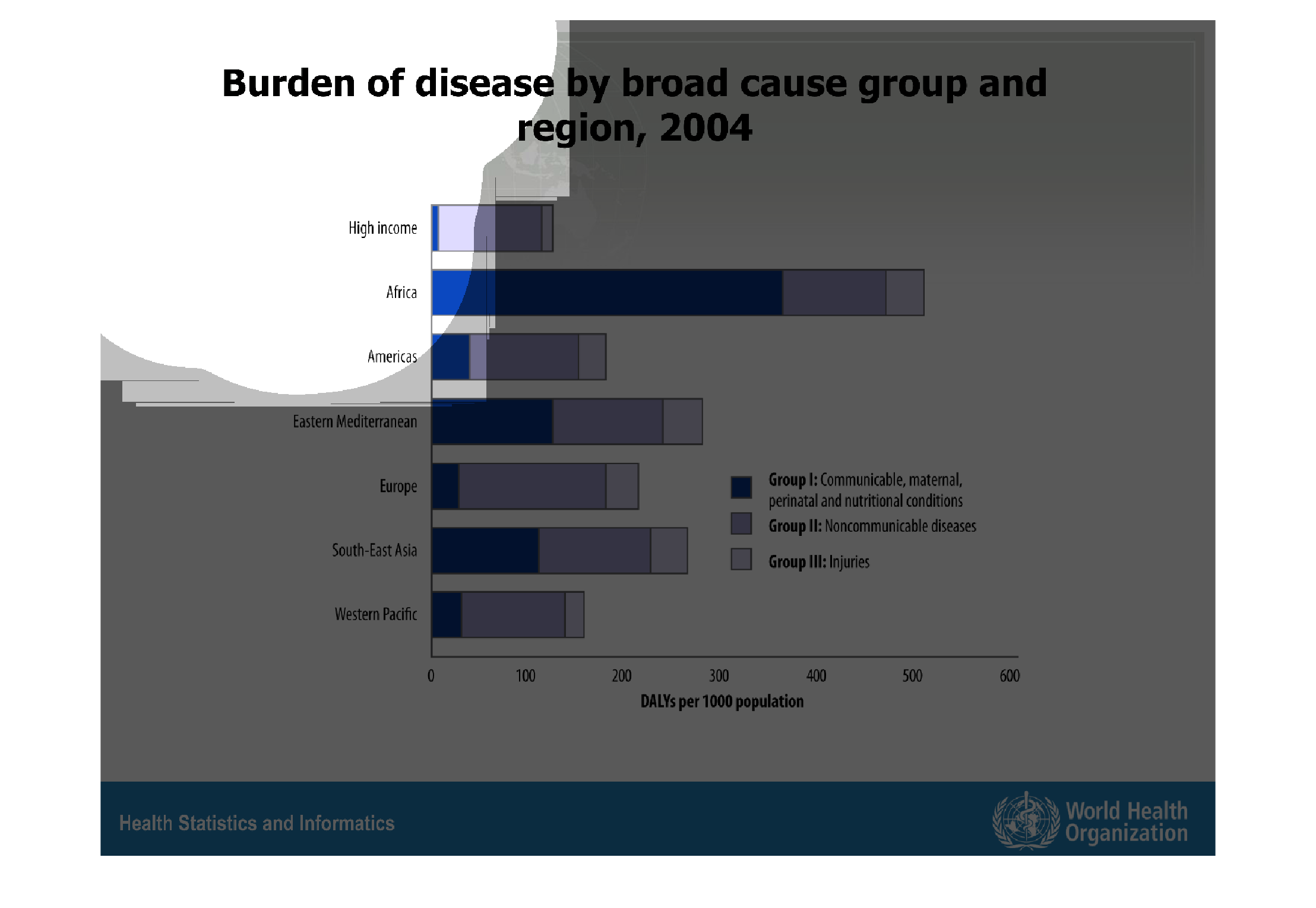
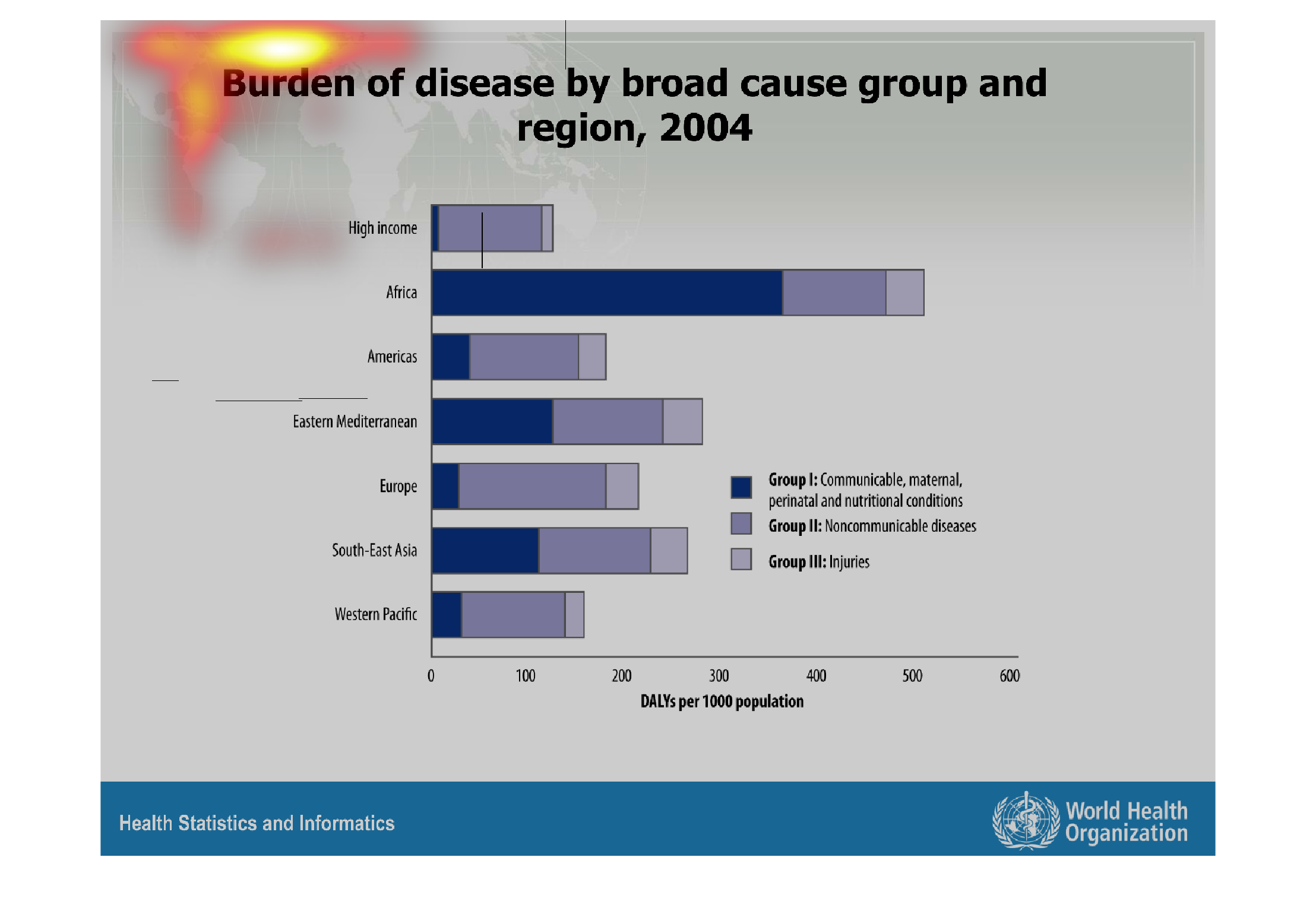
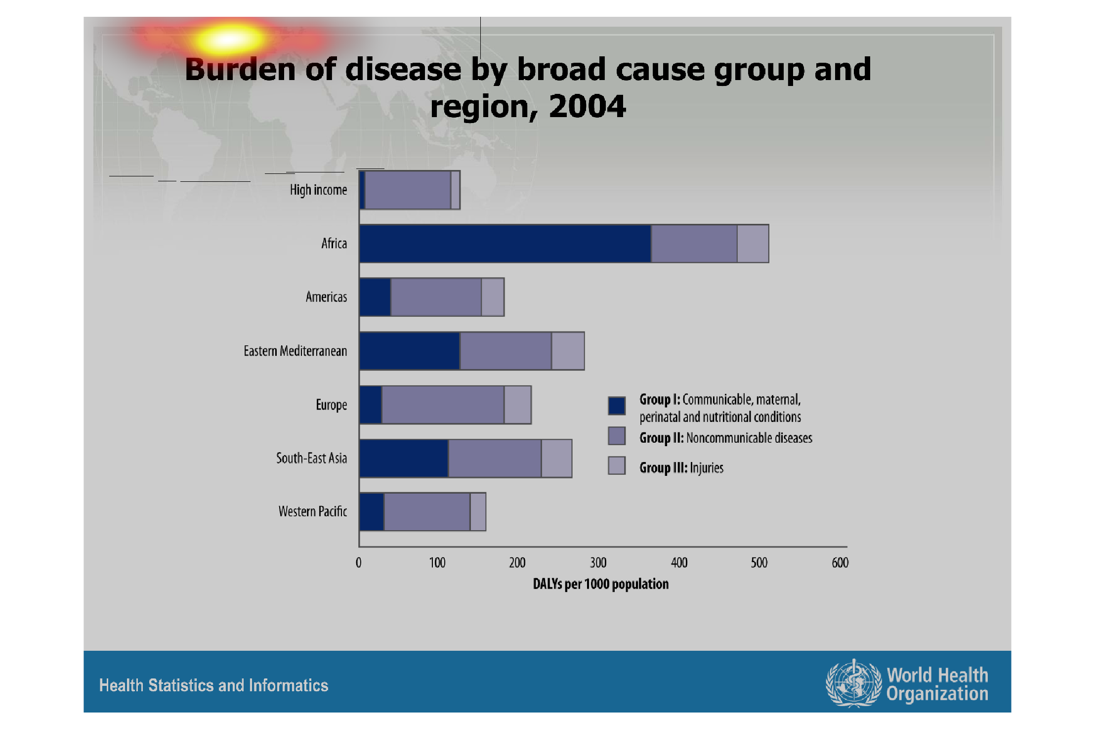
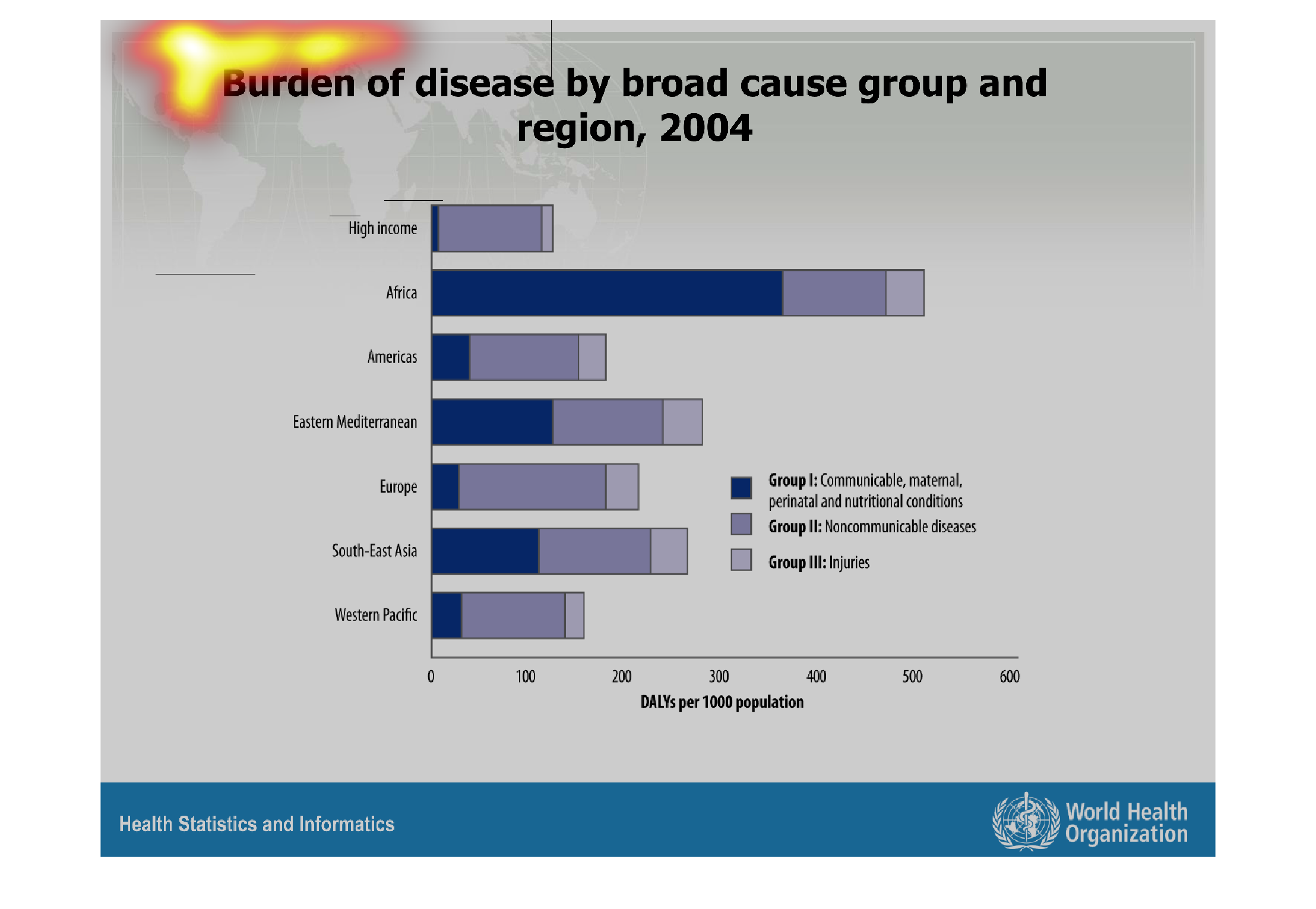
The image depicts a bar graph of the burden of disease by broad cause group and region in
2004. Groups included are: communicable/perinatal/nutritional conditions, noncommunicable
diseases, and injuries. DALYs are per 1000 population. Regions include: High-income, Africa,
Americas, Eastern Mediterranean, Europe, South-East Asian, and Western Pacific. Communicable
disease are prevalent in Africa, and Africa seems to struggle with more overall disease than
other regions. The high income region seems to have less issue with disease.
Warning: Image is too big to fit on screen; displaying at 67%
Warning: Image is too big to fit on screen; displaying at 67%
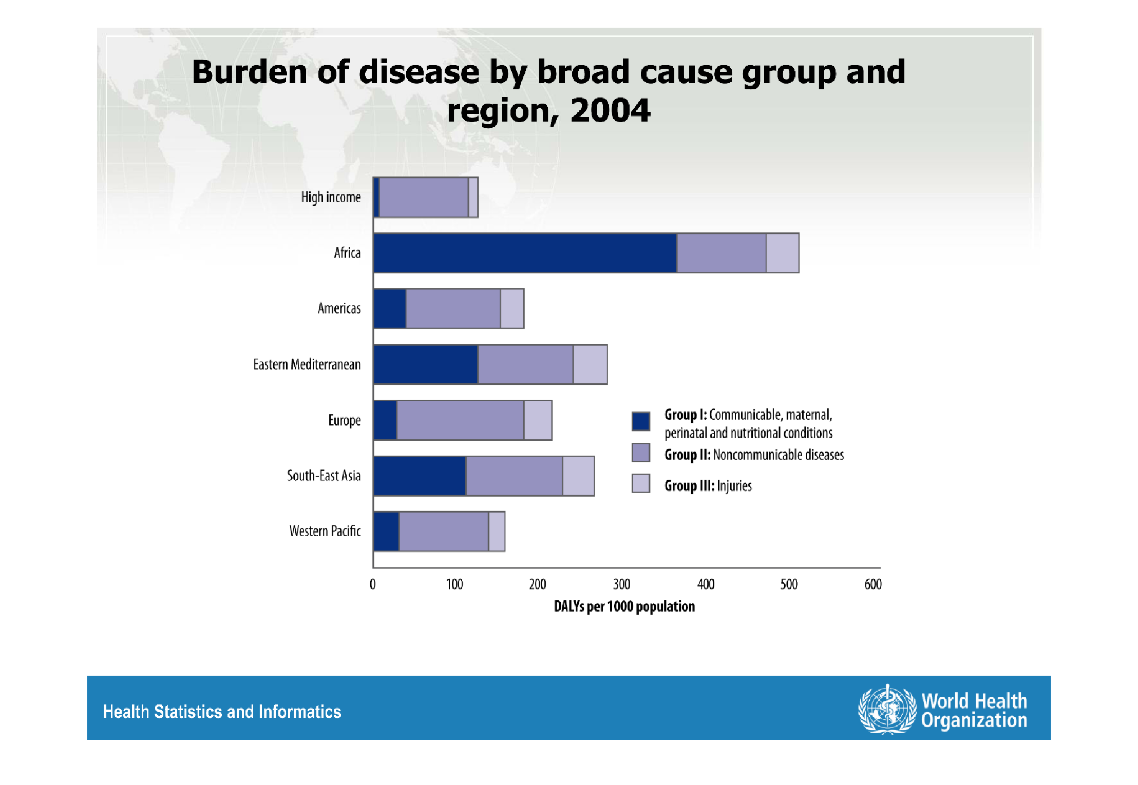
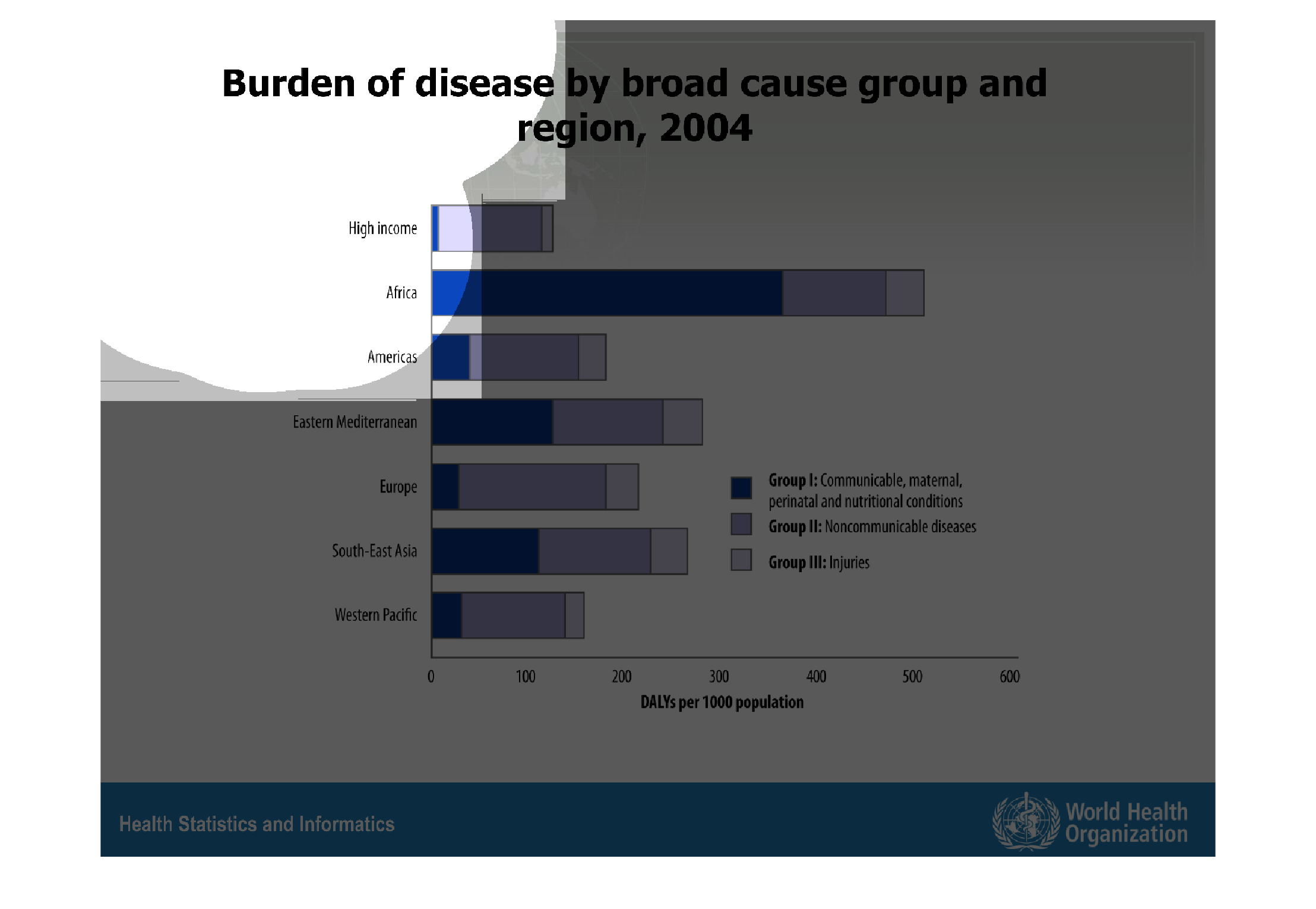
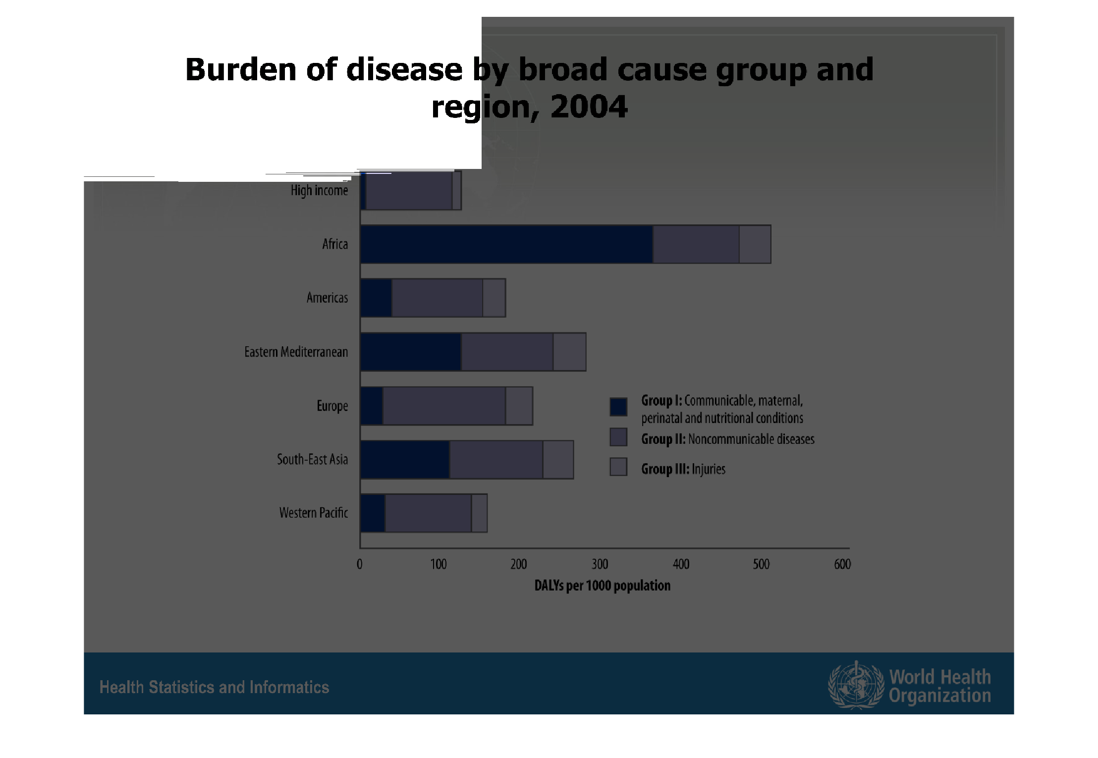
This chart illustrates the burden of disease by broad cause group and region in 2004. Africa
has a significantly larger burden of disease than the European, Eastern Mediterranean, Western
Pacific, and Americas regions. Most of this burden is from communicable, maternal, perinatal
and nutritional conditions.
Warning: Image is too big to fit on screen; displaying at 67%
Warning: Image is too big to fit on screen; displaying at 67%
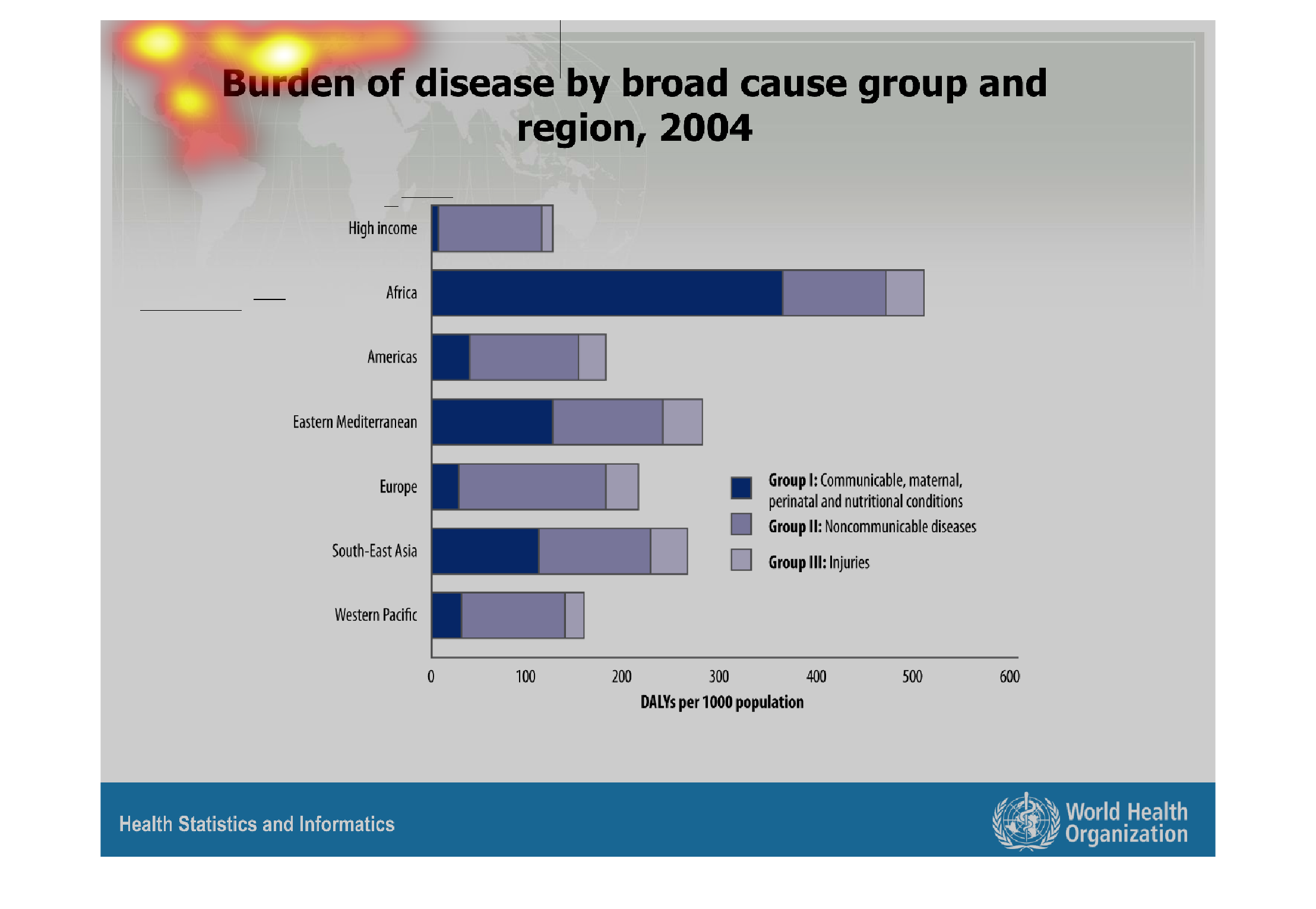
This chart shows the burden of disease by broad cause group and region, from 2004. It is broken
down into countries, and sorted by DALY per 1000 people.
Warning: Image is too big to fit on screen; displaying at 67%
Warning: Image is too big to fit on screen; displaying at 67%
This is a bar graph and it looks like the graph is about burden disease around the world and
regions in the graph it looks like Africa has the most death around the world.
Warning: Image is too big to fit on screen; displaying at 67%
Warning: Image is too big to fit on screen; displaying at 67%
This handmade chart shows the distribution of disease broad cause in 2004. I do not understand
this chart at all and cannot interpret it further.
Warning: Image is too big to fit on screen; displaying at 67%
Warning: Image is too big to fit on screen; displaying at 67%
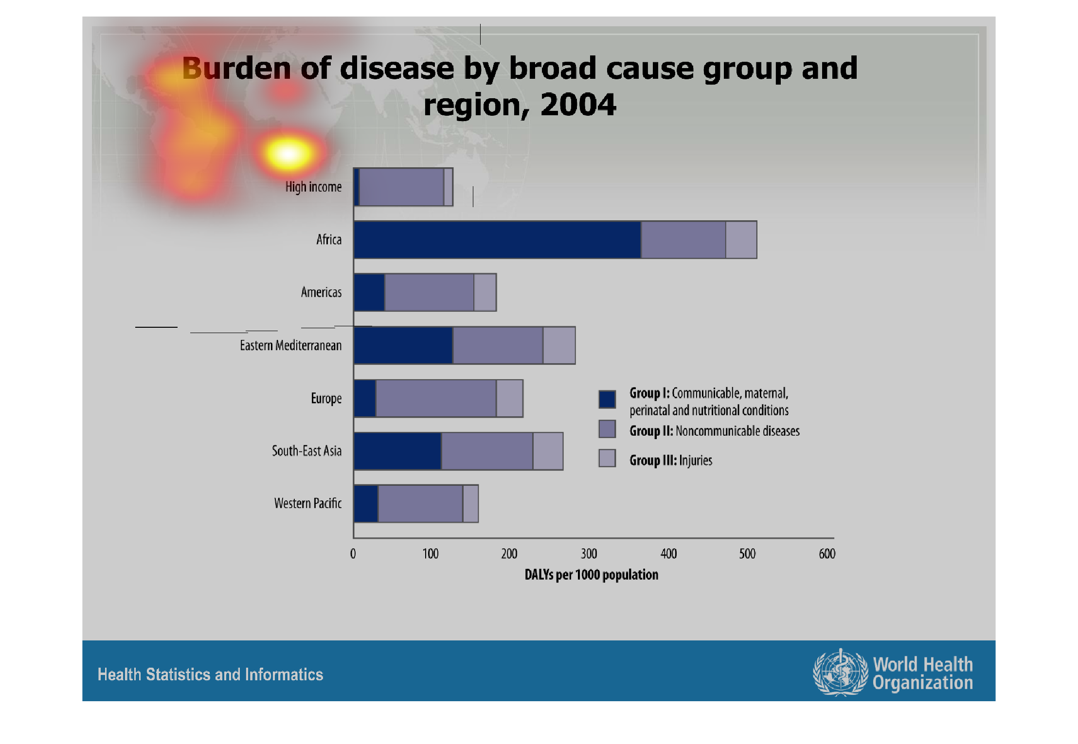
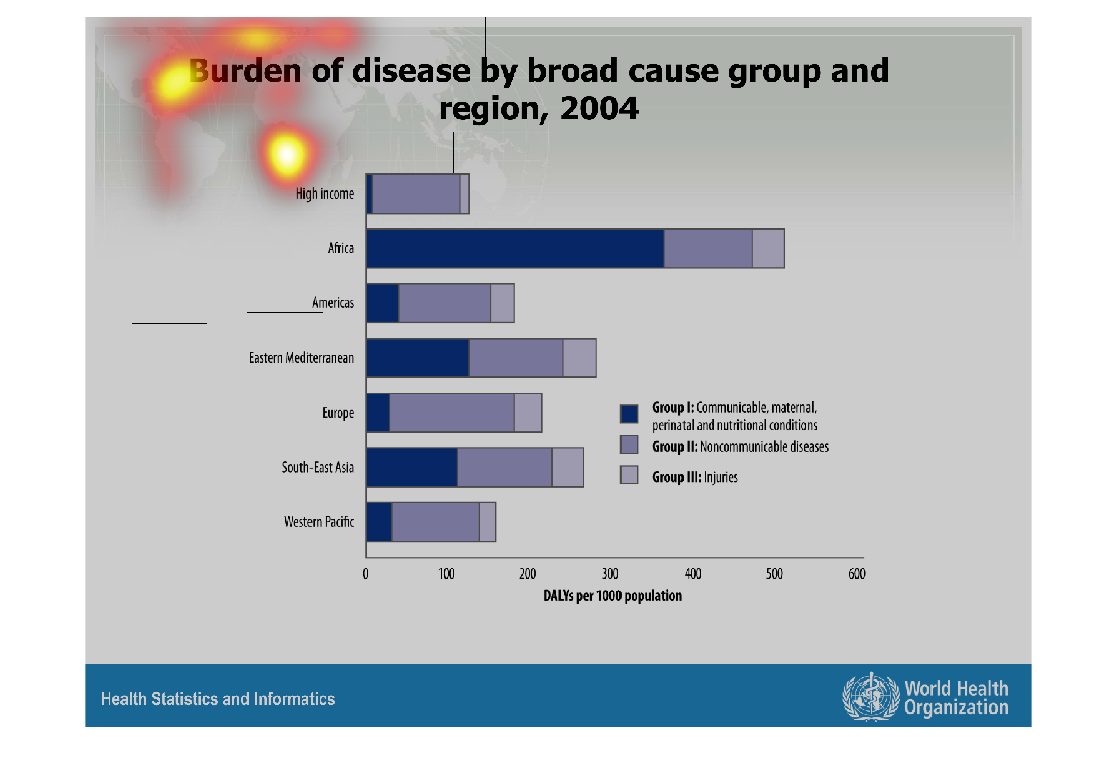
This chart shows the different burdens imposed by different causes of death for different
world regions for 2004. The same three broad groups of death causes are shown. It's clear
that the greatest burden is imposed upon Africa, primarily by communicable disease, etc.
Warning: Image is too big to fit on screen; displaying at 67%
Warning: Image is too big to fit on screen; displaying at 67%
This is a chart that's shows the areas and years of a broad cause of disease. It shows the
facts and numbers through the year of 2004. It also includes injuries as well in the legend.
Warning: Image is too big to fit on screen; displaying at 67%
Warning: Image is too big to fit on screen; displaying at 67%
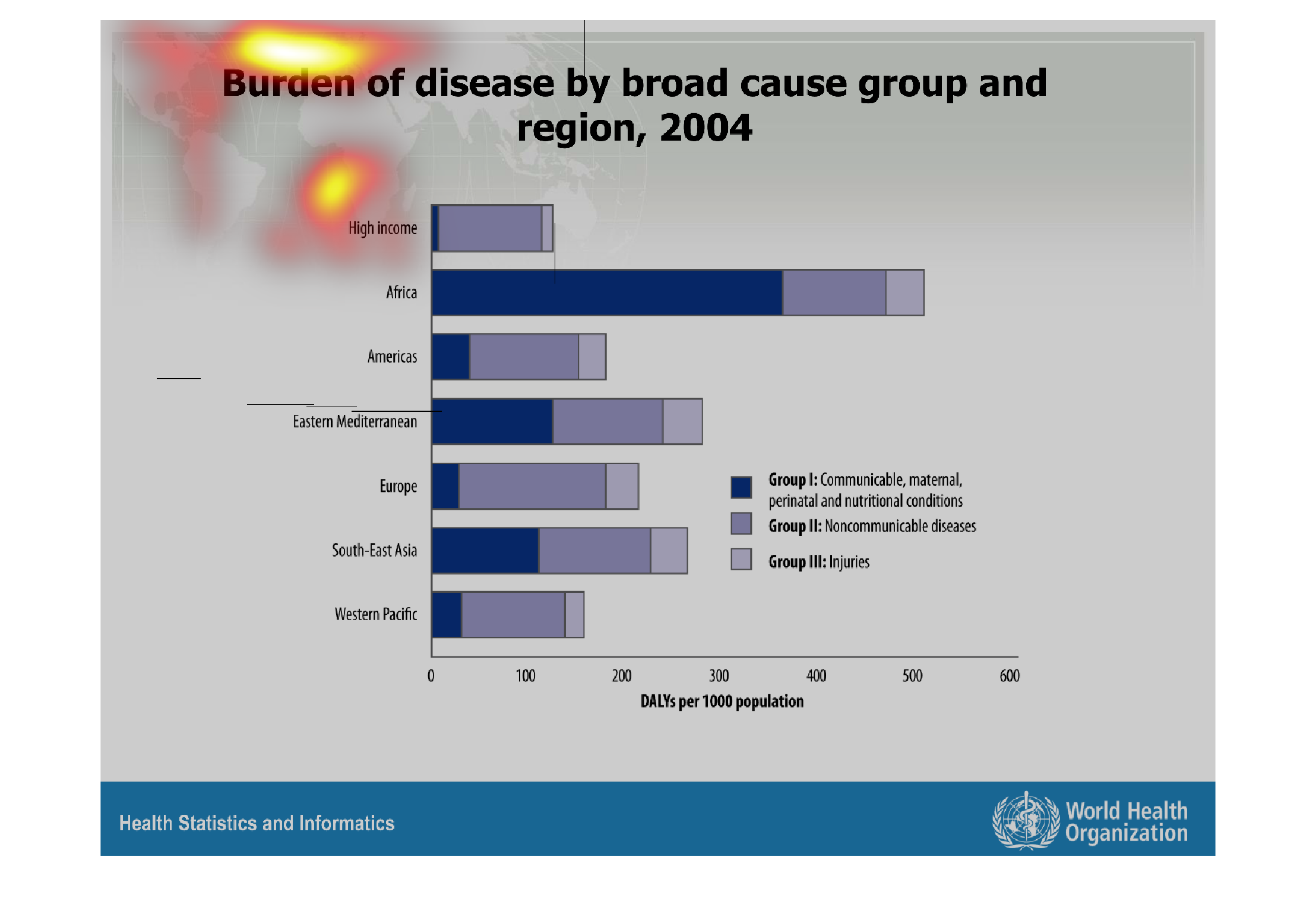
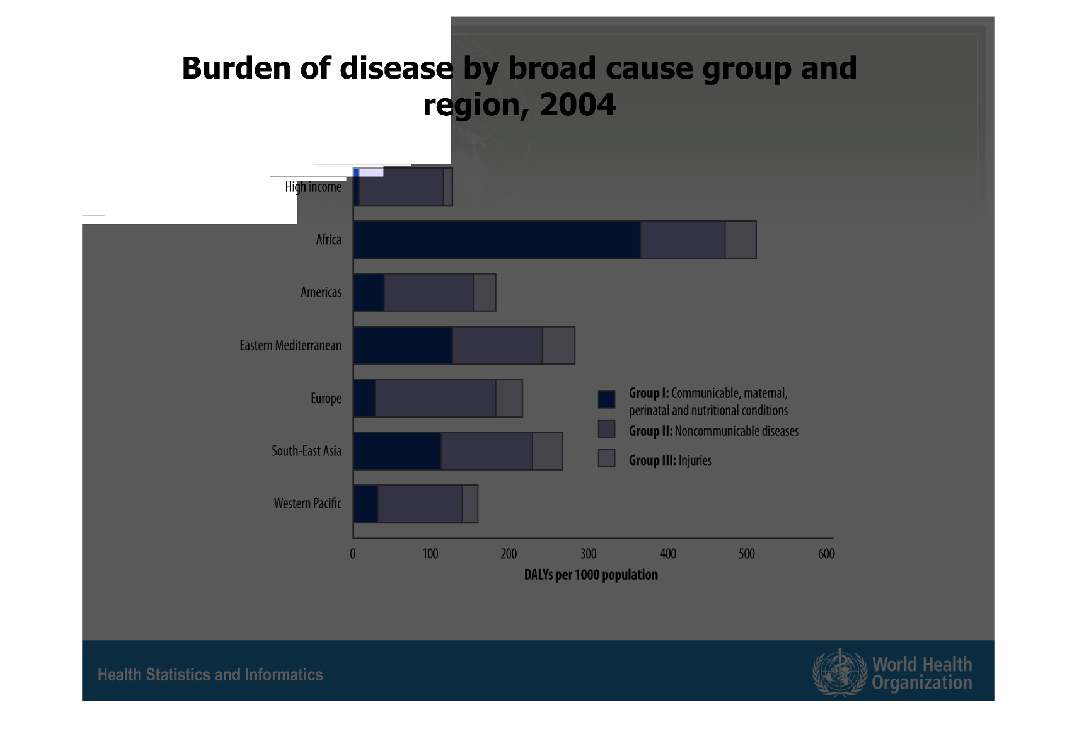
The figure presented is titled Burden of disease by broad cause group and region, 2004.  The
figure shows different region's statistical data for burden of disease.
Warning: Image is too big to fit on screen; displaying at 67%
Warning: Image is too big to fit on screen; displaying at 67%
This chart describes burden of disease by broad cause group and region, for the year 2004.
Categories on the chart include high income, Africa, and Americas.
Warning: Image is too big to fit on screen; displaying at 67%
Warning: Image is too big to fit on screen; displaying at 67%
This graph illustrates the burden of diseases by broad cause and group in 2004.  Africa has
the highest number of communicable diseases and high incomes has the lowest rates.
Warning: Image is too big to fit on screen; displaying at 67%
Warning: Image is too big to fit on screen; displaying at 67%
This chart shows the burden of disease, by broad cause groups and regions, from 2004. Each
horizontal bar is color coded into communicable and noncommunicable diseases, and then finally
a color for injuries, and sorted by world countries, and 'high income' categories.
Warning: Image is too big to fit on screen; displaying at 67%
Warning: Image is too big to fit on screen; displaying at 67%
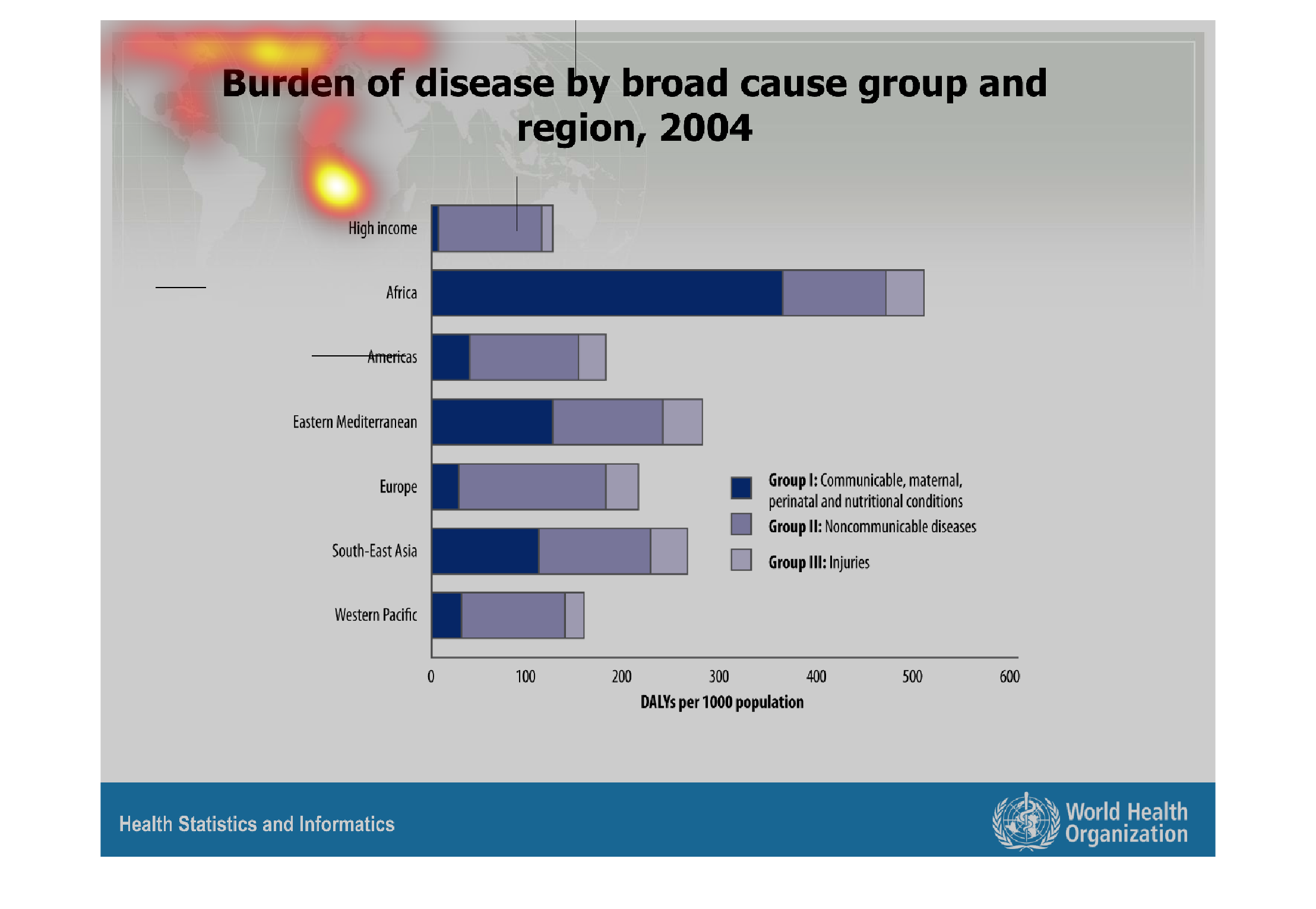
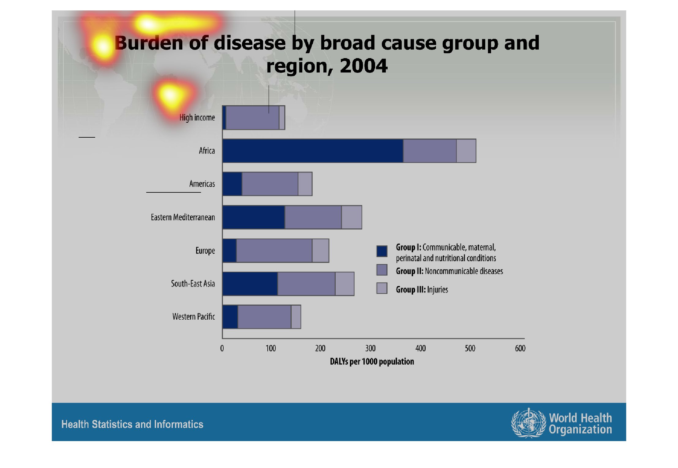
This chart is comparing likelihood of disease based on different groups in the year 2004.
People with high incomes are less likely to get a disease. Africans are the most likely to
get a disease.
Warning: Image is too big to fit on screen; displaying at 67%
Warning: Image is too big to fit on screen; displaying at 67%