Warning: Image is too big to fit on screen; displaying at 67%
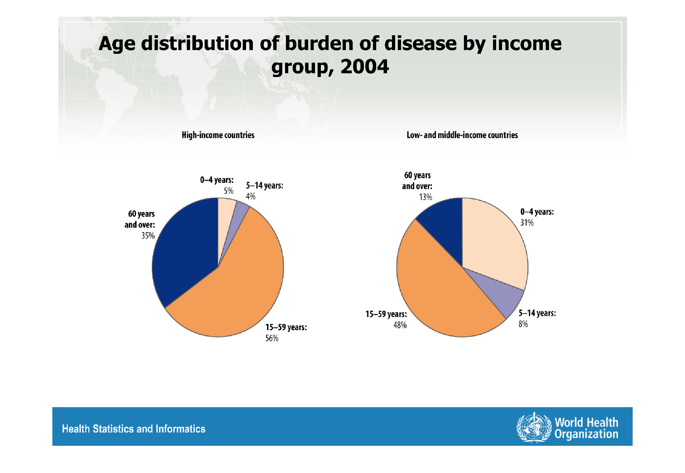
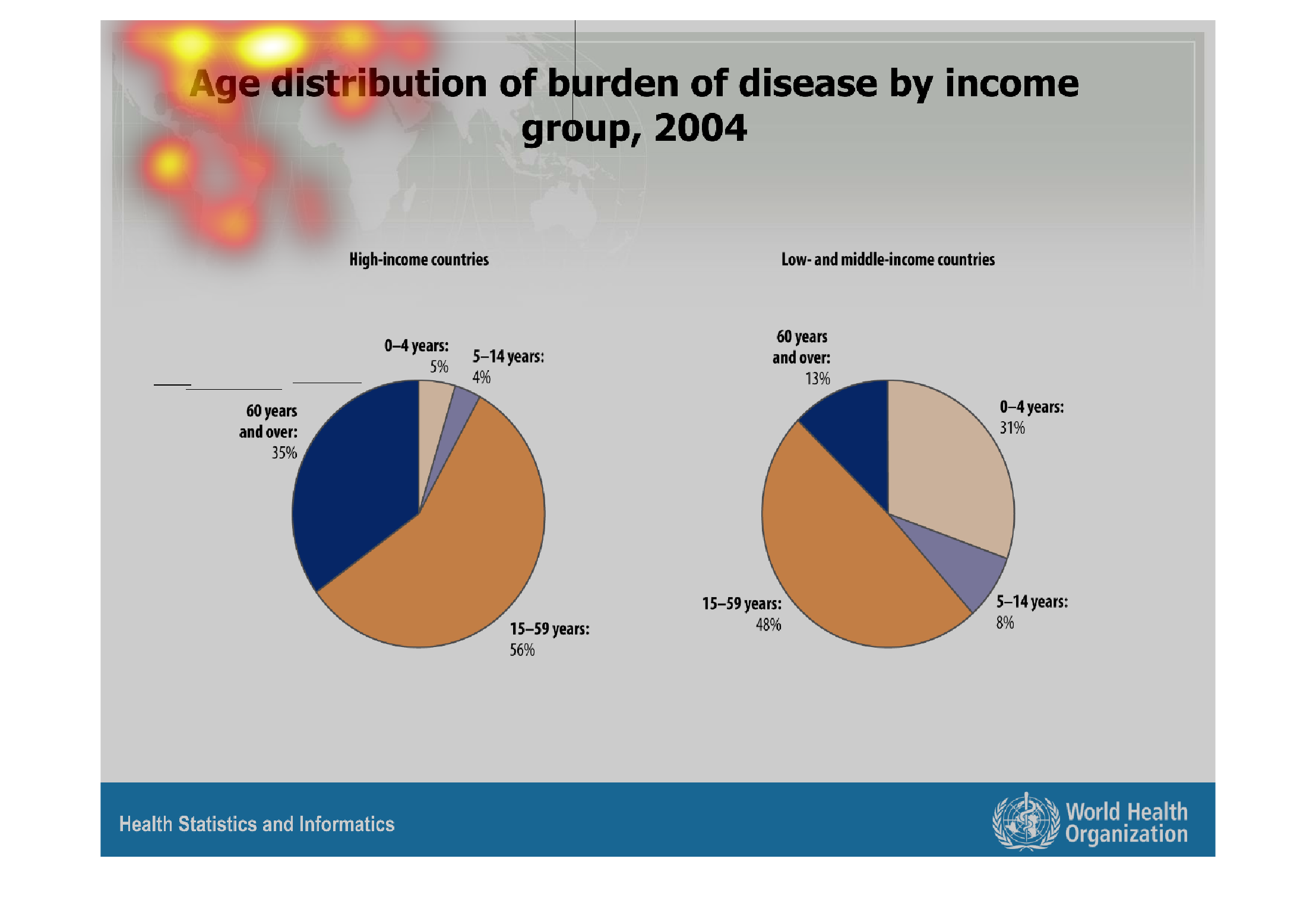
This graph shows the age distribution on diseased countries within certain income groups in
2004. Low and middle income countries have many more diseased individuals that are very young.
Children and young teens make up almost half of their sick.
Warning: Image is too big to fit on screen; displaying at 67%
Warning: Image is too big to fit on screen; displaying at 67%
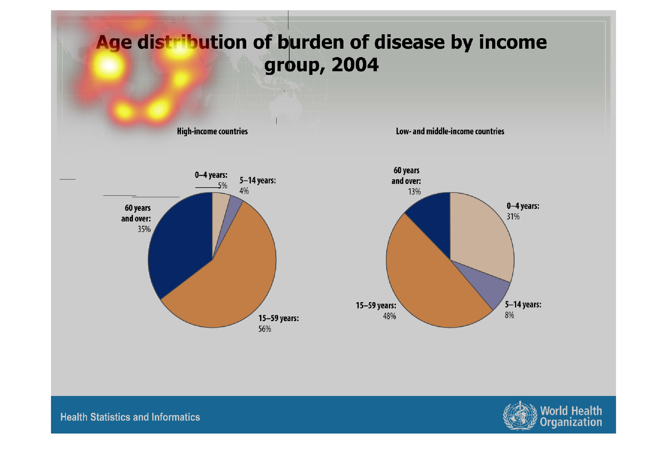
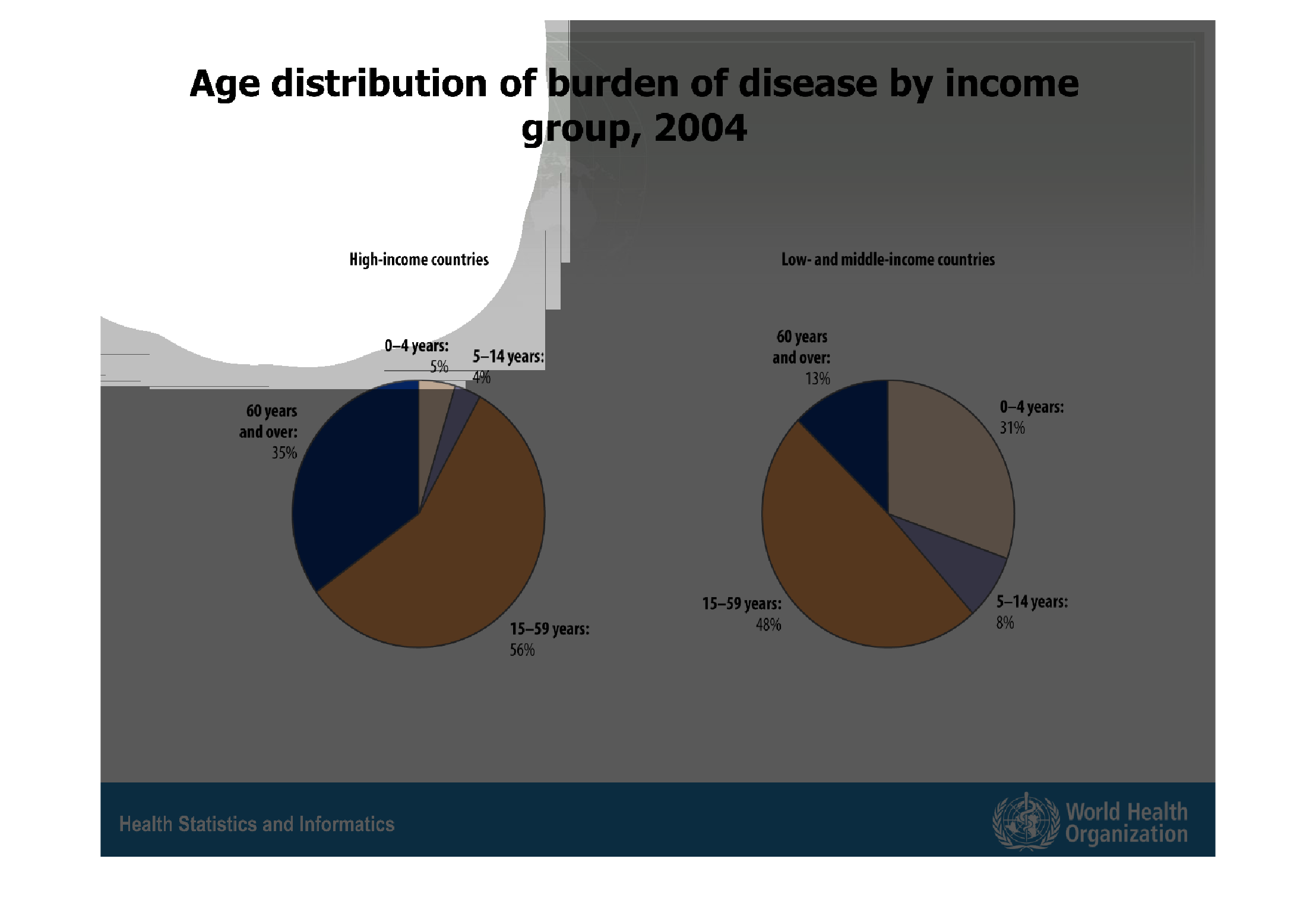
age distribution of burden age of disease by income. study done in 2004.  High income countries
 0-4 years= 5% 5-14 years= 4% 15-59 years= 56% 60+ years= 35%   Low-middle income countries
0-4 years= 37% 5-14 years= 8% 15-59 years= 48% 60+ years= 13%
Warning: Image is too big to fit on screen; displaying at 67%
Warning: Image is too big to fit on screen; displaying at 67%
age distribution of burden of disease by income group, 2004, high income versus medium and
low income companies, the number of children is significantly higher in lower income countries
as opposed to richer countries with a higher number of elderly.
Warning: Image is too big to fit on screen; displaying at 67%
Warning: Image is too big to fit on screen; displaying at 67%

In low- and middle-income countries, there is a high burden of disease on the young. Specifically,
in these countries, 31% of the burden of disease rests on those 4 and under. Only 13% is attributed
to those 60 and over (likely because there is only a small percentage of people who survive
to such a great age.) In contrast, in high-income countries, 35% of the burden of disease
rests on those 60 and over. The largest proportion of the burden of disease in all countries
seems to rest on the young and middle-aged adults (15-59), with 56% in high-income countries
and 48% in low- and middle-income countries. There is also a higher burden percentage for
people ages 5-14 in low-income countries compared to middle- and high-income countries (8%
compared to to 4%)
Warning: Image is too big to fit on screen; displaying at 67%
Warning: Image is too big to fit on screen; displaying at 67%
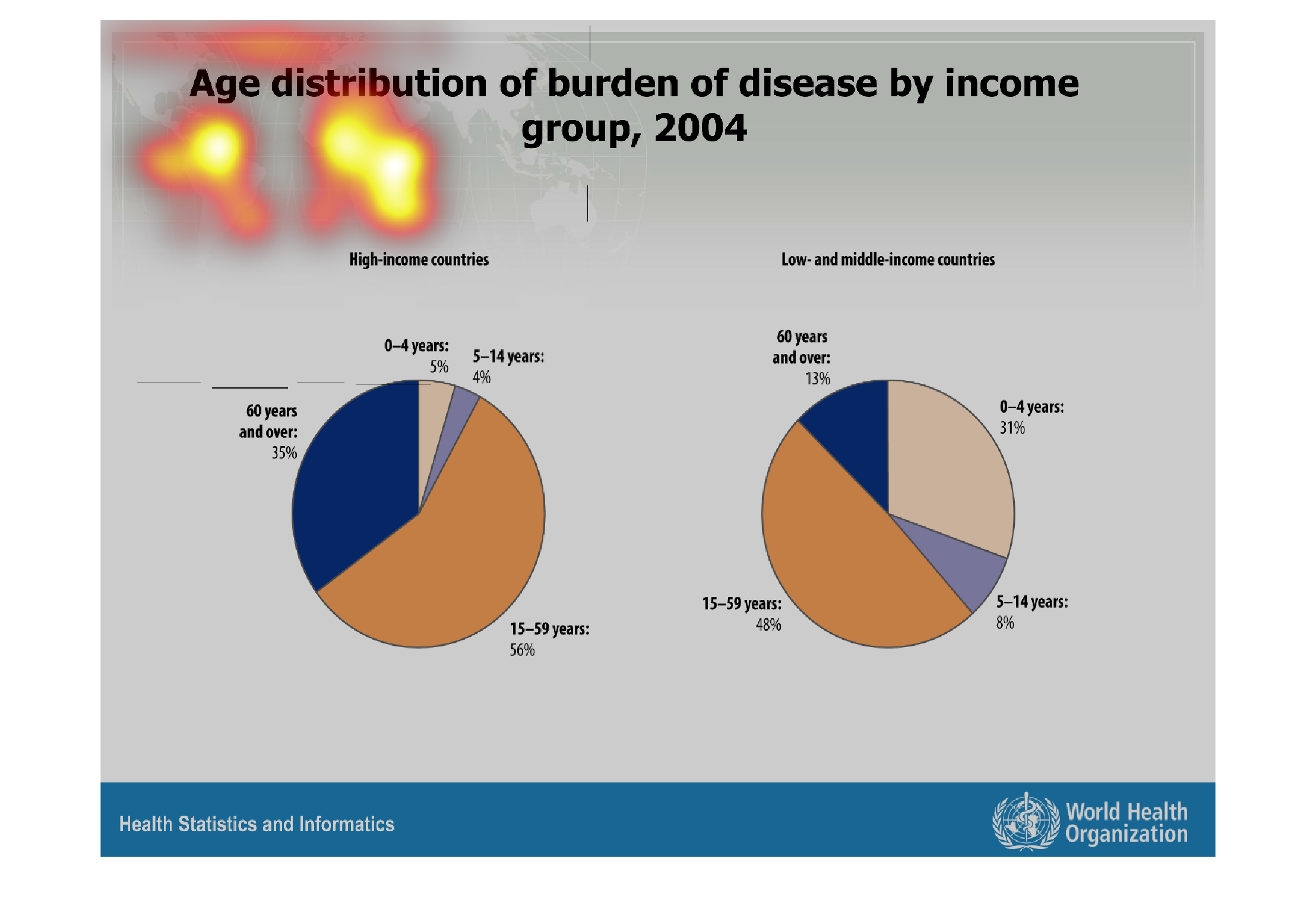
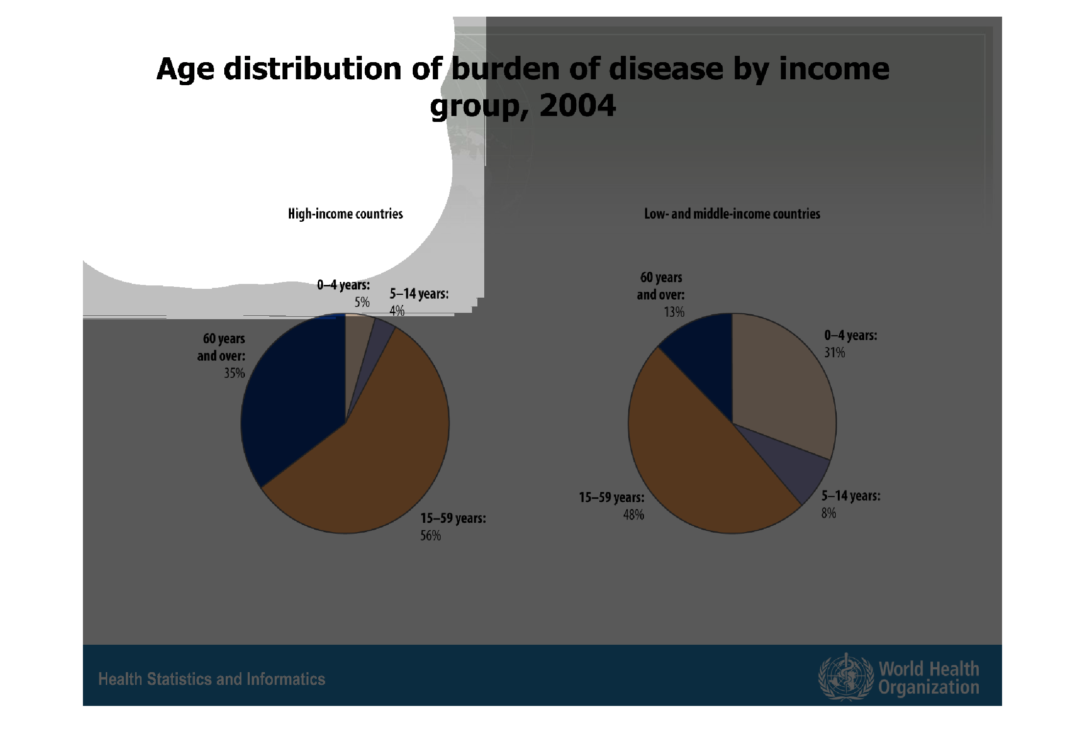
These pie charts represent the age distribution of which age groups carry the "burden of disease"
by age group; the chart on the left represents high income countries, while the one on the
right represents low income ones. In both charts, the age range of 15 to 59 carries most of
the burden.
Warning: Image is too big to fit on screen; displaying at 67%
Warning: Image is too big to fit on screen; displaying at 67%

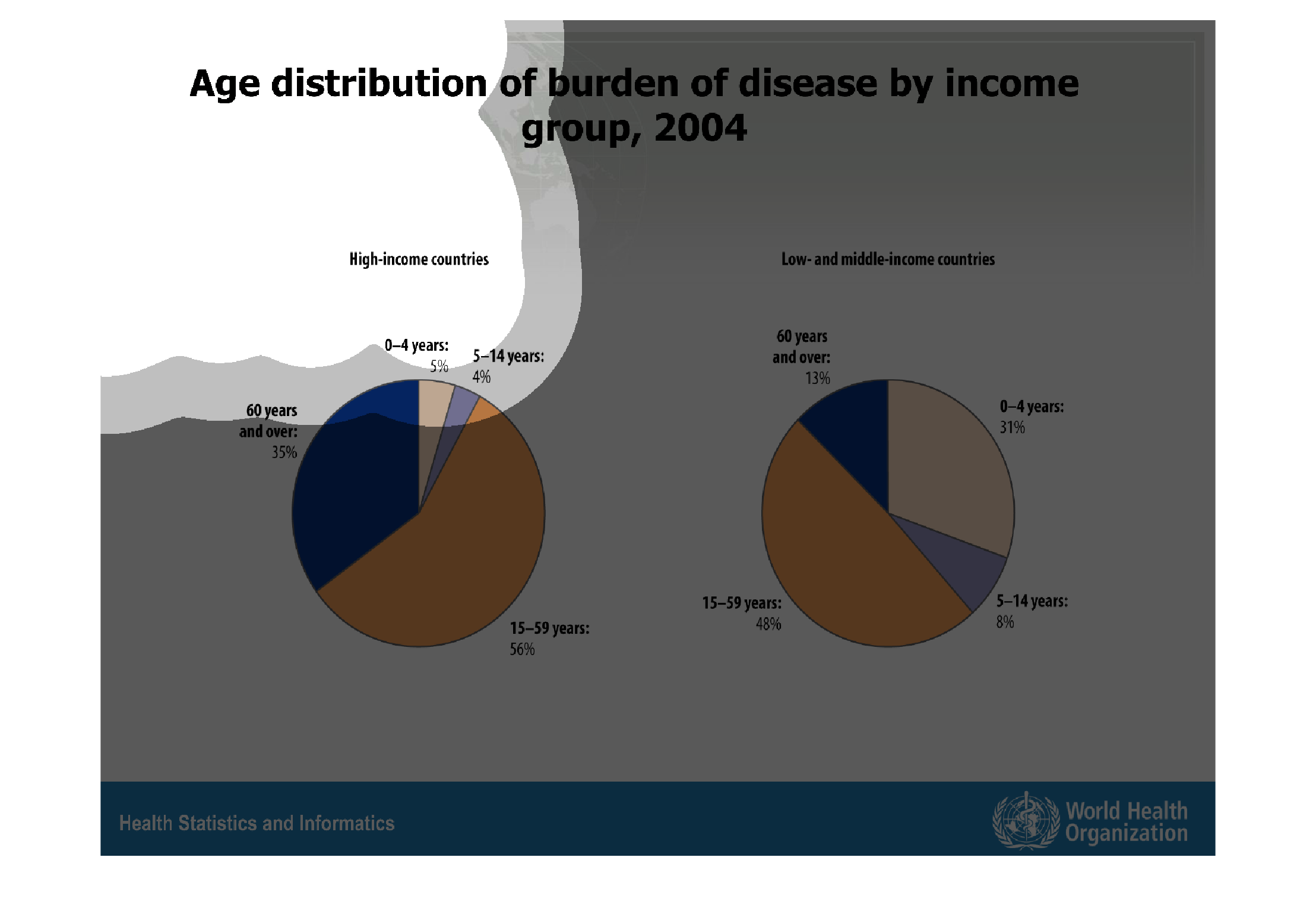
These charts show the age distribution of disease, separated into high-income and low-income
countries. In high income countries it is primarily people 60 and older who get most diseases,
with children accounting for only 9% of cases. In low-income countries, older people get most
diseases as well, but children get 39% of diseases.
Warning: Image is too big to fit on screen; displaying at 67%
Warning: Image is too big to fit on screen; displaying at 67%
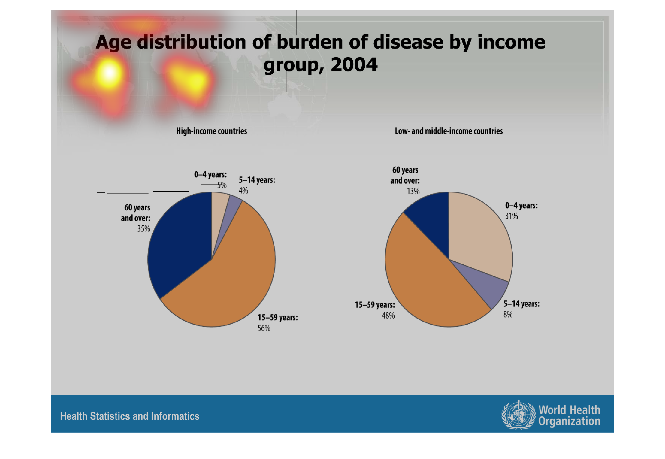

This graph shows the age distribution of burden of disease by income group in 2004,  In high
income countries, the burden was mostly felt by those 15-59 years old at 56%, followed by
those 60 years and over at 35%, then those 0-4 years old at 5%, and finally by those 5-14
years old at 4%.  In low income countries, the burden was again mostly felt by those 15-59
years old at 48%, followed by those those 0-4 years old at 31%, then by those 60 years and
over at 13%,  and finally by those 5-14 years old at 8%.
Warning: Image is too big to fit on screen; displaying at 67%
Warning: Image is too big to fit on screen; displaying at 67%
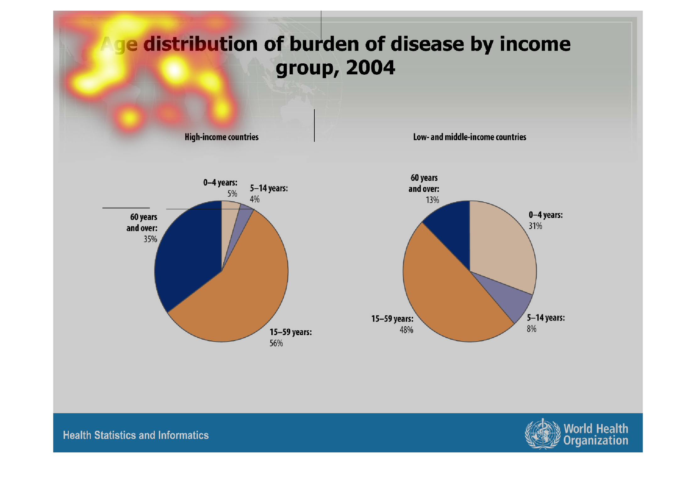
This chart describes age distribution of burden of disease by income group, for the year 2004.
The chart is divided by high income and low and middle income.
Warning: Image is too big to fit on screen; displaying at 67%
Warning: Image is too big to fit on screen; displaying at 67%
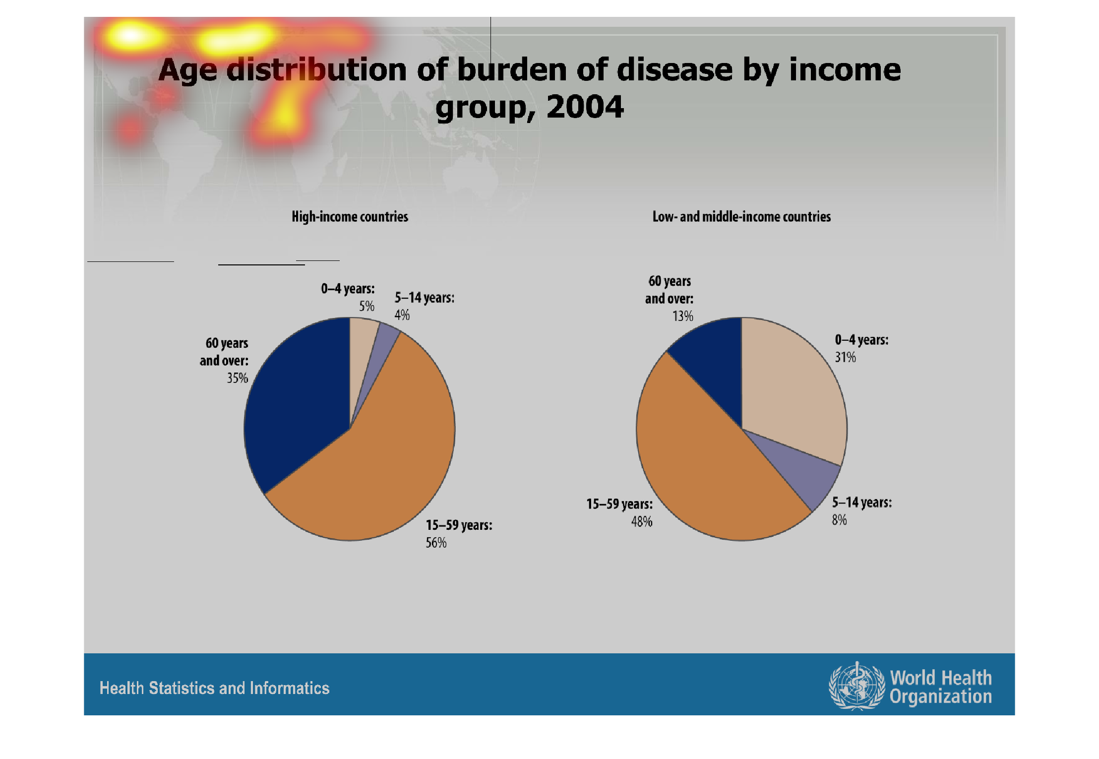
The figure presented is titled Age distribution of burden  of disease by income group, 2004.
 The figure is a representation of the amount of disease in different countries.
Warning: Image is too big to fit on screen; displaying at 67%
Warning: Image is too big to fit on screen; displaying at 67%
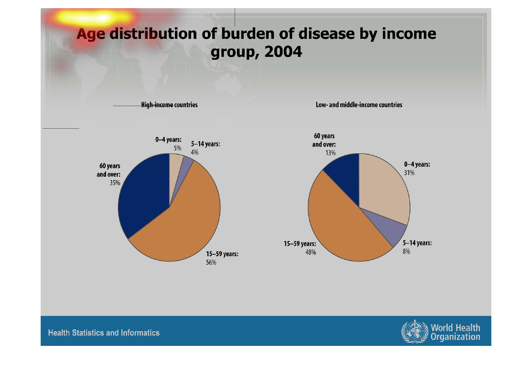
Age Distribution of burden of disease by income group in 2004. In high income countries the
majority 56 percent of income group disease came within 15 to 59 years. With 35 percent 60
years and ever had the second most income group disease. Then by a one percent difference
came 0 to 4 years by 5 percent and 5-14 years by 4 percent income group disease.  With low
and middle income countries 15 to 59 years had 48 percent income group disease. Then next
with income group disease was 31 percent was 0 to 4 years. 13 percent of income group disease
was with 60 years and ever. 5 to 14 years of income group disease with 18 percent was the
lowest percent.
Warning: Image is too big to fit on screen; displaying at 67%
Warning: Image is too big to fit on screen; displaying at 67%
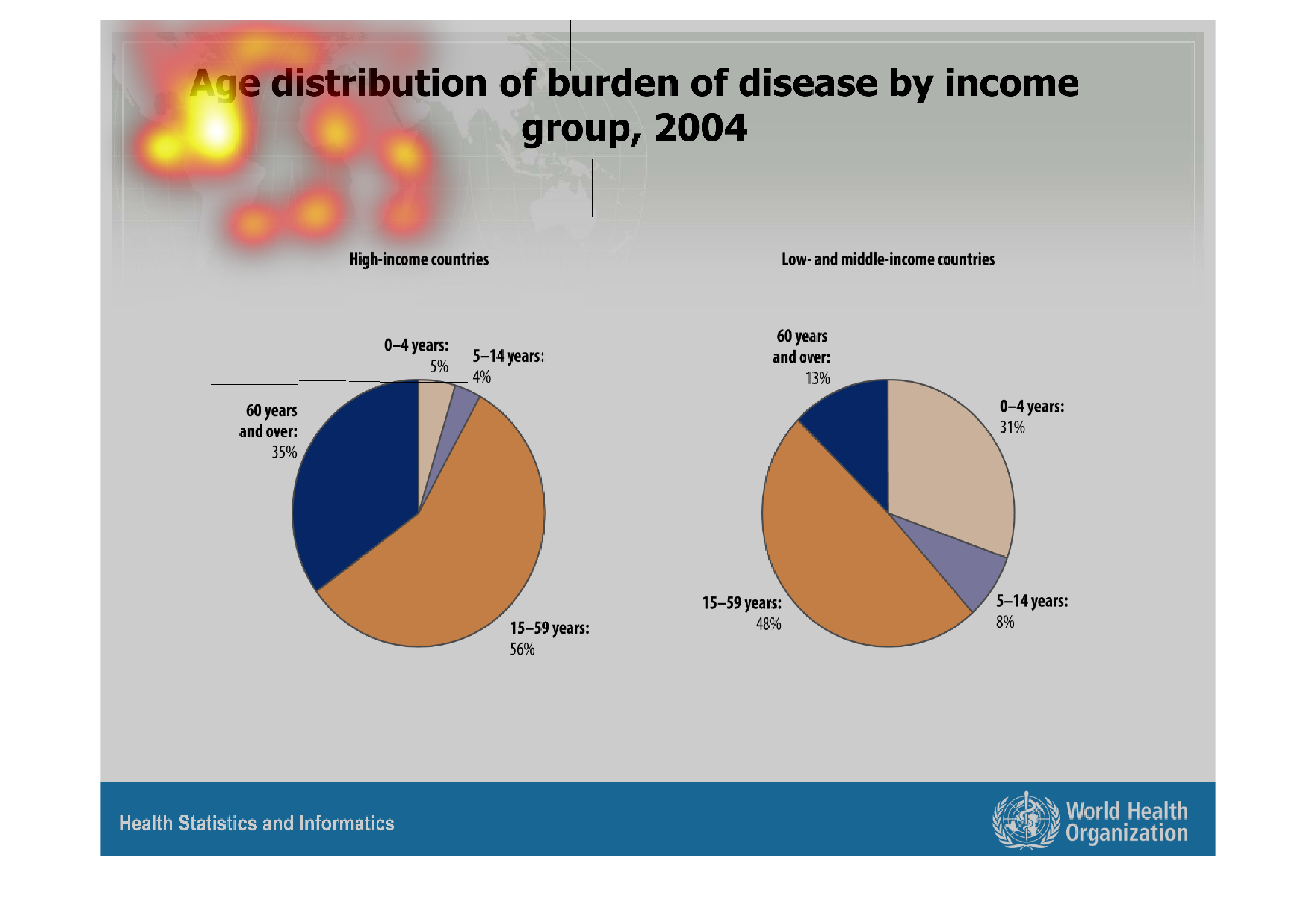
This chart shows how income is affecting the burden of disease in different age group among
the low to medium income countries and high income countries. In low and middle-income countries,
the disease rate in the 0 to 4 years age group is significantly more apparent than the high
income countries.
Warning: Image is too big to fit on screen; displaying at 67%
Warning: Image is too big to fit on screen; displaying at 67%

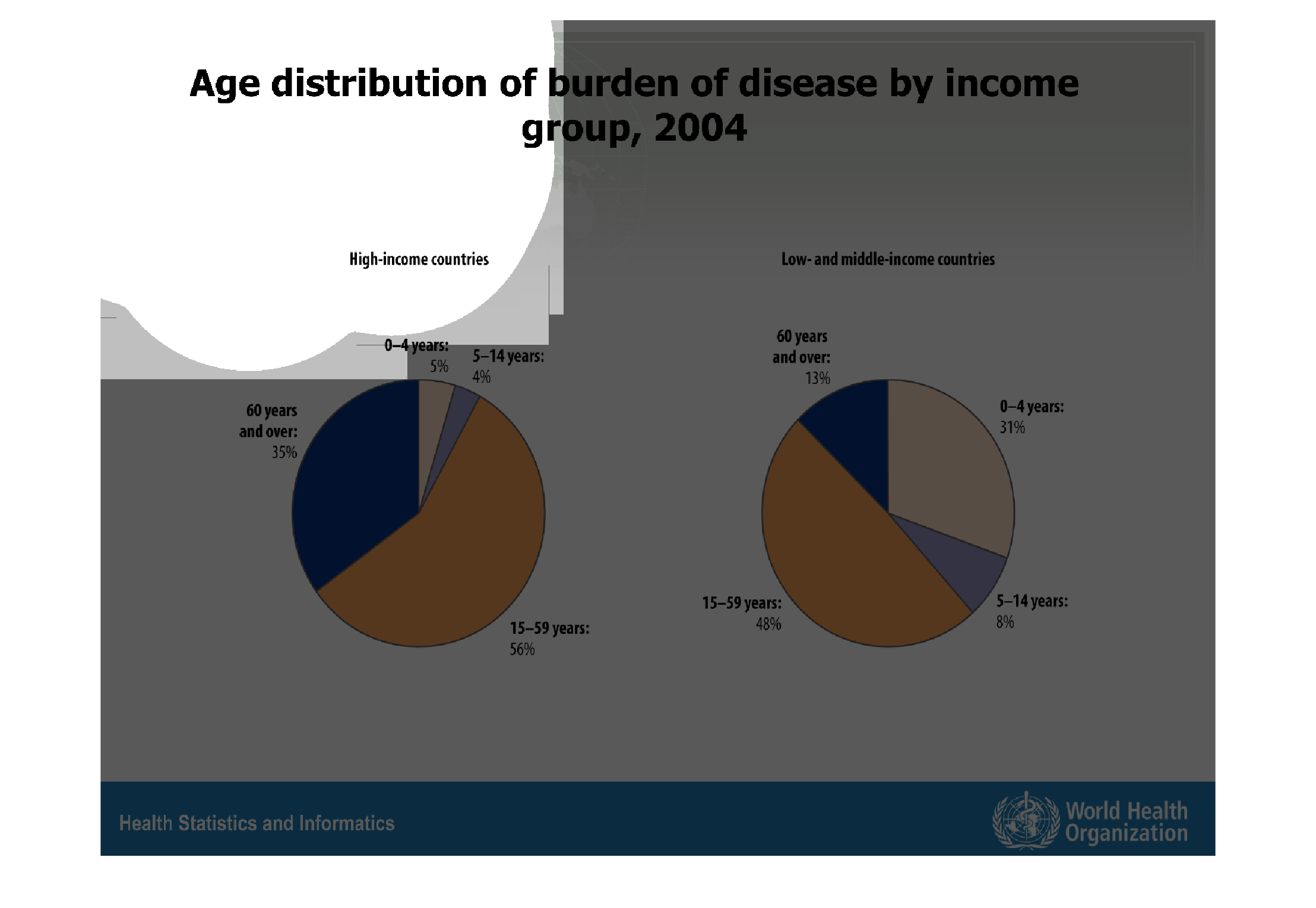
This is a series of pie charts depicting age distribution of burden of disease by income group
in the year 2004. The highest burden in all groups is the 15-59 year olds.
Warning: Image is too big to fit on screen; displaying at 67%
Warning: Image is too big to fit on screen; displaying at 67%

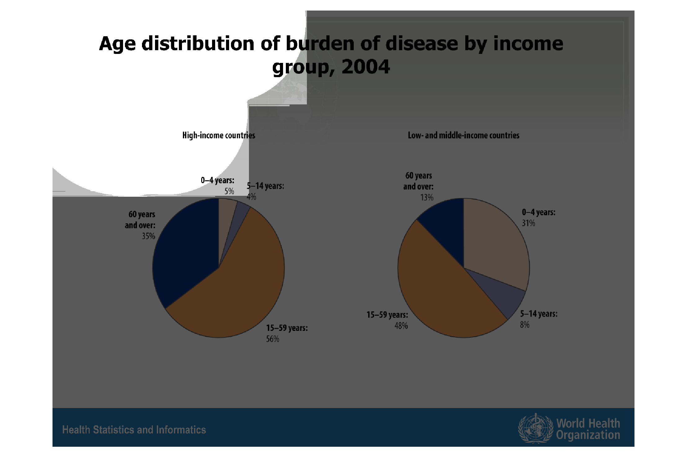
The image on the left hand side is a 2004  study showing the age distribution of burden diseases
by income group.  From this data for high income groups individuals aged 15-59 have the most
amount of burden disease.  This same result is relevant for individuals in low income groups.
Warning: Image is too big to fit on screen; displaying at 67%
Warning: Image is too big to fit on screen; displaying at 67%

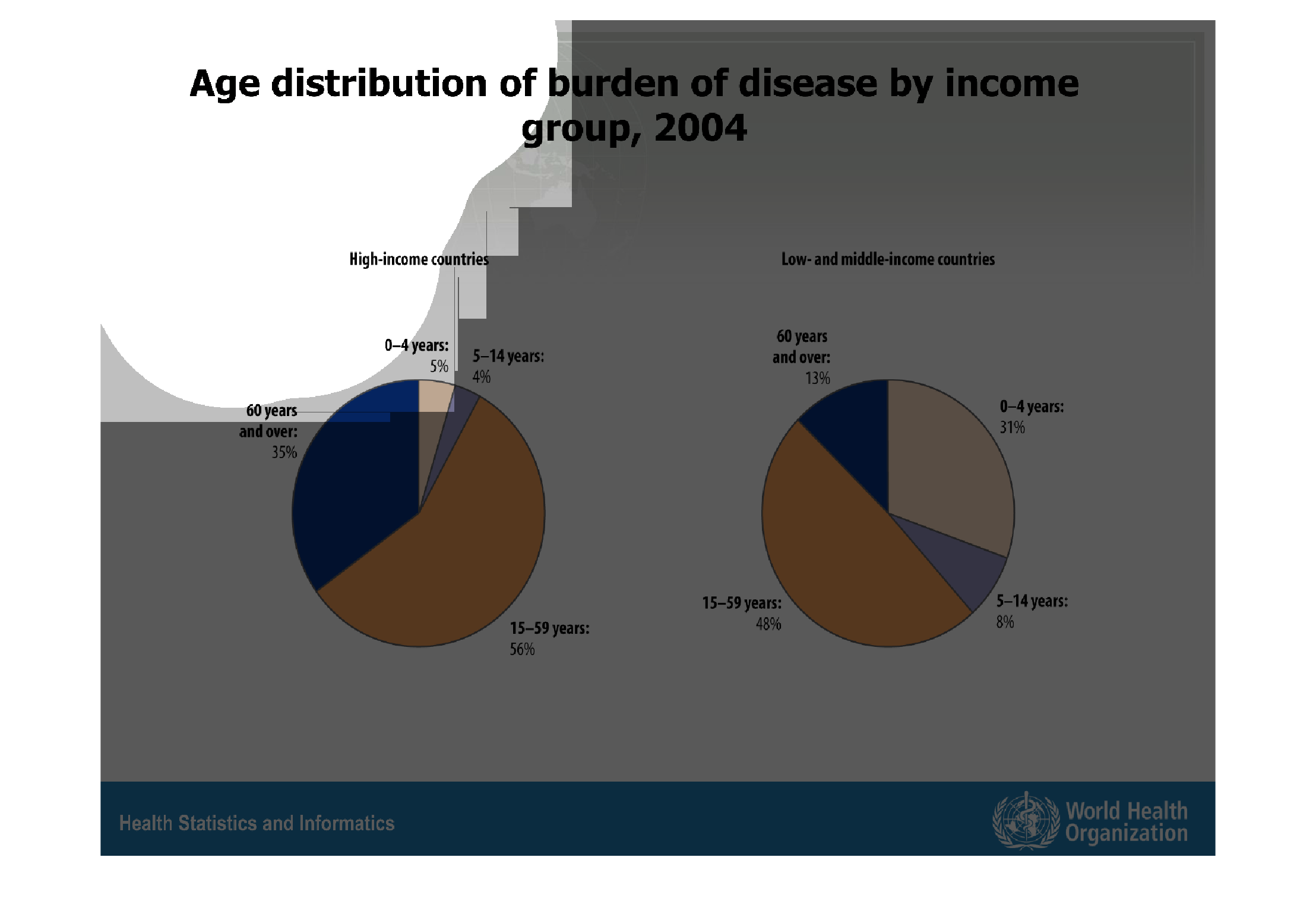
This graph shows the age distribution of burden of disease according to income group in the
year 2004.  In high-income countries, those aged 15 to 59 years had the highest (56 percent)
distribution of illness.  In low- and middle-income countries, 15 to 59 year olds held 48
percent of the distribution of burden of disease.
Warning: Image is too big to fit on screen; displaying at 67%
Warning: Image is too big to fit on screen; displaying at 67%