Warning: Image is too big to fit on screen; displaying at 67%
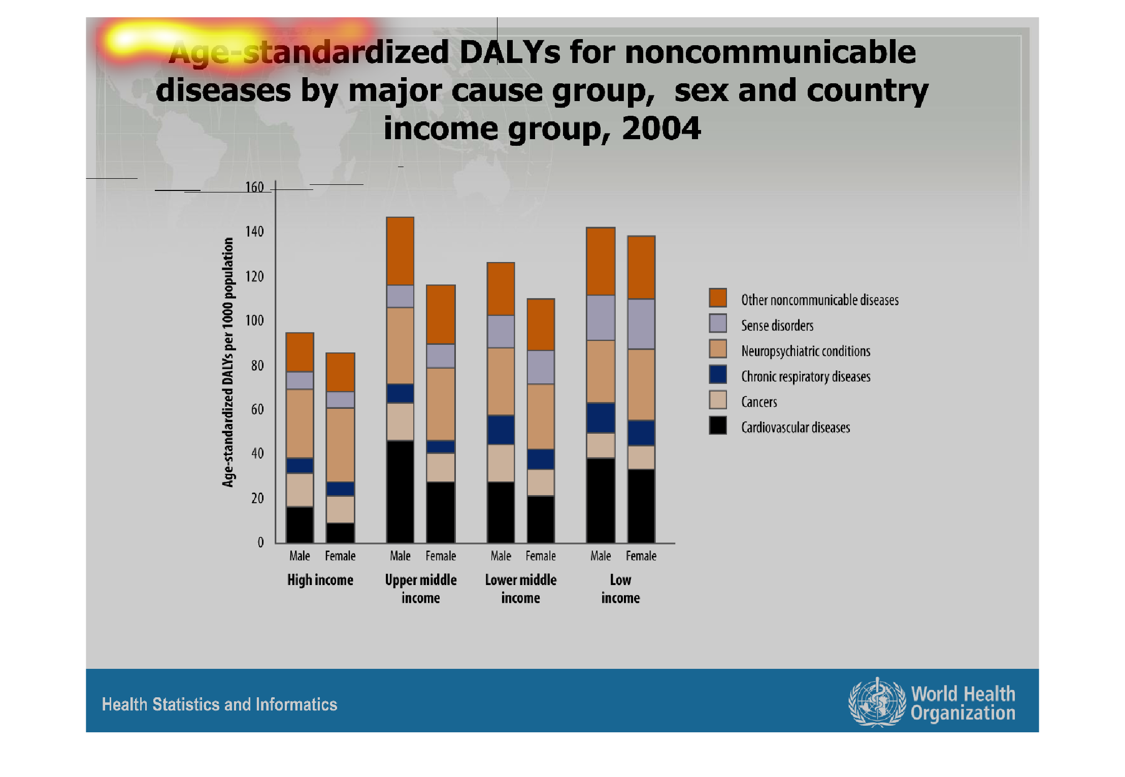
This is a chart of age standardardized DALYs for noncommunicable diseases by major cause groups,
sex and country group, from 2004. It is sorted into high upper middle lower middle a low income
groups, then further color coded into the different diseases.
Warning: Image is too big to fit on screen; displaying at 67%
Warning: Image is too big to fit on screen; displaying at 67%

This shows age standardized DALYs for noncommunicable diseases by major cause group, sex,
and country, and income group. It is greatest from the upper middle class.
Warning: Image is too big to fit on screen; displaying at 67%
Warning: Image is too big to fit on screen; displaying at 67%
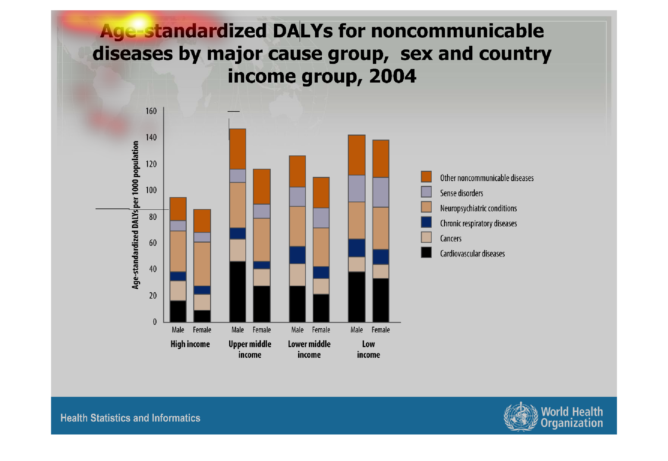
Age-standardized DALYs for noncommunicable diseases by major cause group, sex and country
income group in the year 2004 depicted as a series of bar graphs.
Warning: Image is too big to fit on screen; displaying at 67%
Warning: Image is too big to fit on screen; displaying at 67%
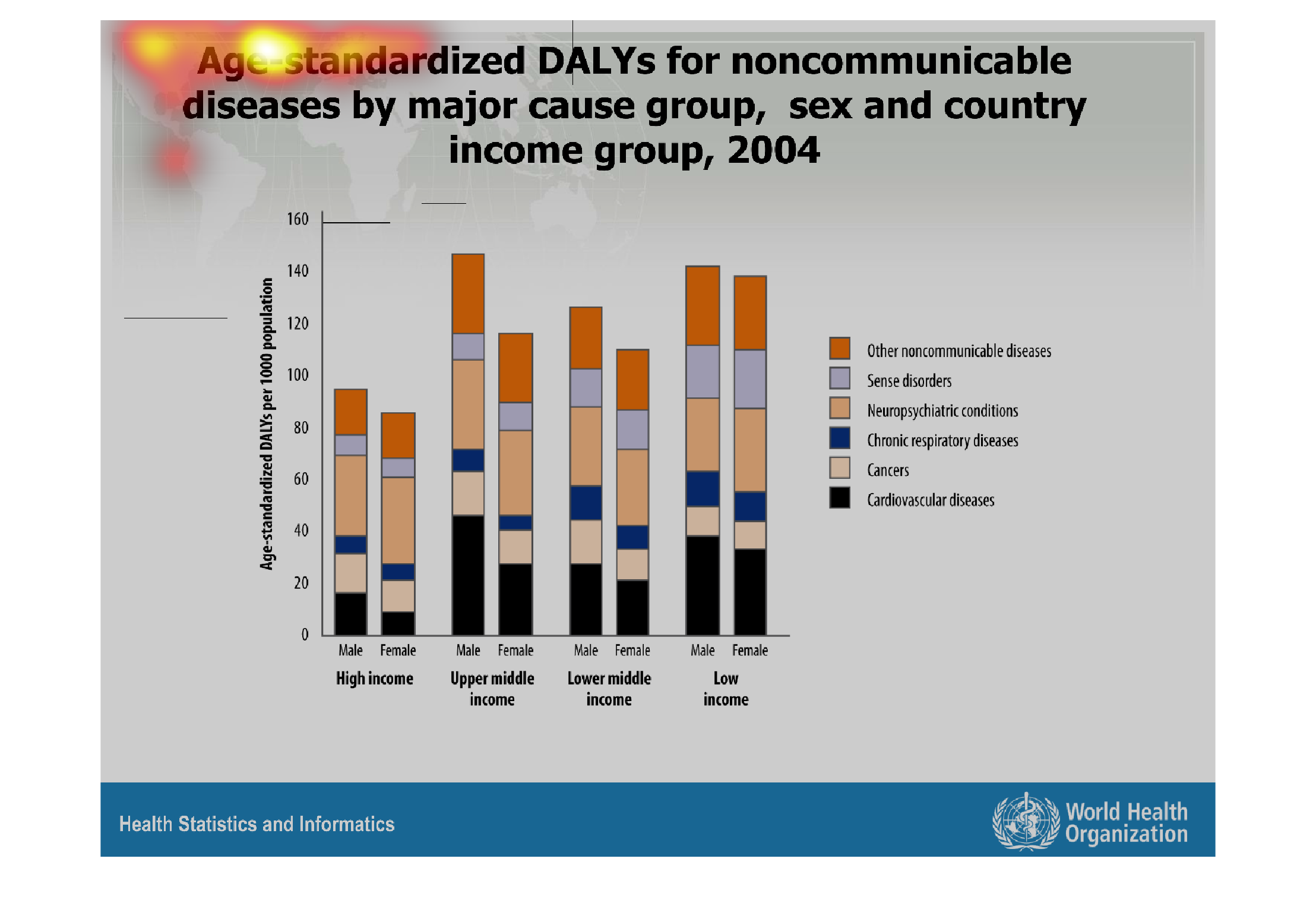
The graph depicts age standardized DALYs for noncommunicable diseases by major cause group,
sex and country income group, 2004. Income groups include: High-income, upper middle income,
lower middle income, and low income, and compare men versus women. Men seem to have elevated
numbers of a plethora of diseases versus women.
Warning: Image is too big to fit on screen; displaying at 67%
Warning: Image is too big to fit on screen; displaying at 67%
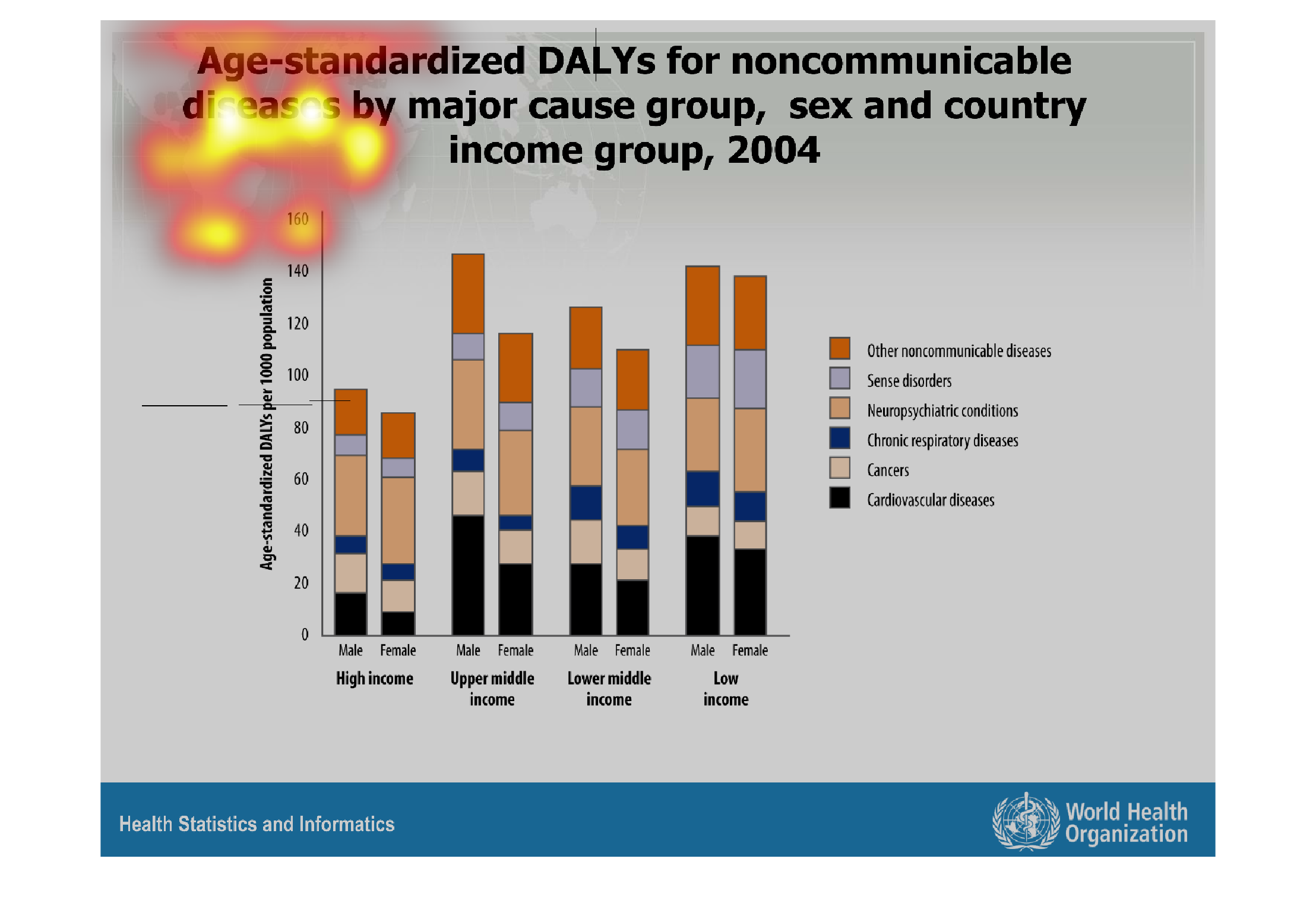

The image on the left hand side displays the socieoeconomic statuses from low-high, as well
as the respected genders: men and women.  This graph shows the age standardized DALY's for
noncommunicable diseases.  From the data collected, it appears that cancer is a big player
in the DALY disease across all respected income levels.
Warning: Image is too big to fit on screen; displaying at 67%
Warning: Image is too big to fit on screen; displaying at 67%

This chart shows in 2004, Age-standardized DALYs of income for different groups. The Upper
middle Income has had the highest percentage, where cardiovascular disease caused the most
impact.
Warning: Image is too big to fit on screen; displaying at 67%
Warning: Image is too big to fit on screen; displaying at 67%
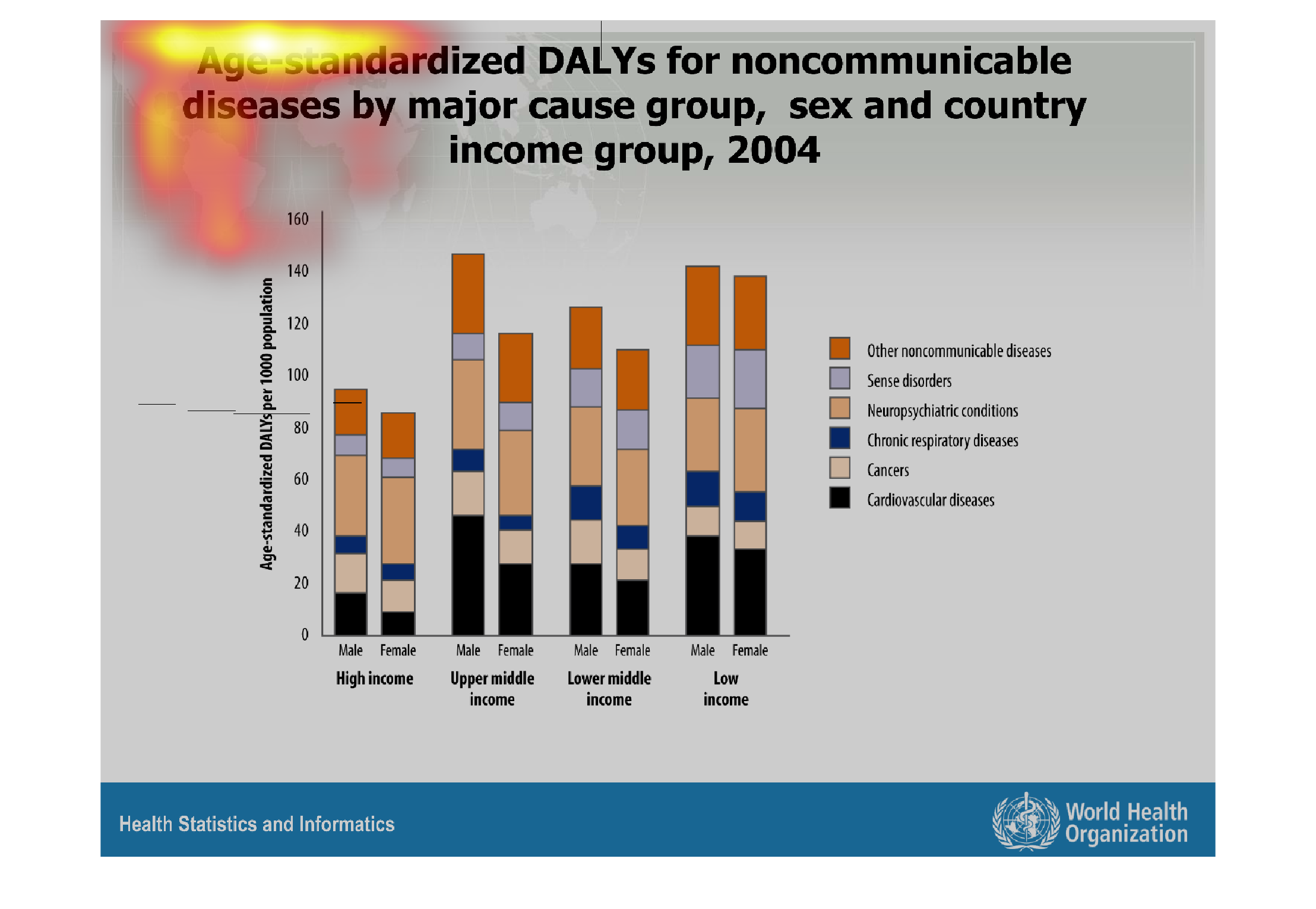
This graph represents noncommunicable diseases based on age, gender and income in 2004. It
covers four different income ranges and divides those income ranges into male and female subgroups.
Warning: Image is too big to fit on screen; displaying at 67%
Warning: Image is too big to fit on screen; displaying at 67%

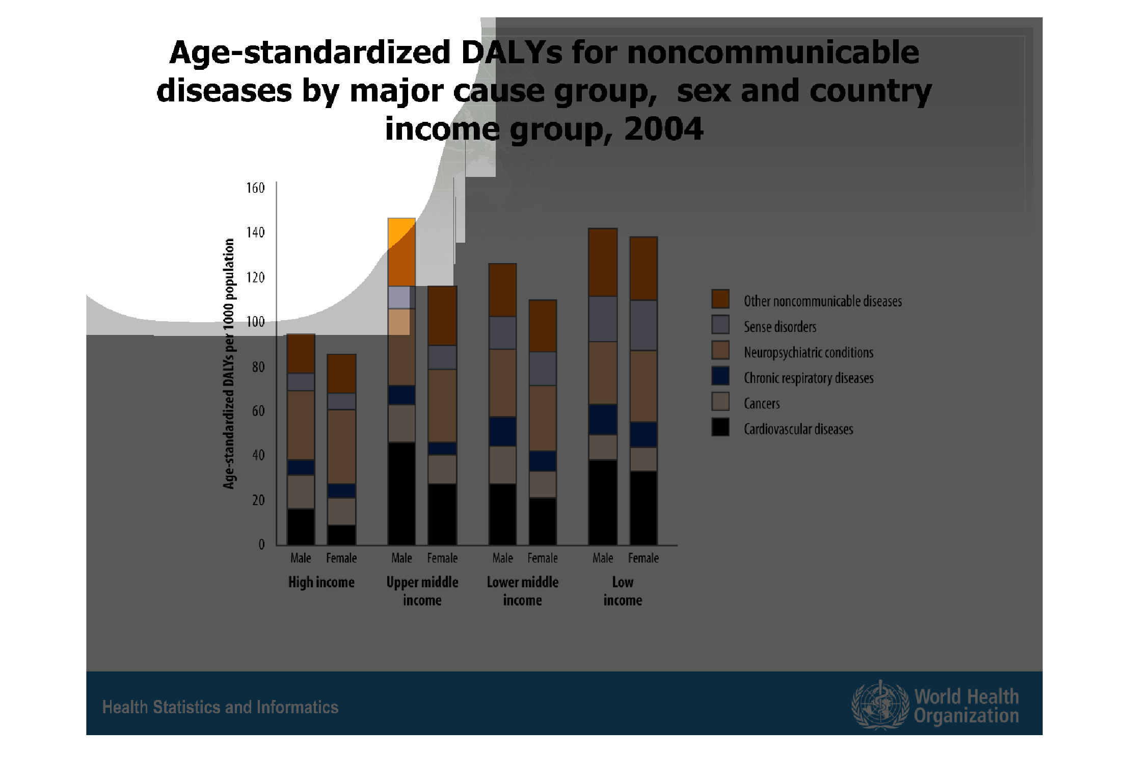
This is a chart for the age standards for noncommunicable diseases. This is a function of
age, sex, income group and country. Overall there is not much a of a change among all groups.
Warning: Image is too big to fit on screen; displaying at 67%
Warning: Image is too big to fit on screen; displaying at 67%

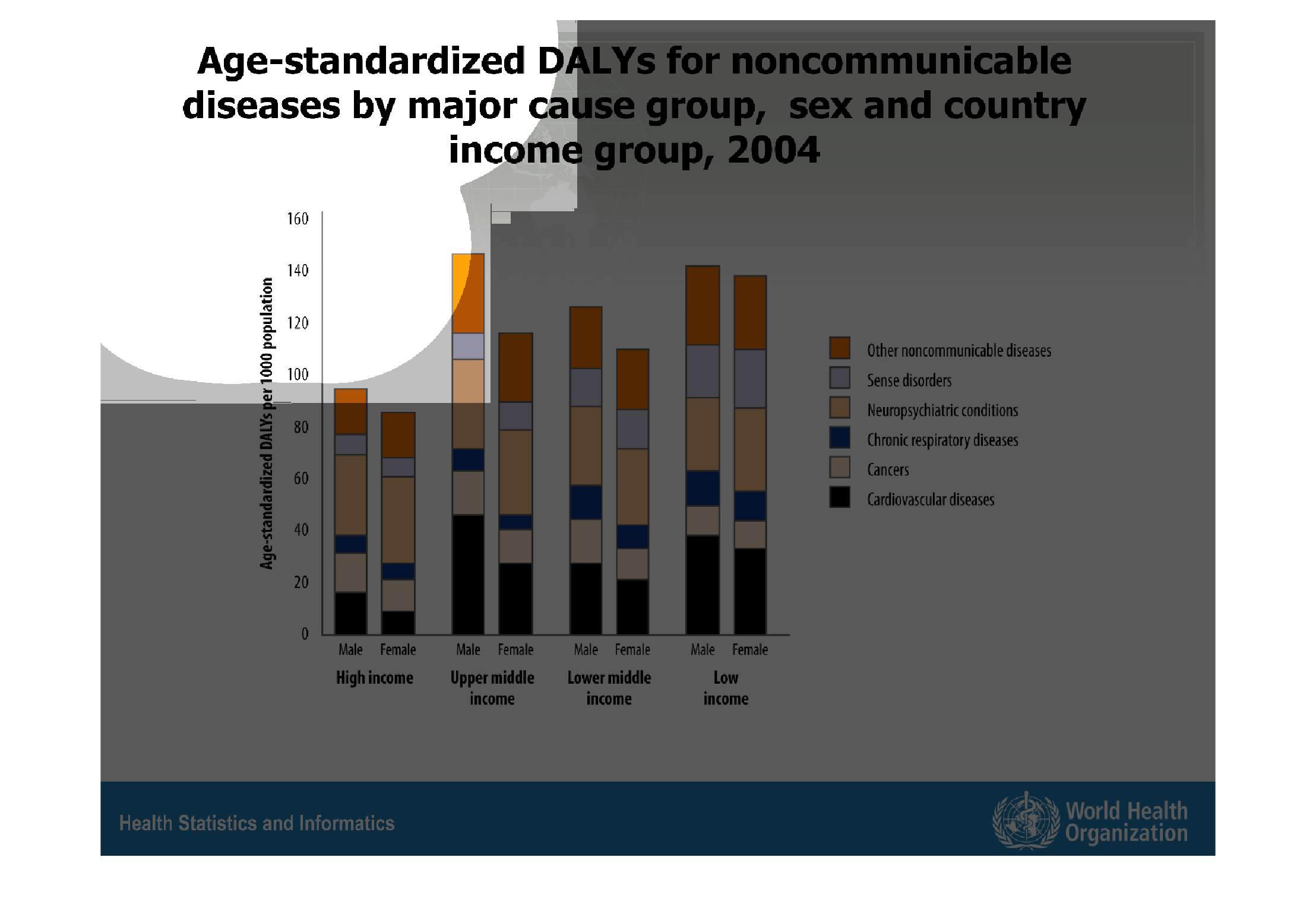
Chart exploring the statistics behind communicable diseases divided by income, sex and country.
It clearly reveals that high income members of either gender are less susceptible, or at least,
less likely to succumb to certain illnesses of the non-communicable nature.
Warning: Image is too big to fit on screen; displaying at 67%
Warning: Image is too big to fit on screen; displaying at 67%
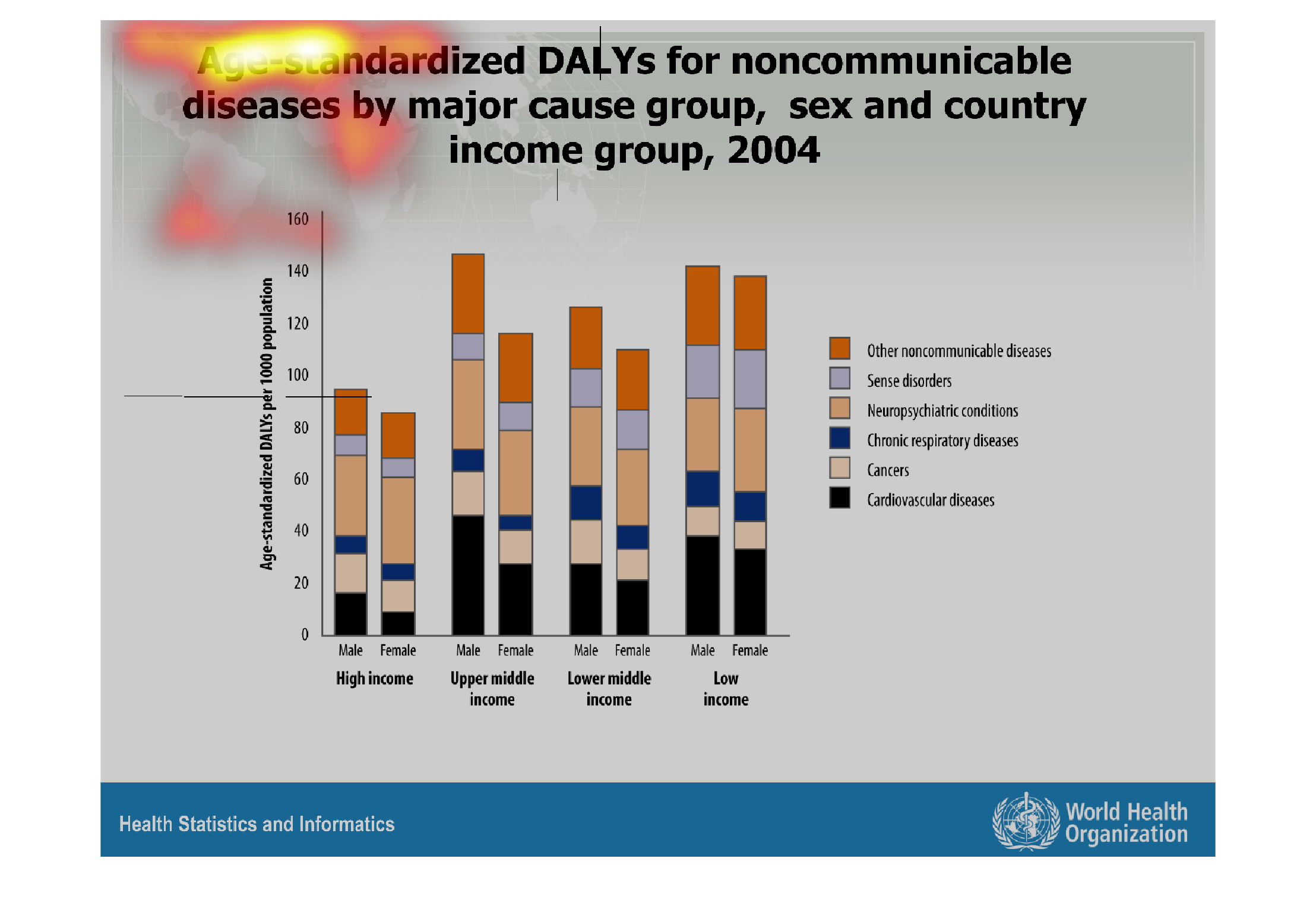
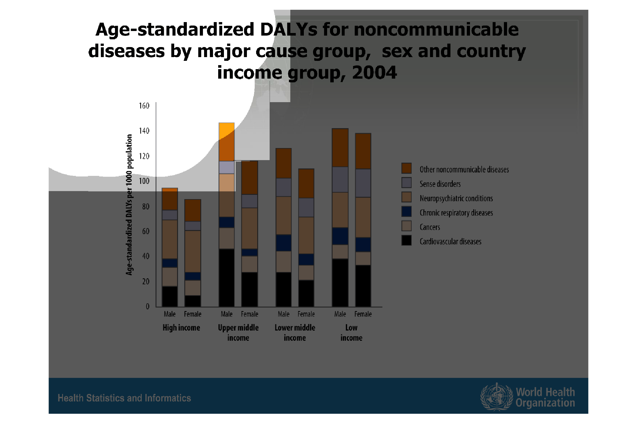
This is a graph that shows the counts for certain non-communicable diseas among the population.
It's broken down by income. It's also broken down by gender.
Warning: Image is too big to fit on screen; displaying at 67%
Warning: Image is too big to fit on screen; displaying at 67%
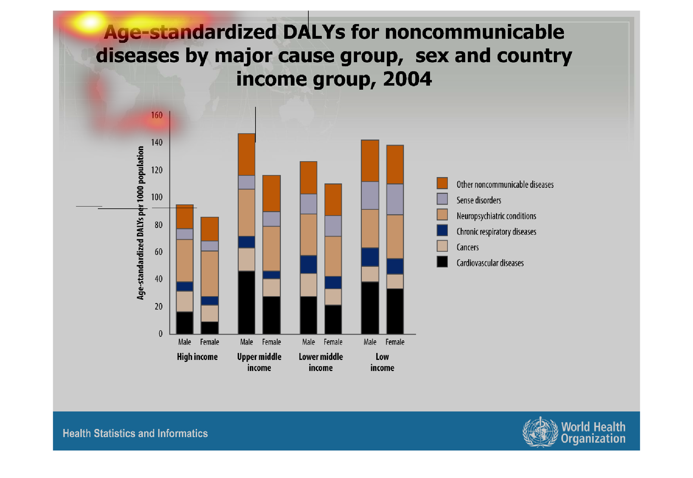
This chart shows the age standardized Dalys or noncommunicable diseases by major group, sex
and country income group in the year 2004. High income, upper middle income, lower middle
income and low income are compared in the chart.
Warning: Image is too big to fit on screen; displaying at 67%
Warning: Image is too big to fit on screen; displaying at 67%
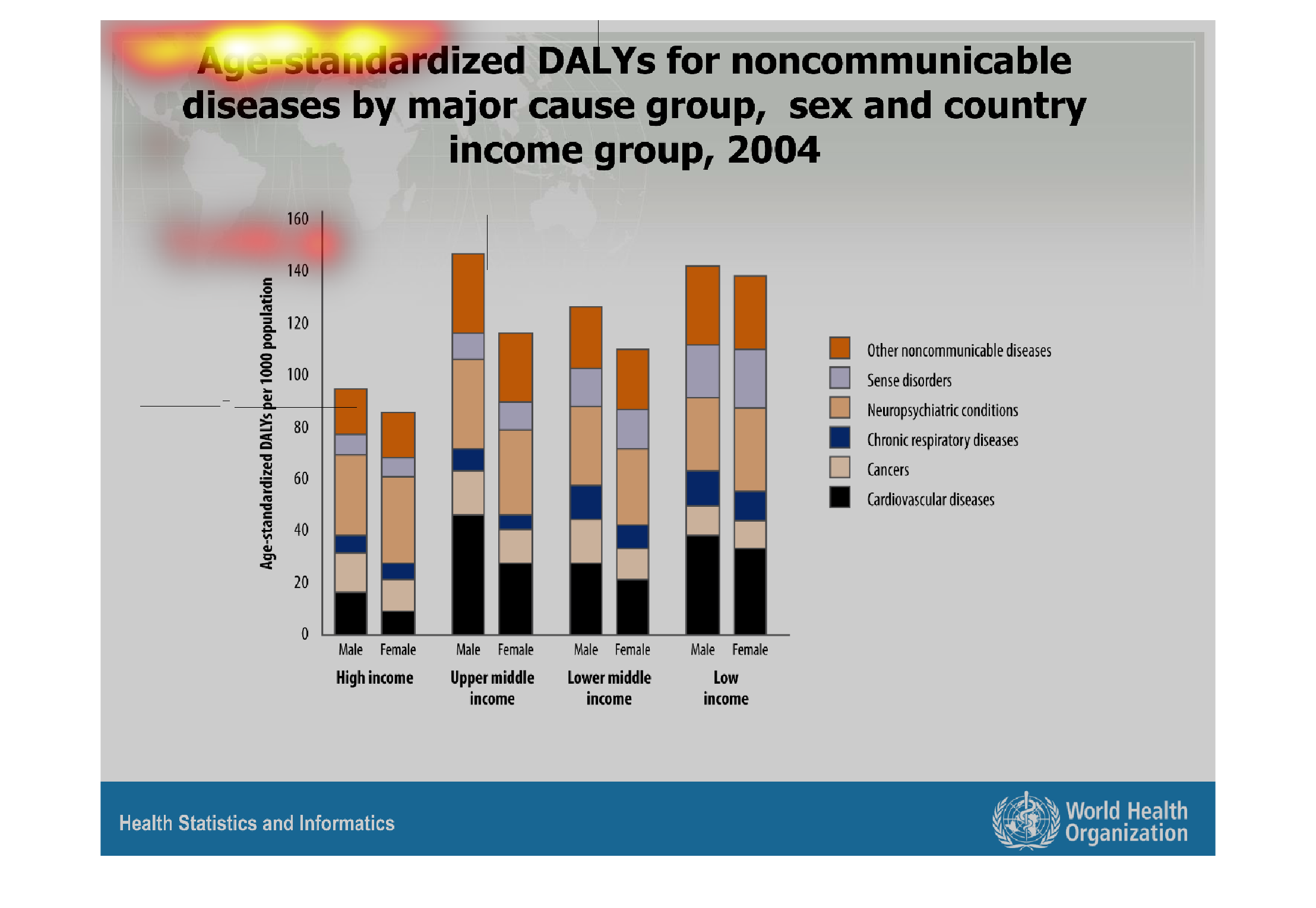
This chart describes age-standardized DALYs for noncommunicable diseases by major cause group,
sex and country income group for the year 2004. Categories include high income.
Warning: Image is too big to fit on screen; displaying at 67%
Warning: Image is too big to fit on screen; displaying at 67%
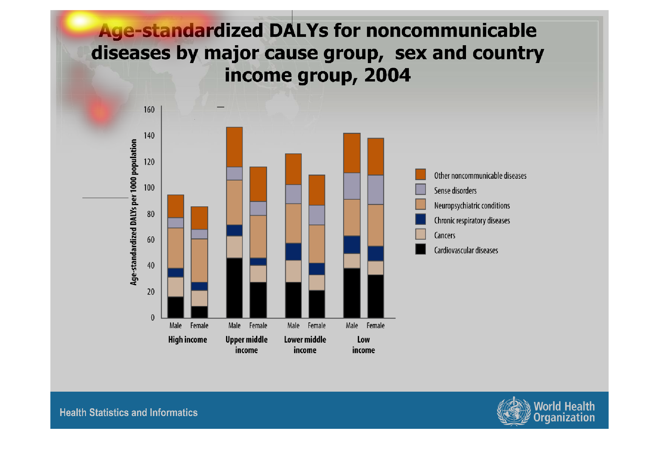
This graph illustrates age standard DALYs for noncommunicable diseases by major cause group,
sex, and country in 2004.  Cancers and cardiovascular diseases are among those represented.
Warning: Image is too big to fit on screen; displaying at 67%
Warning: Image is too big to fit on screen; displaying at 67%
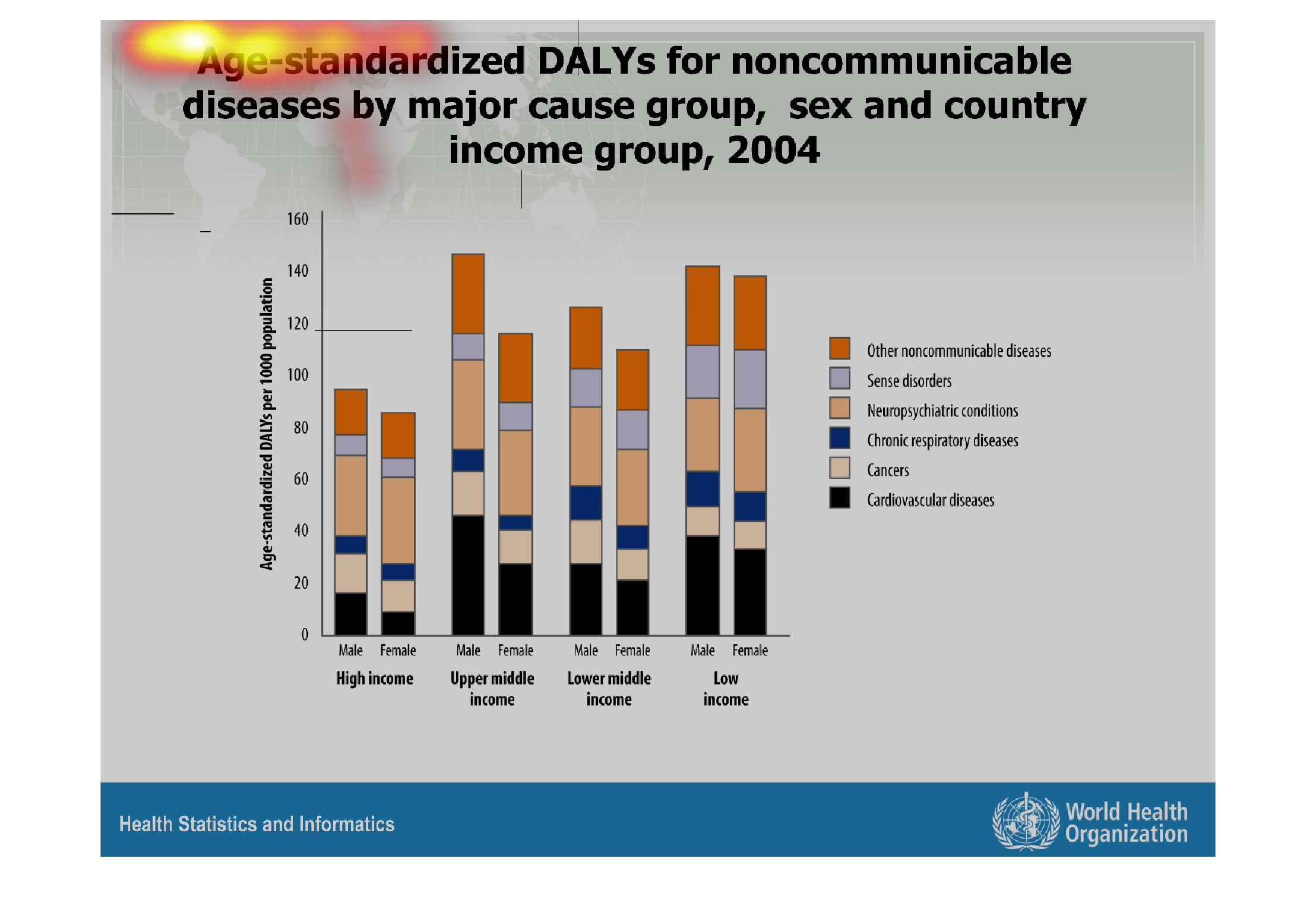
This chart makes no sense because there is no context and it is hard to read. It looks like
it is about DALYs but I have no idea what DALYs are.
Warning: Image is too big to fit on screen; displaying at 67%
Warning: Image is too big to fit on screen; displaying at 67%