Warning: Image is too big to fit on screen; displaying at 67%
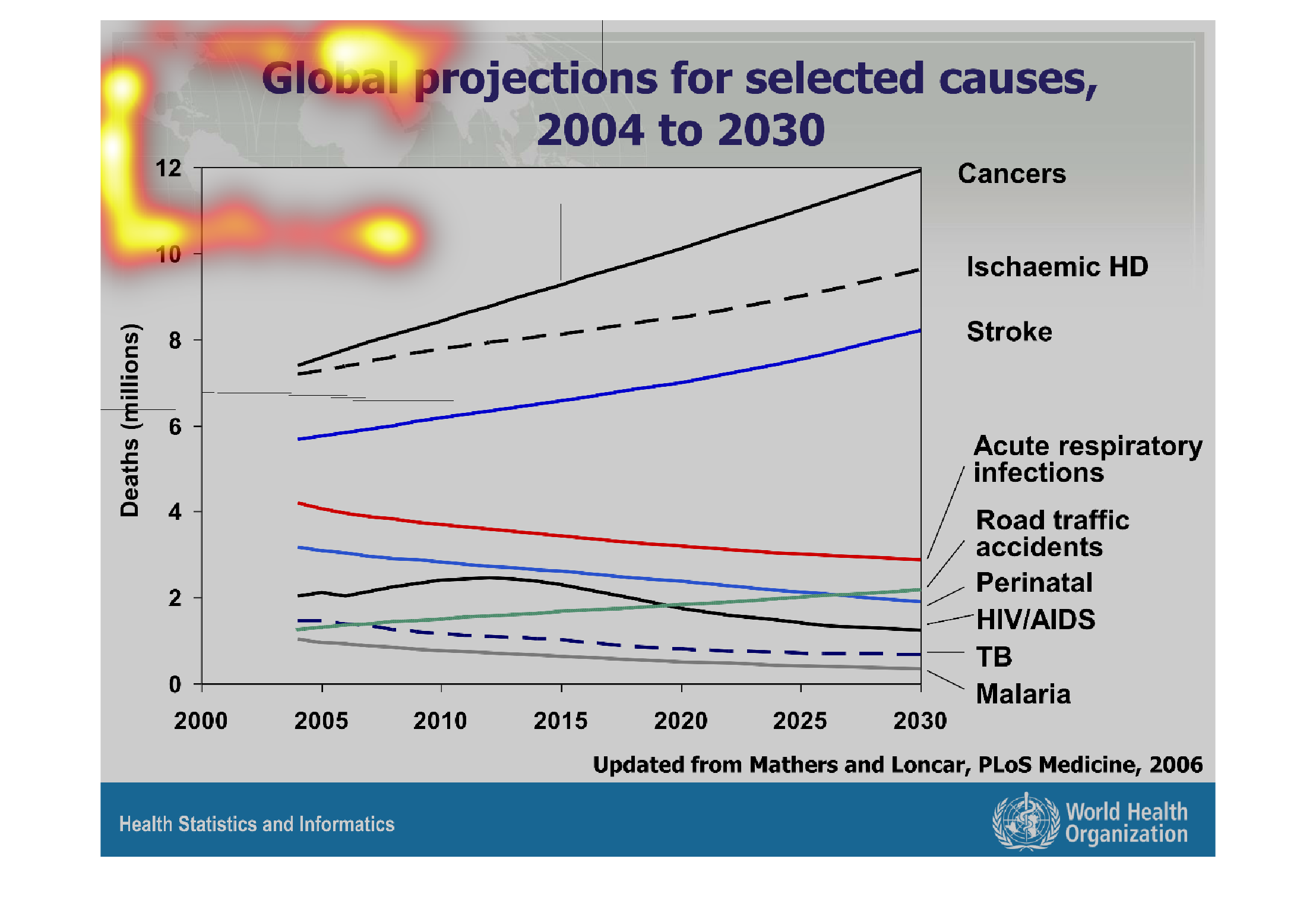
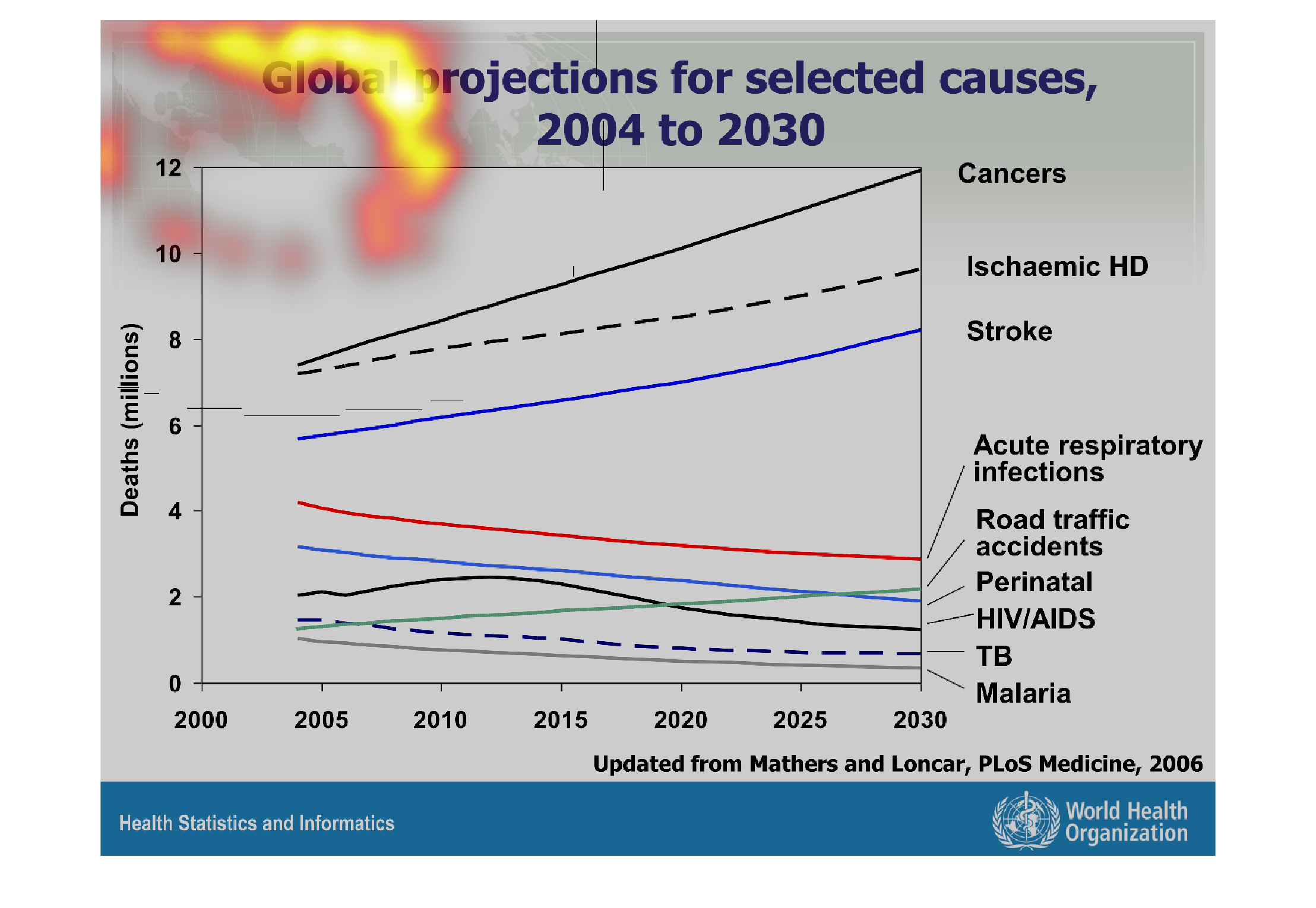
This line graph represents the global causes of death from year 2004 to year 2030. Causes
include cancer, ischemic HD, stroke, acute respiratory infections, road traffic accidents,
perinatal HIV/AIDs, TB, and malaria.
Warning: Image is too big to fit on screen; displaying at 67%
Warning: Image is too big to fit on screen; displaying at 67%
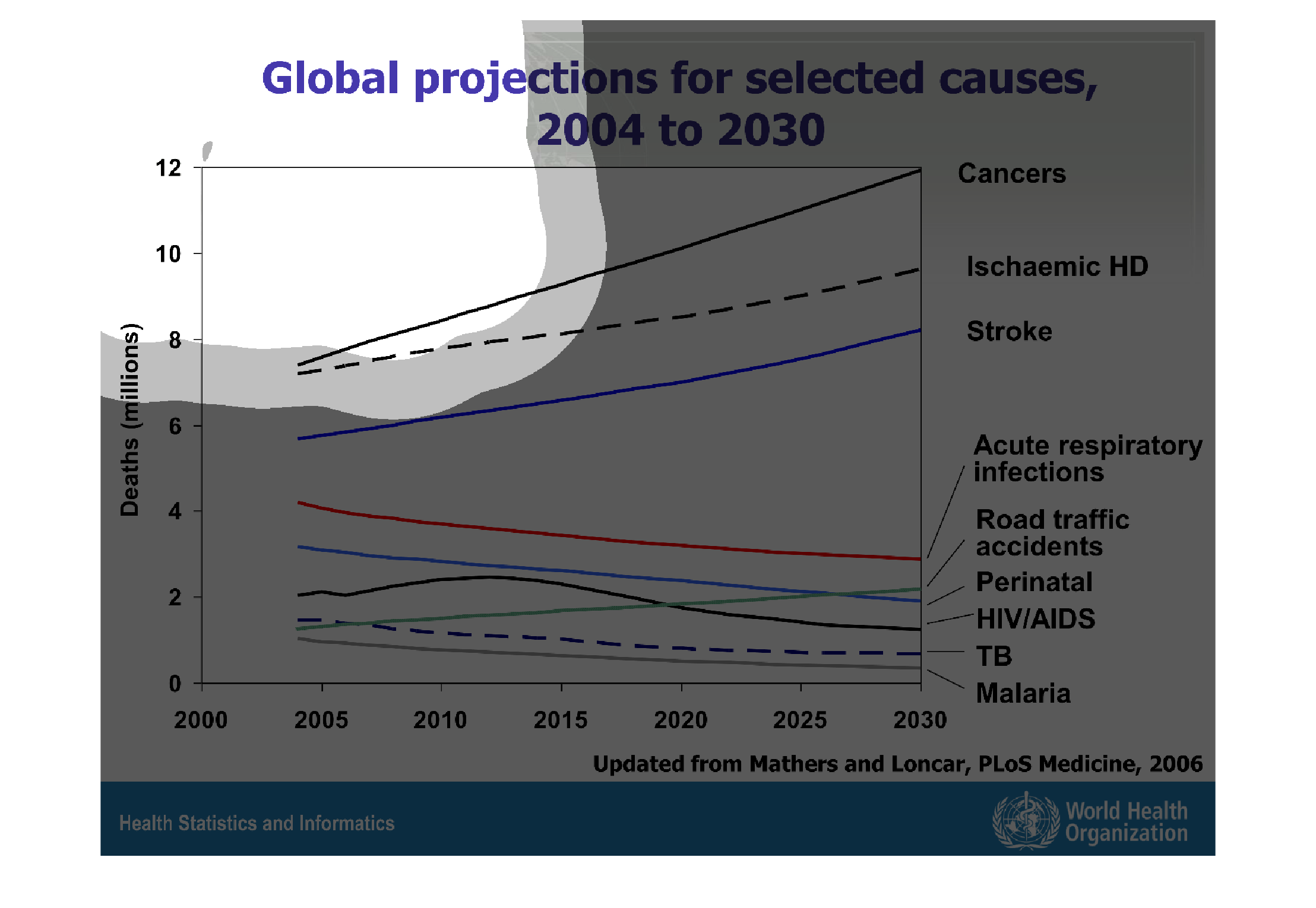
Global Projections for Selected Causes between 2004 and 2030. This chart represents the number
predicted number of deaths per year for various causes of death. Cancer starts out the highest
in 2004 and remains the leading cause of death by 2030. Cancer, Ischaemic HD, traffic accidents,
and stroke are projected to have increasing death rates between 2004 and 2030, while the other
diseases listed show a gradual decline in deaths per year.
Warning: Image is too big to fit on screen; displaying at 67%
Warning: Image is too big to fit on screen; displaying at 67%
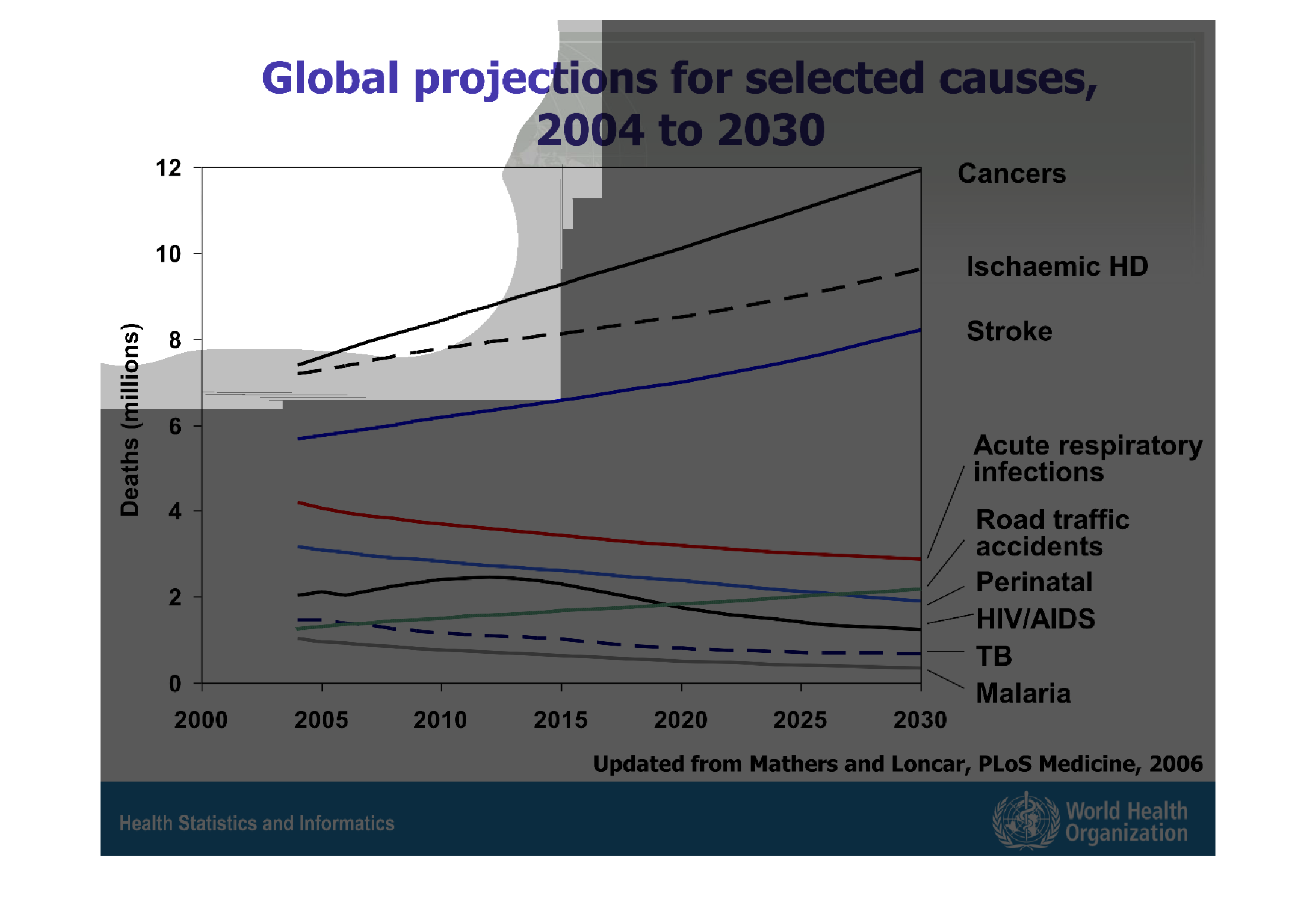
This is a chart of the projected deaths from certain diseases globally. The chart is predicting
that the rates of death from cancer will increase steadily from 2004 to 2030.
Warning: Image is too big to fit on screen; displaying at 67%
Warning: Image is too big to fit on screen; displaying at 67%
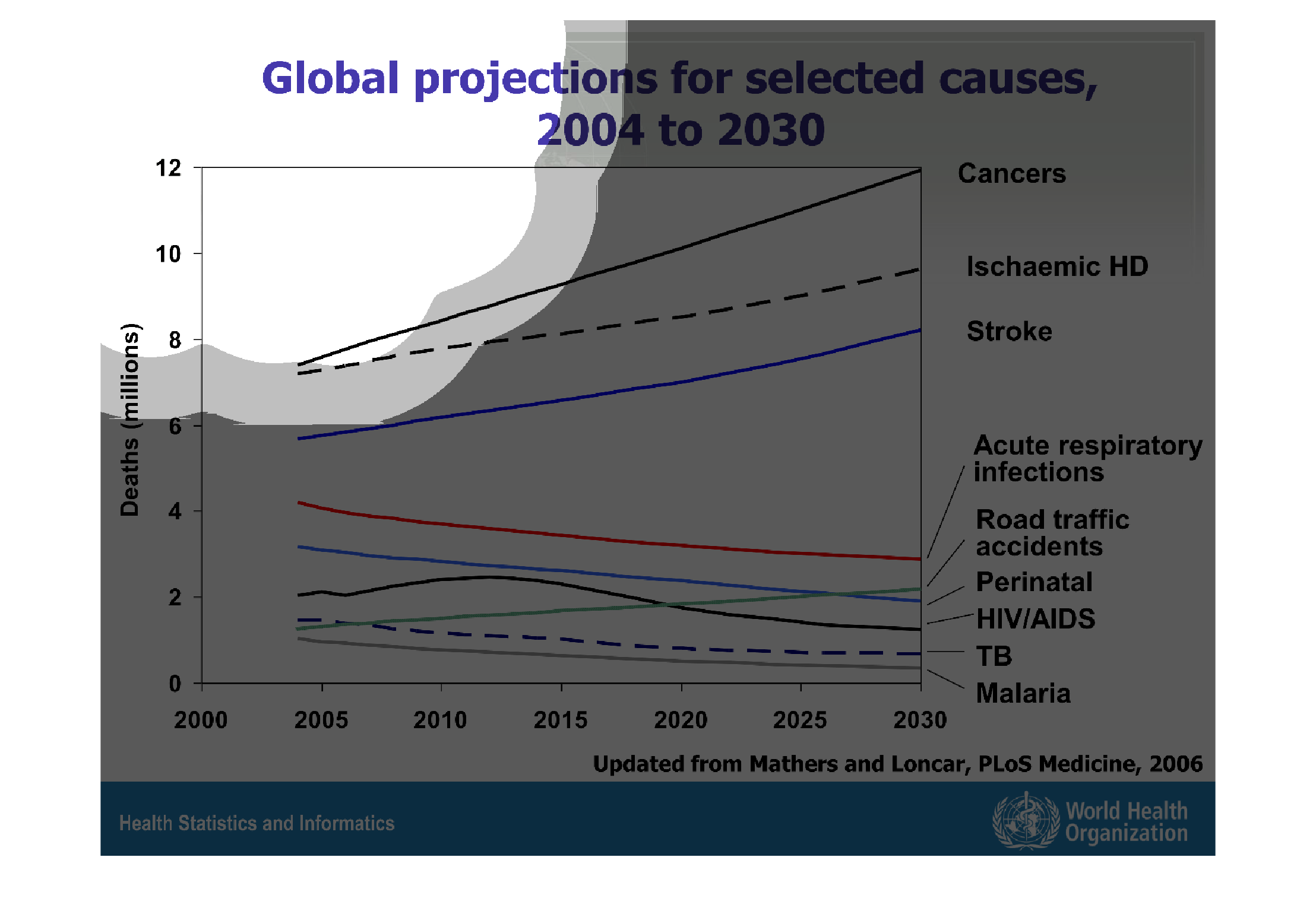
This graph shows the global projection of deaths between 2004 - 2030 and divides it by the
cause of death in the millions, i.e. cancers, ischaemic HD, stroke, acute respiratory infections,
traffic, disease, etc..
Warning: Image is too big to fit on screen; displaying at 67%
Warning: Image is too big to fit on screen; displaying at 67%
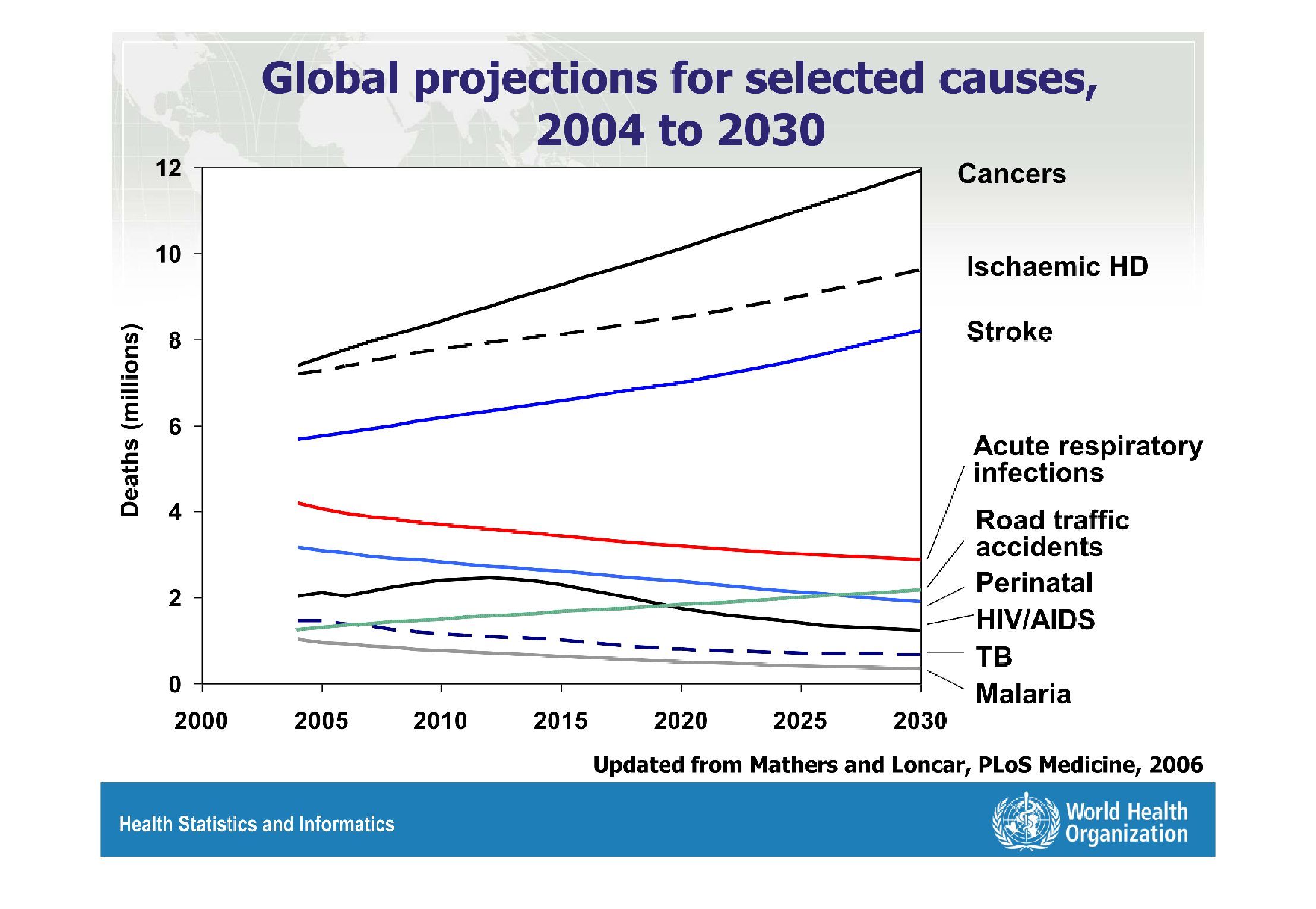
Global projections for selected causes, from 2004 to 2030  From the year 2004 to 2030 the
worst causes in deaths will by far be cancer as number 1, followed by Ischaemic HD, & Strokes.
 Cancer will have well over 12 million deaths in the year 2030.  While during this time period
the amounts of deaths for Acute respiratory infections, road traffic accidents, Perinatal,
HIV/AIDS, TB and Malaria will gradually decrease.
Warning: Image is too big to fit on screen; displaying at 67%
Warning: Image is too big to fit on screen; displaying at 67%
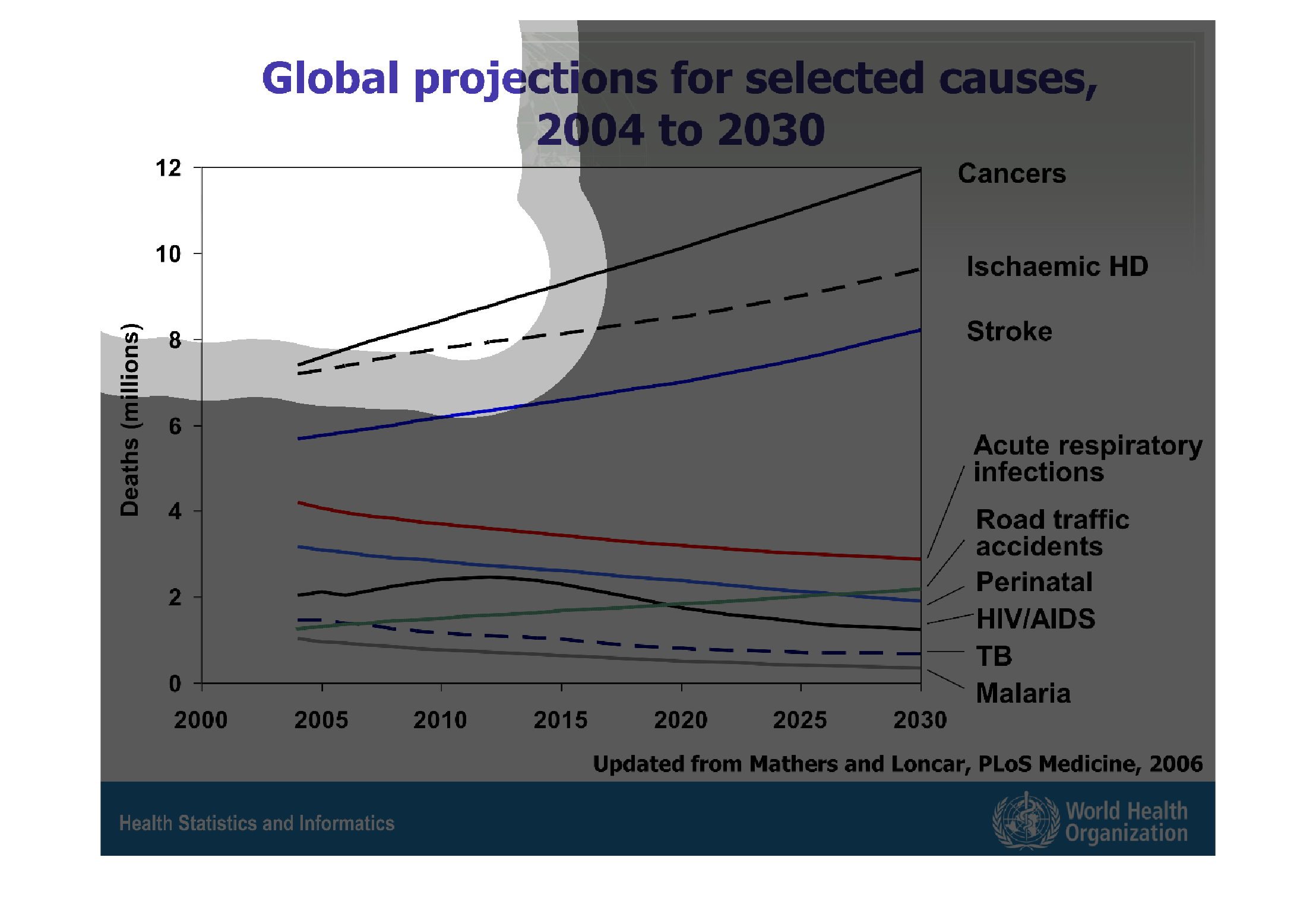
The image shows the amount of deaths caused by a certain illness or condition in the past
as well as predicts what the amount will increase to in the near future. It describes how
many deaths each illness will cause by unit (millions of people)
Warning: Image is too big to fit on screen; displaying at 67%
Warning: Image is too big to fit on screen; displaying at 67%

This graph illustrates global projection for selected causes in 2004 and 2030.  The highest
prevalence is for cancers and lowest project is for TB and malaria.
Warning: Image is too big to fit on screen; displaying at 67%
Warning: Image is too big to fit on screen; displaying at 67%
This graph shows the global projections for selected causes from 2004 to 2030. The biggest
cause of death is cancer, followed by stroke. These numbers are actually increasing. However,
the  numbers of deaths caused by other factors are decreasing.
Warning: Image is too big to fit on screen; displaying at 67%
Warning: Image is too big to fit on screen; displaying at 67%
This chart shows the Global projections for selected causes 2004 to 2030.  Deaths from cancer,
stroke, and ischemic HD are set to rise as time goes on.  But deaths due to acute respiratory
infections, road traffic accidents, perinatal, HIV/AIDS, TB, and malaria are set to fall as
time goes on.
Warning: Image is too big to fit on screen; displaying at 67%
Warning: Image is too big to fit on screen; displaying at 67%
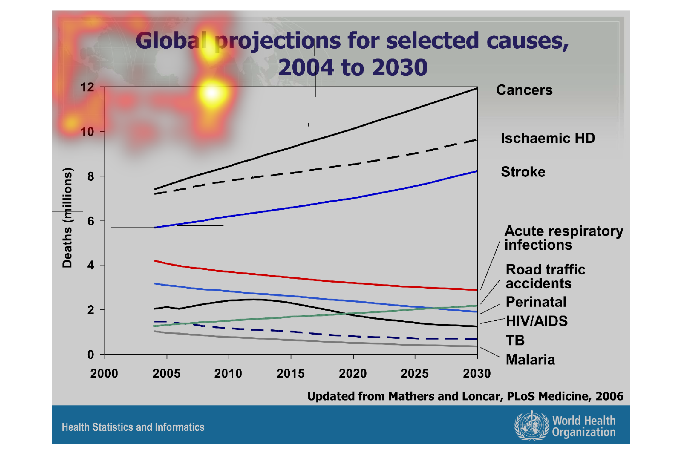
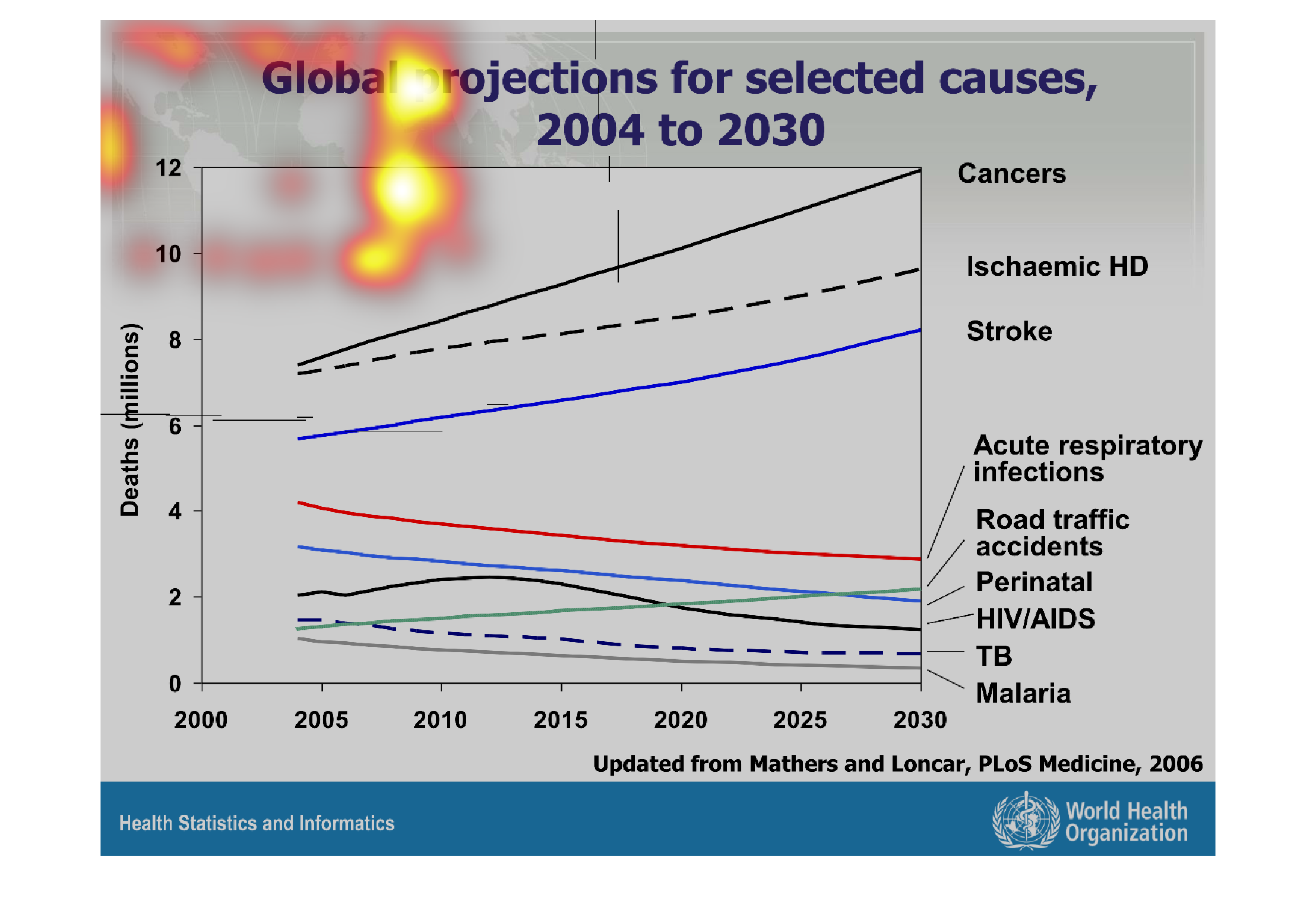
The image of the graph the seems to deal with the likelihood of of people contracting certain
diseases and illnesses, such as malaria, HIV, AIDS and various forms of cancer.
Warning: Image is too big to fit on screen; displaying at 67%
Warning: Image is too big to fit on screen; displaying at 67%
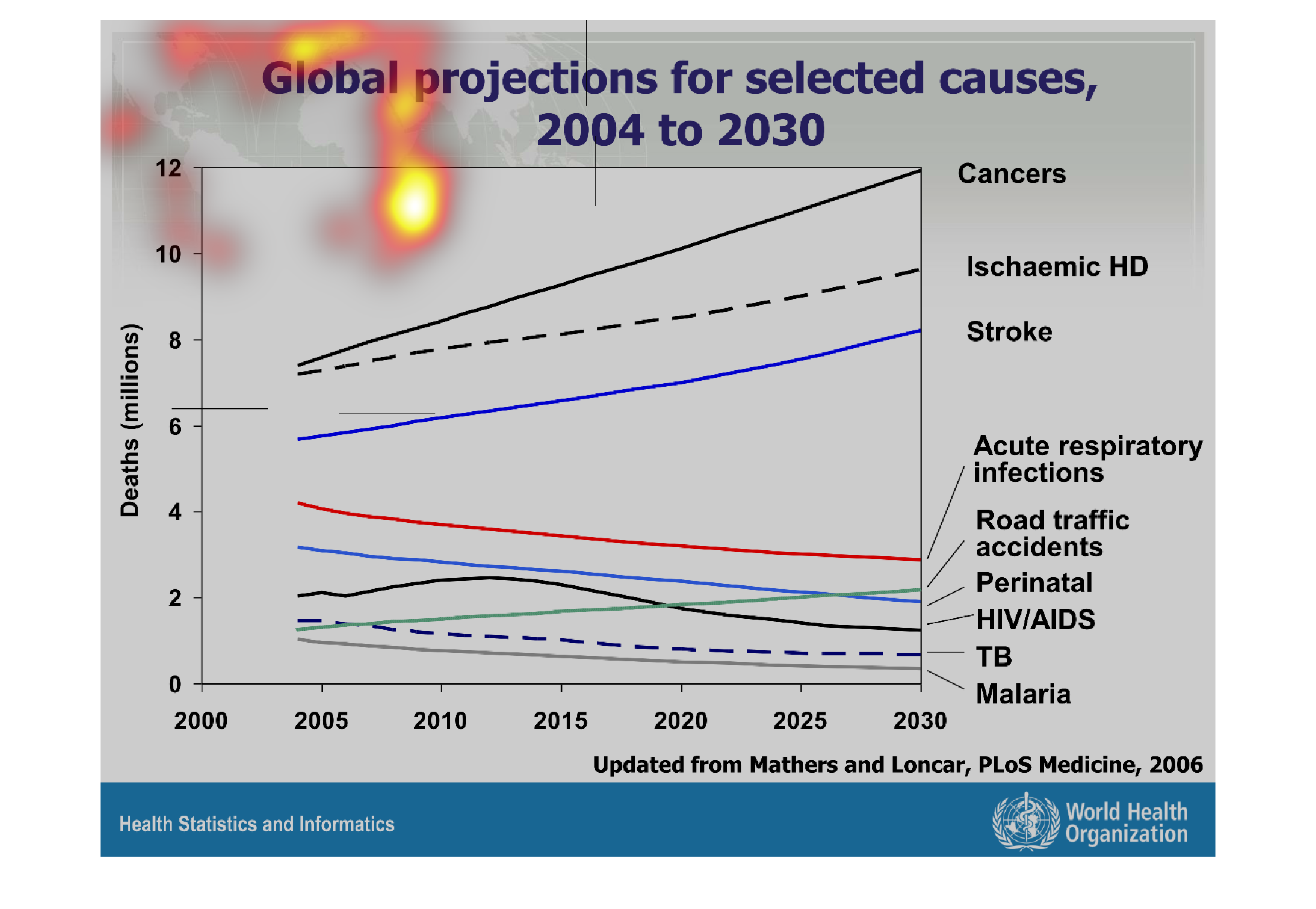
This handmade chart shows selected causes for a list of diseases. Without any context I have
no idea what these mean since it doesn't say what is selected
Warning: Image is too big to fit on screen; displaying at 67%
Warning: Image is too big to fit on screen; displaying at 67%
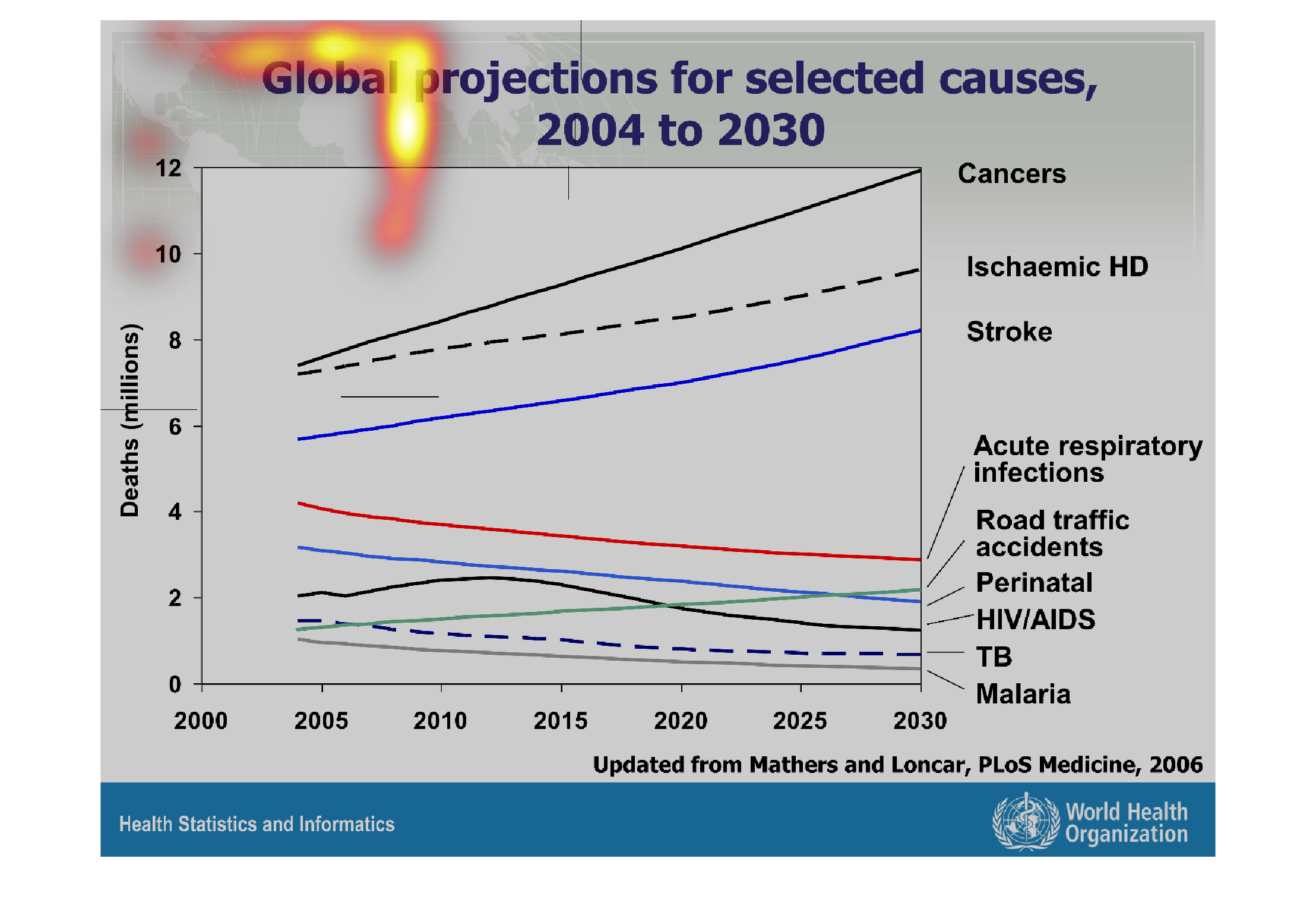
This is a chart depicting global global projections for selected causes from 2004 to 2030
for various diseases including cancer, stroke, HIV/AIDS, TB etc.
Warning: Image is too big to fit on screen; displaying at 67%
Warning: Image is too big to fit on screen; displaying at 67%
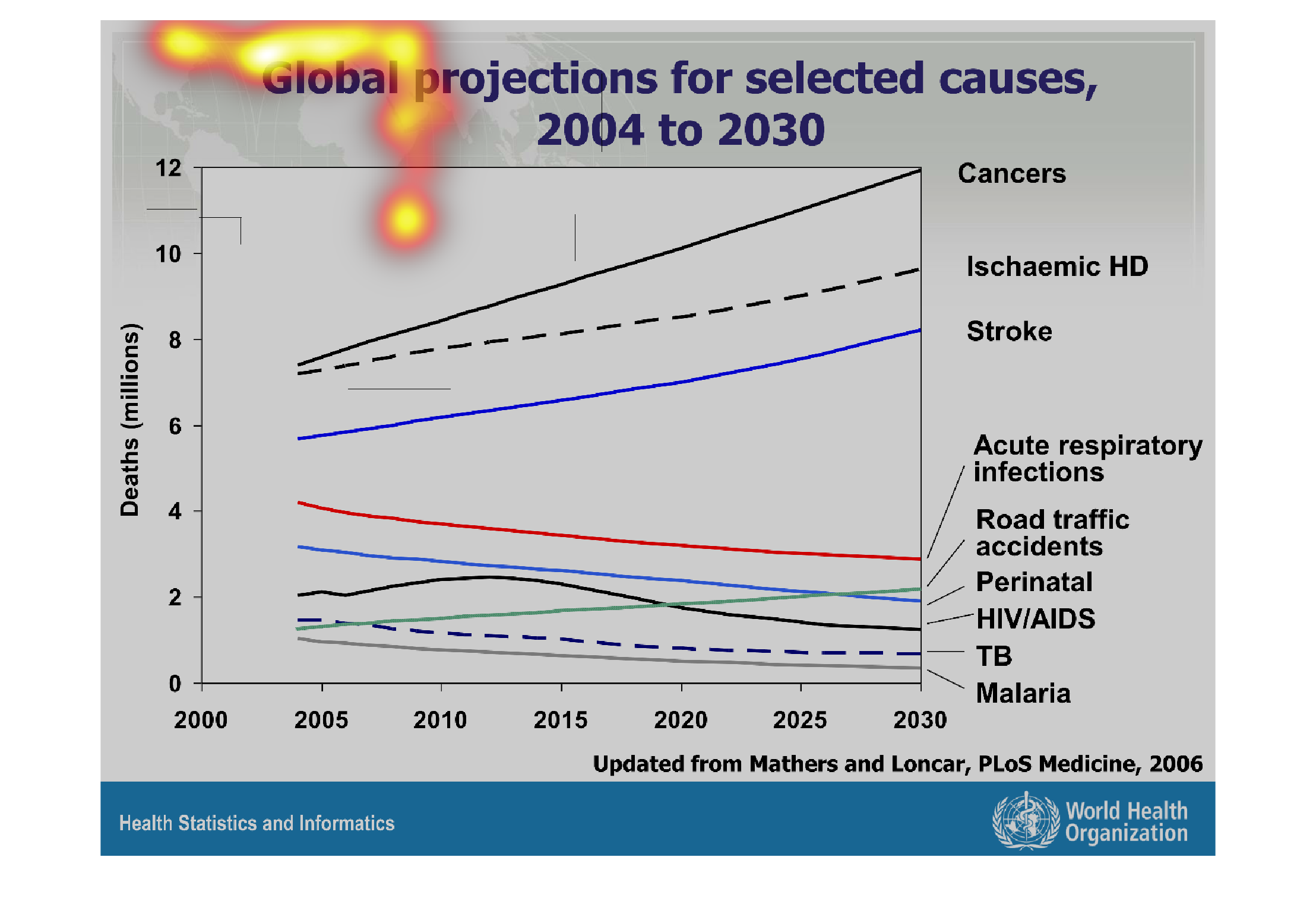
This graph is about global projections of certain causes of death starting in 2004 and projecting
out to 2030.  The graph is being measured in millions  The leading cause is cancer (ending
at a projected 12 million) across the board while malaria stayed at the bottom (ending at
a projected >1 million).
Warning: Image is too big to fit on screen; displaying at 67%
Warning: Image is too big to fit on screen; displaying at 67%