Warning: Image is too big to fit on screen; displaying at 67%
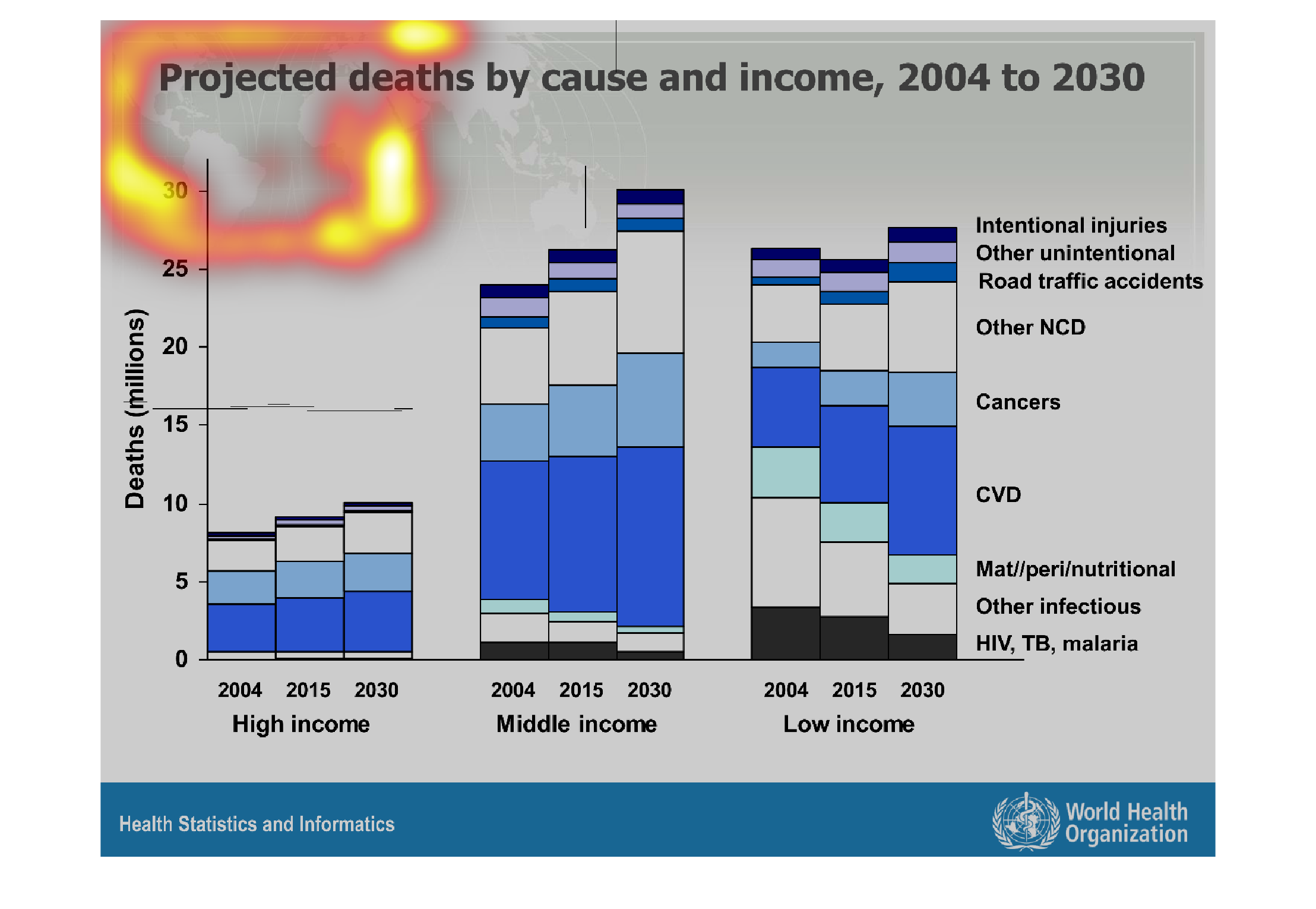
This handmade chart shows the cause of death in 2004 around the world and projected causes
of death in 2030. It shows how certain causes are growing
Warning: Image is too big to fit on screen; displaying at 67%
Warning: Image is too big to fit on screen; displaying at 67%
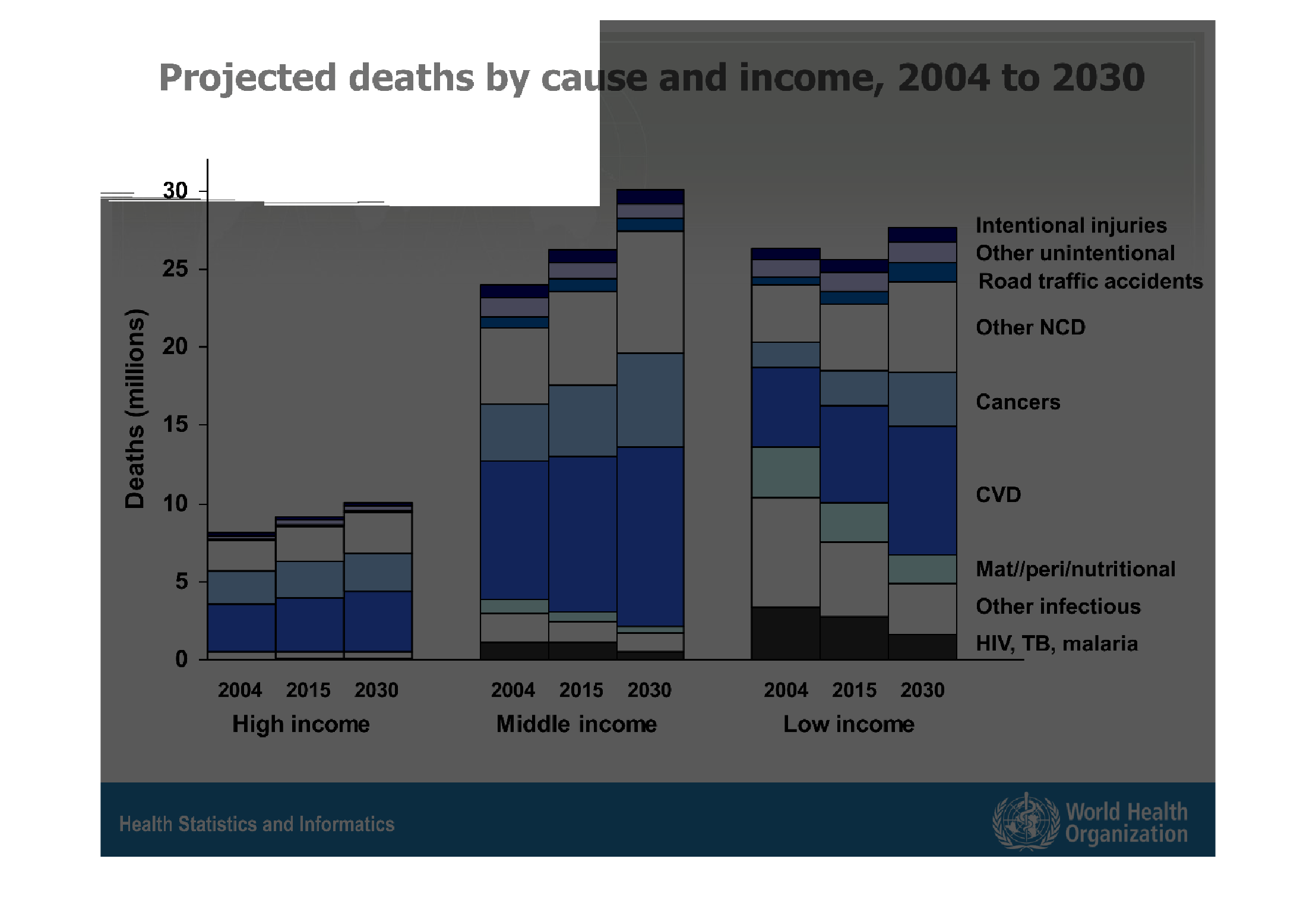
The following chart gives the projected causes of death. With actual data from 2004 and projected
causes all the way out to the year 2030. Its broken down by low income, middle income and
high income countries.
Warning: Image is too big to fit on screen; displaying at 67%
Warning: Image is too big to fit on screen; displaying at 67%
A graph showing the types of deaths in millions over a time period from 2004-2030.  The deaths
are also broken down into three income categories.  Middle income had the most deaths overall.
Warning: Image is too big to fit on screen; displaying at 67%
Warning: Image is too big to fit on screen; displaying at 67%
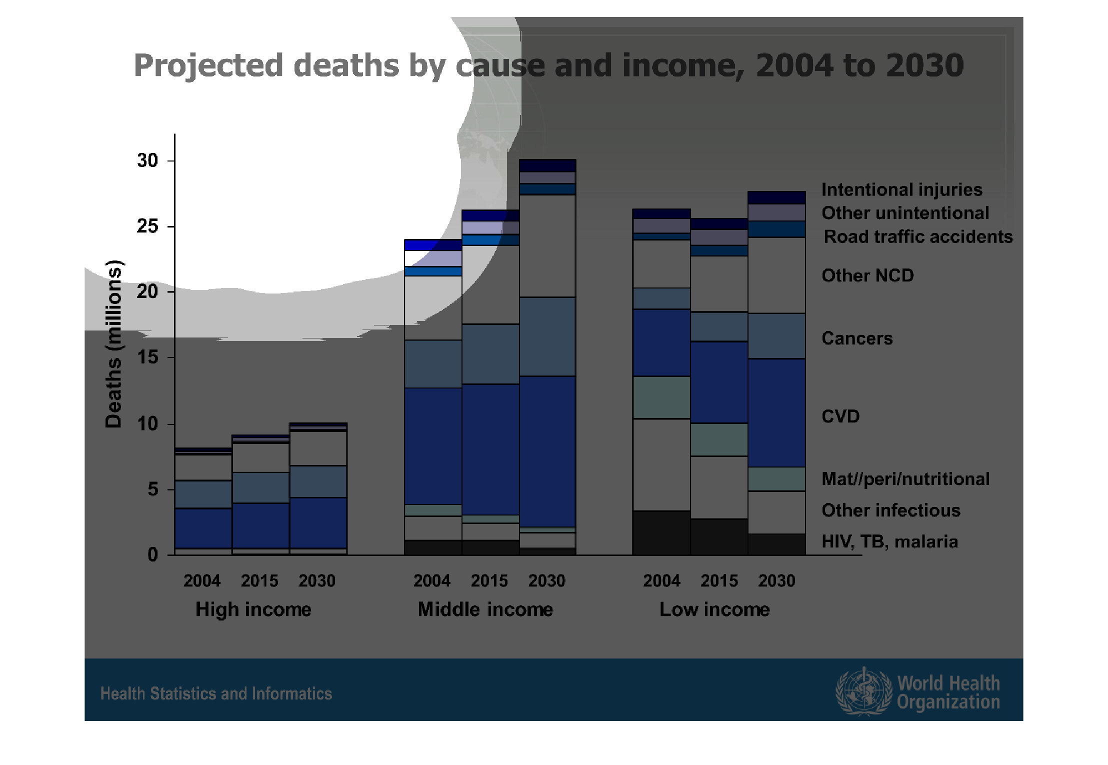
This chart shows projected deaths in millions by cause and income, 2004 to 2030 separated
by High, Middle, and Low income status.  Categories displayed are deaths by cancers, HIV,
TB; CVD; intentional injuries and unintentional injuries.  Highest income predictably shows
the lowest deaths.
Warning: Image is too big to fit on screen; displaying at 67%
Warning: Image is too big to fit on screen; displaying at 67%
Projected deaths by cause and income from 2004 data to 2030 projection.  The image shows three
graphs pertaining to high, middle and low income persons.  Deaths increase in the high and
middle income levels from 2004 to 2015, but decrease in the low income level from the same
time range.  All income levels predict an increase in deaths from 2004 to 2030.
Warning: Image is too big to fit on screen; displaying at 67%
Warning: Image is too big to fit on screen; displaying at 67%
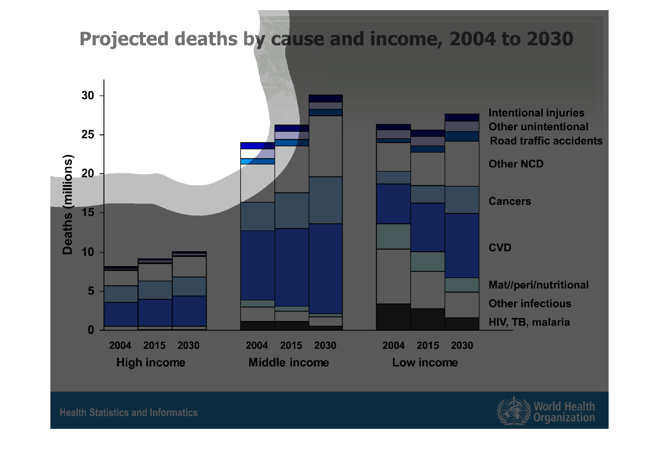
This chart describes projected deaths by cause and income, for the years 2004 through to the
year 2030. Different categories are represented by different colors.
Warning: Image is too big to fit on screen; displaying at 67%
Warning: Image is too big to fit on screen; displaying at 67%
This is a graph of projected deaths by case and income during 2004 to 2030. People of lower
income are more likely to die of HIV and AIDS, while people of  higher income are much less
likely to die of similar causes.
Warning: Image is too big to fit on screen; displaying at 67%
Warning: Image is too big to fit on screen; displaying at 67%

This chart describes projected deaths by cause and income, for the year 2004 to 2030. Categories
on the chart include intentional injuries and other unintentional road traffic.
Warning: Image is too big to fit on screen; displaying at 67%
Warning: Image is too big to fit on screen; displaying at 67%
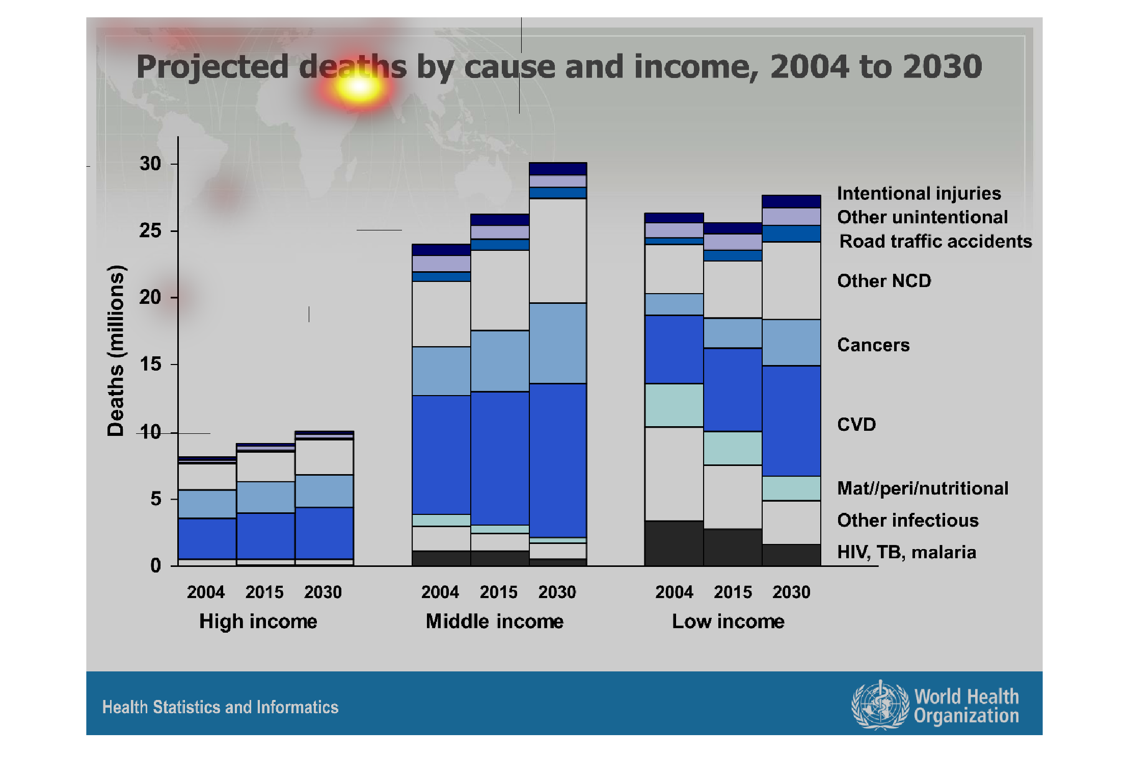
This chart describes about projected deaths by cause and income for the period 2004-2030.
The different reasons for death is showing in the chart. The chart clearly describes about
the income, no of deaths and it's cause.
Warning: Image is too big to fit on screen; displaying at 67%
Warning: Image is too big to fit on screen; displaying at 67%
The following chart gives the projected death by cause and income from the years 2004 to 2030.
Shows that CVD is the highest cause of death among any of the income groups.
Warning: Image is too big to fit on screen; displaying at 67%
Warning: Image is too big to fit on screen; displaying at 67%
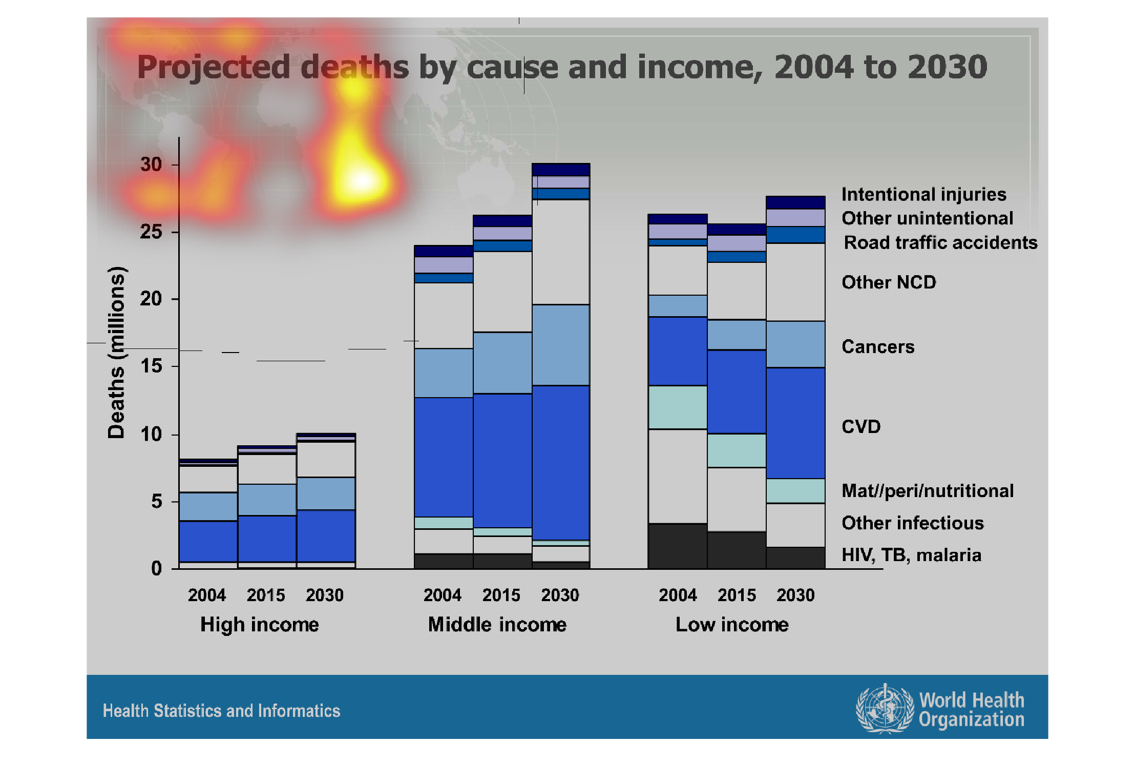

The chart shows projected deaths in millions by cause and income from 2004 to 2030. From 2004,
to 2015, to 2030, deaths projected for high income levels increased slightly over time. However,
the high income group shows the least amount of projected deaths--around 8 million in 2004
and 10 million in 2030. The deaths increase the most for the middle income group--going from
24 million in 2004 to 30 million in 2030. For the low income group, projected deaths decrease
in 2015 but increase again in 2030, showing around 27 million deaths, higher than 2004. For
all income levels, most of the projected deaths were attributable to CVD, the second most
because of "other" and the third most due to cancer.
Warning: Image is too big to fit on screen; displaying at 67%
Warning: Image is too big to fit on screen; displaying at 67%
This graph shows projected deaths by cause and income 2004 to 2030. The highest death rates
are shown to be among the middle and low income and among various causes.
Warning: Image is too big to fit on screen; displaying at 67%
Warning: Image is too big to fit on screen; displaying at 67%