Warning: Image is too big to fit on screen; displaying at 67%
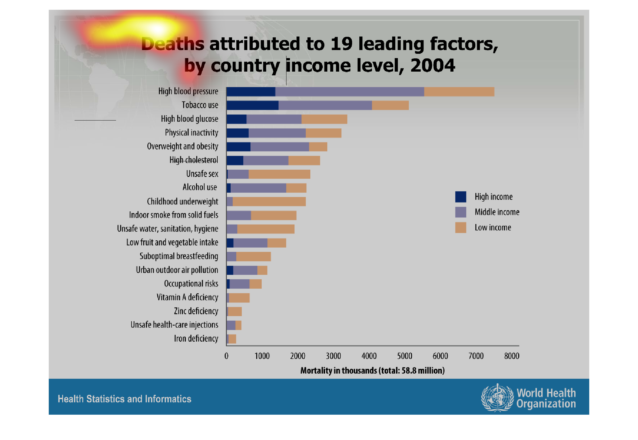
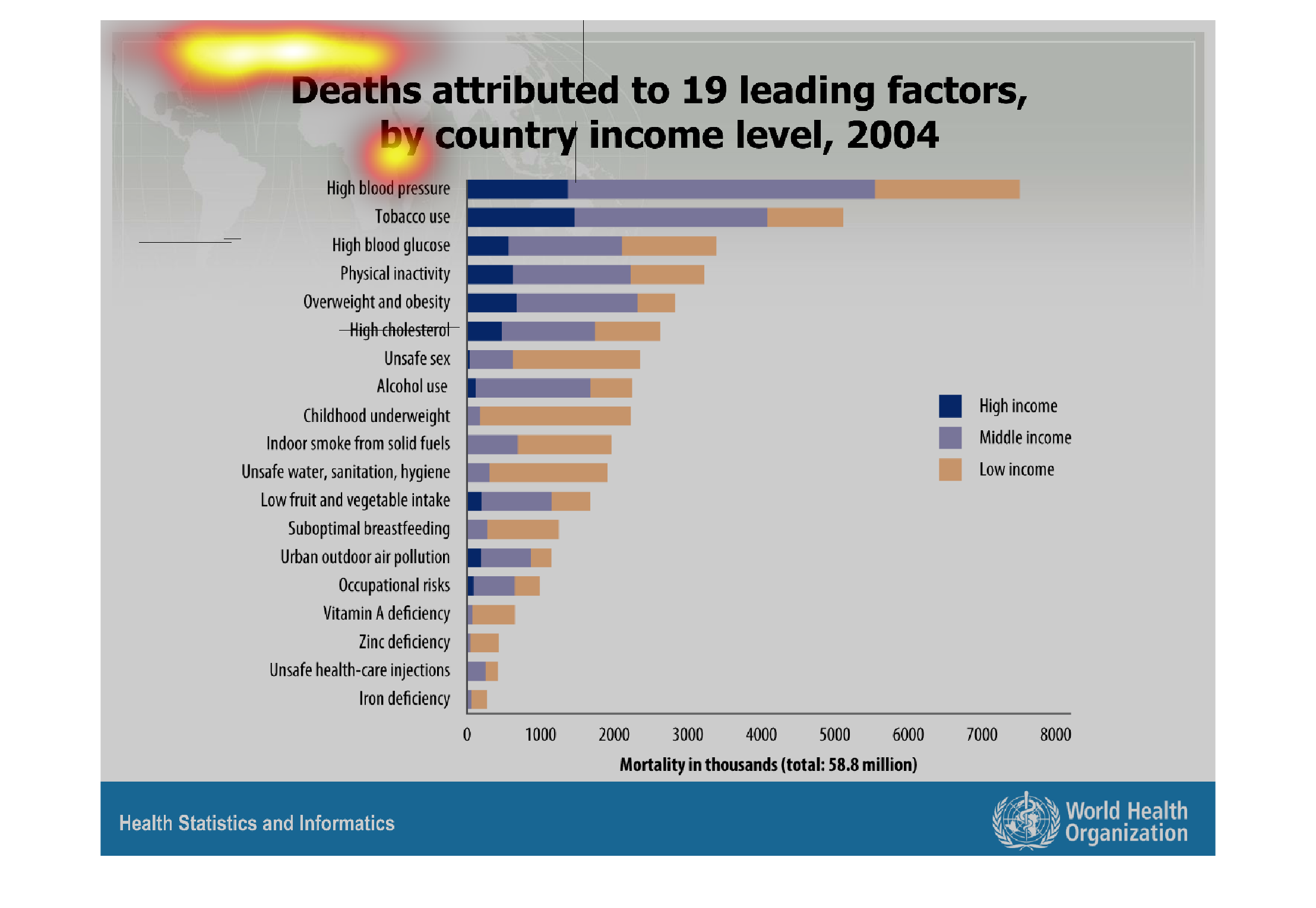
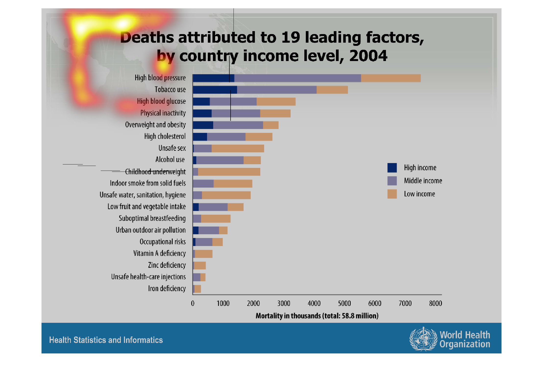
The figure presented is title deaths attributed to 19 leading factors, by country income level,
2004.  The graph is a representation of the deaths attributed to factors.
Warning: Image is too big to fit on screen; displaying at 67%
Warning: Image is too big to fit on screen; displaying at 67%

The graph shows deaths attributed to nineteen leading factors by country and income level
in 2014. According to the legend, blue indicates high income, grey indicates middle income,
while orange indicates low income. The scale used is mortality in the thousands, with a total
of 58.8 million.
Warning: Image is too big to fit on screen; displaying at 67%
Warning: Image is too big to fit on screen; displaying at 67%
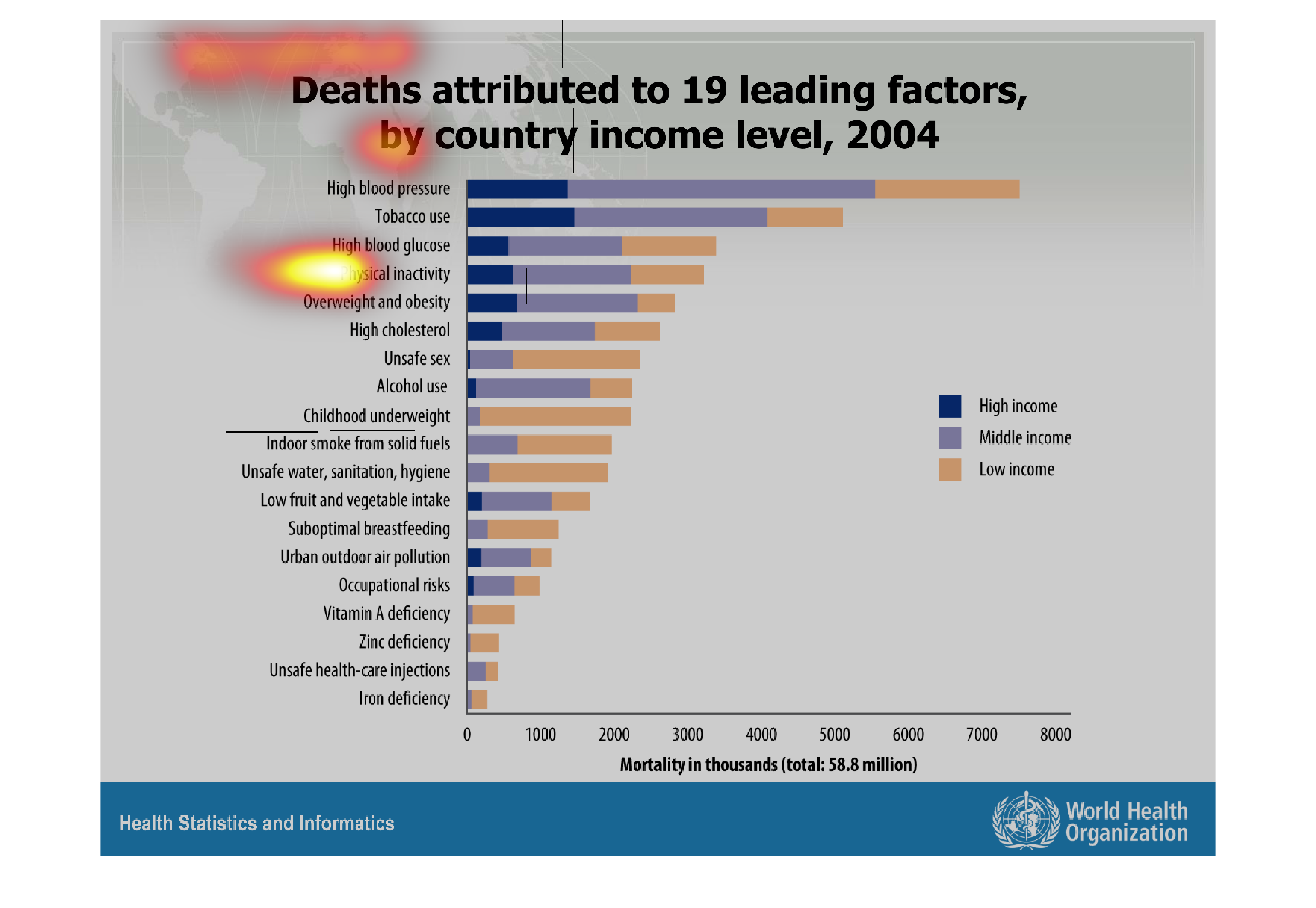
This chart shows the Deaths attributing to 19 leading doctors, by country income levels in
2004.  High blood pressure and tobacco use accounts for a large amount of these deaths in
all income brackets.
Warning: Image is too big to fit on screen; displaying at 67%
Warning: Image is too big to fit on screen; displaying at 67%
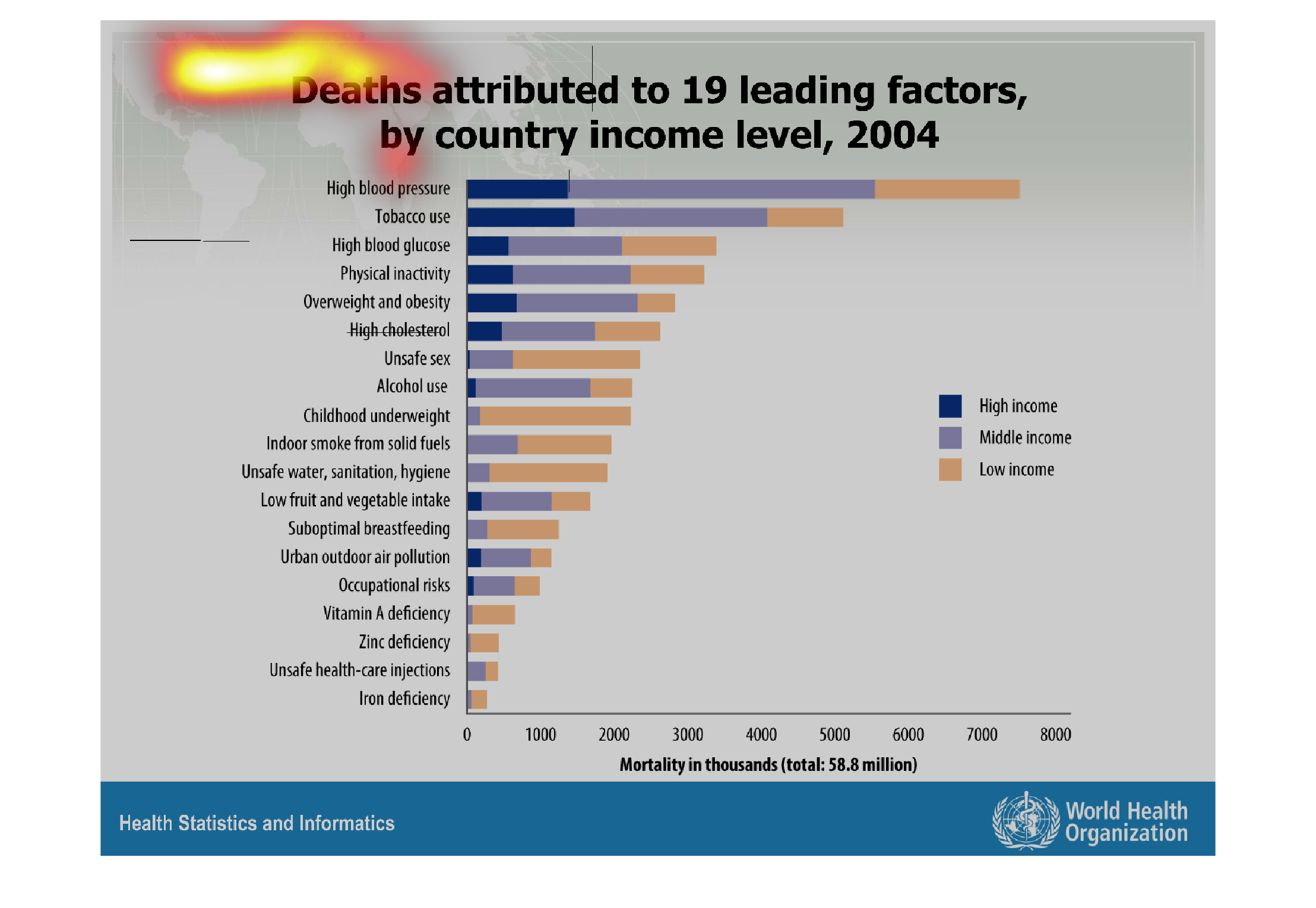

This is a series of bar graphs depicting deaths attributed to 19 leading factors by country
income level in the year 2004. High blood pressure is shown to be the highest factor.
Warning: Image is too big to fit on screen; displaying at 67%
Warning: Image is too big to fit on screen; displaying at 67%

This is a ranking and chart of 19 leading risk factors of death, sorted by countries and income
levels, from 2004. The causes are ranked, then the charts are color coded by income breakdown.
Warning: Image is too big to fit on screen; displaying at 67%
Warning: Image is too big to fit on screen; displaying at 67%
This image or figure shows or depicts in statistical line bar graph format the data concerning
the deaths attributed to 19 leading factors, by country income level in 2004.
Warning: Image is too big to fit on screen; displaying at 67%
Warning: Image is too big to fit on screen; displaying at 67%
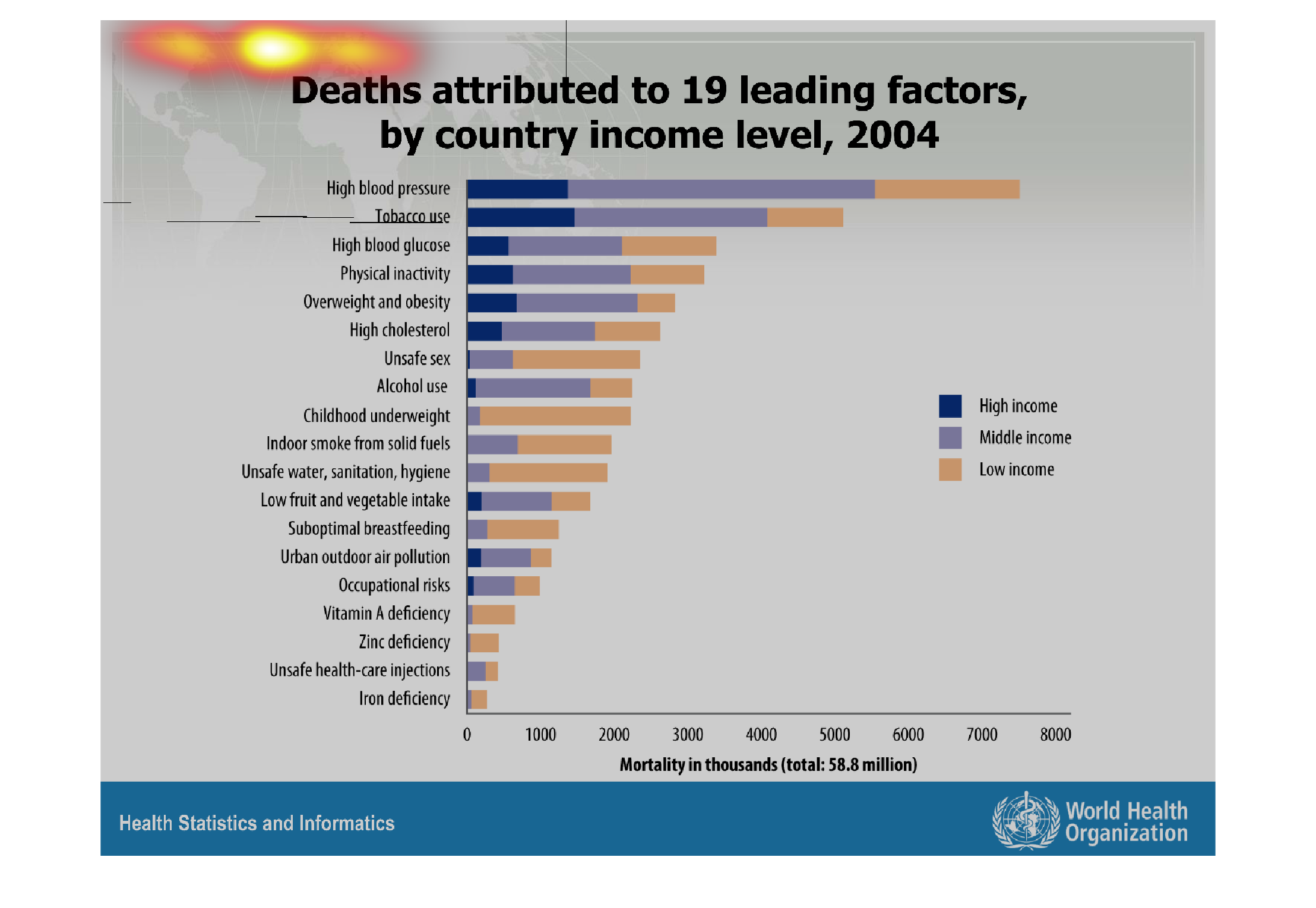
This graph shows death from leading factors by country income level for 2004. These range
from high blood pressure, tobacco use, and iron deficiencies to name a few. The darker is
high income areas and the lightest being low income.
Warning: Image is too big to fit on screen; displaying at 67%
Warning: Image is too big to fit on screen; displaying at 67%
A chart showing deaths attributed to 19 leading factors by country income level in 2004. including
factors such as tobacco use and blood glucose level.
Warning: Image is too big to fit on screen; displaying at 67%
Warning: Image is too big to fit on screen; displaying at 67%
This graph shows deaths attributed to 19 leading factors by country income level 2004. Tobacco
use and high blood pressure are leading causes of death with highest amounts among the low
income.
Warning: Image is too big to fit on screen; displaying at 67%
Warning: Image is too big to fit on screen; displaying at 67%
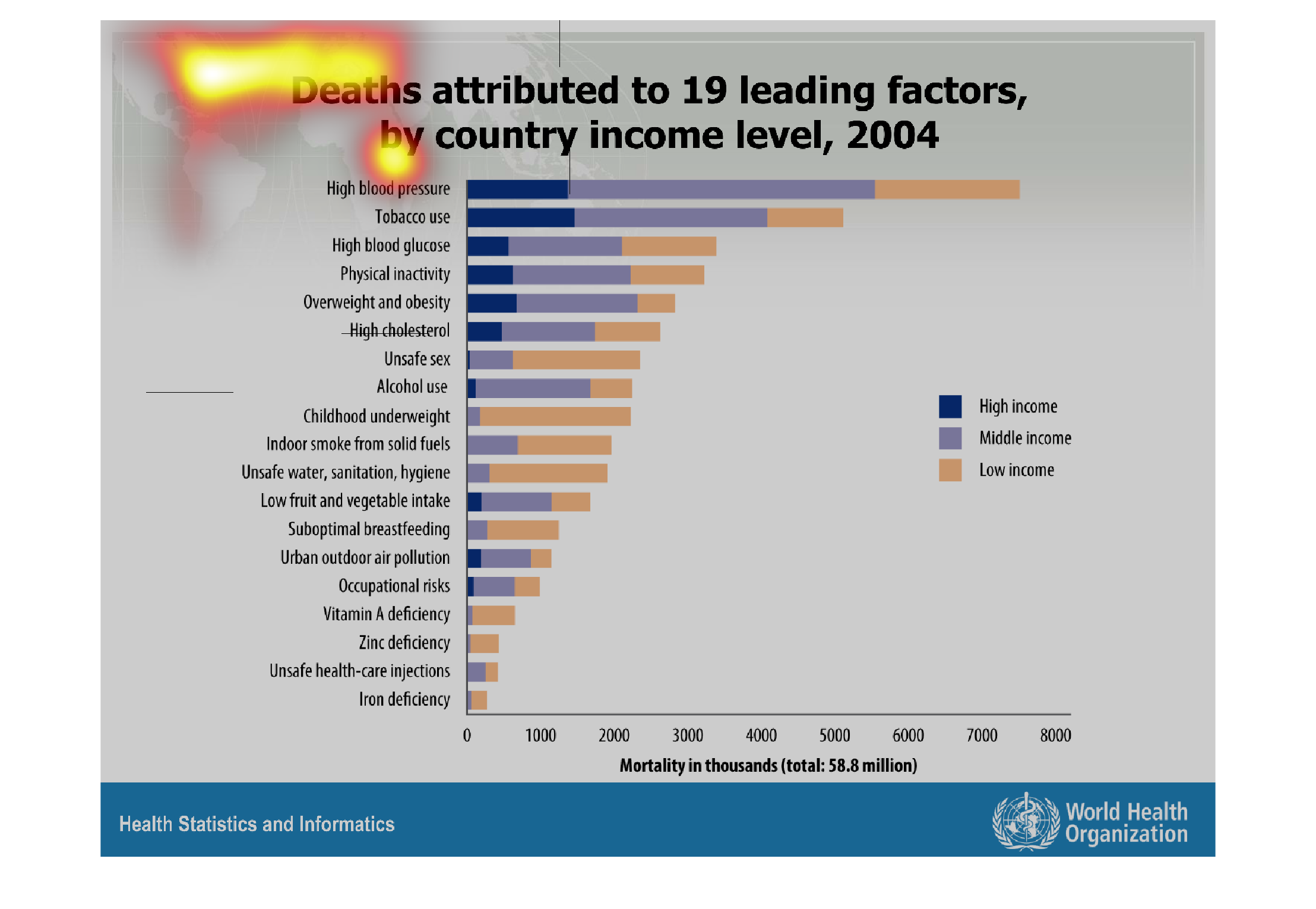
It appears to be a chart that documents the number of deaths caused by the leading 19 factors.
It is established by country and income level. It appears that in middle class the top cause
of deaths result from high blood pressure.
Warning: Image is too big to fit on screen; displaying at 67%
Warning: Image is too big to fit on screen; displaying at 67%