Warning: Image is too big to fit on screen; displaying at 67%
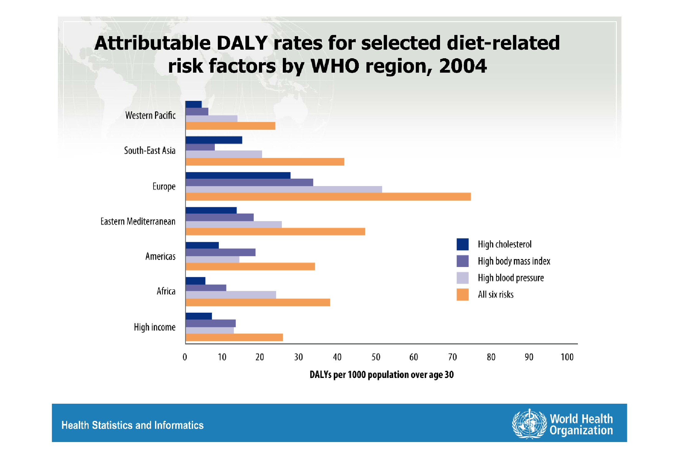
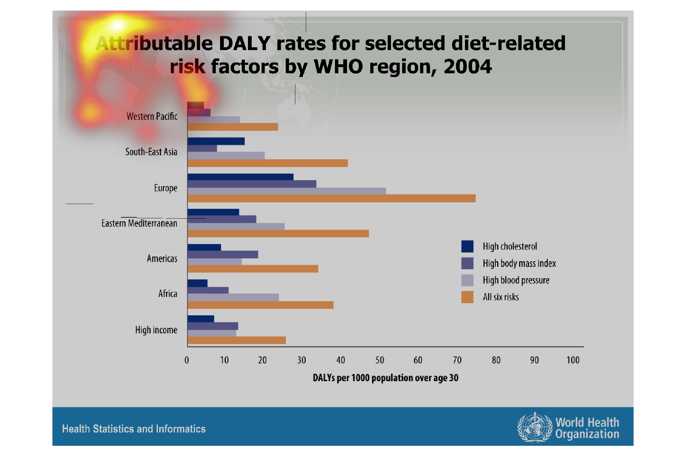
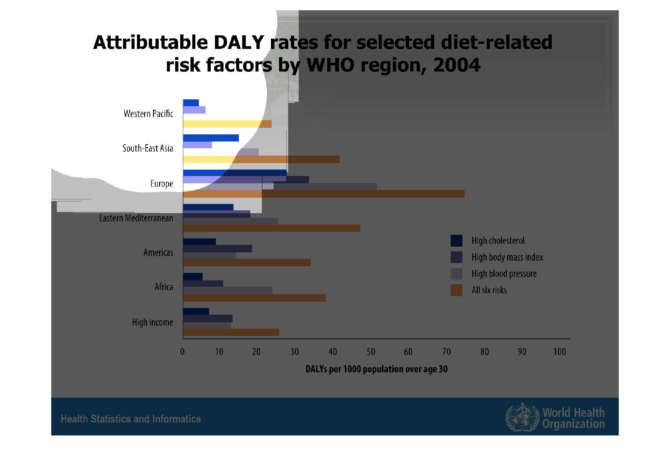
This graph illustrates attributable DAL rates for selected diet-related conditions such as
high blood pressure, high cholesterol, high body mass index, and all other risks.
Warning: Image is too big to fit on screen; displaying at 67%
Warning: Image is too big to fit on screen; displaying at 67%
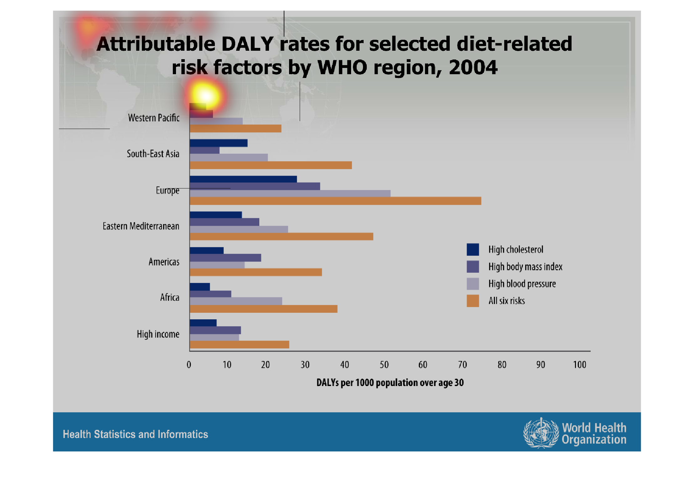
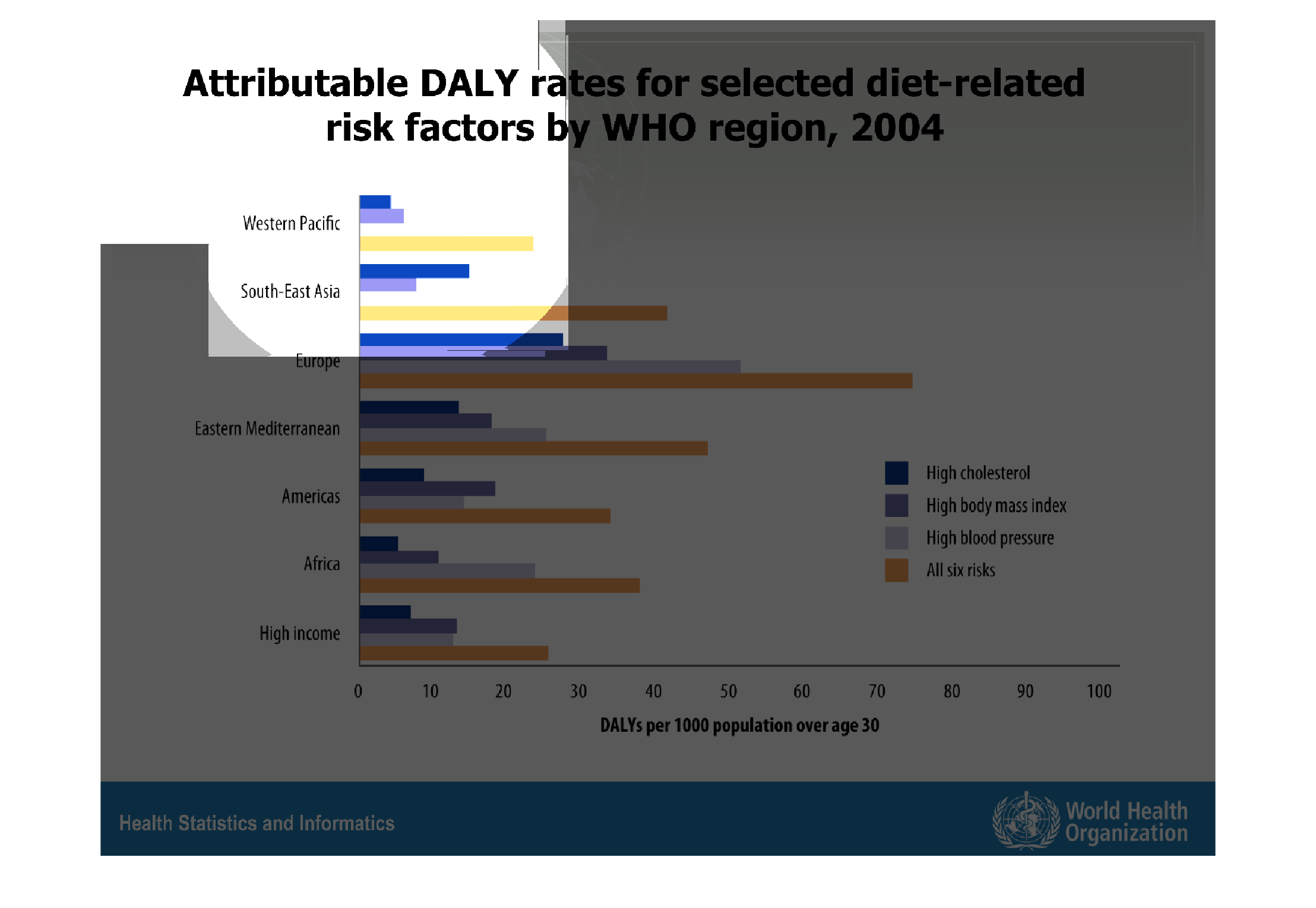
This shows DALY rates and diet risk factors. This information is provided by WHO region of
2004.  It covers the population over 30 across several regions. It also covers what regions
are suffering from what risks such as high cholesterol, high body mass index, high blood pressure
or all the risks mentioned.
Warning: Image is too big to fit on screen; displaying at 67%
Warning: Image is too big to fit on screen; displaying at 67%
This is a series of graphs depicting attributable DALY rates for selected diet-related risk
factors separated by selected WHO regions in the year 2004.
Warning: Image is too big to fit on screen; displaying at 67%
Warning: Image is too big to fit on screen; displaying at 67%
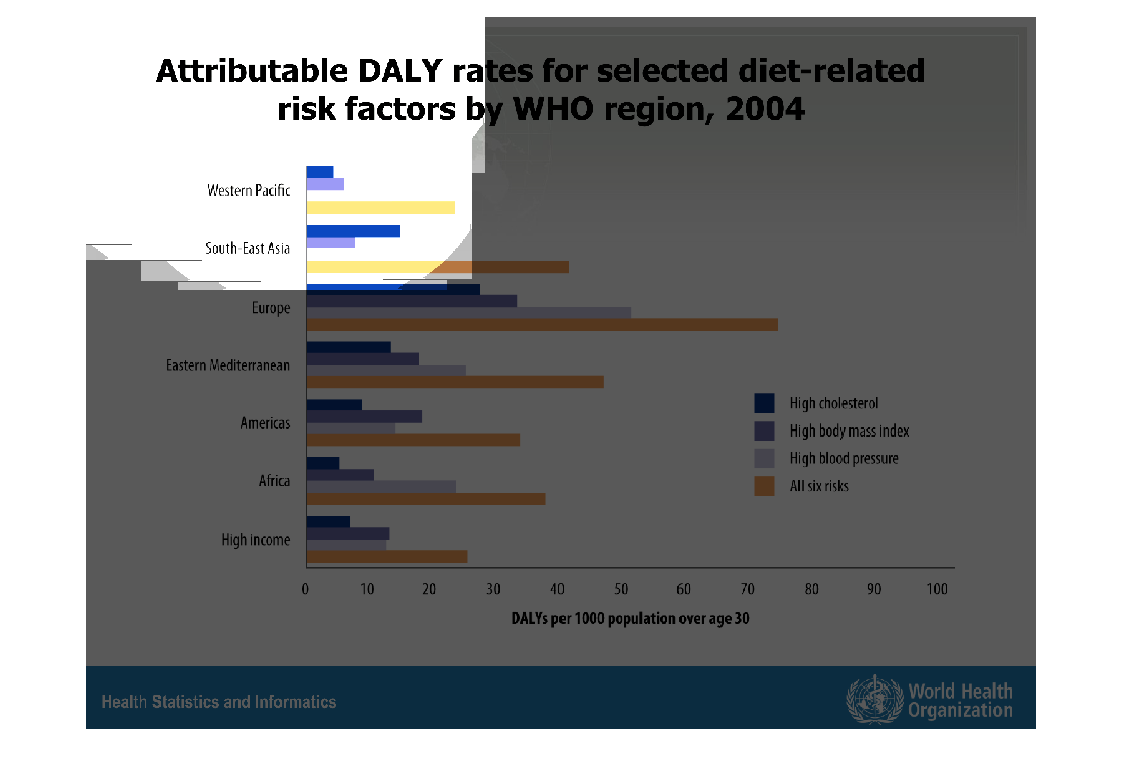
The graph discuss about the attributable daily rate for the diet related risk factors by WHO
region in 2004. The graph is showing about the diet related risk issues of the countries South
East Asia, Europe, America, Alaska etc.
Warning: Image is too big to fit on screen; displaying at 67%
Warning: Image is too big to fit on screen; displaying at 67%
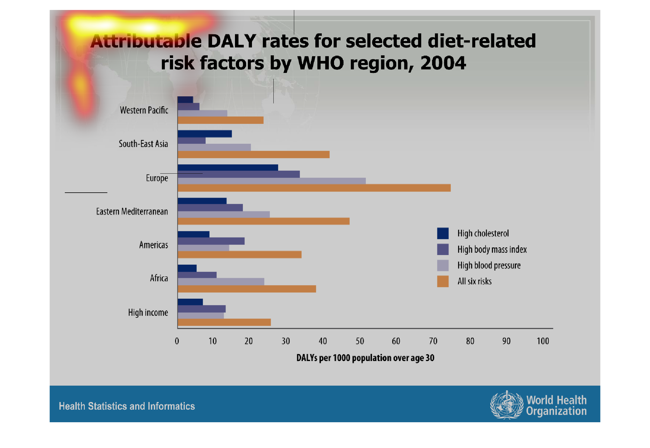
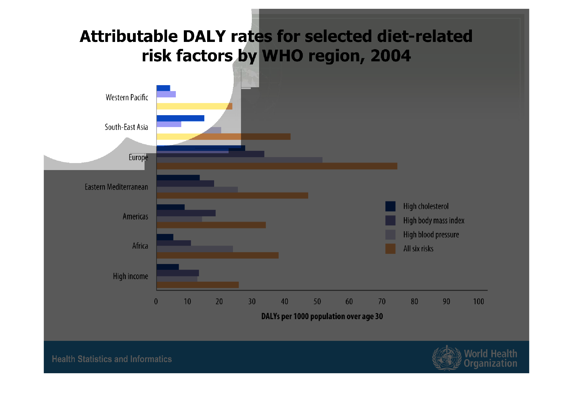
This chart describes attributable DALY rates for selected diet-related risk factors by WHO
region, for the year 2004. Region on the chart include Western Pacific.
Warning: Image is too big to fit on screen; displaying at 67%
Warning: Image is too big to fit on screen; displaying at 67%
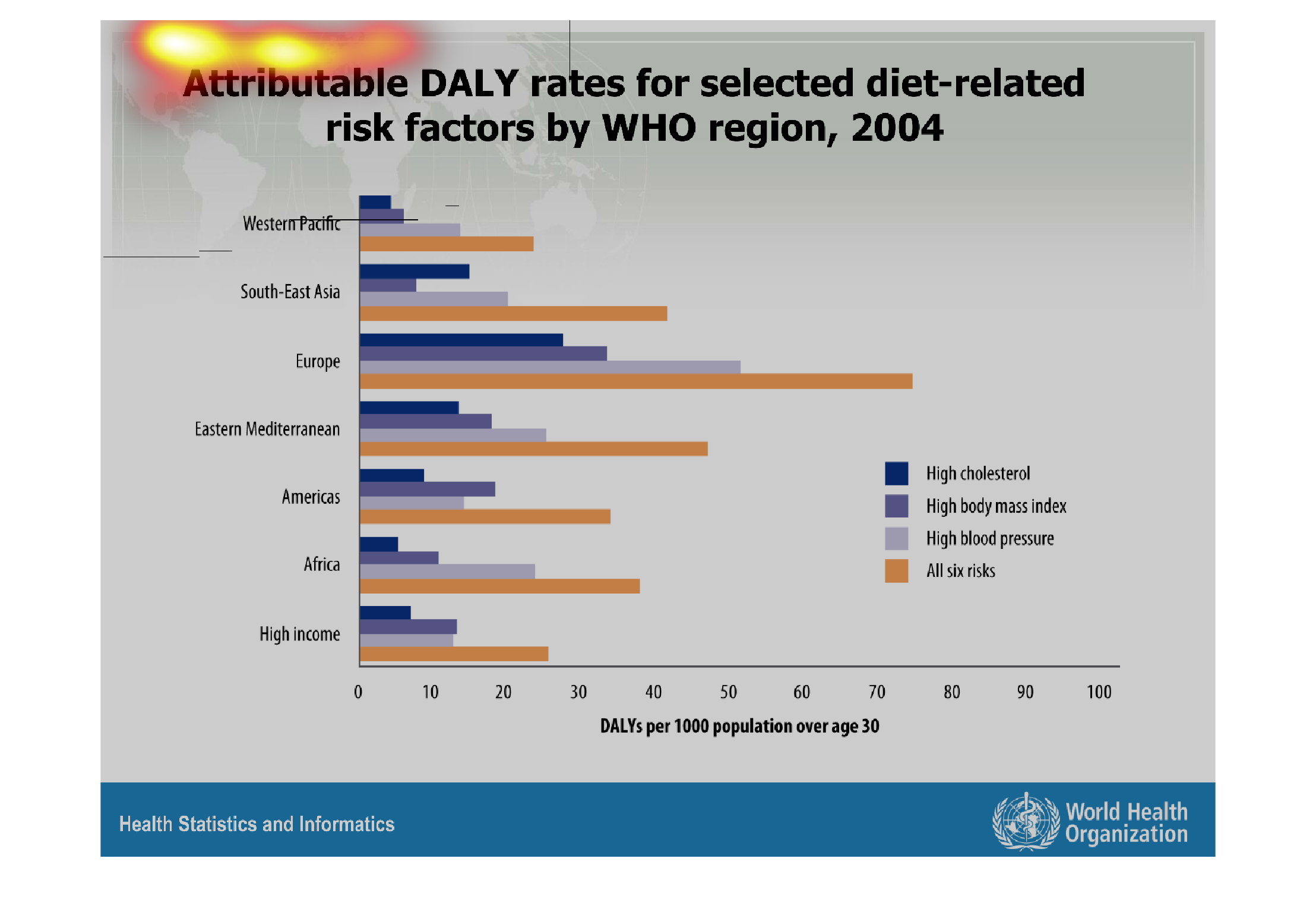
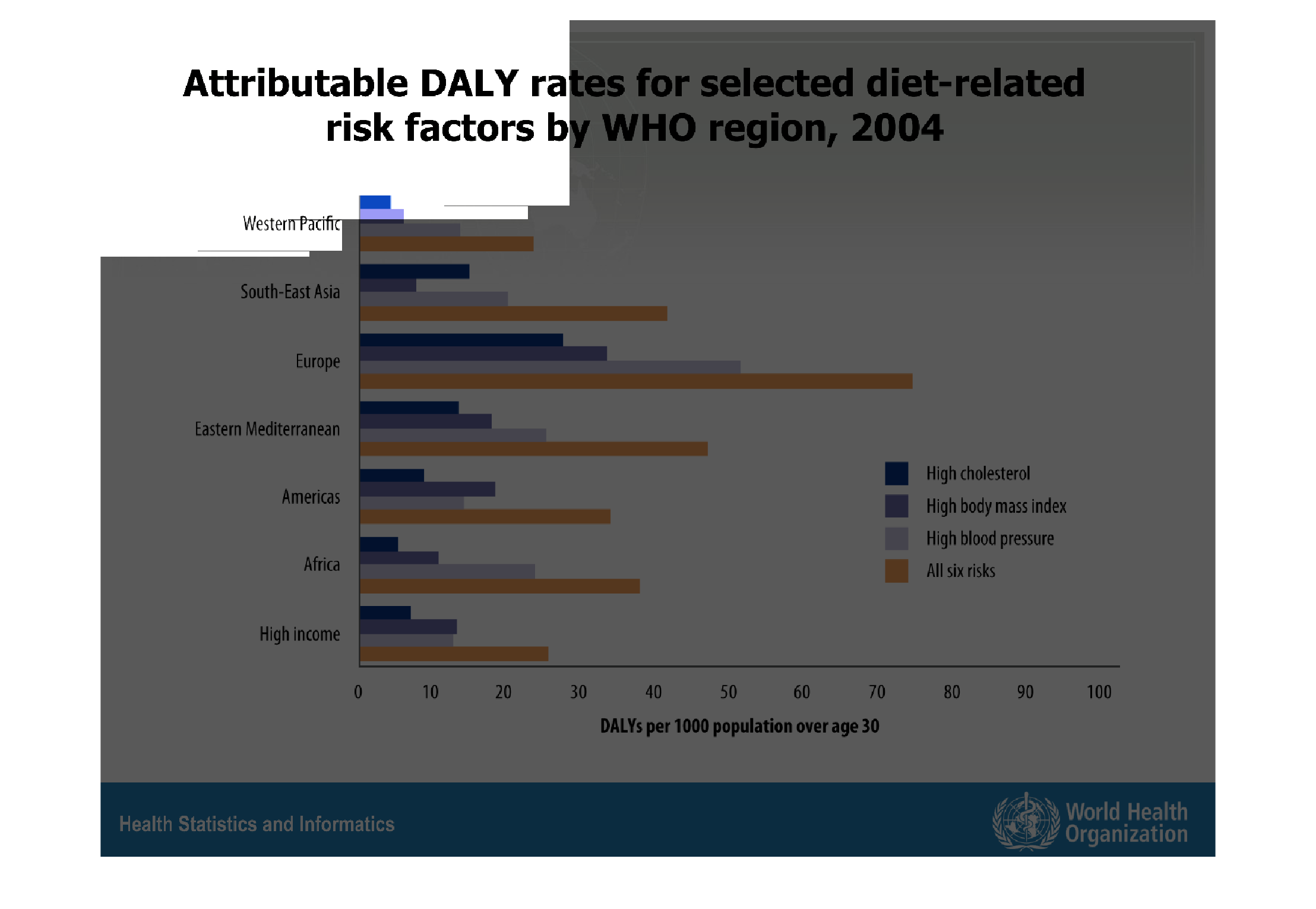
This is a graph by continent/region showing six (three specific ones) different diet based
risk factors (DALY?) as identified by the WHO.  Europe has the highest diet based risks.
The wester Pacific region has the smallest diet based risks.
Warning: Image is too big to fit on screen; displaying at 67%
Warning: Image is too big to fit on screen; displaying at 67%
Attributable DALY rates for selected diet-related risk factors by WHO region, 2004.  This
chart breaks down the diet related risk factors by color and then breaks them down further
into different regions of the world to show how it effects the population.
Warning: Image is too big to fit on screen; displaying at 67%
Warning: Image is too big to fit on screen; displaying at 67%
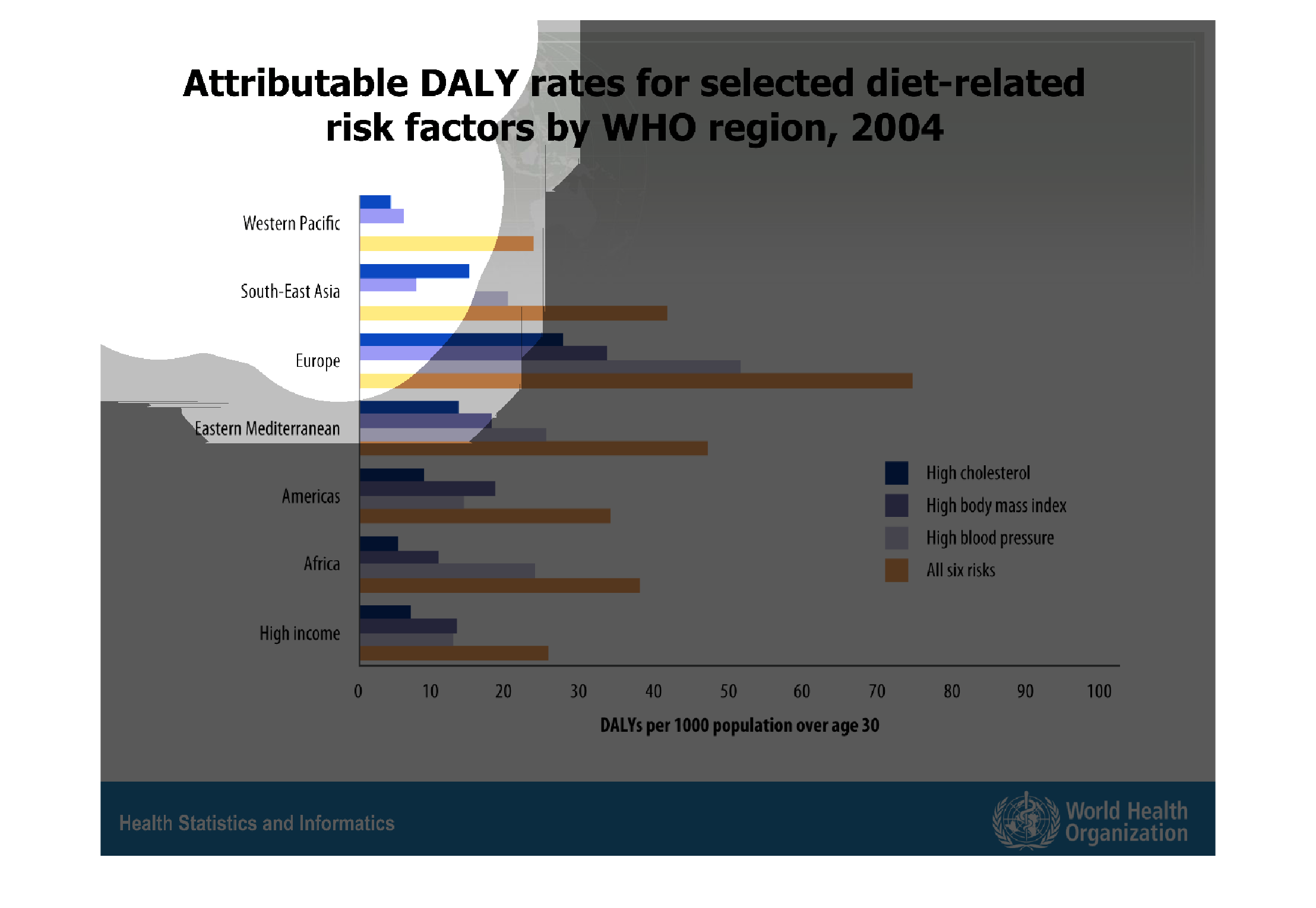
The image on the left hand side is a graph column chart showing the different continents and
their respected populations risk factors.  Europe, one can find from interpreting this data
has the highest DALY related risk factors per its population.
Warning: Image is too big to fit on screen; displaying at 67%
Warning: Image is too big to fit on screen; displaying at 67%
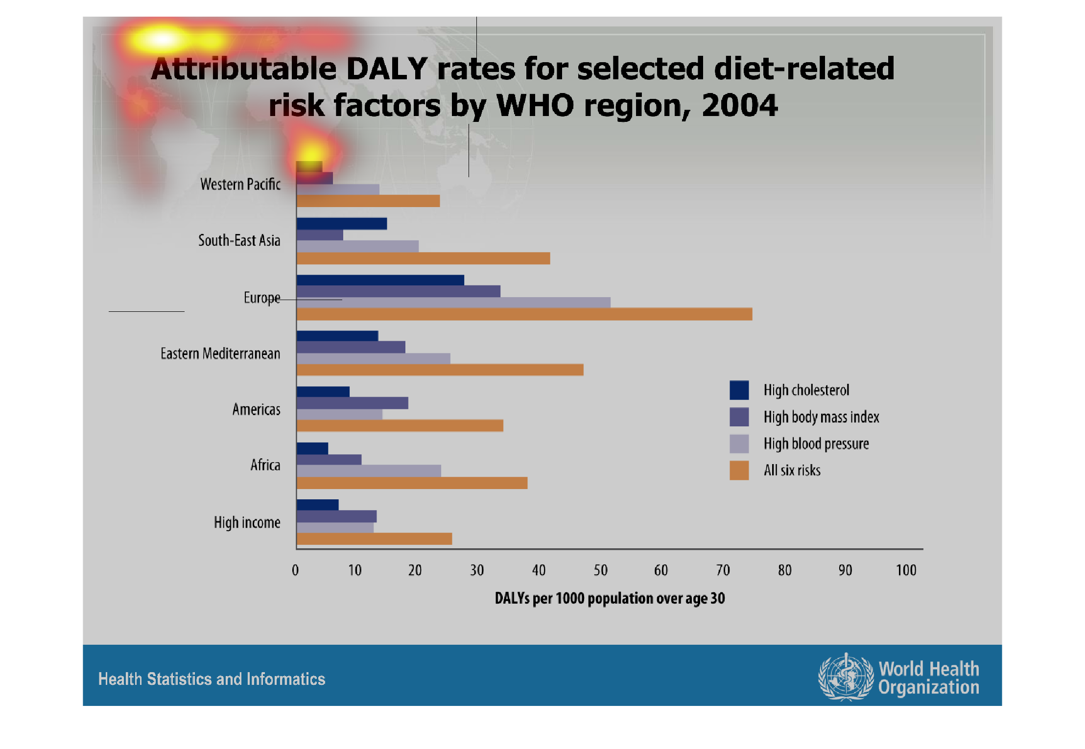
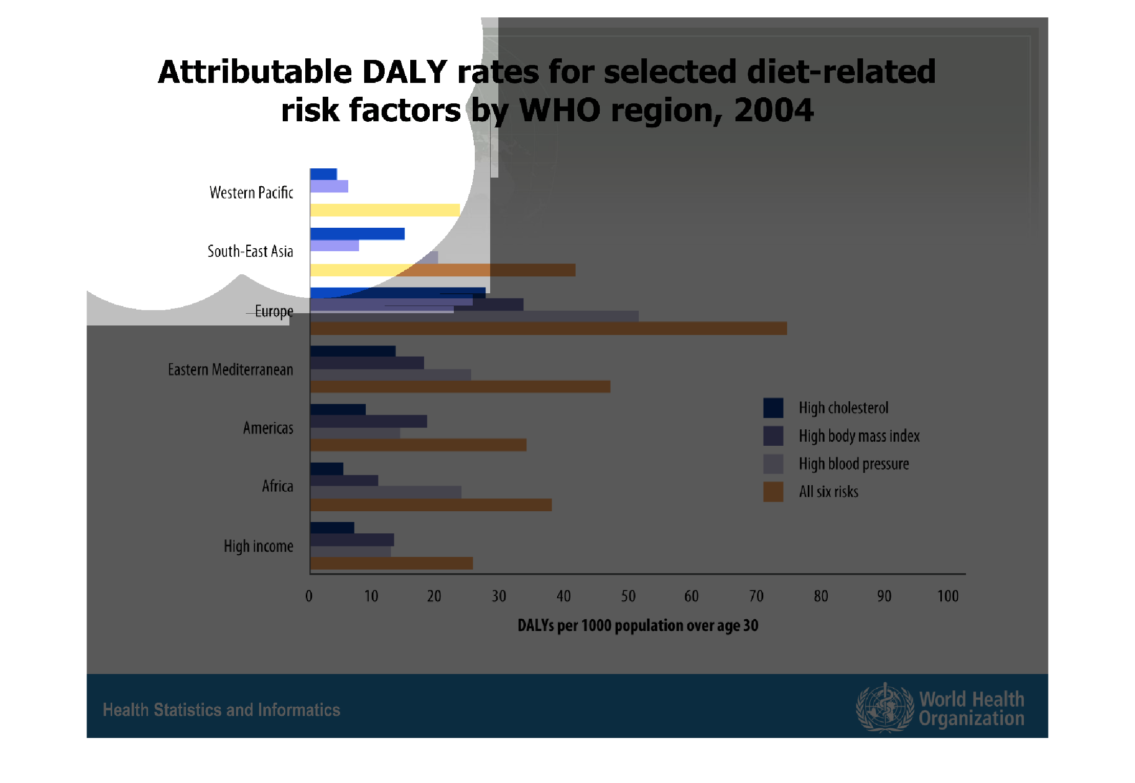
This is a graph that shows the attributable selected daily rates of diet related risk factors
around all the continents. This is a 2004 graph carried out by the WHO.
Warning: Image is too big to fit on screen; displaying at 67%
Warning: Image is too big to fit on screen; displaying at 67%
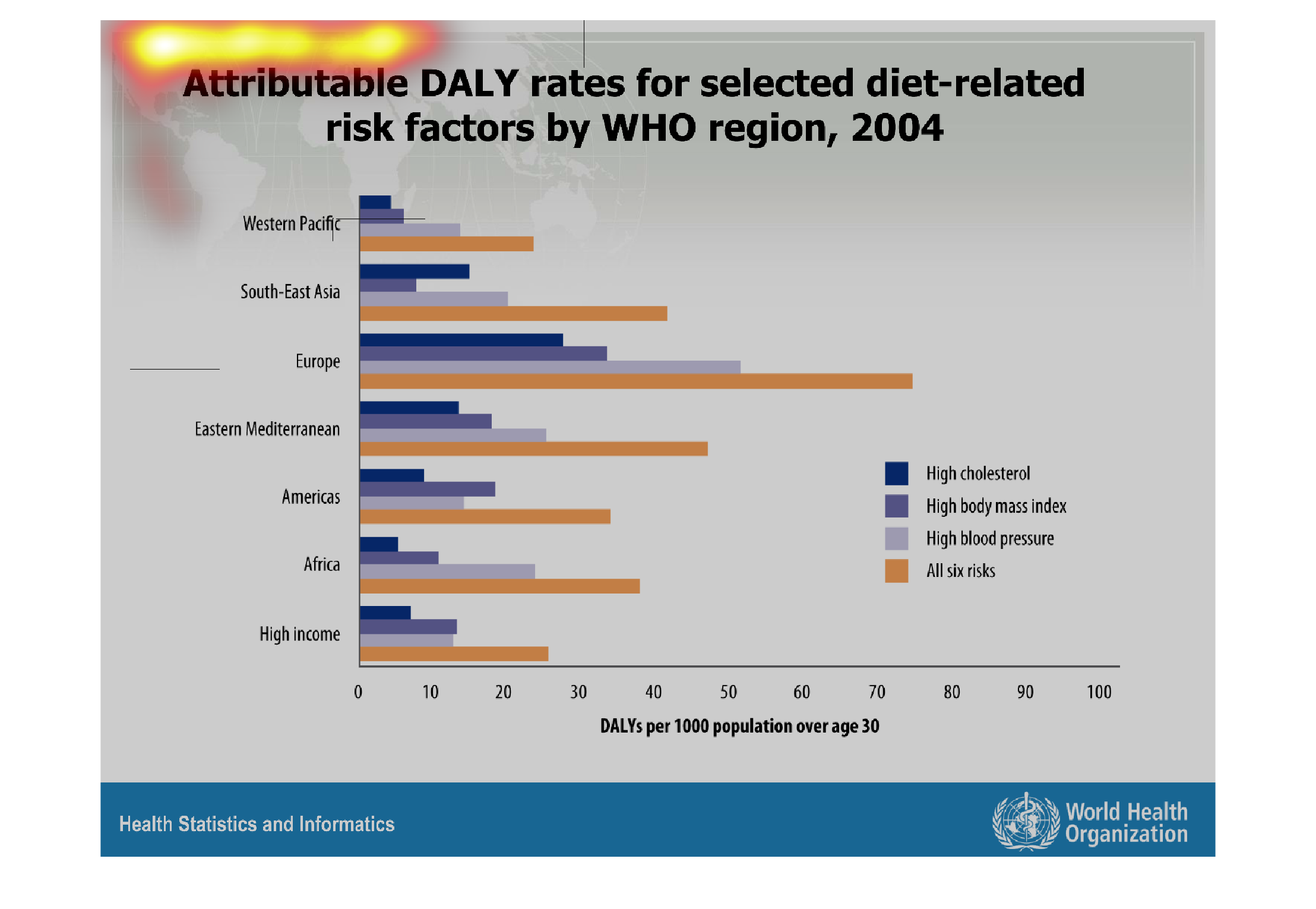
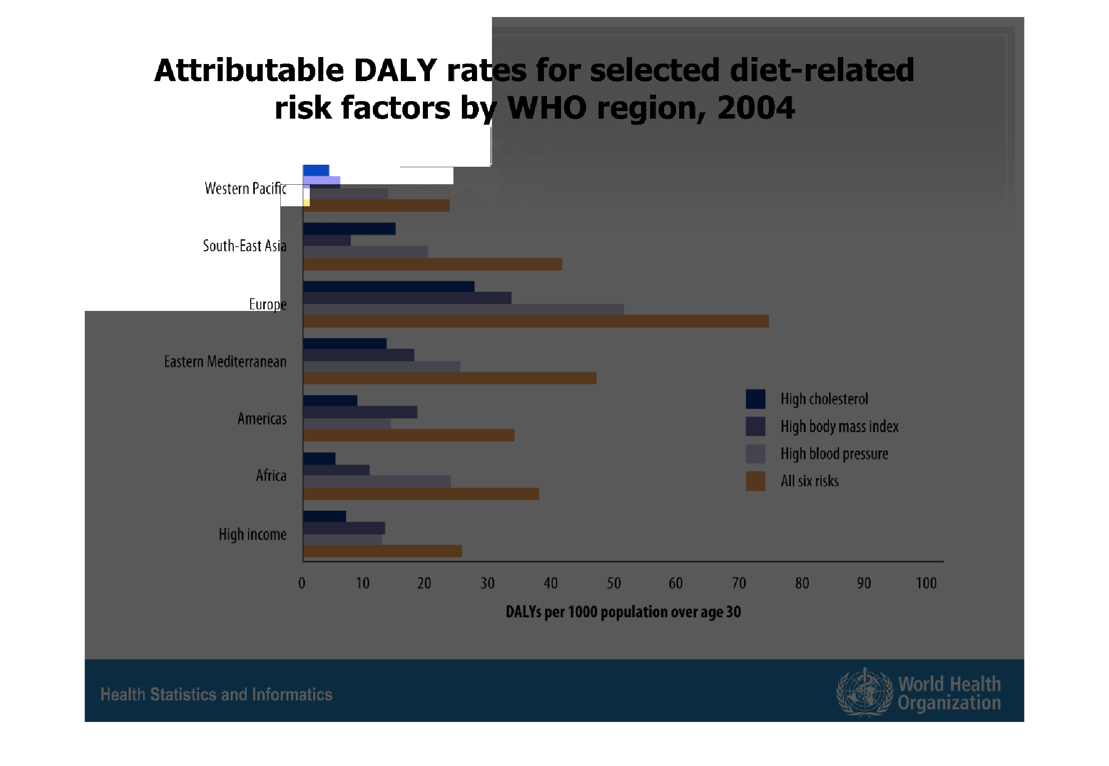
The chart shows the attributable DALY rates for selected diet related risk factors in 2004.
 It is divided by WHO region.  Europe has the highest DALY rate of all the WHO regions.
Warning: Image is too big to fit on screen; displaying at 67%
Warning: Image is too big to fit on screen; displaying at 67%
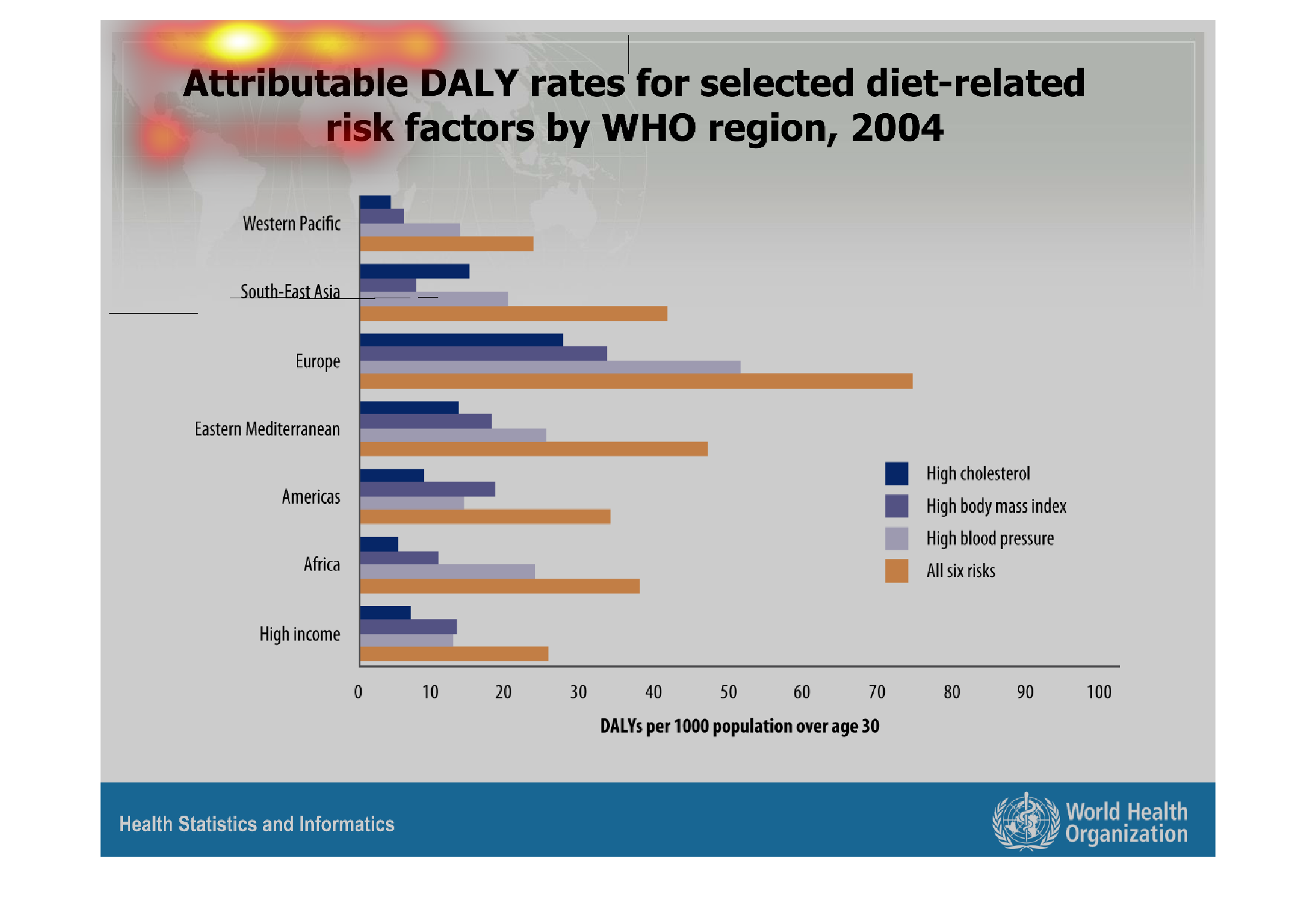
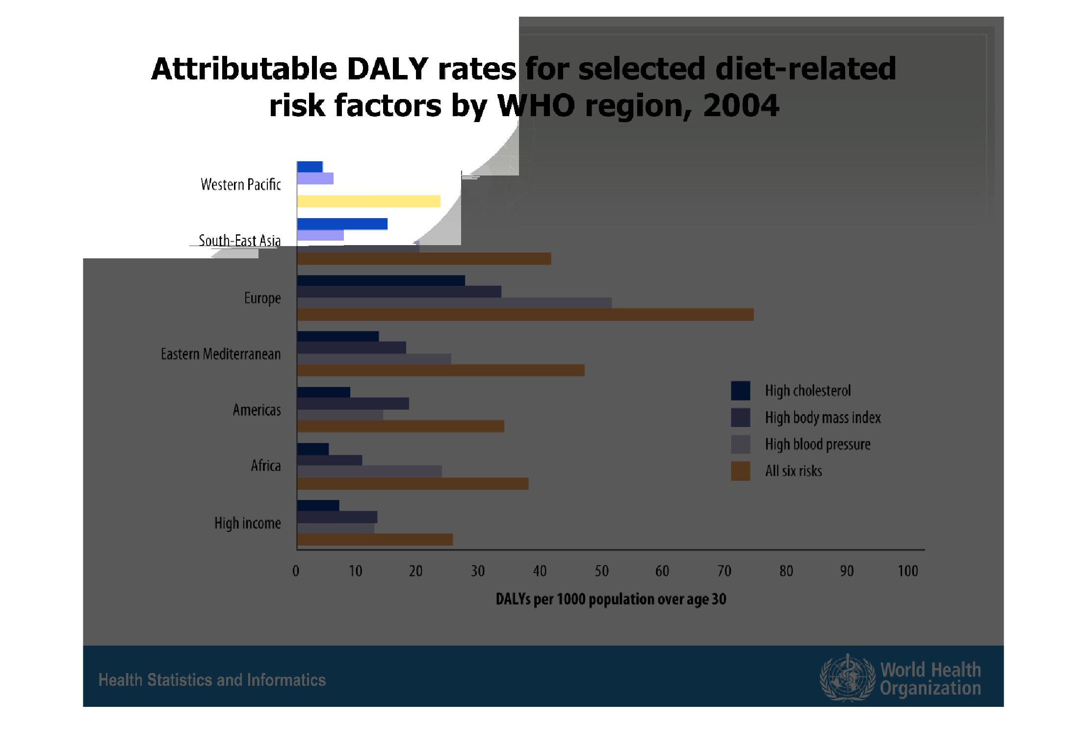
This handmade chart shows the DALY rates for health related ailments as measured by region
around the world such as Europe, USA, and Mediterannean regions
Warning: Image is too big to fit on screen; displaying at 67%
Warning: Image is too big to fit on screen; displaying at 67%
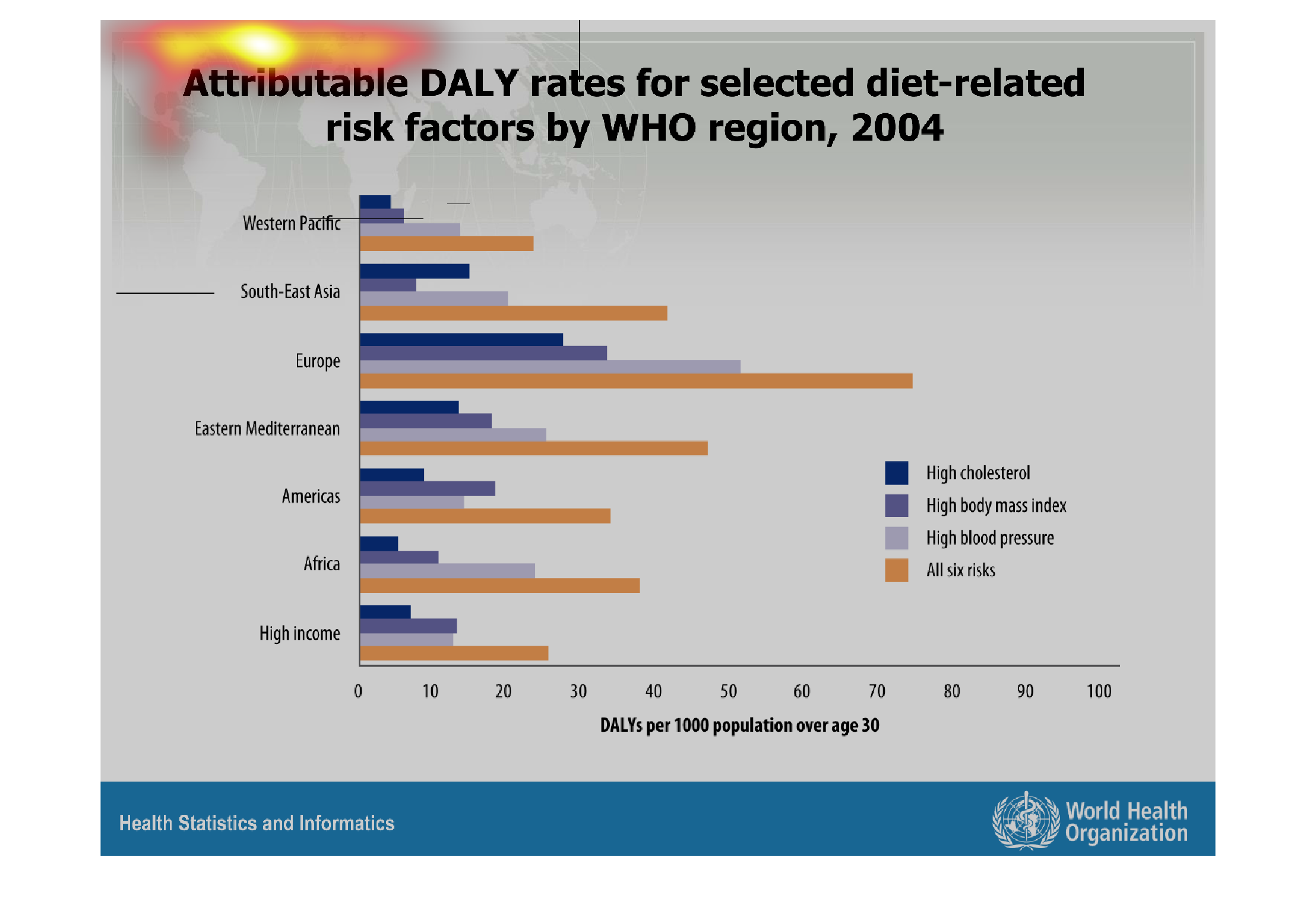
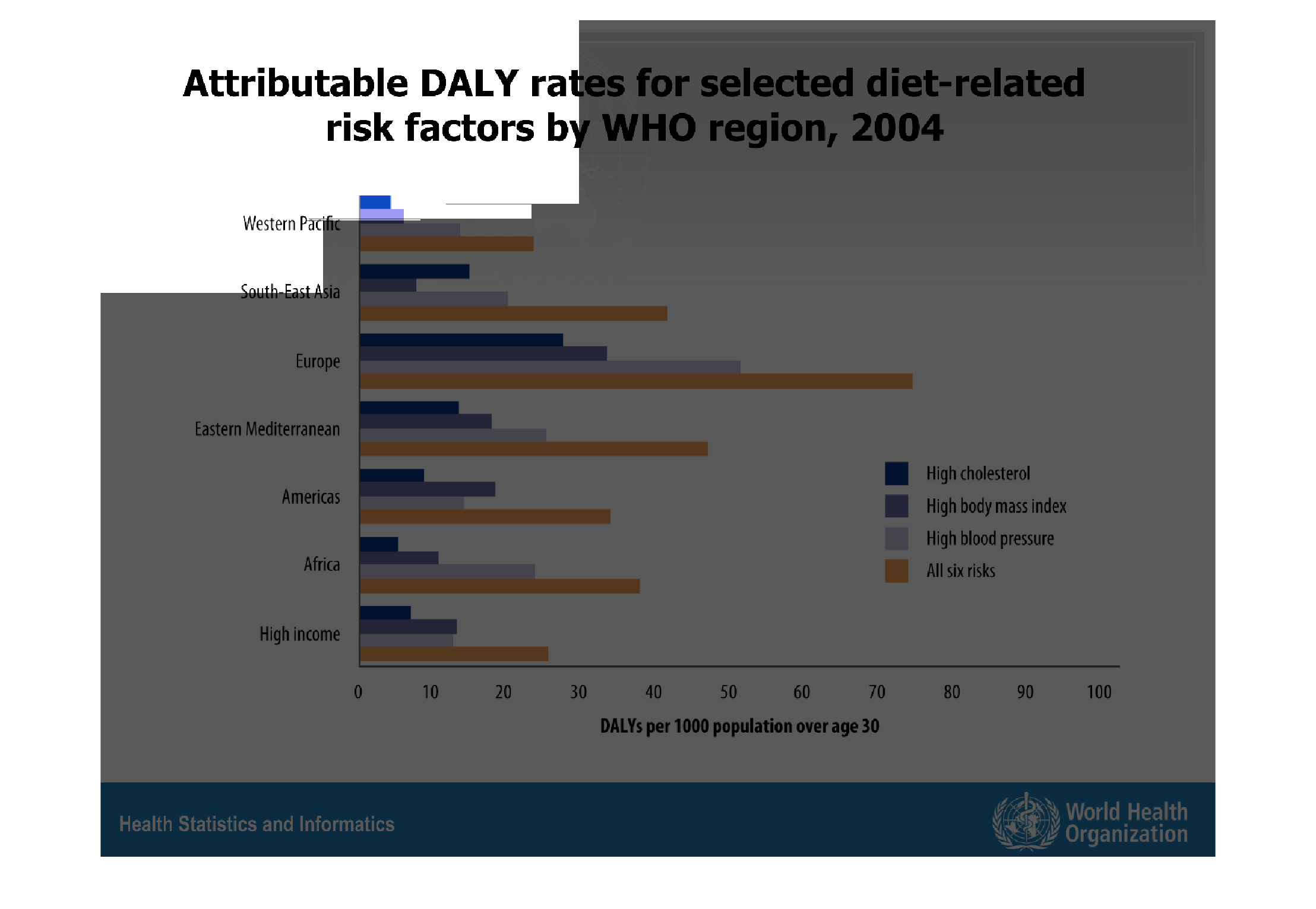
This bar graph shows the attributable DALY rates to specific diets across various regions
of the country. In 2004, Europe was reporting the greatest DALY rates when considering all
6 diet risk factors simultaneously.
Warning: Image is too big to fit on screen; displaying at 67%
Warning: Image is too big to fit on screen; displaying at 67%

The chart describes various degrees of health risks in a different areas of the world. DALY
rates probably refers to some health acronym about diet. WHO refers to the World Health Organization
regions. Europe leads in the category for all health risks, surprisingly. Western Pacific
has the least DALY rates per 100. Lastly, the y axis includes "high income" which you can
compare against the other WHO areas.
Warning: Image is too big to fit on screen; displaying at 67%
Warning: Image is too big to fit on screen; displaying at 67%