Warning: Image is too big to fit on screen; displaying at 67%
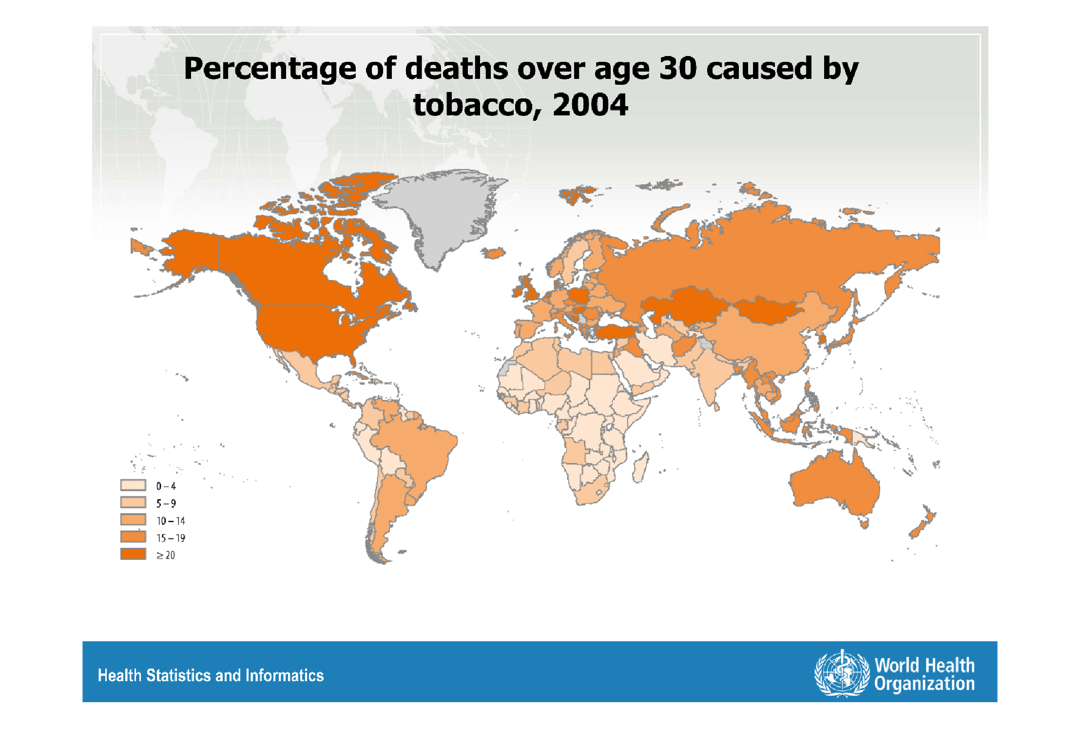
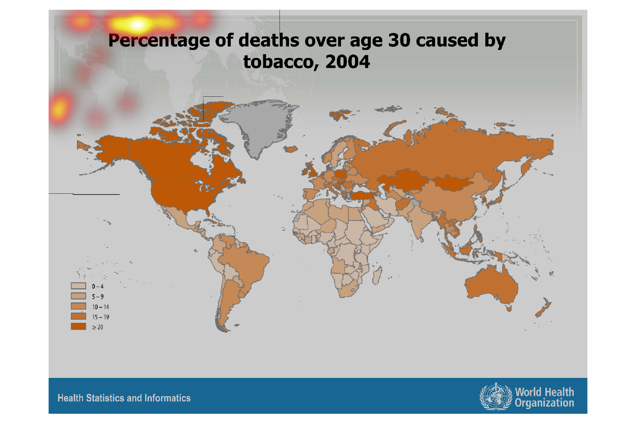
This chart describes percentage of deaths over age 30 caused by tobacco, for the year 2004.
Different categories on the chart are represented by different colors.
Warning: Image is too big to fit on screen; displaying at 67%
Warning: Image is too big to fit on screen; displaying at 67%
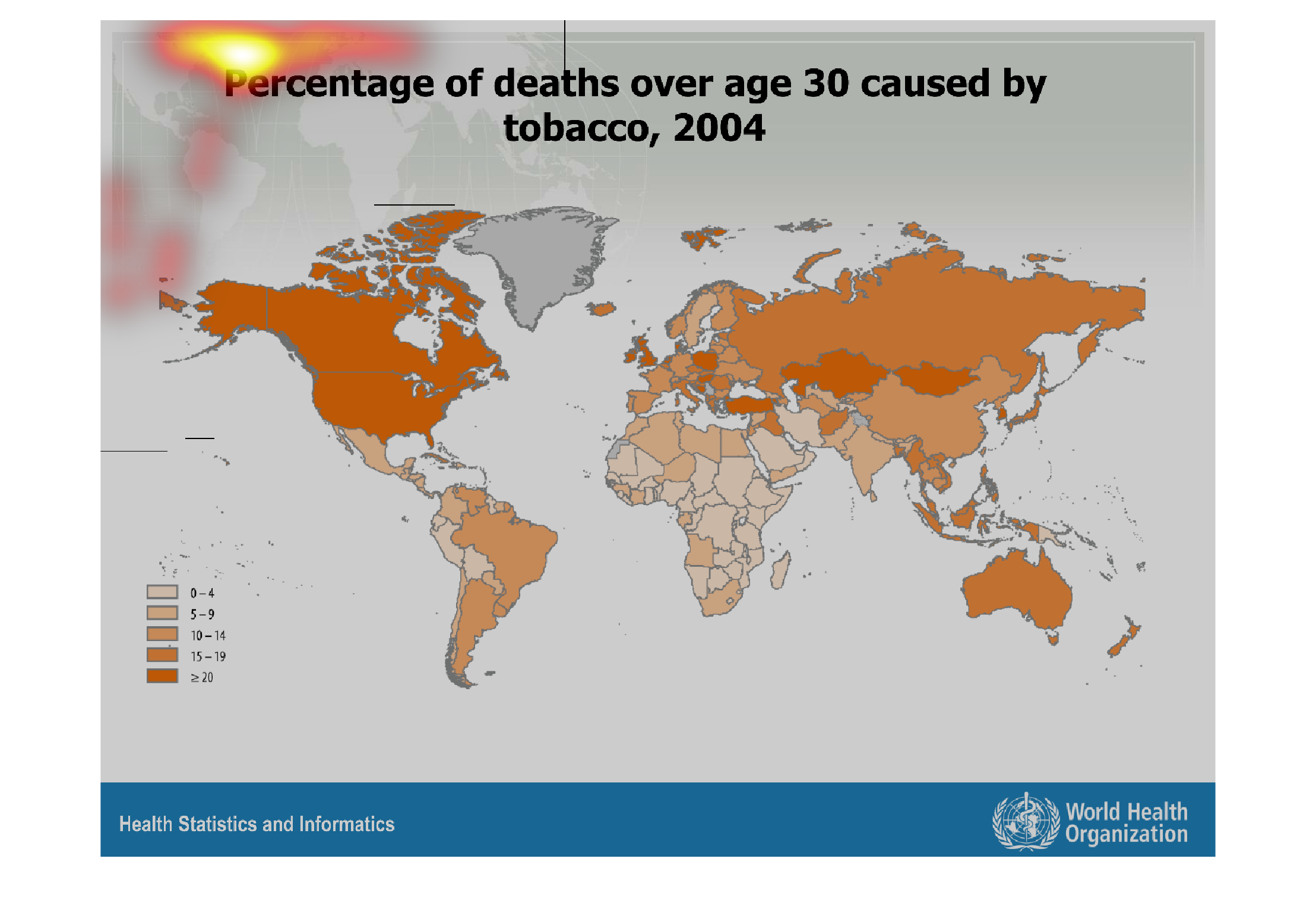
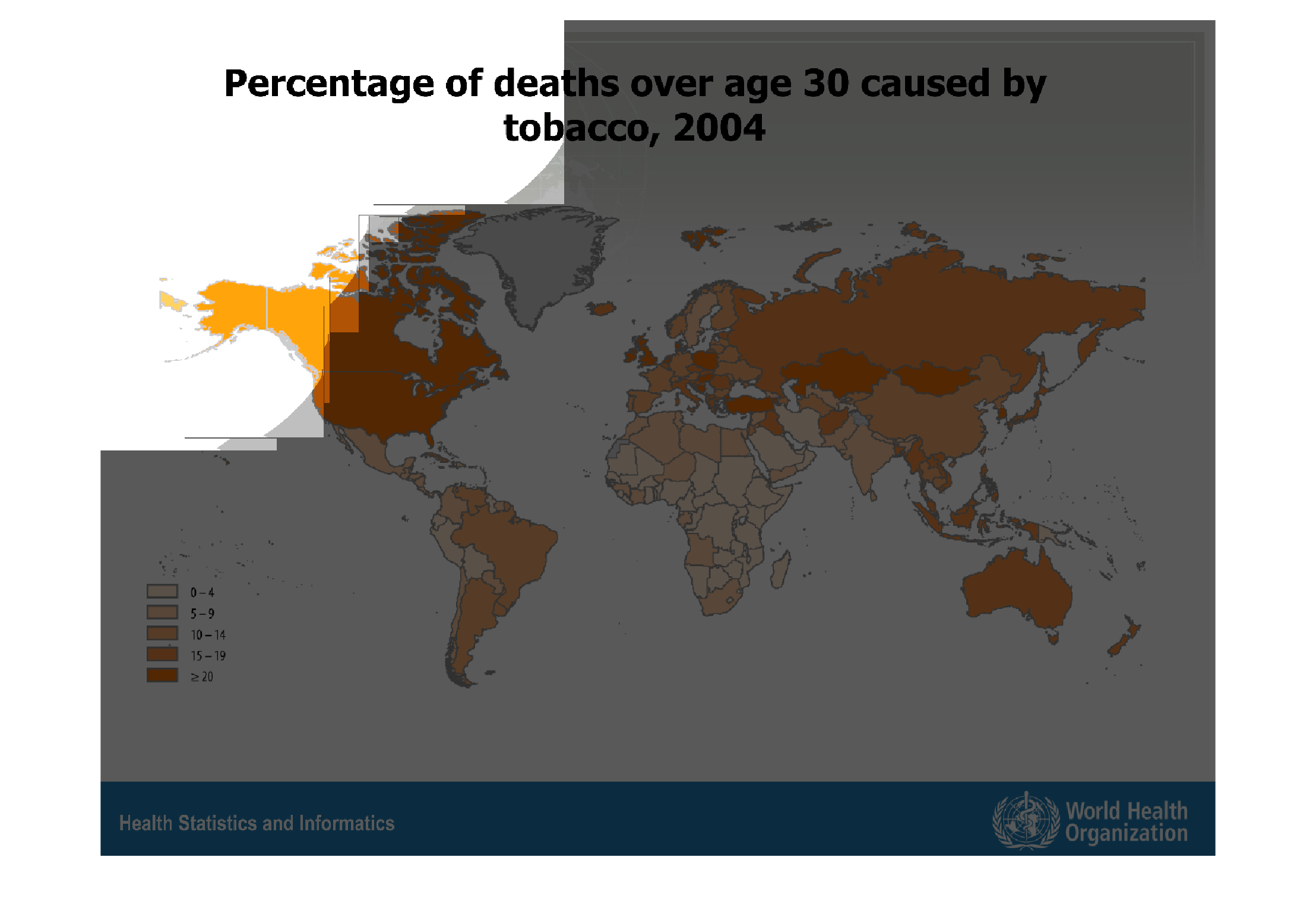
This map shows the percentage of people over the age of thirty who die from tobacco, in 2004.
The highest amount of deaths from tobacco seem to be in North America and England.
Warning: Image is too big to fit on screen; displaying at 67%
Warning: Image is too big to fit on screen; displaying at 67%
The following chart gives the percentages of death caused by tobacco. From the year 2004.
North America had the highest rate reported in the those reporting.
Warning: Image is too big to fit on screen; displaying at 67%
Warning: Image is too big to fit on screen; displaying at 67%
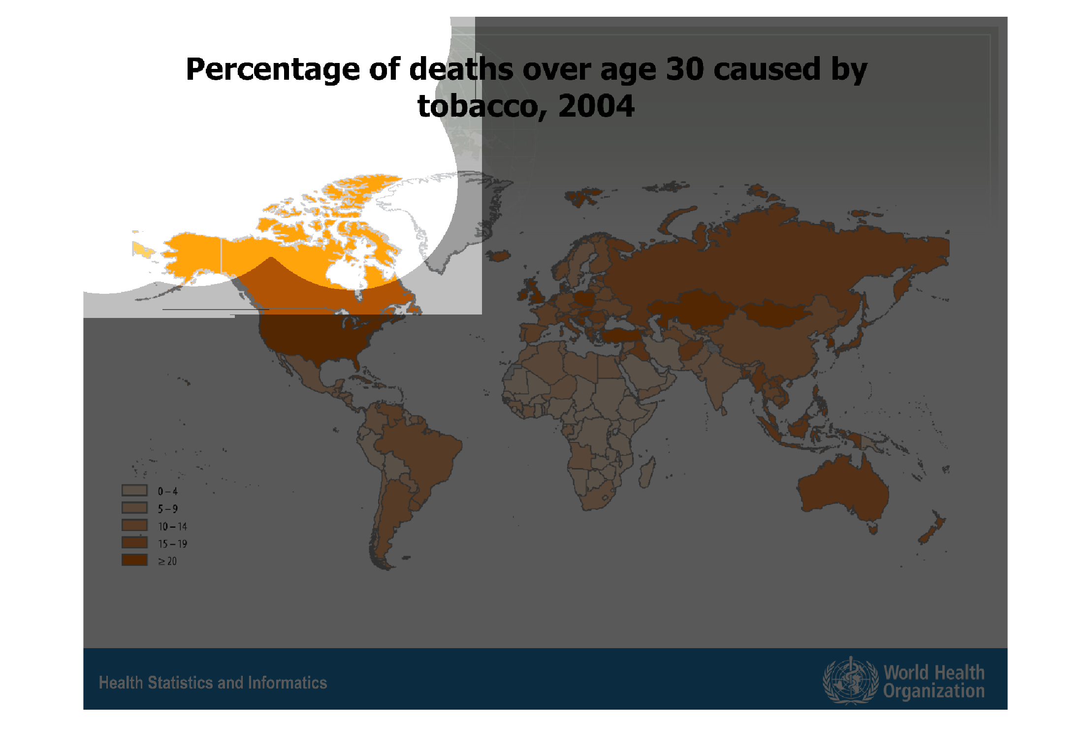
This chart describes percentage of deaths over age 30 caused by tobacco, for the year 2004.
Different percentages on the chart are represented by different colors.
Warning: Image is too big to fit on screen; displaying at 67%
Warning: Image is too big to fit on screen; displaying at 67%
The figure presented is titled Percentage of deaths over age 30 cause by tobacco, 2004.  The
figure is a representation of deaths caused by tobacco for age 30 and over.
Warning: Image is too big to fit on screen; displaying at 67%
Warning: Image is too big to fit on screen; displaying at 67%
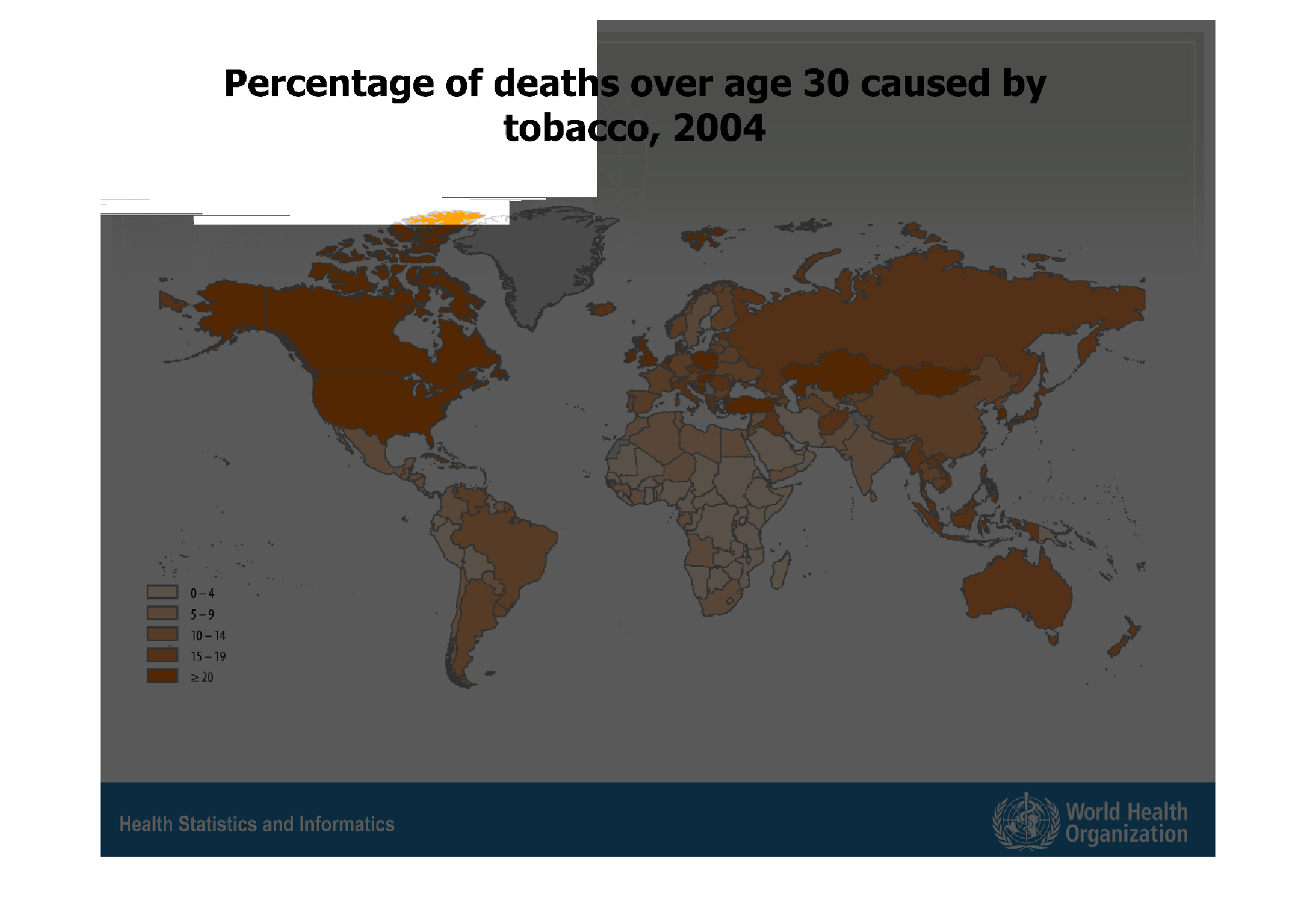
In this graph on my left it covers the percentage of people who died over the age of 30 by
the causes of tobacco in 2004. The graph also shows the world map with percentages from all
over the world
Warning: Image is too big to fit on screen; displaying at 67%
Warning: Image is too big to fit on screen; displaying at 67%
The study describes the percentage of deaths attributable to tobacco use globally in 2004.
According to the chart, Europe and Africa have lower tobacco-related deaths than do China
and the United States, however other causes and life-expediencies are not given.
Warning: Image is too big to fit on screen; displaying at 67%
Warning: Image is too big to fit on screen; displaying at 67%

This graph shows percentage of deaths over age 30 caused by tobacco, 2004. The lowest percentages
are shaded lighter and the highest are shaded the darkest. Some of the highest death rates
due to tobacco are found in the United States.
Warning: Image is too big to fit on screen; displaying at 67%
Warning: Image is too big to fit on screen; displaying at 67%
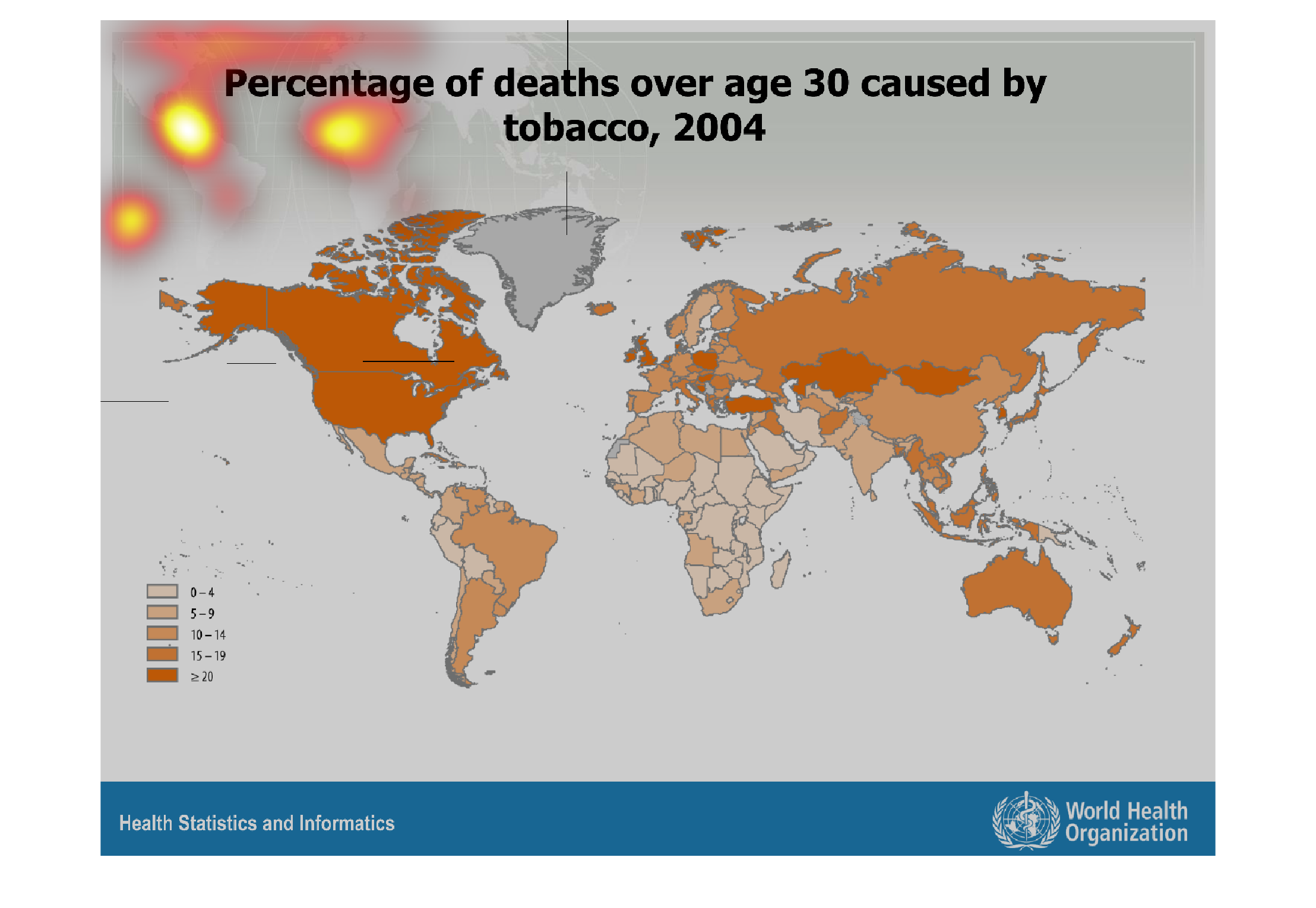
The image shows or depicts in Worldwide Geographical statistical format the percentage of
deaths over age 30 caused by the use of tobacco for the year 2004.
Warning: Image is too big to fit on screen; displaying at 67%
Warning: Image is too big to fit on screen; displaying at 67%
The image on the left hand side is a view of the world.  Within this image it is showing the
percentage of tobacco related deaths throughout the world from people aged 30 or higher.
To better get a grasp of this each country is colored a different shade of orange.  Dark orange
being the highest percentage of deaths, which from the data is from the United States.
Warning: Image is too big to fit on screen; displaying at 67%
Warning: Image is too big to fit on screen; displaying at 67%