Warning: Image is too big to fit on screen; displaying at 67%
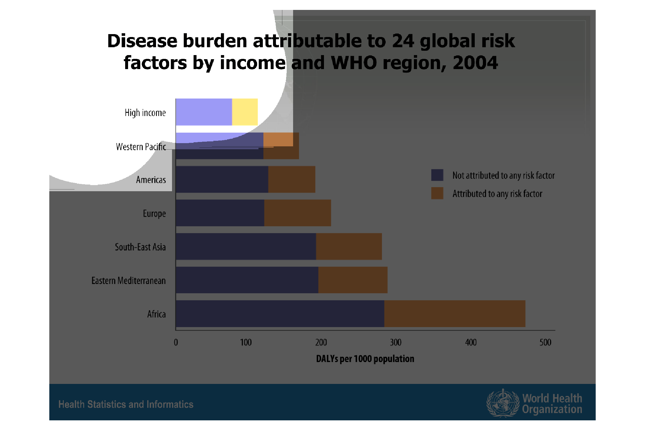
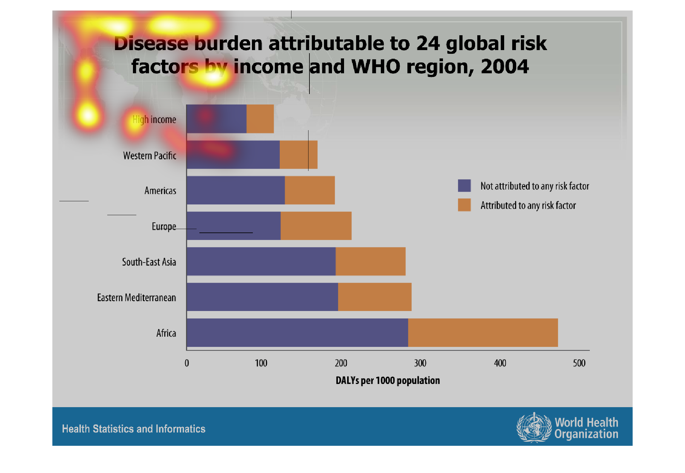
This chart describes the disease burden attributable to 24 global risk factors by income and
WHO regions for the year 2004. Regions on the chart include Western Pacific and the Americas.
Warning: Image is too big to fit on screen; displaying at 67%
Warning: Image is too big to fit on screen; displaying at 67%

This graph shows the disease burden attributable to risk factors by income and WHO region
in 2004. Africa leads the way in both attributable and non attributable risk factors.
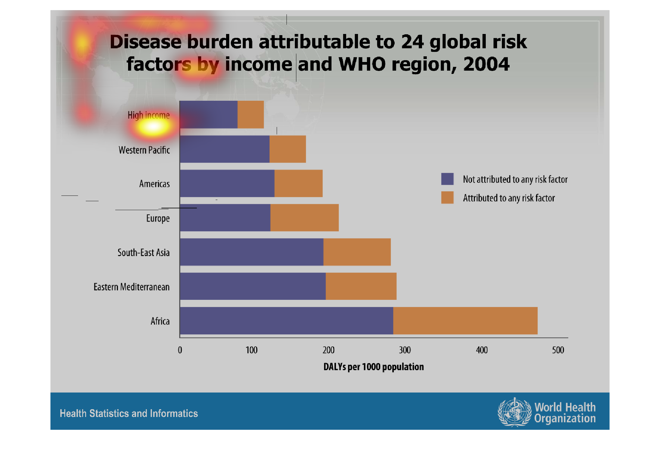
Warning: Image is too big to fit on screen; displaying at 67%
Warning: Image is too big to fit on screen; displaying at 67%

This is a bar graph of disease burden attributed to global risk factors determined by income
and WHO region in 2004. The blue parts are showing what was not attributed to any risk factor,
while the yellow was. We can see that the risk factors always outweigh diseases that weren't
attributed to risk factors. We can also see that each region that is increasingly poorer has
higher rates of disease, while the high income in general has the lowest cases of disease.
Warning: Image is too big to fit on screen; displaying at 67%
Warning: Image is too big to fit on screen; displaying at 67%
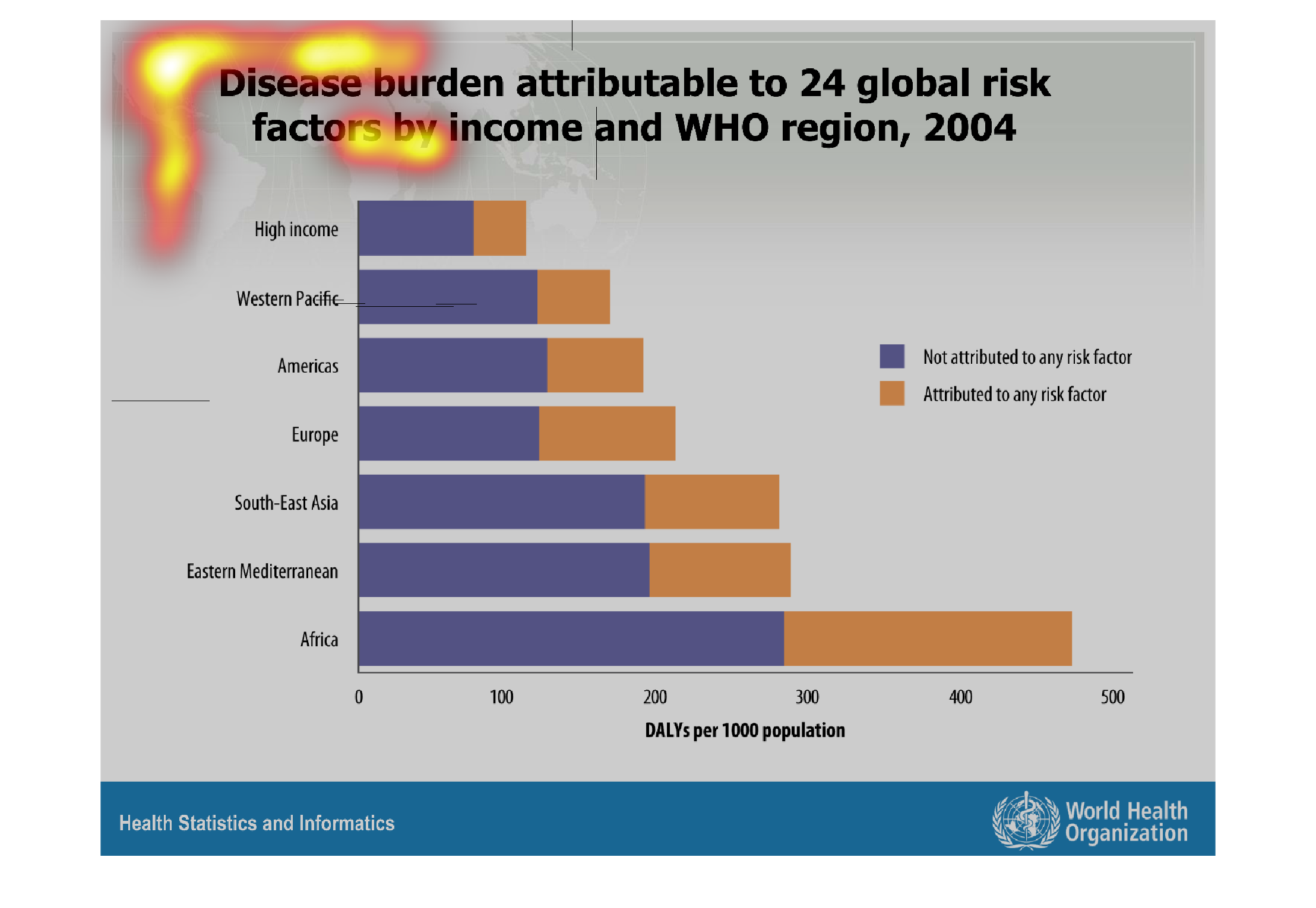
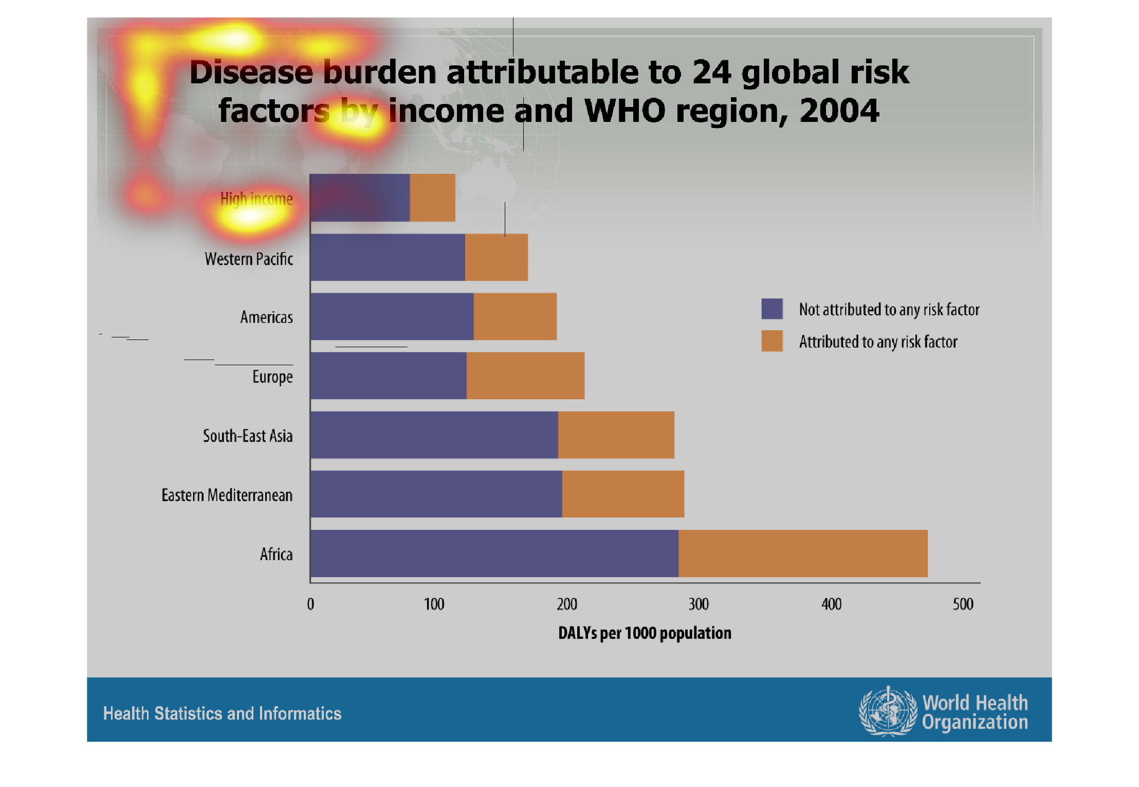
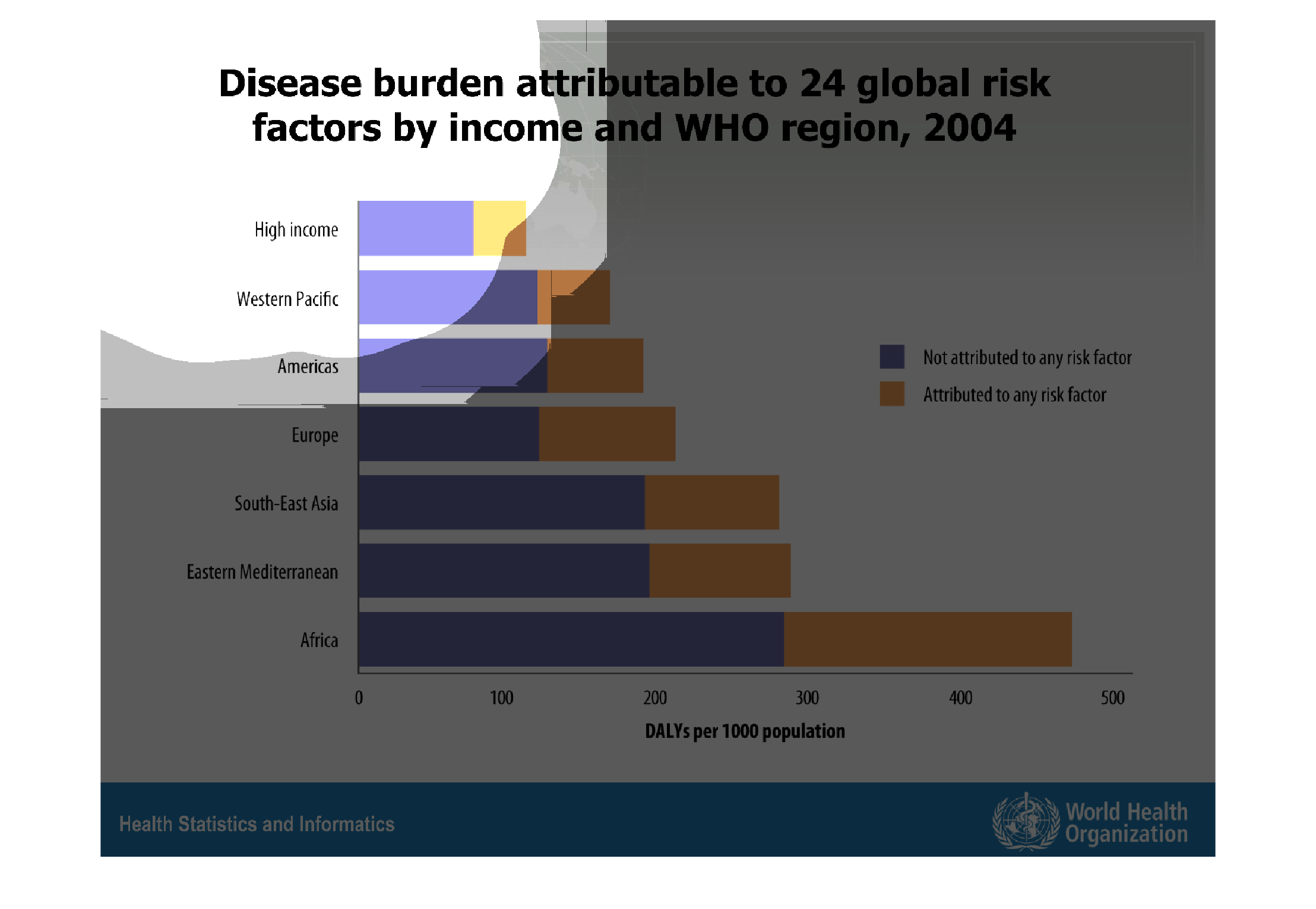
This chart makes no sense because there is no context and it is hard to read. It looks like
it is about diseases that are common throughout the world, but doesnt say what those are
Warning: Image is too big to fit on screen; displaying at 67%
Warning: Image is too big to fit on screen; displaying at 67%
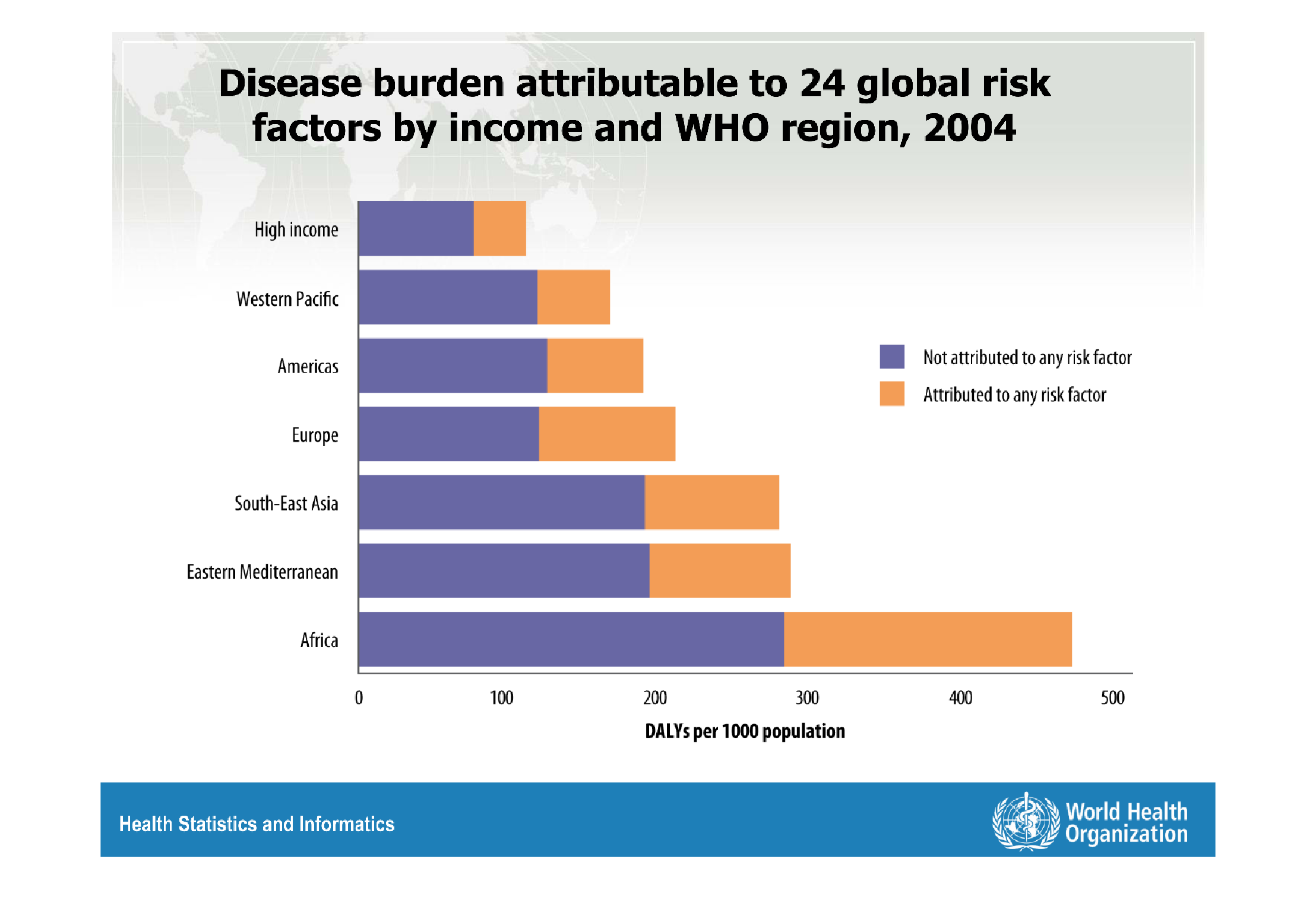
This graph shows disease burden attributable to 24 global risk factors by income and WHO region
in 2004. It shows United States as well as European countries.
Warning: Image is too big to fit on screen; displaying at 67%
Warning: Image is too big to fit on screen; displaying at 67%
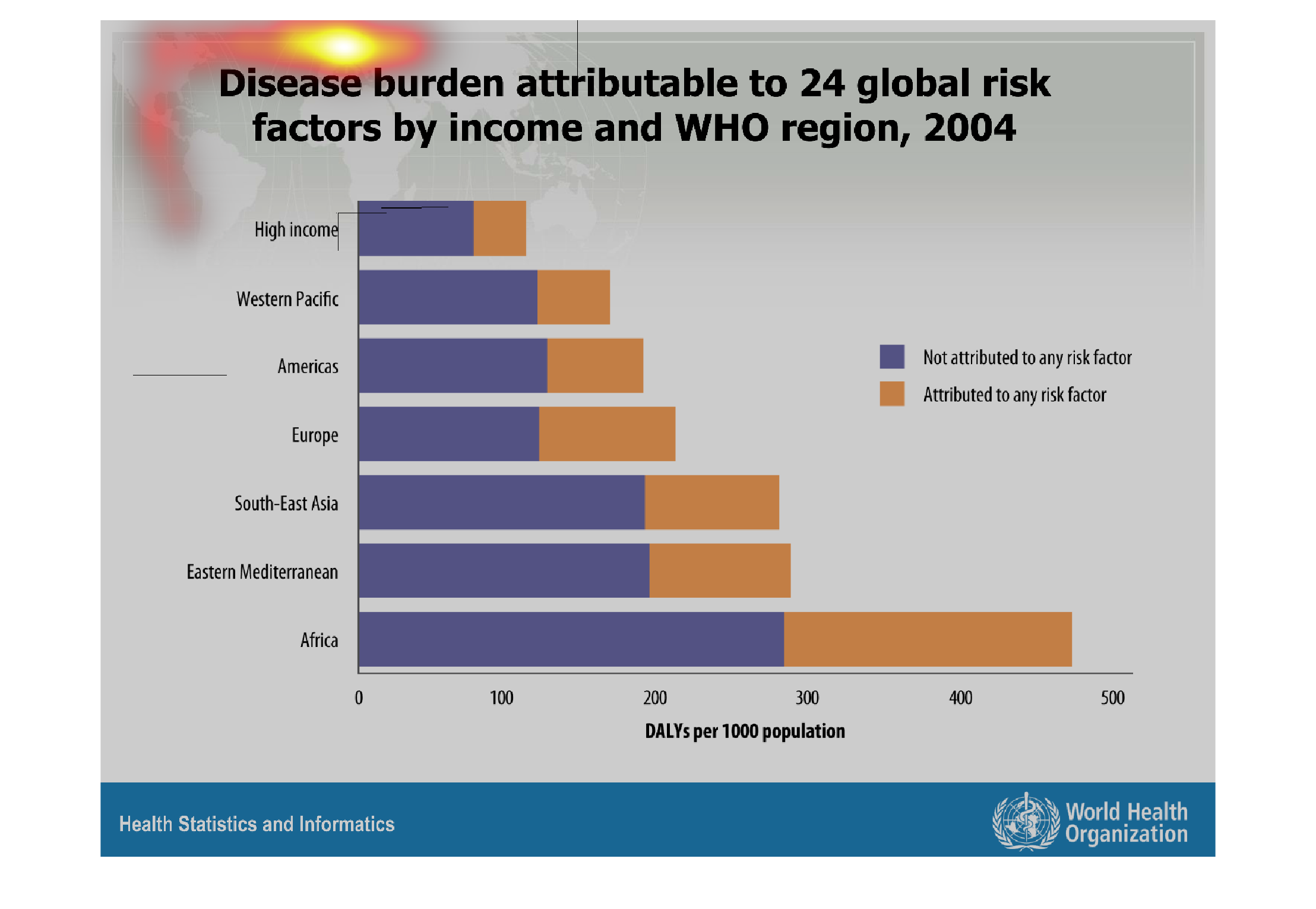
This image shows or depicts in statistical bar graph format disease burden attributable to
24 global risk factors by income and WHO region for year 2004.
Warning: Image is too big to fit on screen; displaying at 67%
Warning: Image is too big to fit on screen; displaying at 67%
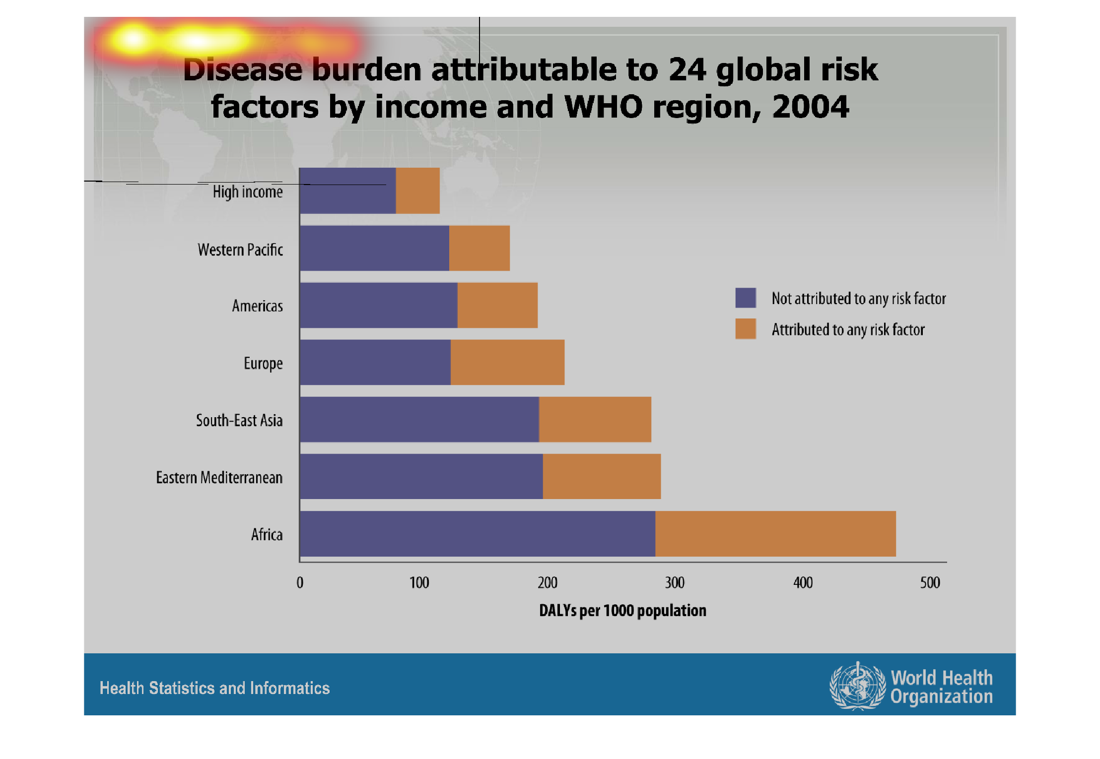
disease burden attributed to 24 global risk factors by income and WHO region 2004. Image seems
to be a chard that show the differences of health risk factors separated by income and location.
Warning: Image is too big to fit on screen; displaying at 67%
Warning: Image is too big to fit on screen; displaying at 67%
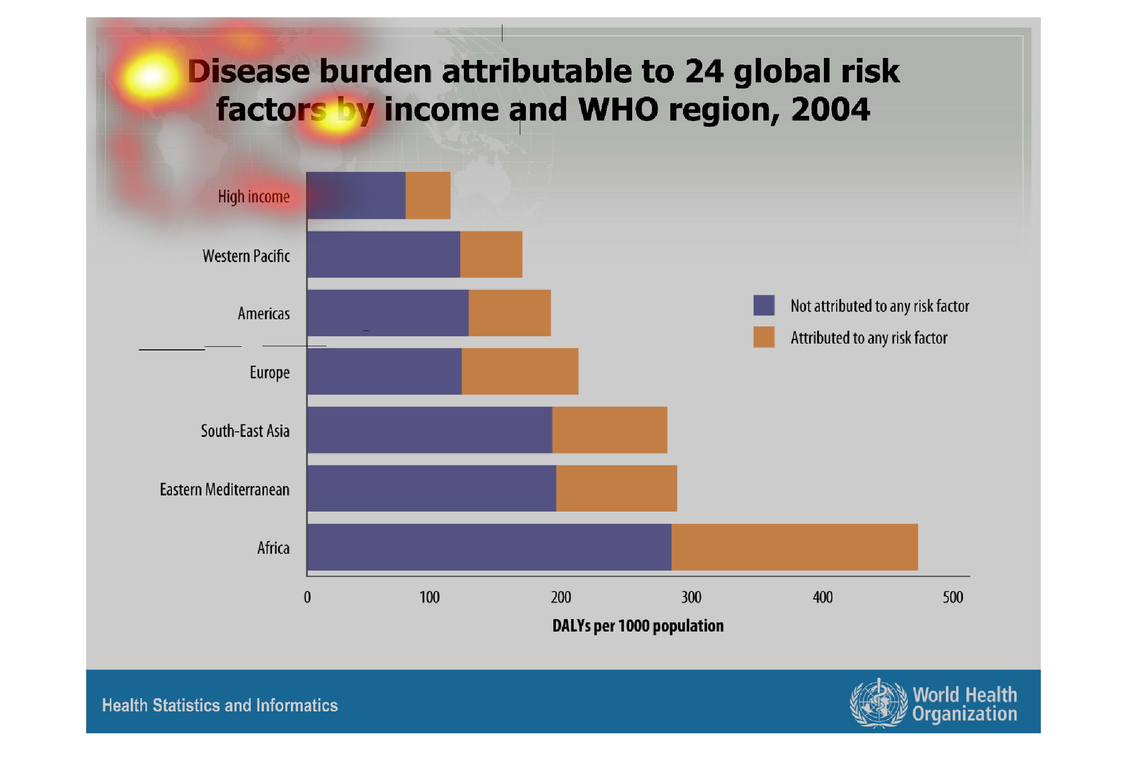
The chart shows the disease burden attributable to 24  global risk factors by income and WHO
region in 2004. Africa has the most factors that didn't attribute to any risk factor, and
the most attributed to any risk factors.
Warning: Image is too big to fit on screen; displaying at 67%
Warning: Image is too big to fit on screen; displaying at 67%
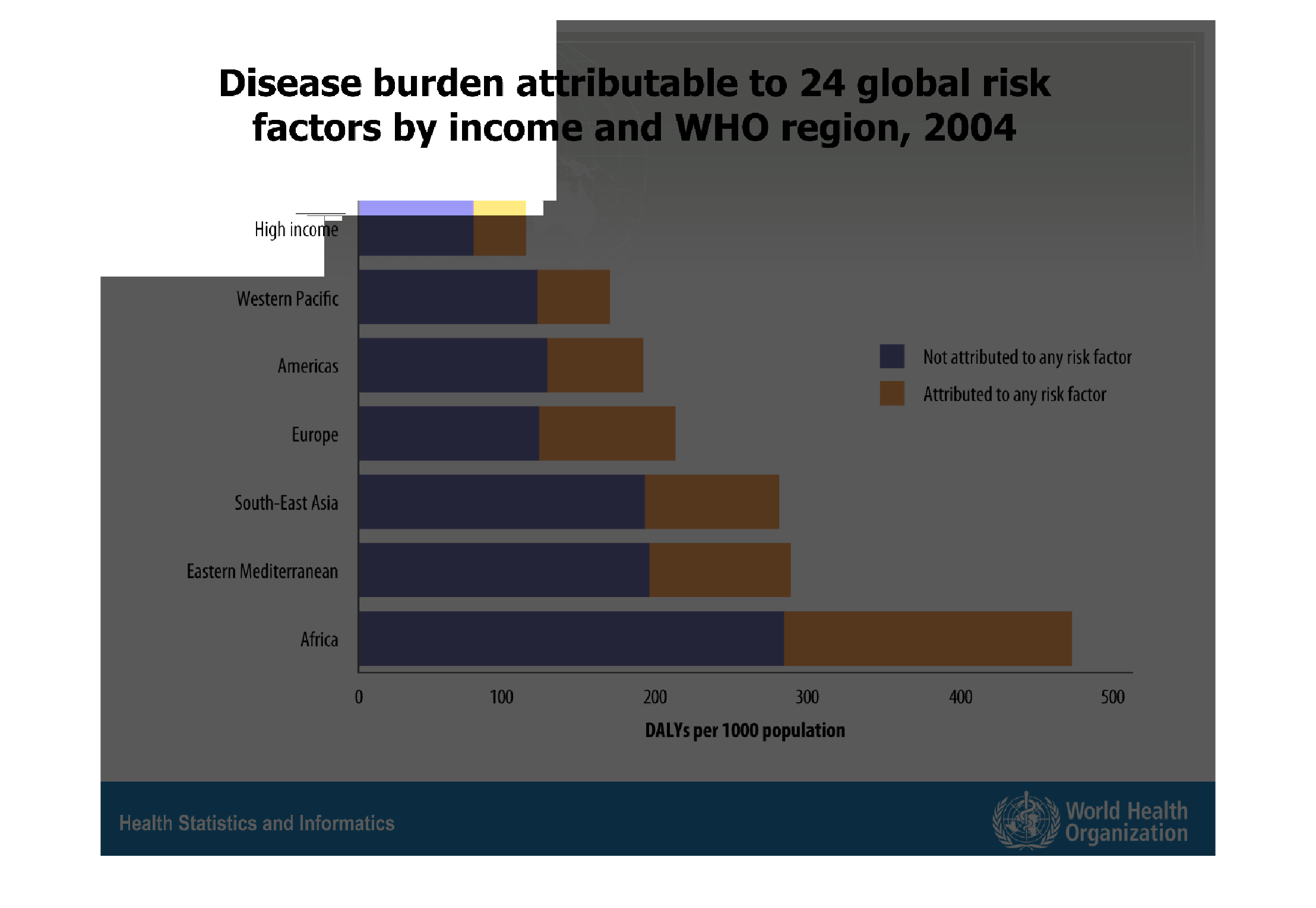
This is an image of a bar graph that shows disease burden attributable to 24 global risk factors
by income and region.  The Y axis at the left of the graph is the different regions and income,
and the X axis at the bottom of the graph is the DALYs per 1000 population.
Warning: Image is too big to fit on screen; displaying at 67%
Warning: Image is too big to fit on screen; displaying at 67%
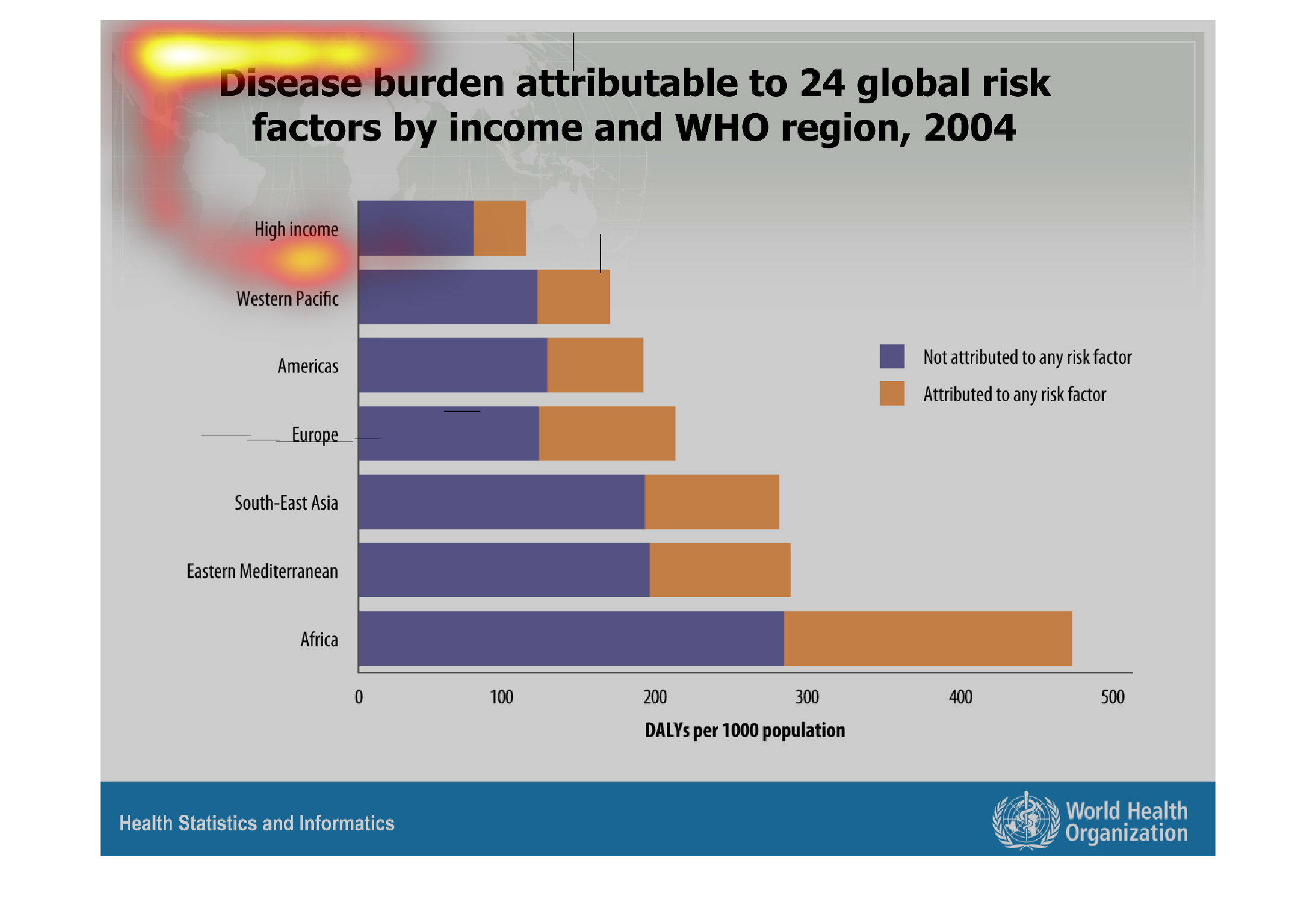
This graph represents the disease burden attributable to 24 global risk factors by income
and WHO region in 2004.  The graph shows that Africa is at the highest risk with a long lead
from the other regions, while high income seems to diminish some risk altogether.
Warning: Image is too big to fit on screen; displaying at 67%
Warning: Image is too big to fit on screen; displaying at 67%
This chart describes disease burden attributable to 24 global risk factors by income and WHO
region, for the year 2004. Categories on the chart include high income.
Warning: Image is too big to fit on screen; displaying at 67%
Warning: Image is too big to fit on screen; displaying at 67%
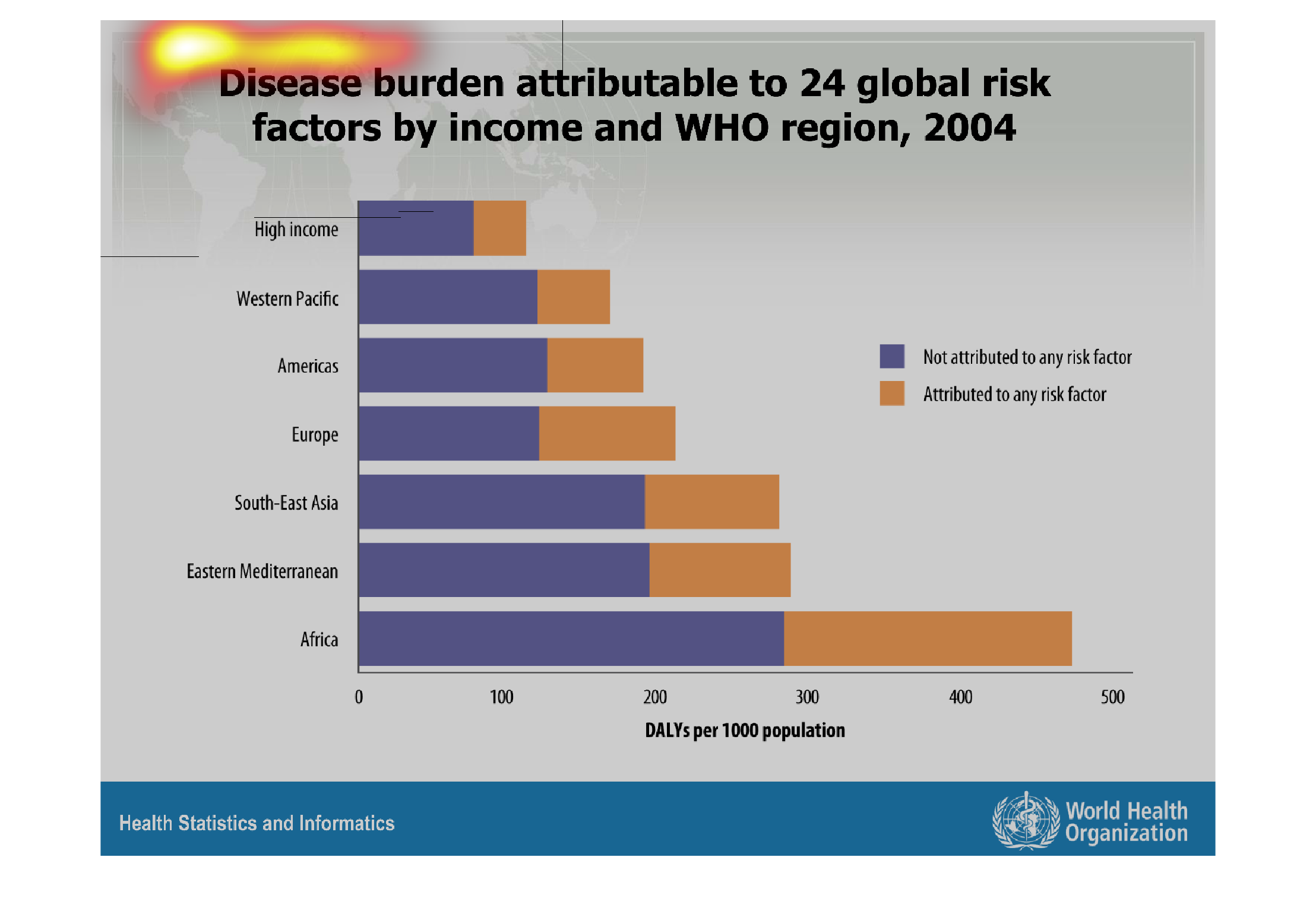
This is a histogram of disease burden attributed to 24 global risk factors by income and WHO
region in 2004. The experimental variable is various continents and also high income areas.
The chart is much greater in poorer countries and there tends to be more stress on things
not attributed to risk factors.
Warning: Image is too big to fit on screen; displaying at 67%
Warning: Image is too big to fit on screen; displaying at 67%