Warning: Image is too big to fit on screen; displaying at 67%
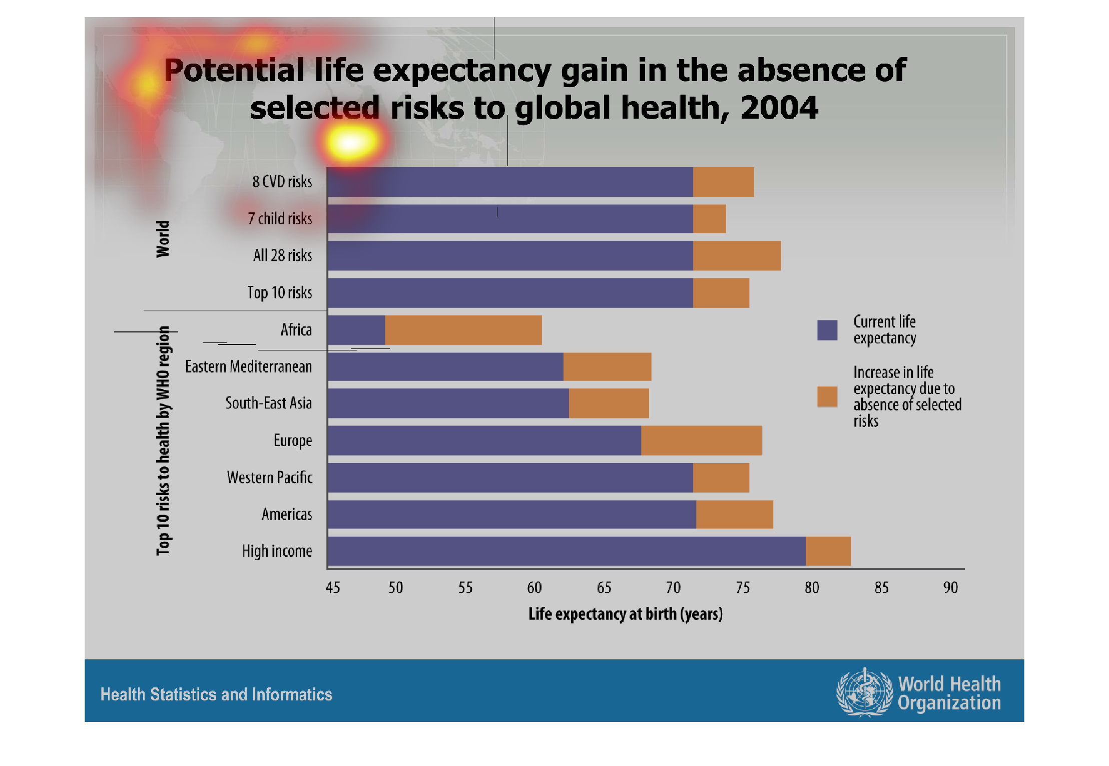
This image shows a bar graph that depicts the potential life expectancy gain in the absence
of selected risks to global health in 2004.  The purple line is showing the current life expectancy,
while an orange line shows the increase in life expectancy due to the absence of these factors.
Years are listed at the bottom of the graph, and along the left is the top 10 risks to health
by WHO region.  A line is then drawn to show the life expectancy rate using both the purple
and orange colors.
Warning: Image is too big to fit on screen; displaying at 67%
Warning: Image is too big to fit on screen; displaying at 67%
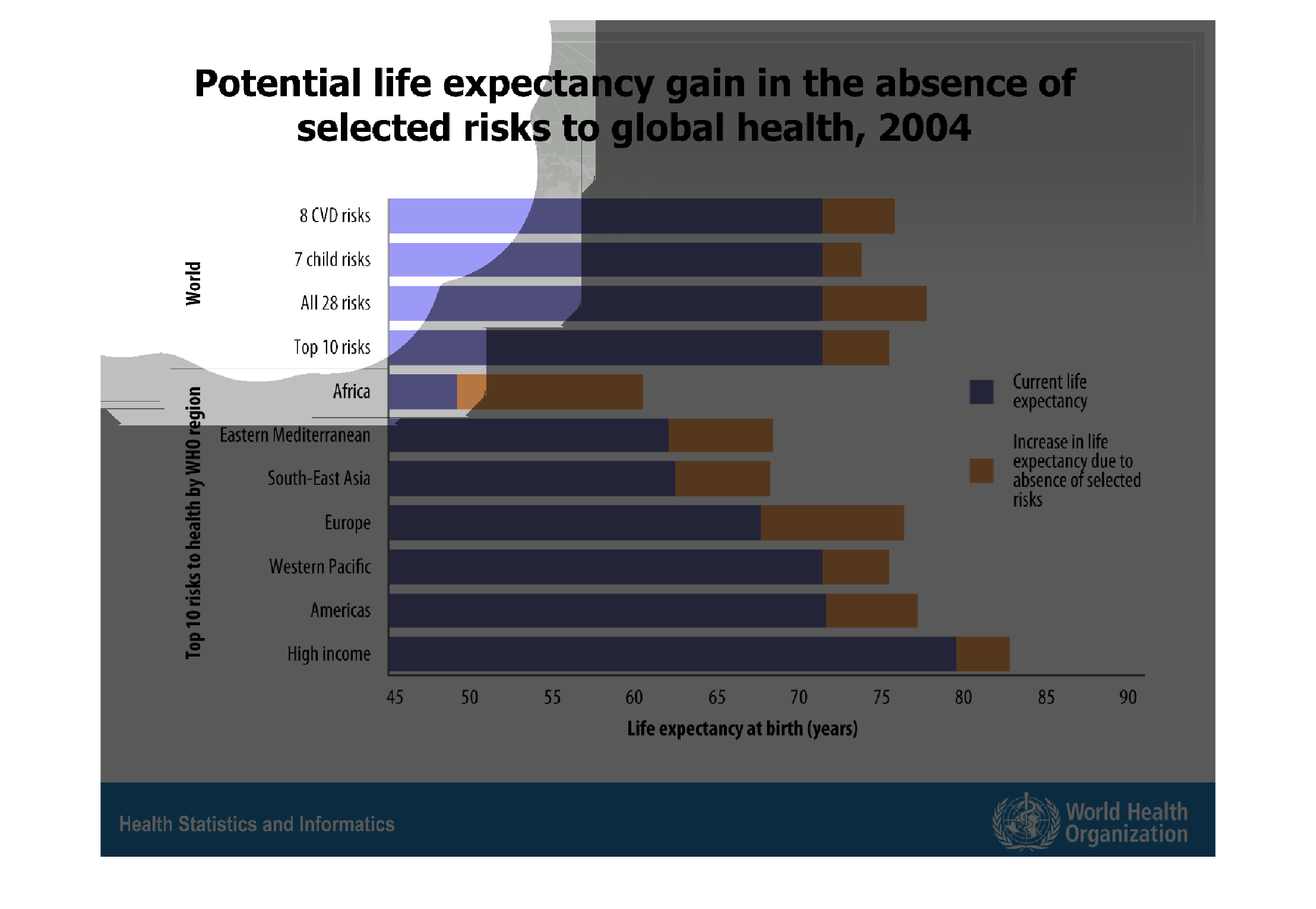
This graph shows the potential life expectancy gain in the absence of selected risks to global
health in 2004. The regions surveyed include the Americas, Africa, the Mediterranean, Europe,
and Asia.
Warning: Image is too big to fit on screen; displaying at 67%
Warning: Image is too big to fit on screen; displaying at 67%
This chart describes potential life expectancy gain in the absence of selected risk to global
health, for the year 2004. Categories on the chart include 7 child risks.
Warning: Image is too big to fit on screen; displaying at 67%
Warning: Image is too big to fit on screen; displaying at 67%
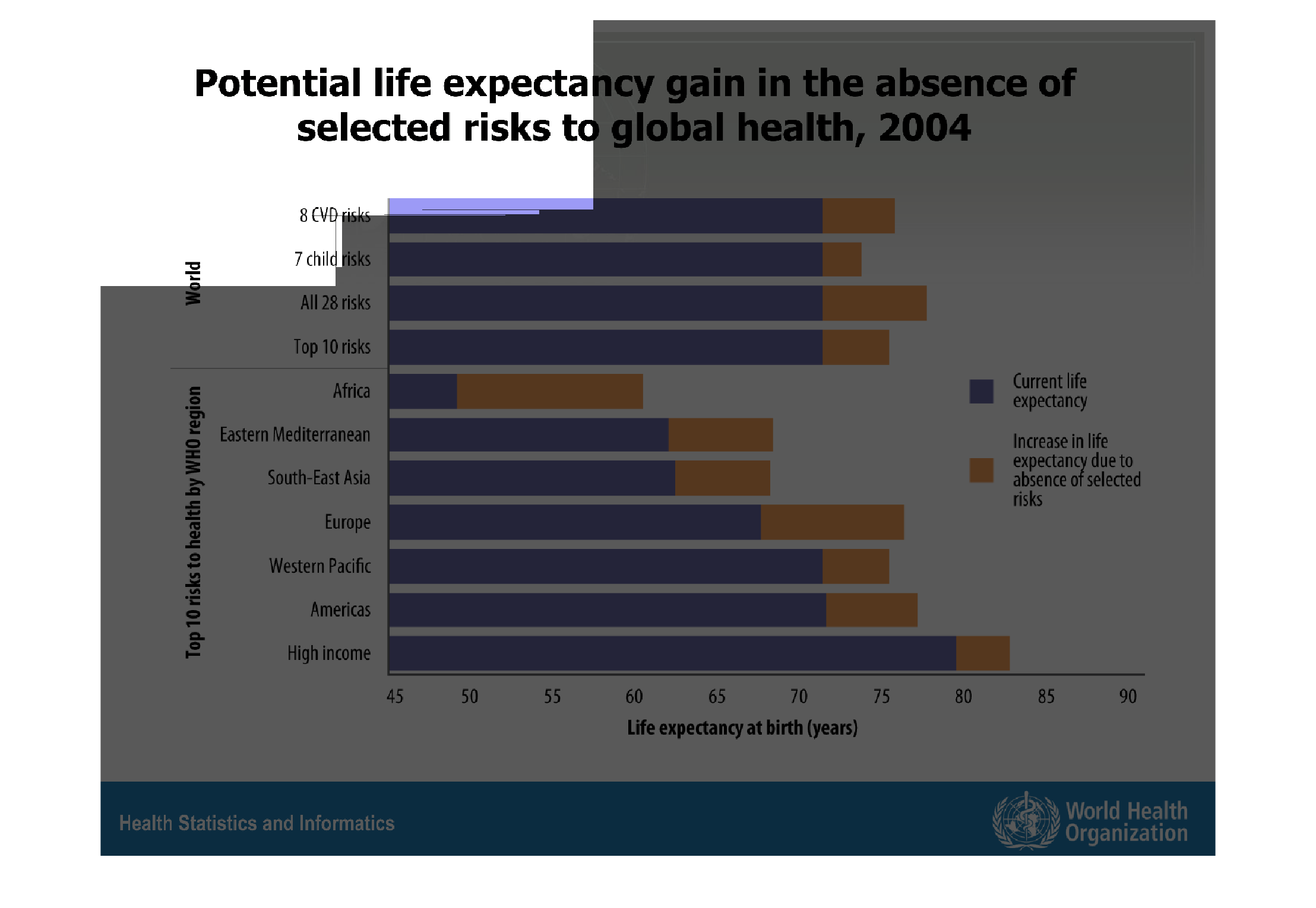
THIS PLOT SHOWS THE INCREASE IN LIFE EXPECTANCY FOR DIFFERENT GROUPS IF THE TOP 10 RISKS TO
LIFE EXPECTANCY ARE ELIMINATED. THE GROUPS ARE BROKEN DOWN BY INCOME AND LOCATION.
Warning: Image is too big to fit on screen; displaying at 67%
Warning: Image is too big to fit on screen; displaying at 67%
The chart to my left shows the potential life expectancy gain in the absence of selected risks
to global health in 2004. The graph also shows the percentages of top countries and developing
countries as well as high income and low income places
Warning: Image is too big to fit on screen; displaying at 67%
Warning: Image is too big to fit on screen; displaying at 67%
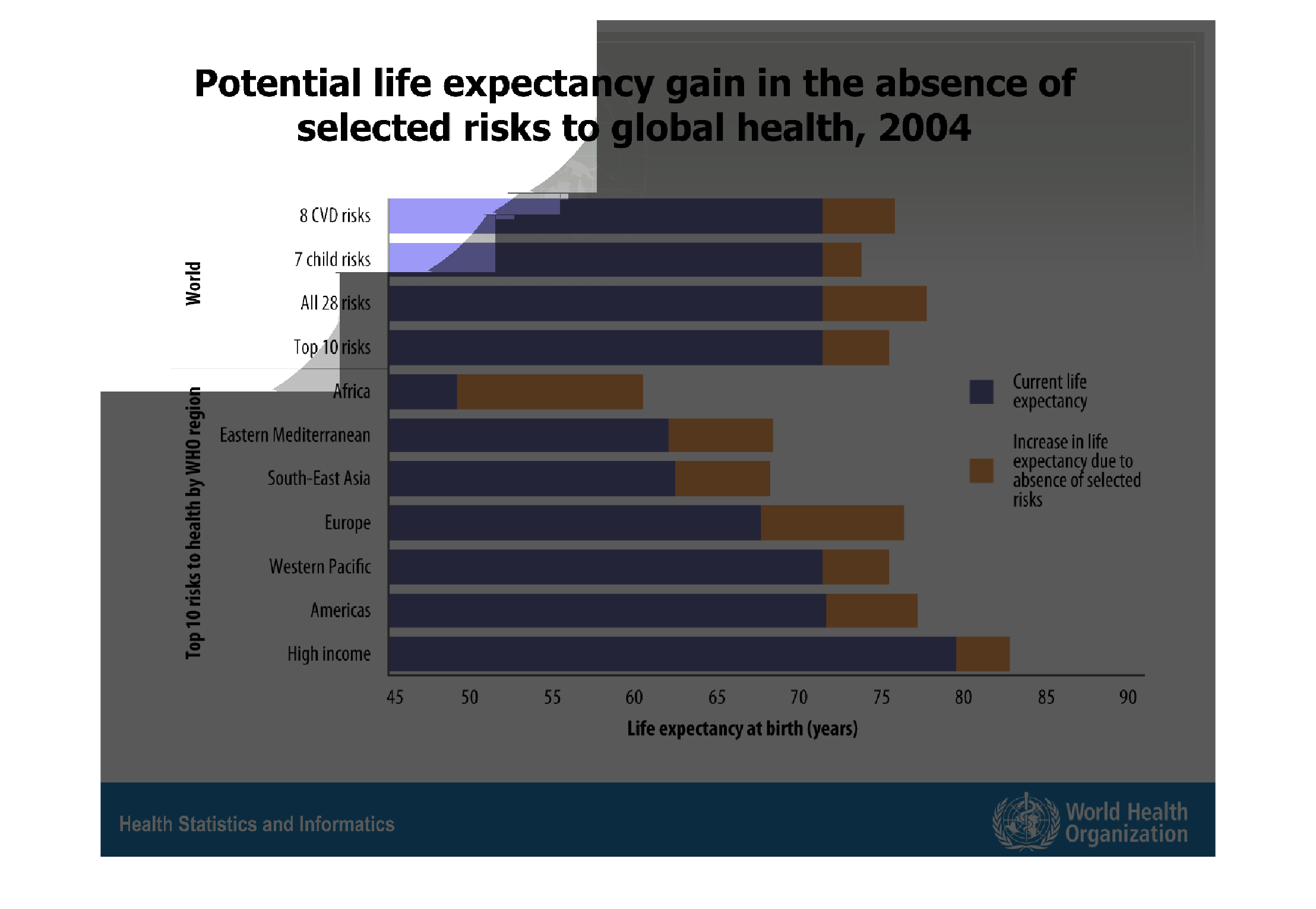
This chart makes no sense because there is no context and it is hard to read. It looks like
it is about potential life expectancies globally. But no other idea.
Warning: Image is too big to fit on screen; displaying at 67%
Warning: Image is too big to fit on screen; displaying at 67%
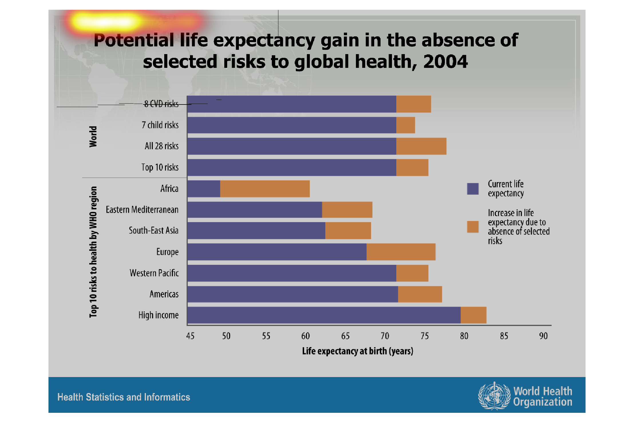

This chart shows the potential life expectancy gains, in the absence of selected risks to
global health, from 2004. The vertical axis denotes the risks, and the bars are color coded
by current life expectancy, and the potential increase.
Warning: Image is too big to fit on screen; displaying at 67%
Warning: Image is too big to fit on screen; displaying at 67%
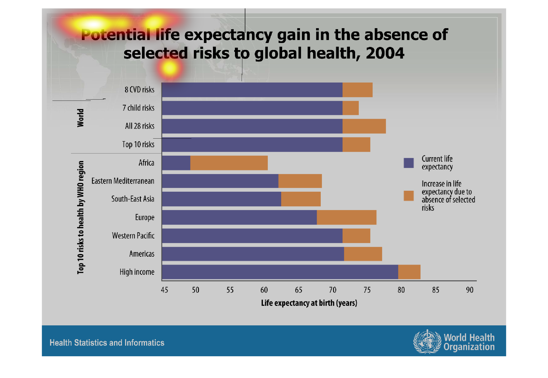
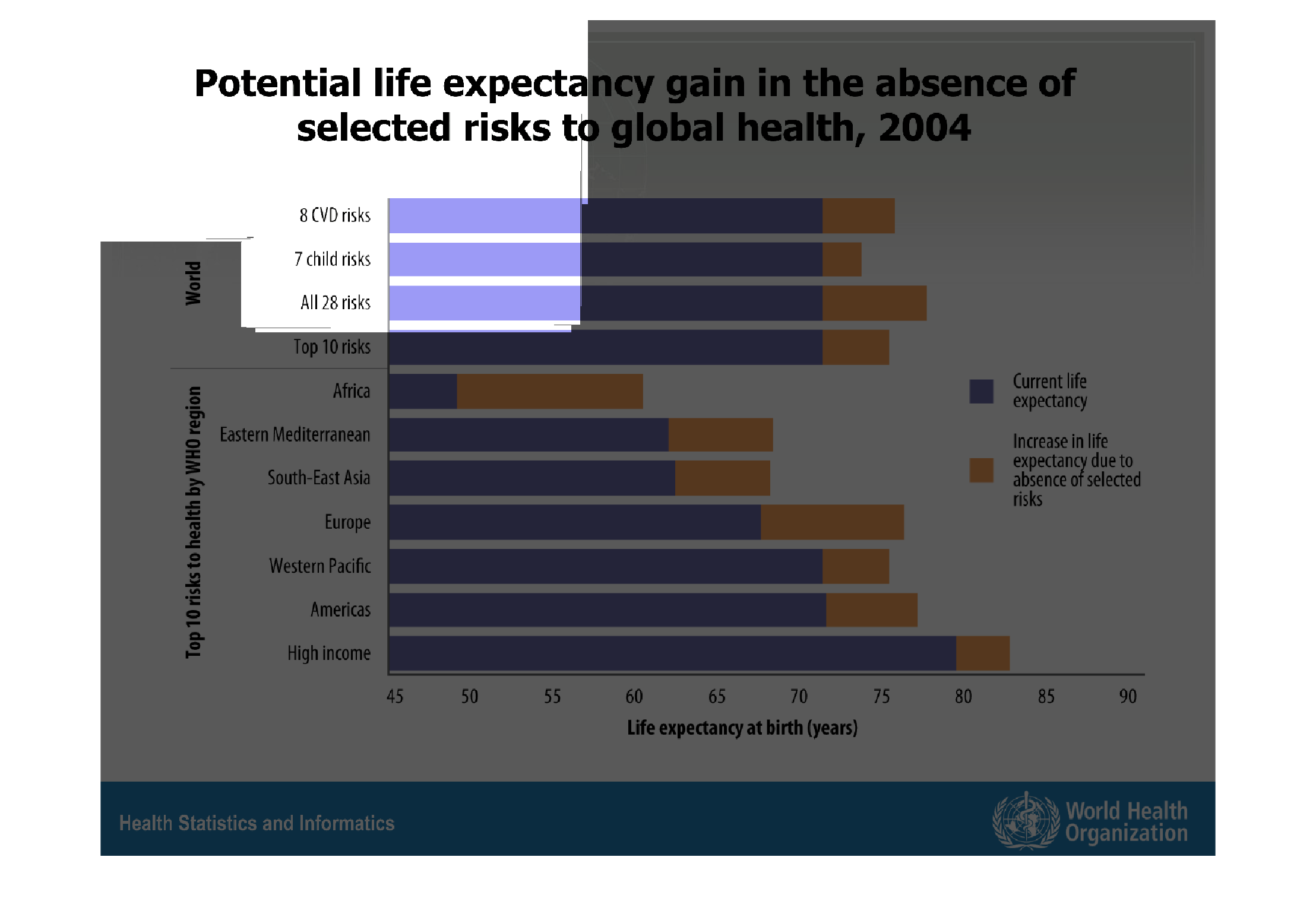
The chart shows current and potentially increased life expectancy (due to absence of selected
risks) by both world risks and the top ten risks to certain groups. The greatest growth in
life expectancy appears in Africa, growing a full decade. The least change appears in wealthy
individuals with a growth of only a few years.
Warning: Image is too big to fit on screen; displaying at 67%
Warning: Image is too big to fit on screen; displaying at 67%
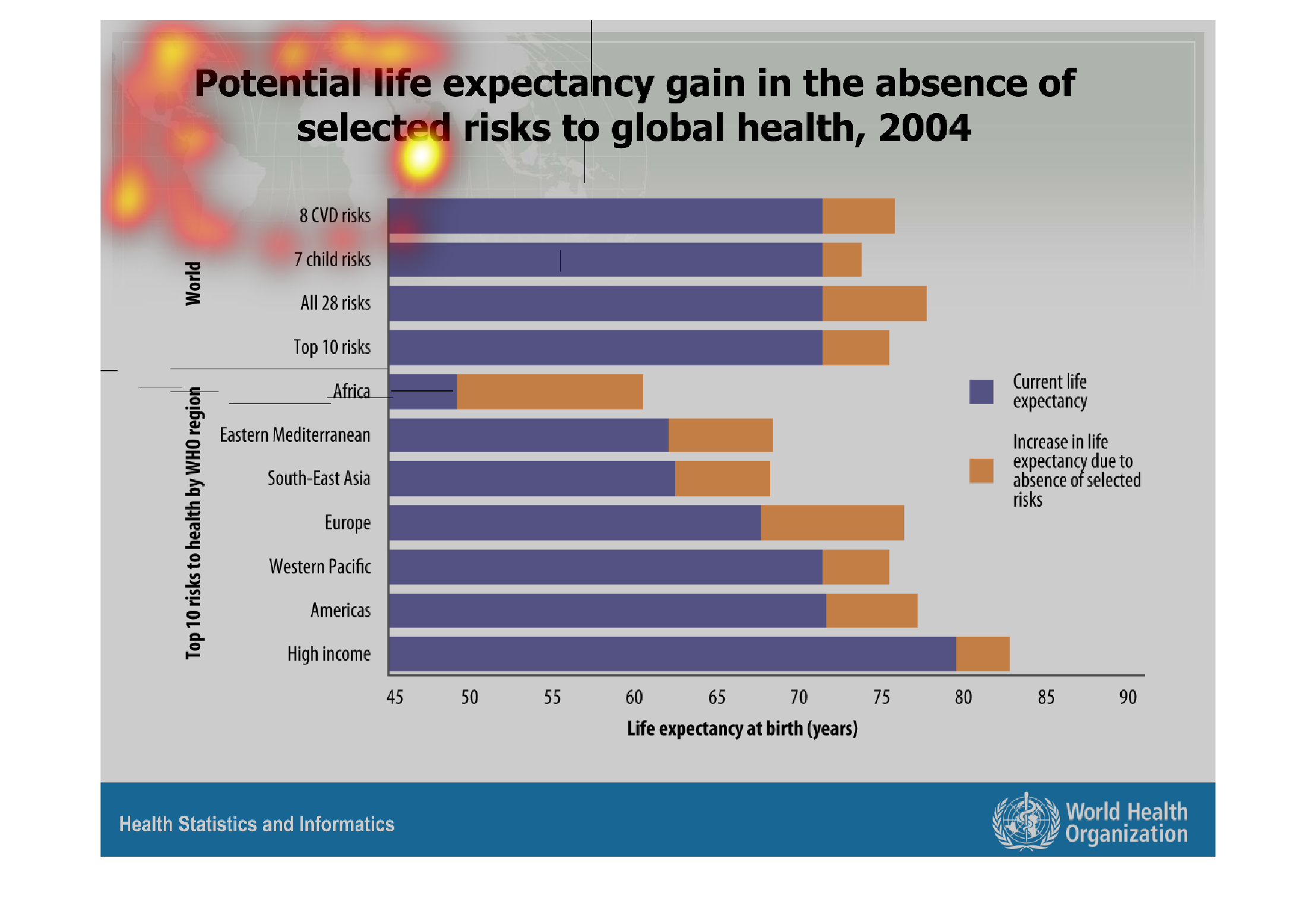
This image shows or depicts in statistical bar graph format potential life expectancy gain
in the absence of selected risks to global health for 2004.
Warning: Image is too big to fit on screen; displaying at 67%
Warning: Image is too big to fit on screen; displaying at 67%
This is a chart showing the potential life expectancy gain in the absence of selected risks
to global health. Africa shows the most dramatic increase in potential life expectancy.
Warning: Image is too big to fit on screen; displaying at 67%
Warning: Image is too big to fit on screen; displaying at 67%
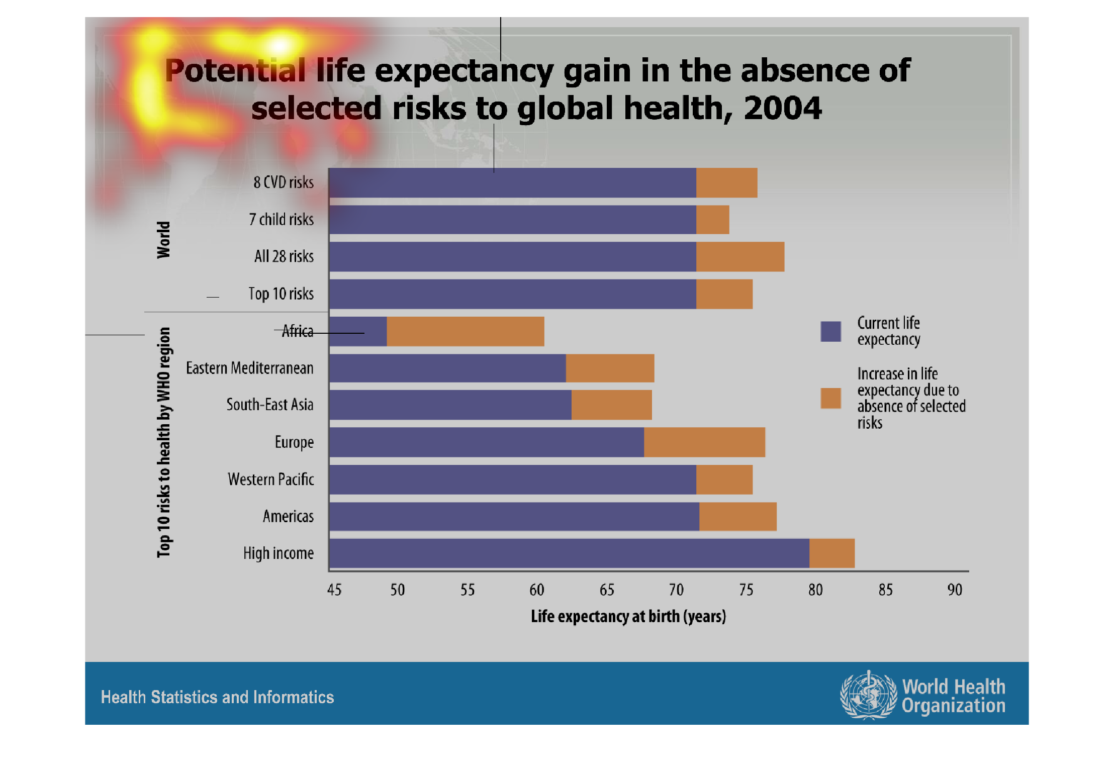
The image on the left hand side is to help people understand their life expectancy if they
give up bad habits.  They have it broken down by each continent and then have it also categorized
by how many bad habits an individual may have.  The least amount of bad habits the more the
individual will on average live longer.
Warning: Image is too big to fit on screen; displaying at 67%
Warning: Image is too big to fit on screen; displaying at 67%