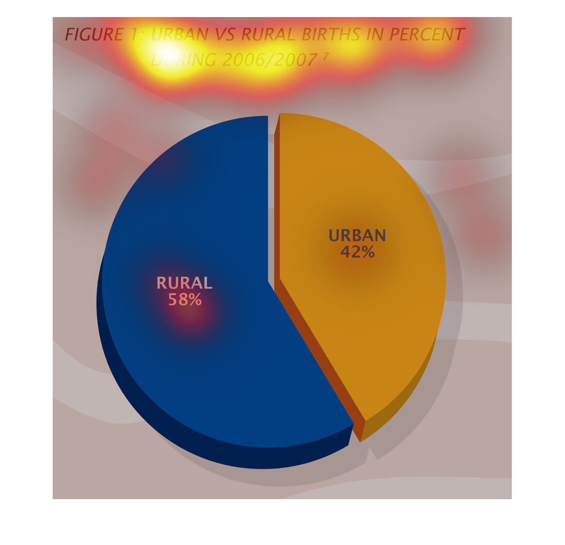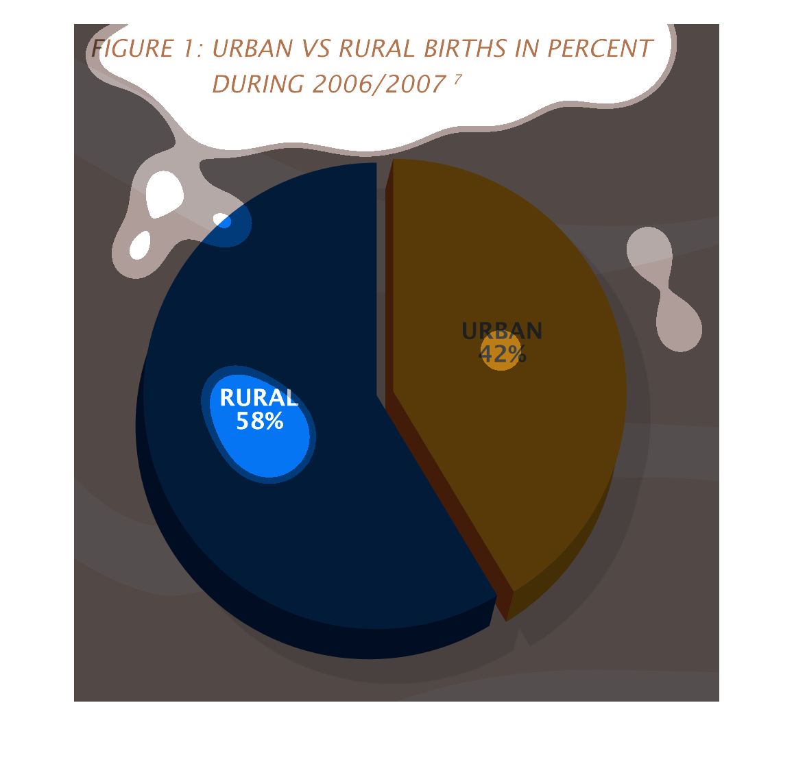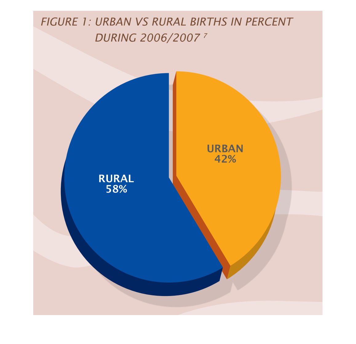
This pie chart shows the different in urban versus rural births, for 2006/7. Rural leads,
at 58%, while urban stands only at 42%. Rural is colored blue, while urban is yellow.
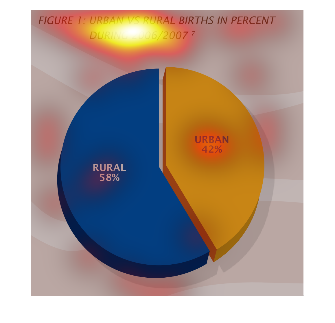
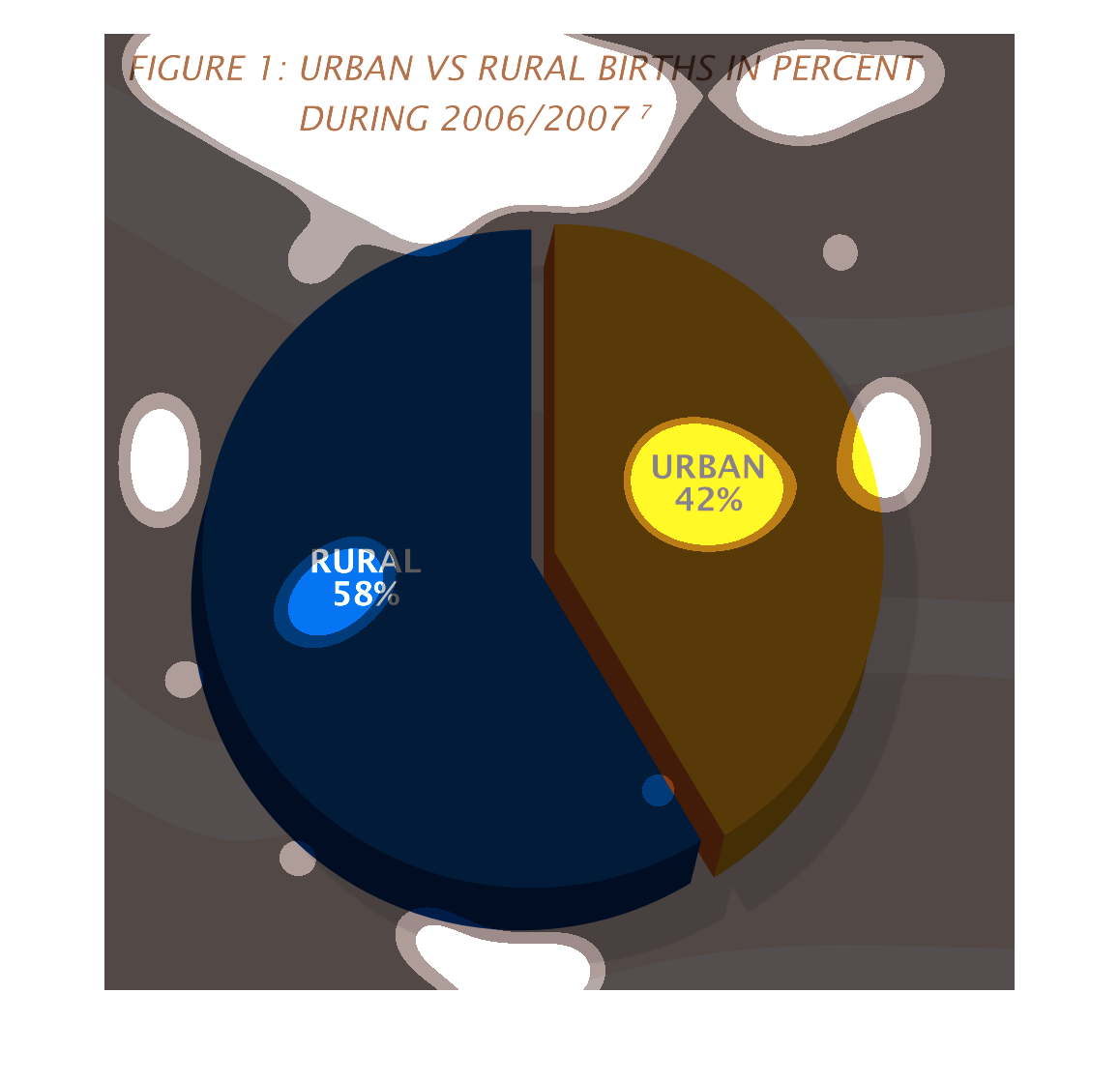
This chart describes urban versus rural births in percent during 2006/2007. Different categories
on the chart are represented by different colors. With blue for rural.
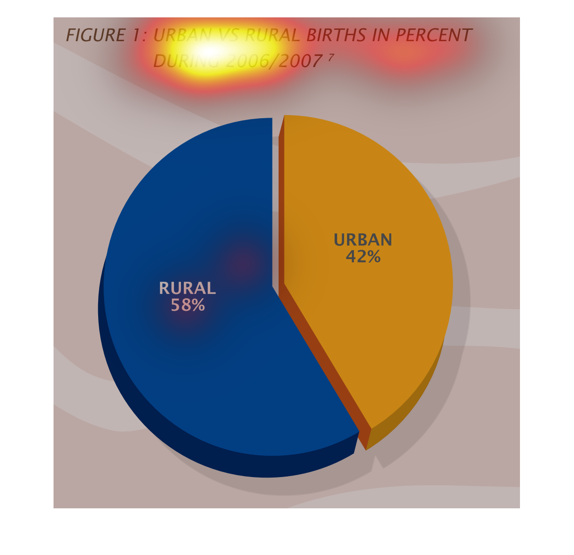
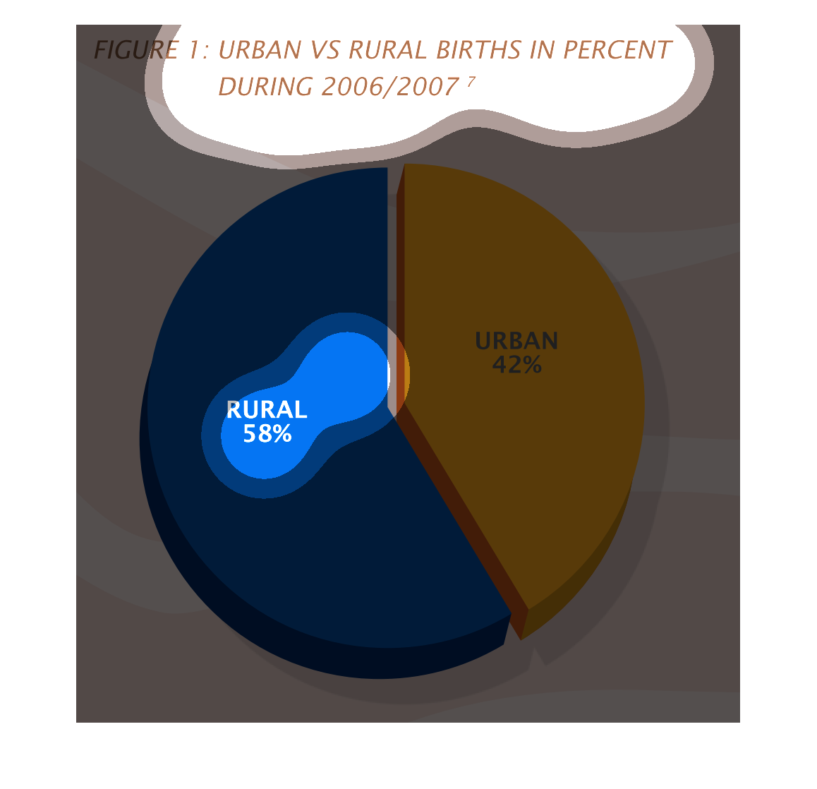
The figure presented is titled figure 1: urban vs. rural births in percent during 2006/2007.
 The figure is a representation of urban vs rural births in 2006/2007.
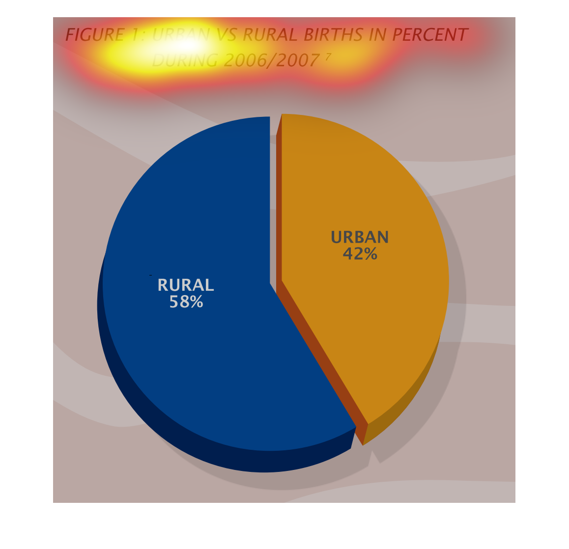
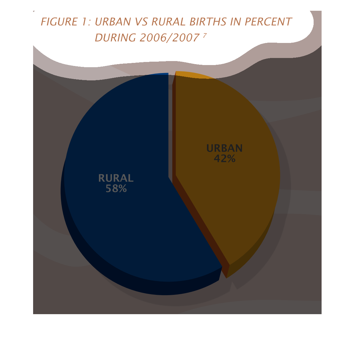
The graph describes the percentages of births separated by rural and urban conditions in the
calendar years from 2006 and 2007. More births were recorded in rural areas than in urban
areas.
This chart compares urban and rural birth rates. Births in rural areas accounted for 58% of
total births in 2006/2007. Births in Urban areas were 42% of the total in that same time period.
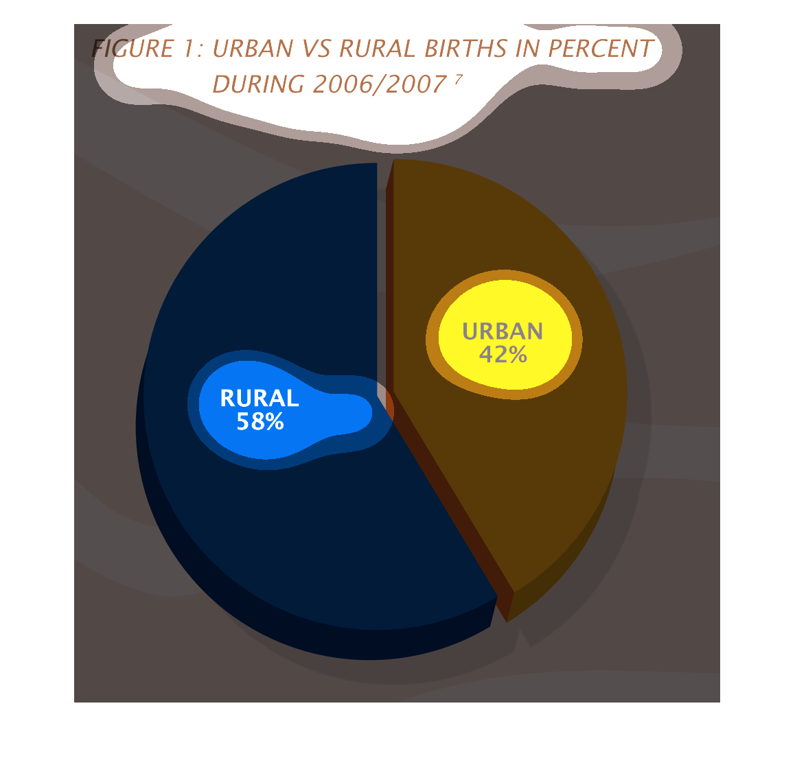
The 2006/2007 of birth rate is made up of 42% urban and 58% rural area. This total of whole
is equal to 100% of the births that occurred during this time.
This is a graph that shows the number of urban versus rural births. It shows this figure in
form of a percentage and it covers the year 2006 and 2007.
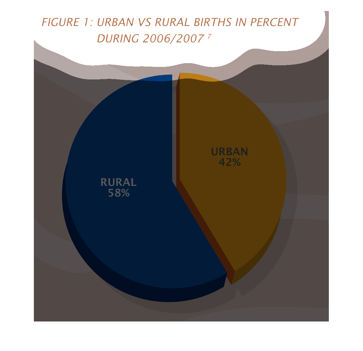
This graph depicts the percentage of births occurring in urban vs. rural settings during 2006
to 2007.  58% of births occurred in rural settings, with 42% in urban.
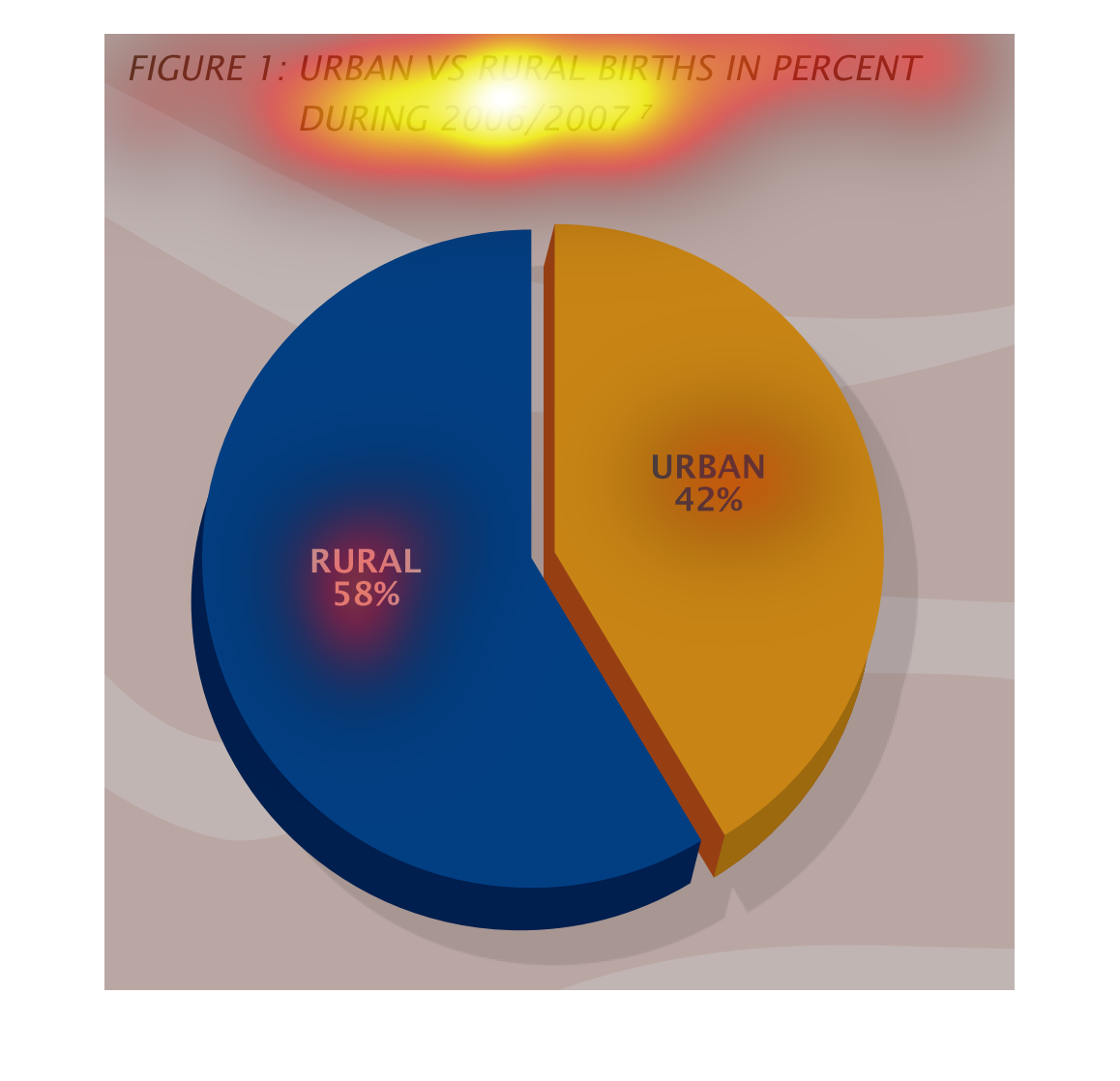
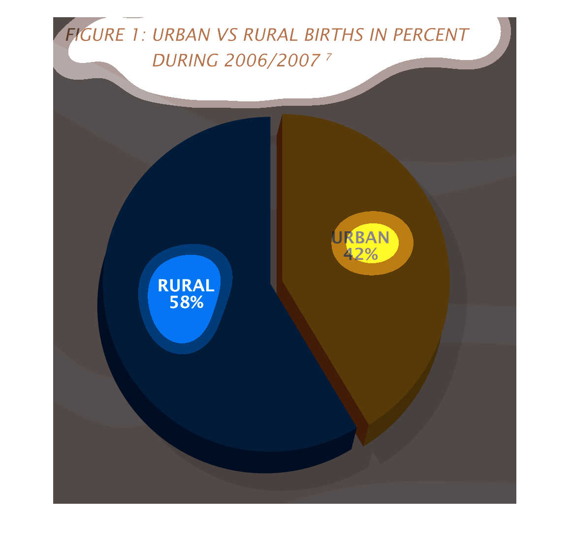
This chart describes urban versus rural births in percent during 2006/2007. The biggest percentage
of the chart is Rural with fifty-eight percent, and colored blue.
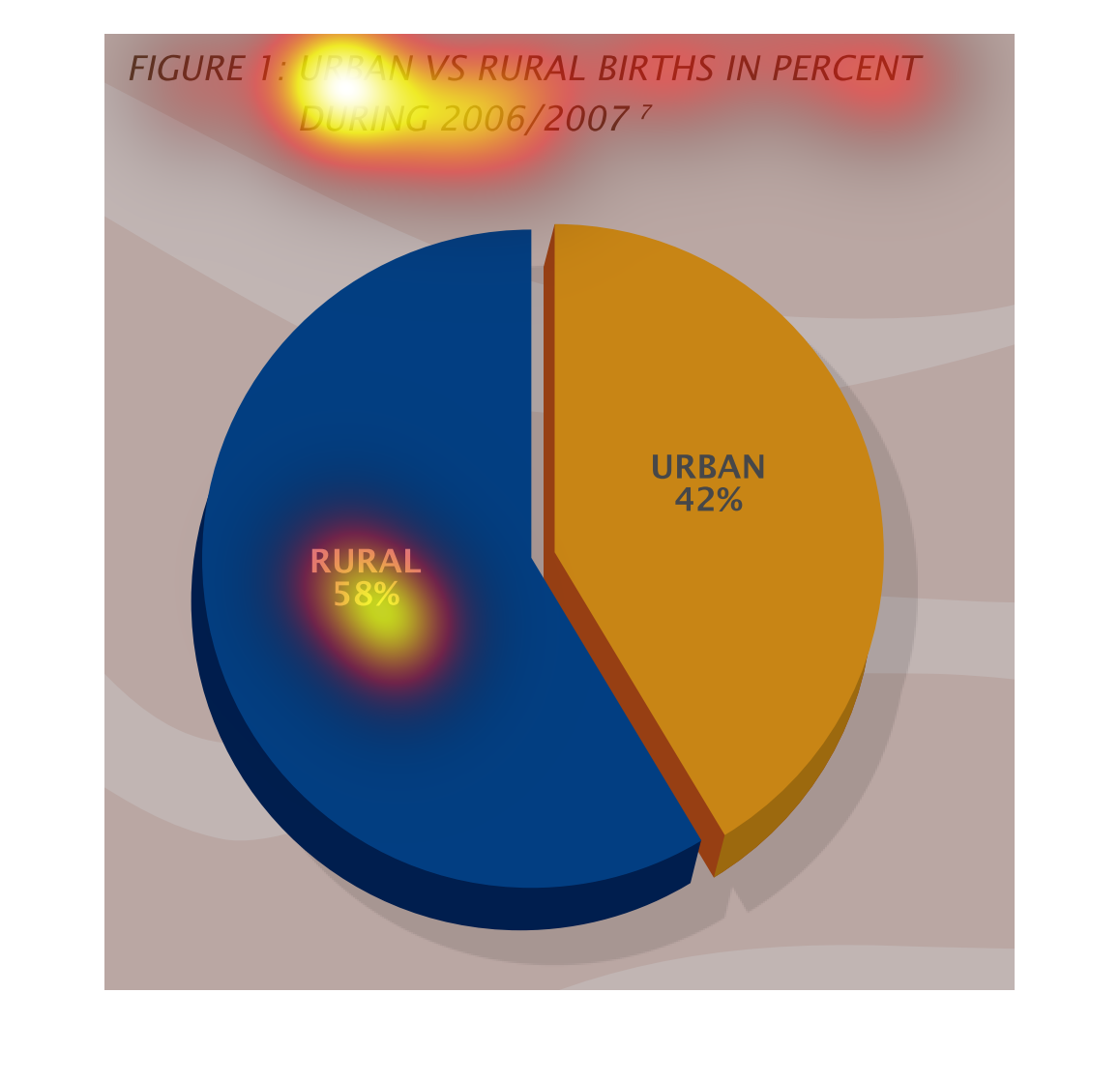
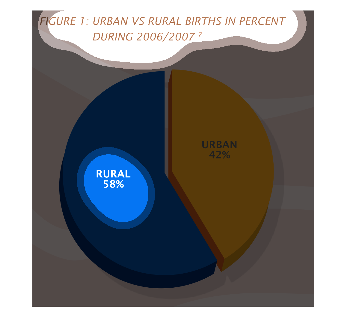
This handmade chart shows the split between births in urban versus suburban/rural settings.
It shows how urban is more dominant than the other group.
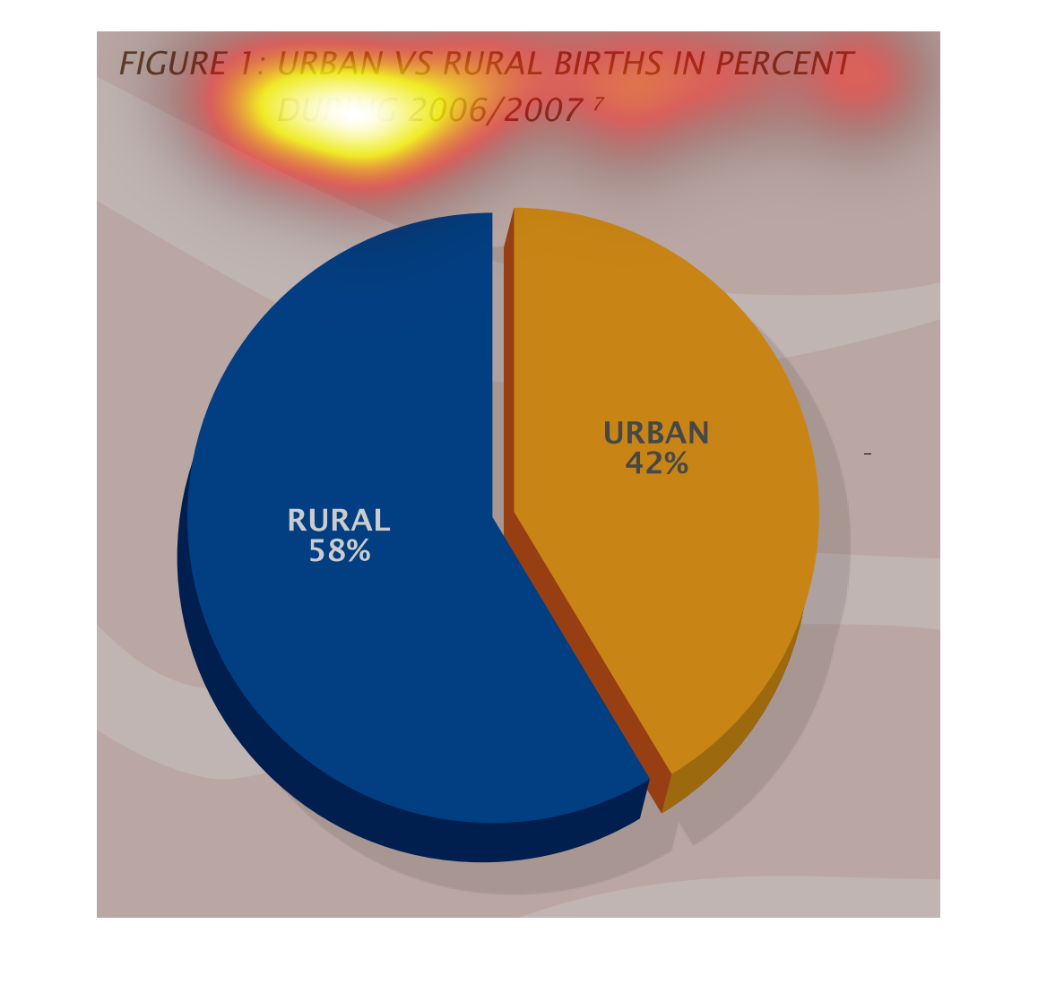
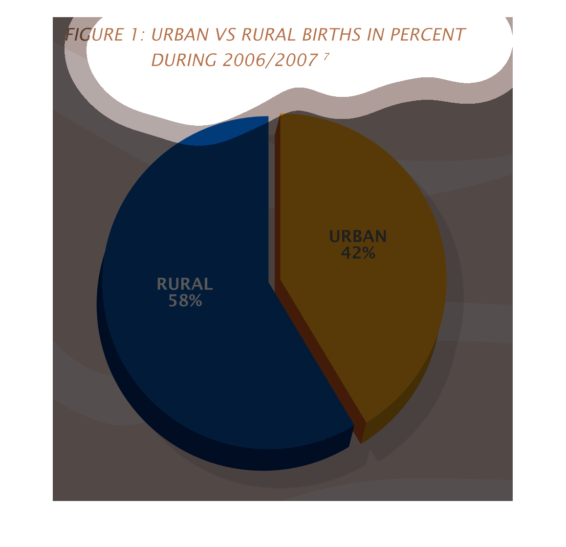
Urban versus rural births as a pie graph for the years of 2006 and 2007. During these years
the percentage of rural births was 58 and the percentage of urban births was 42 percent.
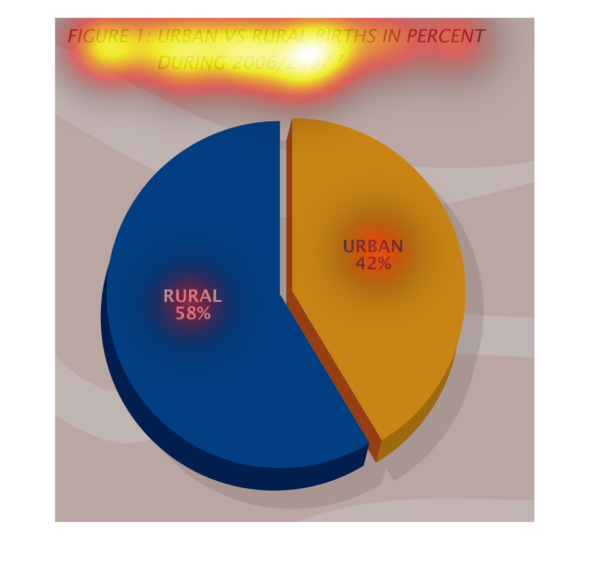
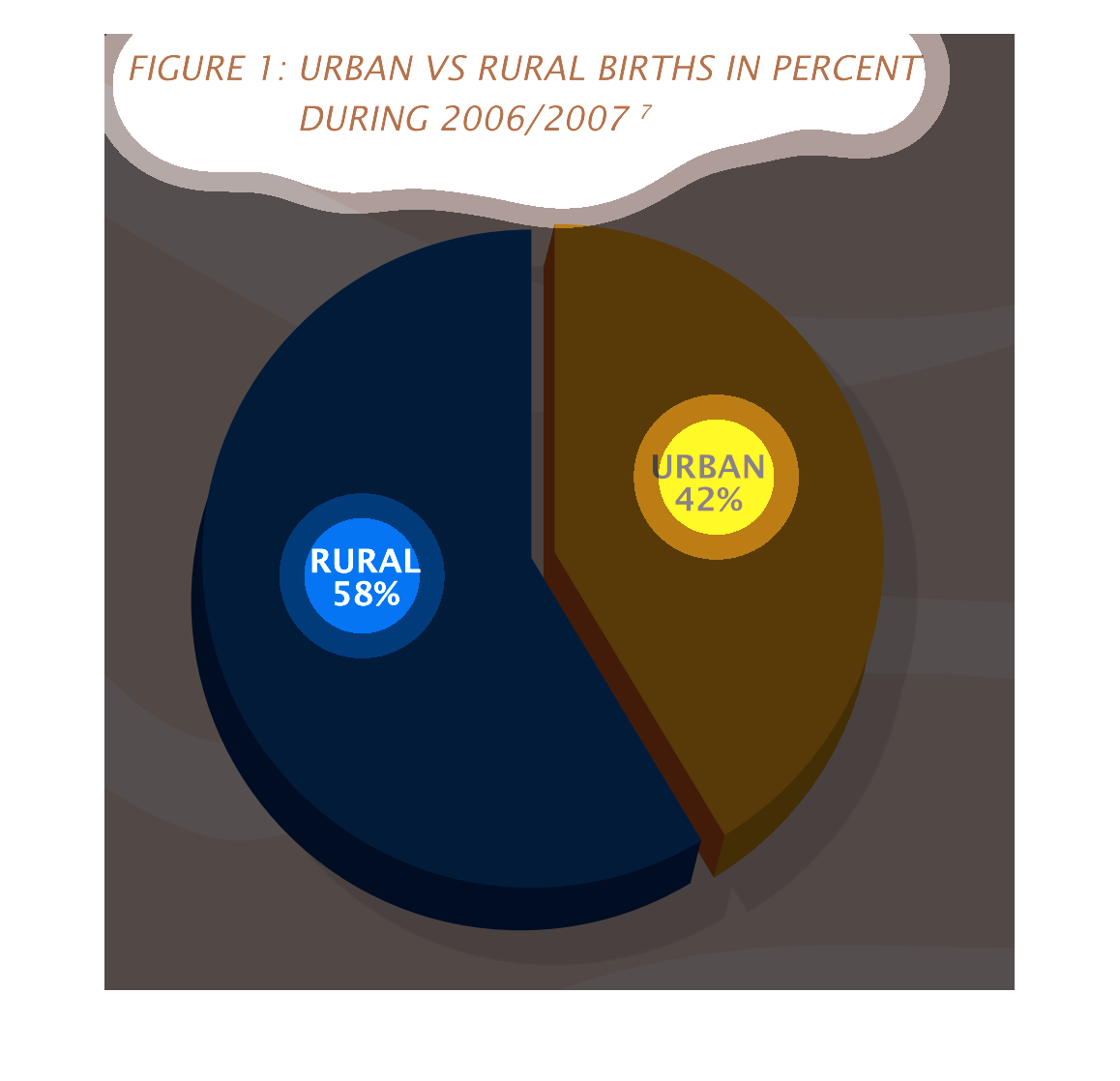
This is a circle chart of urban vs rural births in the years of 2006 and 2007 in terms of
percent. The chart is split between 42% rural and 58% urban.