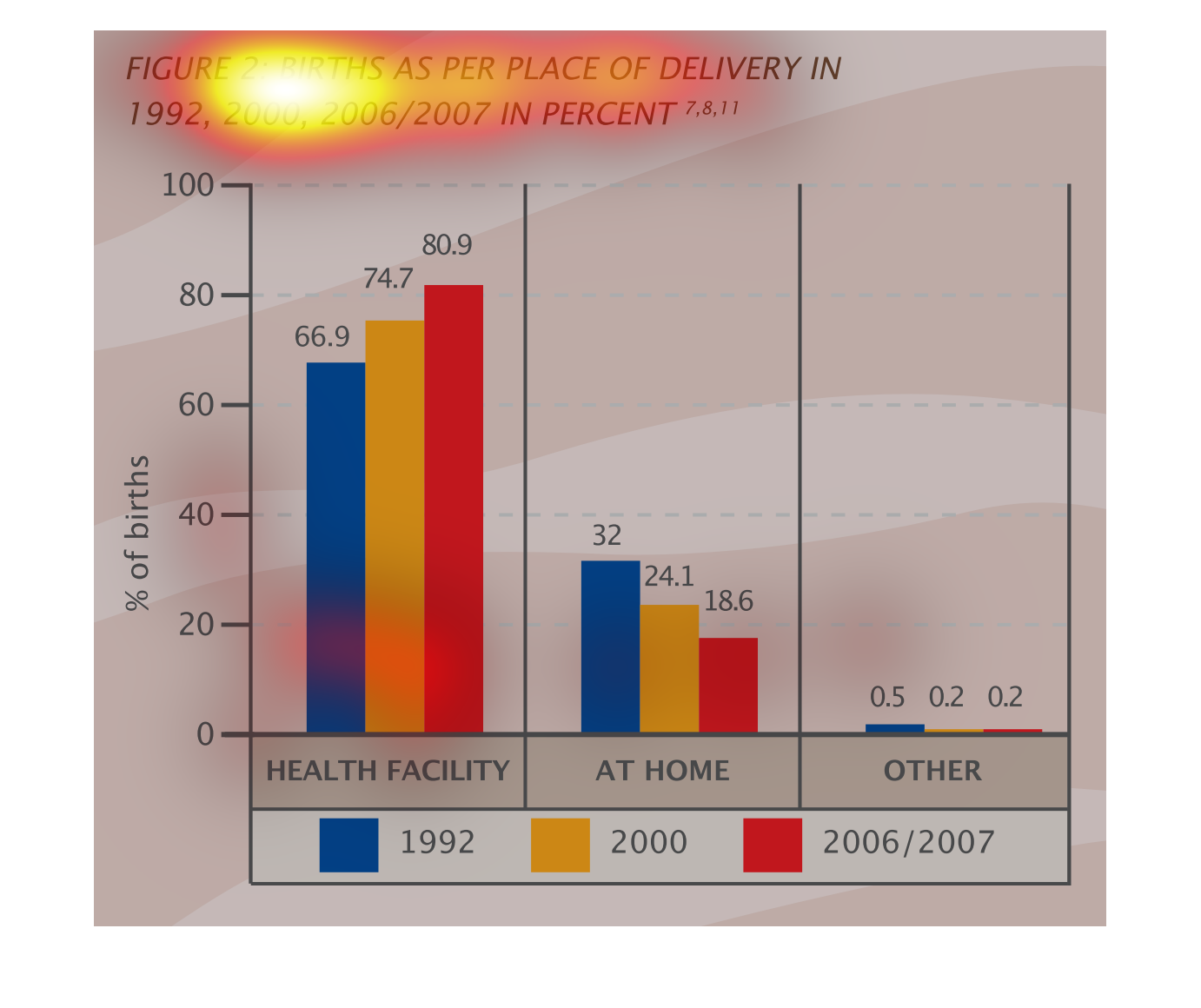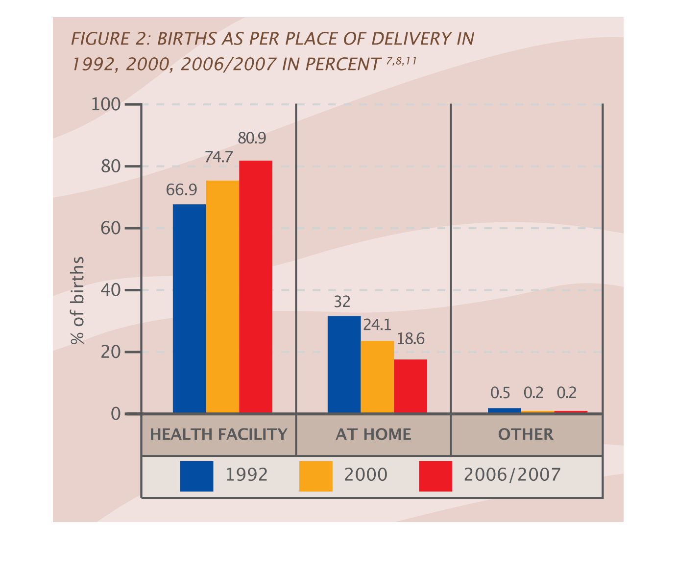
These graphs show births as per place of delivery, in 1992, 2000, and 2006/7. The categories
are health facitilies, at home, and other, and the bars are color coded to denote different
years.
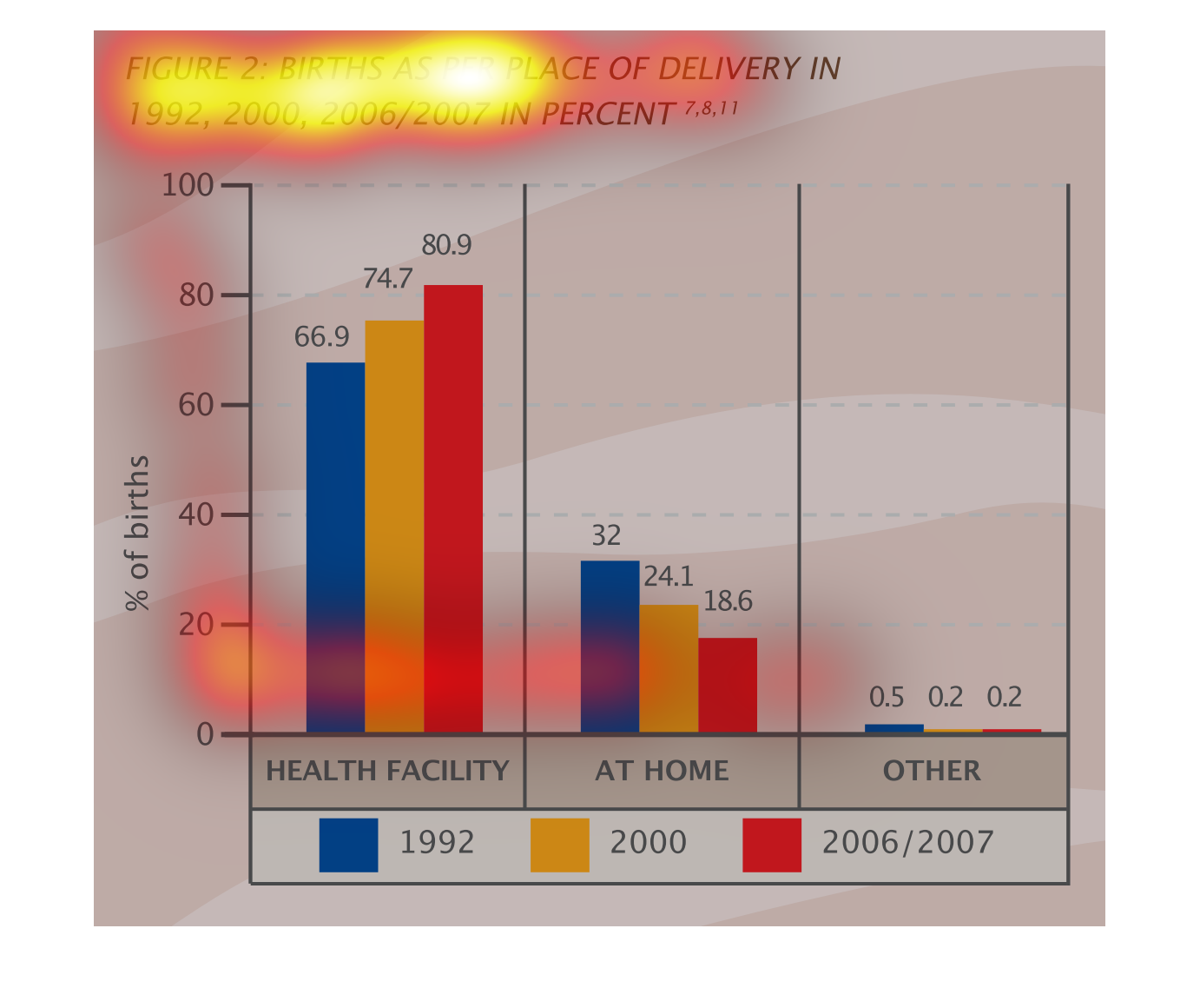
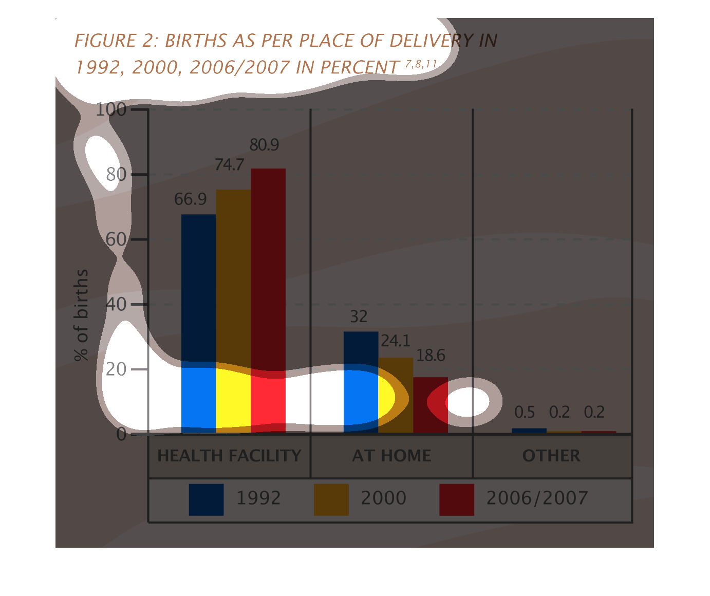
The figure is a bar chart showing the percent of births in three different locations (health
facility, home, or other) and three different times (1992, 2000, 2006-7). A large and growing
majority of births were at health facilities.
A line chart about places of birth in 1992, 2000, 2006/2007 whether in medical facility, at
home or elsewhere. In 1992 there about 67% of births in a medical facility, this was 74.7%
in 200 and 801% in 2006/2007. Of the remaining births in those years, the majority were at
home with only a very small percentage being "elsewhere"
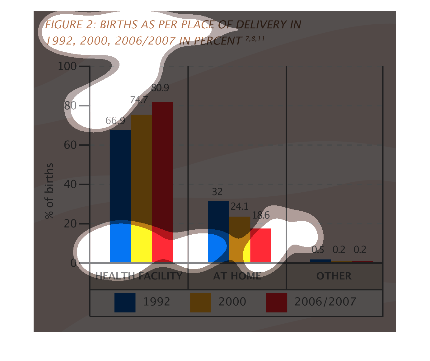
This is a series of color coded bar graphs depicting births as per place of delivery in 1992,
2000 and 2006/2007 by percentage. Split between in a health facility, at home and all others.
The image on the left hand side is displaying where births have taken place over three specific
time period.  From the data collected, Births taken in a health facility have increased over
the years.  However, births from home have decreased since the study first began in 1992.
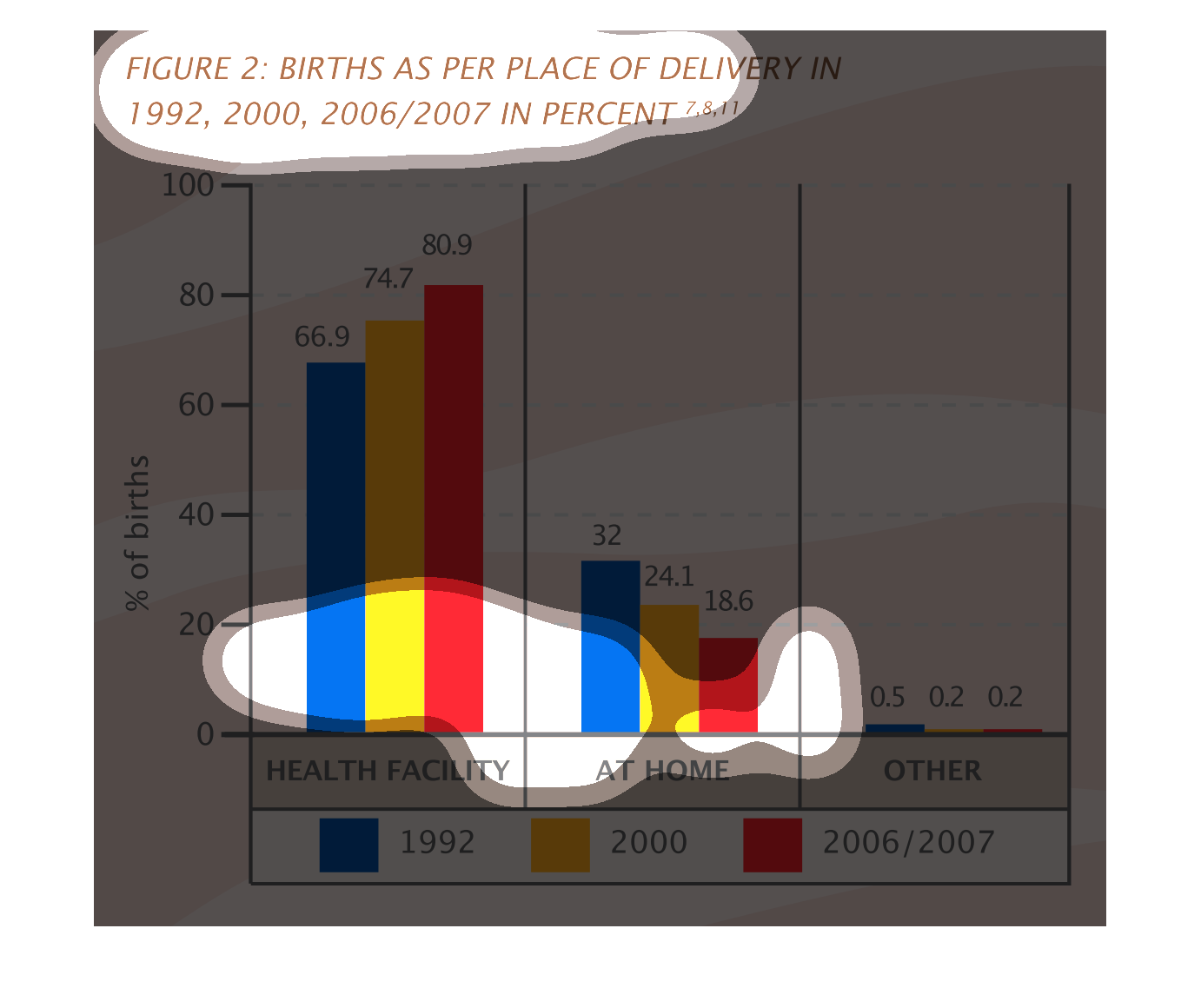
This chart shows the percentage of births as per place of delivery, from 1997 to 2007. Where
in the years of 2006 and 2007 had the most births at a health facility.
This is a bar chart of birth as per place of delivery in 1992, 2000, 2006/2007 in percent.
The majority is at health facility, with an increasing trend. Much fewer are at home, and
that is in a decrease. Other is negligibly small throughout.
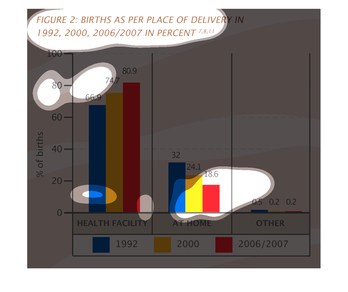
This graph shows the percentage of births in particular places during three different years.
Most births occur in some sort of health facility, followed by home births then other. As
time progresses, more health facility births have been occurring.
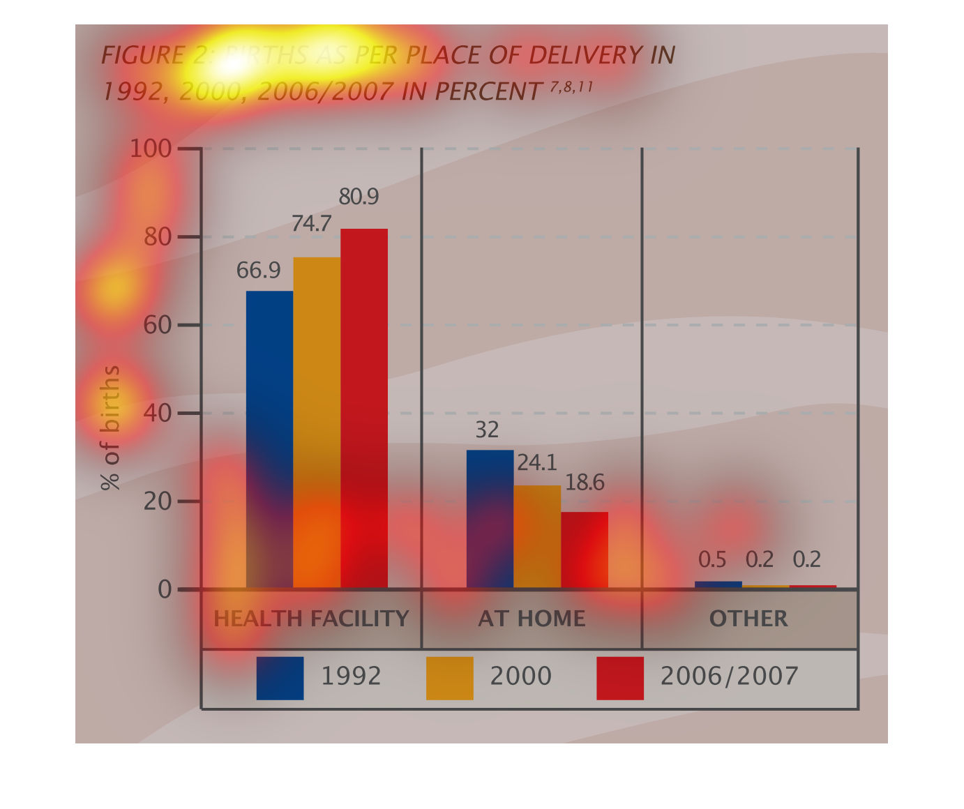
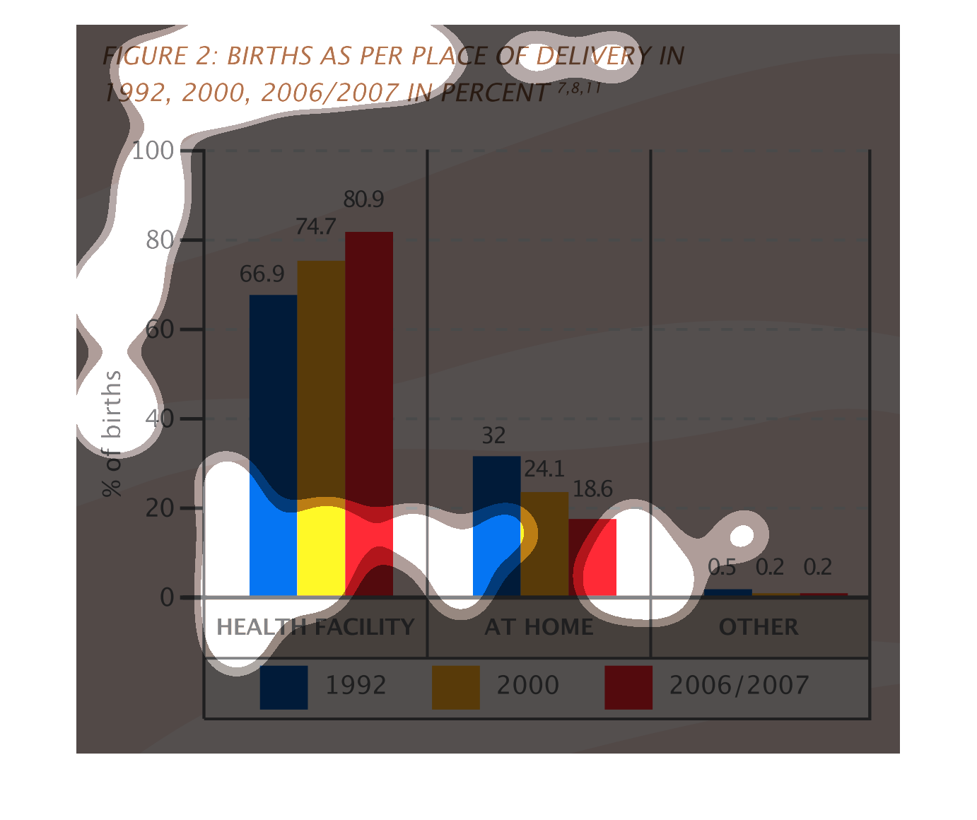
This chart shows the number of births by place. It compares the number of births in hospitals,
at home and a small percentage of other places. We can see see how different families choose
different things.
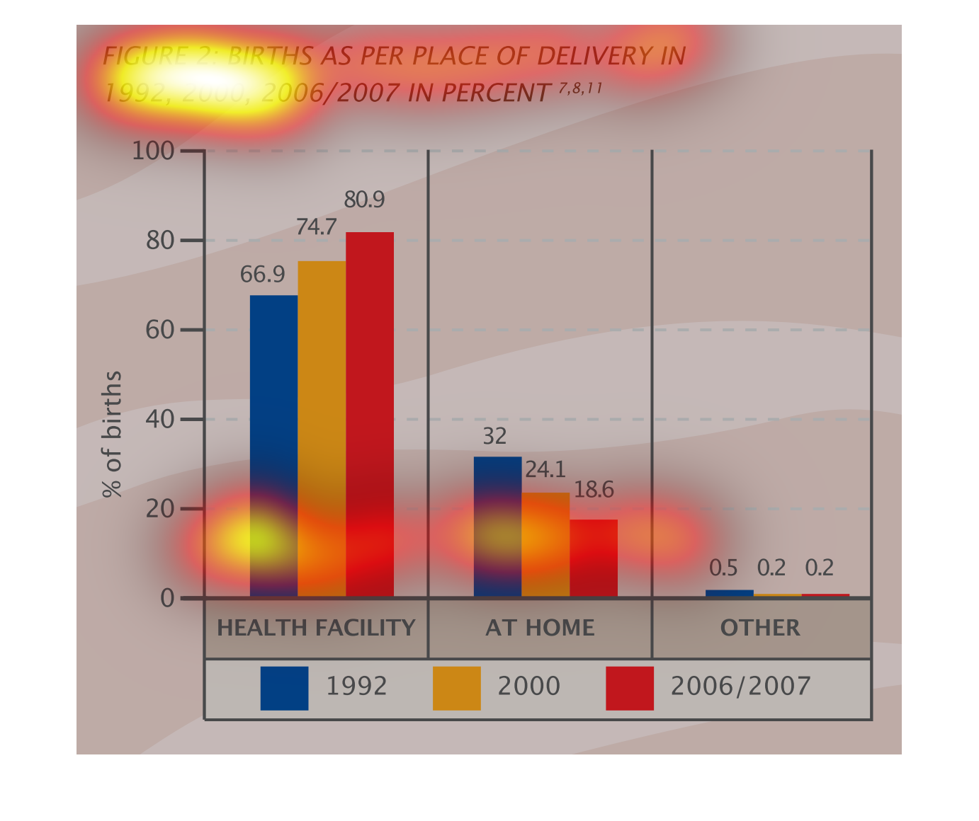
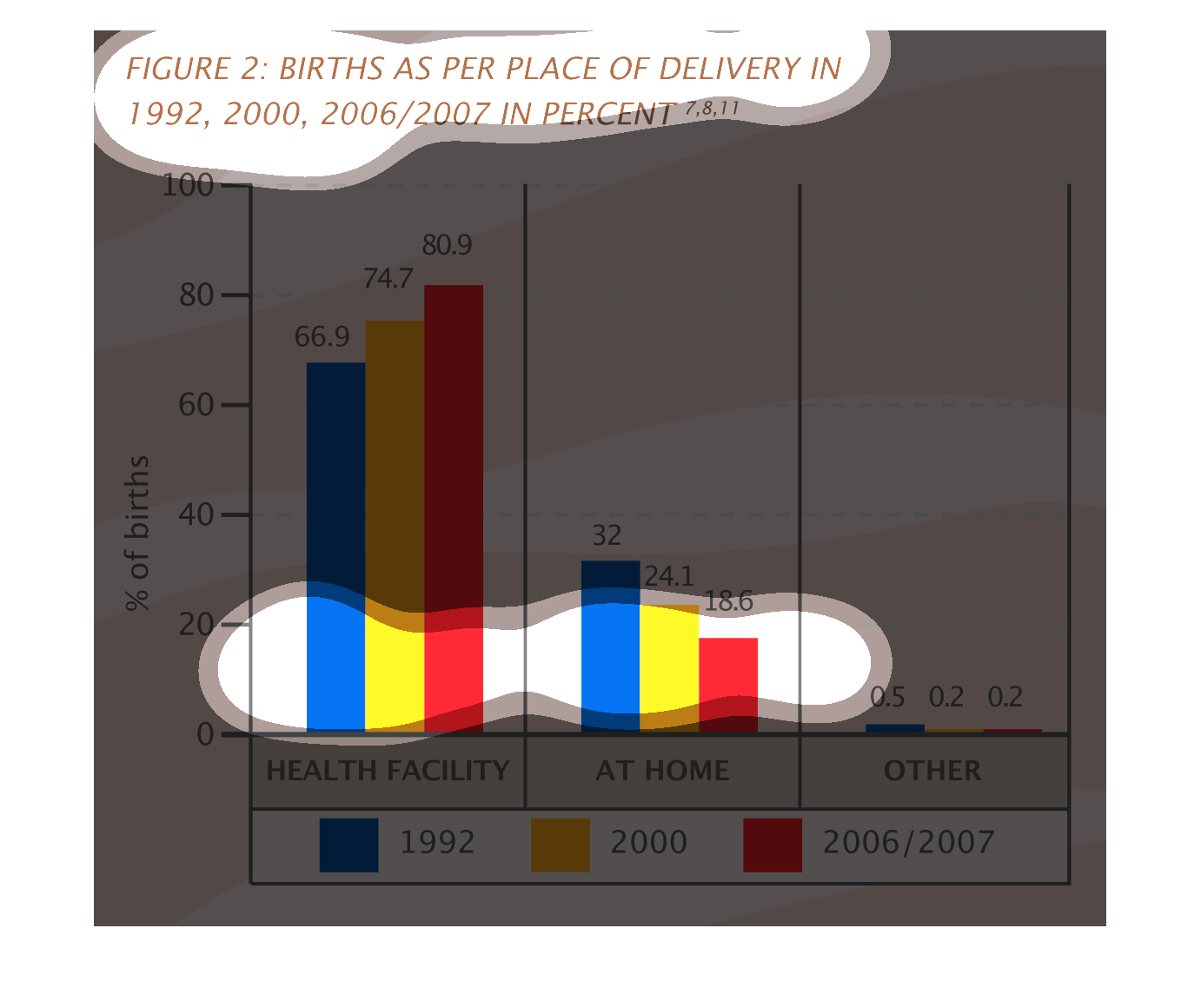
Figure 2 shows births as per place of delivery in 1992, 2000, 2006/2007 in percent. This bar
graph shows an overwhelming majority of births for all of these years had been in healthcare
facilities.
This charts is births as per place of delivery 1992, 2000, 2006/2007 in percent. Places include
health facility, at home or other. In 2006/2007 more births took place in health facilities.
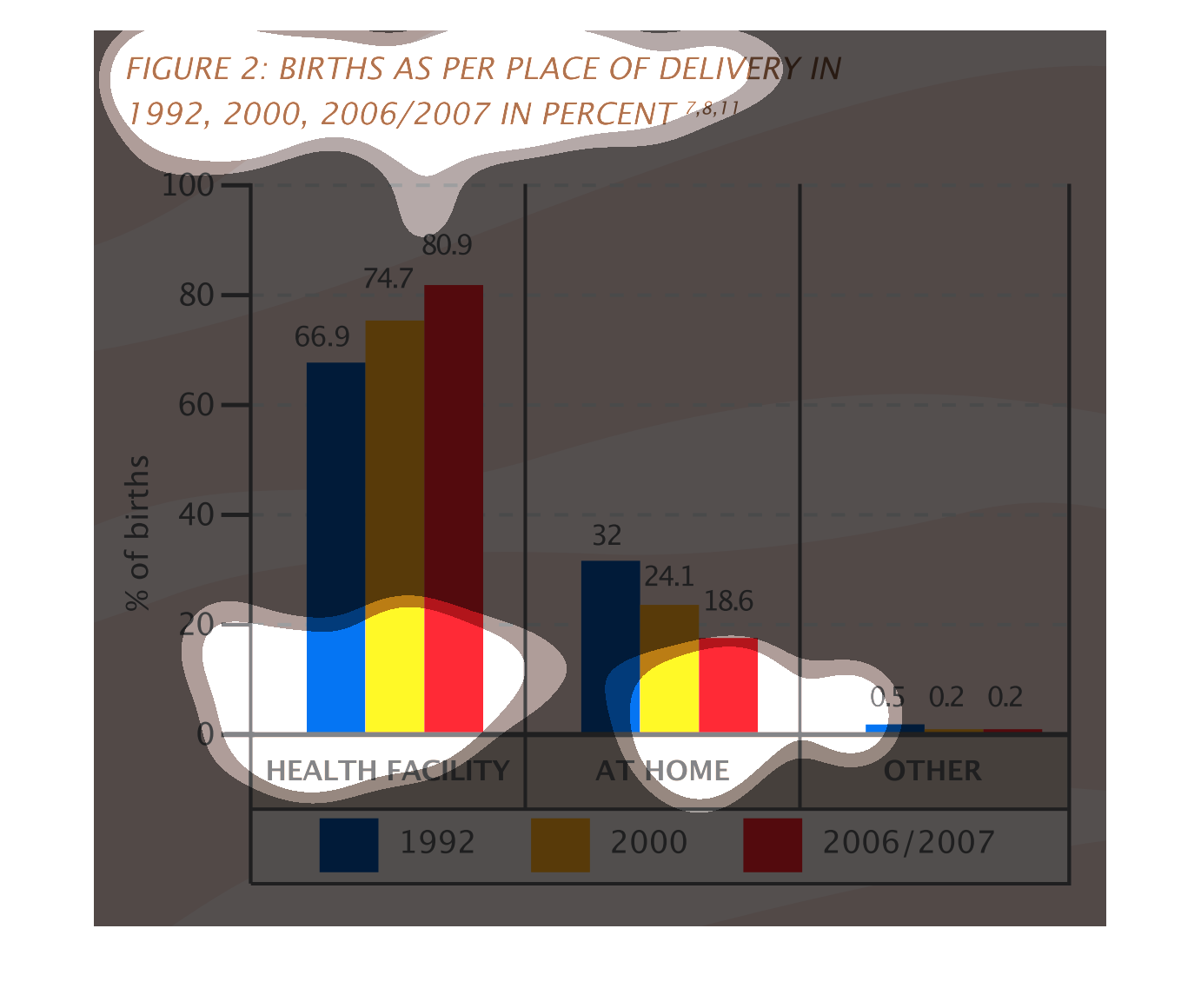
This graph shows births as in place of delivery in 1992, 2000, 2006/2007 in percent. The places
include health facility, home and other. The largest number of births at a health facility
occurred in 2006/2007 at 80.9%.
This chart describes births as per place of delivery in in the years 1992, 2000, 2006/2007
in percent. Different years on the chart are represented by different colors.
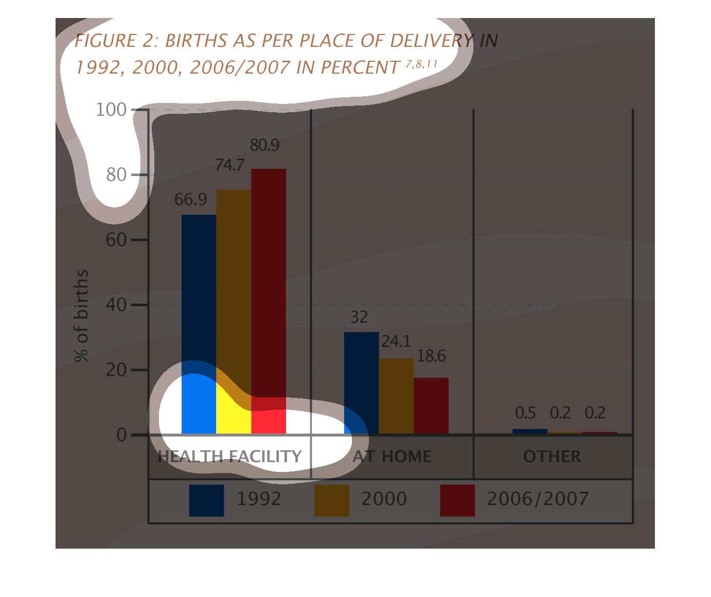
This graph represents births as per place of delivery in the years 1992, 2000 and 2006/2007.
  It is separated by births taking place in health facility and those taking place at home.
This handmade chart shows the number of births in health centers, home and other places over
time. Other than that, it looks like health centers are the most common