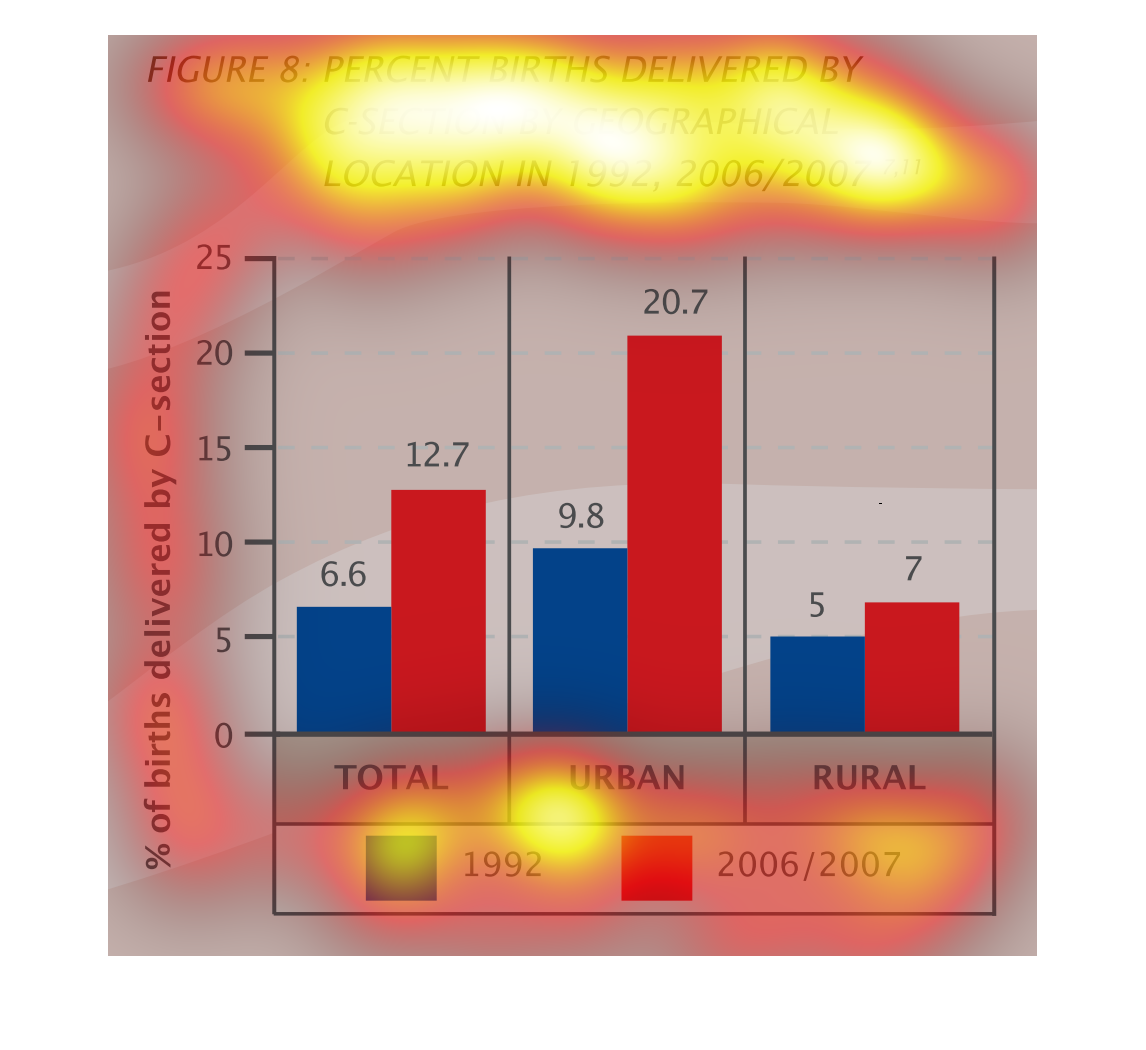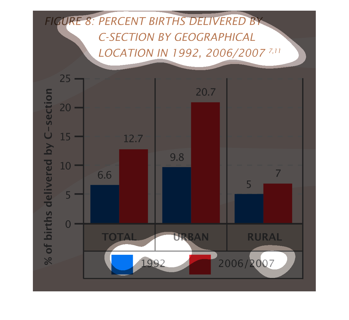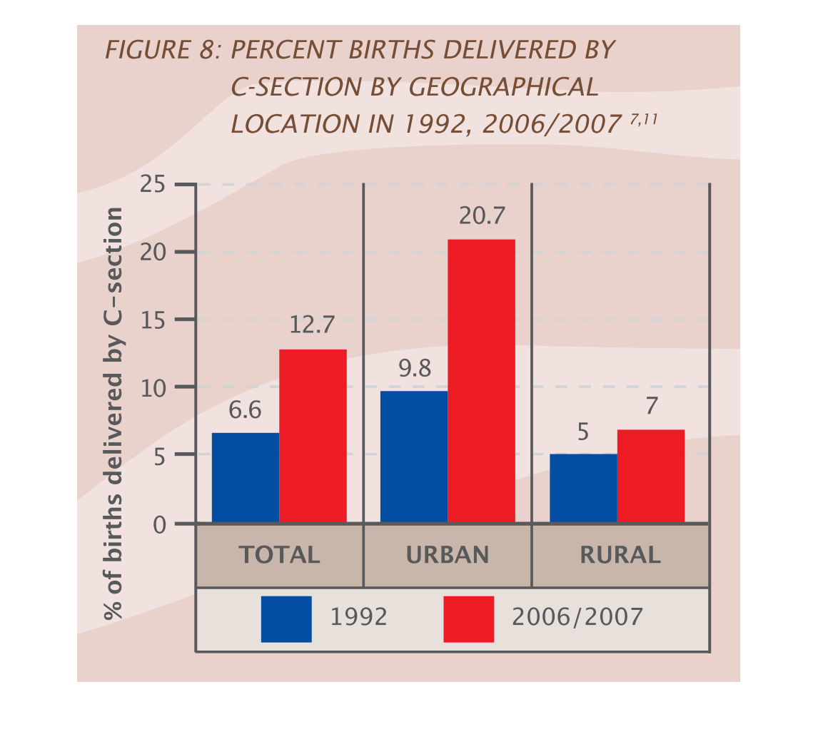
Figure 8 describes the percent of births by C-section by geographical areas in 1992 and 2006/2007.
The percents are the highest in urban areas in both sets of years, however 2006-2007 percents
are by far the highest.
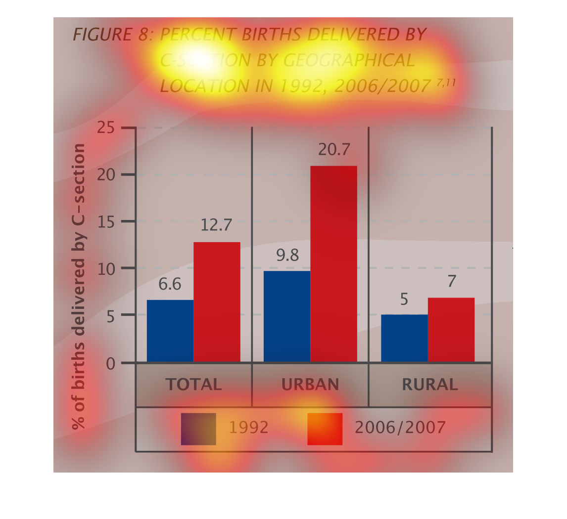
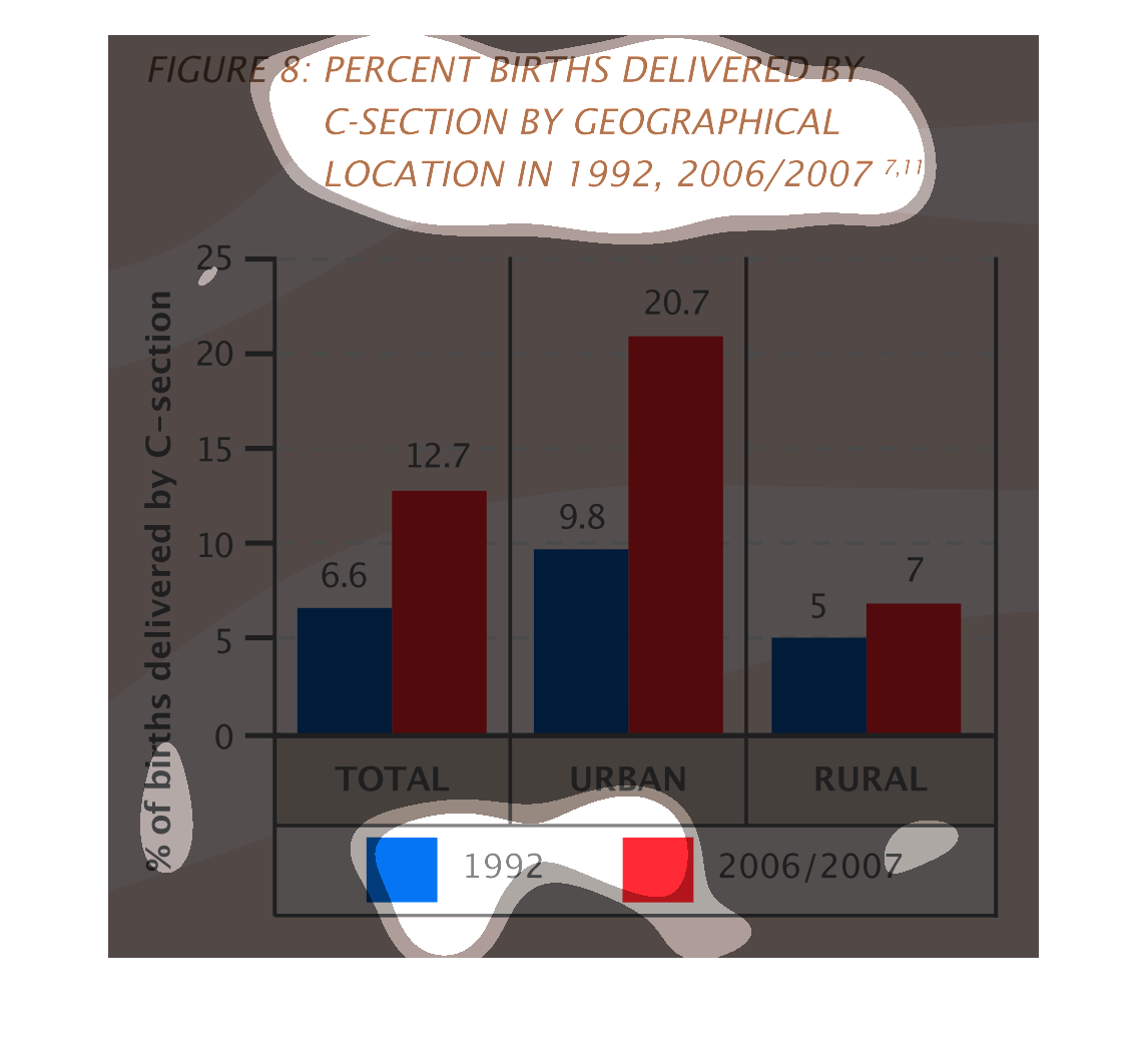
Graph shows percentage of c-section births delivered in 1992 and 2006 through 2007. The urban
areas have shown the most c-section births compared to rural areas.
This handmade chart shows the use of caesarian sections by urban and suburban populations
between 1990s and 2000's and it shows urban has grown signifcantly
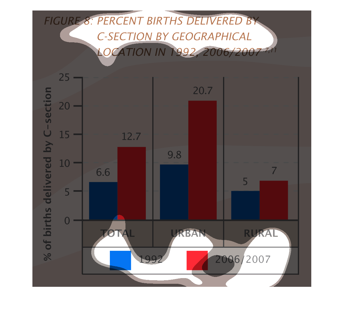
This graph depicts the percentage of births delivered by C-section by geographical location
comparing rates in 1992, 2006/2007. Overall C-section rates have increased in both urban and
rural areas.
This graph demonstrates the level of c-section births in urban areas compared to rural areas
in two different time periods. In all time periods, c-sections were roughly double in urban
areas than in rural and c-sections in all regions have also roughly doubled from 1992 to 2006/07
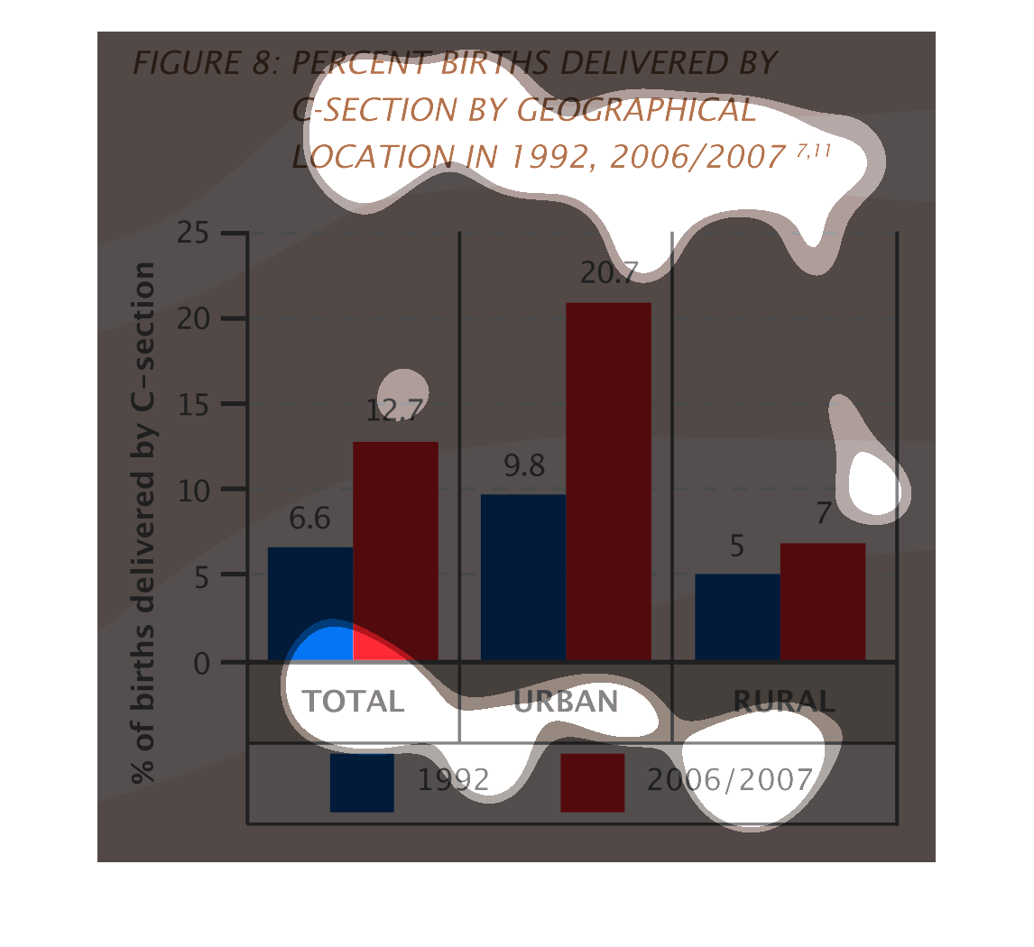
This bar graph shows percent births delivered by C-section by geographical location in 1992,
2006/2007. It compares urban to rural areas. There were a lot more C-sections performed in
urban areas.
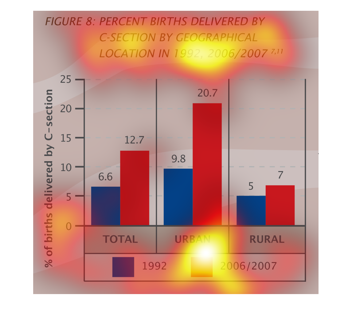
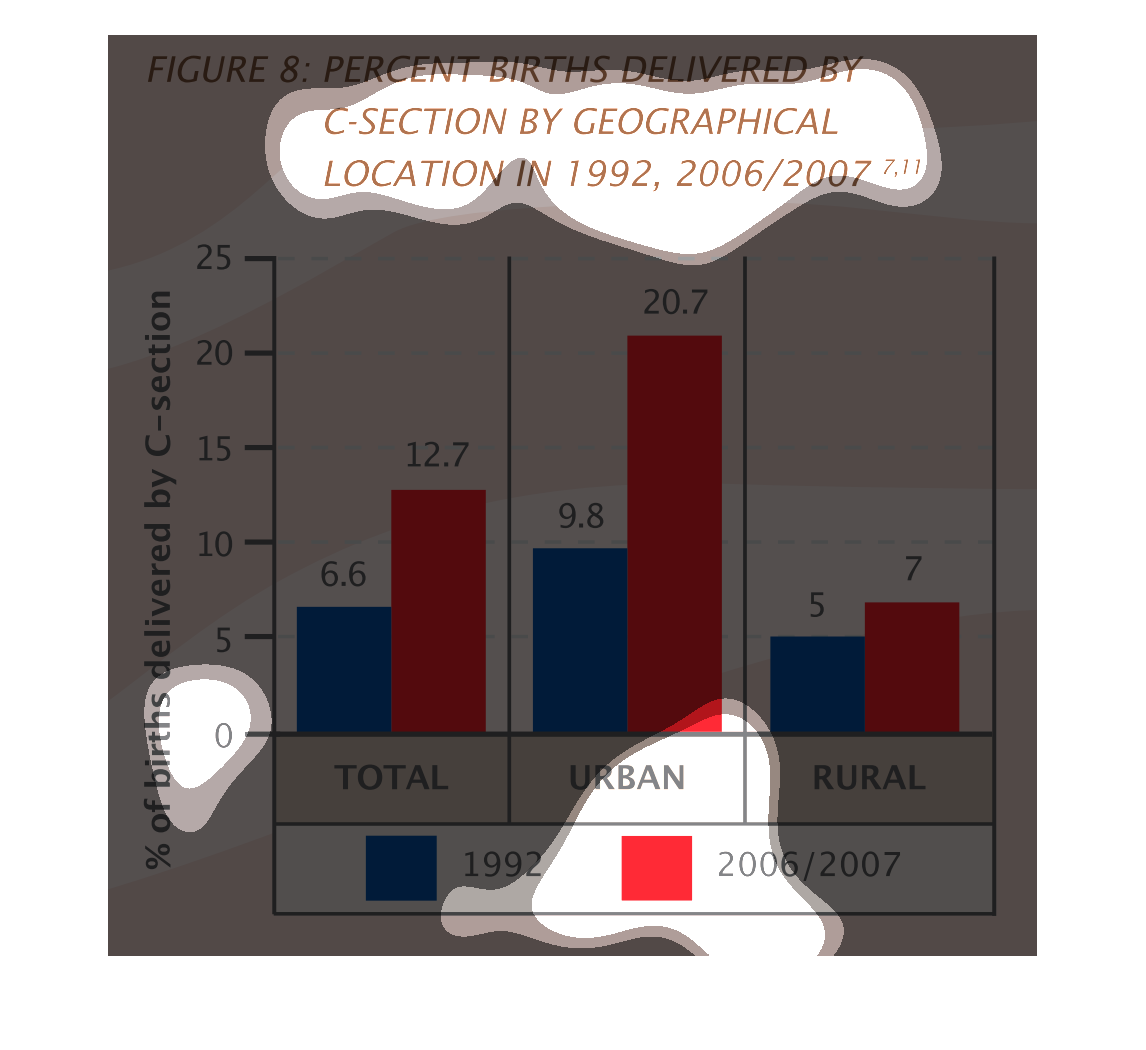
This is a graph of the percentage of births delivered by C-Section by geographical location.
The data shows that C-Sections are most common in urban areas, and are least common in rural
areas.
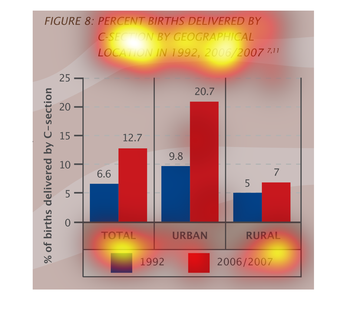
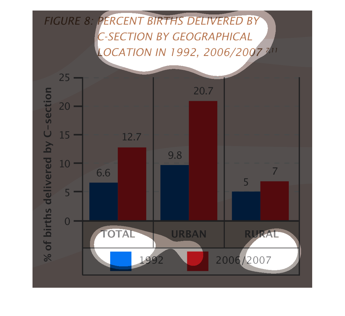
The figure presented is titled Percent births delivered by c-section by geographical location
in 1992, 2006, 2007.  The data represents percentages of c-sections.
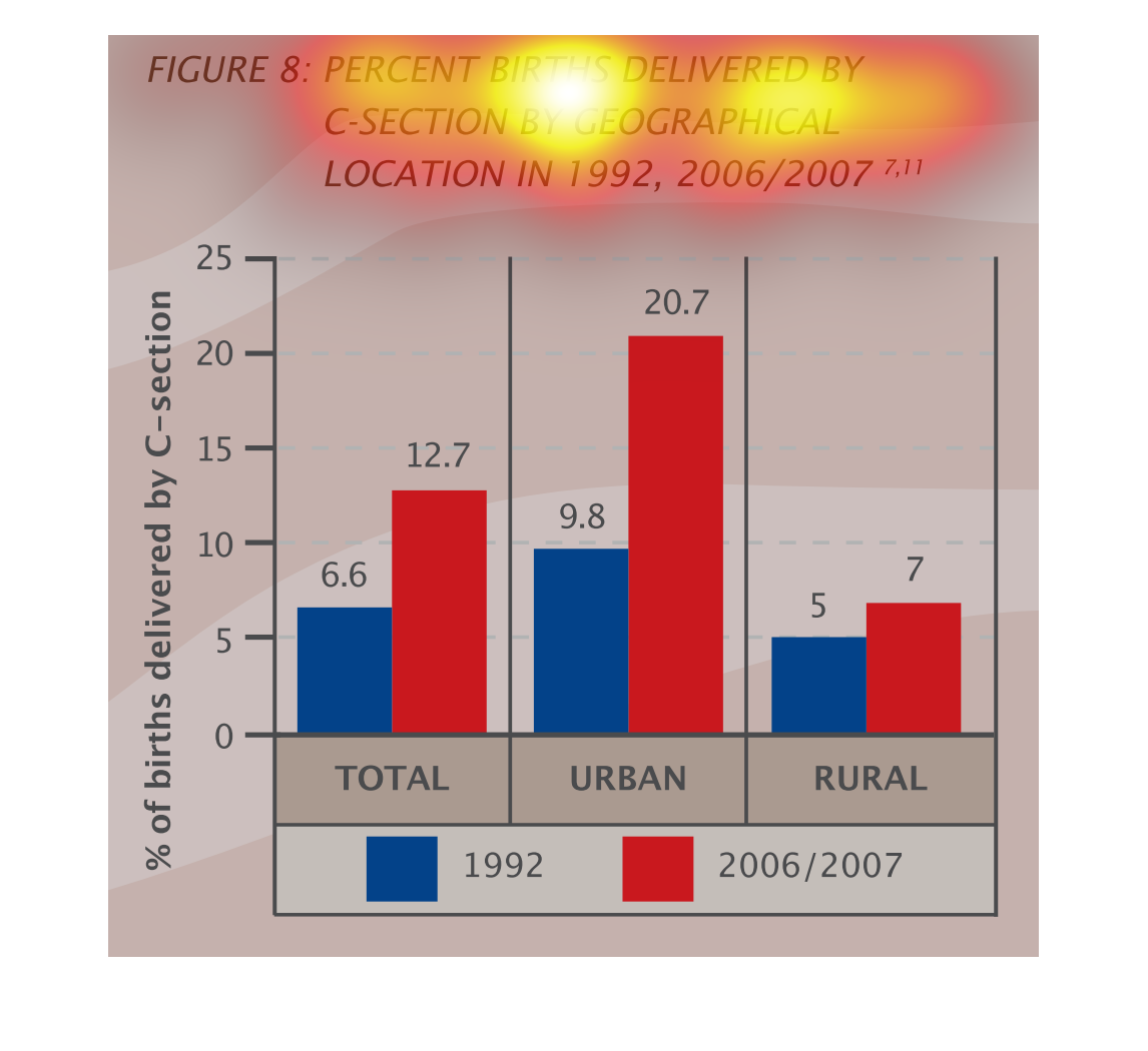
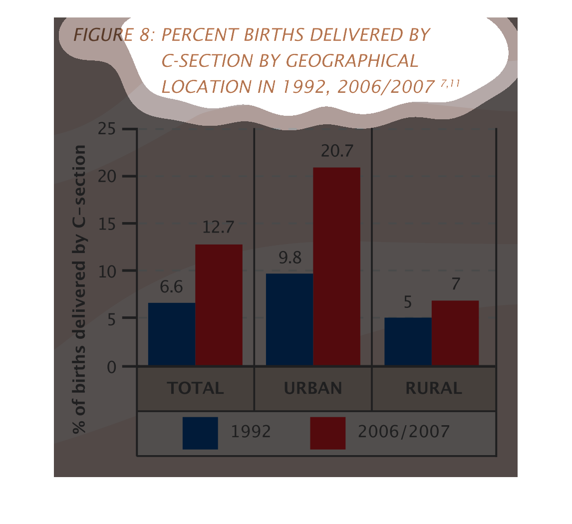
Percent of pregnancies delivered by c-section based on geographical location in 1992 vs. 2006/2007.
The urban percentage between the two measured time frames increased the most (9.8 to 20.7).
While rural percentage (5 to 7) only increased slightly. Total increased from 6.6 to 12.7.
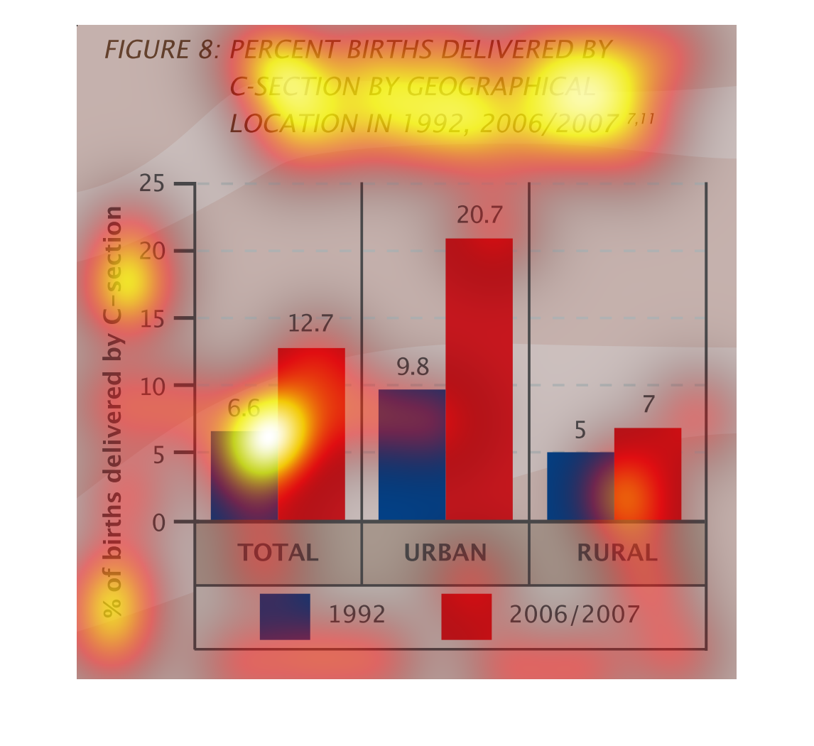
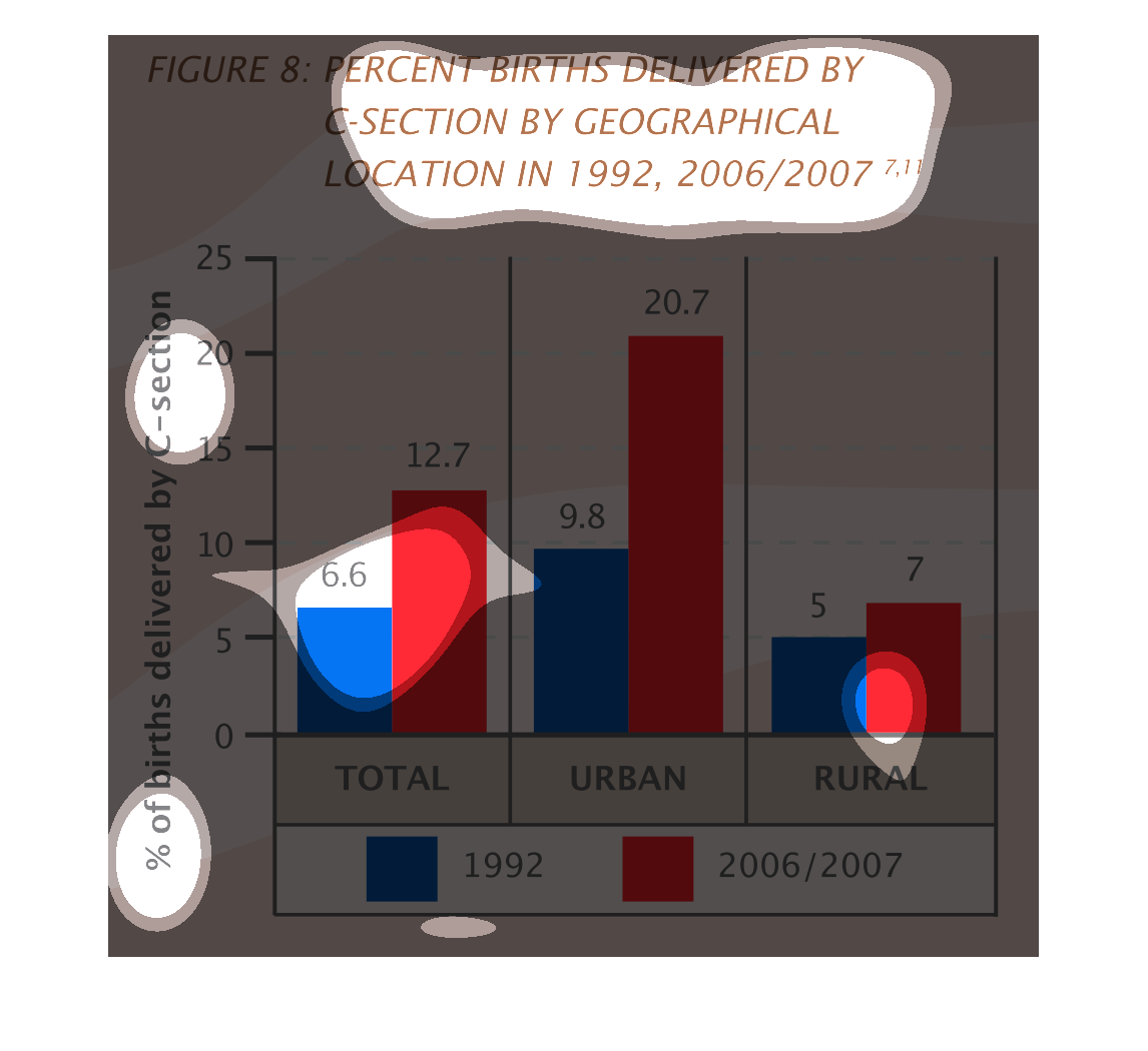
This is a graph that describes a rise in the percentage of C-section births from 1992 to 2006,
and also compares the data on geographic lines, Urban, rural, and total births are all compared
on the graph. It is unclear what area of the world this data was obtained from.
This chart compares the number of births delivered by C-Section in 1996 and 2006/2007 by geographical
area. It breaks the regions down into Urban, Rural and Total. It is shown in % of total births
and how many were C-Sections.
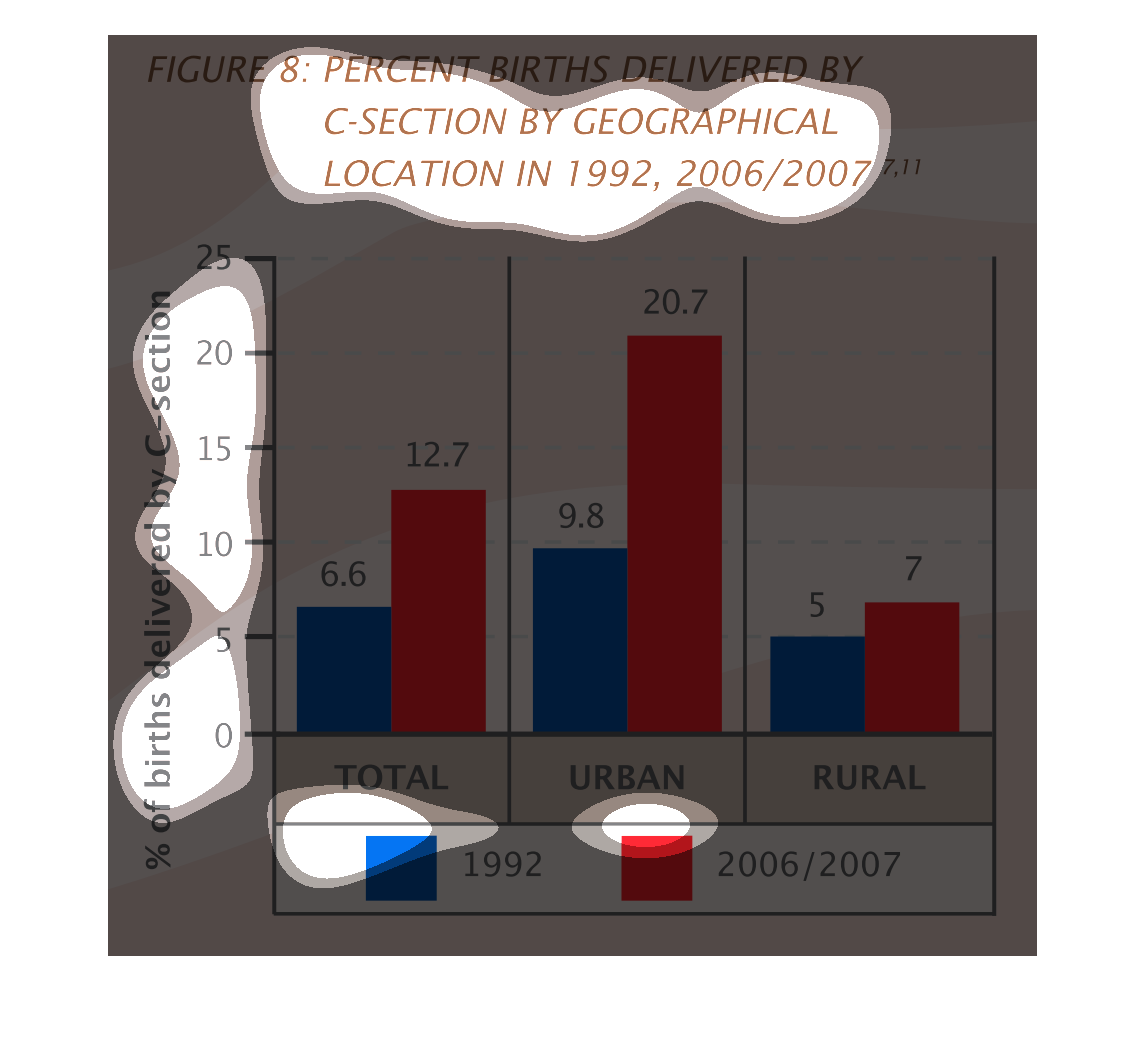
It is a bar graph displaying the percent of births delivered by c-section by geographical
location in 1992 vs 2006/7. In every location, there were more c-section deliveries in 2006/7
then in 1992. The difference between the 2 was the largest in urban areas, and the difference
was the closest in rural areas.
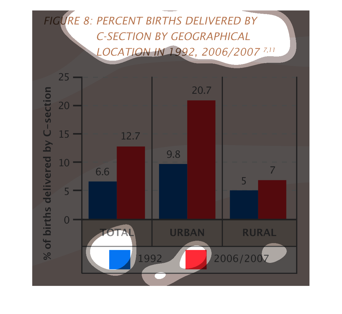
The chart shows the percentage of births delivered by C-section by demographic location in
1992, and 2006/2007.  Information is presented on a bar graph.  Percentages are listed along
the left and values are shown along the bottom for total, rural and urban.  The bar for the
values in 1992 are shown in blue, and the values for 2006/2007 are shown in red.