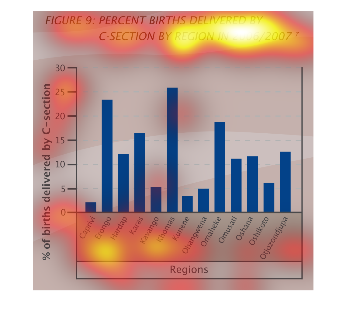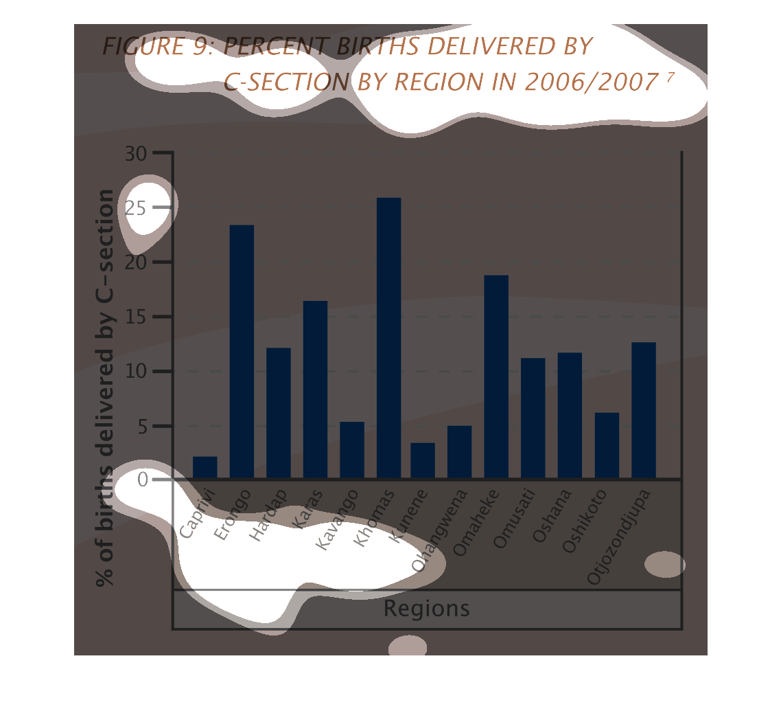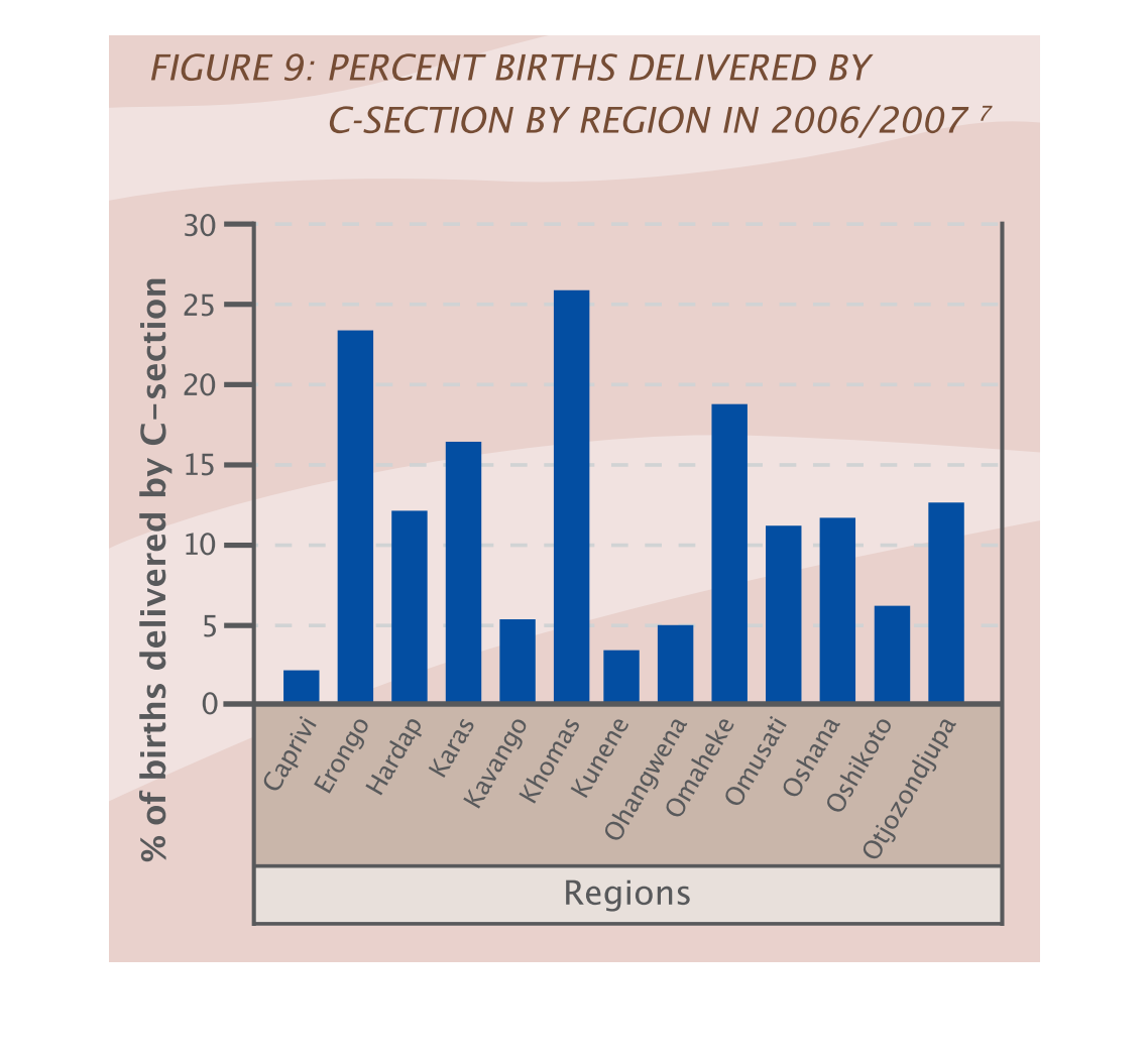
This graph shows the percentage of births delivered by C section, by region, in 2006/7. The
vertical axis shows the percntage, while the regions are ranked on the horizontal axis: they
appear to all be african or elsewise foreign location.
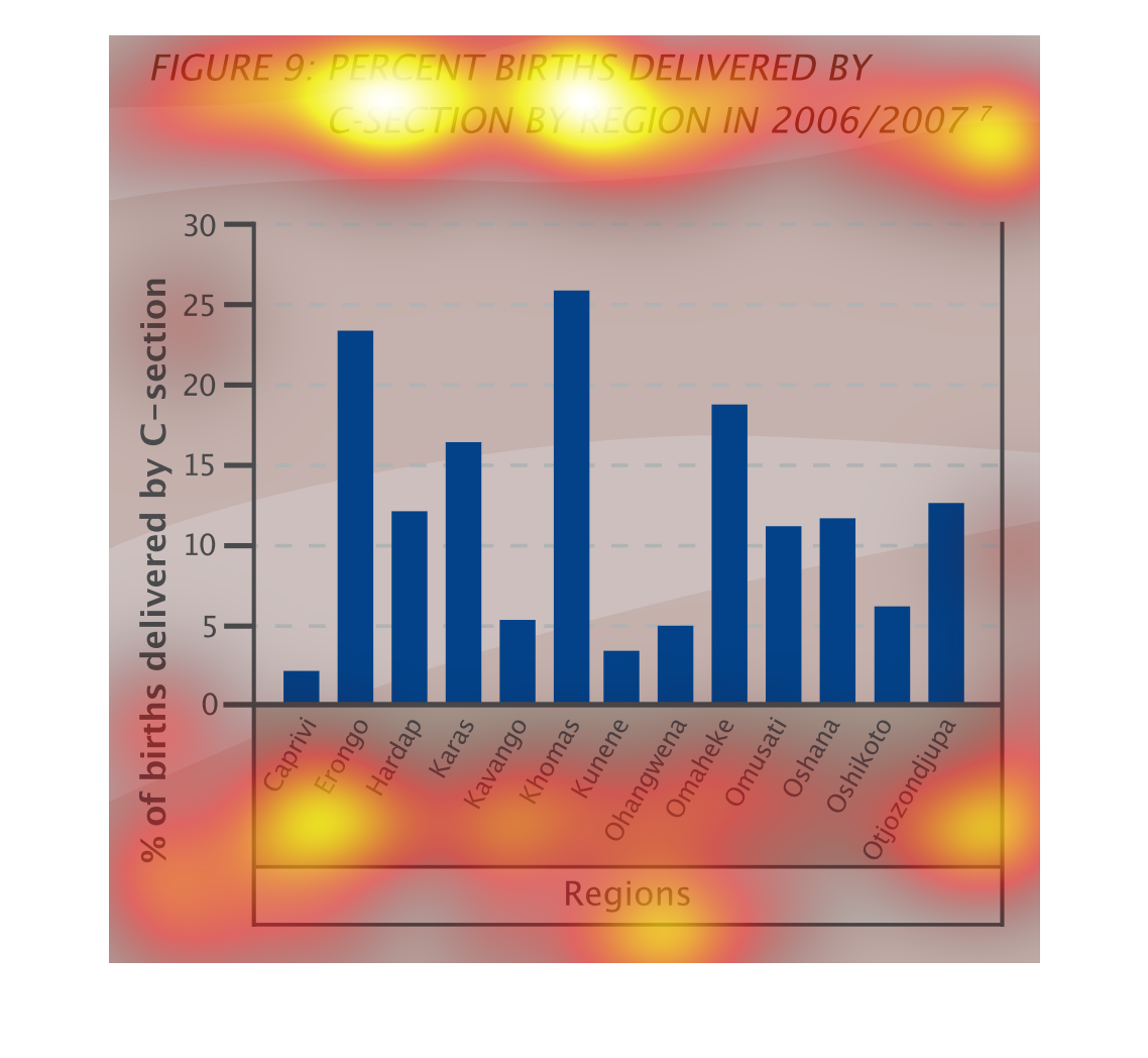
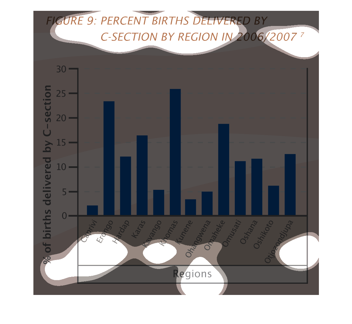
This chart describes percent births delivered by c-section by region in 2006/2007. Regions
on the chart include Caprivi, Erongo, Hardap, Karas, and Khomas.
This is a bar graph showing regions and percents of births delivered by C-section. It is labeled
Figure 9 and divided by region and by the years 2006 or 2007.
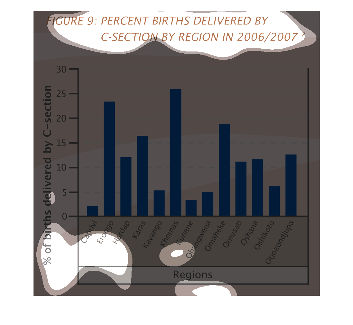
This image shows or depicts in statistical bar graph format the percentage of births delivered
by C-section by region from years 2006-2007. Regions of Africa
The figure presented is titled figure 9: percentage of births delivered by c-section by region
in 2006/2007.  The figure is a representation of births delivered.
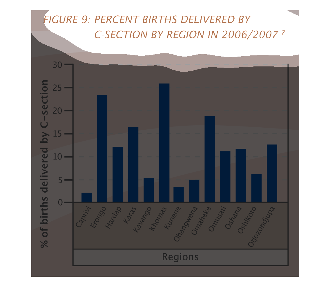
This is a chart showing the percentages of birth in 2006 and 2007 between 0% and 30% that
were c-sections. The chart is representing the different regions of Namibia, which is a country
in Africa.
figure 9: percent births delivered by c-section by region for 2006 and 2007. the Y axis is
percentage of births 0% through 30%, the X axis shows regions in africa
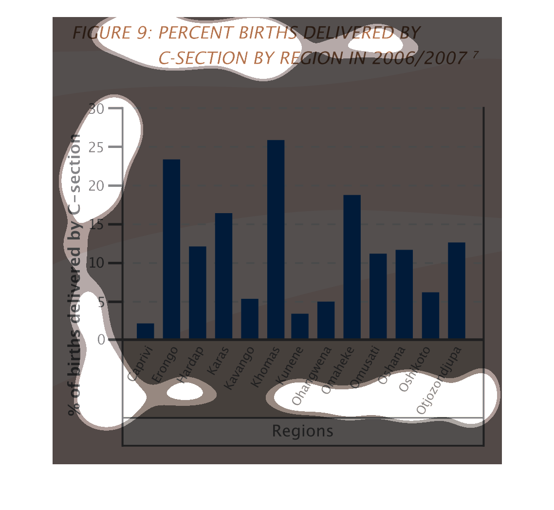
the graph is a bar graph depicting births that were deliver by c-section in 2006 and 2007.
It's broken down by region and percentage of births delivered by c-section out of all births
per year, per region.
This handmade chart shows the percentage of caesarian sections between 2006 and 2009. It shows
how some regions (?) have more c sections than others.
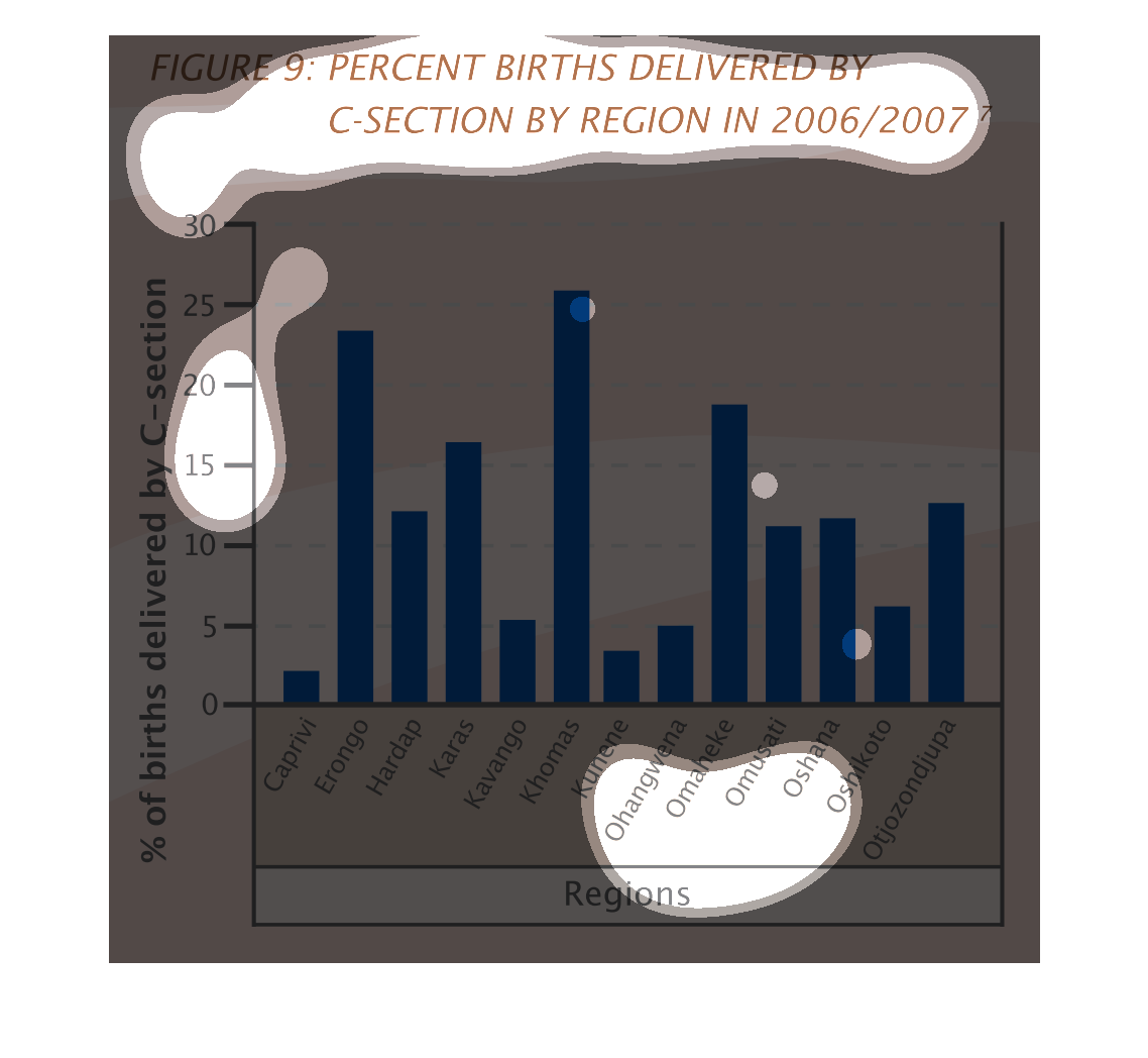
The image on the left hand side show what appears to be regions of Africa and analyzing the
percentage of C-sections between 2006 and 2007 that that region incurred.   From the graph
and data collected, Khomas had the highest percentage of C-sections out of all the regions
with roughly 25% of the births.
This chart describes percent births delivered in the year 2006/2007. Catergorires on the chart
include Caprivi, Erongo, Hardapm, Karas, Kavango, and Khomas.
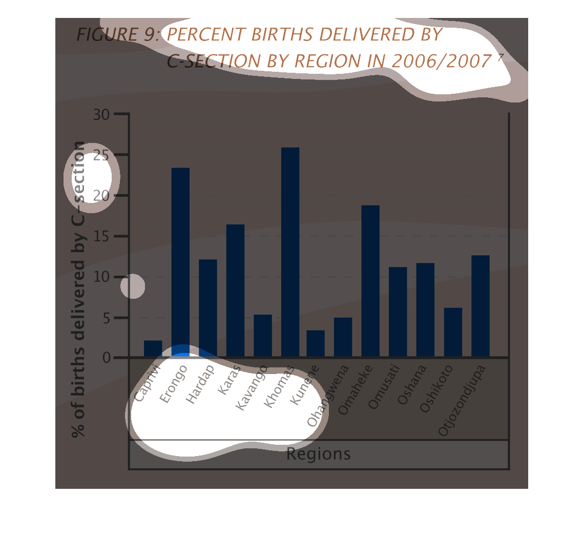
This graph illustrates percentage of births delivered by C-section in 2006 and 2007.  The
bars illustrate the number of C-section births by selected regions.
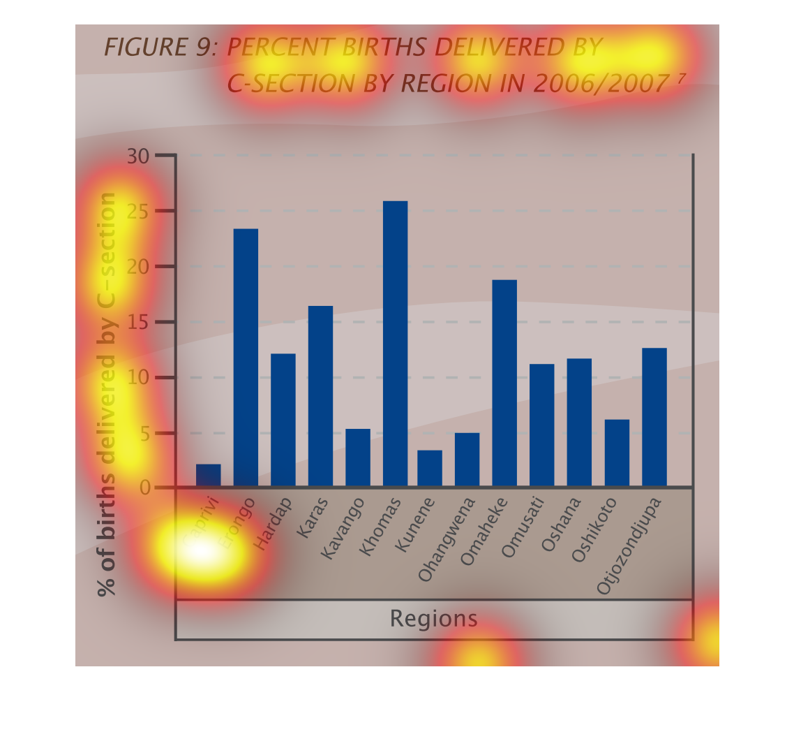
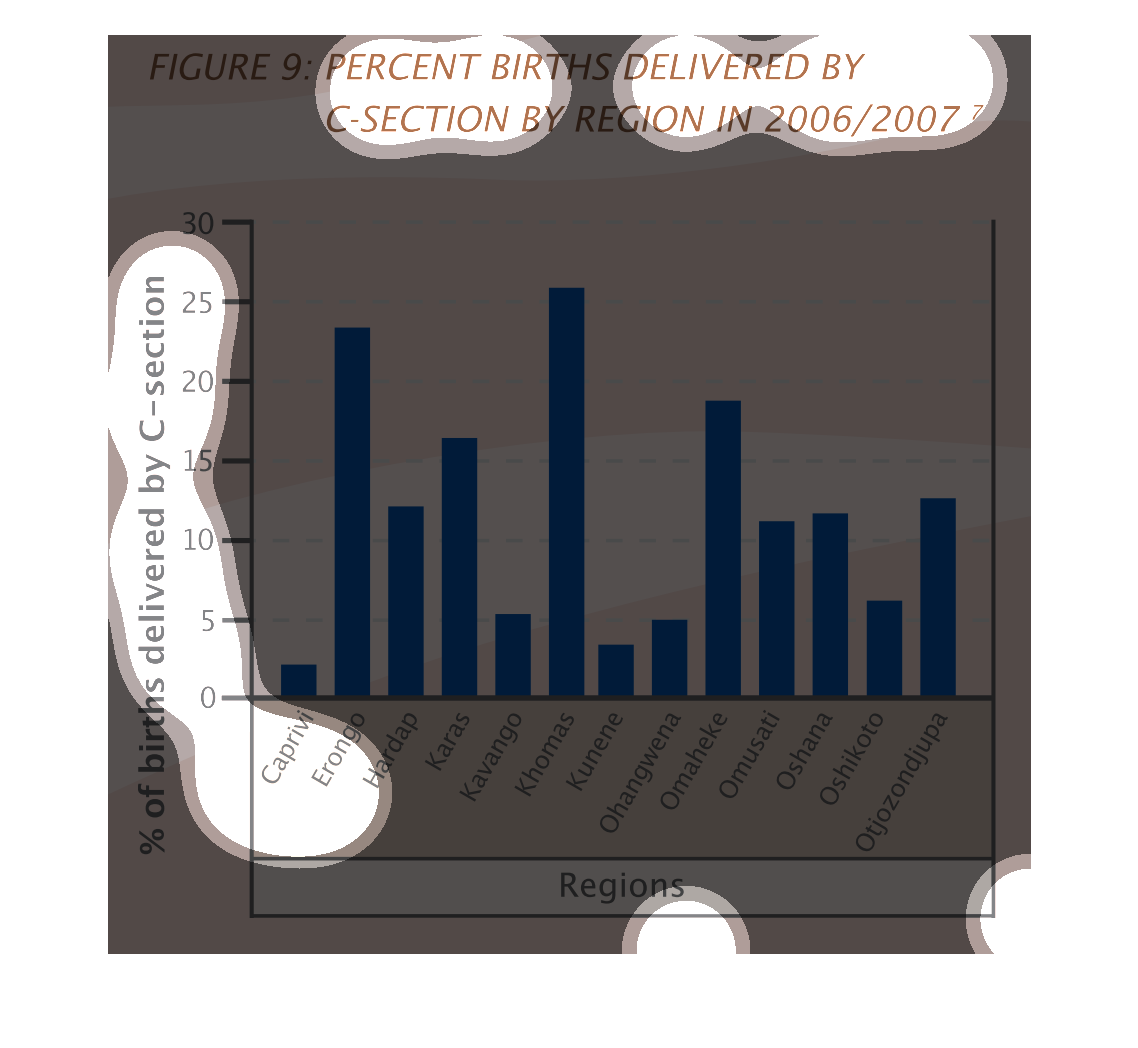
This is a bar chart of the percentages of babies born by c-section by region between the years
of 2006 and 2007. The percentages vary between 2.5% and 25%/