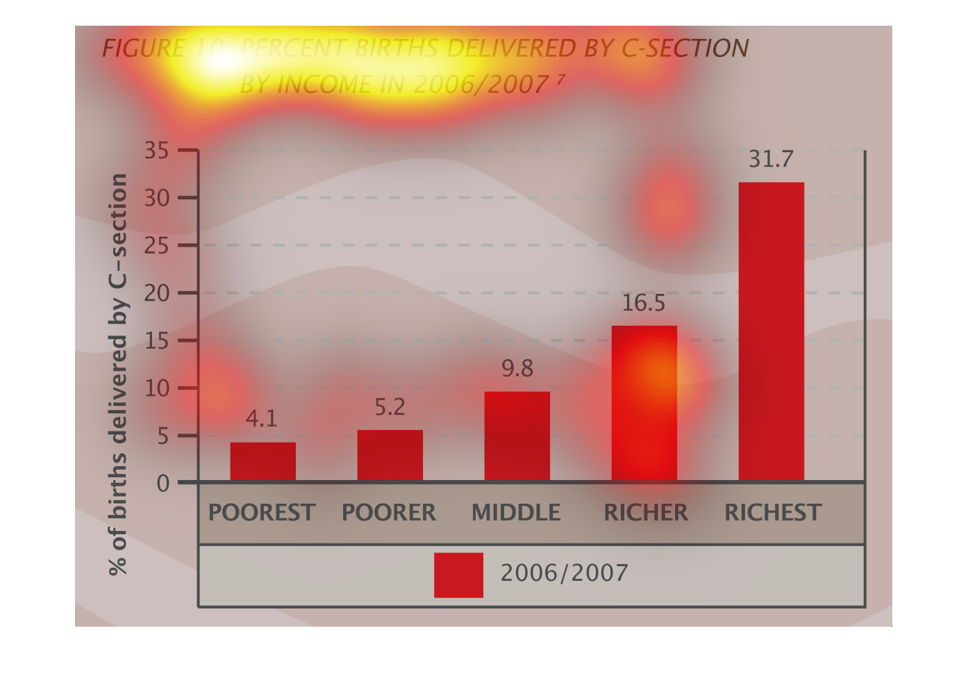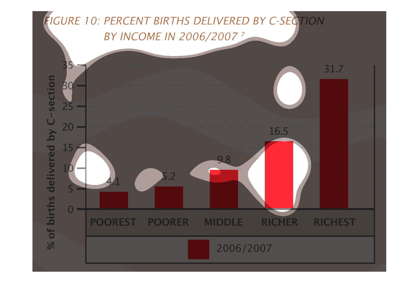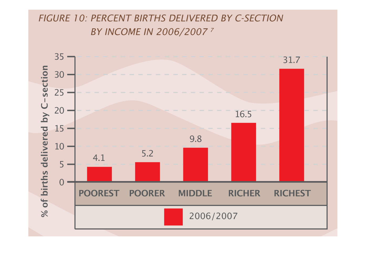
This graph shows the relationship of income and the amount of c-sections related to those
income groups.  This study seem to be about how money or lack of affects birth decisions.
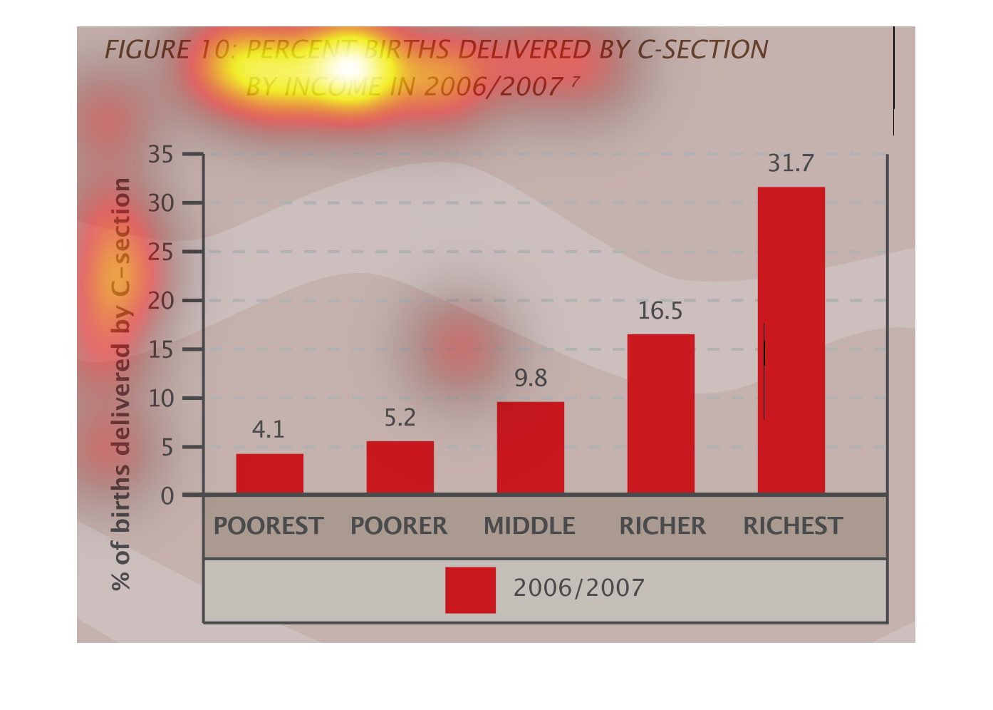
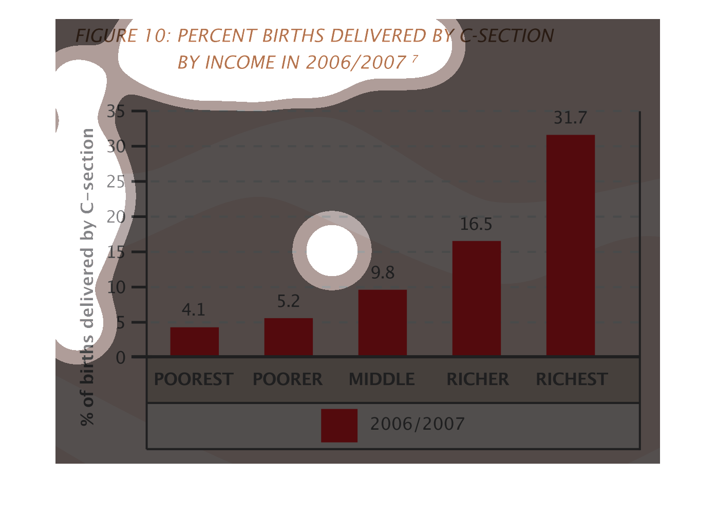
This is a graph of the percentage of births delivered by C-Section. The data shows that the
wealthier that the people are, the higher percentage get C-Sections.
This bar graph displays the percentage of births delivered by C-section by income in the 2006-2007
time period. The percentage scales to 35% on the 7 axis, with the horizontal axis labeled
from poorest on the left to richest on the right. There is one bar per income group, shaded
red, and labeled in the key as being 2006/2007 data. The data trend increases as the observer
moves right on the x axis.
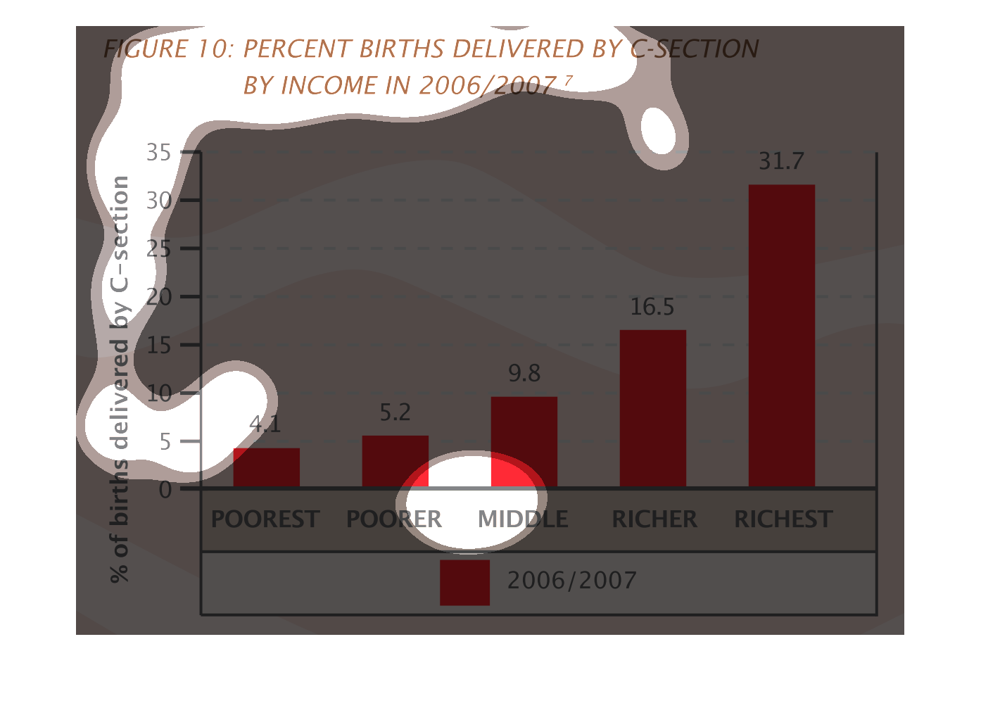
This is a graph that shows the total number of recent births delivered via the C-section method
by income and it covers the years 2006 to the year 2007
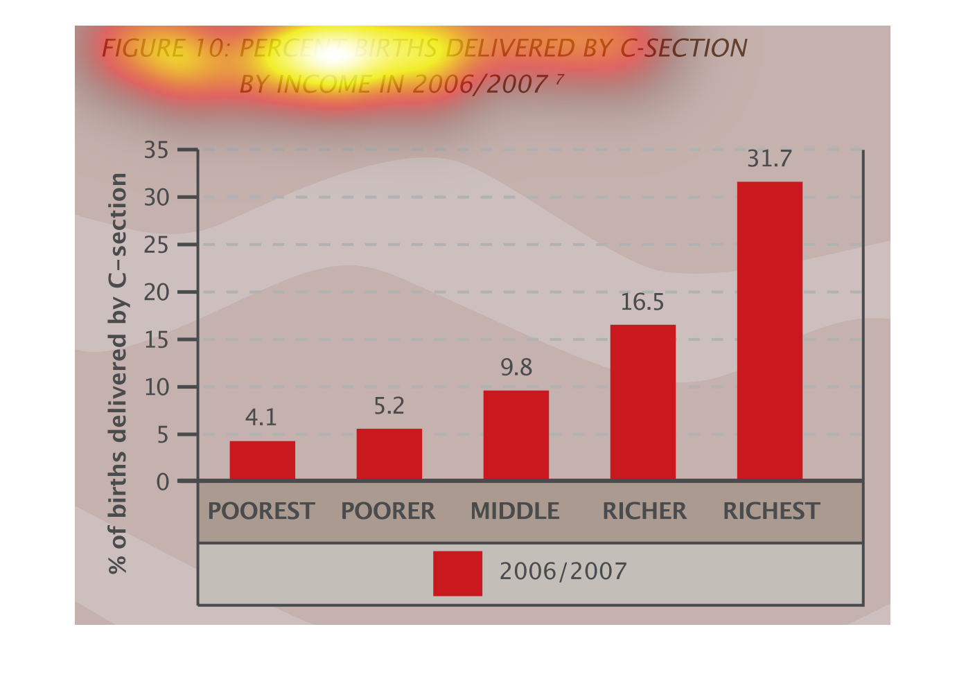
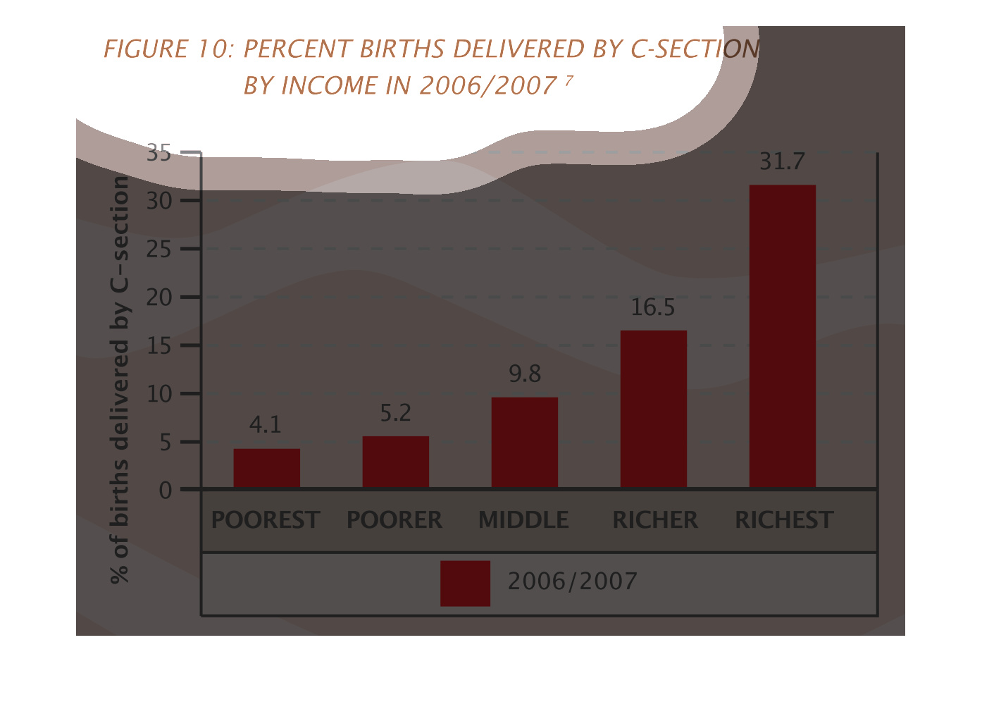
This chart depicts the percentage of C- section births; separated by income level between
the years of 2006 and 2007. It reveals a trend that the higher income levels of families have
C section births.
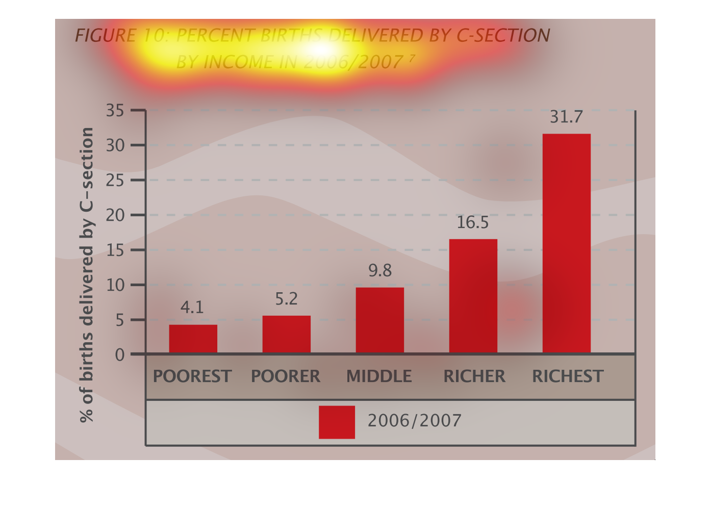
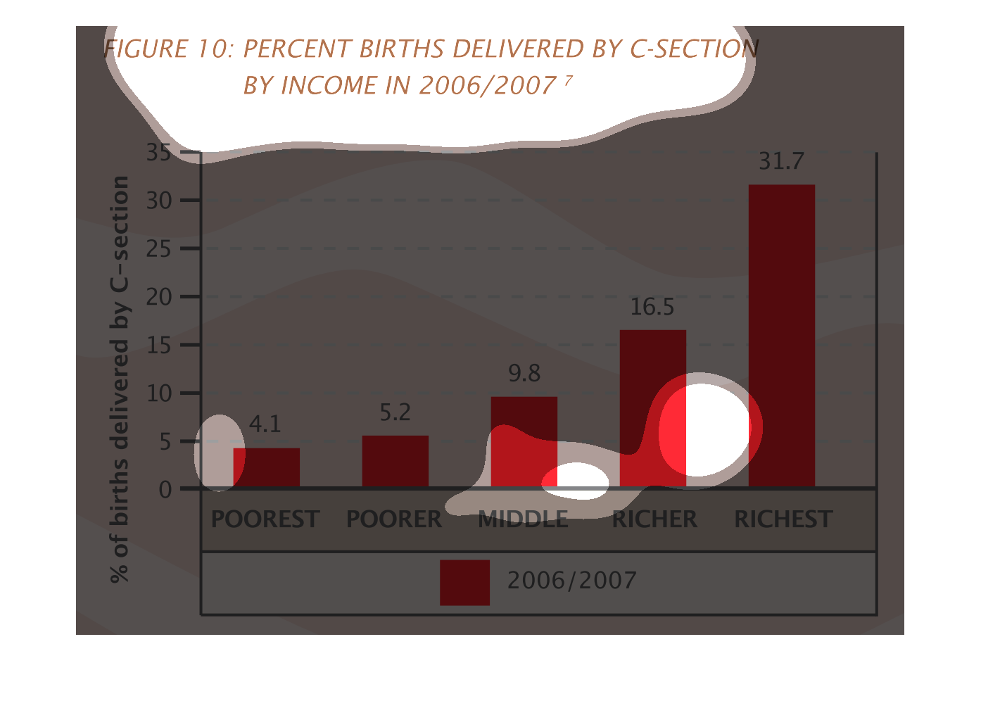
The graph shows the percent of people that are born via a C section.  From the graph it seems
the rich have the most C sections and the poor the least.
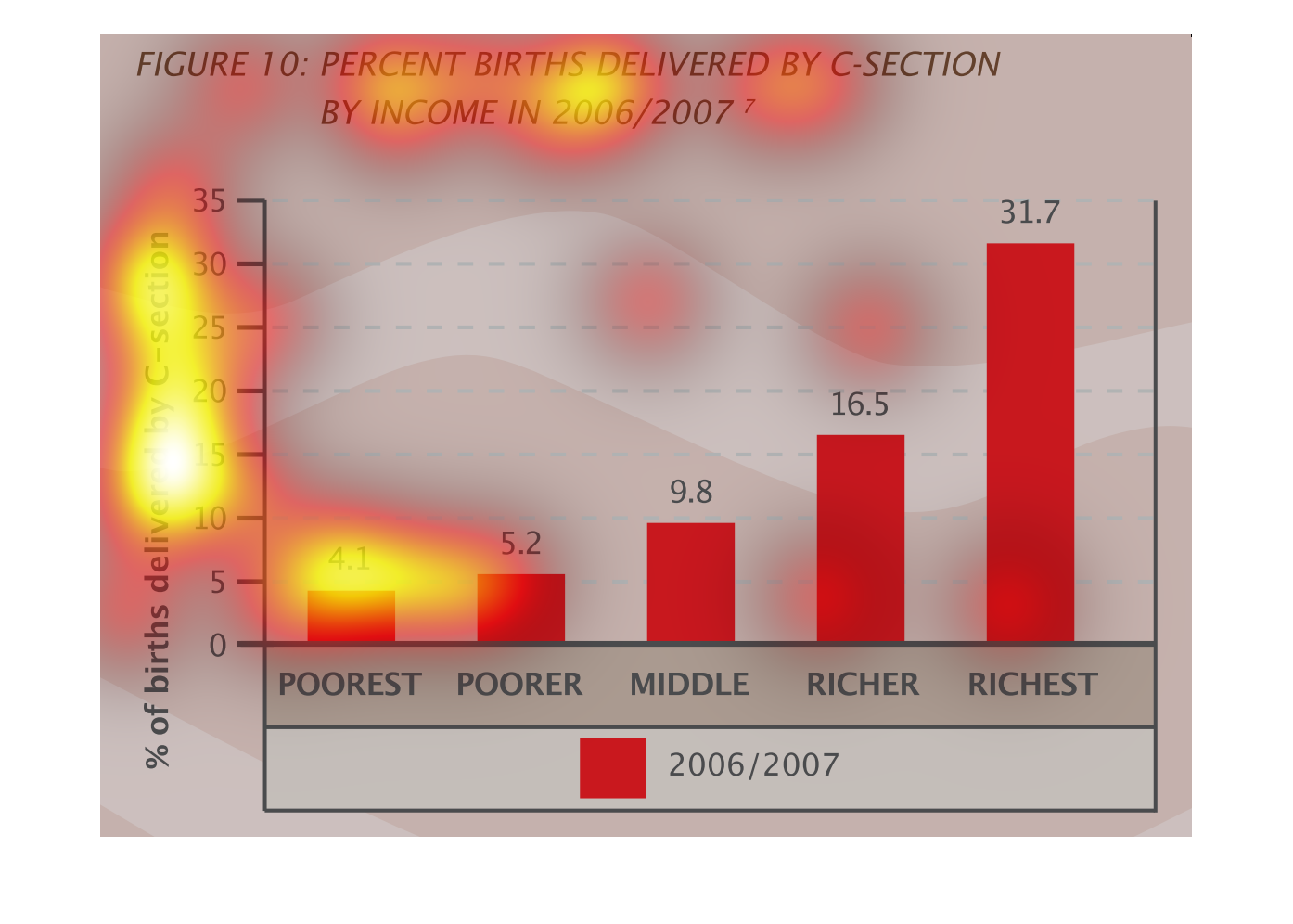
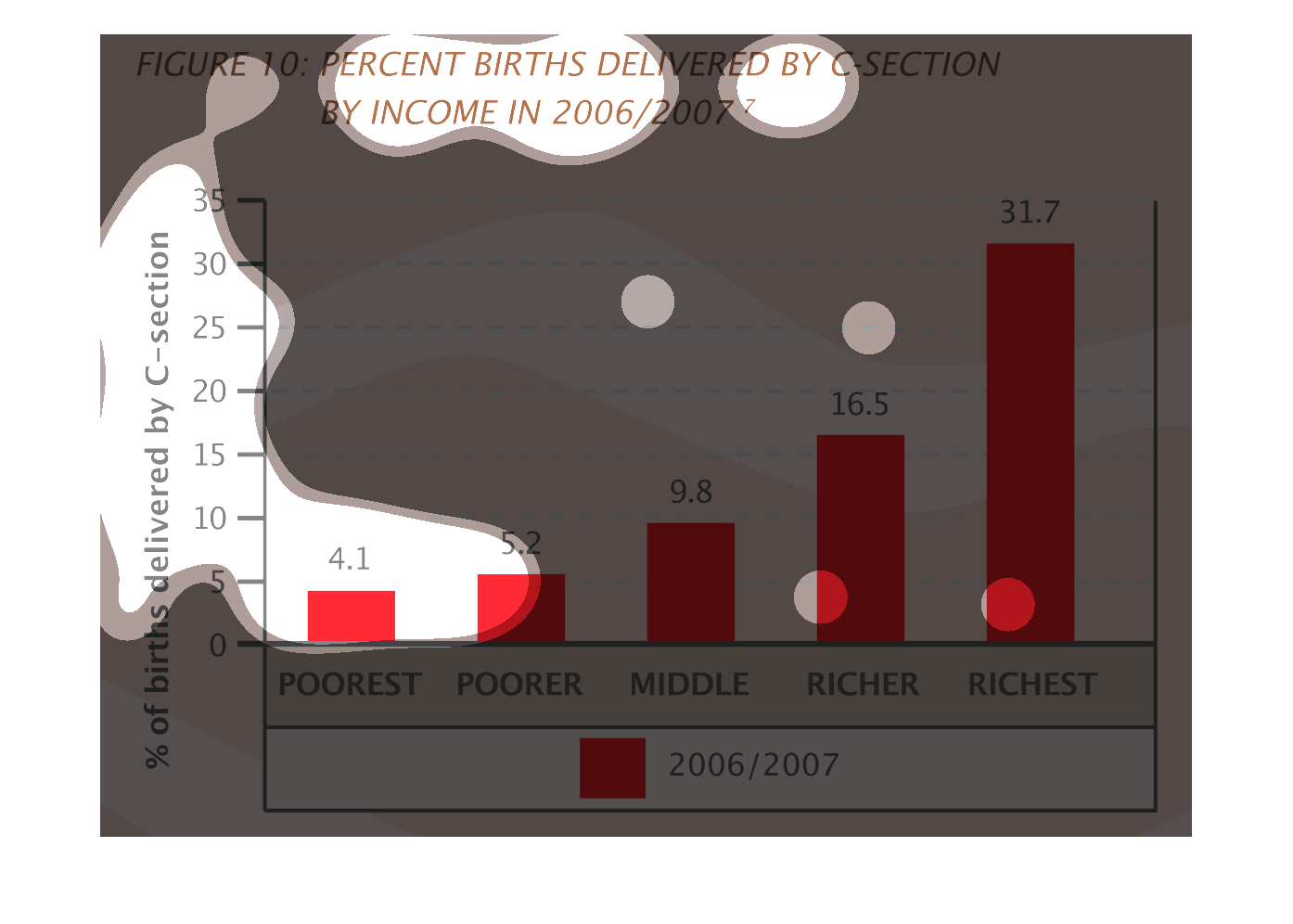
This picture shows a figure out of a book. It is a bar graph with red bars and it is titled
"Percent births delivered by C-section." It is organized based off of income 2006 and 2007.
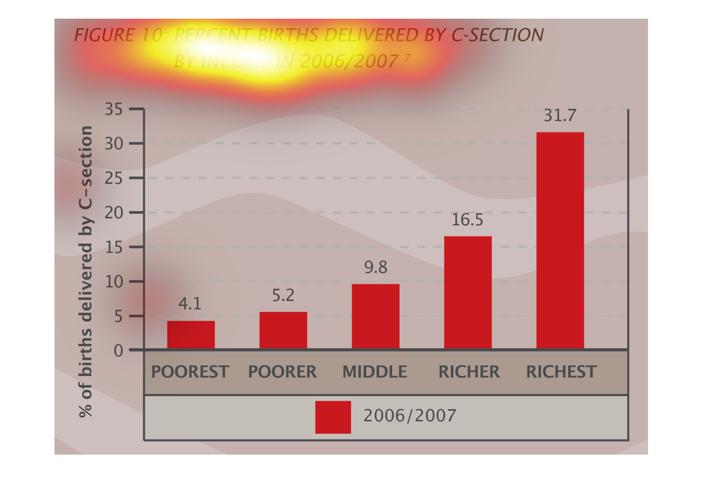
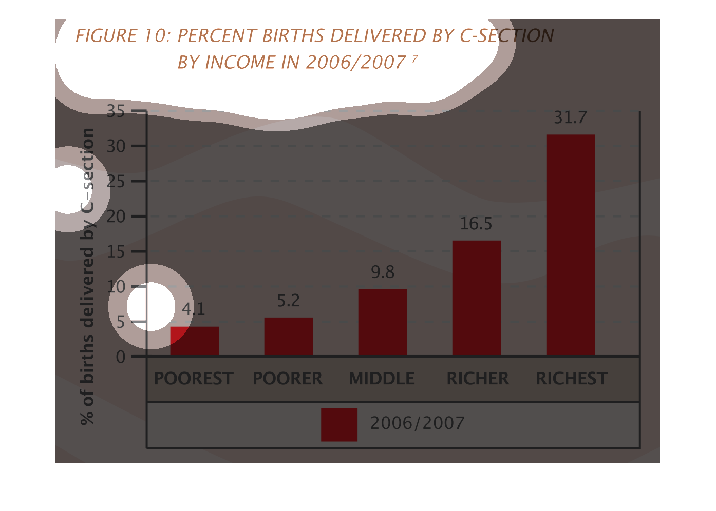
This chart describes percent births delivered by c-section by income for 2006/2007. Categories
on the chart include Poorest, poorer, middle, richer, and richest.
This graph shows the percentage of births given by C-Section for 2006-2007 in each class from
poorest to richest. The amount of C-Sections go up with each class, meaning that the richest
class is the one that has the most C-sections, and the poorest has the least .
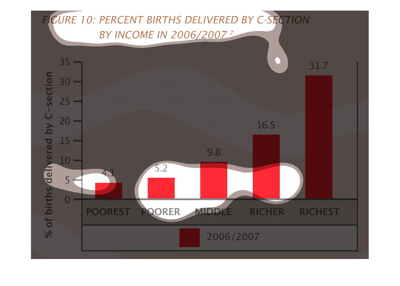
The image on the left hand side shows a column chart showing the gradual rise of C sections
by income level.  As one might expect C sections are more popular with higher income levels.
 The poorest income levels have the least amount of C sections.
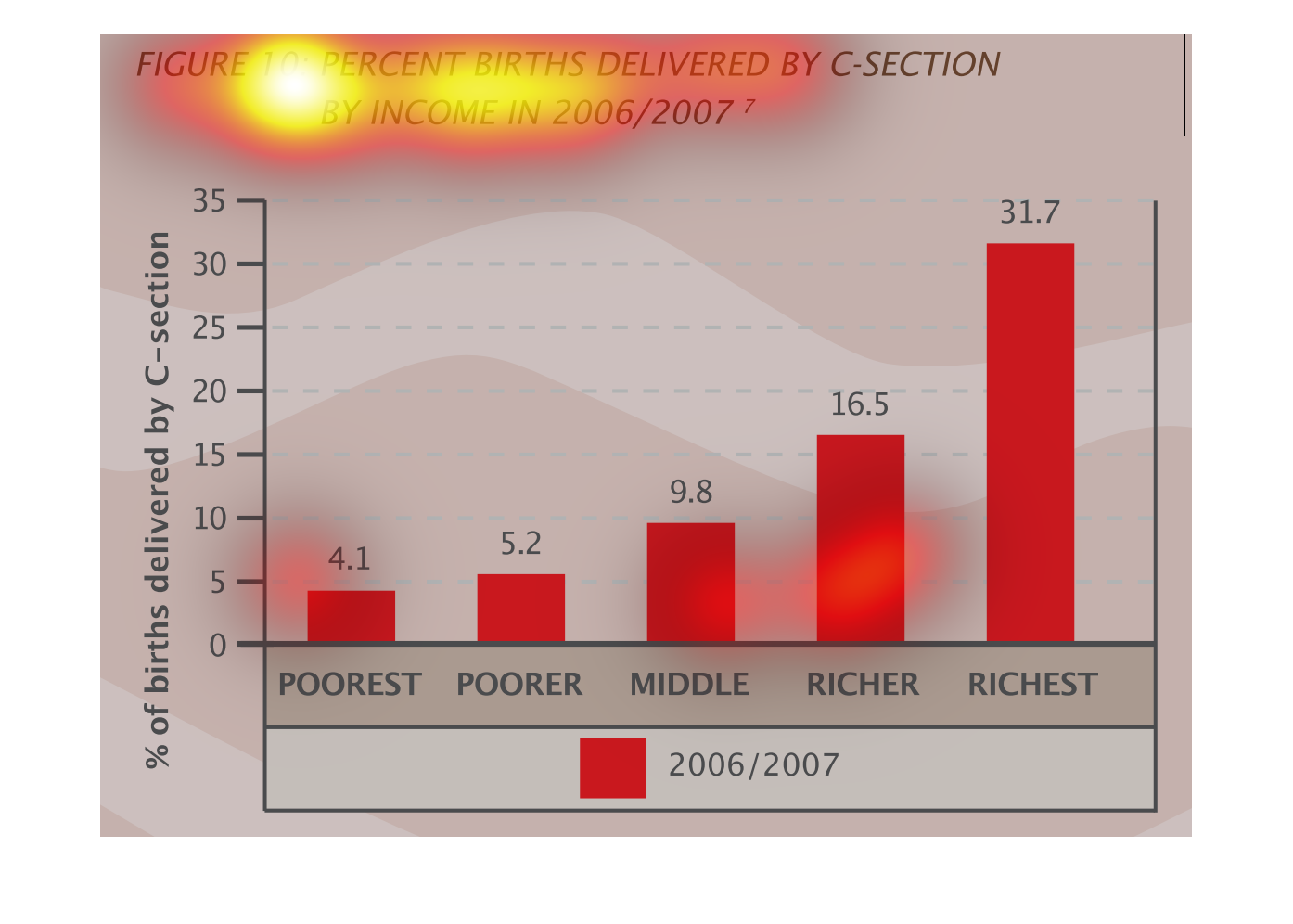

Figure 10 shows percent births delivered by c-section by income in 2006 and 2007. This red
bar graph shows that the higher the income the more c-section births.
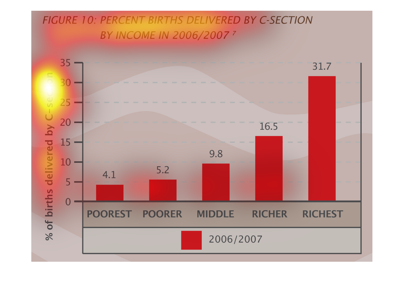
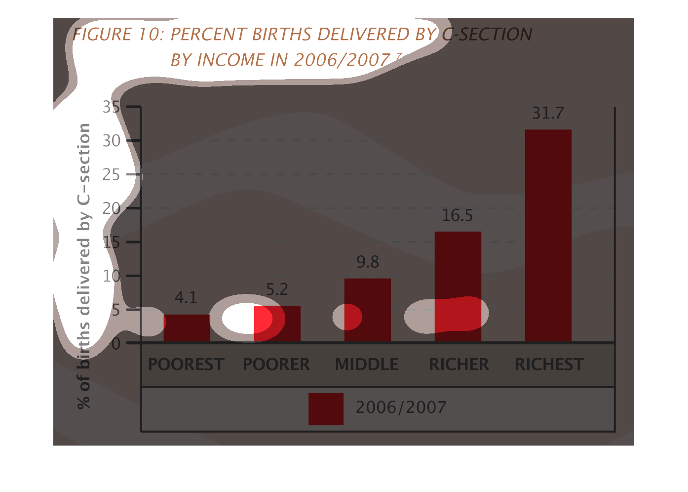
Figure 10 shows number of births delivered via C-section by income in the years 2006 and 2007.
This is a red bar graph that shows that more cesarian sections are performed on the wealthy
than the poor.