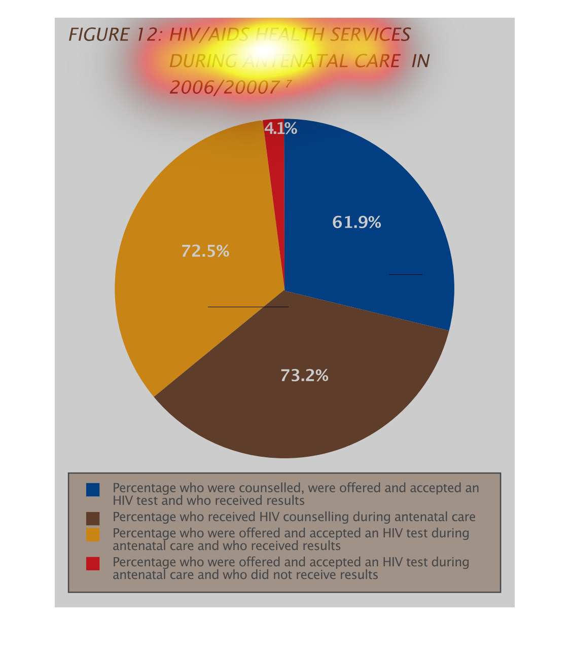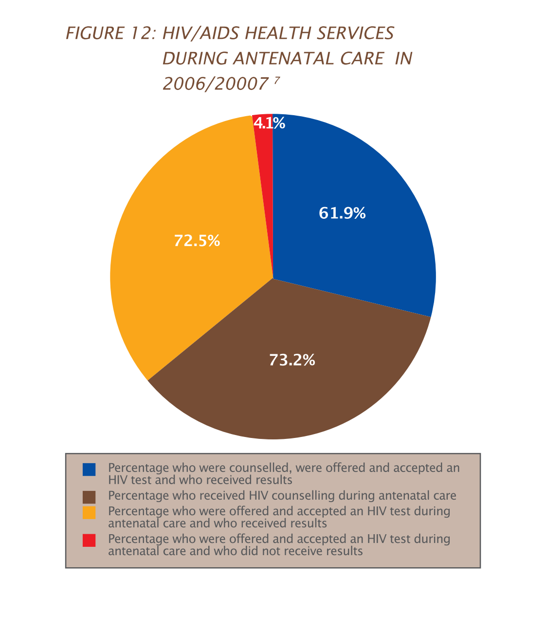
This is a circle graph showing different levels of HIV/AIDs interventions for pregnant mothers.
 The four sectors indicate if mothers were given HIV tests, whether they received the results,
counseling, etc.  The largest group were mothers that were tested and received their results.
   The smallest group were offered the test but did not receive the results.
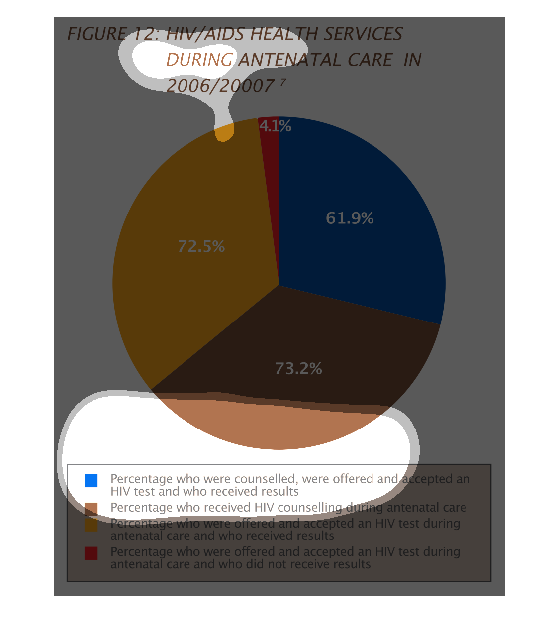
Pie chart describing HIV/AIDs services during antental care from 2006 and 2007.  73.2% received
counselling. 61.9% were counseled, received a test and results. 72.5% received a test and
were given results. 4.1% were tested, but not given results.
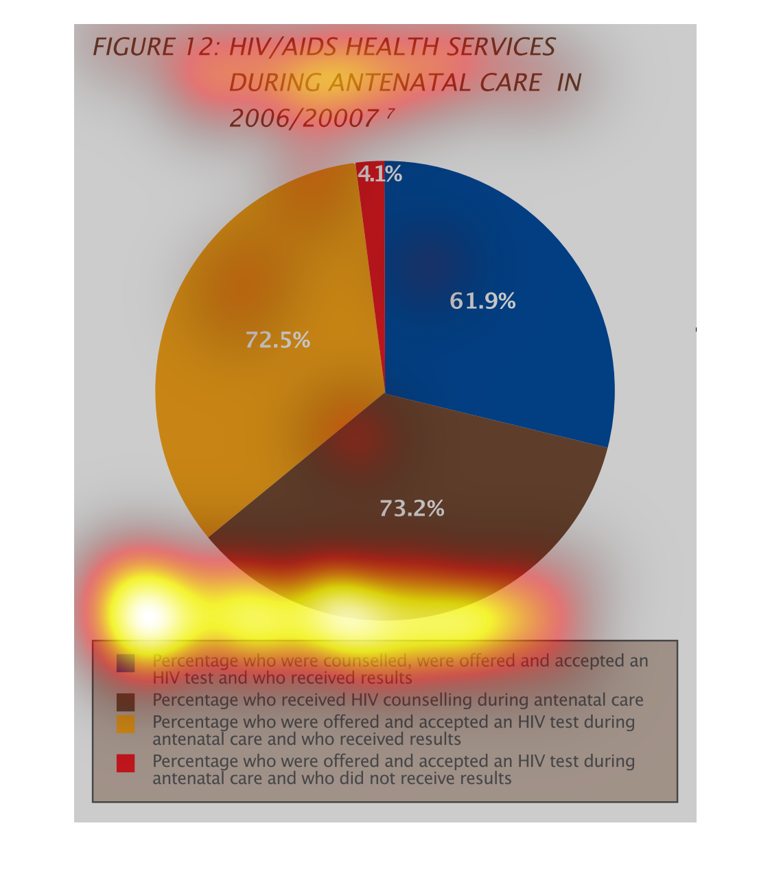
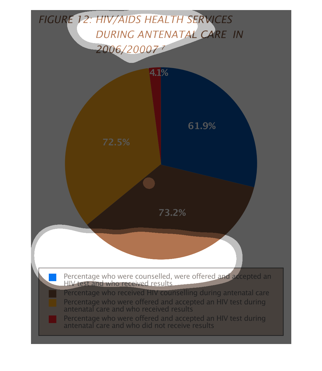
This pie chart represents HIV/AIDS health services during antenatal care in 2006/2007.  It
has categories for percentages that were counseled or treated or offered an AIDS test.
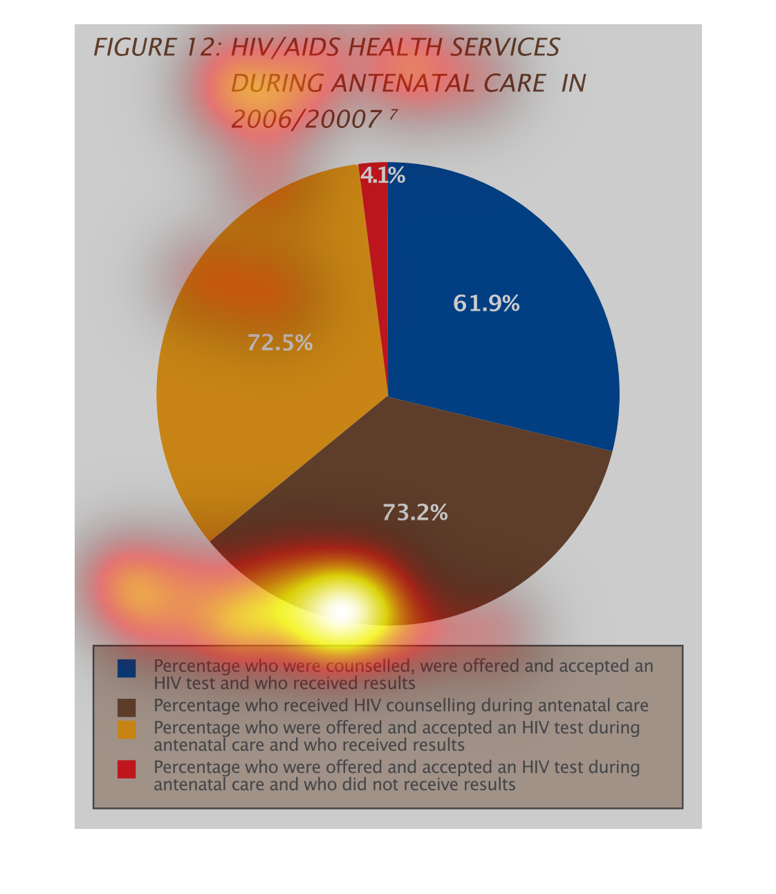
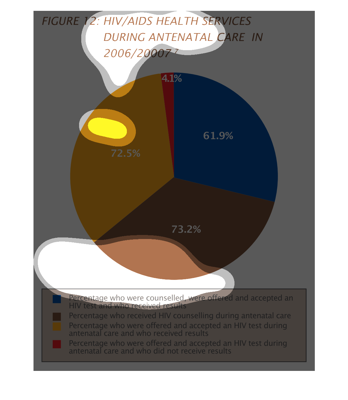
This pie chart shows the percentage of patients that received HIV/AIDS health services during
antenatal care. 61.9% were counseled, offered and accepted an HIV test and received results.
73.2% received HIV counseling. 72.5% were offered and accepted an HIV test and received results.
4.1% were offered and accepted an HIV test and did not receive results
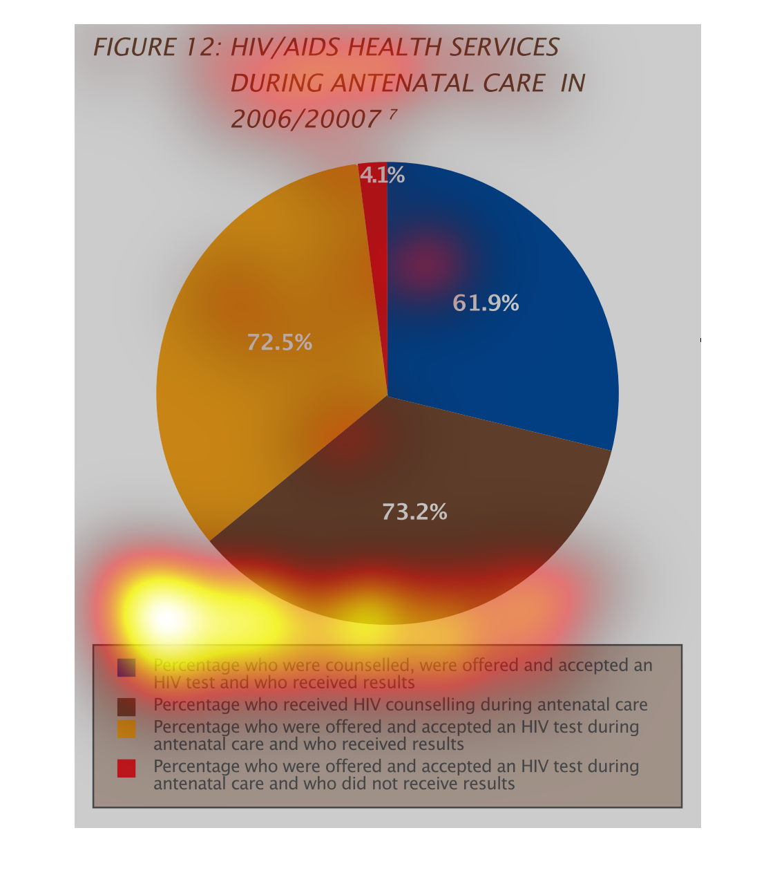
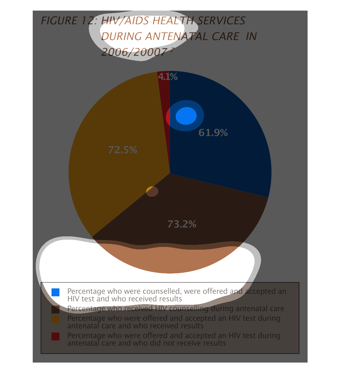
The chart describes HIV/AIDS care in patients after they are born.  The pie chart is misleading
because the totals do not add up to 100%. Still, the minority were offered a test and did
not receive results.
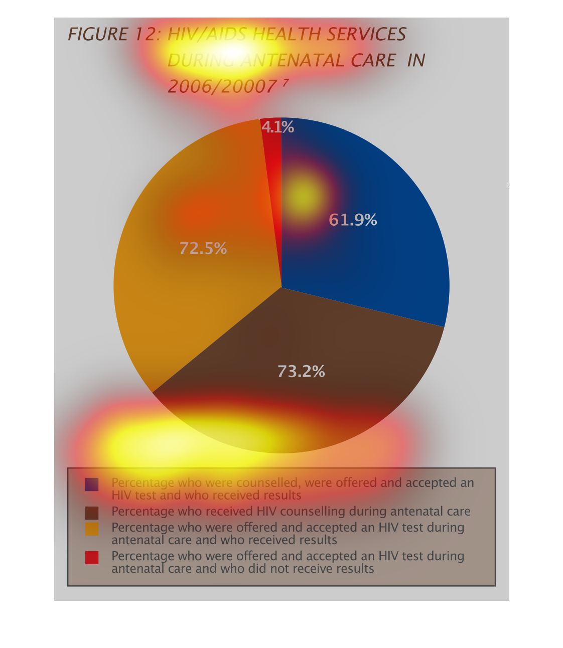
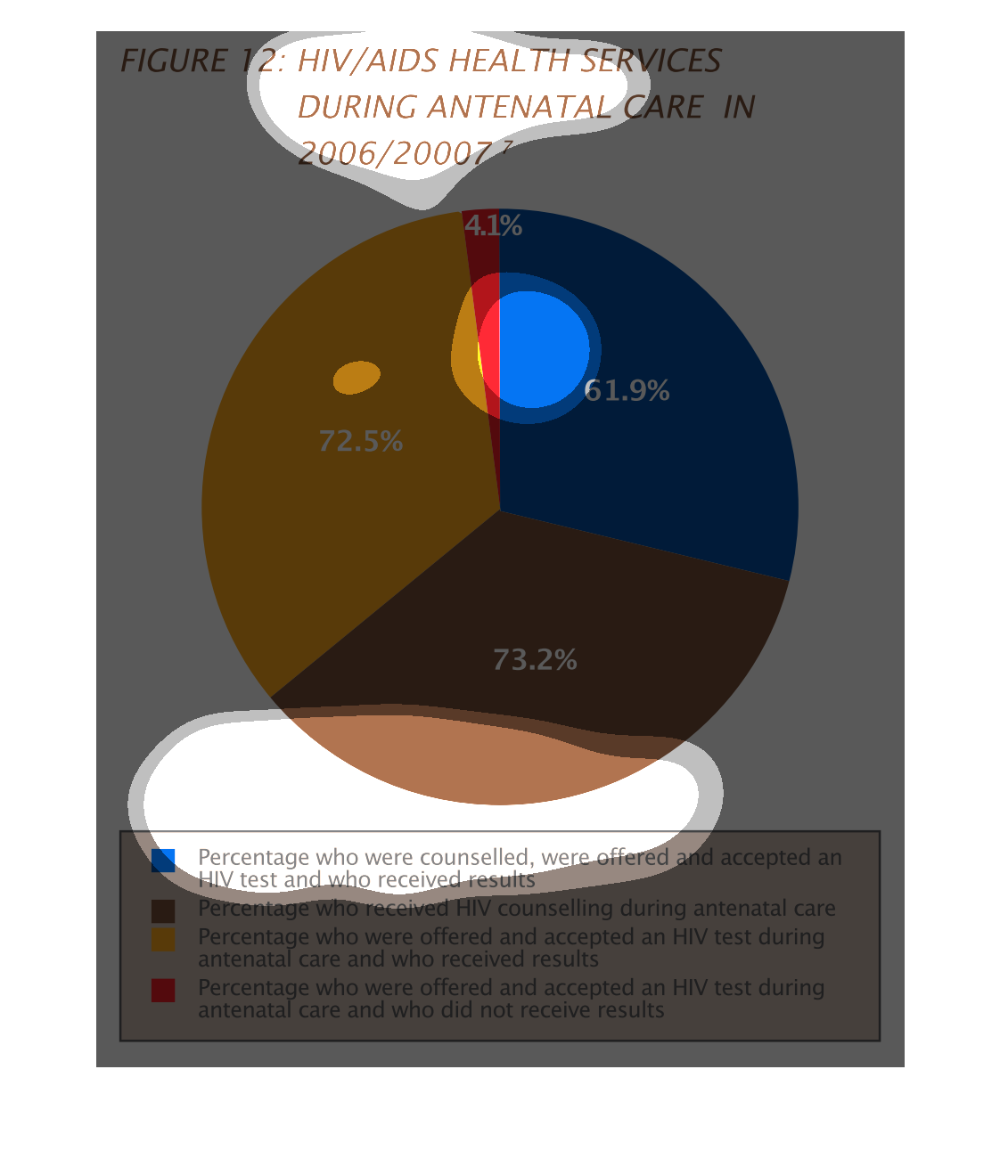
This graph is describes an HIV/AIDS health service during the years of 2006 and 2007. There
is a Pie graph with 4 colored section. the smallest section being personnal being given testing
but not given results. the other categories sound very similar to eachother.
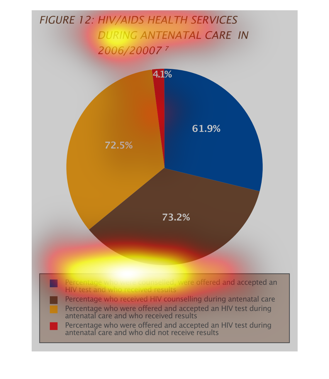
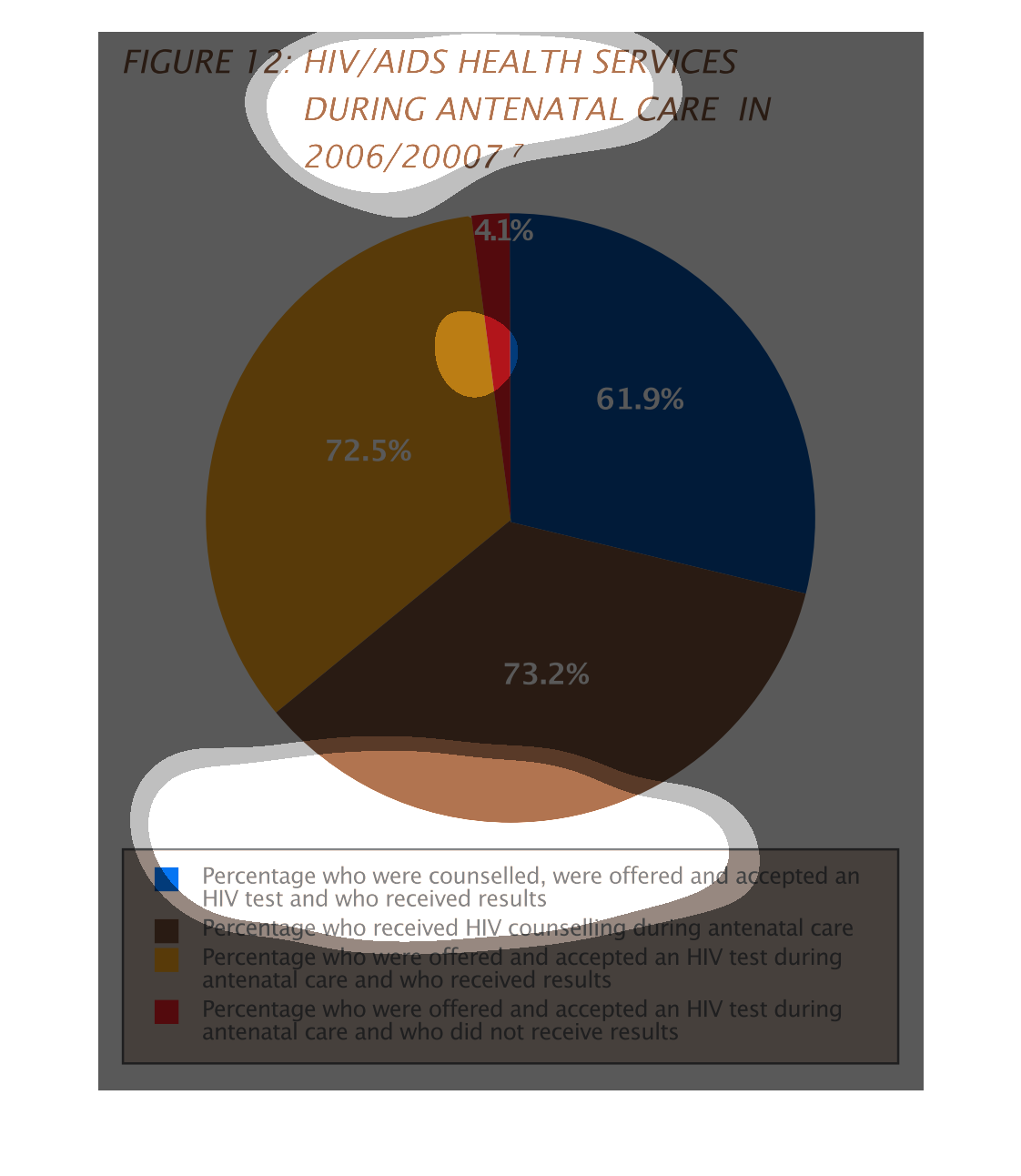
This chart describes HIV/Aids health services during antenatal care in 2006/2007. Different
categories on the chart are represented by different colors.
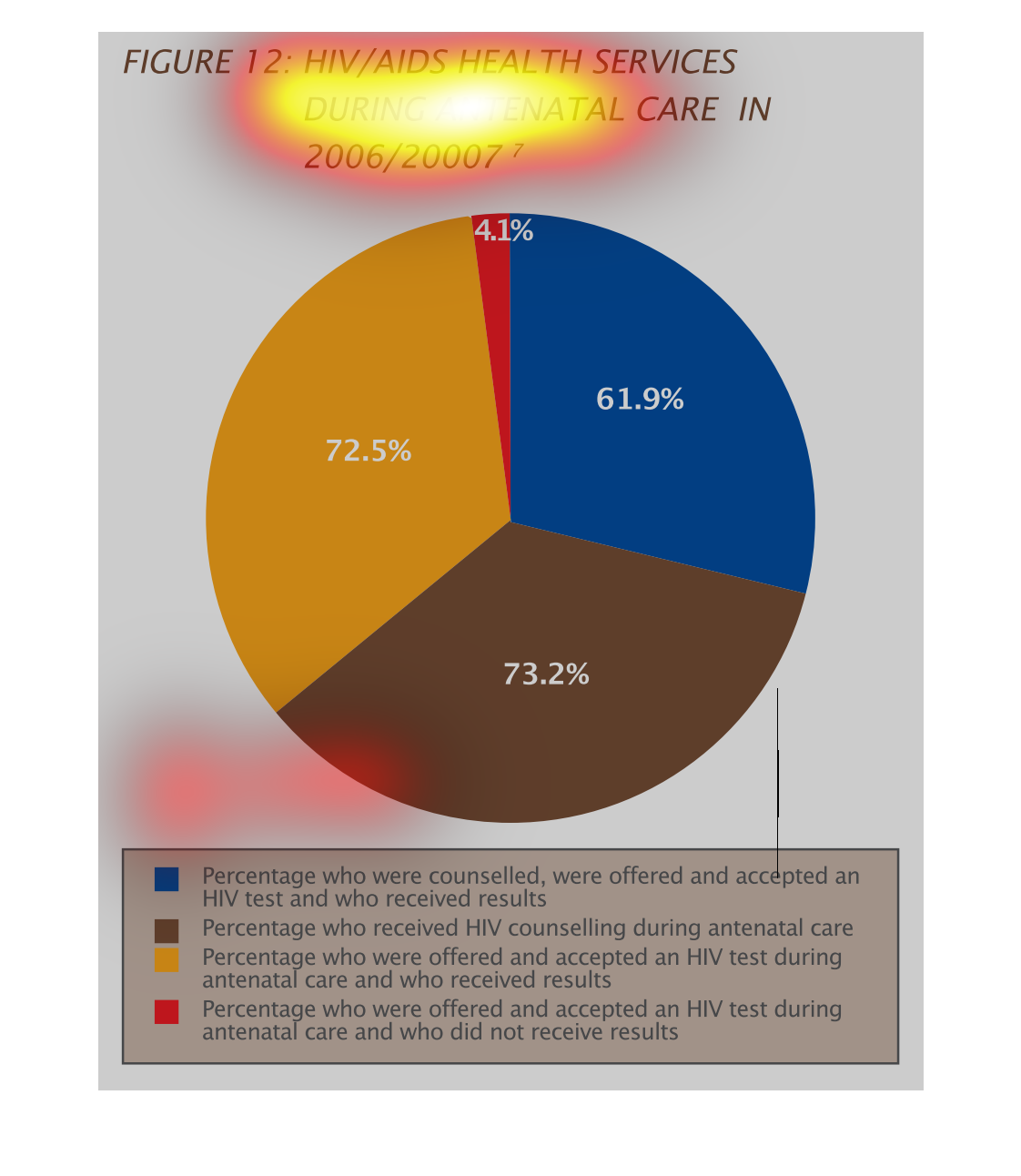
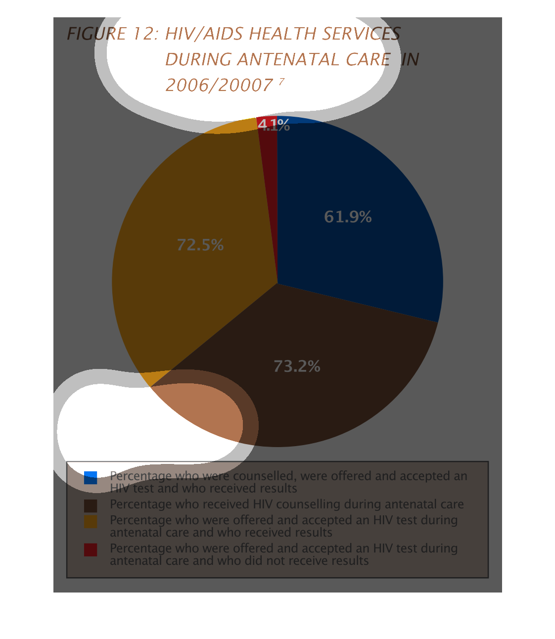
This is a circle chart that shows the HIV/AIDS health services antenatel care in 206 and 2007.
The chart is nearly evenly split between people who weer offered, consulted, and accepted
care. There is a small sliver for those people who did not accept care.
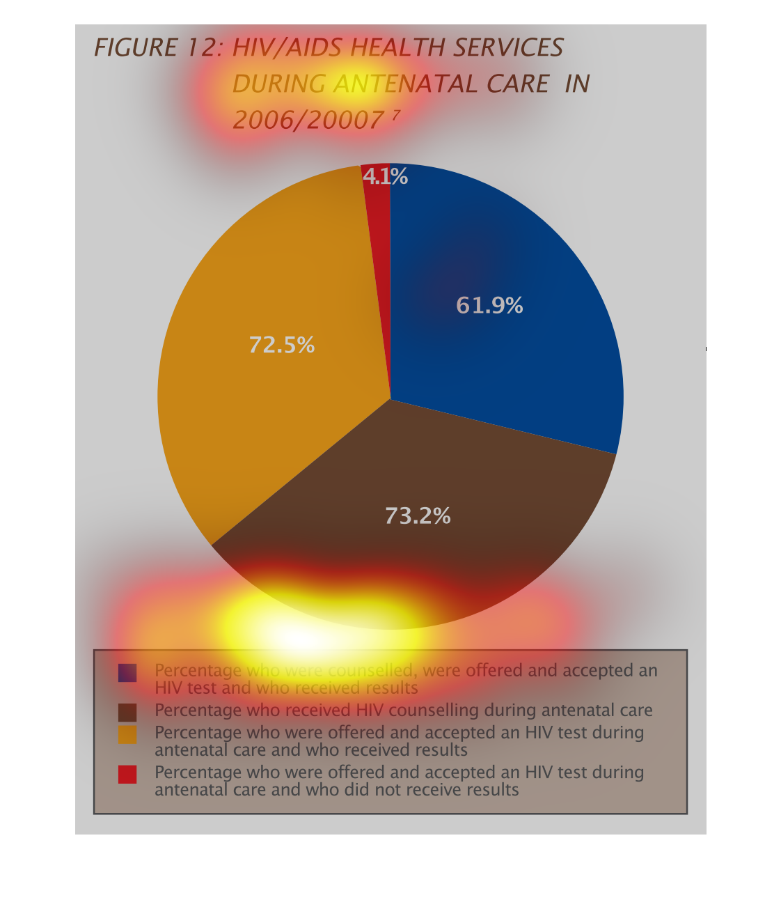
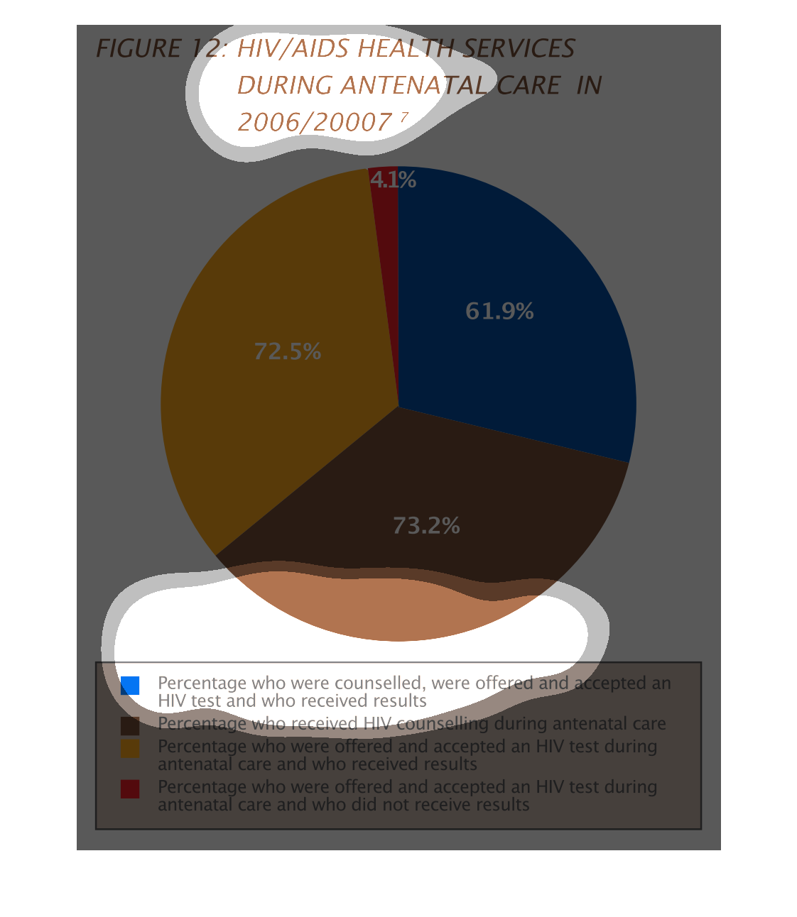
This is a color coded pie chart depicting HIV/AIDS health services during antenatal care in
the years 2006/2007. The highest percentage is shown to be those who were offered and accepted
testing and received results during care.
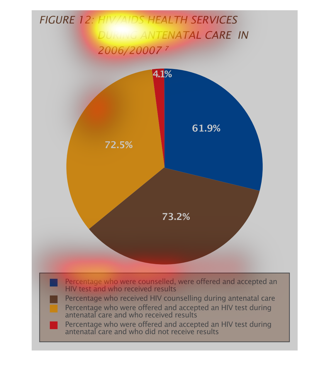
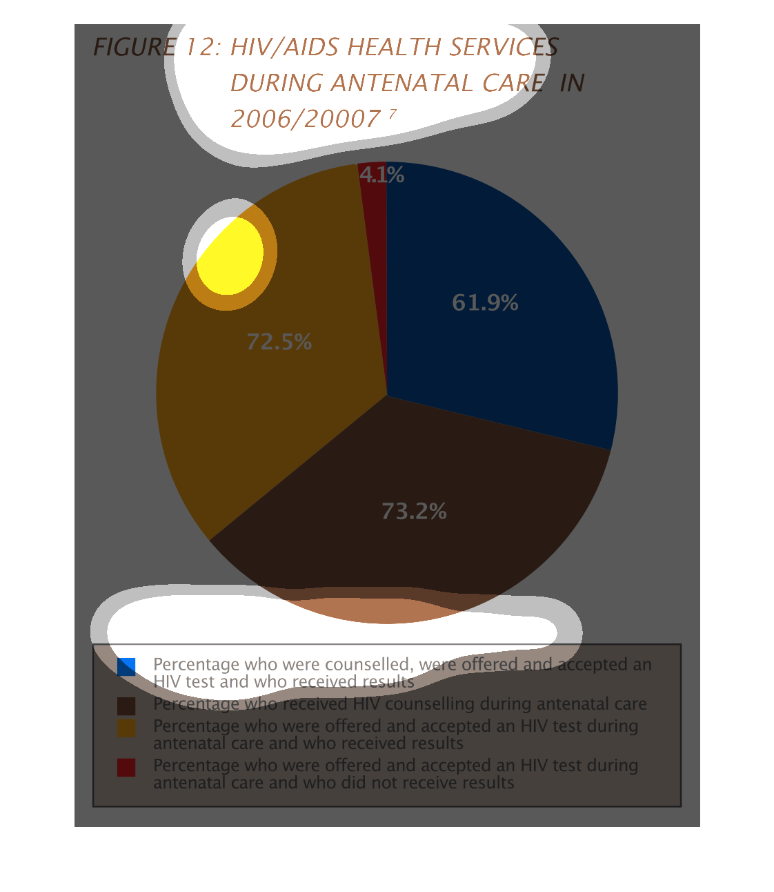
Figure 12 shows HIV/Aids health services during antenatal care in 2006/2007. The largest percentage
of this circle graph are the people who received just counseling during antenatal care. The
smallest group were tested but received no results.
This pie chart shows HIV/Aids health services during antenatal care in 2006/2007. This biggest
percent at 72.5 account for percentage who were offered and accepted an HIV test during antenatal
care and who received results.
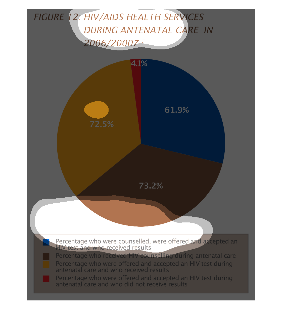
This handmade chart shows the post natal access to HIV and AIDS services. I can only assume
this is for babies born with HIV/AIDS and have no idea what this is about
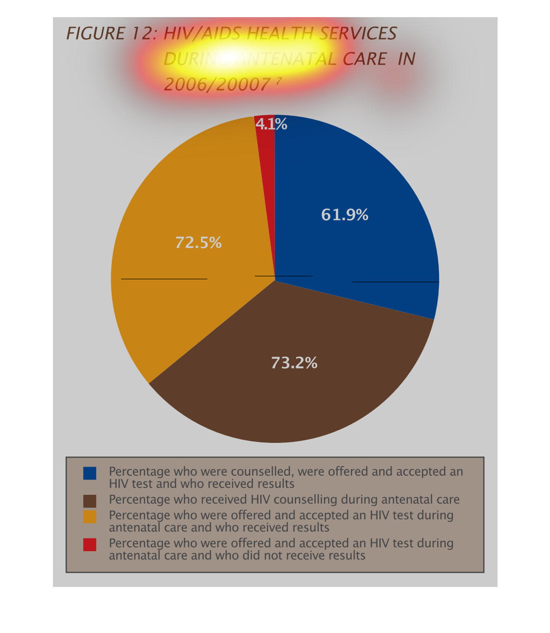
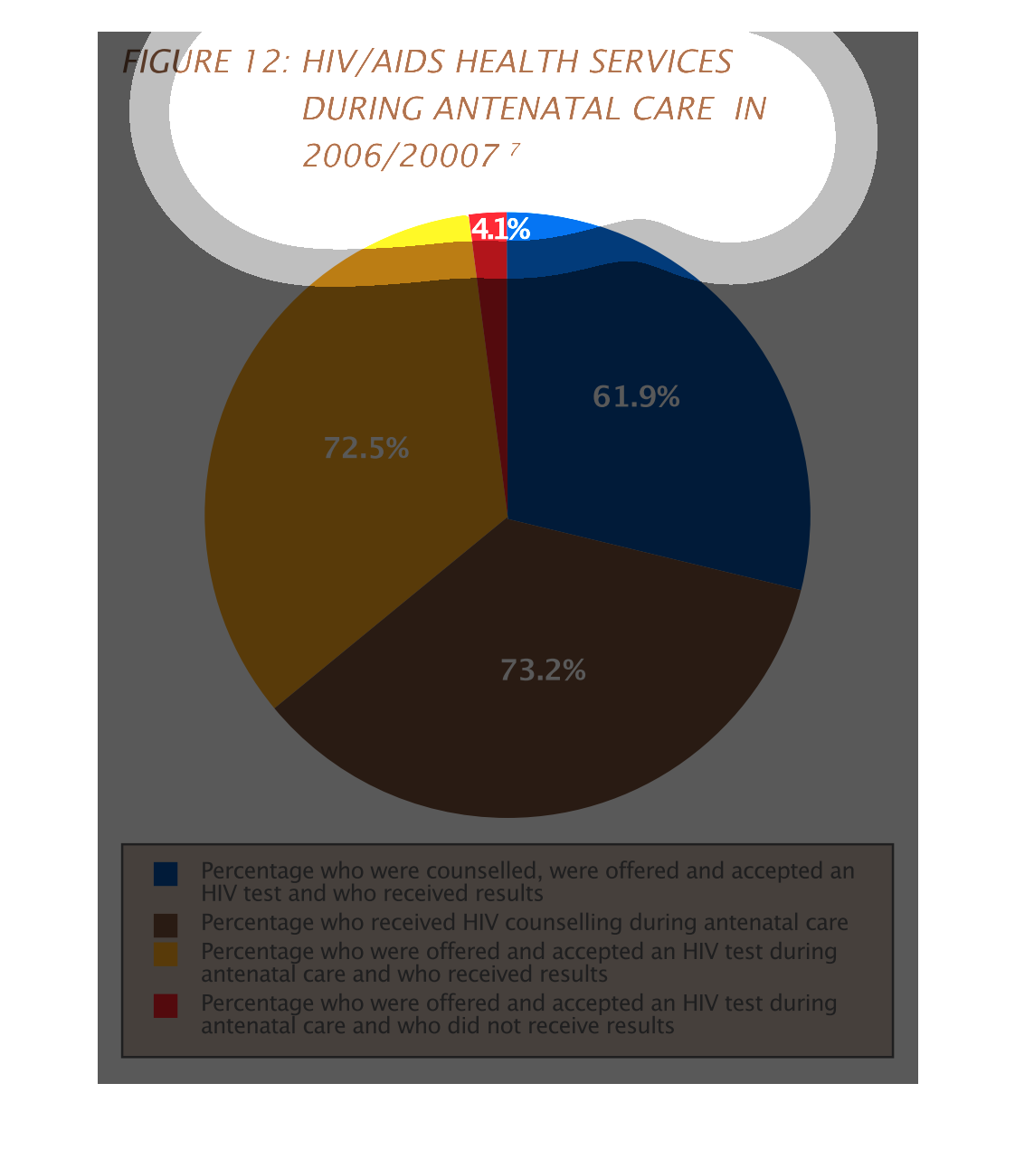
The figure presented is titled HIV/AIDS health services during antenatal care in 2006/2007.
 The figure is a pie chart and it shows the data for HIV/AIDS services.