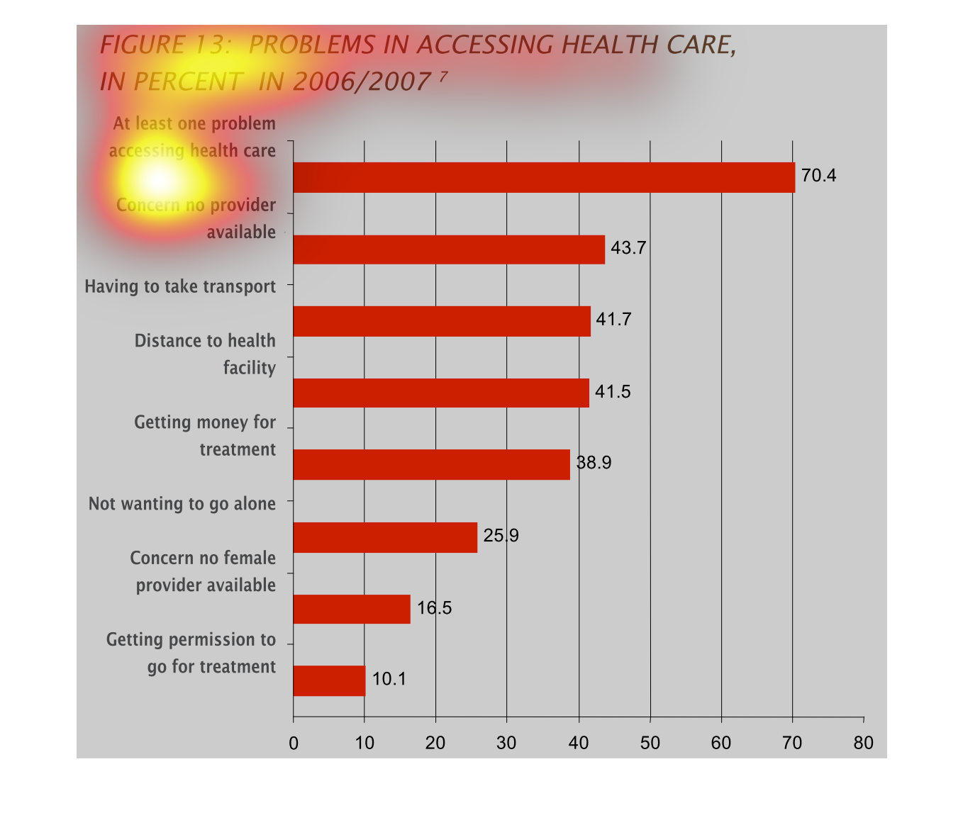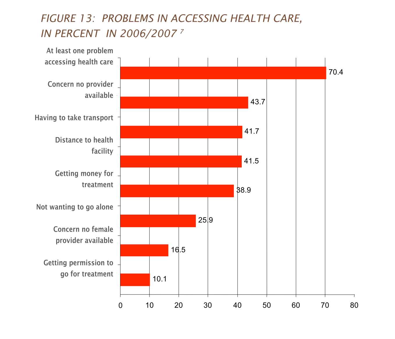
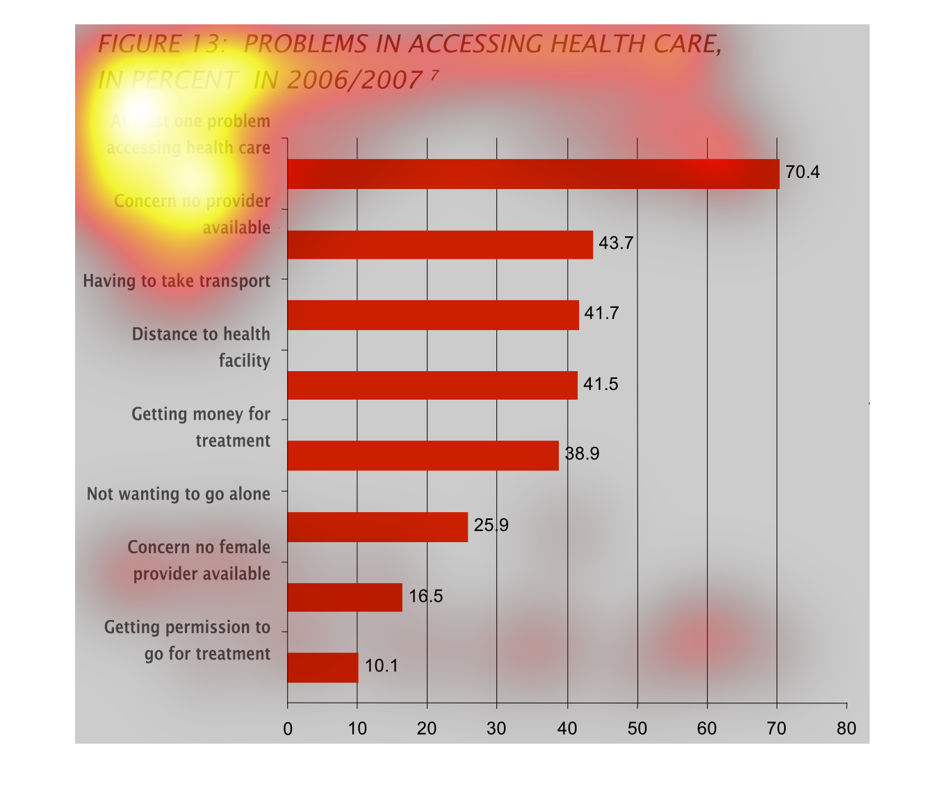
This chart describes problems in accessing health care, in percent in the year 2006/2007.
Categories on the chart include at least one problem accessing health care.
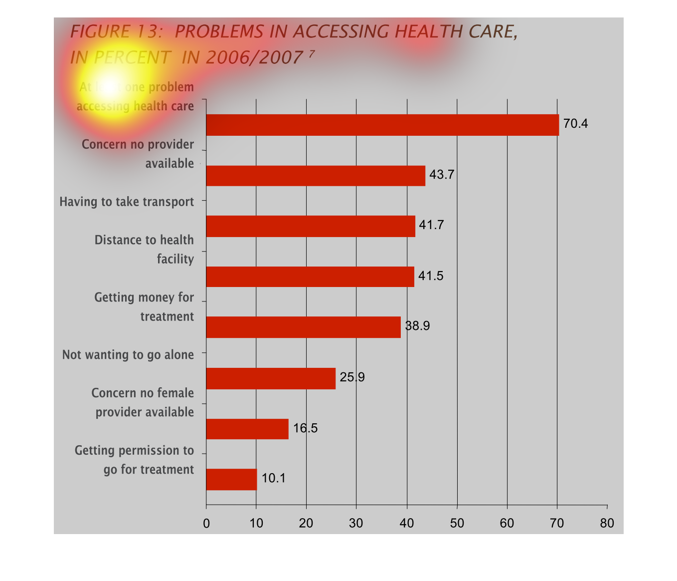
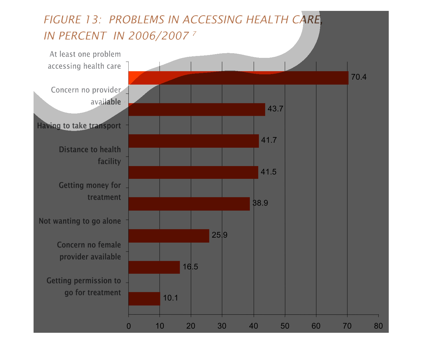
This graph illustrates the problem in assessing health care by percent in 2006/2007.  The
highest percentage is at least one problem accessing health care followed by concern there
is no provider available.
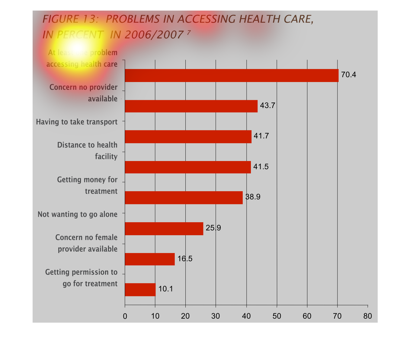
The chart describes different issues or problems in accessing health care providers in the
year of 2006 and 2007.There was a very high rate with at least 1.
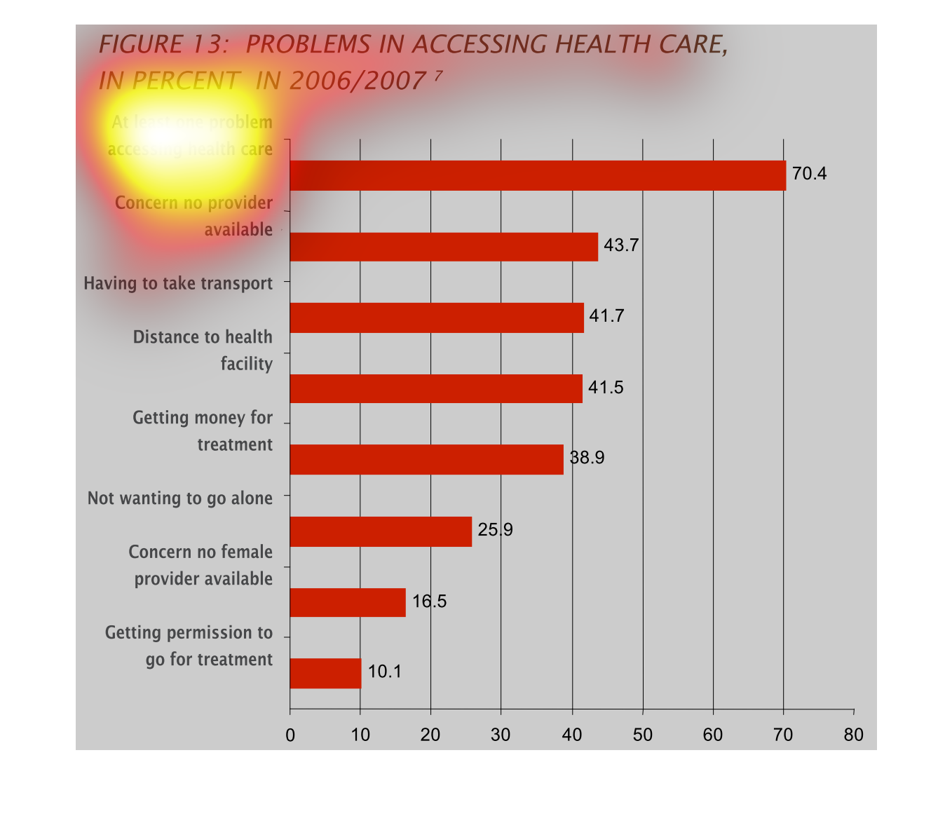
This graph shows percentage of people who experience various problems in accessing healthcare.
The most common problem was concern that no provider was available. Th least common problem
was getting permission to go for healthcare treatment.
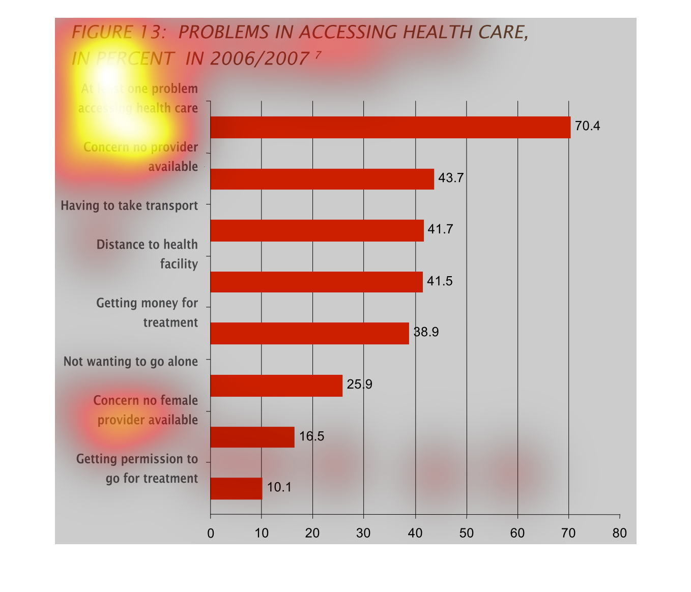
This handmade chart shows the difficulties people face in accessing health care. It lists
some reasons and the number of people who faced that problem
This bar graph is representing problems accessing health care in percent in 2006/2007. The
highest was that at least one problem accessing health care. The other category is concern
no provider available
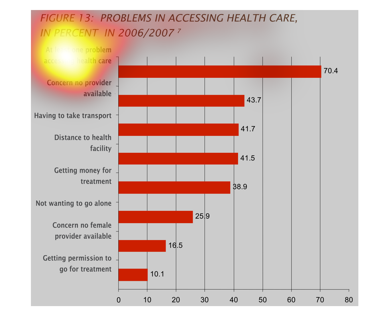
It appears that the graph shows reasons or problems why people do not have access to care
from 2006 to 2007.The high reached 70.4 with the low being 10.1.
The chart shows a survey on peoples problems in receiving heath care. It gives different issues
which people may have had and then shows the total percent  of respondents that had that issue.
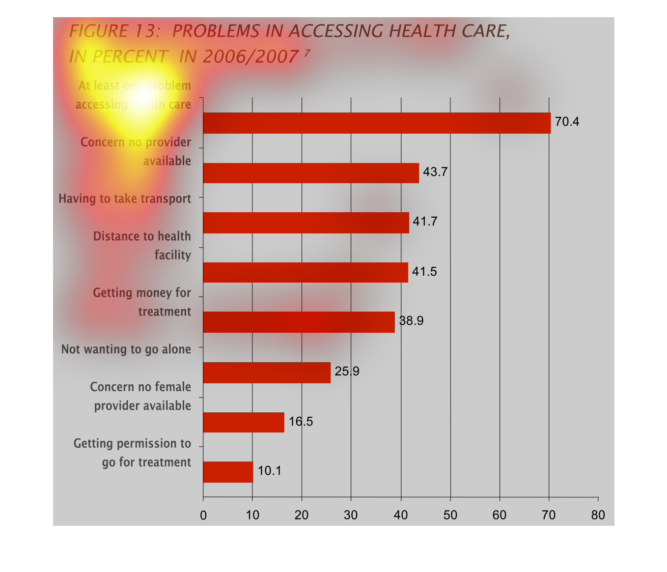
This graph shows problems in accessing healthcare, in percentage, from 2006/7. The horizontal
bars show percentage, and the categories rank different reasons for problems, with the largest
simply being 'at least one problem.'
This graph shows how common it is to encounter problems in acquiring health care. It shows
the occurences in bar graph form. The different categories are sorted on the vertical axis
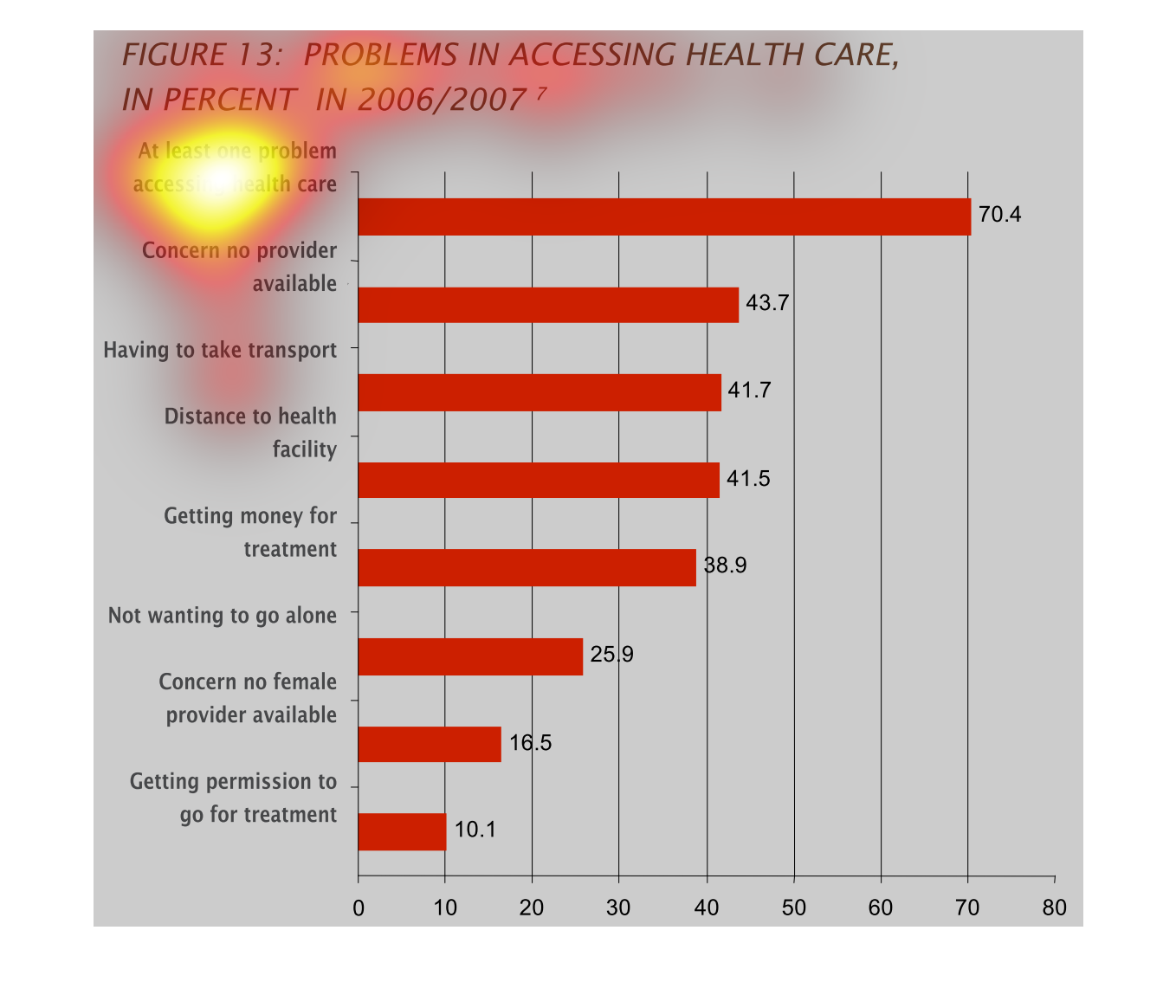
This figure shows problems in accessing health care in percent in 2006 and 2007. About 70.4%
had a problem accessing health care at least once. 10.1% had a problem getting permission
to go a treatment.
The graph describes problems accessing healthcare in years 2006 and 2007. The graph represents
the problems by percentage. The graph indicates that atleast 70.4% of people have atleast
one problem accessing health care. The most common problem was a lack of available providers.
The least common problem was difficulty getting approval to receive treatment
This chart describes problems in accessing health care, in percent for the year 2006/2007.
categories on the chart include concern no provider available.