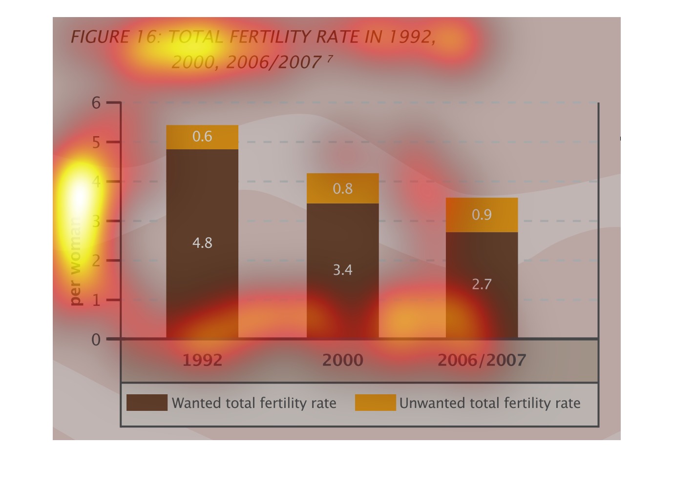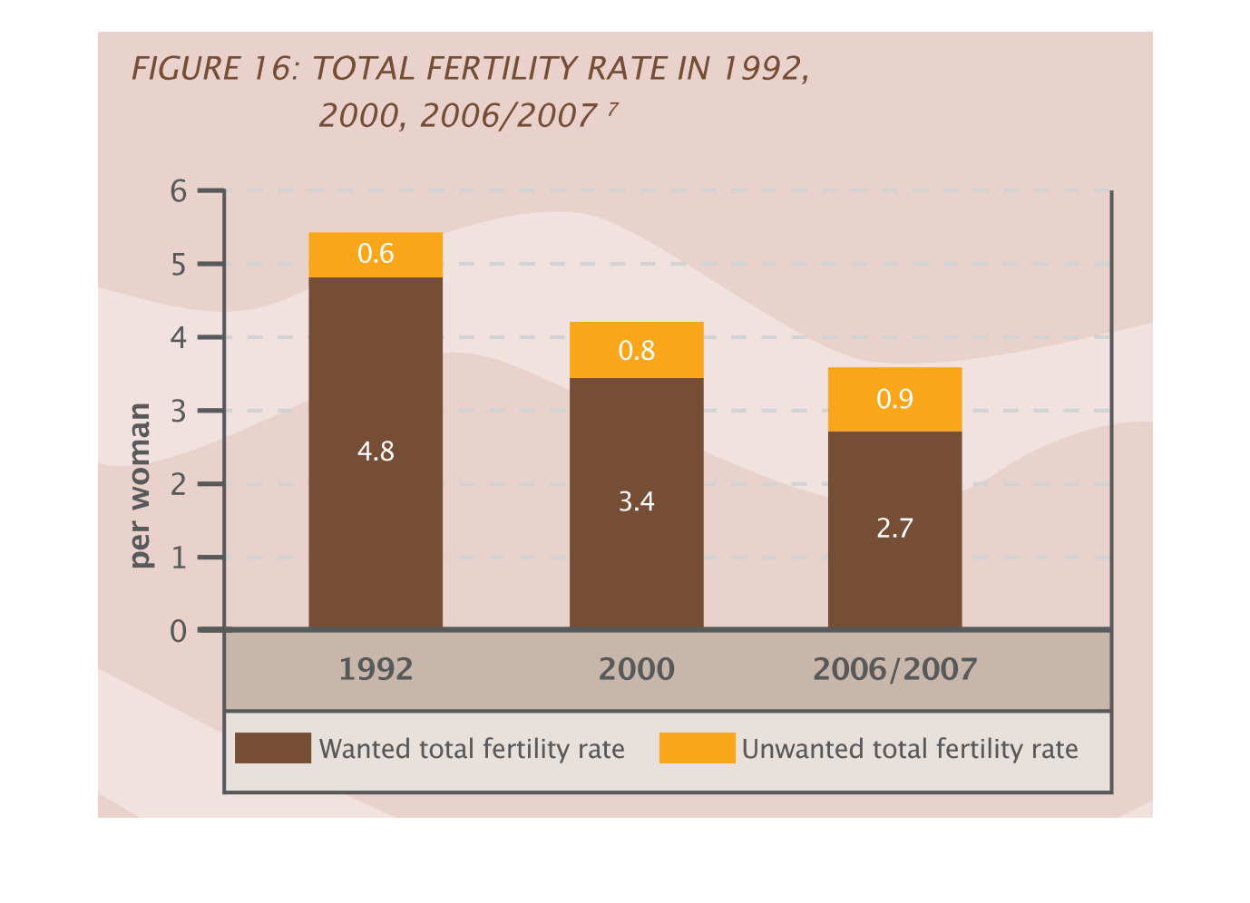
This is a graph of the total fertility rate in 1992, 2000, and 2006/07/. Fertility has slowly
decreased over the period from 1992 to 2006, with about a 25 percent decrease.
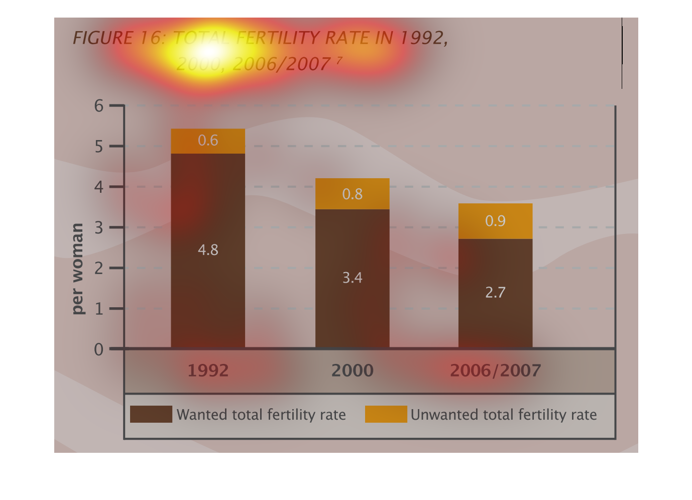
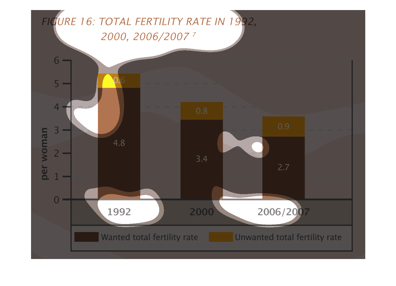
The bar graphs show total fertility rate in 1992, 2000, 2006/2007. On y axis is per women
and  x axis are the years. The brown color show wanted total fertility rate and the  orange
show unwanted
A bar chart infographic showing the total fertility rates from 1992, 200, and 2006 and 2008.
It shows a decrease in fertility rates for both unwanted and wanted
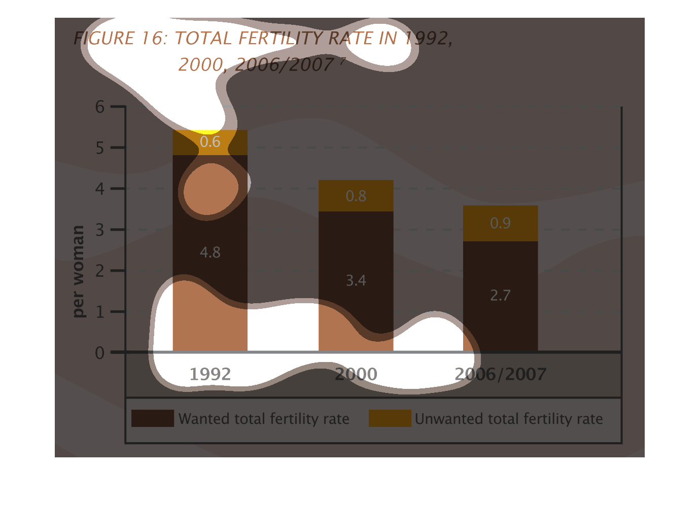
This graph illustrates total fertility rates in 1992, 2000, and 2006/2007.  It has percentages
for both the wanted and unwanted total fertility rates.
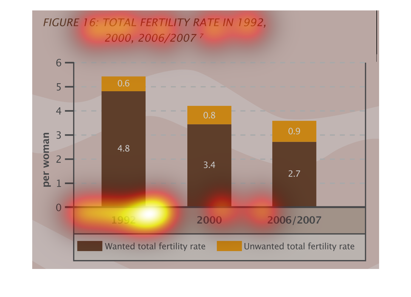
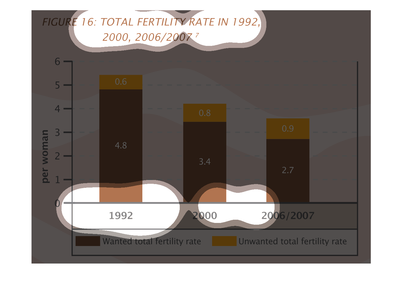
This chart describes total fertility rate in the years 1992, 2000, and 2006/2007. Categories
on the chart include wanted total fertility rate and unwanted total fertility rate.
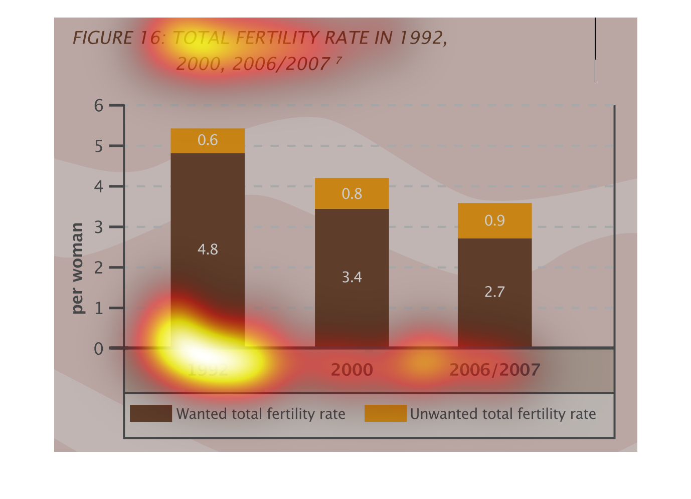
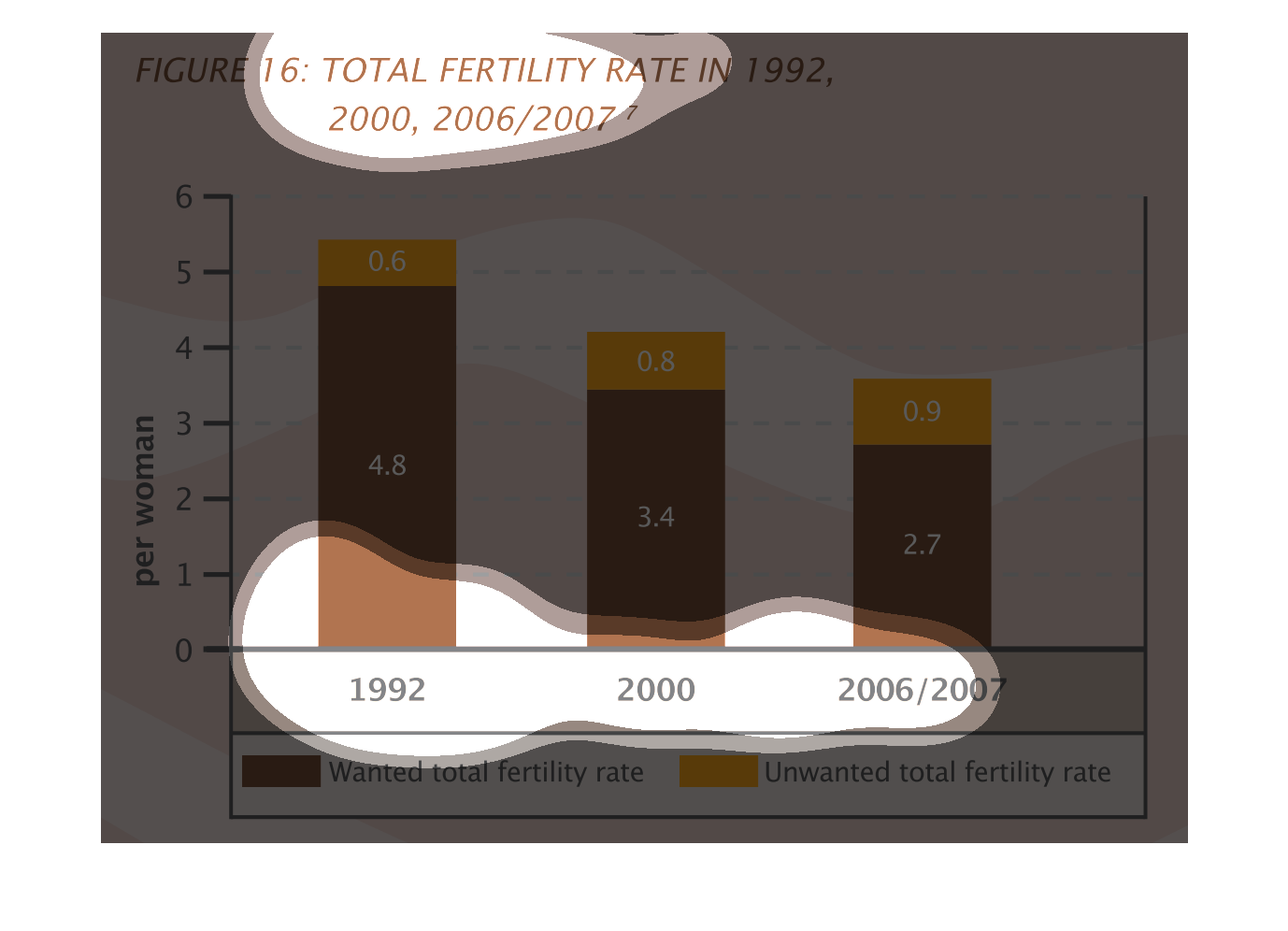
This graph describes the fertility rates in women in the years of 1992, 2000, and 2006/2007.
It charts the number of wanted and unwanted births per woman in each year. Overall, the number
of births over the years has decreased, but the number of unwated births per woman has increased.
The figure presented is titled Total fertility rate in 1992, 2000, 2006/207.  The figure is
a representation of statistical data of the total fertility rate.
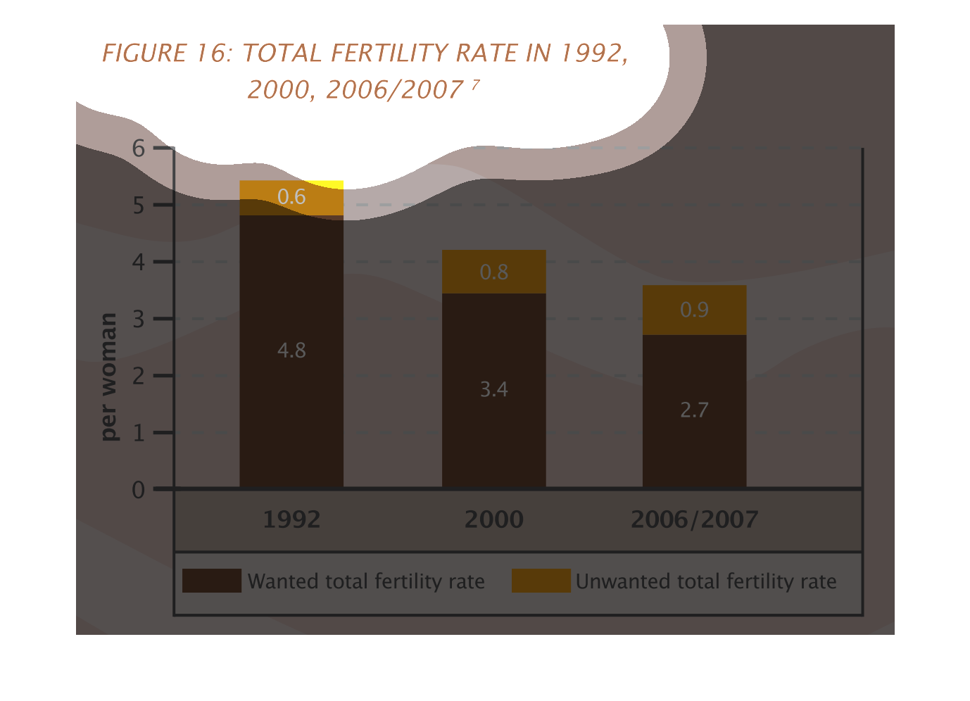
The graph shows the total fertility rate in the years 1992, 2000, 2006/2007.  It is divided
by wanted and unwanted fertility.  The highest incident overall was in 1992, however, the
highest incident of unwanted was in 2006/2007.
This graph illustrates fertility rates in women in 1992, 2000 and 2006/2007. While "wanted"
pregnancy rates have fallen since 1992, the number of unwanted pregnancies have risen slightly.
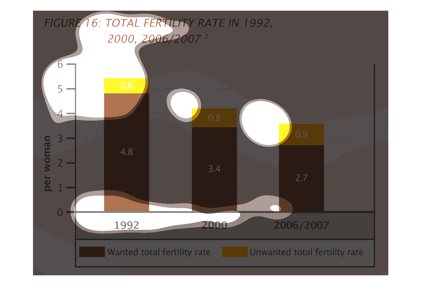
This is a series of bar graphs depicting the total fertility rate in the years 1992, 2000
and 2006/2007. The highest rate is shown to have been in 1992.
Figure 16 shows Fertility rate in 1992, 2000, 2006/2007. Wanted fertility rate is shown in
brown. Unwanted fertility is shown in orange. Wanted Fertility rates trend downward from 1992-2007.
Unwanted rises slightly.
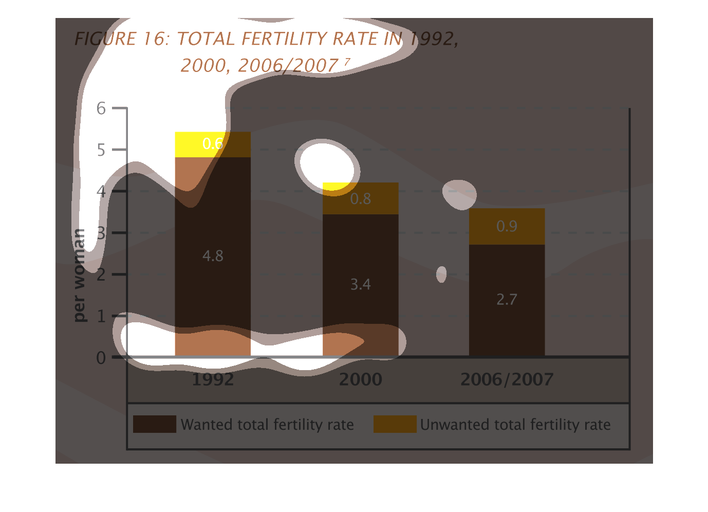
This is a graph that shows the total fertility rate for the years 1992, 2000 and 2002/2007.
It shows the number of children per woman sampled and shows both wanted and unwanted fertility.