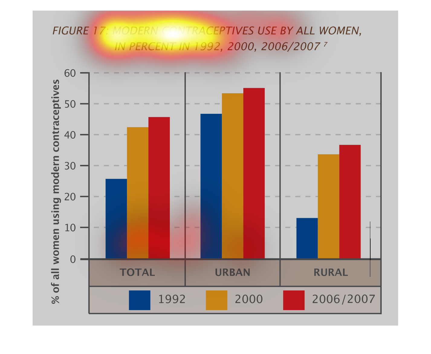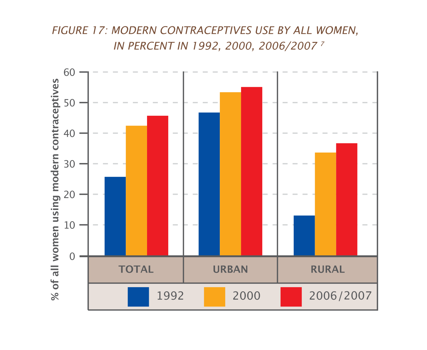
This study is measuring the use of contraceptive over the years by women.  The study appears
to be evaluating the rise of fall of contraceptive use for various years.
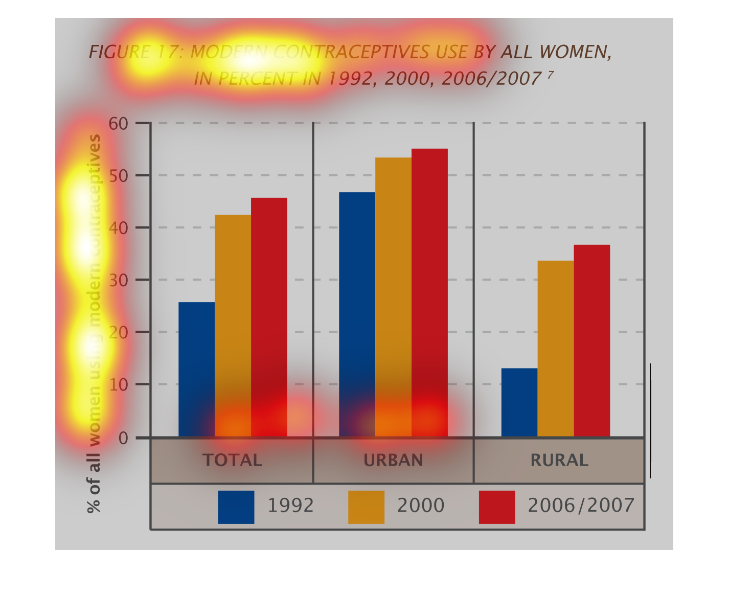
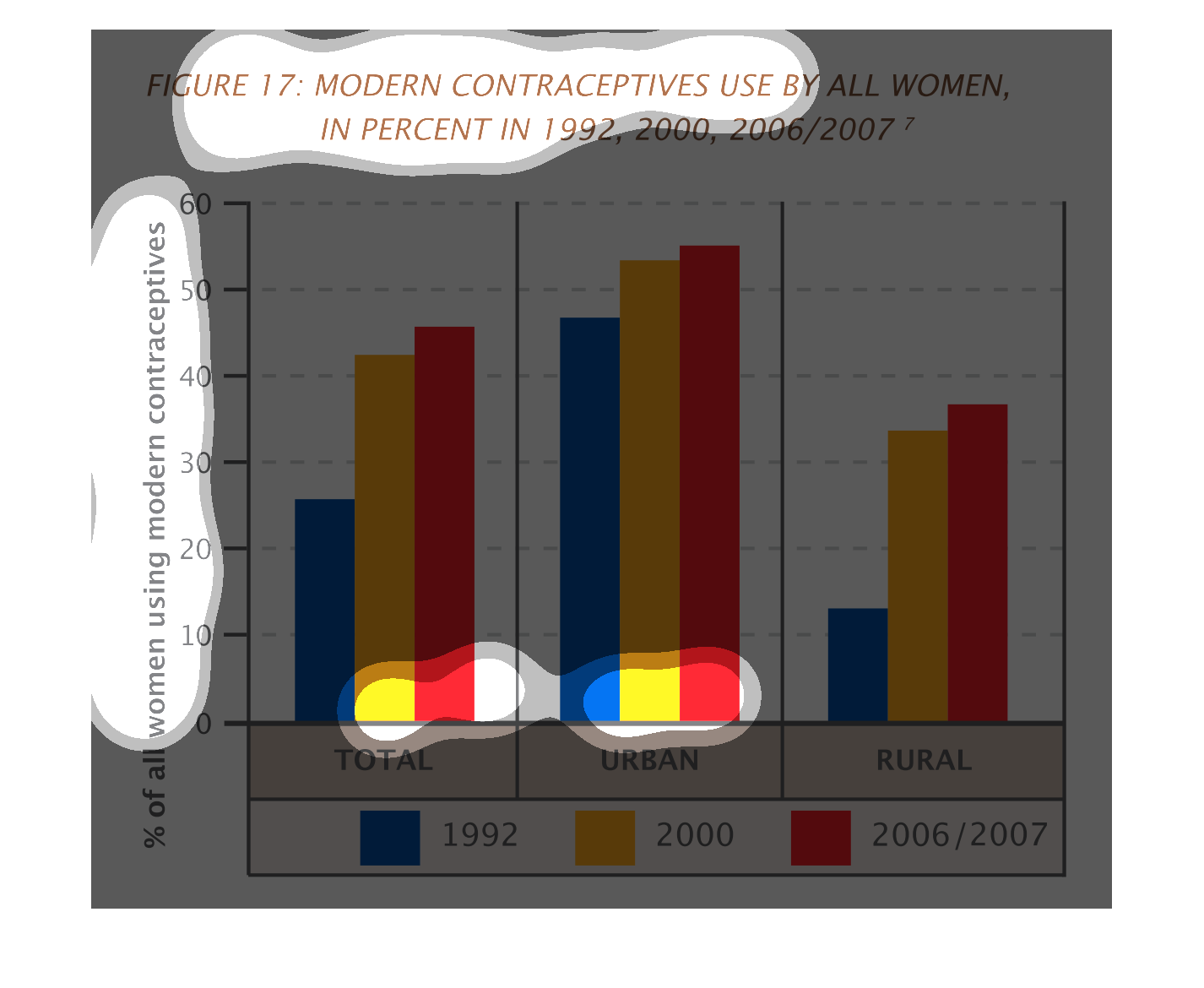
These are a series of graphs showing the use of contraceptives by all women by percentage,
in 1992, 2000, and 2006/2007. The vertical bars denote percentage, and then the years are
ranked by colors.
This is a chart showing the modern contraceptives that are used by women in percent during
1992, 2000, and 2006/07. The rate of women using modern contraceptives have steadily gone
up from 1992 to 2007.
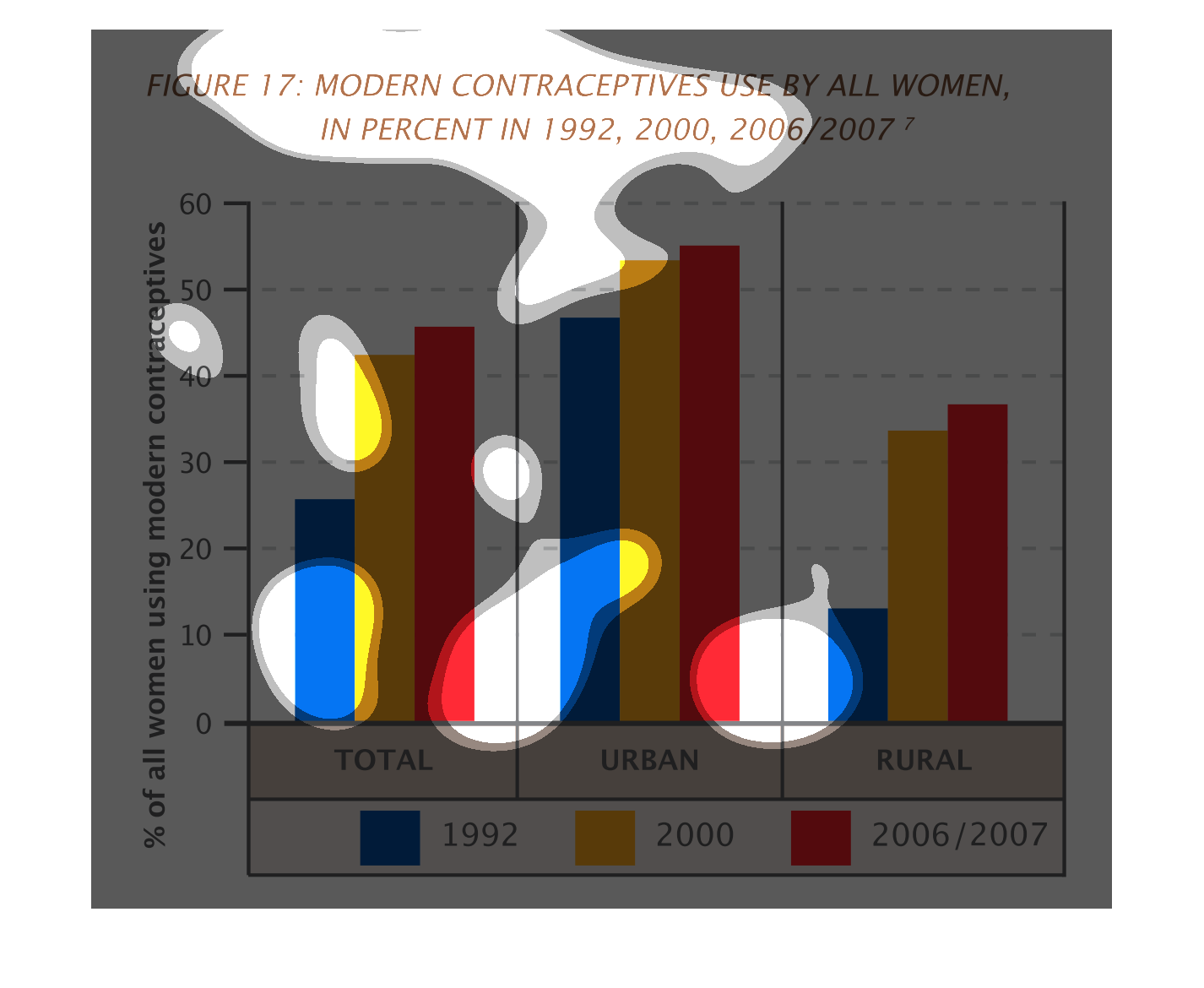
The image on the left hand side show data collected over a two decade period screening the
usage of contraceptives for women in rural and urban communities.  From the data collected
contraceptive use has risen since the data was first collected in both of these areas, especially
in the rural areas for instance.
This chart depicts the percentage of women using modern contraceptives in urban and rural
environments in 1992, 2000, and 2006-07.  The cumulative percentiles are also shown.
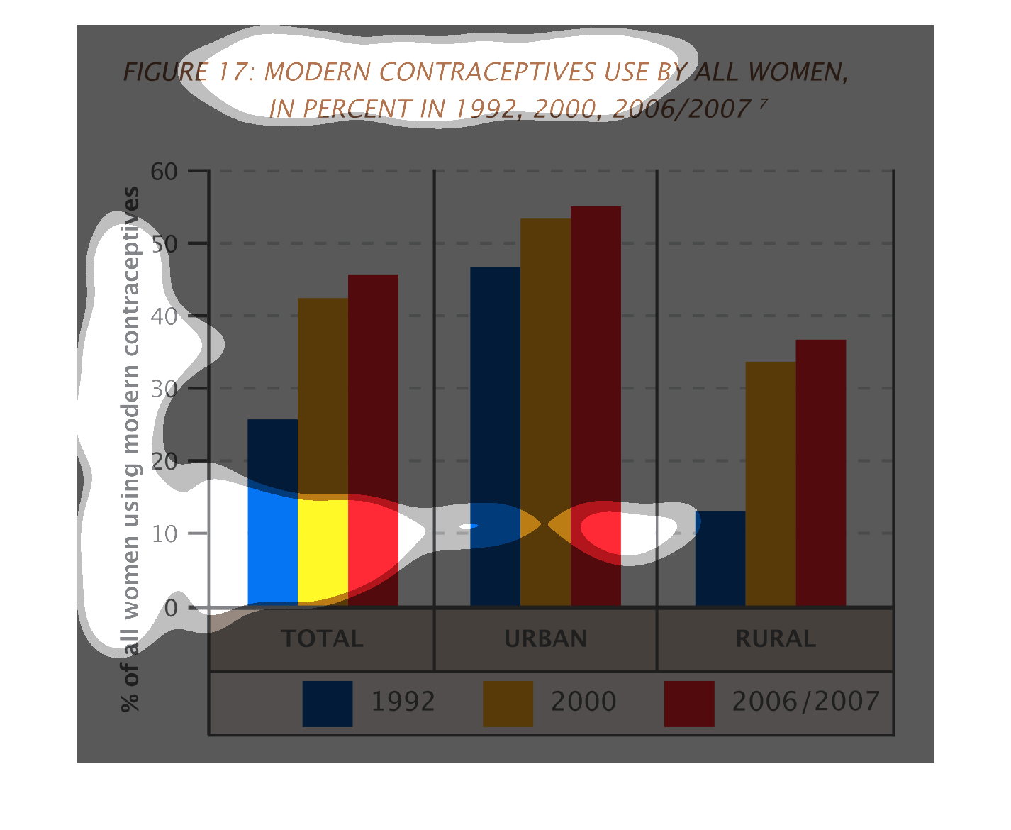
This is a graph that shows the modern contraceptive use by women in percent for the years
1992, 2000, 2006 and 2007. It groups the women in terms of those in rural and those in urban
areas.
This chart depicts the use of modern contraceptive by all women comparing the years of 1999,
2002, and 2006/2007 respectively. 2006 and 2007 were combined. The urban and rural settings
were also distinguished; the chart reveals that contraceptive use has increased in both sectors
as of 2006/2007.
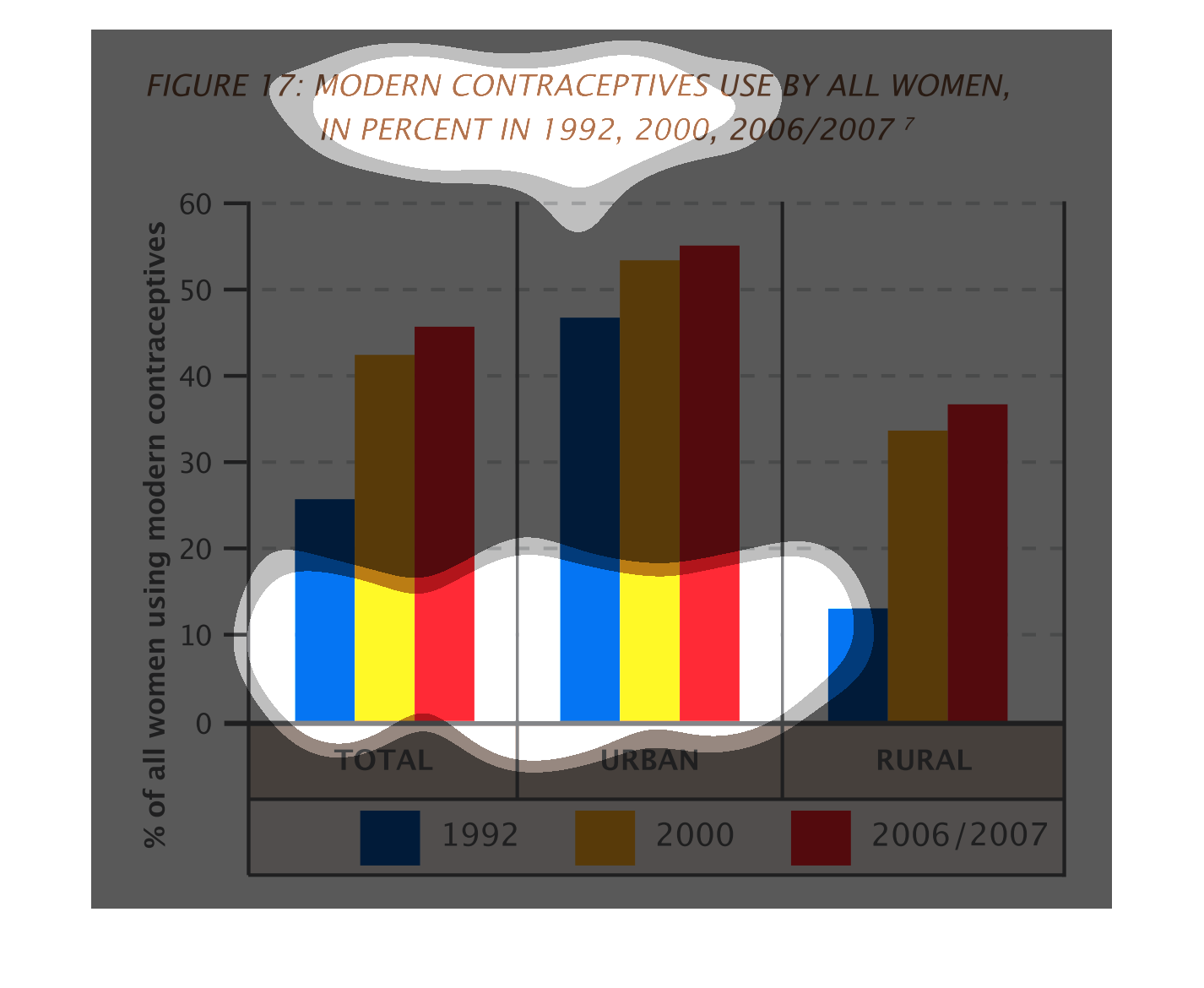
This graph shows the percentage of all women using contraceptives in rural and urban communities
in three different years .  Those years are 1992, 2000, and 2006-2007.  It also looks at the
ages of the women.  This graph indicates that in women in urban communities use contraceptives
later in life than rural women.
This image or figure shows or depicts in statistical bar graph format the modern contraceptive
use by all women in percent in 1992, 2000 and 2006/2007.
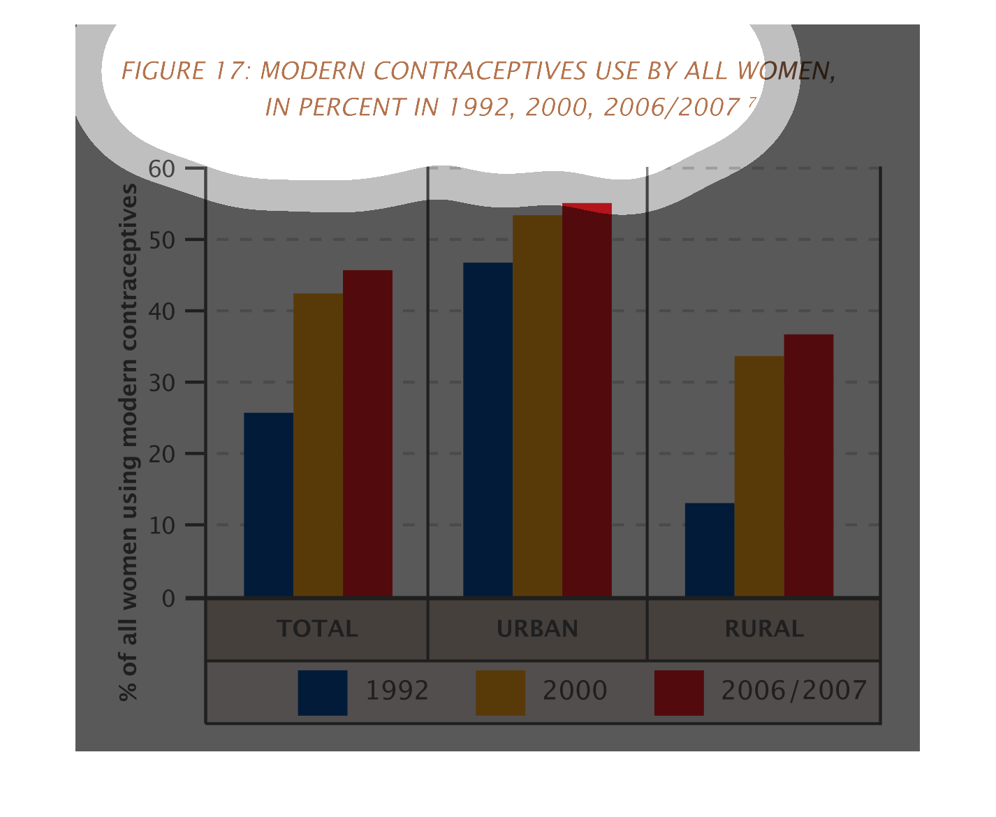
This chart describes the percent of women using modern contraceptives covering years 1992,
2000, 2006 and 2007. The chart compares women in rural and urban areas. Women in urban areas
use contraceptives more than those in rural areas.
Figure 17 shows modern contraceptive use by all women in percent in 1992, 2000, 2006/2007.
This bar graph shows percent of women using contraception among urban and rural areas. Contraceptive
use is highest among urban areas.
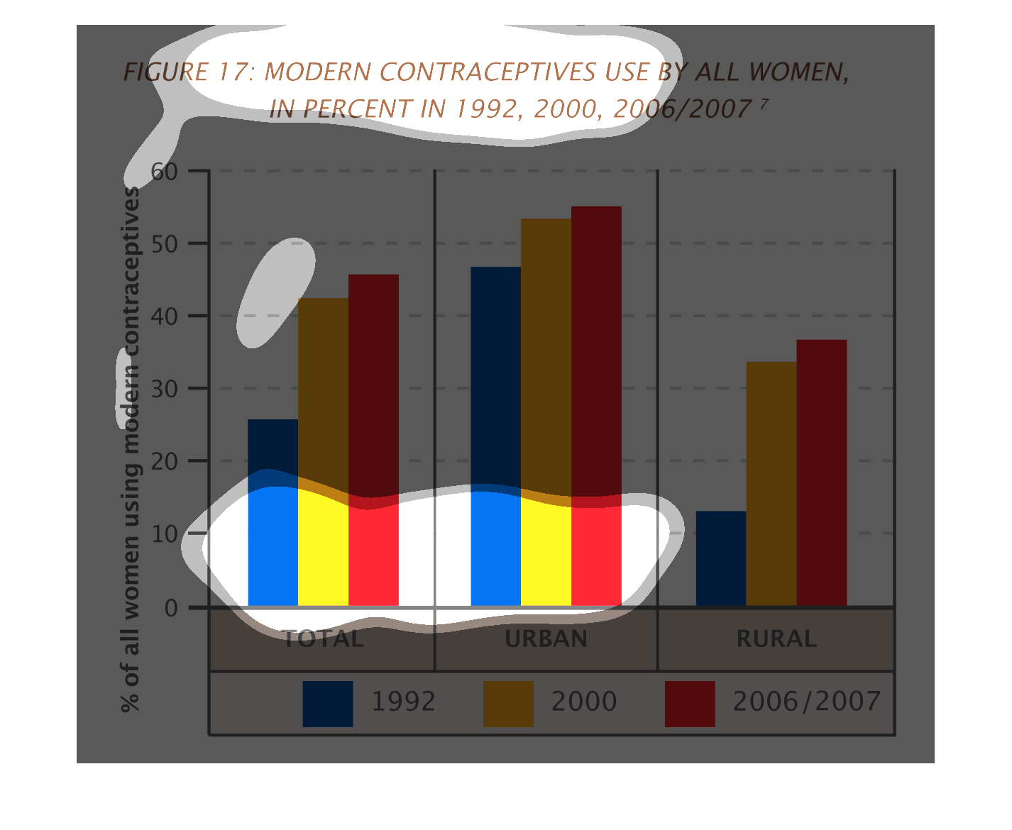
This chart describes modern contraceptives use by all women, in percent for the years 1992,
2000, and 2006/2007. Different years on the chart are represented by different colors.