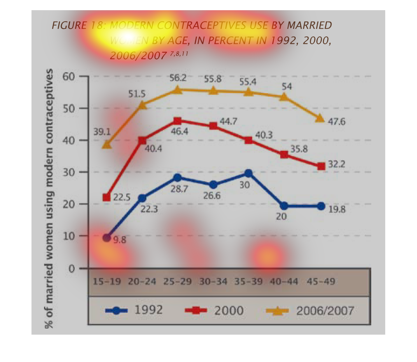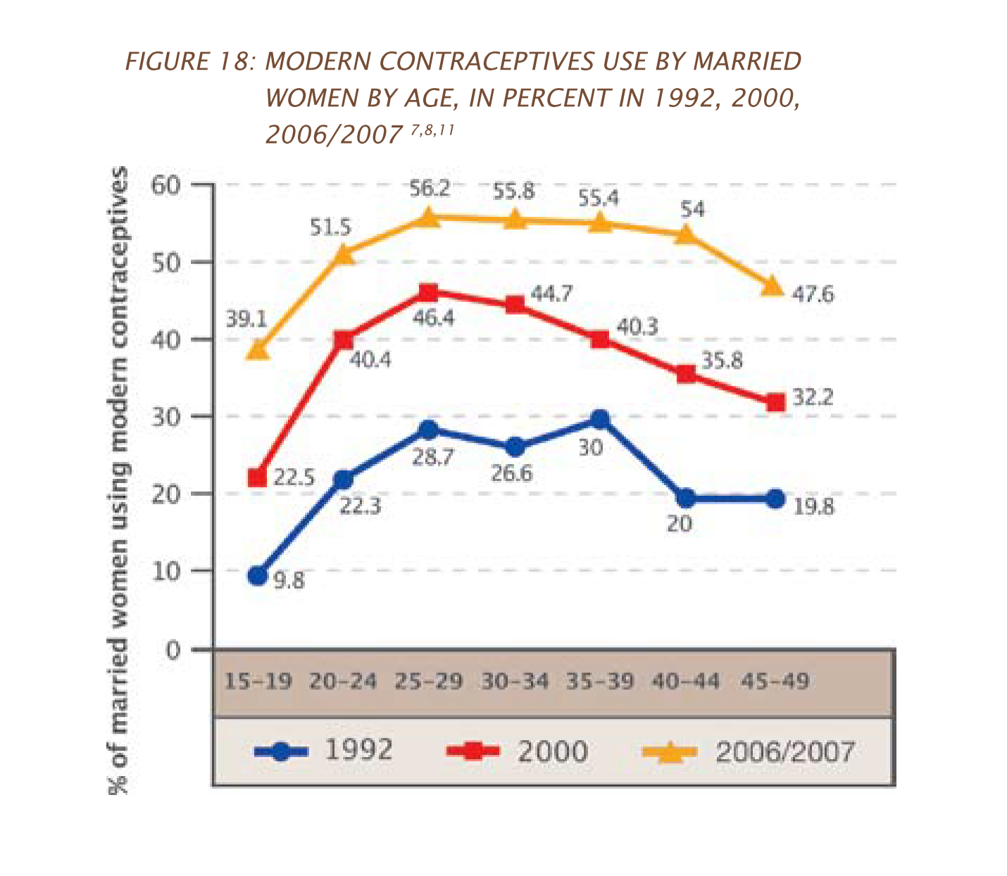
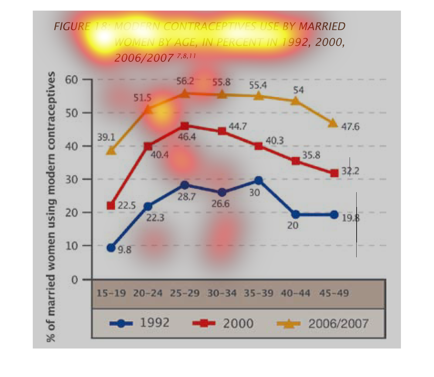
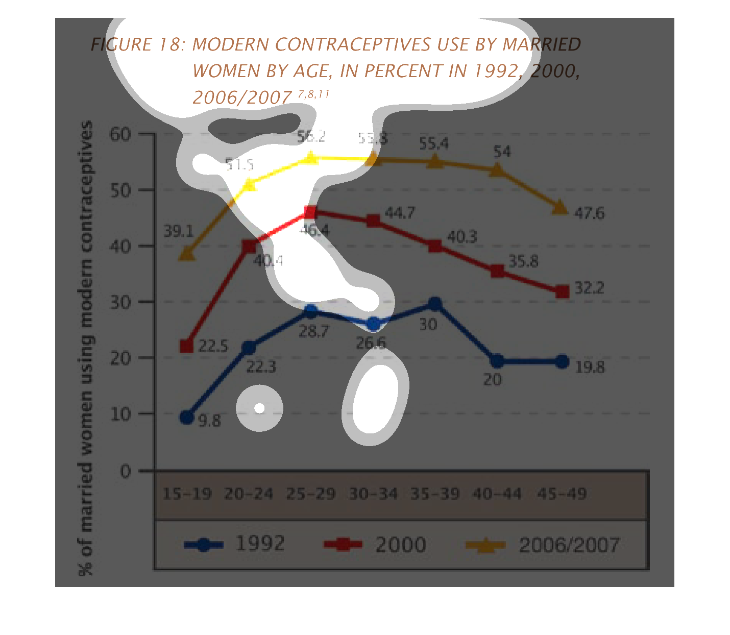
This image shows modern contraception use by married women by age in 1999, 2000, and 2006/2007.
 Percentages are listed on the left side of the graph.   Ages (from 15-49) are grouped along
the bottom. Each year is given a color.  1999 is blue, 2000 is red and 2006/2007 is yellow.
 Each amount is then plotted on the graph in the corresponding color.
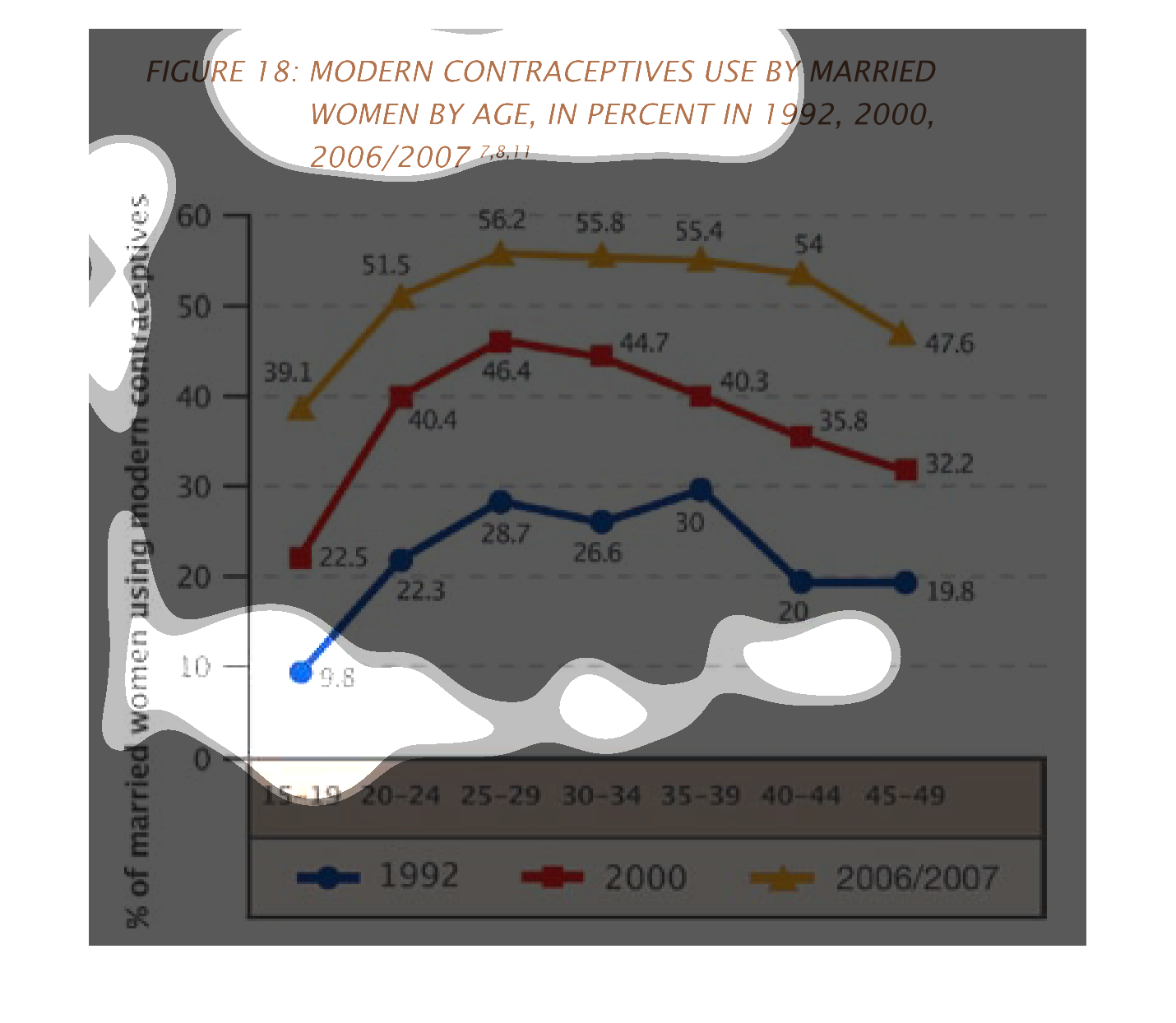
This image or figure depicts or shows in line and dot statistical graph format the modern
contraceptives use by married women by age, in percent for 1992, 2000, 2006/2007.
This chart makes no sense because there is no context and it is hard to read. It looks like
it is about modern contraceptive use by women. But it doesn't specify what kind of contracteptive.
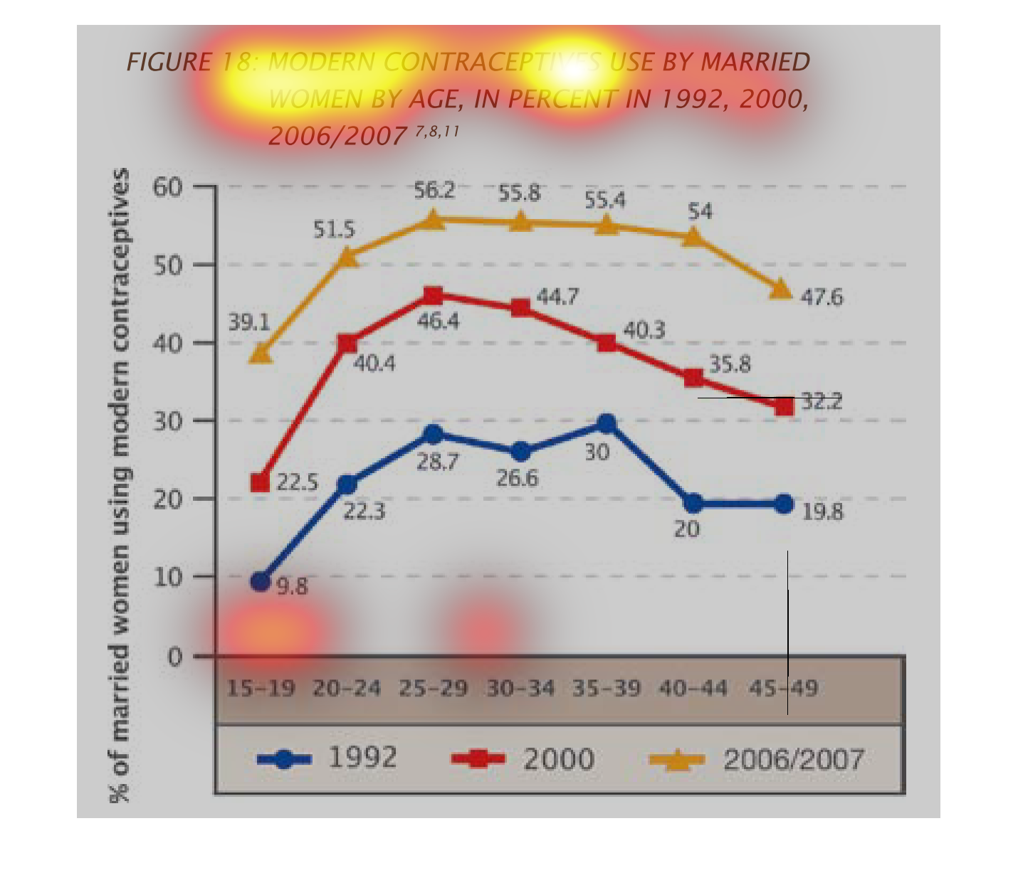
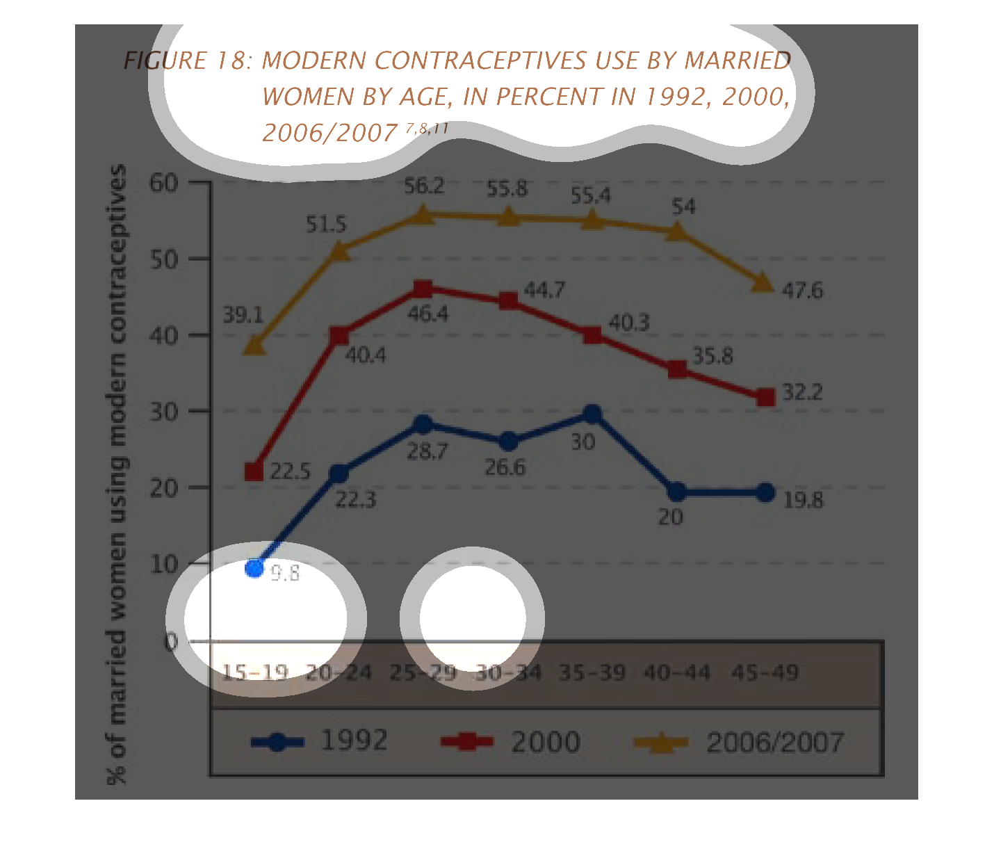
Modern contraceptives used by married women by age in percent in 1992, 2000, 2006/2007,  Image
appears to be a chart of the different contraceptives used by women through the years. Seems
to broken down by years of study and age of the women.
This graph compares the contraceptive usage by married women across a variety of years. The
graph shows that more married women are using modern contraceptives in the 2006/7 demographic
than did the women in 2000, who used more modern contraceptives than married women in 1992.
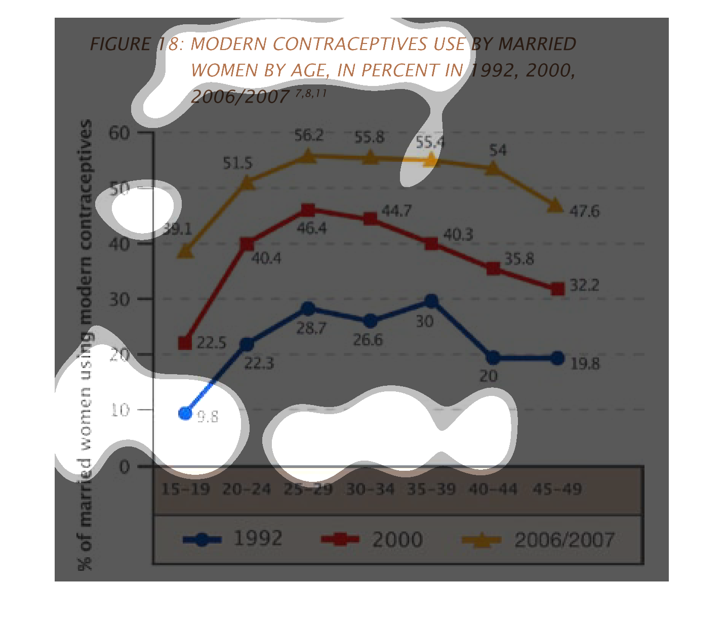
This image shows a graph of the percentage of married women using modern contraceptives by
age.  Each colored line represents a different year.  Blue is 1992, Red is 2000, and Yellow
is 2006/2007.  The Y axis on the left side of the graph is the percentage of women using modern
contraceptives, and the X axis at the bottom of the graph is the age.

The graph is a line graph that represents the use of contraceptives by married women in 1992,
2000, 2006 and 2007. It's broken down by age in percentages
This chart describes modern contraceptives used by married women by age, in percent for the
years 1992, 2000, and 2006/2007. Different years on the chart are represented by different
colors.
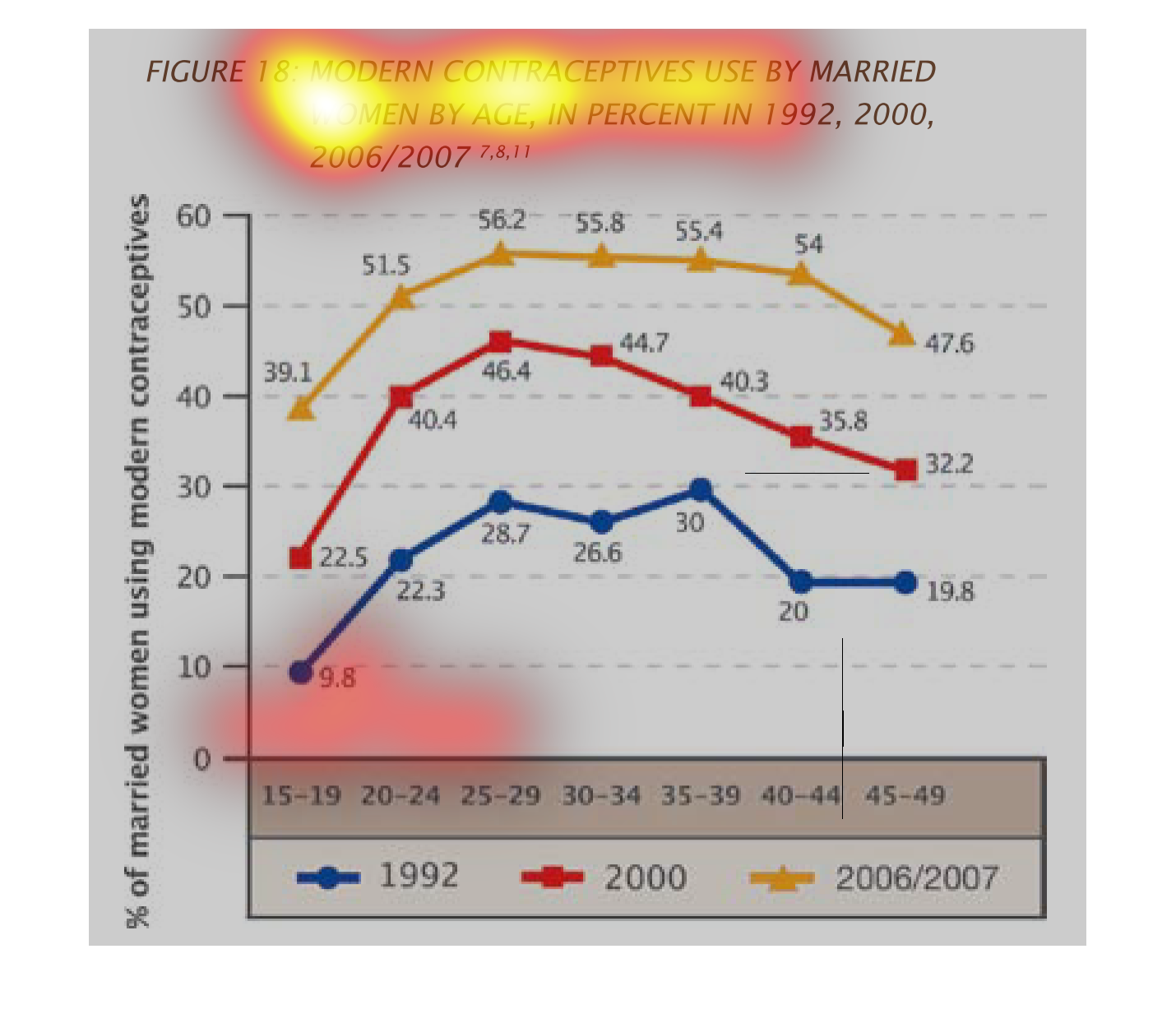
This is a graph that shows how women of different age use contraceptives. This is regarding
married women. It shows the usage of contraceptives in different decades.
This is a chart depicting modern contraceptives use by married women by age, in percent, in
1992, 2000 and 2006/2007. It shows an overall rise, then decline across all age groups.
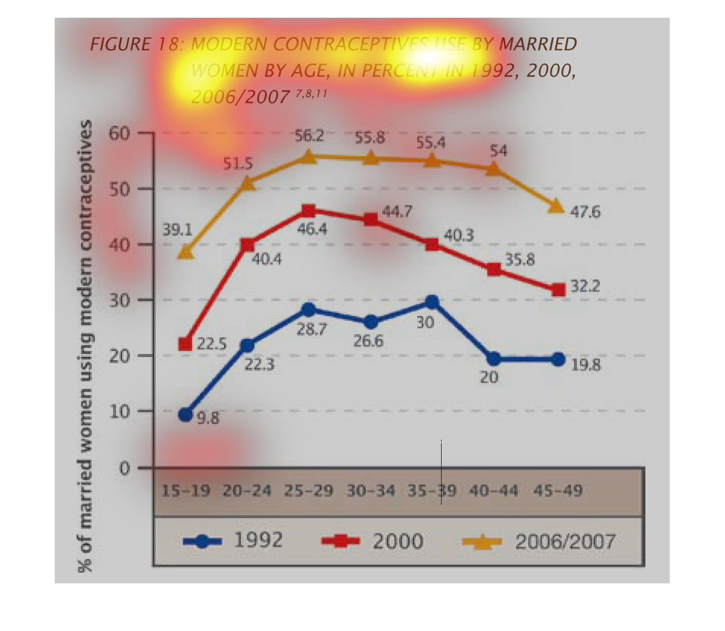
the line graph shows trends of contraceptive use of married women compared over 3 separate
years and over age groups. The highest use was measured in the year 2006/2007 and the lowes
in 1993.  All the years have basically the same tren: younger women use more contraceptives
than older women