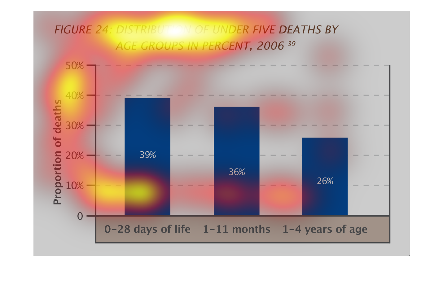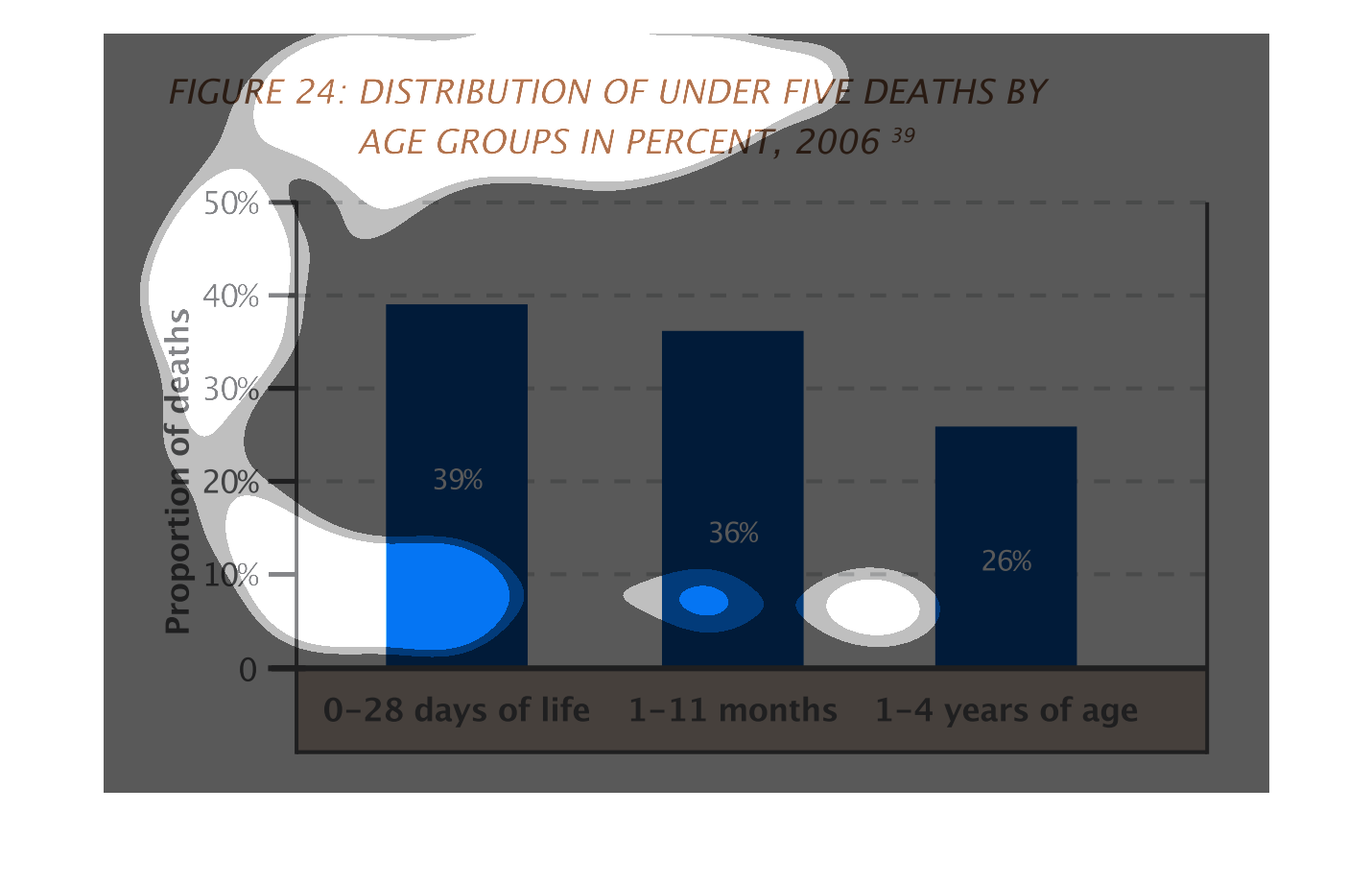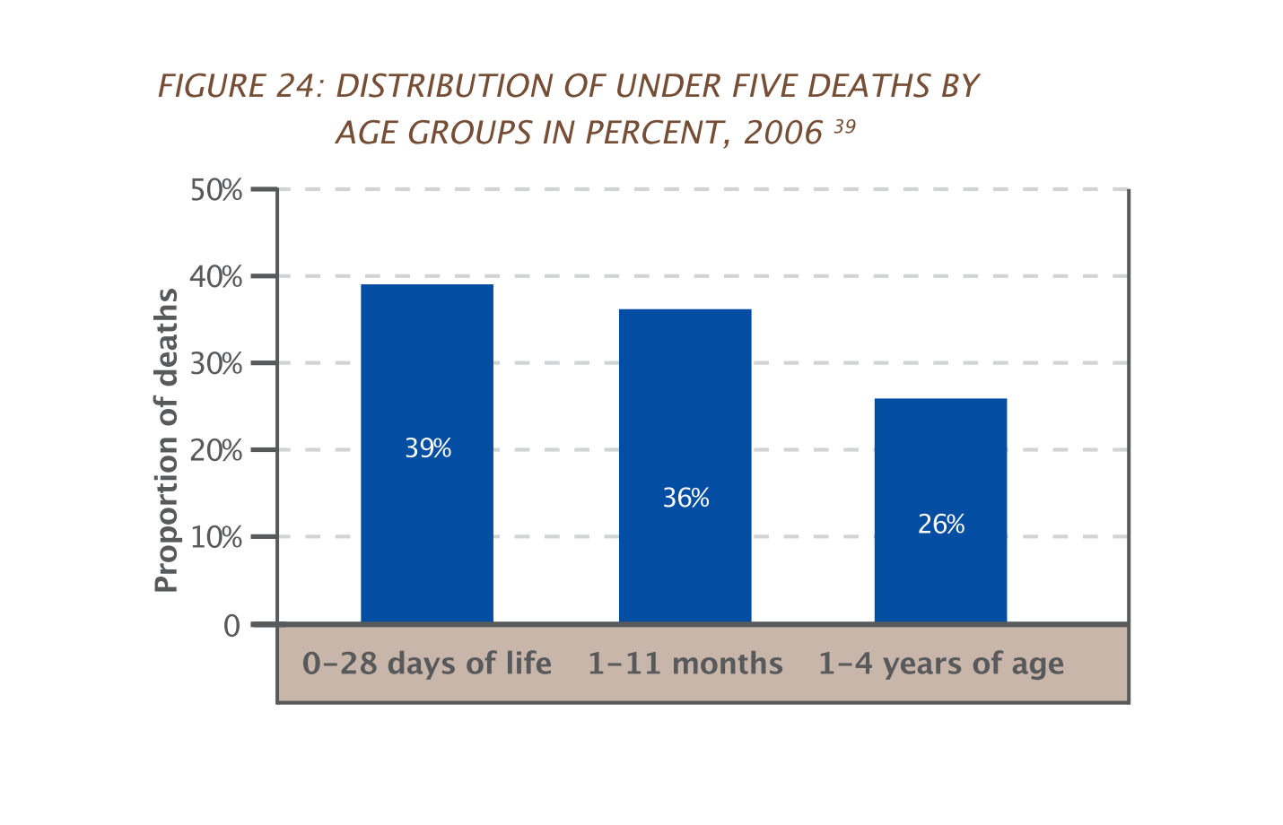
This bar graph represents data on the percentage of children under the age of 5 years old
die. Approximately 40% die between the ages of 0 to 28 days. Approximately 35% die between
the ages of 1 and 11 months. Approximately 25% die between the ages of 1 to 4 years.
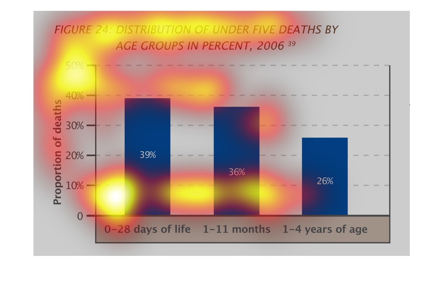
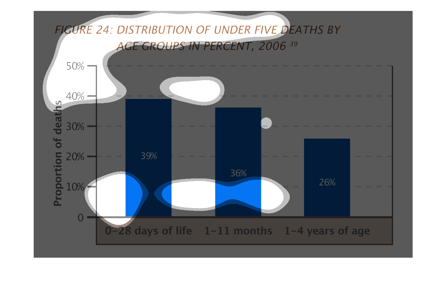
This graph shows the percentage of deaths in 2016 for deaths under five and breaks it down
into age groups.  The greater number of deaths are from 0-28 days of life.
Figure 24: Distribution of under five deaths by age groups in percent, 2006  This chart graphs
out the proportion of deaths from 10% to 50% for 3 age groups, 0-28 days of life, 1 to 11
months old & 1 to 4 years old.  The highest death rate was in the first 28 days of life at
39%, followed by age 1 to 11 months at 36%, and finally age 1 to 4 years at 26%.
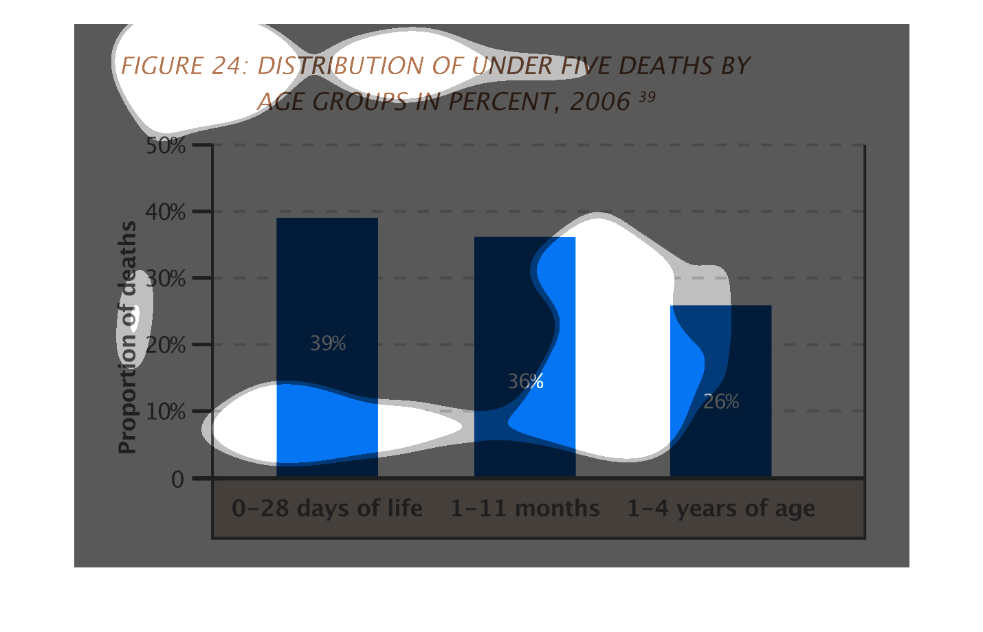
The chart shows the distribution of under 5 deaths by age groups in 2006.  The most are in
0 - 28 days of life, with 39%.  The percentages go down from there.
This is a series of bar graphs depicting the distribution of under five deaths by age groups
as a percentage in the year 2006. The highest is shown to be within 0-28 days of birth.
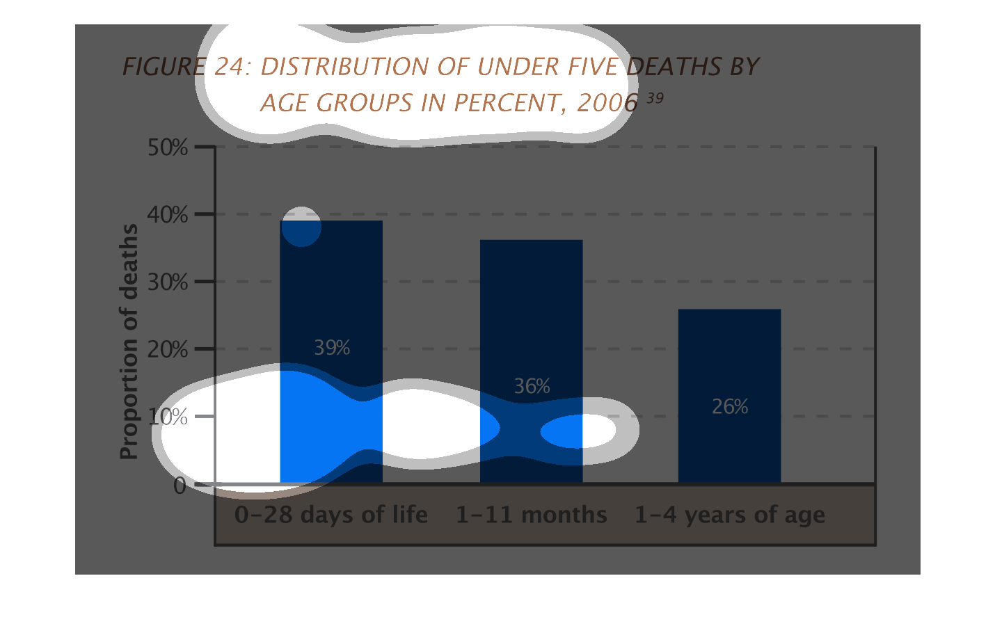
This graph shows the distribution of deaths for those children under 5 by age group in 2006.
 Zero to 28 days is the largest group, 1 to 11 months is next, then 1 to 5 years is the lowest
mortality.
The figure presented is titled figure 24: distribution of under five deaths by age groups
in percent, 2006.  The figure is a representation of under five deaths.
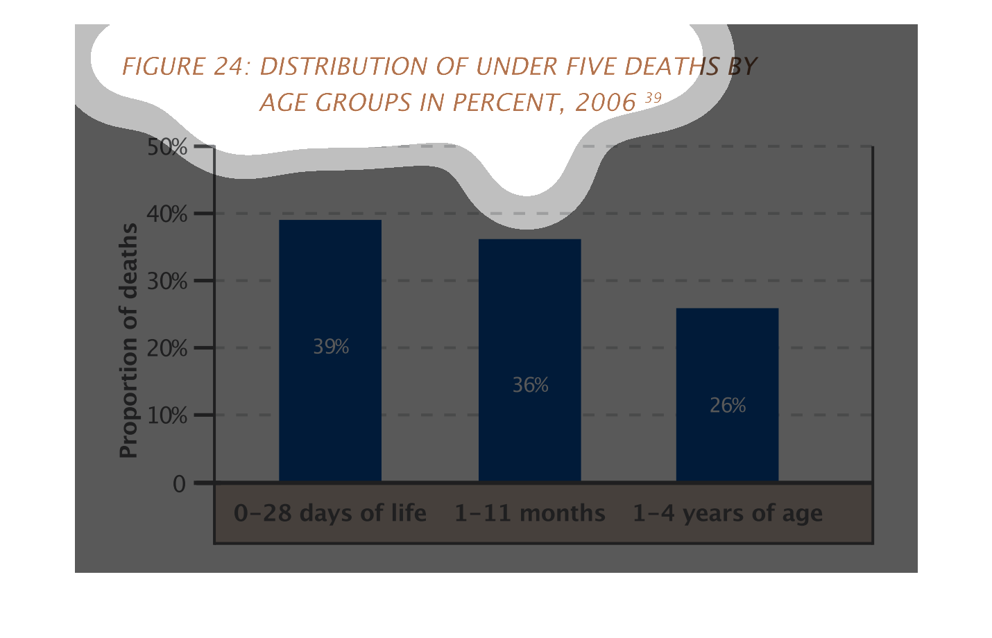
The graph shows the number of under five deaths in different age groups. These numbers are
from 2006. The greatest amount is within 28 days, whereas the least number of deaths is when
the child is 1-4 years old.
This chart shows the distributions of death in ages under 5 from 2006. Three vertical bars,
one for 0-28 days, one for 1-11 months, and finally 1-4 years of age, make up the chart. It
is ranked by percentage.
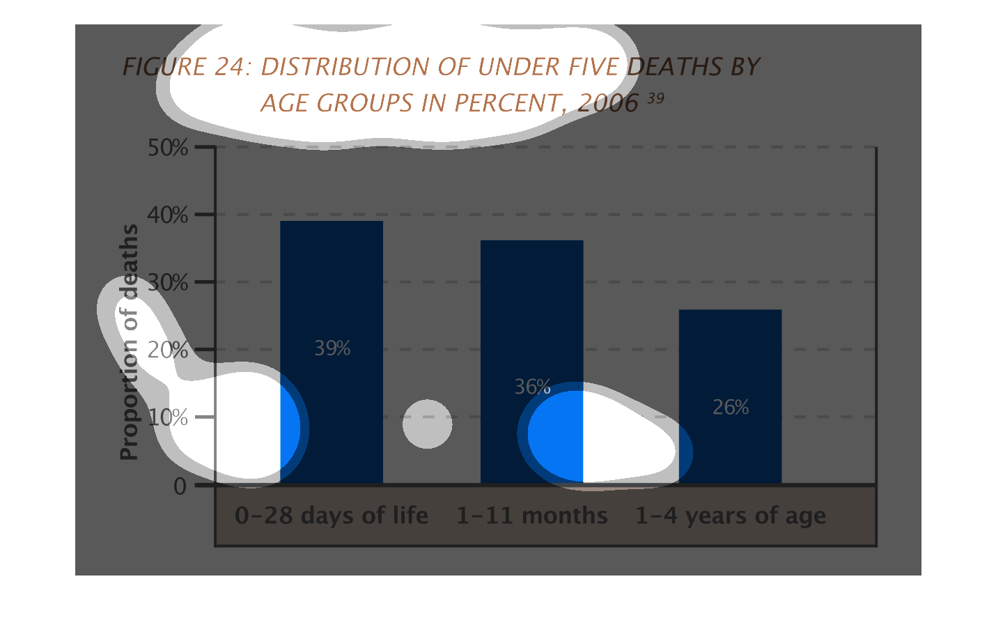
This chart shows the distribution of under five deaths by age groups in percent 2006.  Children
from birth to 4 years of age are measured in increments of 0-28 days, 1-11 months, and 1-4
years.  The proportion of death decreases as children age.
The image of the graph seems to deal with the distribution of death within the five and under
age group.The chart shows that higher mortality rates occur at younger ages.
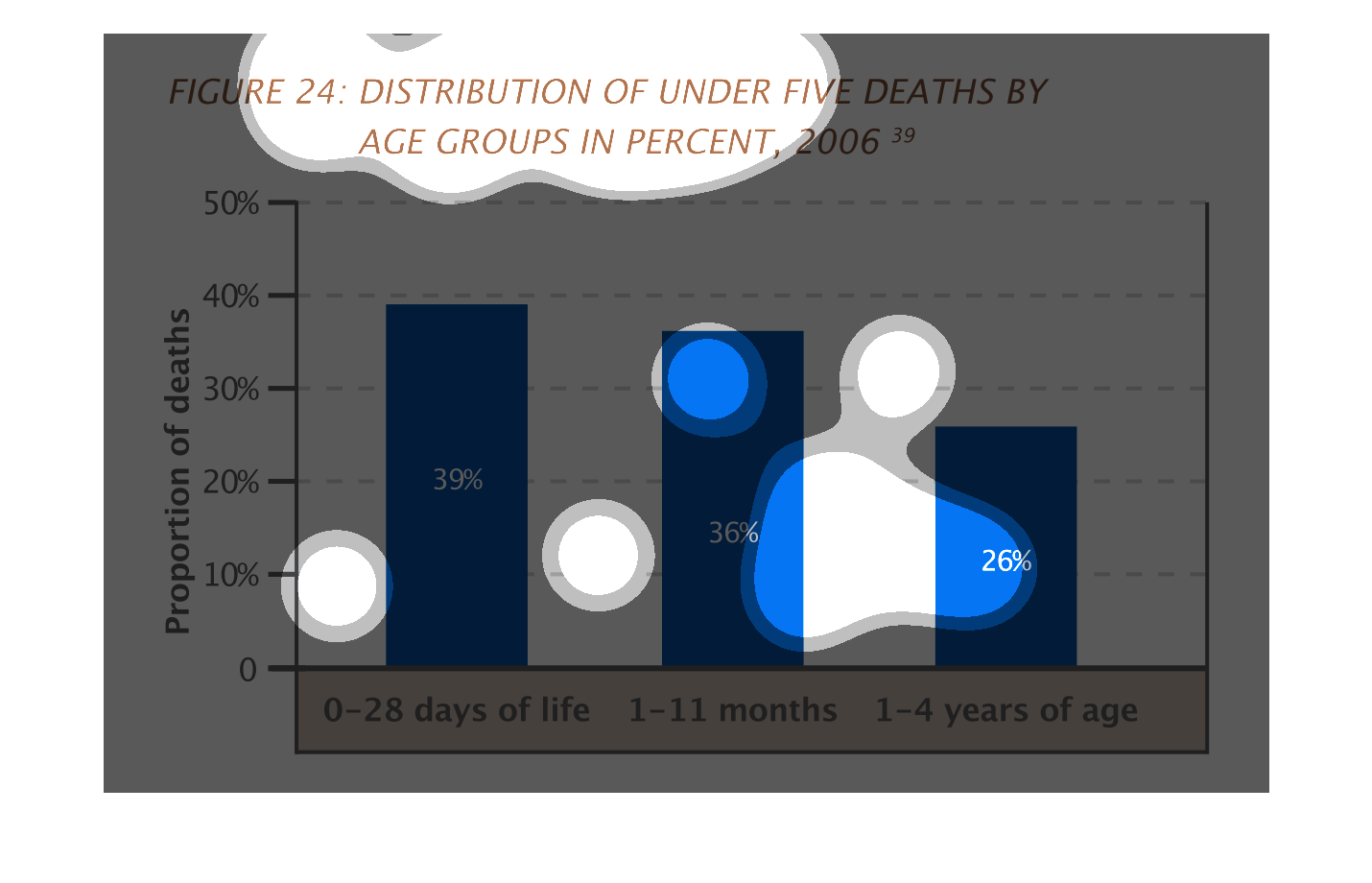
This handmade chart shows the causes and incidence of death for people under five years of
age. Other than that it does not say much because there is no context.
This graph is depicting causes of death based on age groups under 5.  0-28 days of life is
the highest percentage (at just under 40%) while 1-4 years of age is the lowest at about 25%.