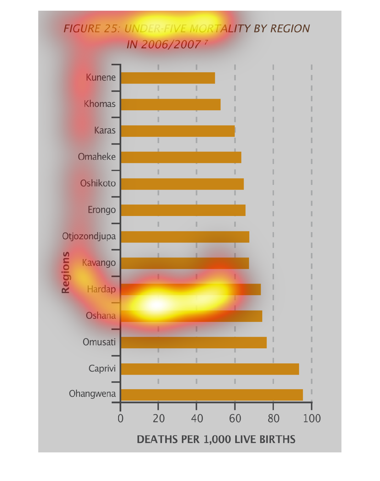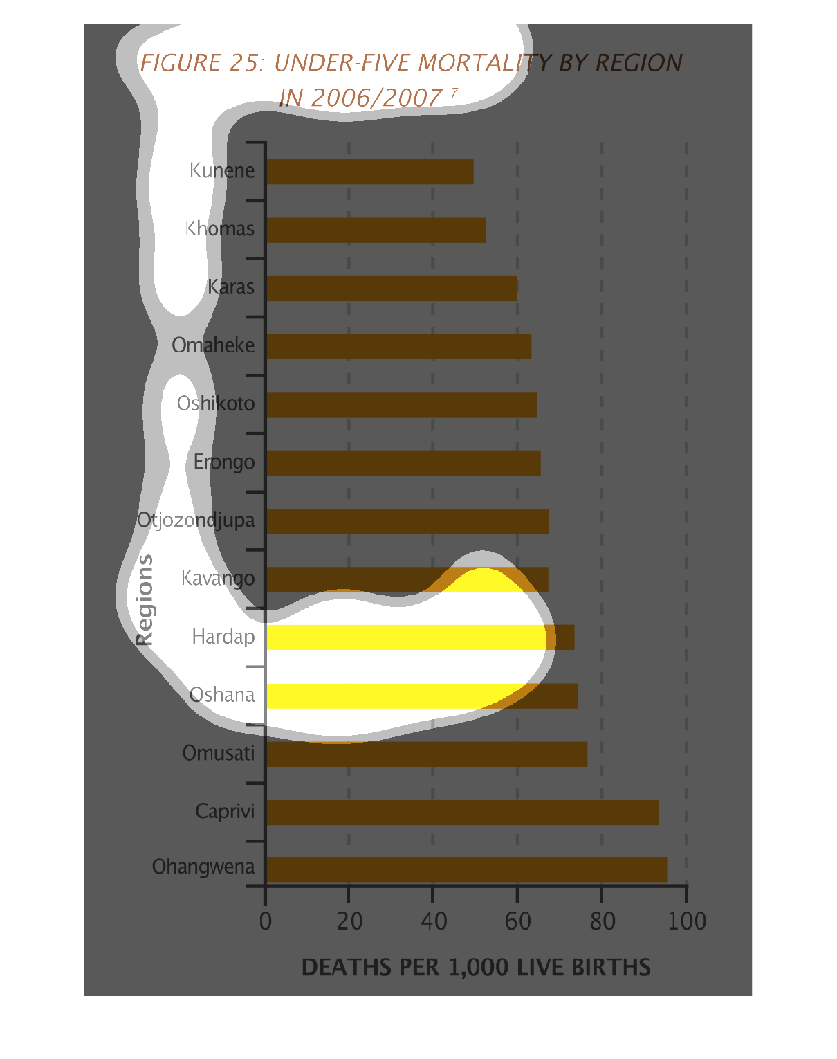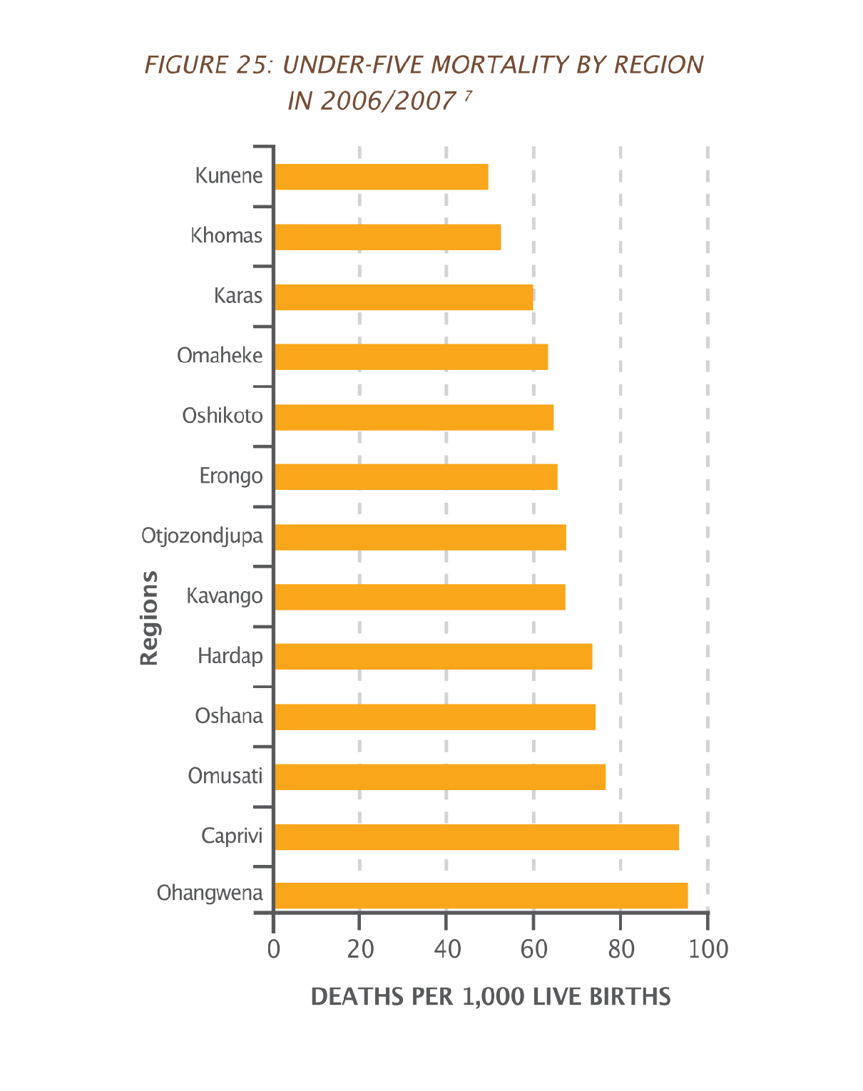
figure 25: under-five mortality by region in 2006 and 2007. Y axis shows different remote
african regions, the X axis shows deaths per 1,000 live births.
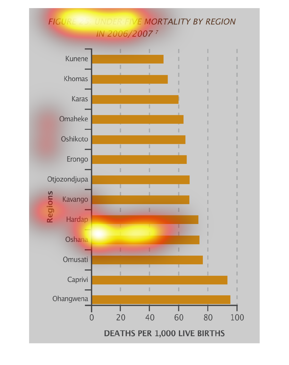
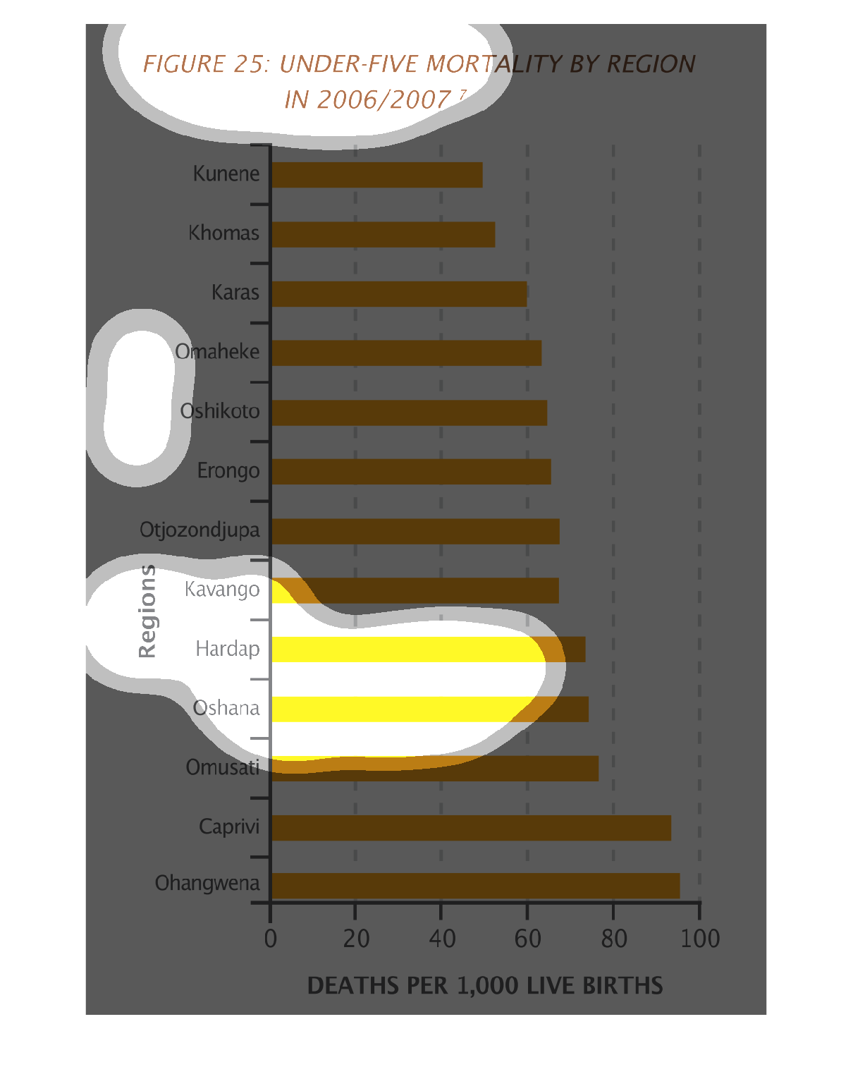
This image or figure shows or depicts in statistical bar graph format children under the age
of five that have mortality rates by region in the years 2006/2007.
This graph describes mortality rates for children under 5 in 2006 and 2007 in specific regions.
Ohangwena has the highest mortality rate of children under 5, while Kunene has the lowest.
There is a steady increase in deaths until Caprivi, where deaths increase significantly.
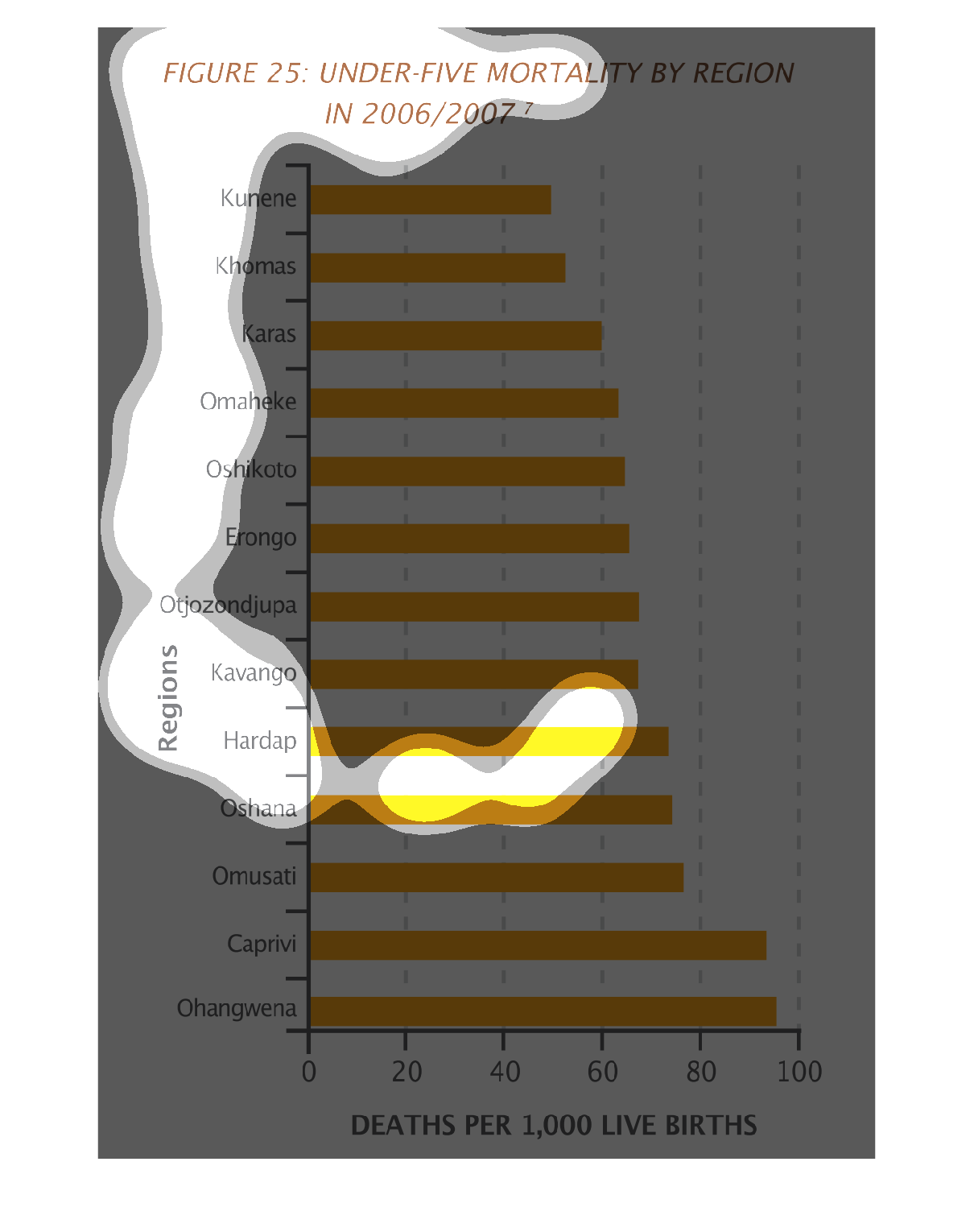
Under five mortality by regions for 2006 and 2007. There are a bunch of areas listed that
I am not familiar with that are hard to type because of the limited view.
This graph shows the mortality by region of children under the age of 5. Ohangwena has the
highest number of deaths with almost 100 deaths out of every 1,000 live births.
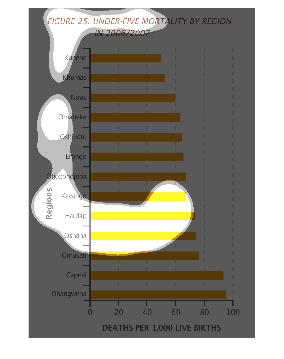
This graph shows the mortality rates of children under 5 years of age per region. Compared
to the Ohangwen region, there were far fewer deaths in the Kunene region.
This figure is titled Under-five mortality by region in 2006/2007.  Listed below the title
are many different regions and their statistics on death in that area.
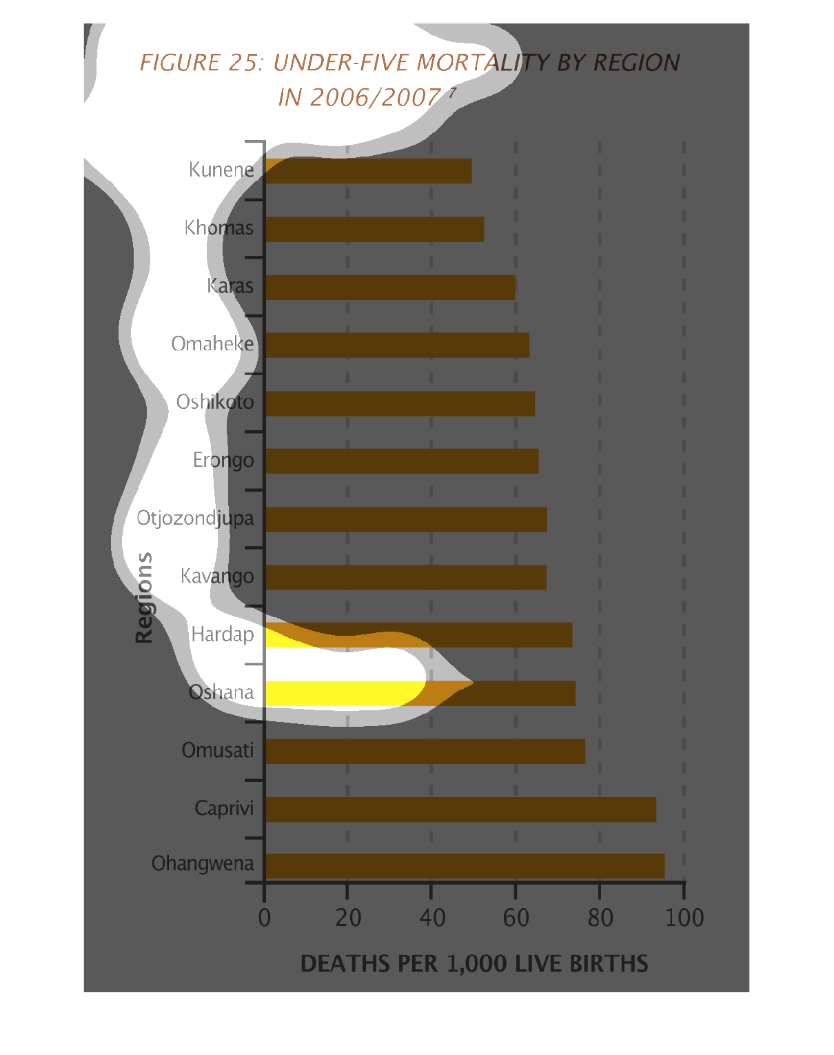
This graph illustrates the mortality rate for children under 5 by region in 2006 and 2007.
 The highest rates are for Ohangwena, Caprivi, and Omusati.
This graph shows the rate of under-5 mortality in different regions in 2006-2007. The rate
was shown as the number of deaths per 1000 live births. The highest mortality rate was in
Ohangwena, and the lowest was in Kunene.
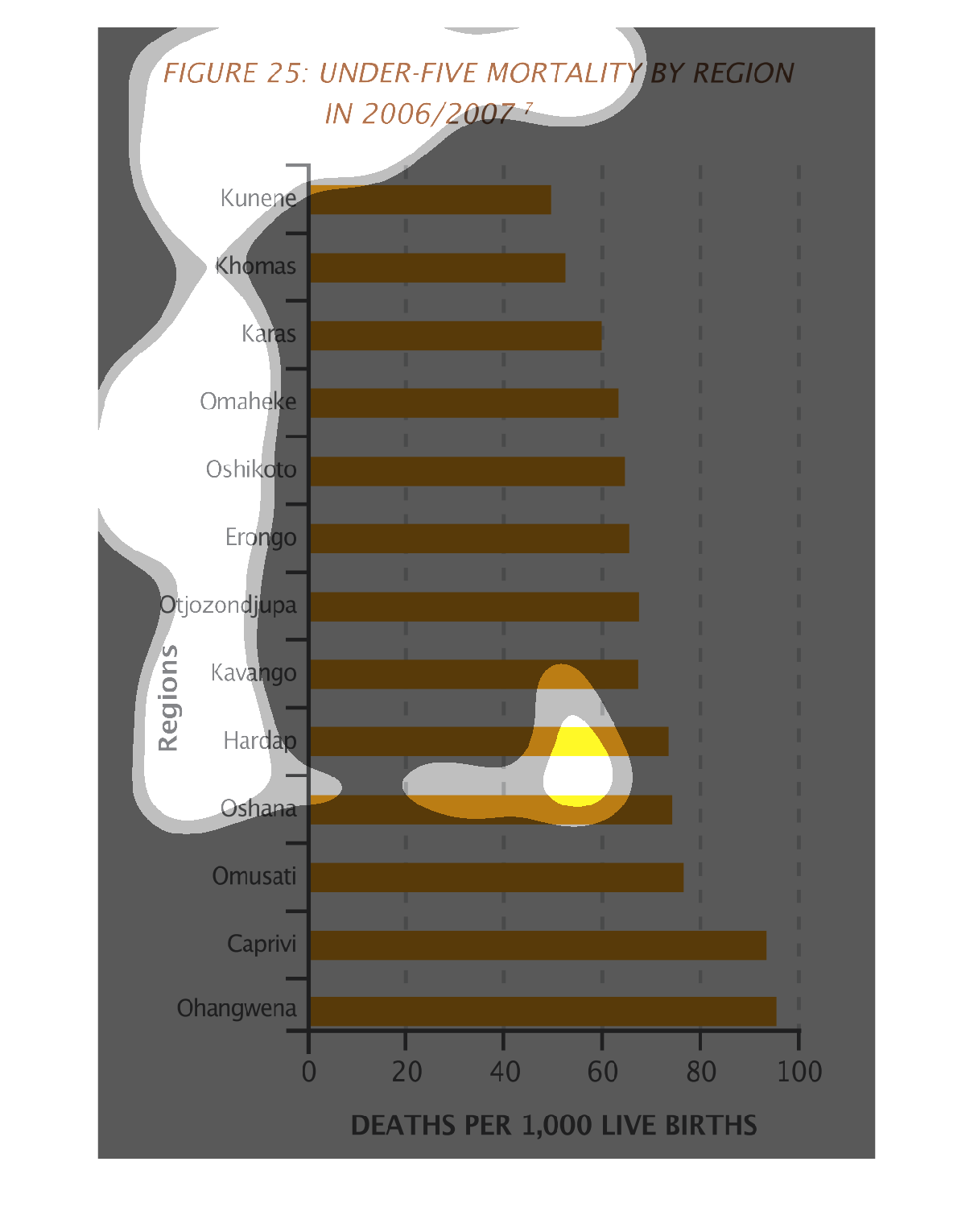
This chart is about the under 5 year old mortality rate according to region in 2006/2007.
Kunene appears to have the smallest amount and Ohangwena has the largest rate.
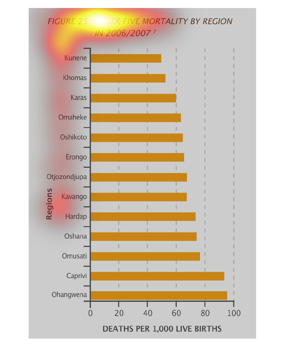
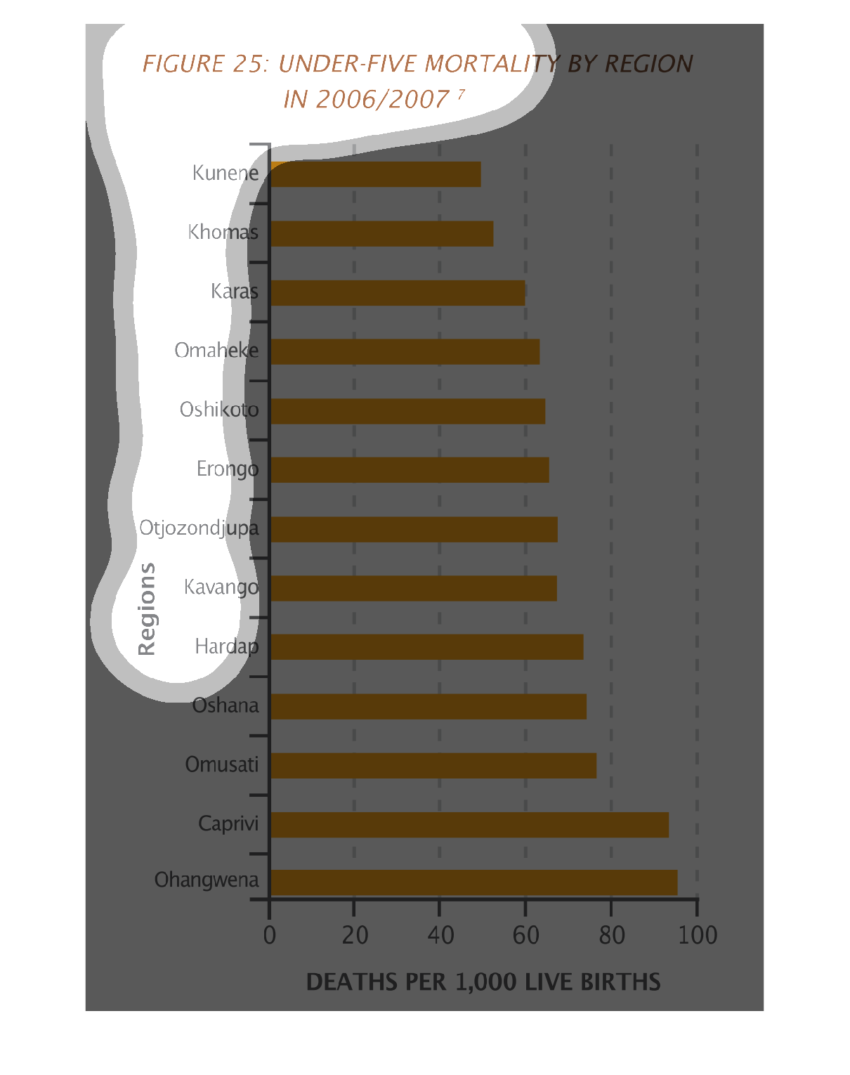
This figure describes the mortality rate for children under the age of five by region for
the years 2006 and 2007. It describes deaths per 1,000 live births. Ohangwena tops this figure
at nearly 100 deaths per live births.