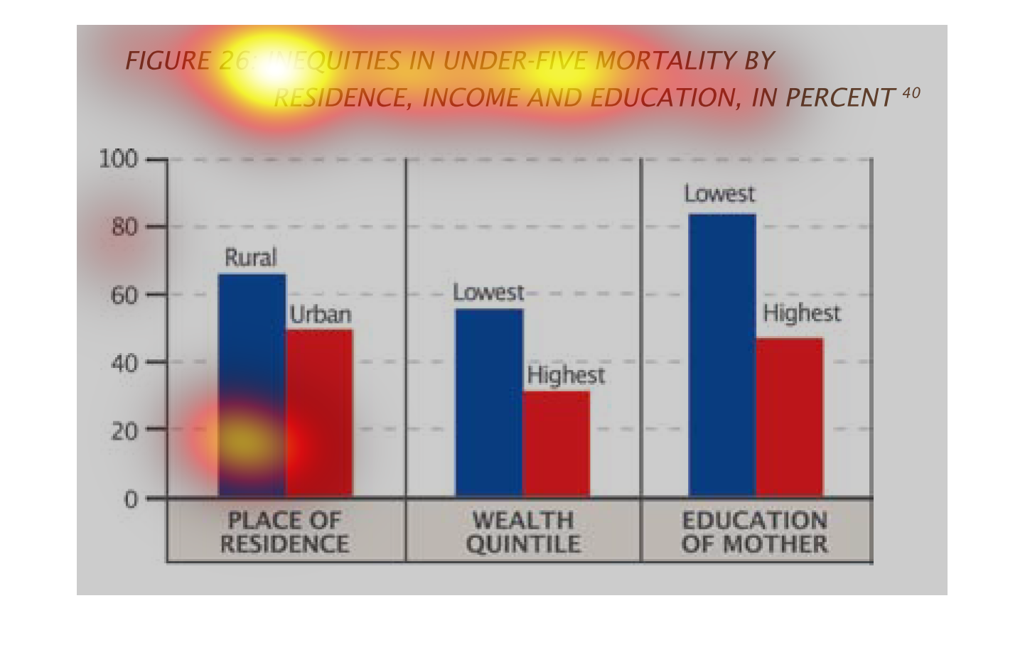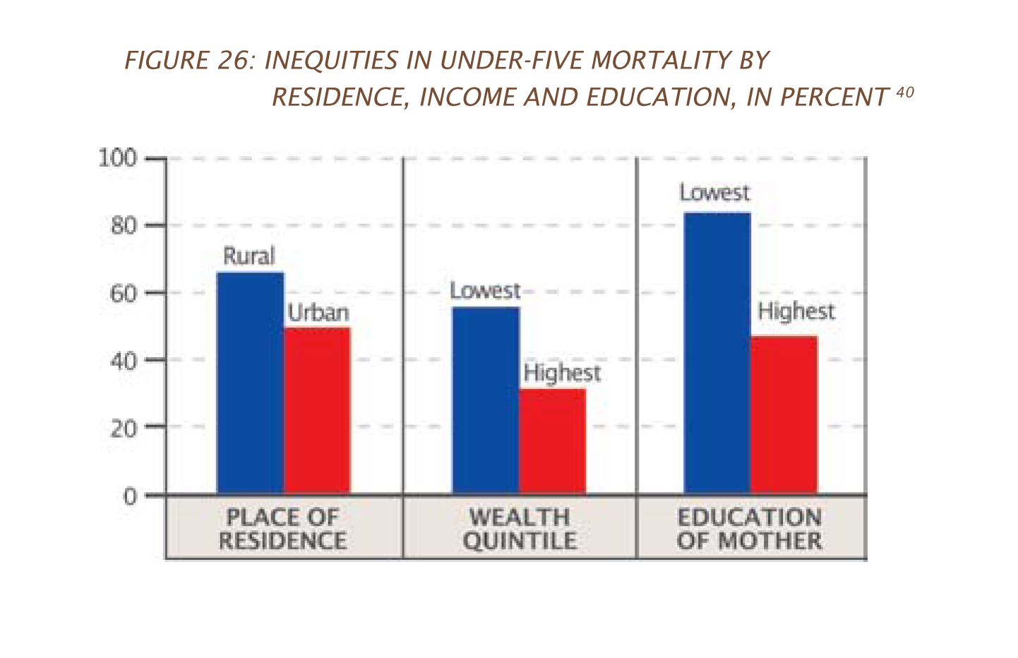
The figure presented is titled figure 26: inequalities in under five mortality by residence,
income and education, in percent.  The figure is a representation of inequalities.
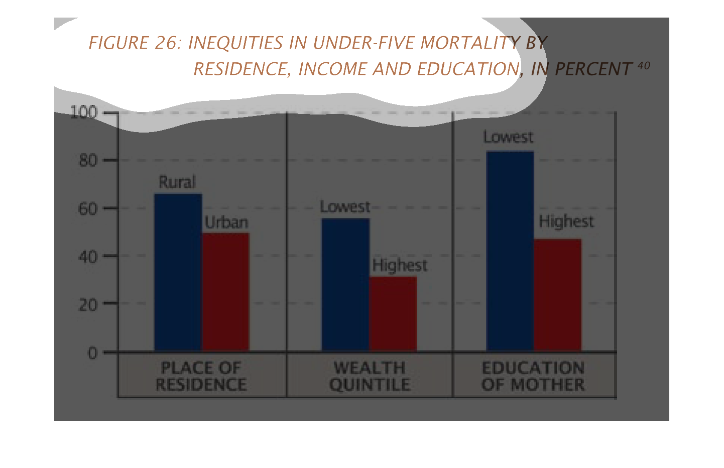
This handmade chart shows something like inequities among children around the world.  Other
than that it doesn't say much because there is no context.
This is a graph of inequities in under five mortality by residence, income, and education.
Lower education, people living in rural areas, and the poorer people have greater rate of
inequities.
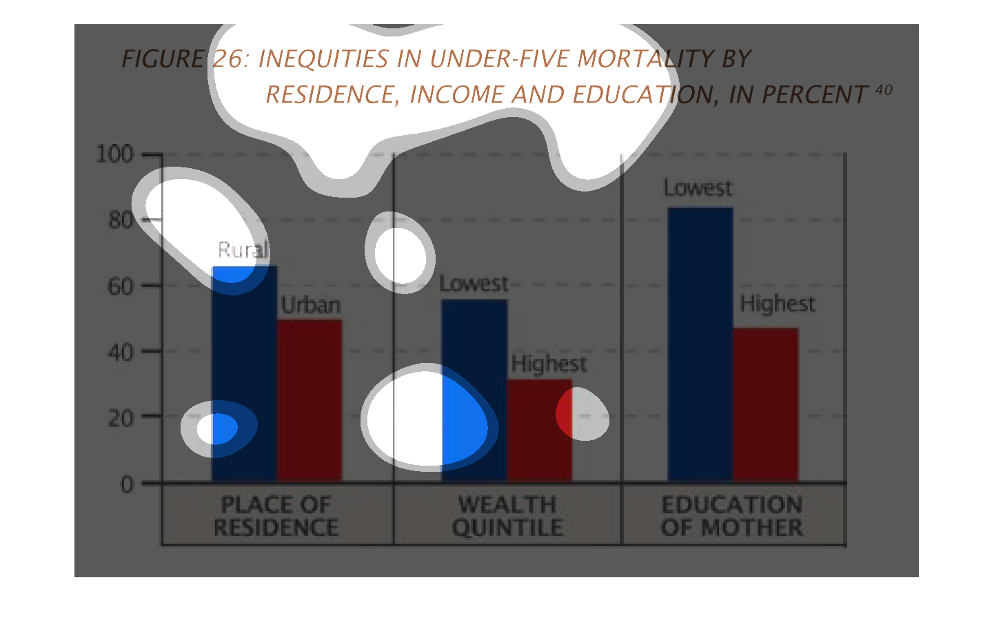
This chart describes about inequities in under five mortality by Residence, Income and education.
The first bars shows place of residence. The seconds bars shows wealth and the third bars
shows education. The blue shows the lowest and the red shows the highest.
This graph describes the inequities of mortality under 5 by residence, income and education
by percentage. Blue shows the highest, while red shows the lowest.
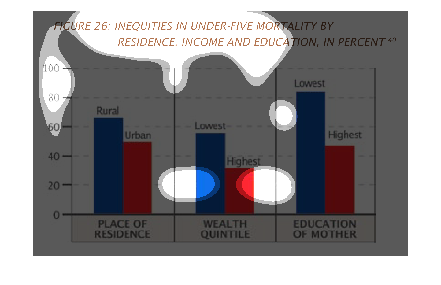
It seems to be three graphs showing the under-five mortality rate of children in different
demographics.  In all three graphs there is a clear difference with higher mortality rates
among those who live in rural areas vs urban, those who are poorest vs richest, and those
with leasteducation vs highest.
This chart describes inequities in under five mortality residence, income and education, in
percent. The chart is divided into three categories, including place of residence.
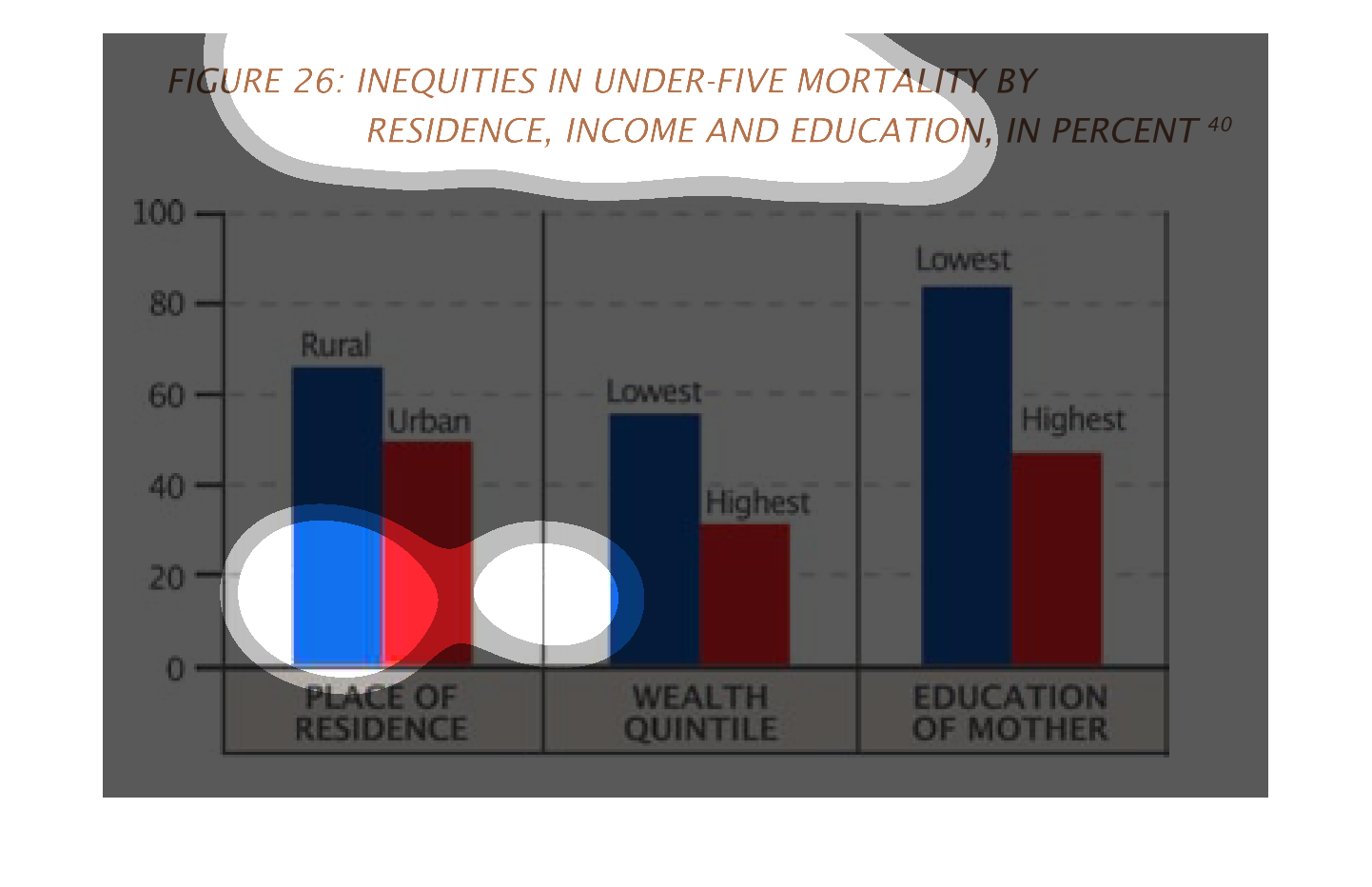
This chart shows inequities in under-five mortality by residence, income and education, in
percentage. Each section is categorized into a blue bar for rural, and a red bar for urban.
Urban has the overall lower inequities, with blue being higher.
The chart shows the inequities in under five mortality, by percent, divided by residence (rural,
urban), income (lowest, highest), and Mother's education  (lowest, highest).  The percentage
is highest among rural communities, lower incomes and least education.
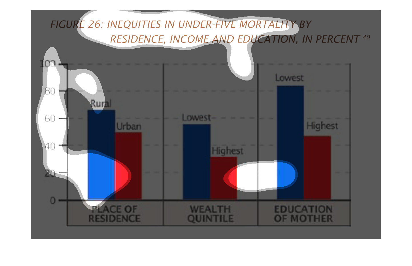
This graph examines the percentage of deaths of children under five in three categories: where
the child lives (rural vs urban); the economic status of the family (lowest vs highest income);
and the education of the mother (lowest vs highest amounts). The highest rates of mortality
are found in rural areas, low income families, and families with the least educated mothers.
The most determinate factor according to this graph is the mother's education; the percentage
of mortality in the lowest educated mothers is nearly double that of the most educated mothers.
Economic standing has the next largest impact. Type of community of residence has the least
impact.
The figure presented is titled Inequities in under-five mortality by residence, income, and
education, in percent.  The figure represents inequities in under-five mortality.
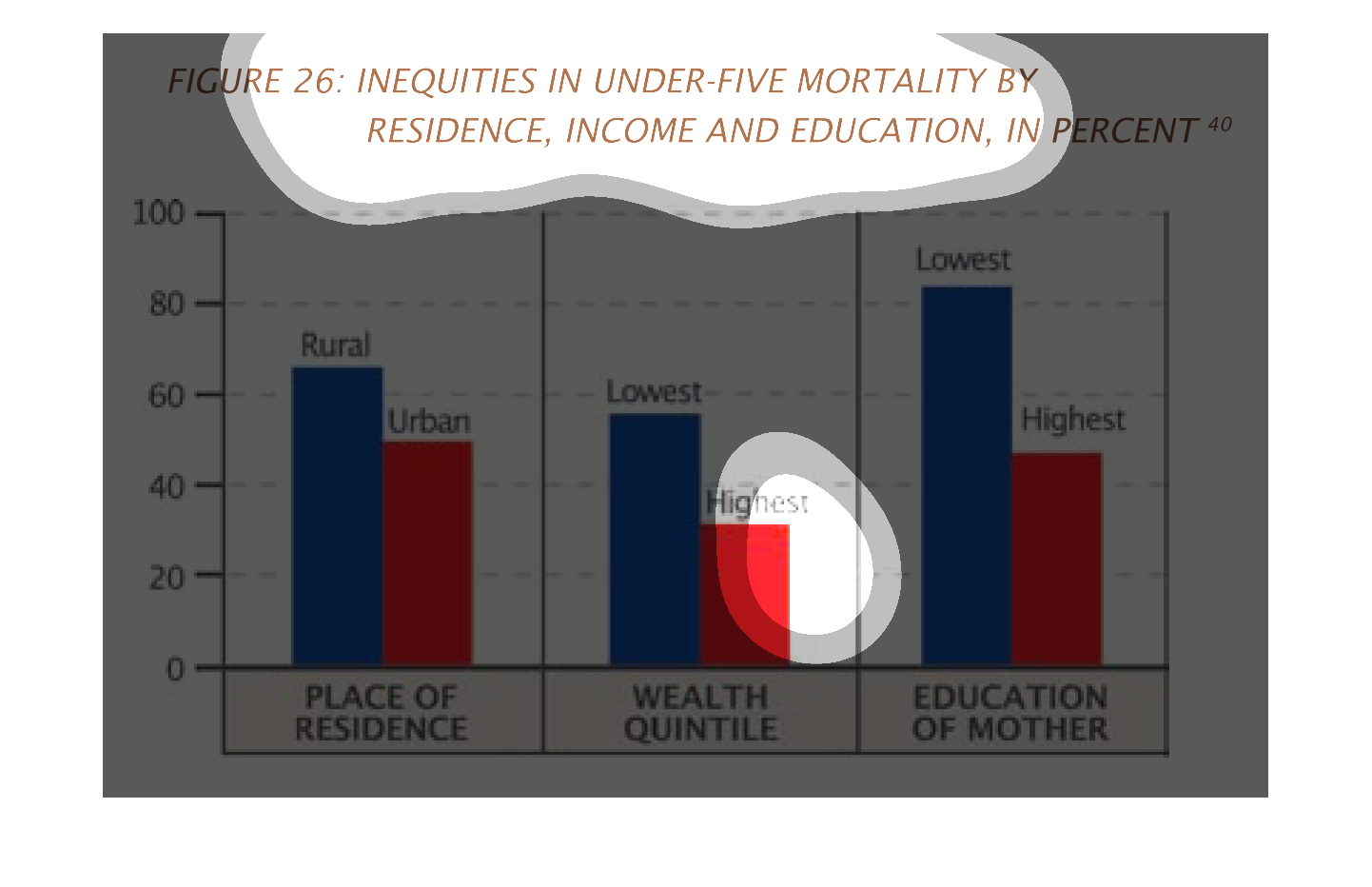
This graph illustrates inequities in under five mortality by region, income, and education.
 Those in rural areas with low income and low education were most likely to have higher mortality.
This graph shows differences in mortality of children under five based on income, education
and residence.  Rural children have a roughly 15% greater mortality rate than urban children.
Children of lower income have a 20% greater mortality than higher income children. Children
of educated mothers have a 30% lower mortality rate than non-educated mothers.
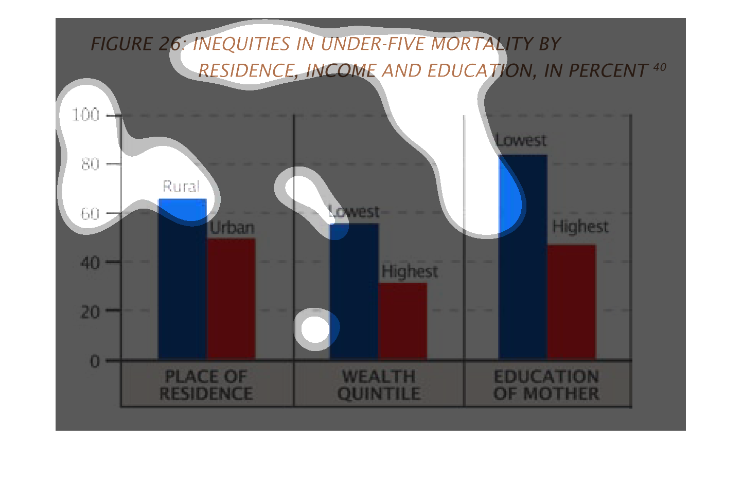
This chart describes inequities in under-five mortality by residence, income and education,
in percent. categories on the list include place of residence.