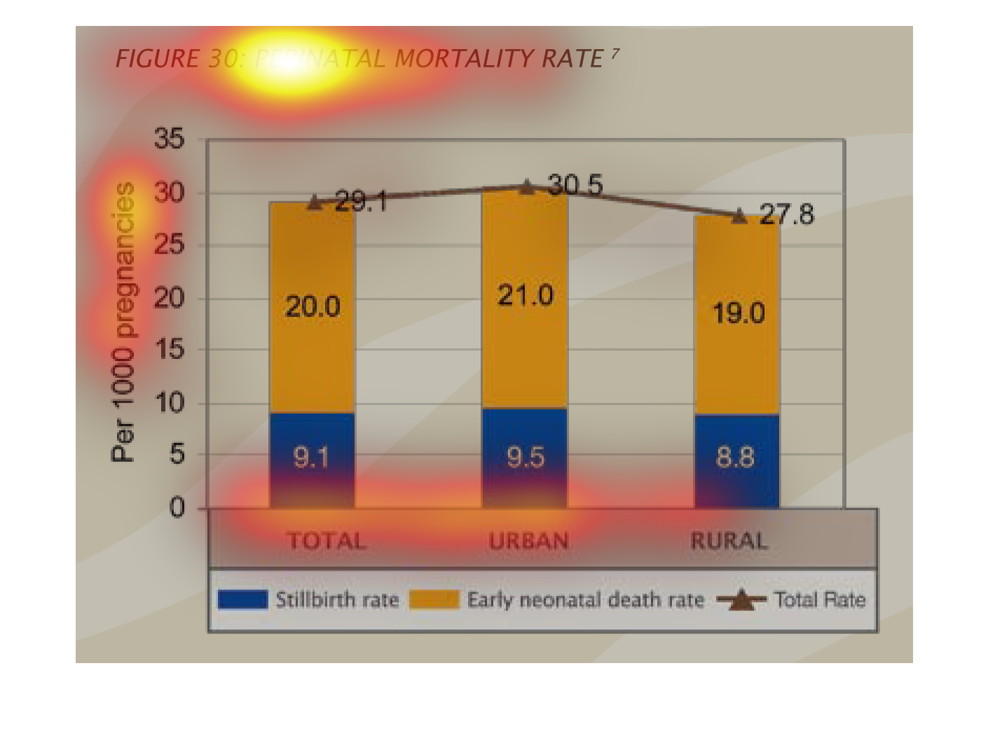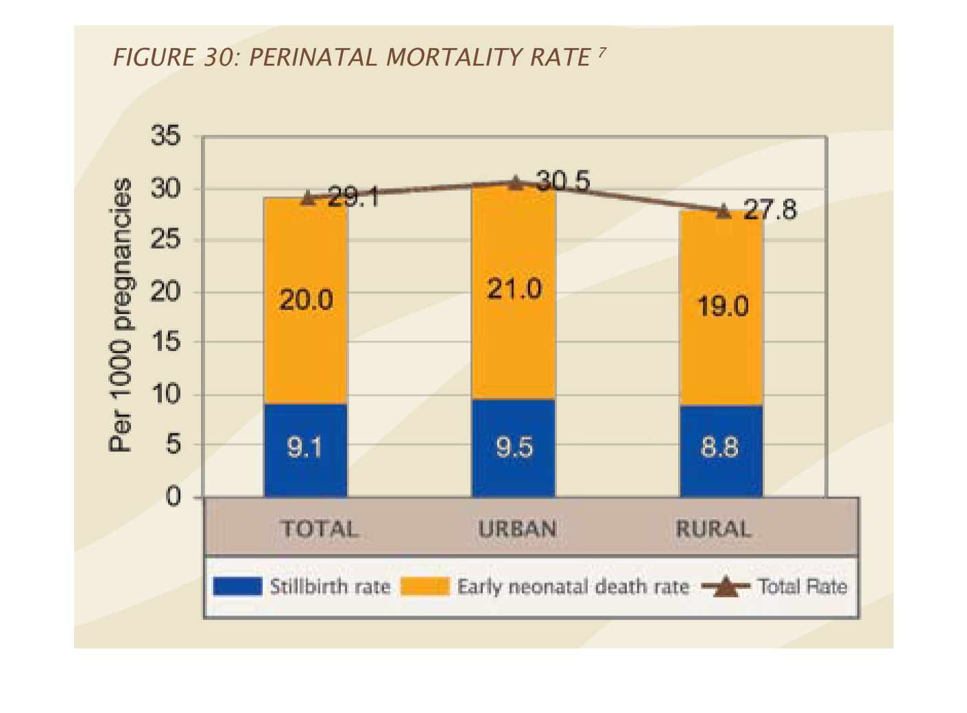
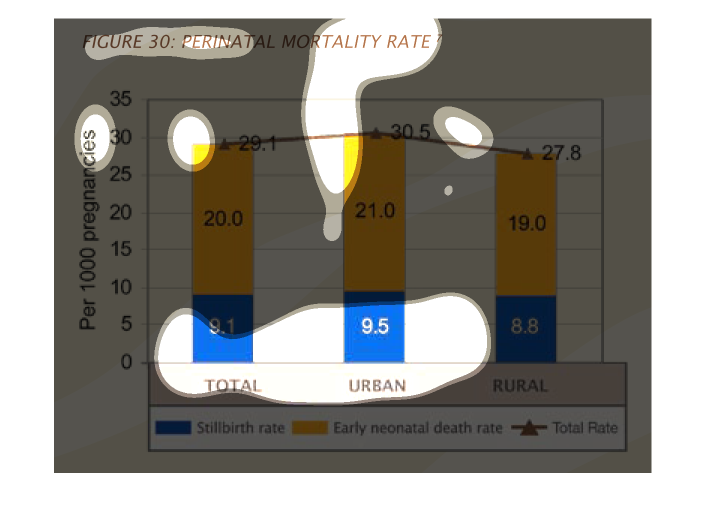
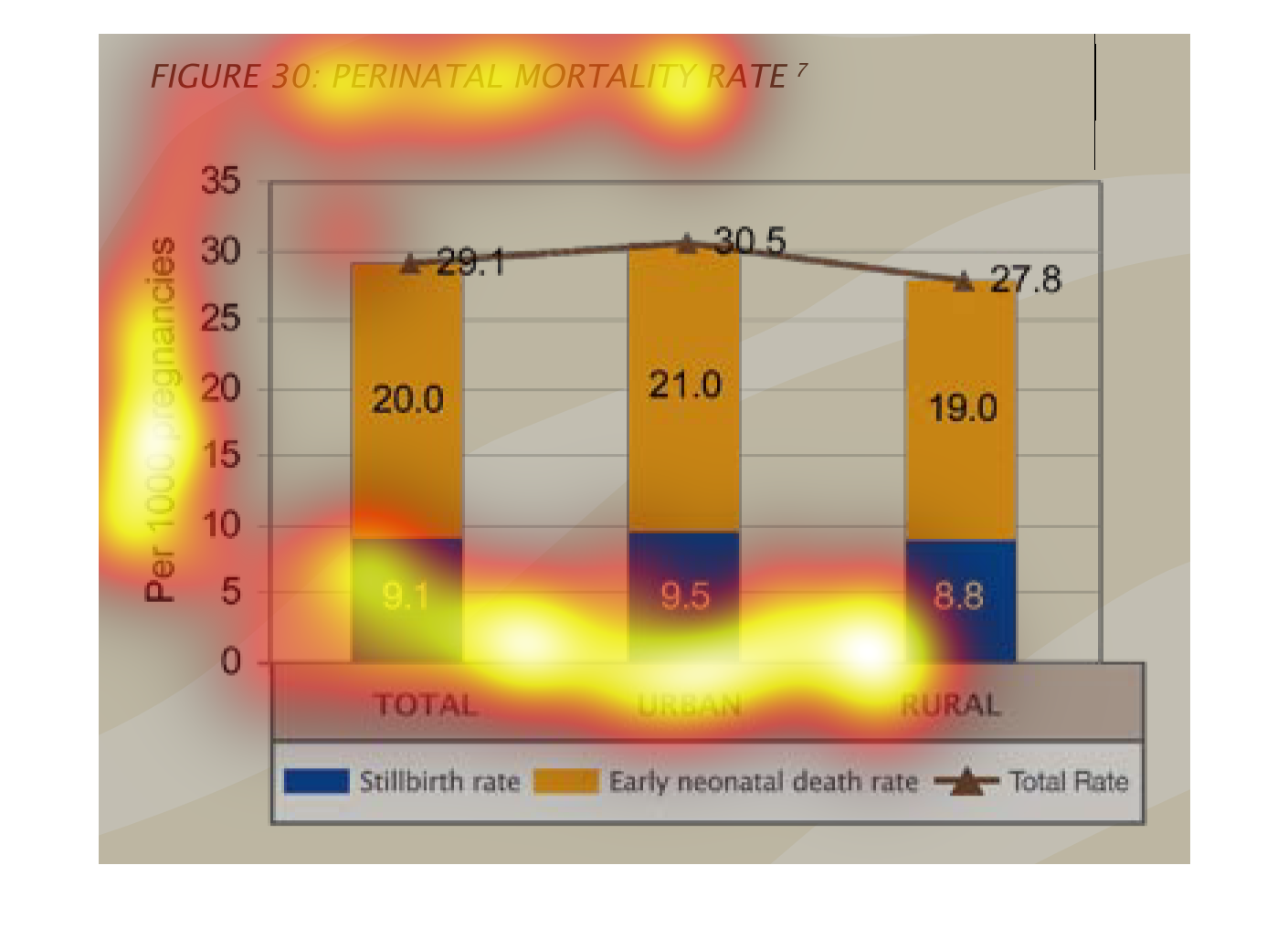
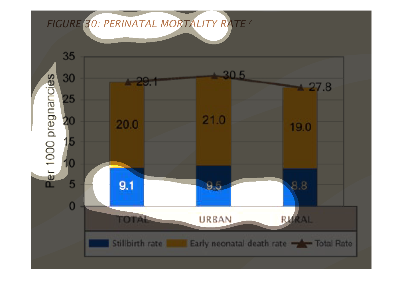
This plot shows perinatal mortality rate in total and as a function of area type - rural or
urban. Urban area have higher mortality rates than rural areas. Mortality comes largely from
early neonatal death rate, though stillbirths also contribute significantly to the mortality
rate.
This graph shows the perinatal death rates from all causes, and compares rural and urban death
rates. The total neonatal death rate is slightly higher in urban settings.
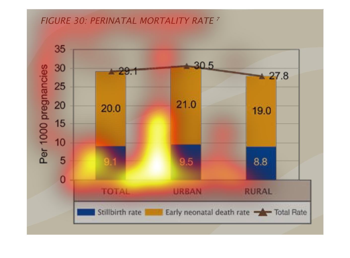
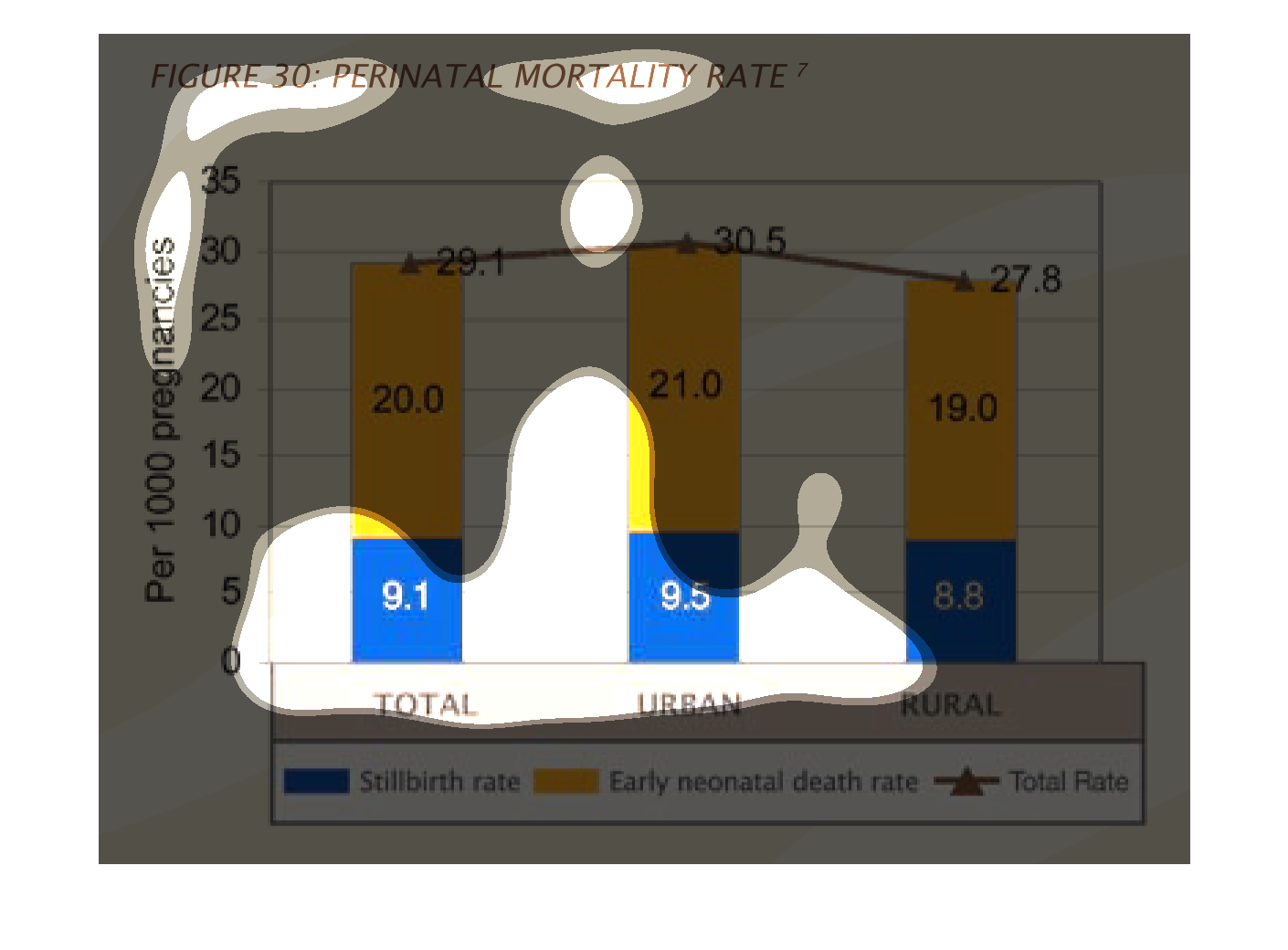
This image shows a bar graph that depicts the perinatal mortality rate.  Colors are given
to the stillborn rate (blue), the early neonatal death rate (yellow), and A triangle shows
the totals.  Amounts are shown for rural areas, urban areas, and total.  Percentages are listed
along the left side of the graph.  Bars are then drawn showing the amount of each type of
death.  A triangle is then drawn to show the totals.  These triangles are then connected with
a line.
This chart shows the rate of perinatal deaths. Distinguishing from urban and rural areas,
urban areas seem to have slightly higher rates of death for both stillbirth and early neonatal
deaths.
This graph illustrates the perinatal mortality rate and shows both the stillbirth rate and
early neonatal death rate as well as the total rate.  It is reflected for rural areas, urban
areas, and the total.
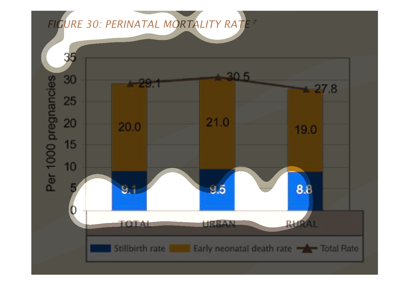
THIS PLOT SHOWS THE PER 1000 INFANT MORTALITY RATES FOR URBAN AND RURAL BABIES AND THE TOTAL.
EACH BAR IS DIVIDED BETWEEN STILLBIRTHS AND EARLY NEONATAL DEATH.
Figure 30 shows perinatal mortality rates per 1000 pregnancies. Still births and neonatal
death rates are represented. Rates are slightly higher among urban areas than rural areas.
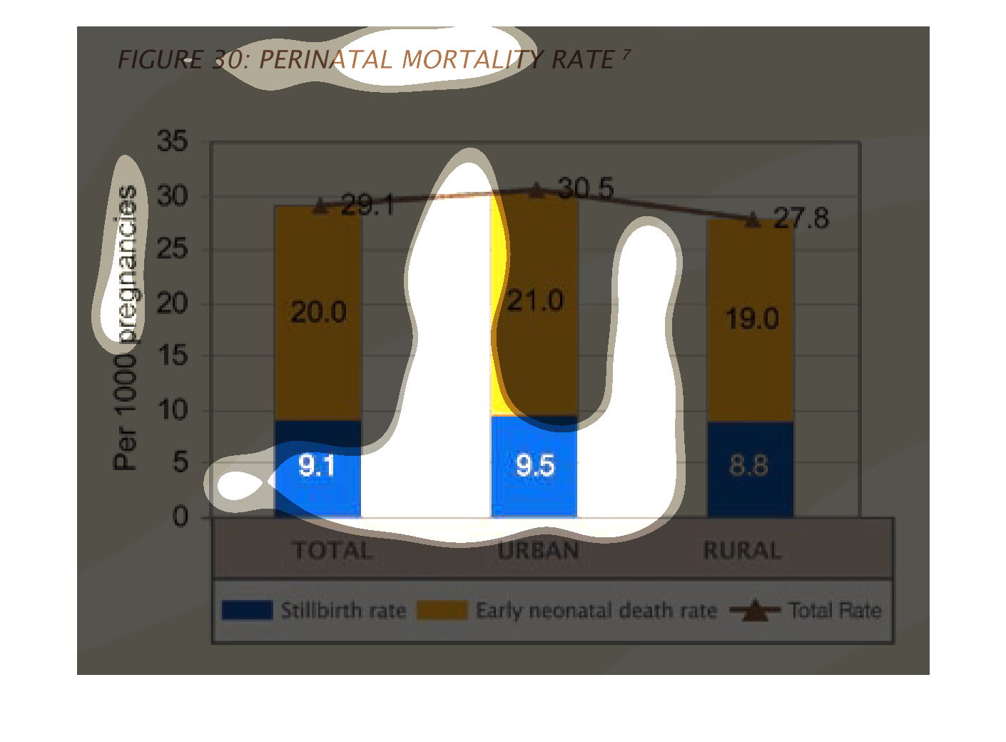
figure 30: perinatal mortality rate. Y axis per 1,000 pregnancies per 1,000, 0 through 35.
X axis is three columns each representing urban, rural, and overall, each column is color
coded by type of death, stillbirth and early neonatal.
This chart denotes perinatal mortality rates, per 1000 pregnancies. The bars are color coded
for stillbirths and early neonatal death rates, and a trend line runs above them showing the
total rate.
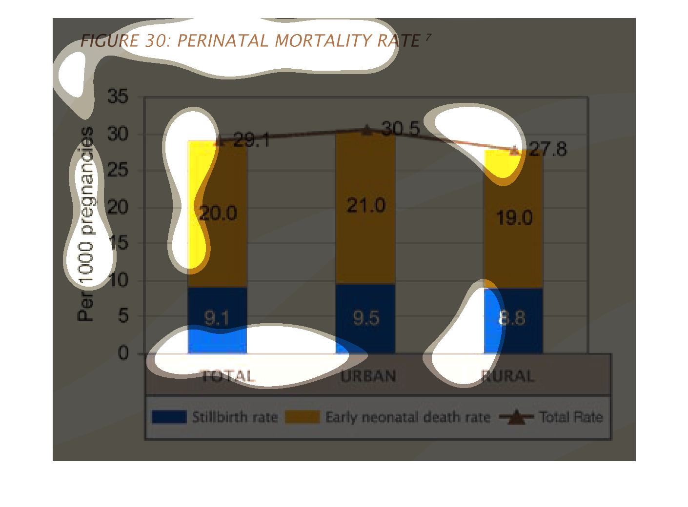
The chart shows a relationship between urban, rural and total areas, and the percentage of
pregnancies (per 1,000) resulting in stillbirth or early neonatal deaths. With only a small
threshold between, more urban pregnancies result in infant fatalities.
This is a chart showing perinatal mortality rates per 1000 pregnancies. The percentages is
greater in urban areas than in rural areas of the sample source.
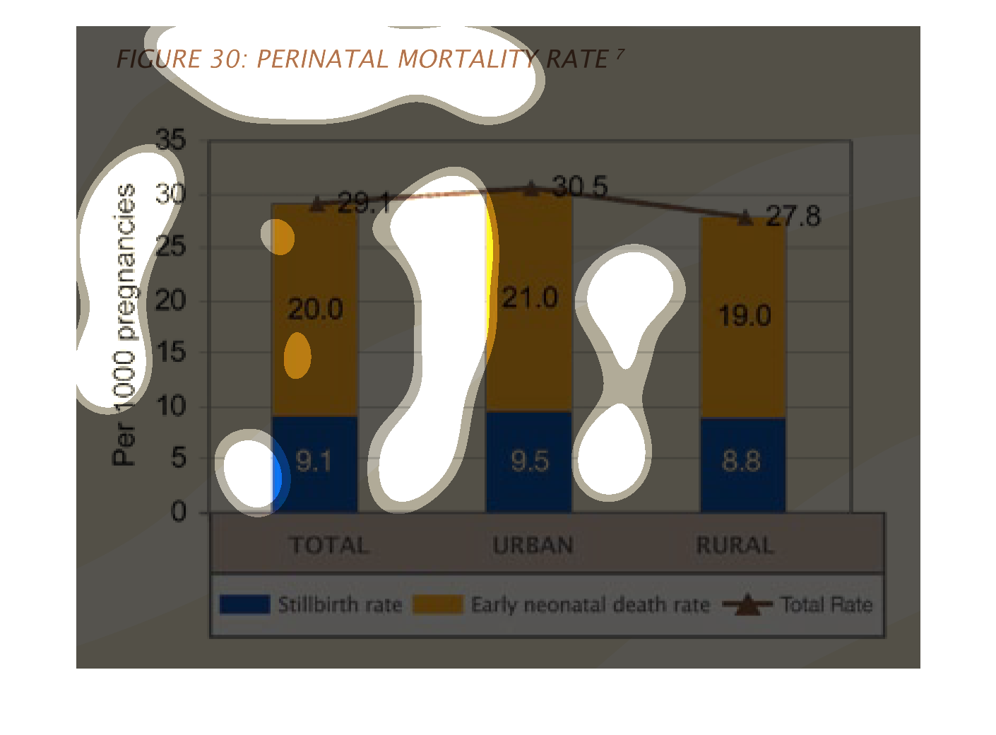
This chart is figure 30. The title of the chart is prenatal mortality rate. Blue is stillbirth
rate and yellow is early neonatal death rate is compared in the chart.
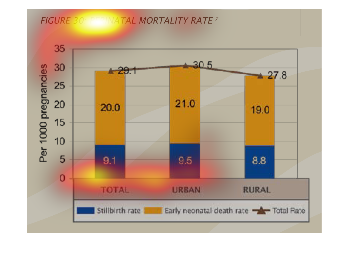
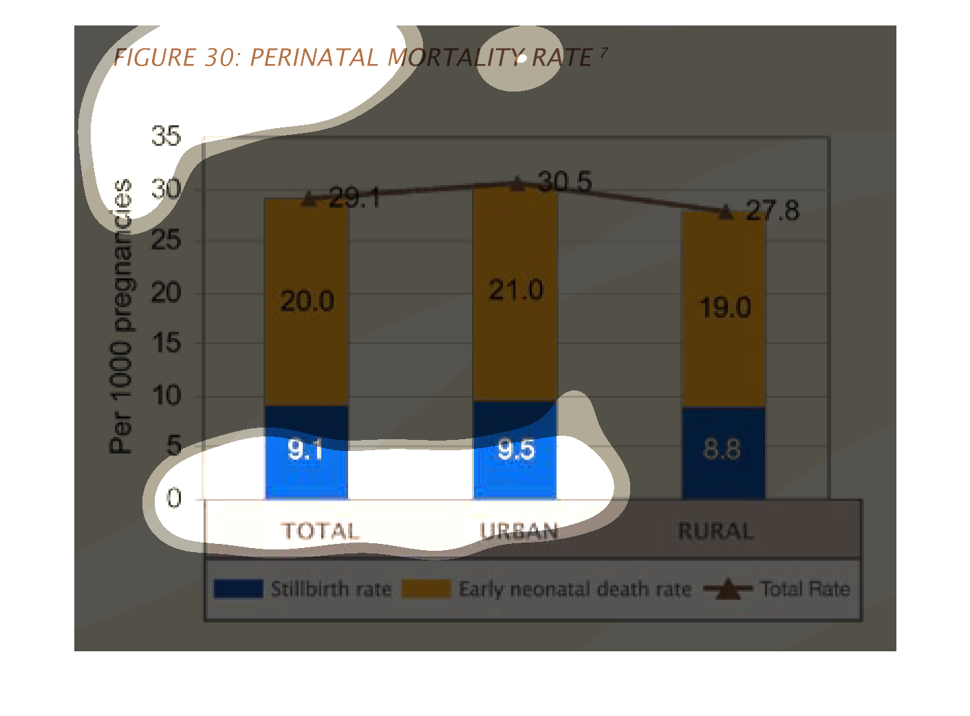
This is a graph displaying information regarding perinatal mortality rate. Along the x-axis
we have stillbirth rate, early neonatal death rate, and total rate. The y-axis regards the
amount of pregnancies.