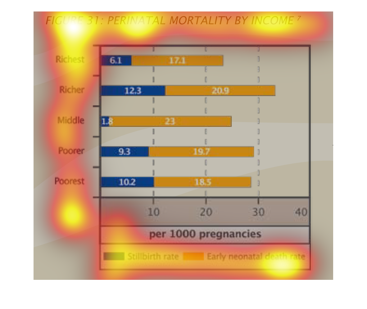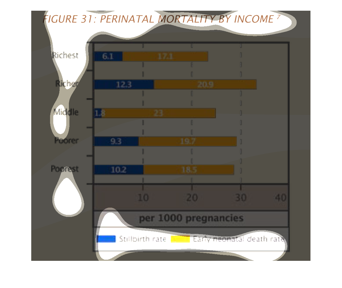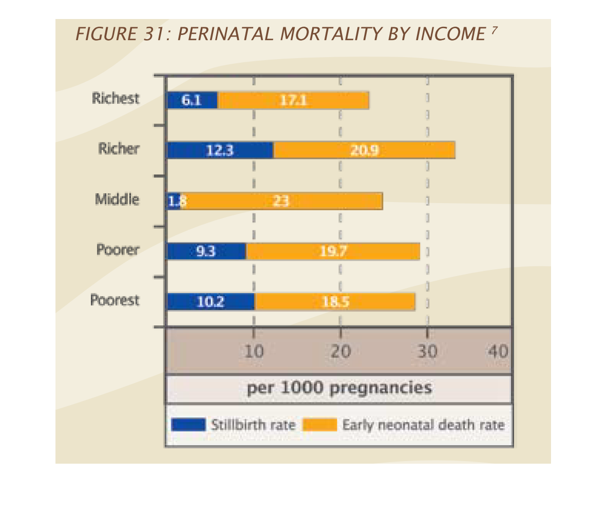
The chart shows perionatal mortality amongst income groups.  Richer people experience perinatal
mortality at a higher rate than poorer people or middle income people.
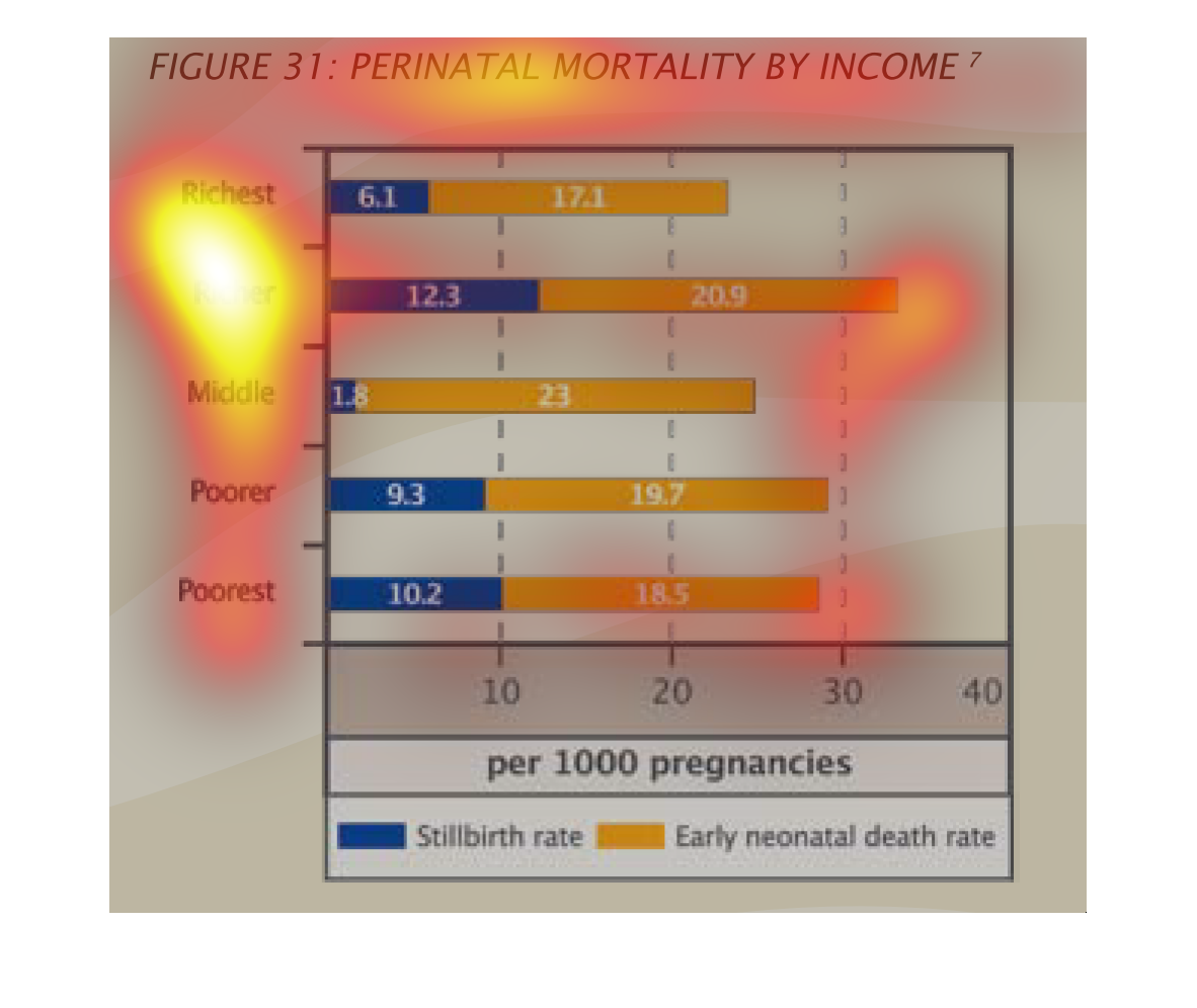
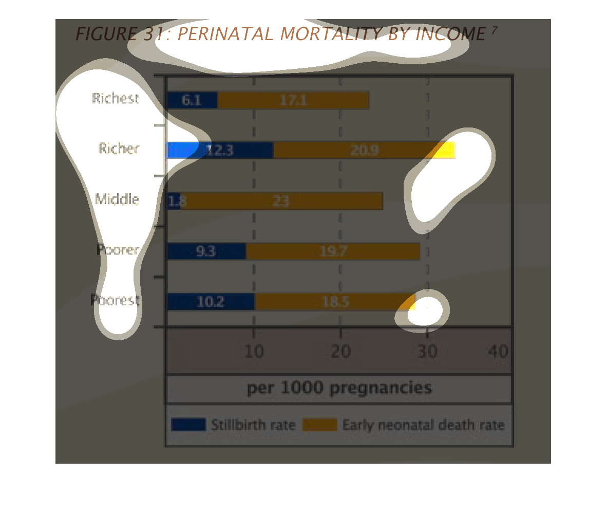
Figure 31 shows a graph of perinatal mortality by income. The bar graph outlines different
categories from richest, to middle, to poorest and rates of mortality per 1,000 pregnancies.
This is a series of bar graphs depicting perinatal motality by income. It shows that that
highest early death rate comes from the segment labeled  "rich".
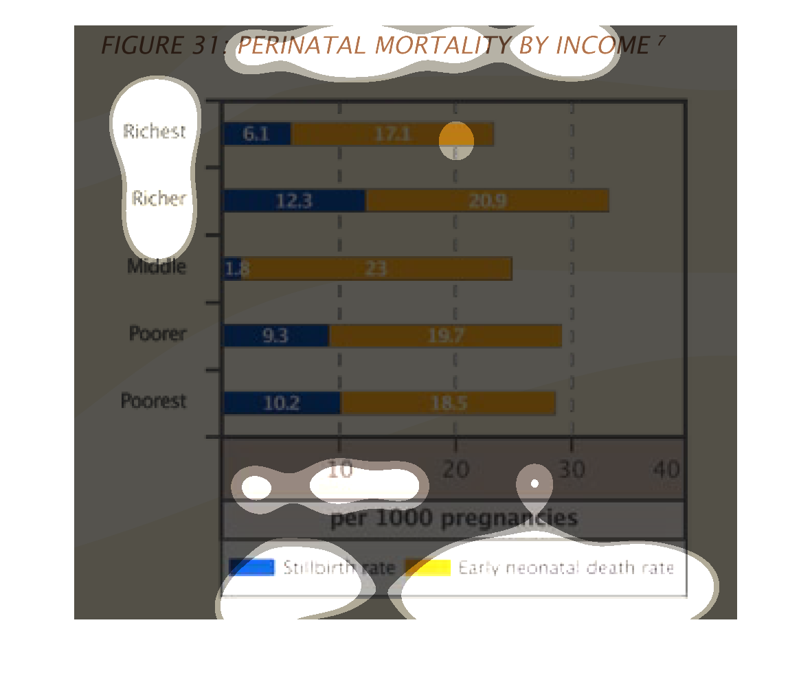
The figure presented is titled figure 31 perinatal mortality by income.  The figure is a statistical
representation of perinatal mortality by current income level.
This graph shows how the rates of stillbirths and early neonatal deaths differ based upon
the mother's income level.  The richest experience the fewest incidences of each, though surprisingly
the middle class has lower rates than the richer category.  In addition, the middle class
has a very low rate of stillbirths.  The poorer and poorest groups experience slightly more
complications than the middle class.
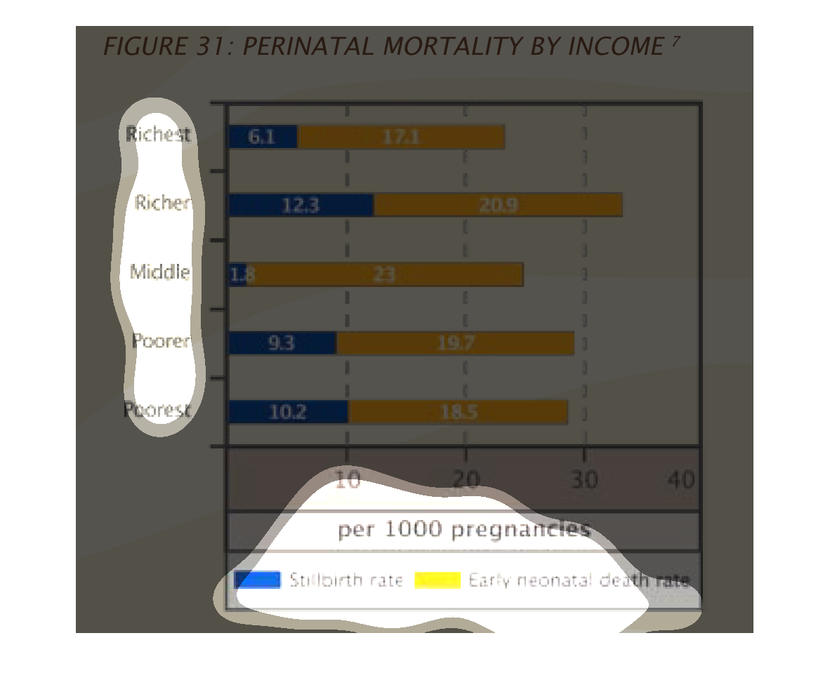
This chart describes perinatal mortality by income. Categories on the chart include richest,
richer, middle, poorer, and poorest. Others include stillbirth rate.
From the graph on the right is showing the still birth rates and early neonatal death rates
by socioeconomic class.  From the data collected one can not find a significant conclusion
linking socioeconomic status to deaths at birth and still deaths.
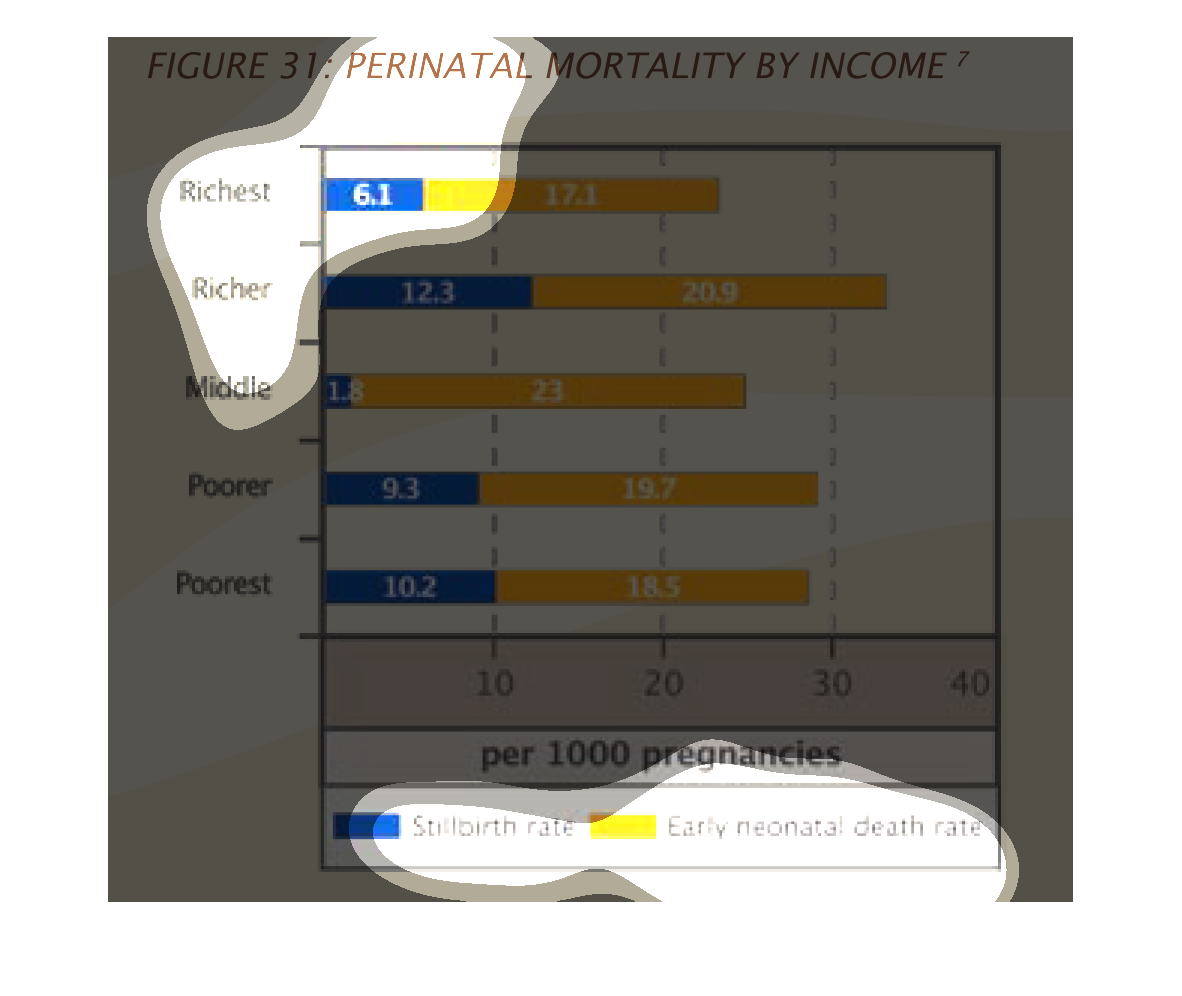
This is a graph of perinatal mortality by income. The economic class is denoted by the vertical
axis, and the horizontal bars are colored representing still birth and early neonatal death
rates.
This handmade chart shows the rate of perinatal mortality as measured by income levels. It
does not specify which country or region and the location is unknown
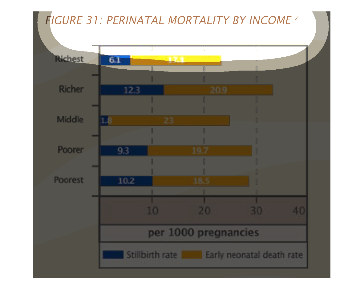
This chart shows rates of perinatal mortality per income level. For all groups, neonatal mortality
rates were significantly higher than stillbirth rates, though mid level income group had the
smallest number of stillbirths.
this graph illustrates perinatal mortality by income.  It shows both the stillbirth rate and
the neonatal death rate for the richest ot the poorest region.
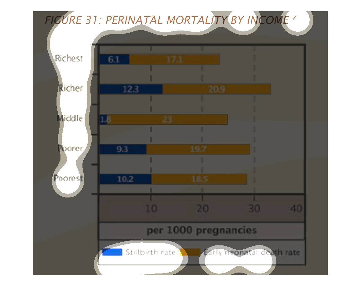
This is a bar graph which shows the perinatal mortality rates by income.  Income levels are
listed along the left side of the graph.  The stillbirth rate is given the color blue while
early neonatal deaths are given the color yellow.  Bars are then drawn with the colors to
show the level of each type of deaths per each income level.