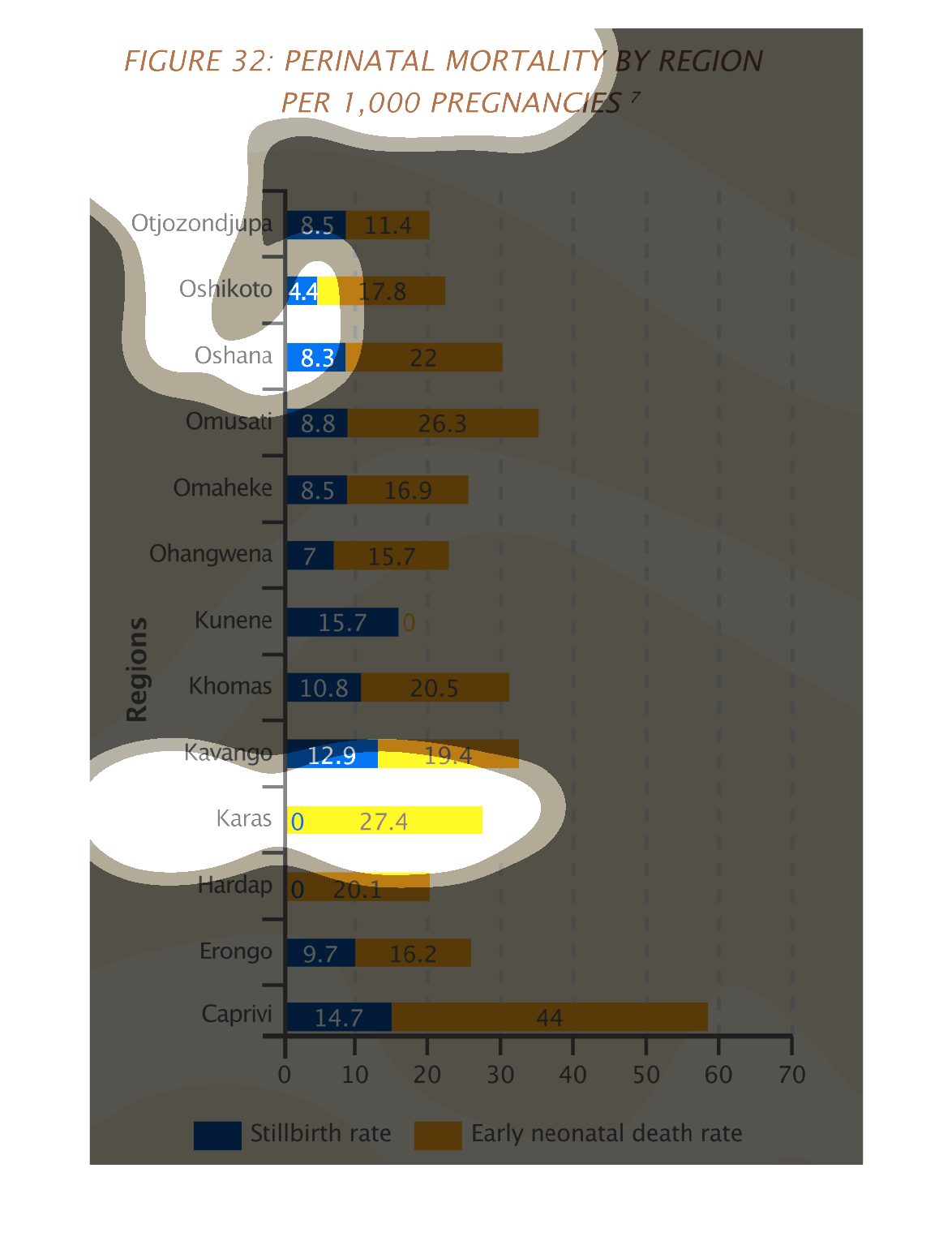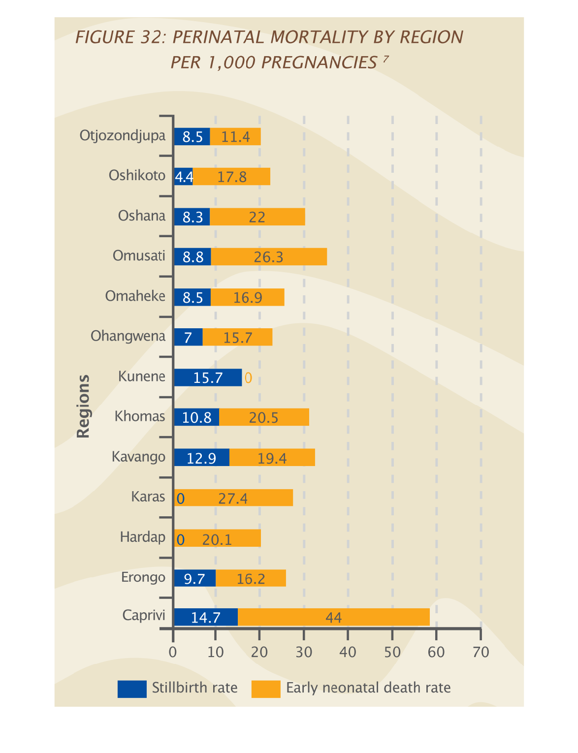
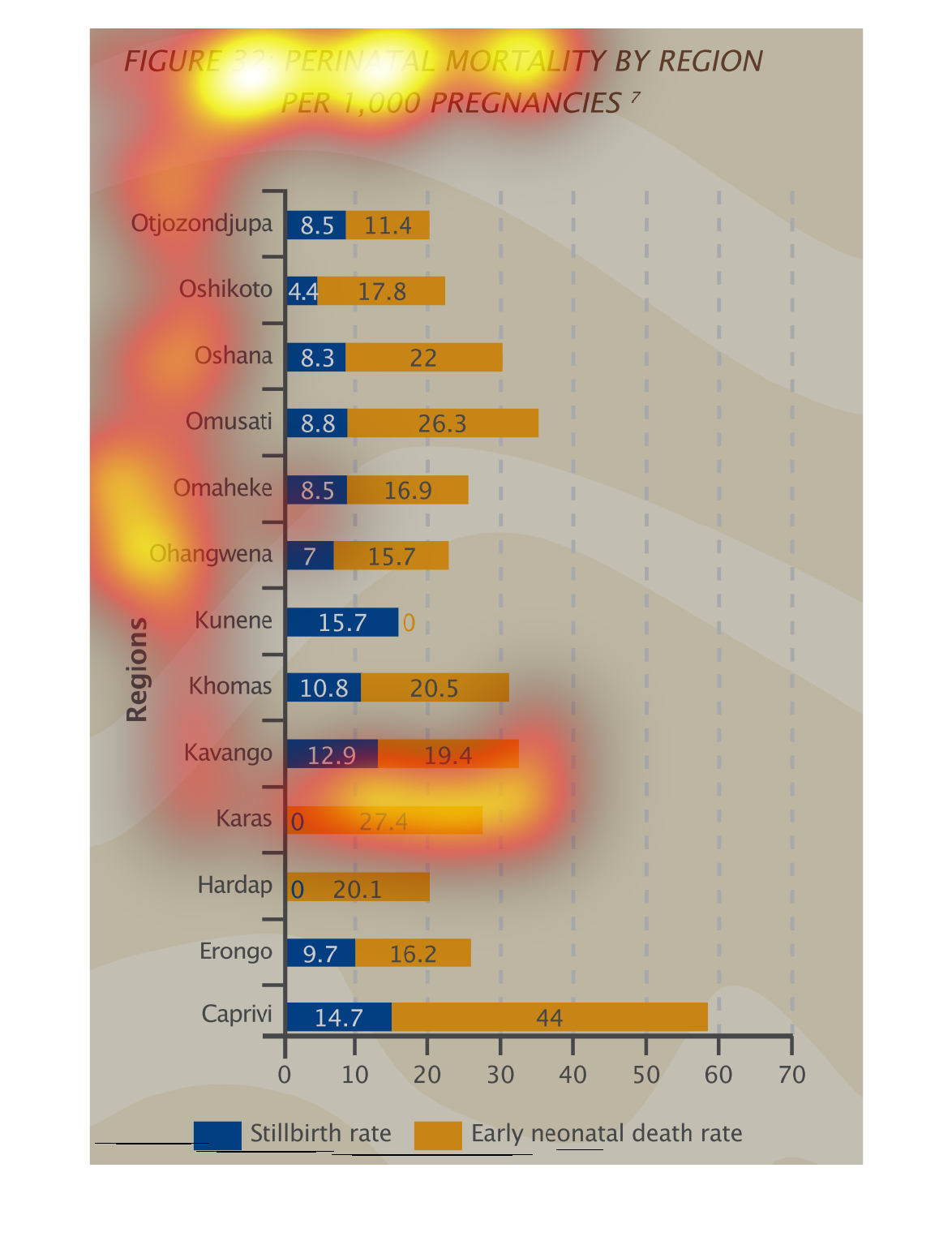
Figure 3 describes the perinatal mortality rate by region per 1000 pregnancies. The colors
compare stillbirths versus early neonatal death rates. The region of Caprivi has the highest
rates.
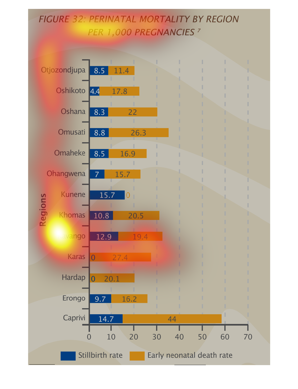
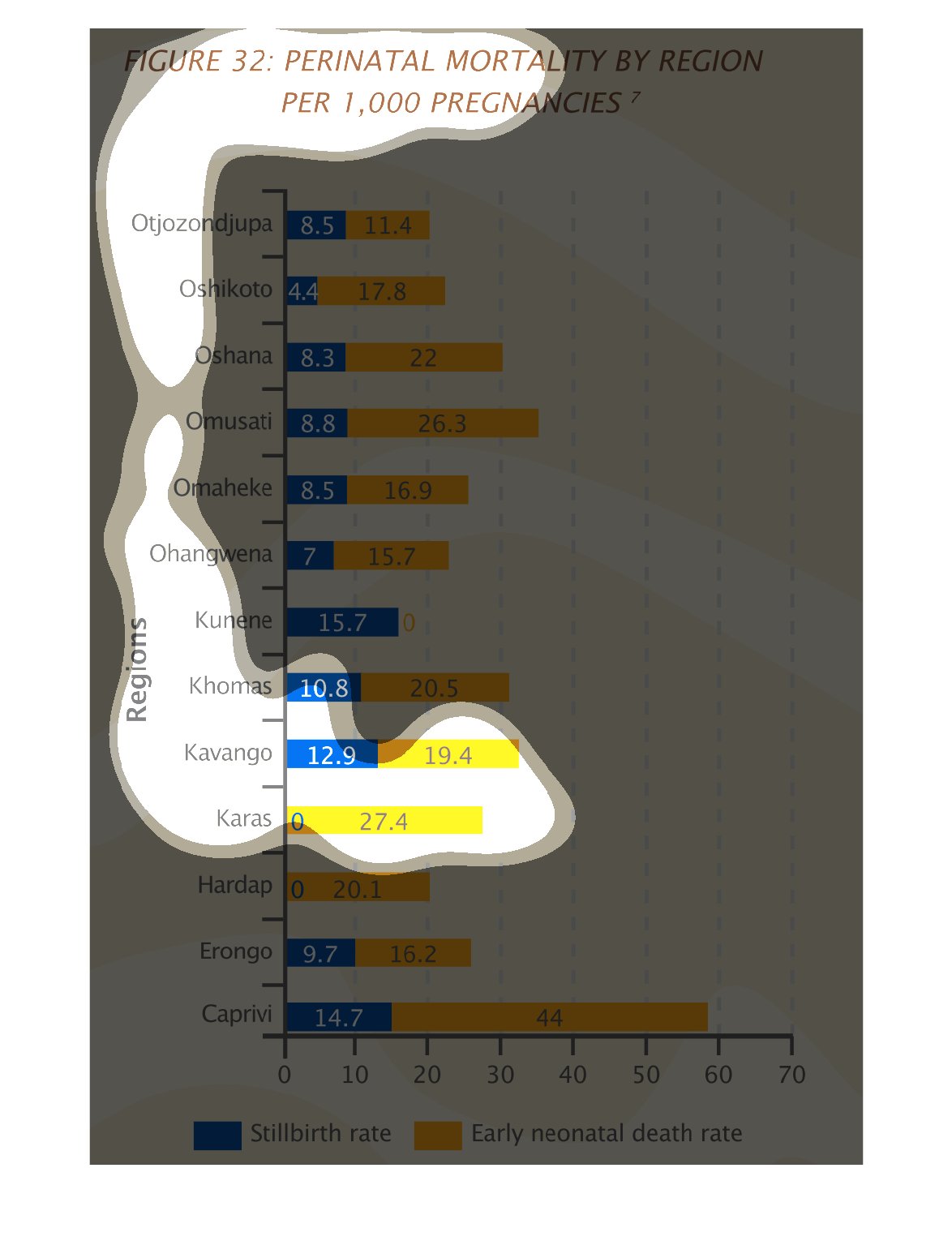
This graph shows the perinatal mortality for a region within 1000 pregnancies. These are in
other countries by still birth and early neonatal deaths. Early neonatal deaths are shown
as more.
This handmade chart shows the incidence of perinatal deaths by region and by cause. It shows
some causes have grown over time but I do not know what these are
This graph depicts perinatal mortality rates by region. Each region has two data collections
measured which are still birth and early neonatal death rates. Overall neonatal death rates
are higher except in the region of Kunene.
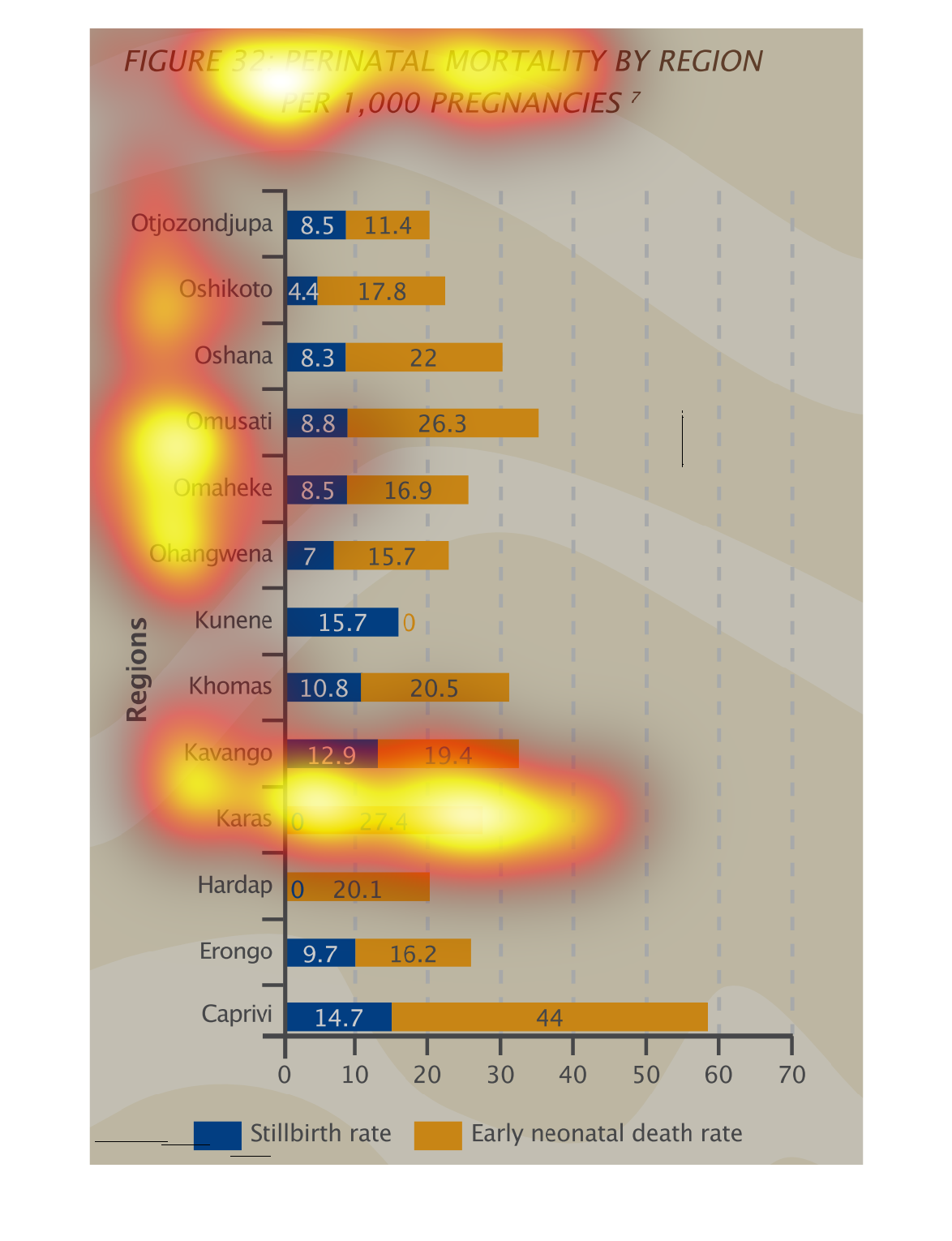
The figure presented is titled Figure 32: Perinatal mortality per region by 1,000 pregnancies.
 The figure is a representation of perinatal mortality.
The figure presented is titled perinatal mortality by region per 1000 pregnancies.  The figure
is a representation of the perinatal mortality rates in different regions.
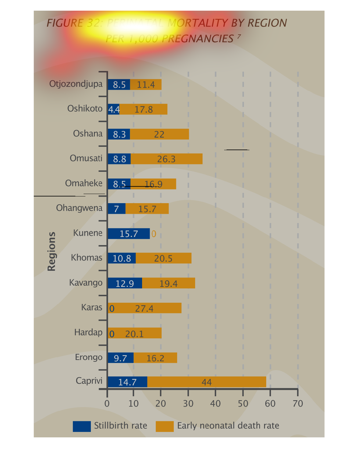
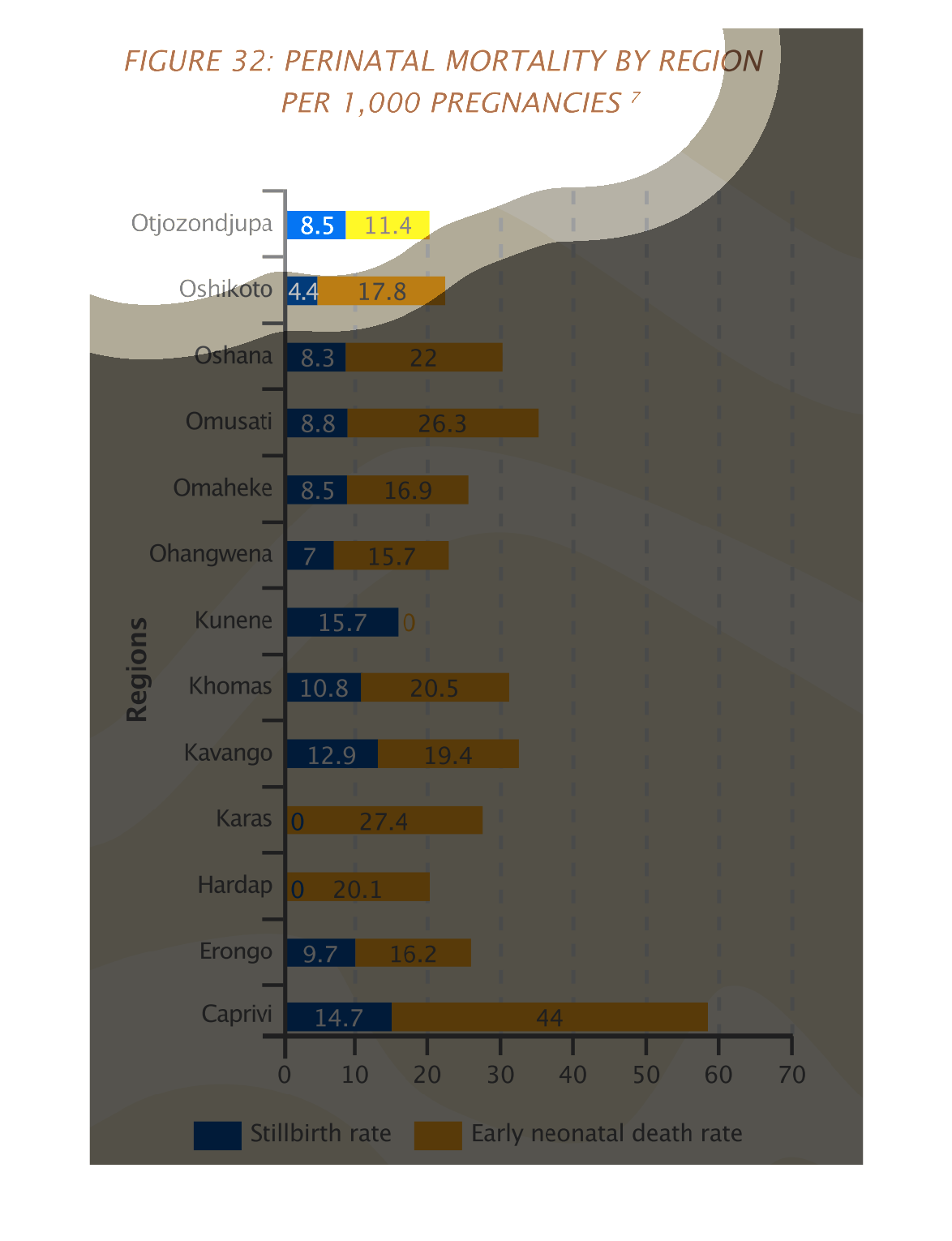
This is a graph of the perinatal mortality by region per 1000 pregnancies. The data shows
that in all of the cities early neona death rate is higher than the rate of stillbirths.
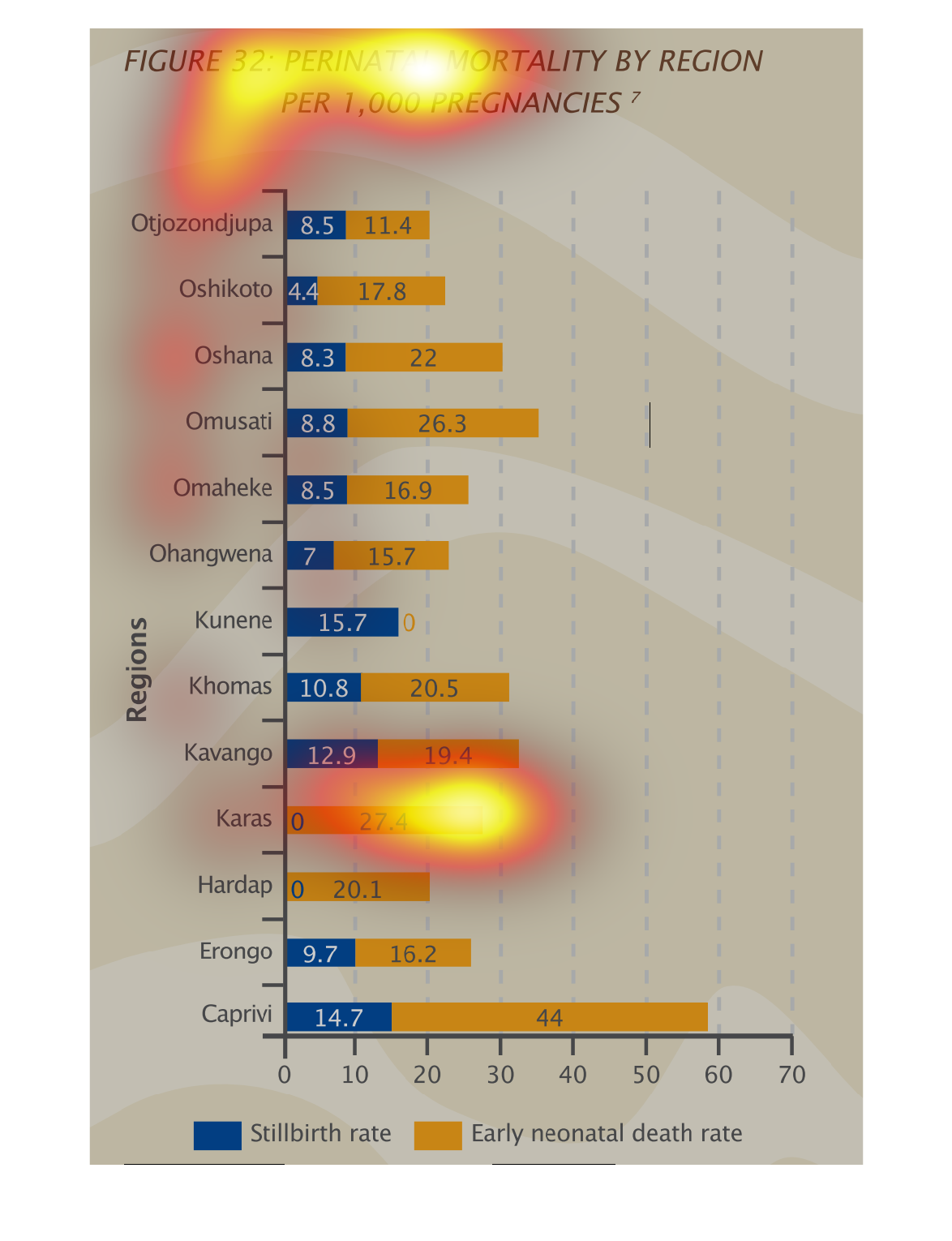
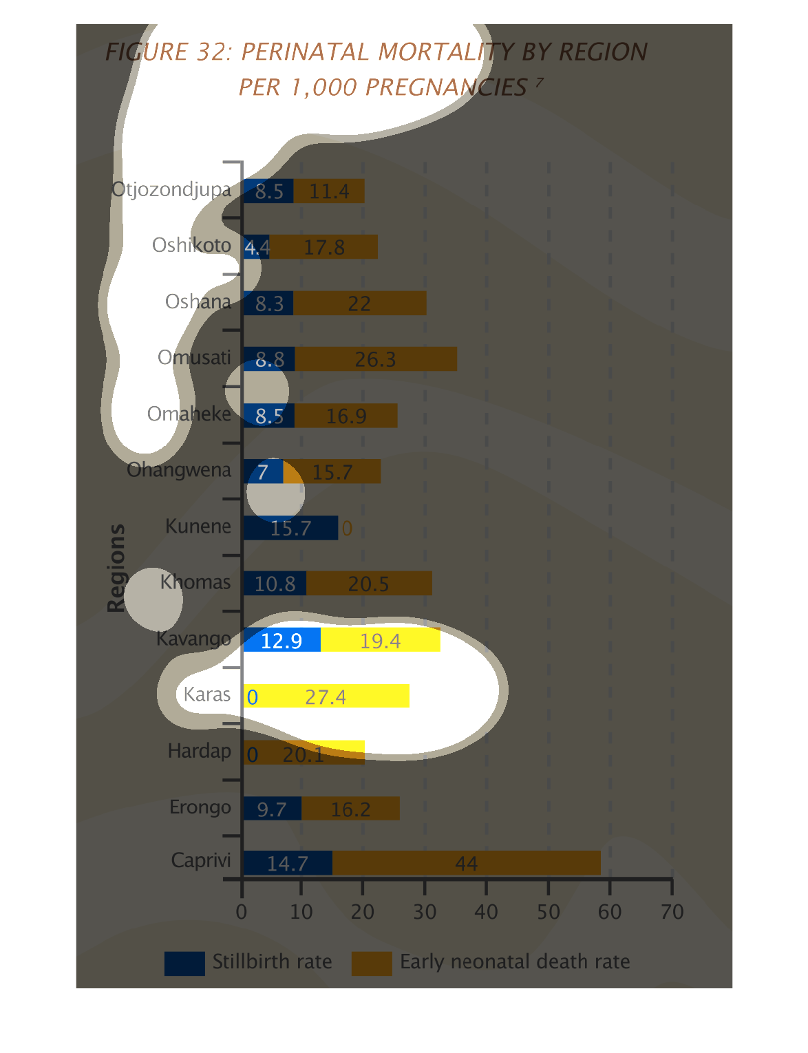
Perinatal mortality by region per 1000 pregnancies is what this graphic is showing. The Caprivi
region has the highest number of overall mortality rates but when mortality is split into
two categories (stillborn vs. early neonatal deaths) Caprivi only has the highest mortality
rate in early neonatal deaths while Kunene has the highest stillborn deaths.
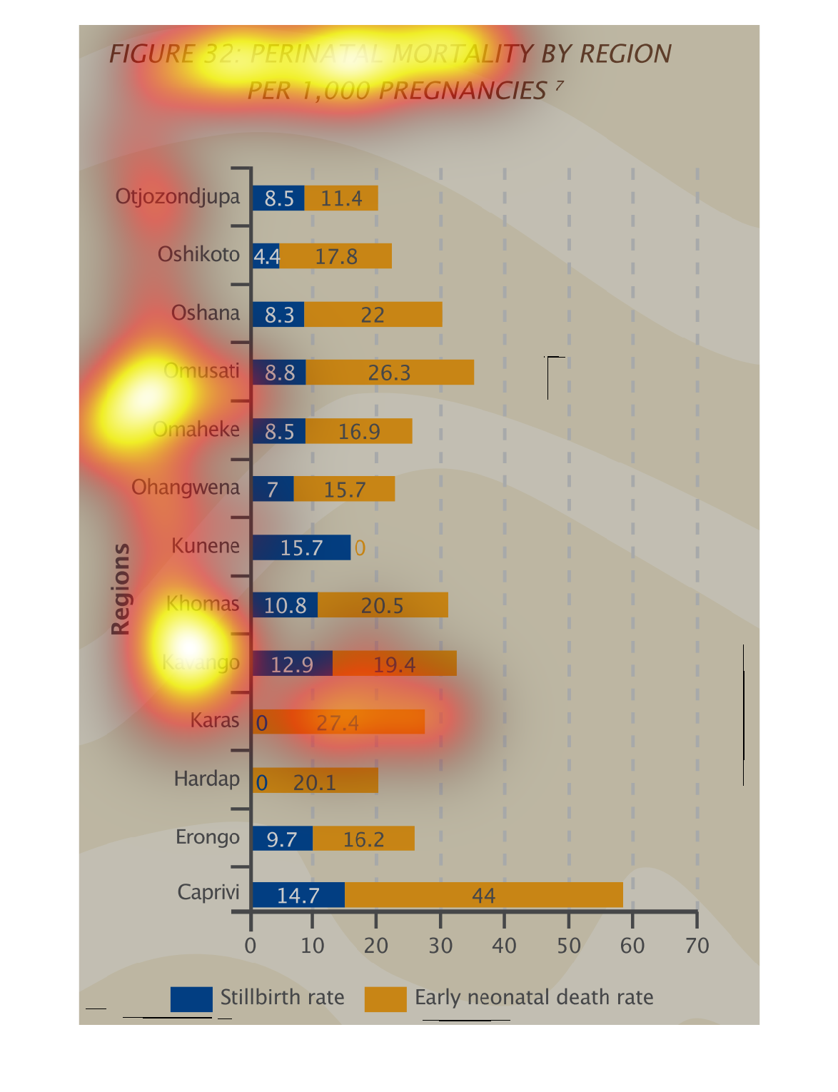
Chart showing the perinatal mortality by region per 1000 pregnancies. All regions showed significantly
lower stillbirth rates than they did early neonatal death rates, with the exception of the
kunene region, which has no early neonatal deaths. The Caprivi region by large had the most
early neonatal deaths.
Perinatal Mortality by Region per 1,000 pregnancies  Regions on the left Still births/death
rate below  Death rate is much greater in the majority of the regions
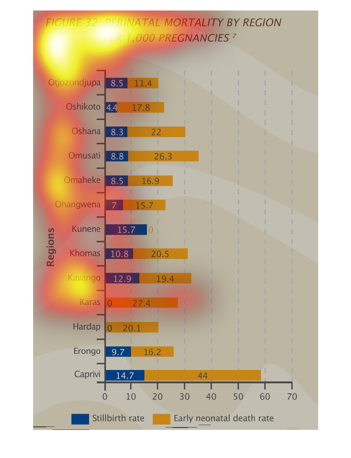
This is a chart of perinatal mortality by region per 1,000 pregnancies.  Kunene has the highest
stillbirth rate, while caprivi has the highest early neonatal death reate.
The image displays the mortality rates of infants by region. It distinguishes between stillbirth
rates and early neonatal deaths. It's clear from the chart that although stillbirth numbers
are high there are many more early neonatal deaths with Caprivi being significantly higher.
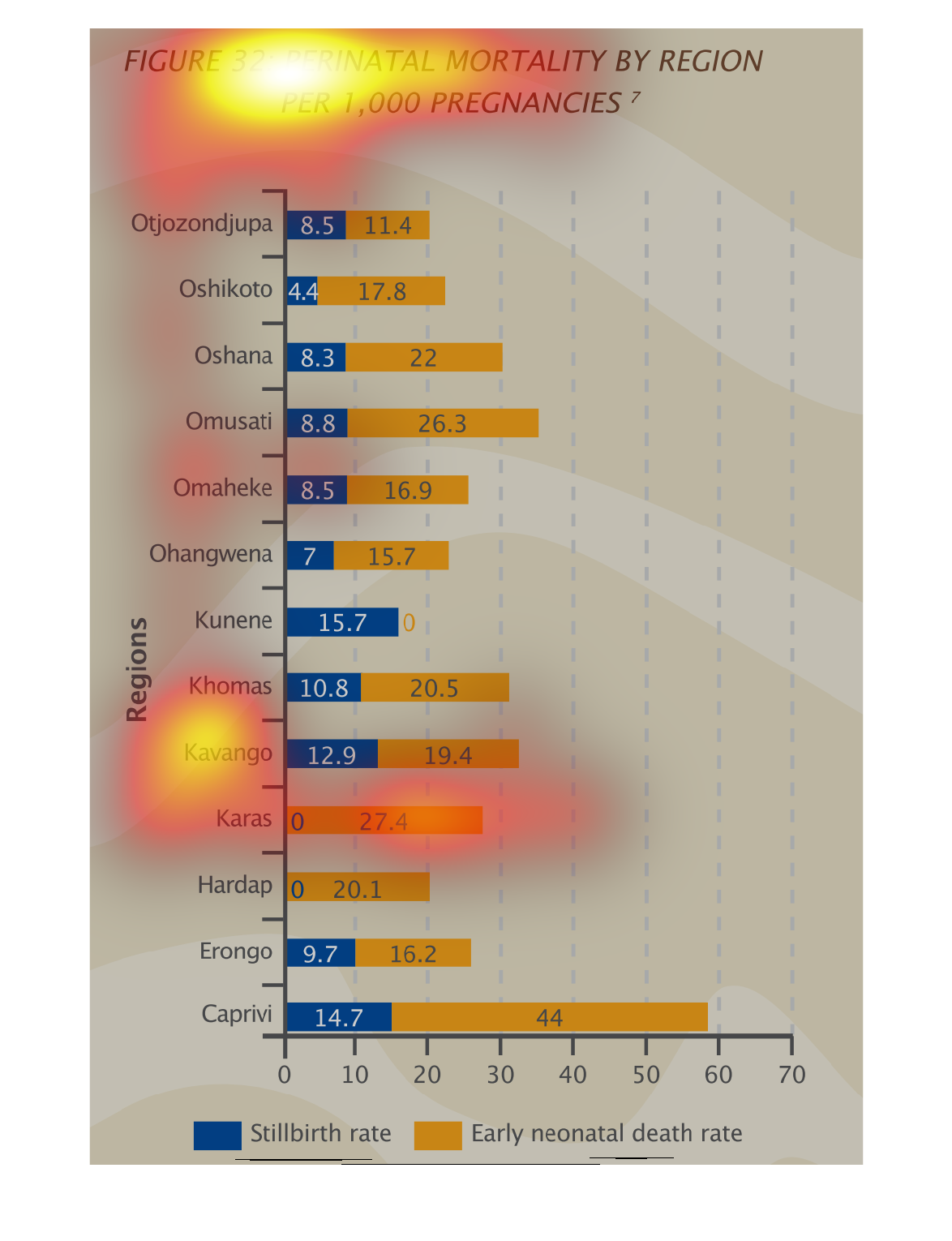
This image shows perinatal mortality by region.  Values are given for the stillborn rate and
early neonatal deaths.  These amounts are shown in a bar graph with each type of death be
shown by a color (stillborn - blue and early neonatal death - yellow).  Regions are listed
and bars are drawn showing the value of each type of death.