This handmade chart shows the effective coverage for interventions for infants. I think it
is related to vaccines but it is not clear based on anything in the chart

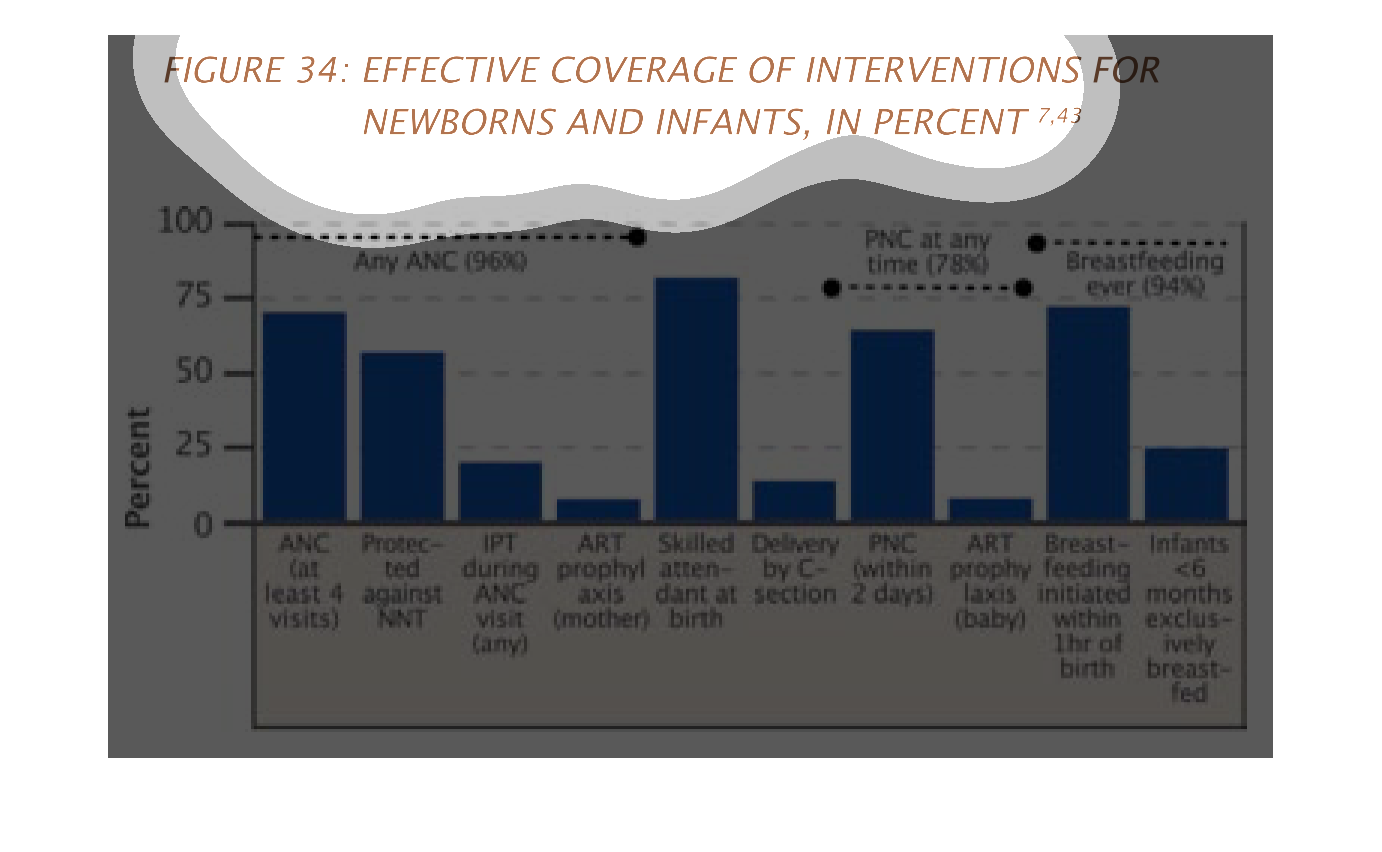
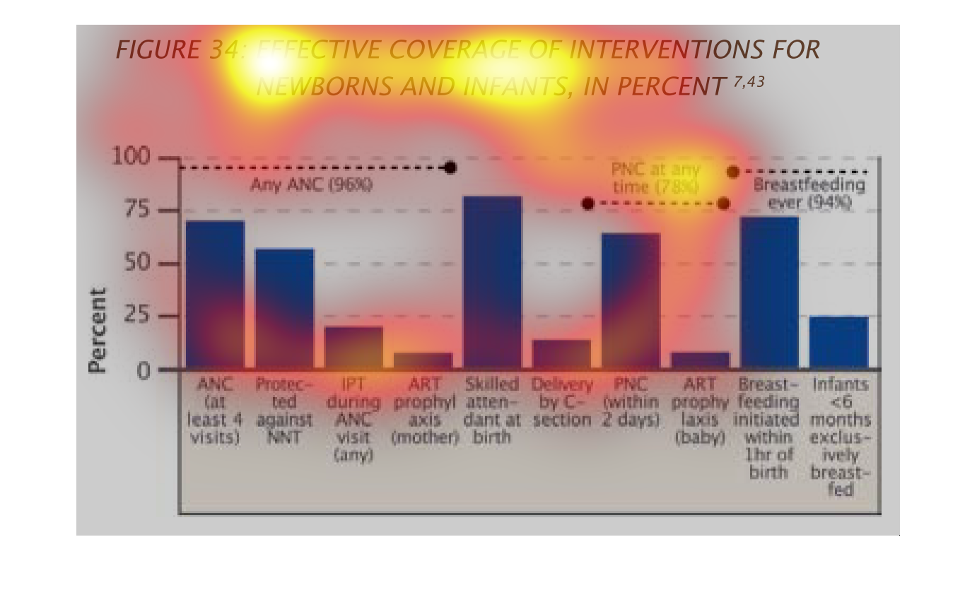
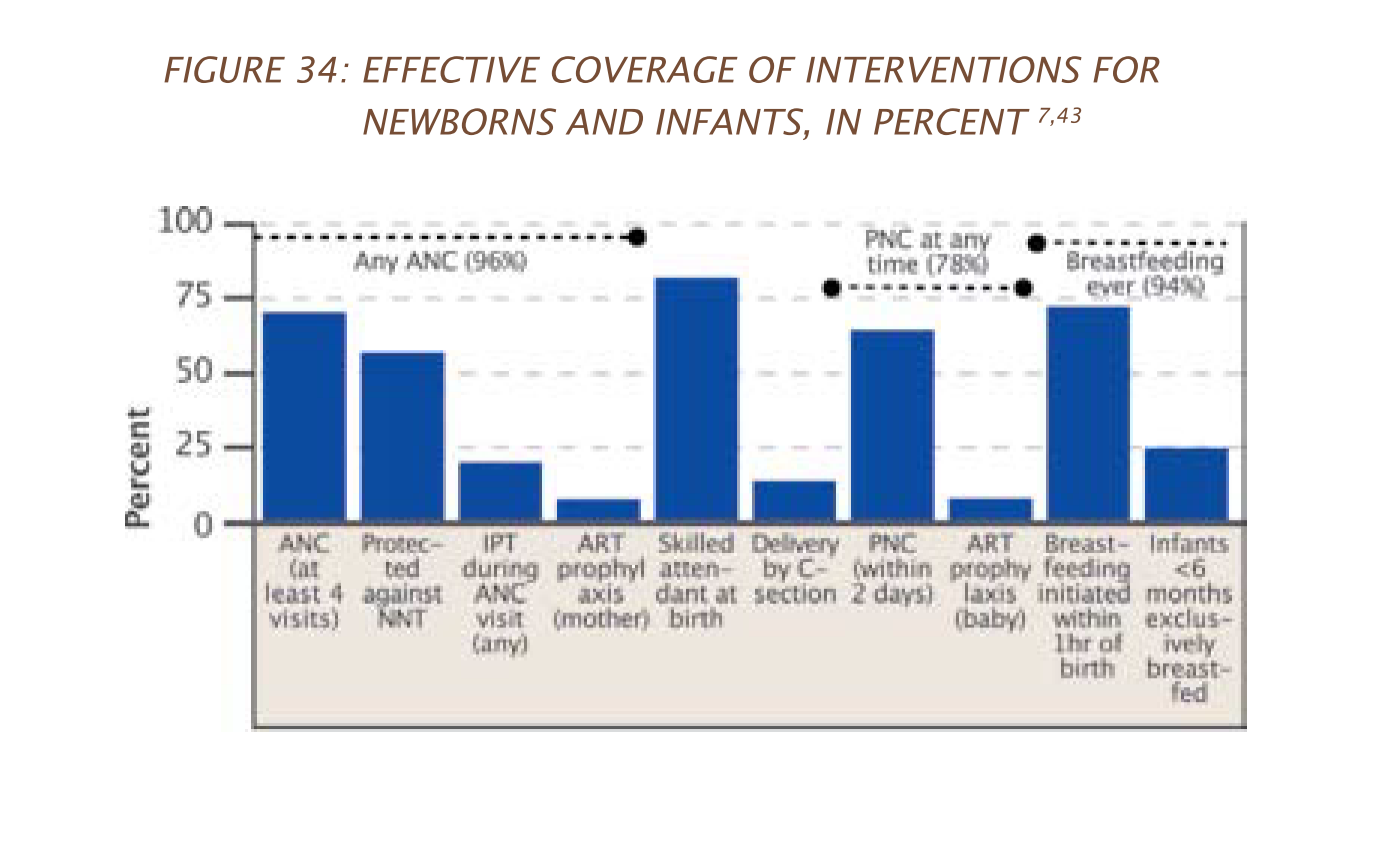
This chart describes effective coverage of interventions for newborns and infants, in percent.
Categories on the chart include ANC (at least 4 visits).
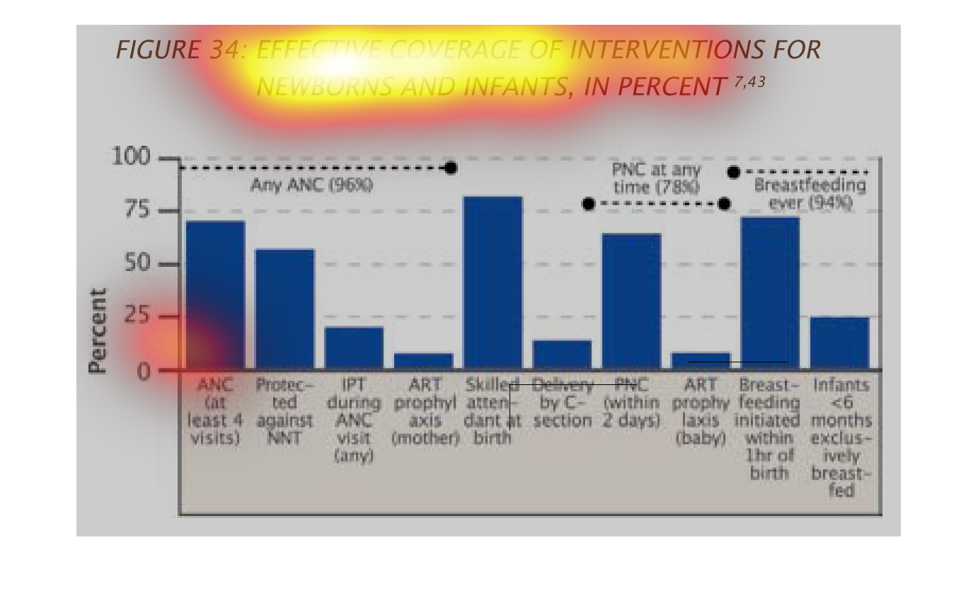
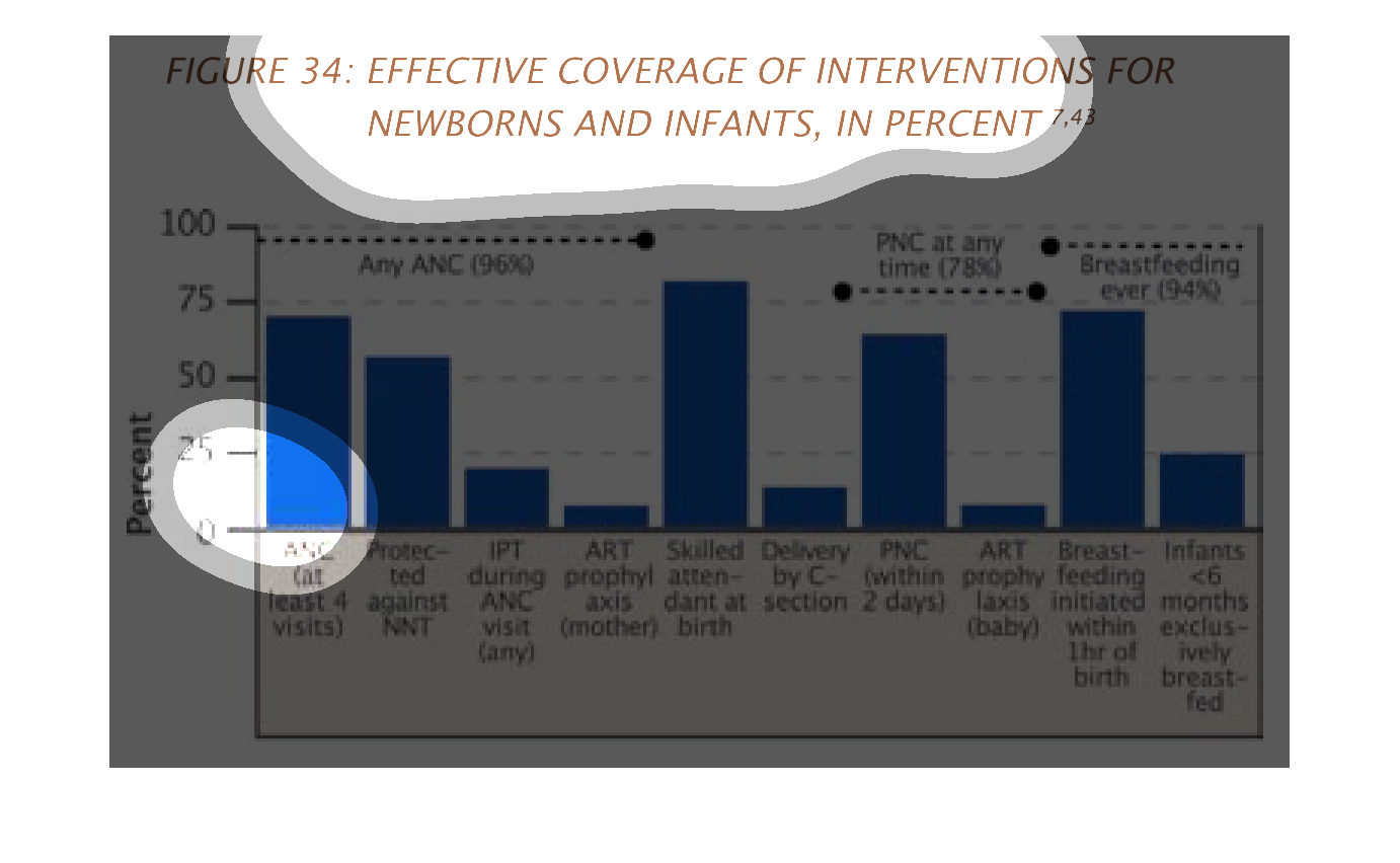
This is a series of bar graphs depicting effective coverage of interventions for newborns
and infants as a percentage across several different metrics.
This graph describes effective coverage of  intervention for newborn and infants, in percent.
Skilled attendant at birth has the highest percent on the graph.
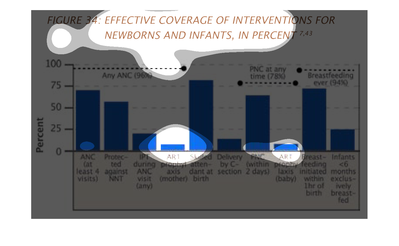
This chart describes effective coverage of intervention for newborns and infants, in percent.
categories include protected against NNT and IPT during ANC visit.
This chart shows the effective coverage of interventions for newborns and infants in percent.
 The most effective methods were: - Breast feeding within one hour of birth (just under 75%)
- skilled attendant at birth (just over 75%) - PNC within 2 days (over 50%) - ANC (at least
4 visits) (just under 75%) - Protected against NNT (just above 50%)
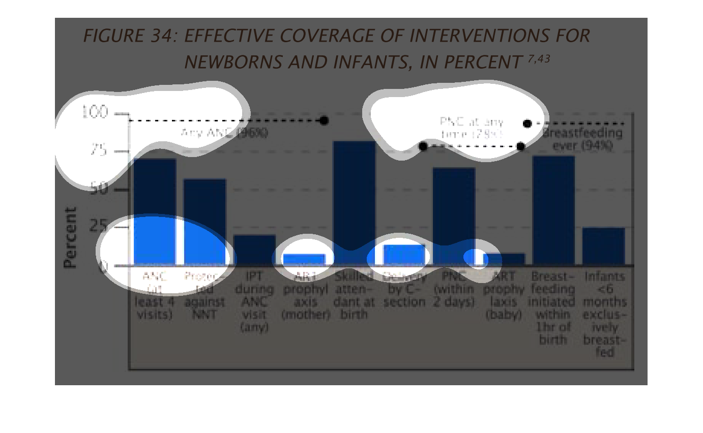
The chart describes the Effective Coverage of Interventions for Newborns and Infants in percentage
points. The chart deals with topics such as ANC, PNC and breastfeeding.
figure 34: effective coverage of intervention for newborns and infants in percent. Y axis
shows percentage 0-100, x axis shows different variables that affect health.
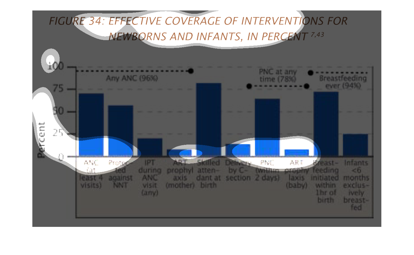
The graph describes the effective coverage of interventions for newborns and infants, in percent.
 75% had ANC (at least 4 visits), 50% protected against NINT, 25% had IPT during any ANC visit,
<10% of mothers had ART prophylaxis. 80% of mothers had a skilled attendant at birth, and
~13% had delivery by C-section. 75% had PNC within 2 days of giving birth. A similar amount
of babies had ART prophylaxis as did mothers. Almost 80% of babies initiated breastfeeding
within 1 hour of being born, and 25% of babies (<6 months old) would breastfeed exclusively.
This is a graph that shows the coverage of effective interventions for newborns and infants.
This is with respect to vaccinations, breastfeeding and method of child delivery used.
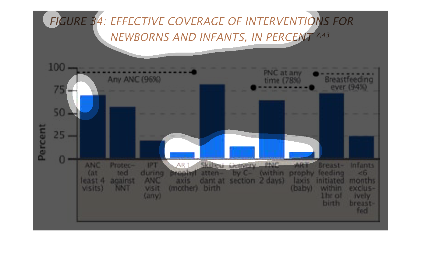
The following chart shows the effective coverage of interventions for medical coverage for
infants and newborns. Shows what percentage receive the proper vaccinations and other medical
care that they are need of.
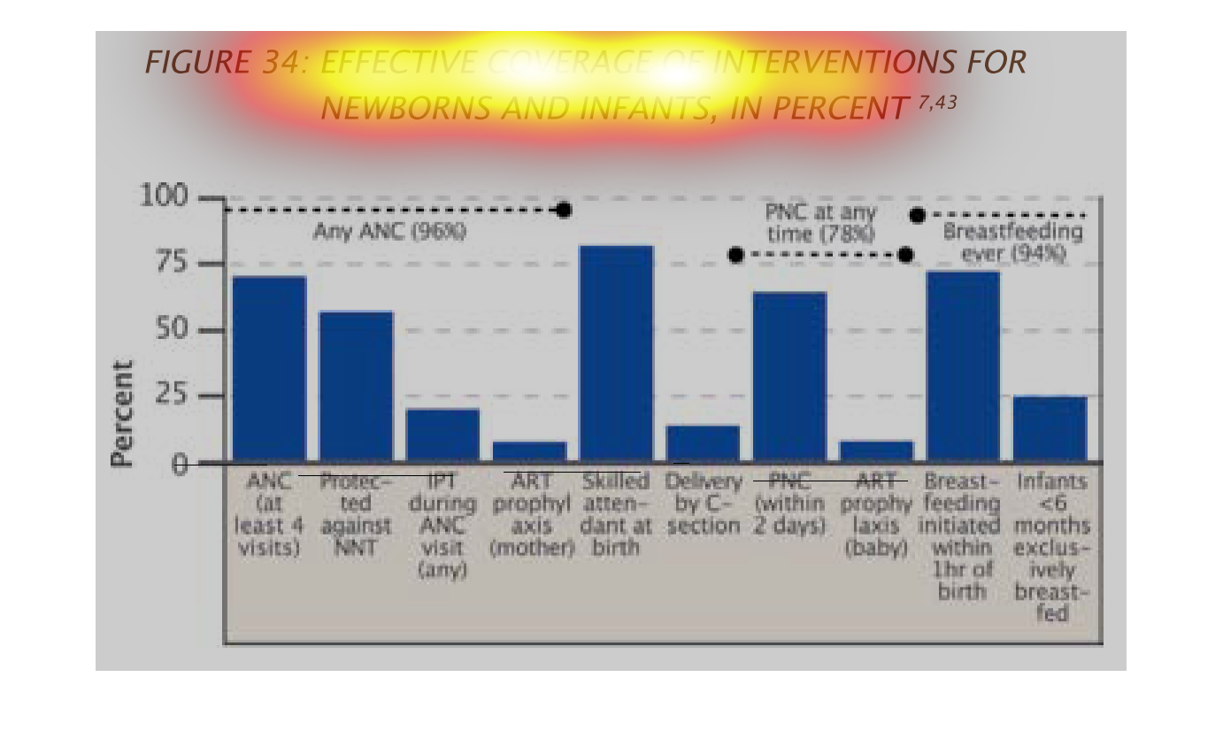
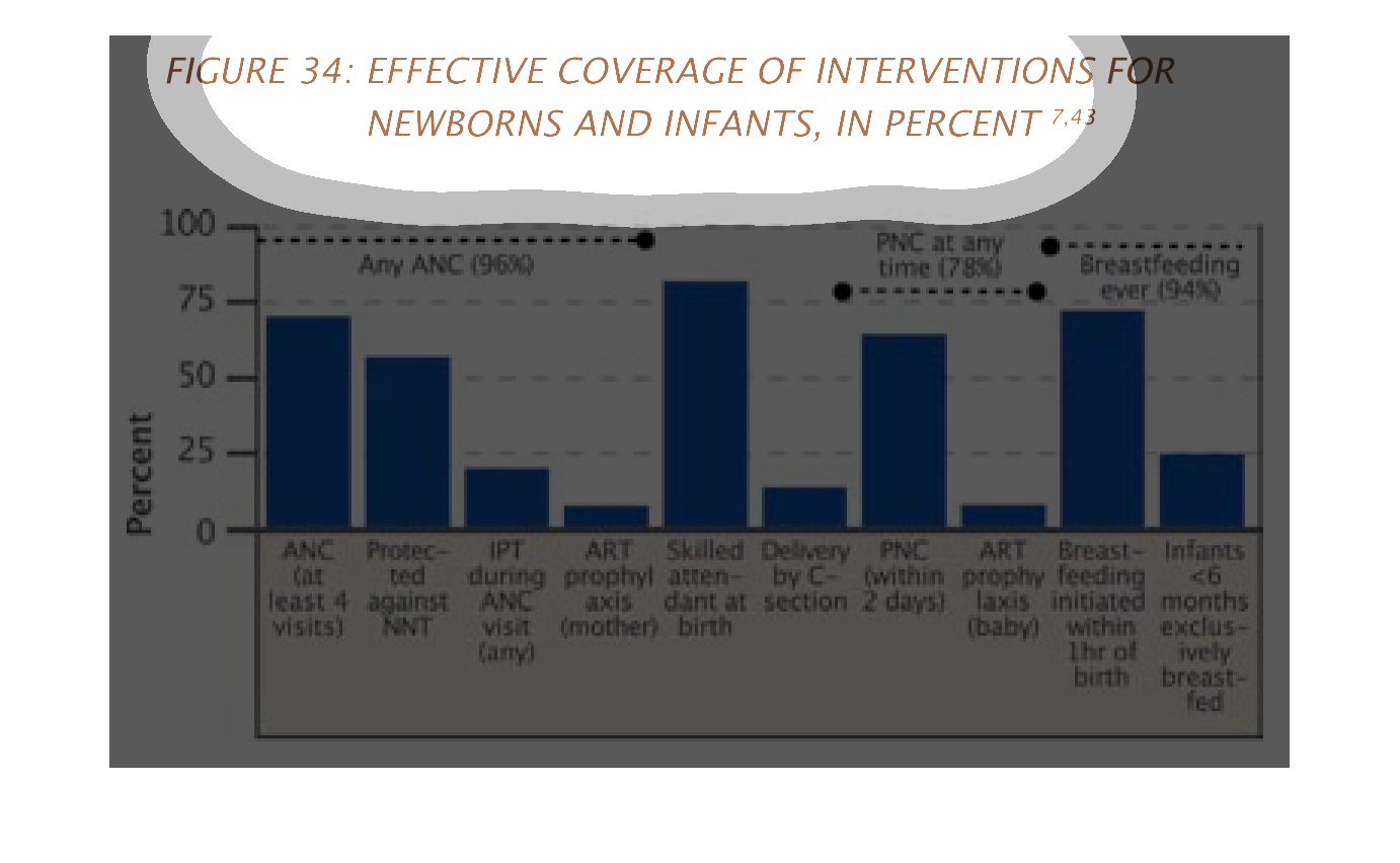
The image of the graph seems to deal with the coverage and availability of immunizations for
infants and the diseases that have the possibility of effecting them
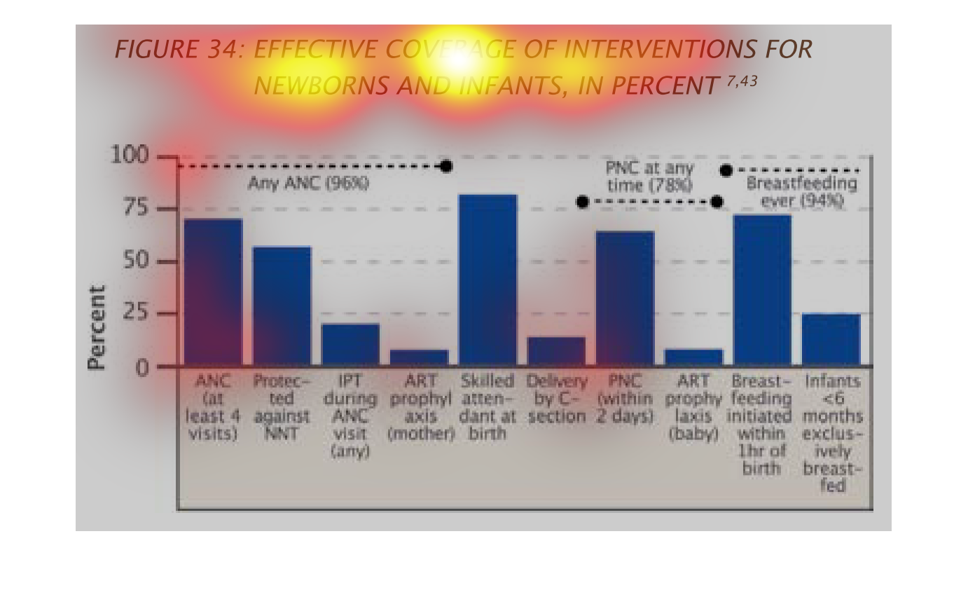
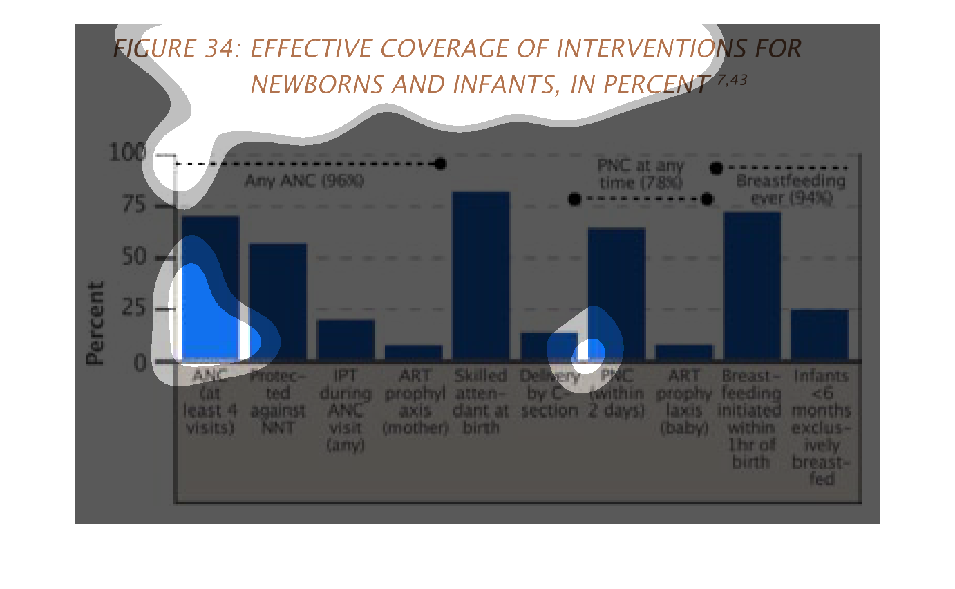
The figure presented is titled Figure 34: effective coverage of interventions for newborns,
and infants, in percent.  The figure is a representation of effective coverage for newborns.
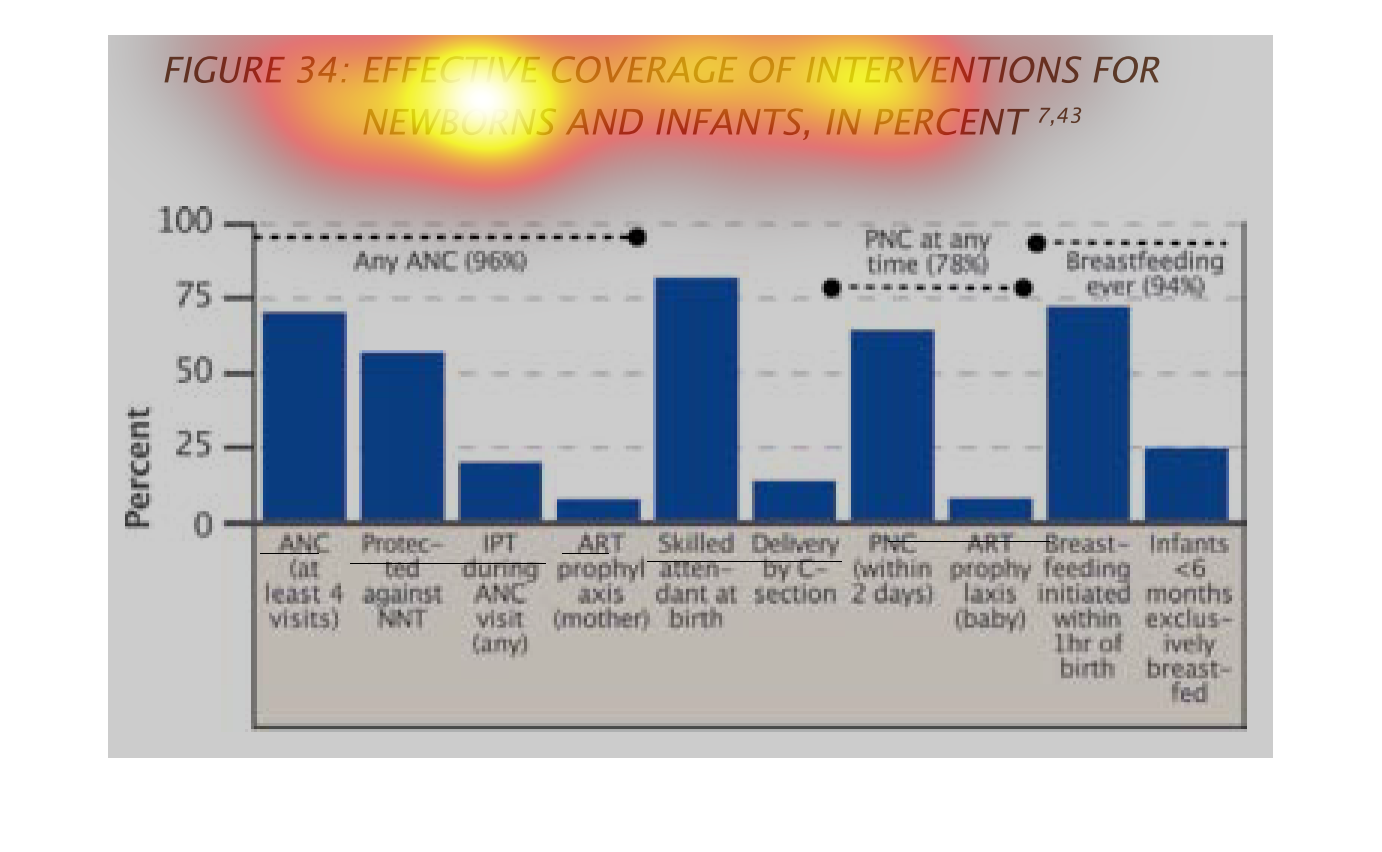

This is a graph of effective coverage of interventions for newborns and infants in percent.The
data was greatest when breast feeding occurred and medical professionals were present.