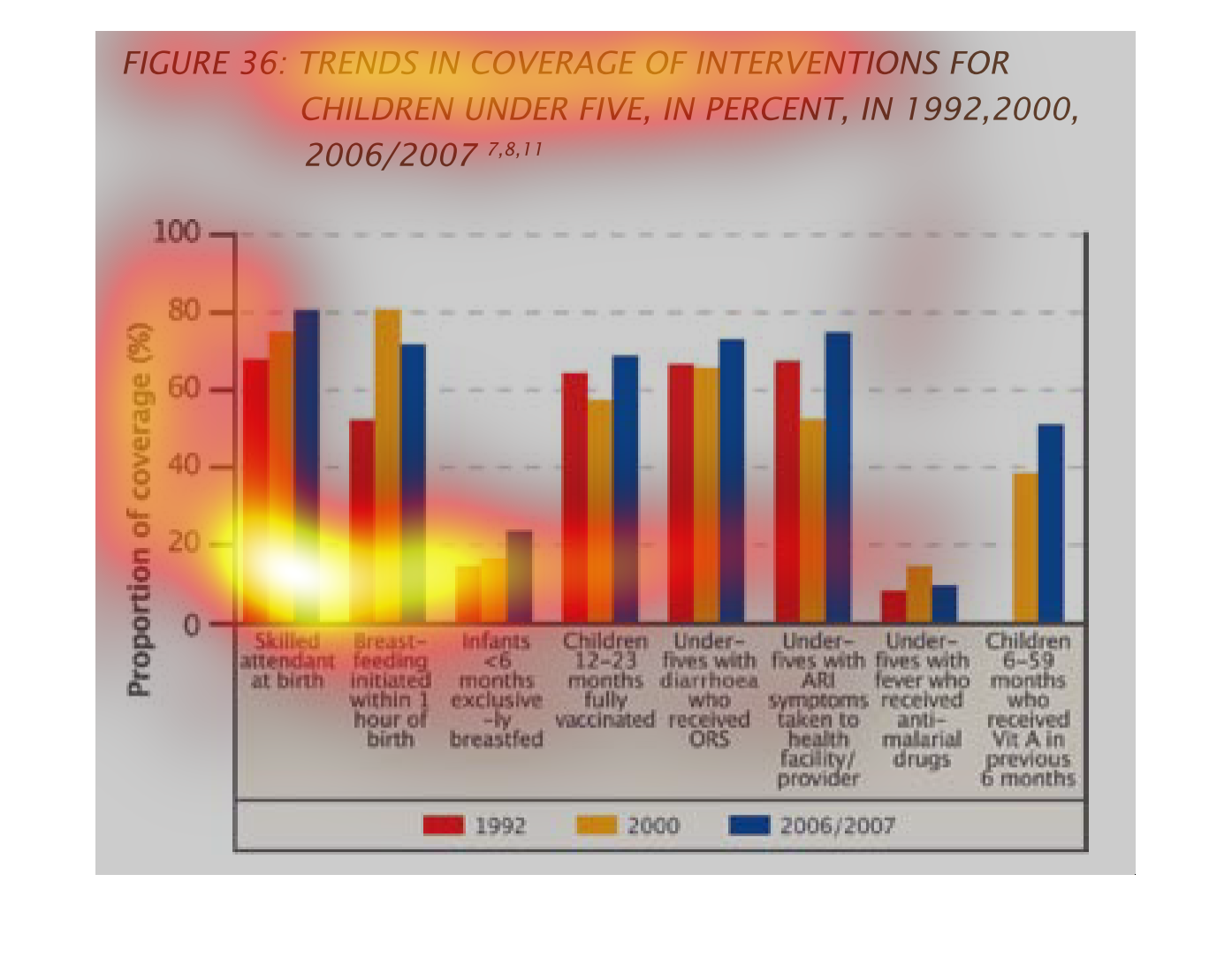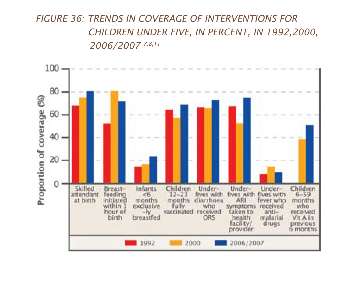
This chart shows the trends in coverage of the intervention of children under 5, for 1992,
2000, and 2006/7. Height of the bars denotes percentage, while the colors show the years.
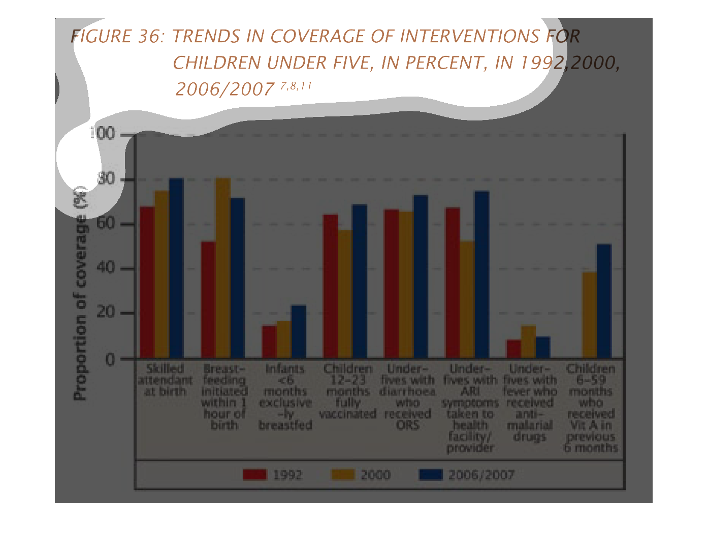
The following chart gives the trends for children in regaurds to interventions. In reguards
to being breastfeed and receiving immunizations, those receiving anti malaria drugs, and vitamin
A.
The image on the left hand side shows different years over roughly a two decade period and
the types of treatments that were imposed on newborns and infants.  From the data it shows
an increase in having skilled professionals help with the delivery of the baby.  It also shows
that over the years only relying on breastfeeding has also become more popular.
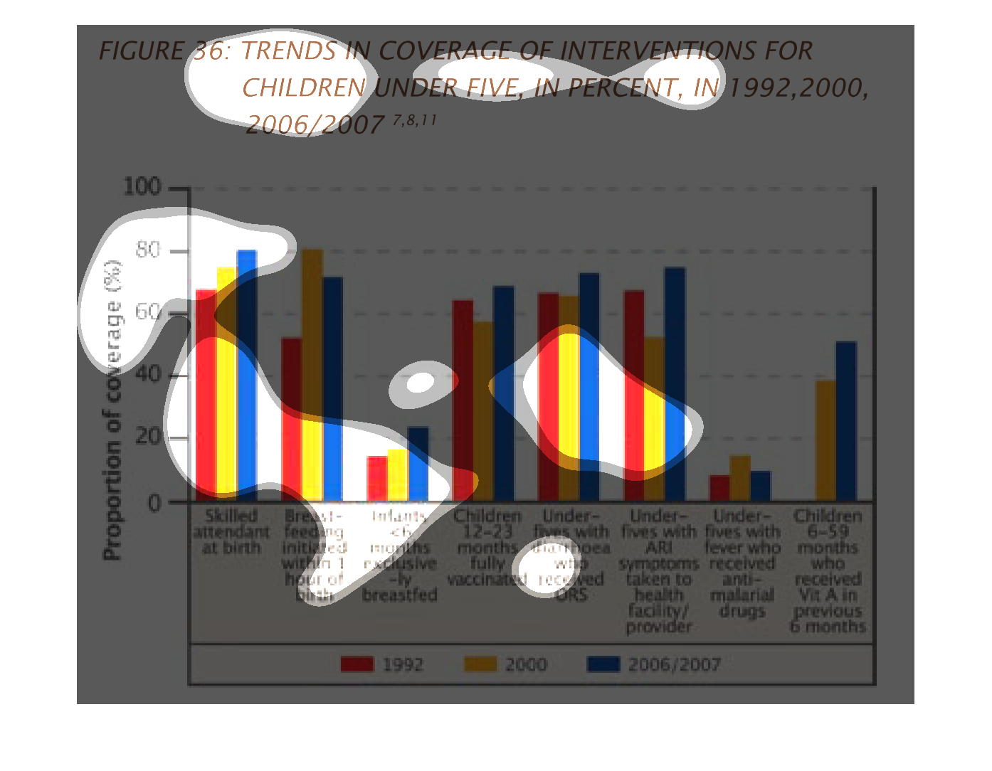
This graph shows different healthcare techniques for treating newborns and their extent of
usage in the years 1992, 2000, and 2006/2007. There was no significant increase in such healthcare
practices throughout the years except that more babies were fed within an hour of birth.
This chart depicts the percentage of children who have coverage for various recommended treatments
and care.  The chart shows the coverage for 1992, 2000, and 2006-07.
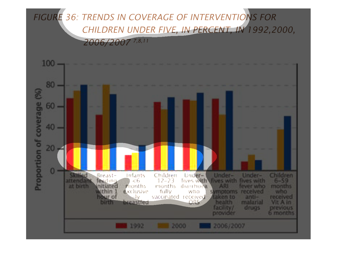
Trends in coverage of interventions for children under 5, in percent, in 1992, 2000, 2006/2007.
 The categories covered are Skilled attendant at birth, where 1992 was lowest and 2006/2007
were highest percentage (70% low to 80% high); breast-feeding initiated within 1 hour of birth
(about 50% for '92 with a high of 80% for 2000, falling to about 70% for 2006/07); children
12-23 months fully vaccinated (low of below 60% for 2000); under-fives with diarrhoea who
received ORS (highest in 2006/07); under-fives with ARI symptoms taken to health facility
(highest in 2006/07, lowest in 2000); under fives with fever who received anti-malarial drugs
(all under 20%, highest for year 2000); children 6-59 months who received Vit A in previous
6 months (1992 not shown; year 2006/07 was higher at about 50% to year 2000, at about 40%).
This is a graph that shows the convergence of interventions for all children under five years
of age in the years 1992, 2000, 2006, 2007, 2008 and 2011.
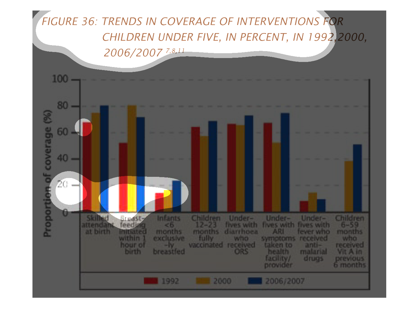
This is a graph showing the coverage of interventions for children under five in percent.
The rate is much higher for those children that were vaccinated.
This chart describes trends in coverage of interventions for children under five, in percent,
for the years 1992, 2000, and 2006/2007. Categories include skilled attendant at birth.
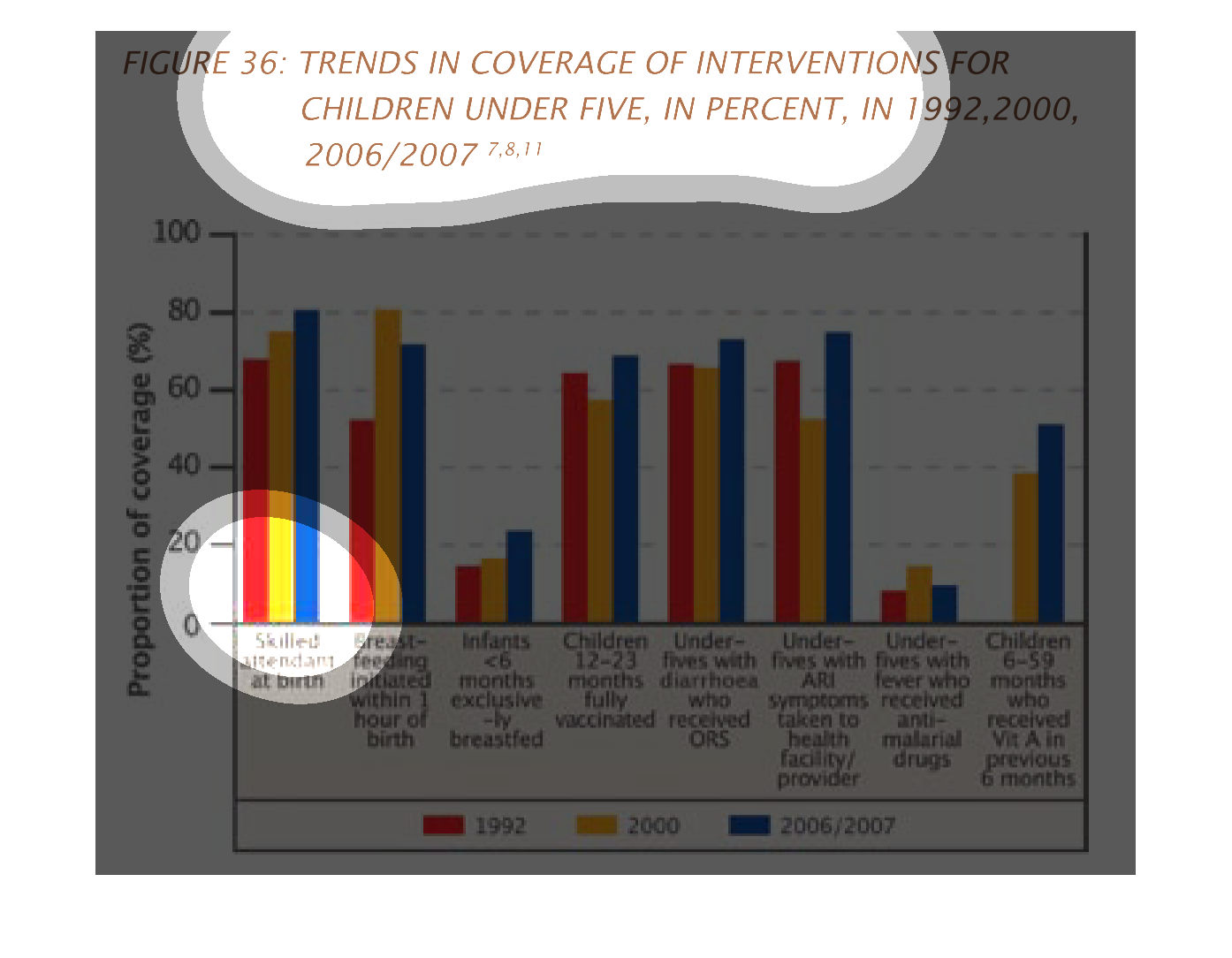
This graph describe trends in coverage of intervention for children under five.  It is described
in percentage for three different years.  Those years are 1992, 2000 and 2006/2007.  The red
is 1992, the orange is 2000, and the blue is 2006/2007.
This image or figure shows or depicts in statistical bar graph format trends in coverage of
interventions for children under five, in percent, in 1992, 2000, 2006/2007.
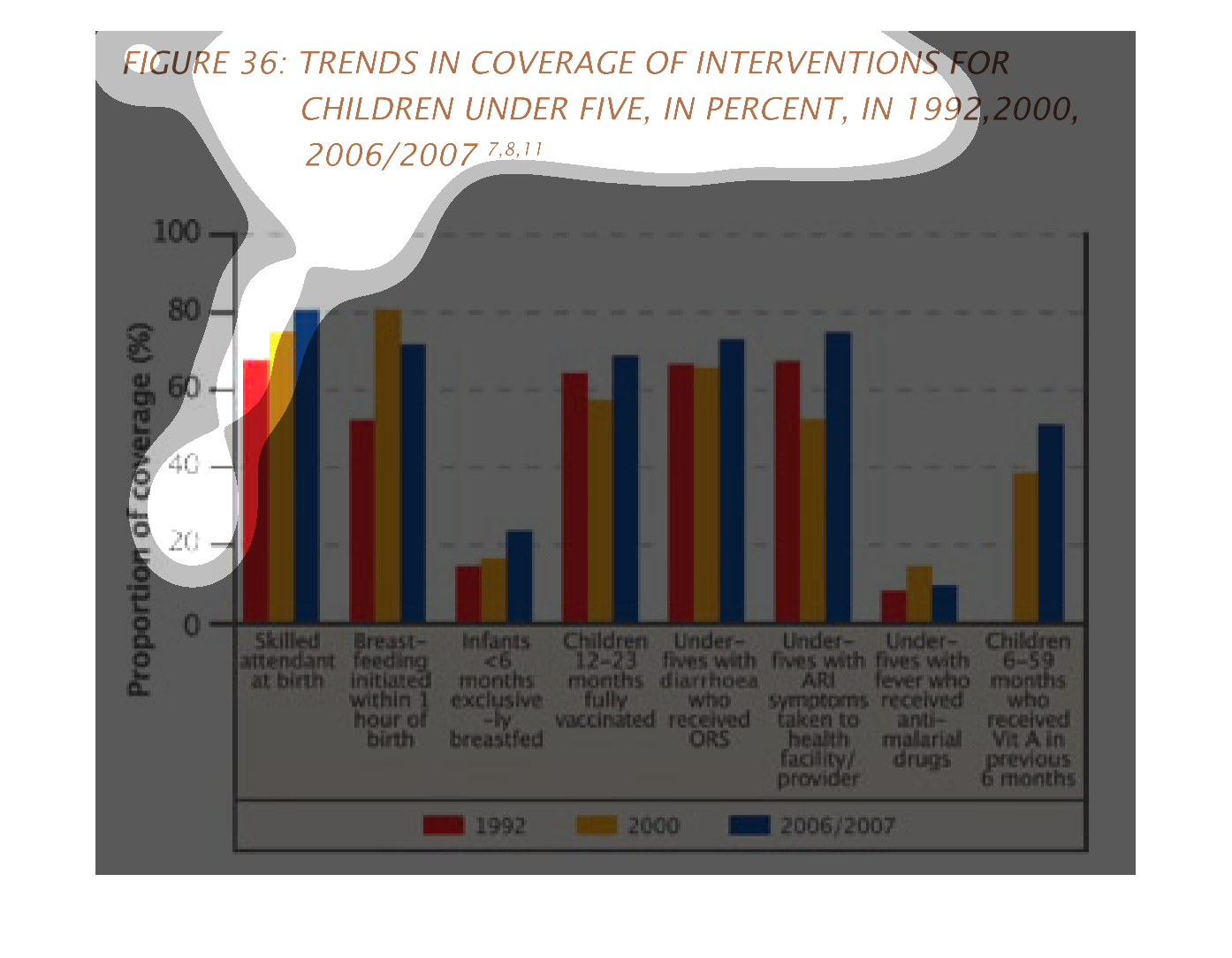
This chart describes different interventions for children that are under five.  It covers
the years of 1992, 2000 and 2006,2007. This chart covers various forms of interventions including
vaccinations and breastfeeding.
This chart describes trends in coverage of interventions for children under five, in percent,
in the years 1992, 2000, and 2006/2007. Categories include skilled attendant at birth.

Figure 36 shows trends in coverage of interventions for children under 5 in percent in 1992,
2000, 2006/2007. This bar graph shows least amount of coverage for infants less than 6 months
exclusively breastfed and most coverage for skilled attendant at birth.