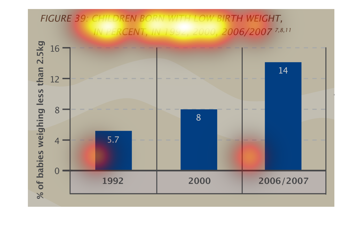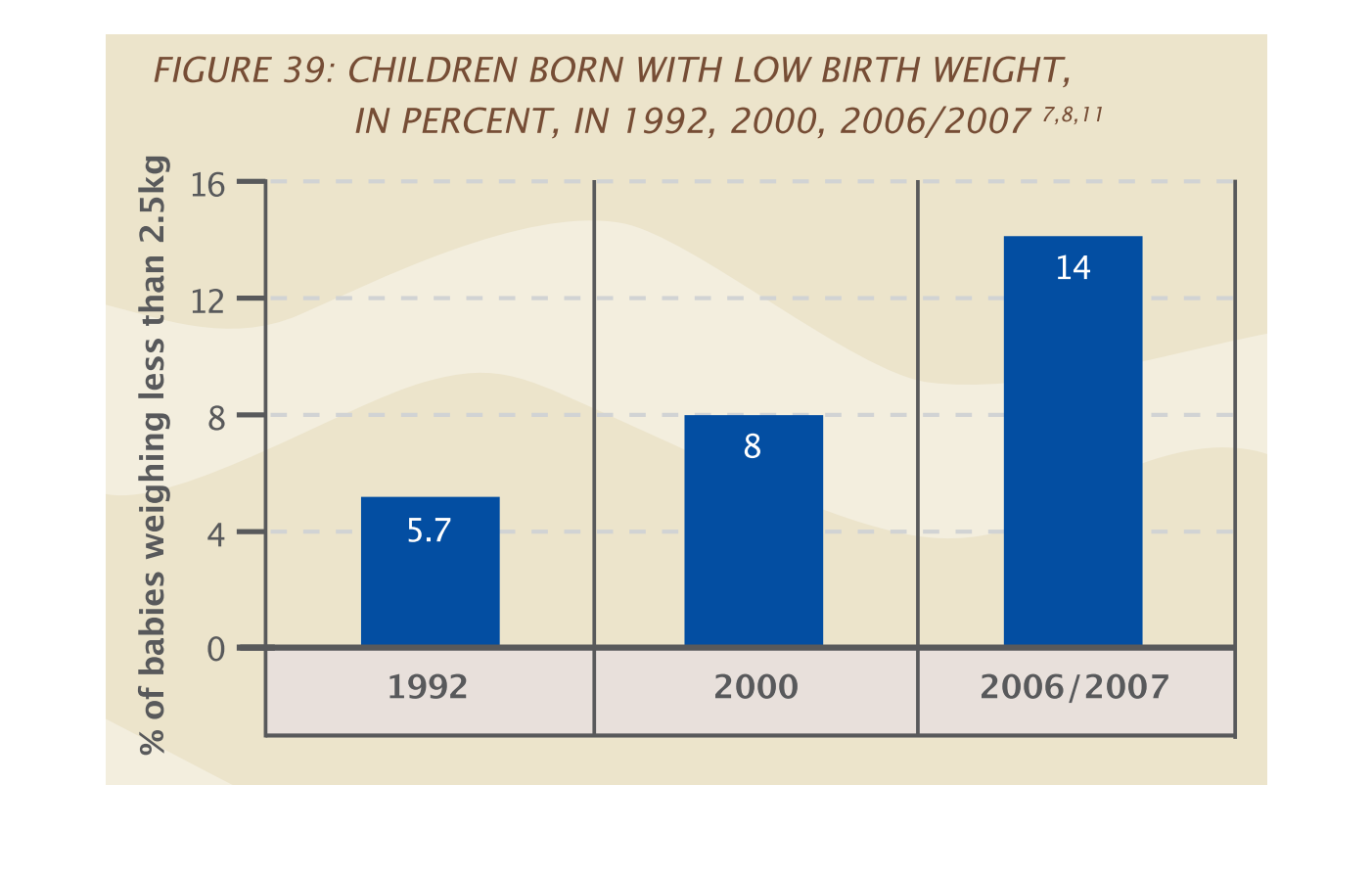
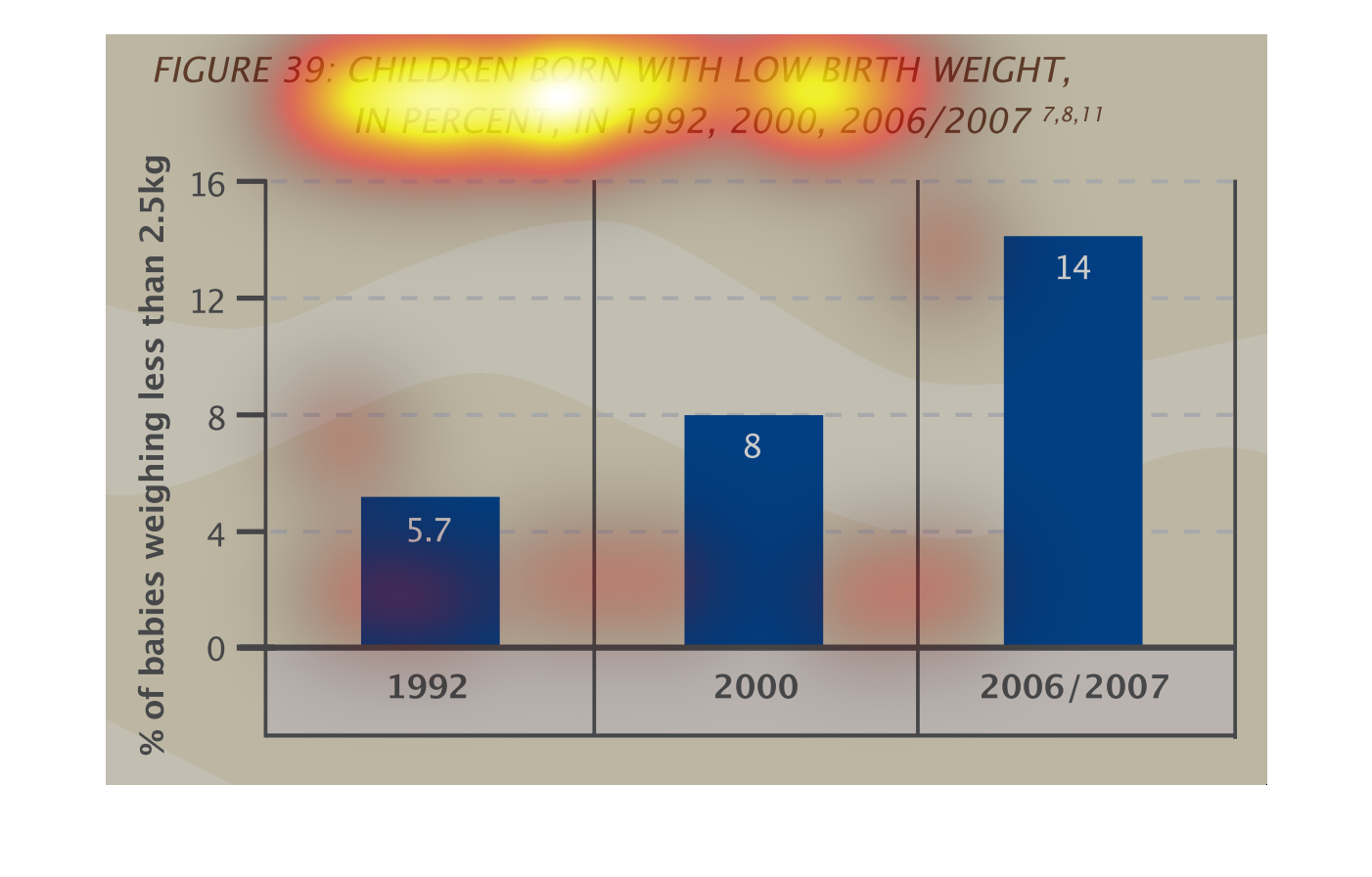
This is a graph that shows children born with low birth weight. Ti shows this measurement
in percentage and it covers the years 1992, 2000 and 2006/2007.

This bar chart illustrates the prevalence of low birth weight babies as a percentage of total
babies born worlwide. The three bars represent 1992, 2000, and 2006/7. The left side represents
the percentage of low birth weight babies.
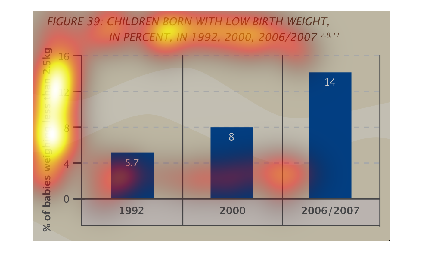
This chart shows the growth in the percentage of children born with low birth weight in the
years 1992, 2000, & 2006/2007. It shows an increase in low birth weight births, with almost
a 3x increase from '92 to '07.
The graph on the left hand side, is showing the percentage of new born babies that have been
born with low birth weights.  From the data collected from different years over a 15 year
period, there has been an increase in low birth weights as compared to the beginning of the
study by roughly more the double.
This handmade chart shows the number of babies born with low birth rates from 1992 to 2006/2007.
 Other than that it doesn't say much because there is no context.
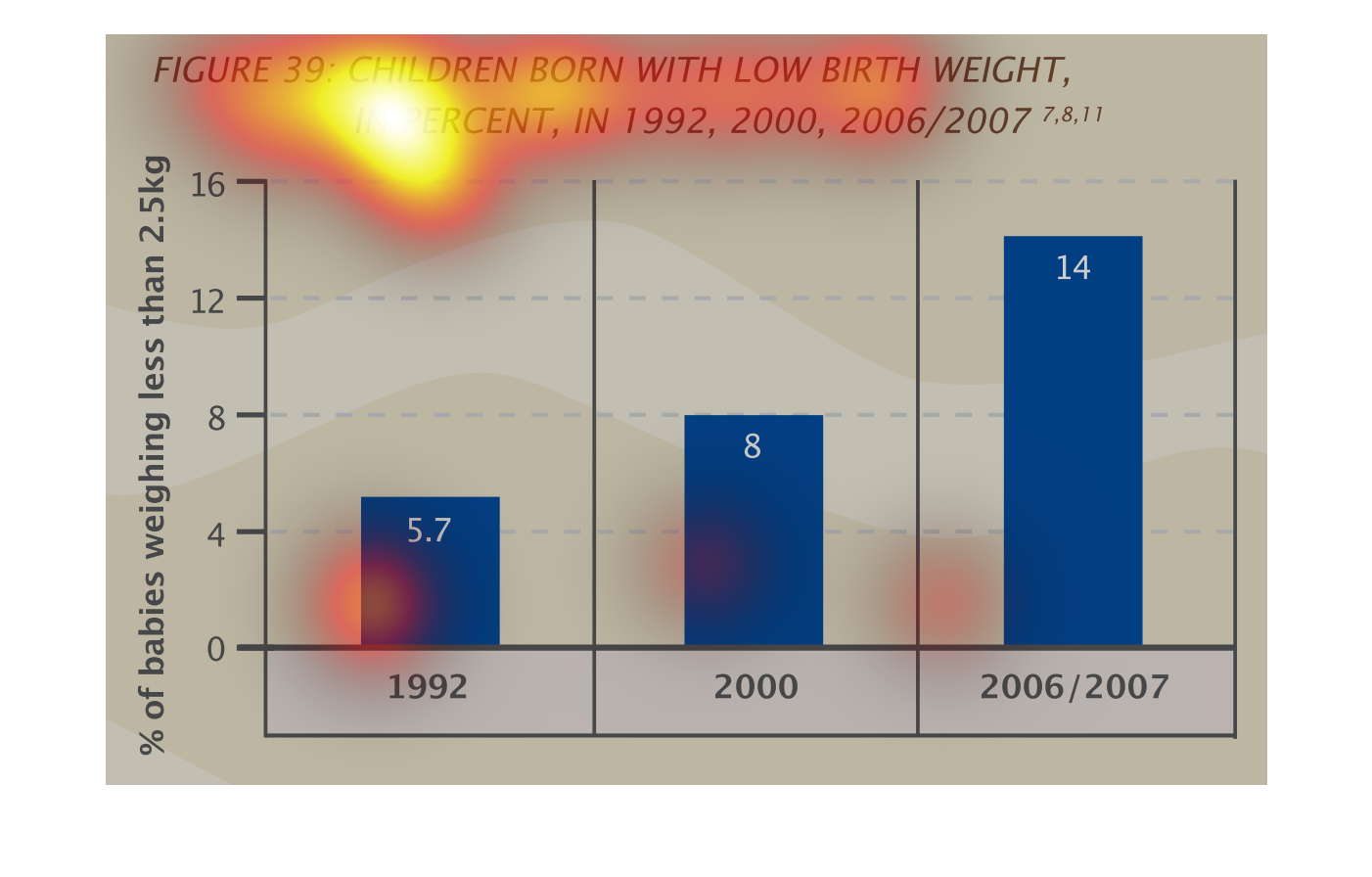
This bar graph shows children born with low birth weight in percent in 1992, 2000 and 2006/2007.
The percent of babies weighing less than 2.5 kg was at the highest in 2006/2007 at 14%.
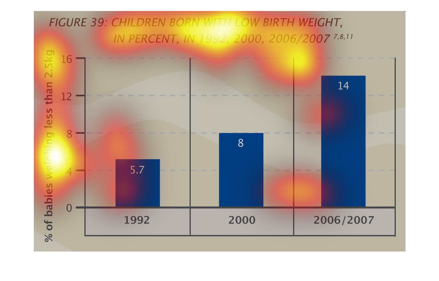
This is a graph of the percentage of children that are born with a low birthrate. The percentage
has almost doubled from 1992 to 2006 and 2007, steadily increasing each year.
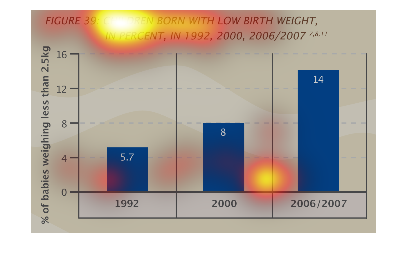
This shows the number of  low birth weight children born in 1992, 2000 and 2006/2007. In 1992,
low birth rate children comprised 5.7% of newborns. However, in 2006/2007 14% percent of newborns
were born with low birth rates.
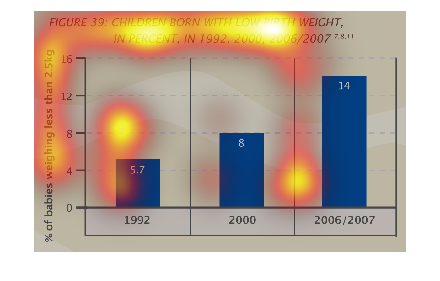
This chart describes the percentage of all births weighing less than 2.5 kg that were born
in 3 different years, 1992, 2000, and 2006. It is unclear what area this data was obtained
from.
This chart shows the % of babies weighing less than 2.5kg in 1992, 2000 and 2006/2007. It
shows low birth weight babies and the % of babies born and how many were low weight.
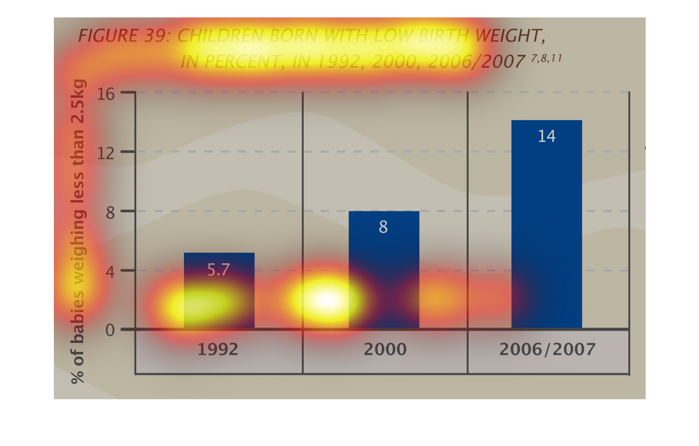
This chart describes children born with low birth weight, in percent, in 1992, 2000, and 2006/2007.
The highest spike on the chart occurred in 2006/2007.


This chart shows the percetnage of children born with low birth weight, in 1992, 2000, and
2006/7. The height of the bars represent percentage and each of the three bars represents
a different year.
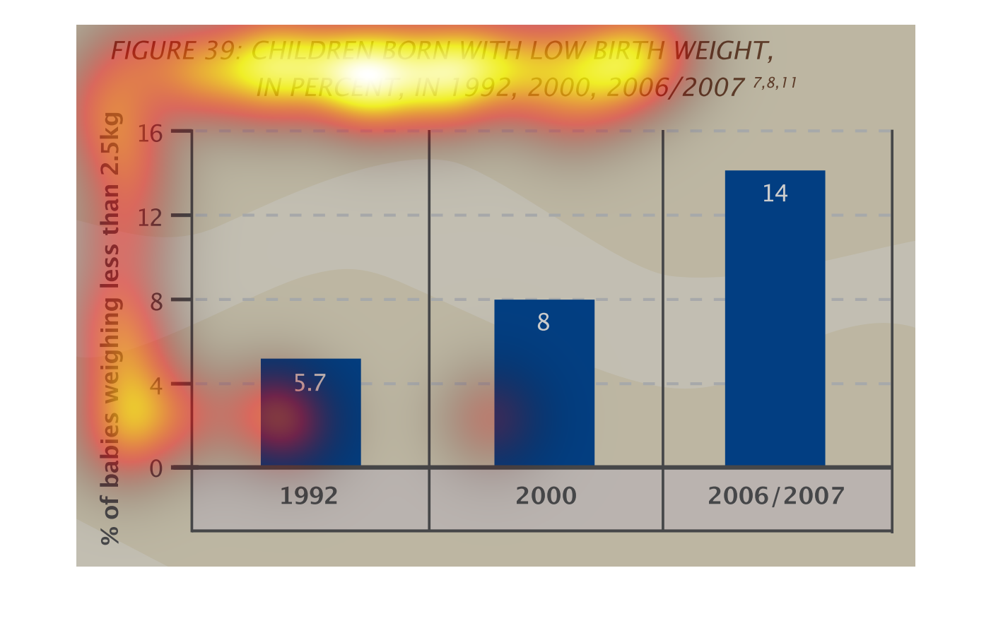
This graph illustrates the number of children born with low birth weight in 1992, 2000, and
2006/2007.  The percentage has increased over time in each time period.