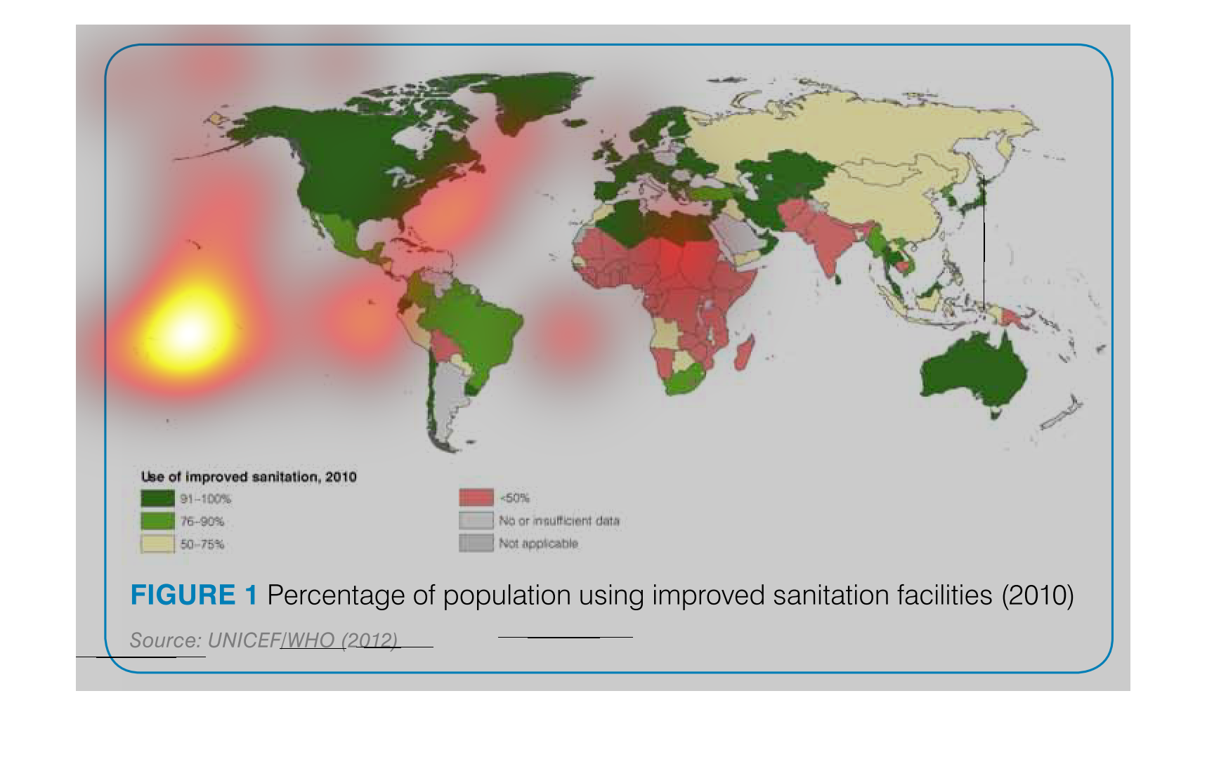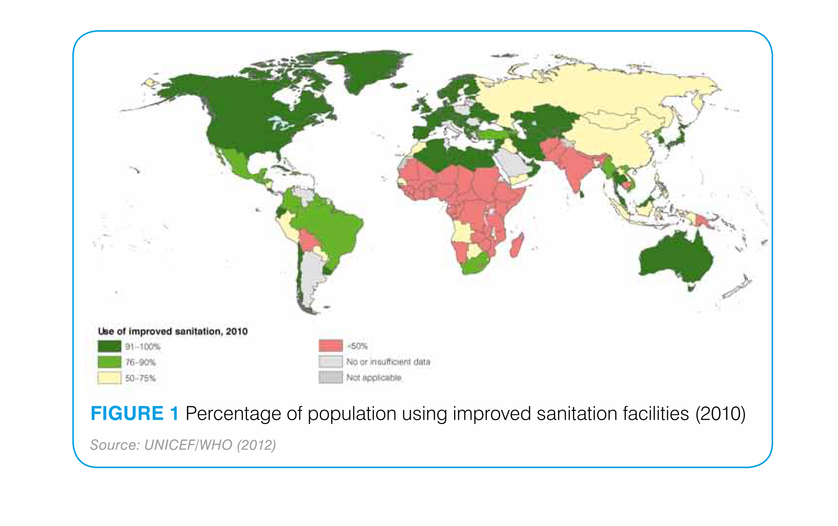
This figure is a world map which shows the percentage of the population of each country using
improved sanitation facilities in 2010. Green indicates higher improved sanitation usage while
red indicates lower usage. Grey indicates insufficient or no data. The data is sourced from
UNICEF and WHO from 2012.

This chart recognizes the use of improved sanitation in 2010. Most of the European areas and
most of North America excluding Mexico were in the top percentage.  This also includes Australia,
Japan and parts of North Africa.
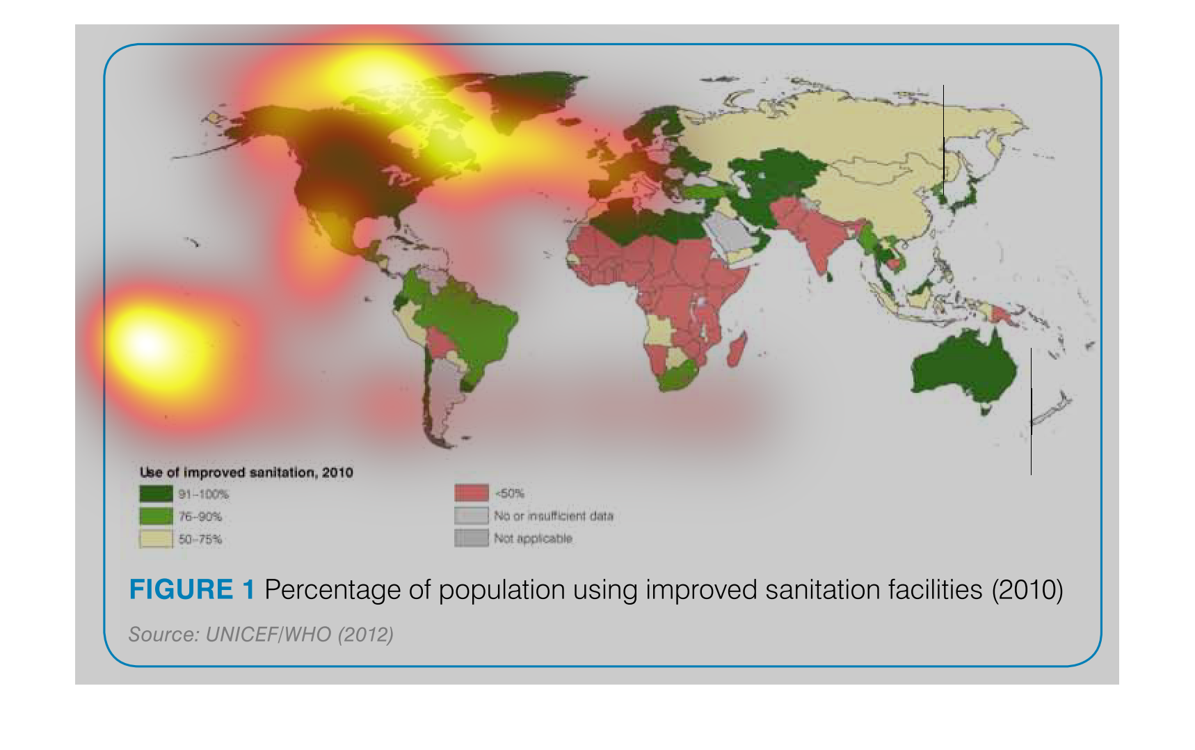
This graph shows the percent of population using improved sanitation in 2010. North America,
Europe and Australia use the highest quality sanitation while most of Asia and Africa use
lower quality saniation.
This is a global map of the percentage of people using improved sanitation facilities. North
America and Europe have the highest percentage, while Africa has the lowest.
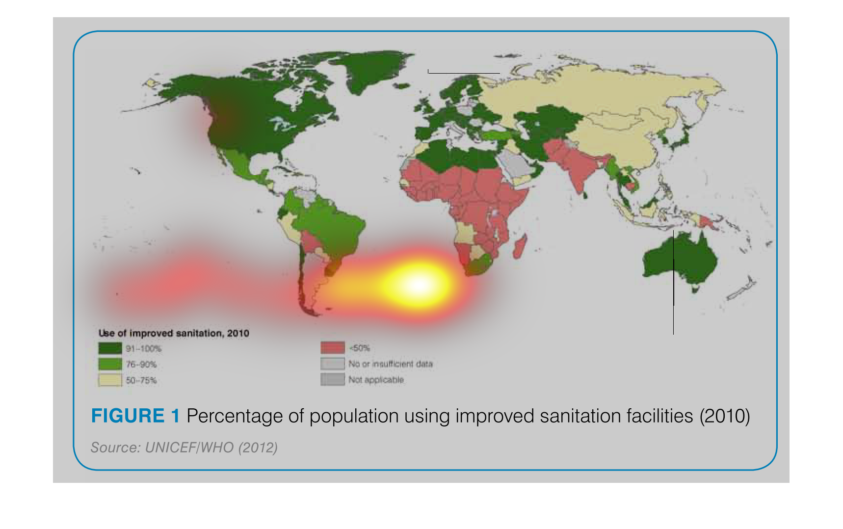
This is a world map showing percentages from 2010, of countries that use improved sanitation
technologies. Each nation is colored and shaded on a spectrum.
This image or figure show in statistical World Geographical format the data concerning the
percentage of population using improved sanitation facilities (2010).
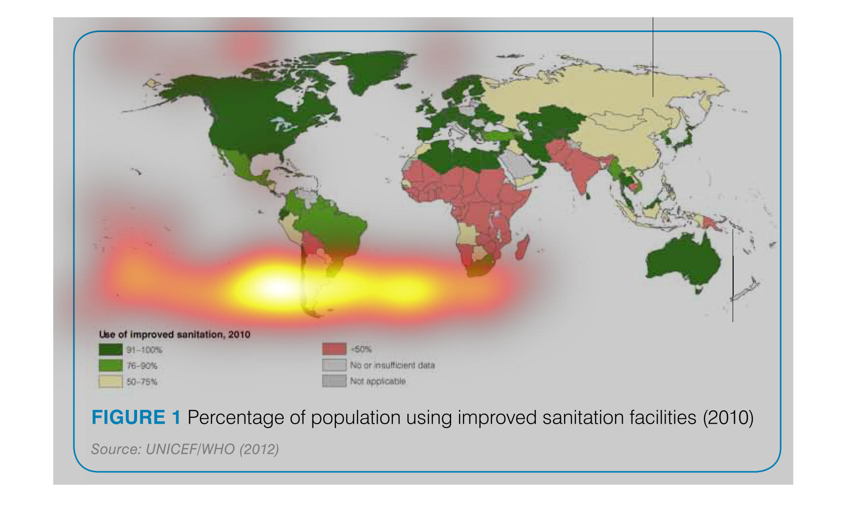
This graph describes use of improved sanitation for the year of 2010. It goes by the percentage
of population. The darkest colors shows the increase, while the lightest color shows little
improvement.
This chart describes the percentage of the population using improved sanitation facilities,
for the year 2010. Different categories on the chart are represented by different colors.
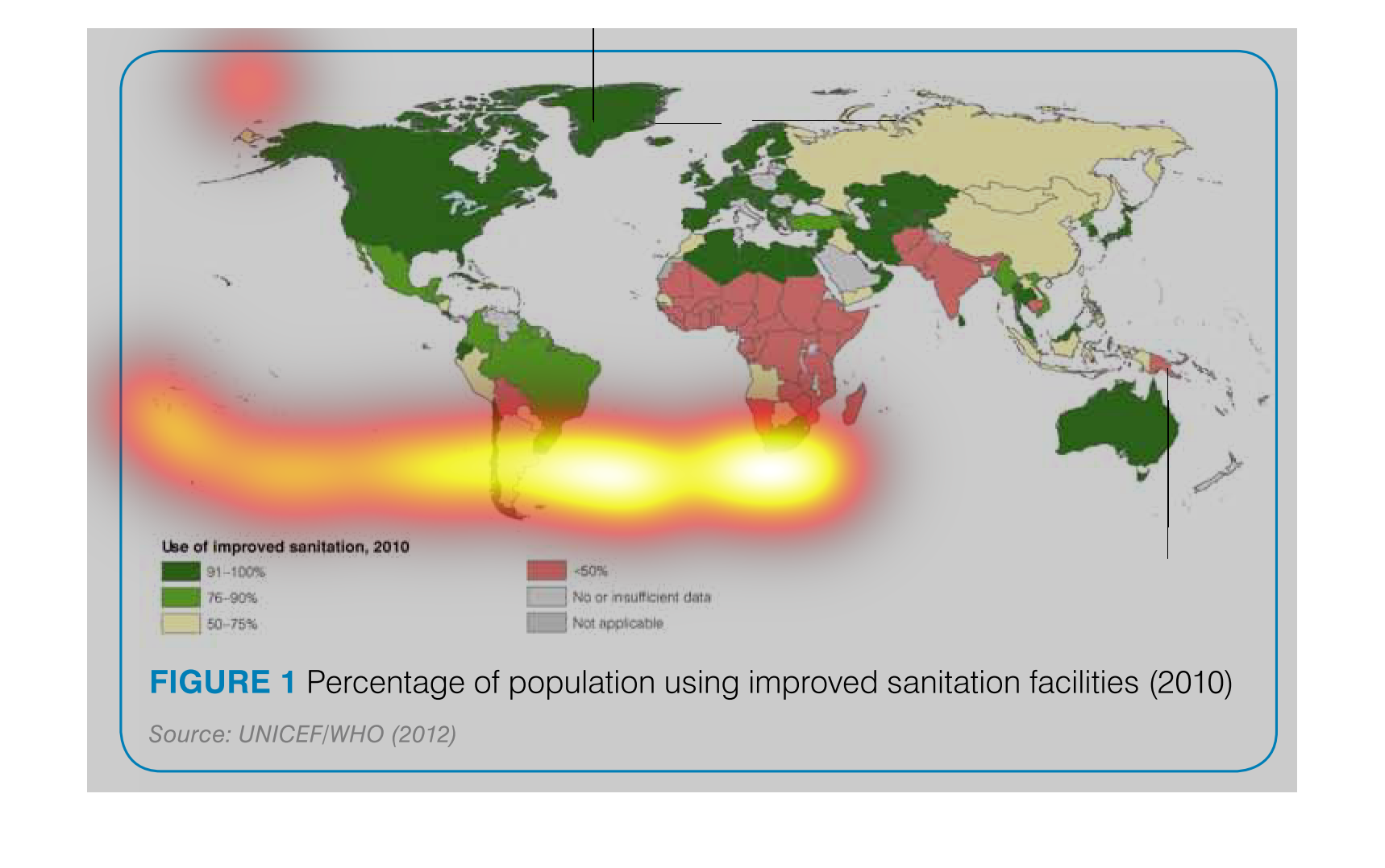
A chart showing the continents on the globe which are color coded reflecting the percentage
of population in countries with the use of improved sanitation in the year of 2010.
The following map of the world gives the percentage of approved sanitization programs with
in the individual countries. Countries in Africa had the lowest rates of this.