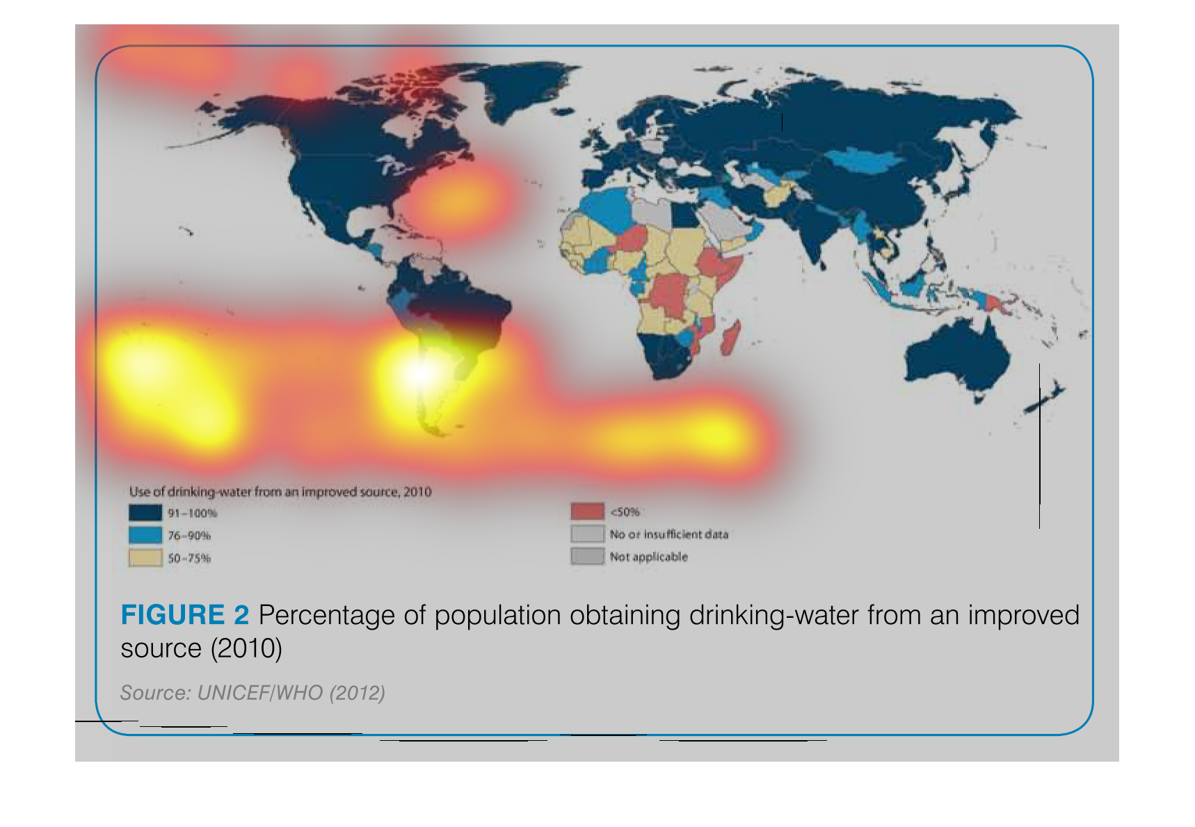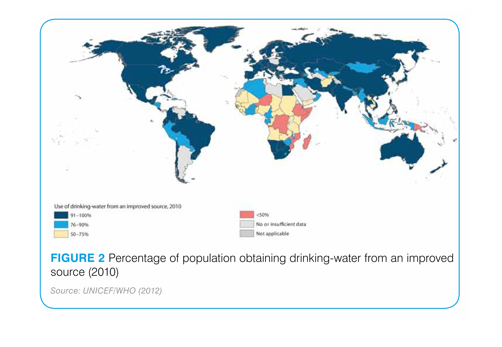
This chart describes percentage of population obtaining drinking water from an improved source
for the year 2010. different regions on the chart are represented by different colors.
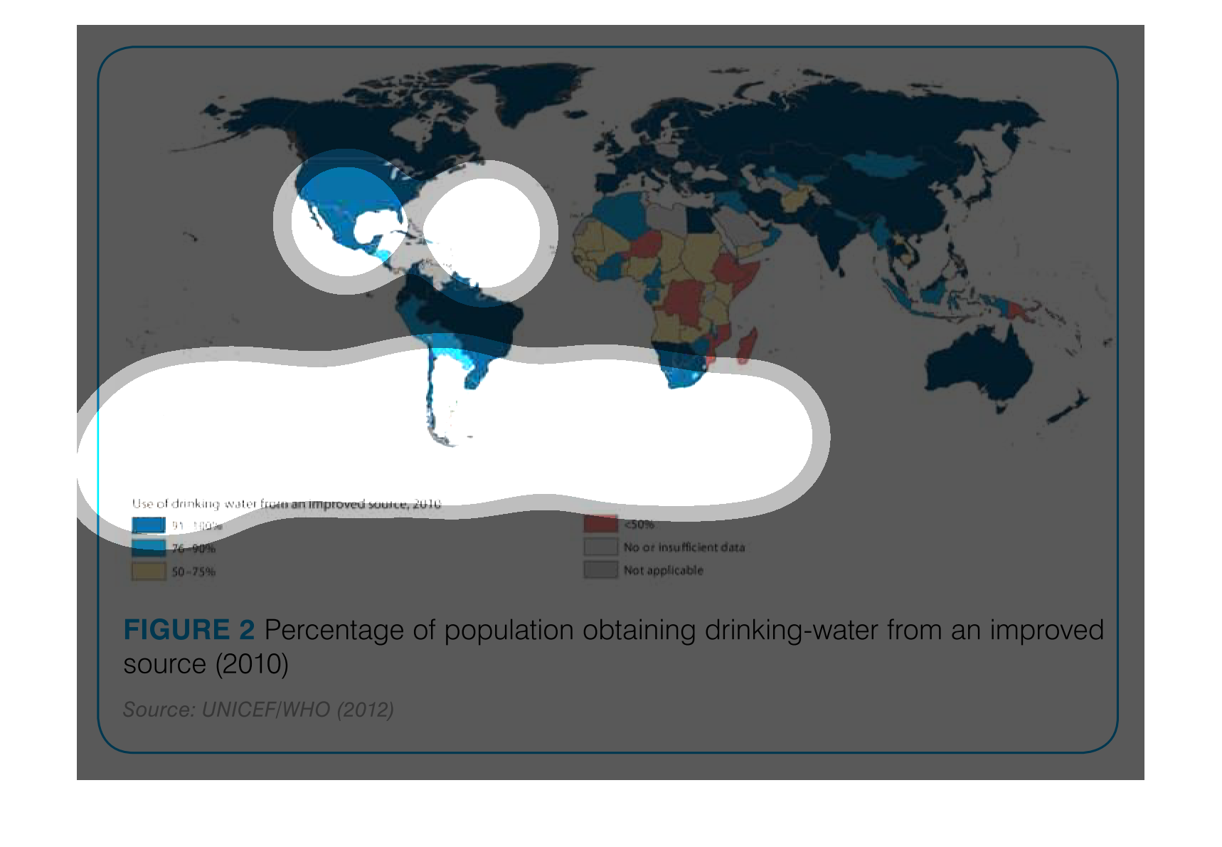
The following chart is a map of the world that shows the number of people in each country
who receive their water from an improved water source. Countries in Africa had the lowest
number of people receiving water from an improved source.
This is a global map of the percentage of people obtaining drinking water from an improved
source. Countries in North America and Europe have the highest percentage of people getting
drinking water from an improved source, while countries in Africa have the least.
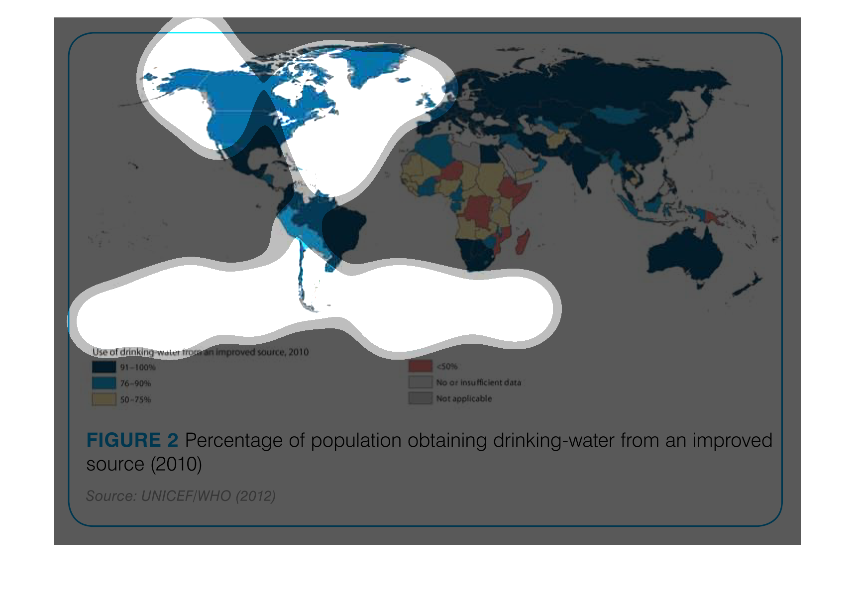
The is a picture of a world map. The colors show the different percentages of the population
that have been obtaining drinking water from and improved source.
This is a map that shows the percentage of population in all countries of the world who receive
drinking water from improved sources. The map shows that the entire world mostly gets good
water and the outlier countries are in Africa and Pacific Islands.
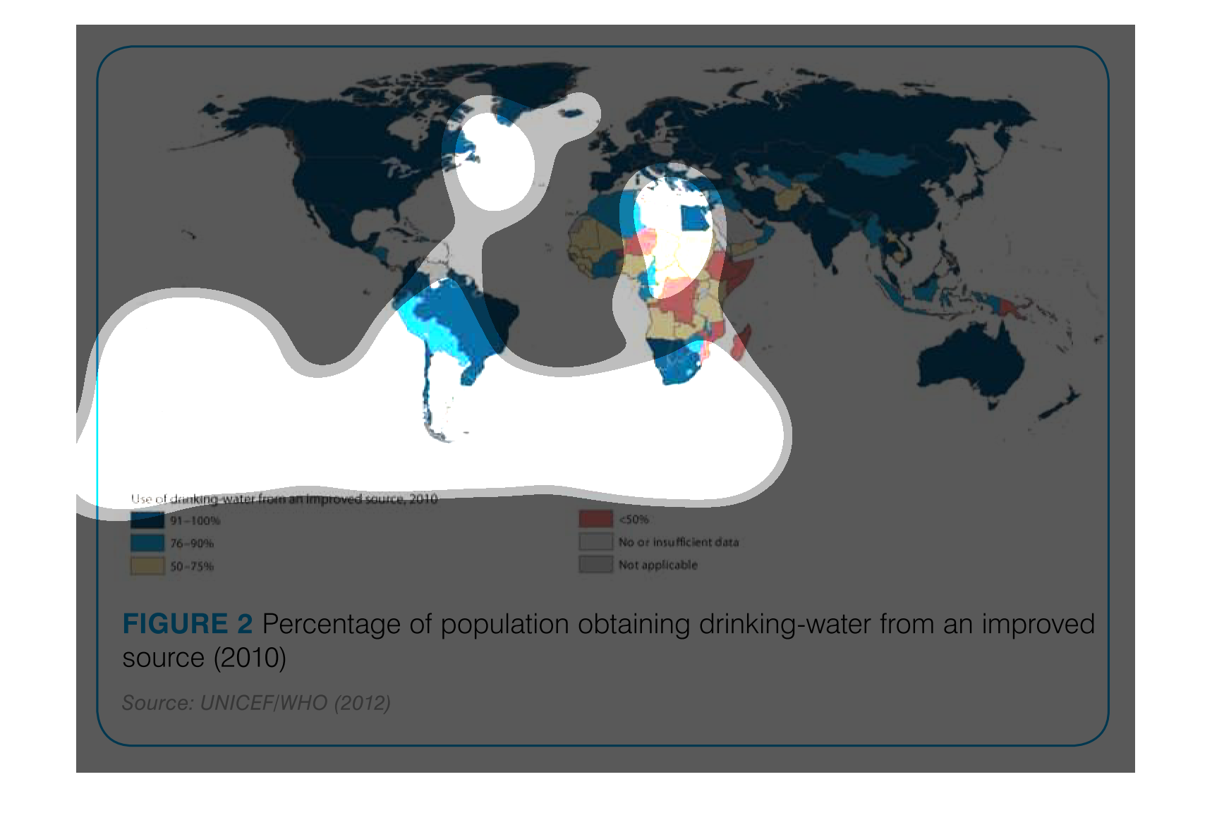
This chart/graph shows the percentage of people drinking water from an improved source as
of 2010. It shows the whole world and it is pretty different among the nations
World map showing the percentage of population receiving drinking water from an improved source
(2010). Dark blue shows the highest population receiving drinking water from improved source.
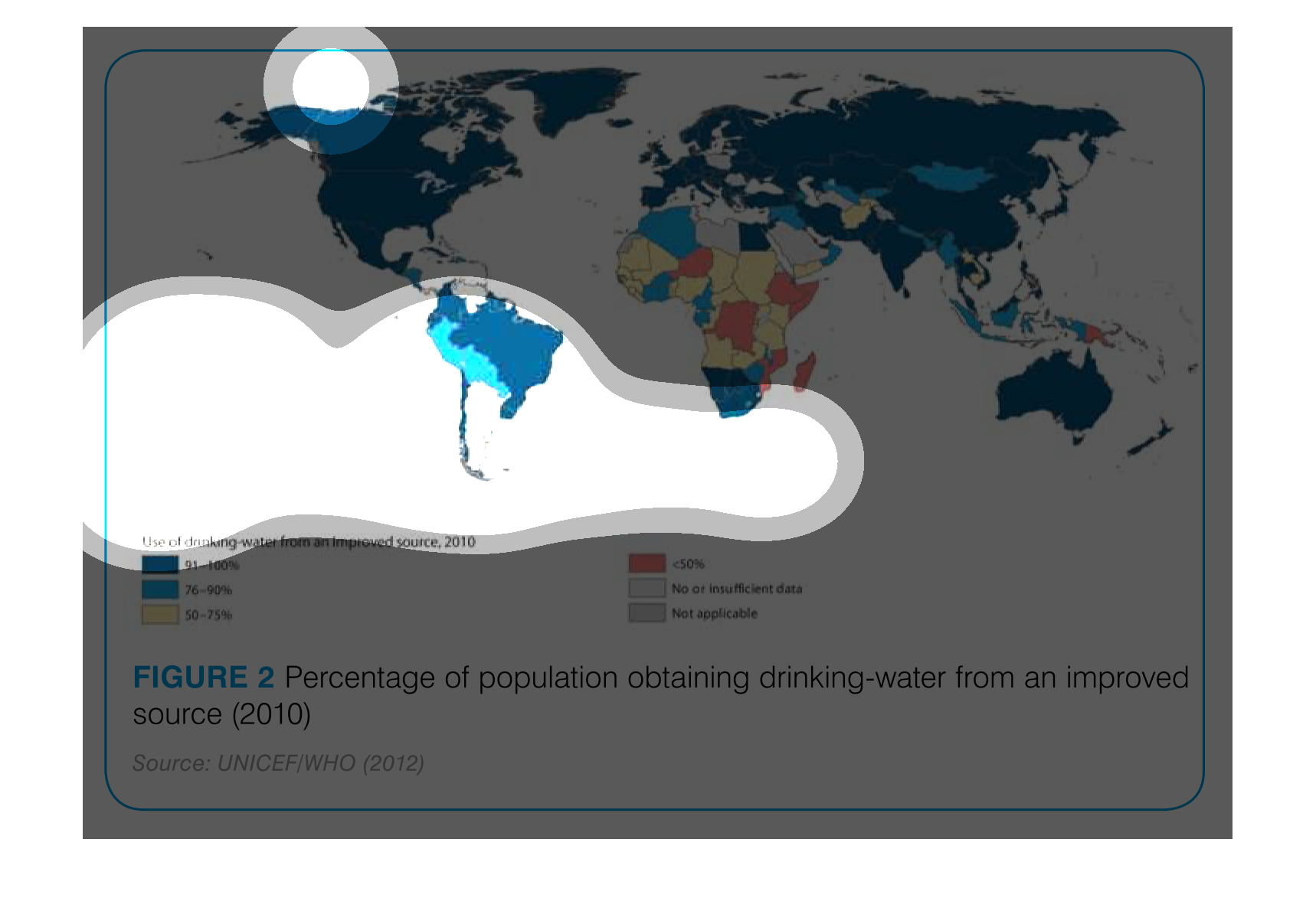
This picture is a map of all the continents. The title says it is the Percentage of population
obtaining drinking water from an improved source. This source was taken in 2010.
The map shows the rate at which populations of countries throughout the world are obtaining
drinking water from improved sources.  In general, Africa and countries in the southern hemisphere
are lacking in the percentage of people who have access to improved water sources.
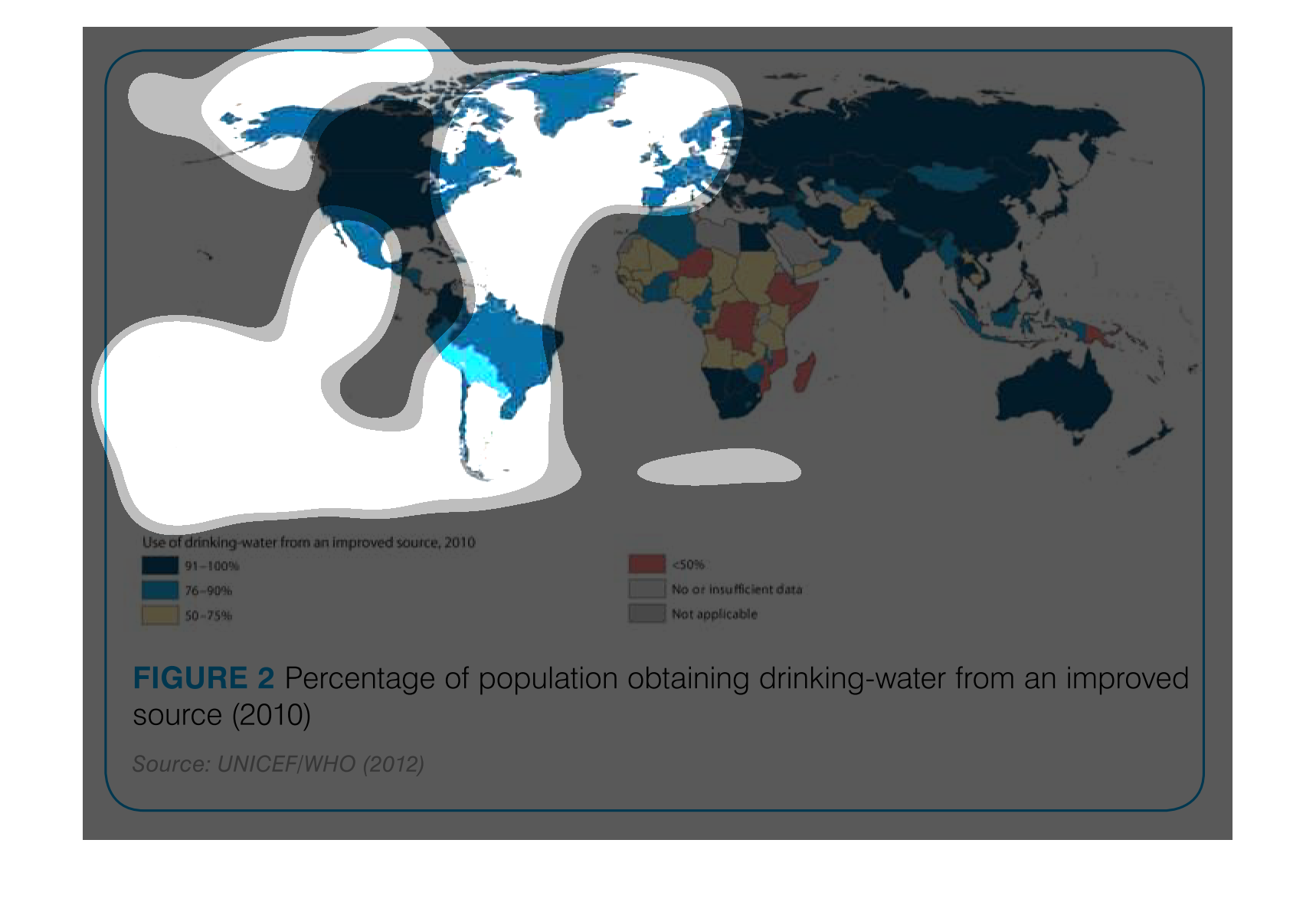
The image shows the map of the world and displays the percentage of the population obtaining
drinking water from an improved source. From the map, it looks like the USA gets the most
amount of good water.
The image on the left hand side is a study done from 2010 analyzing each countries availability
to approved drinking water sources.  From the data/image presented one would infer that the
third world countries in-particular all of the countries of Africa have the least amount of
available approved drinking water.
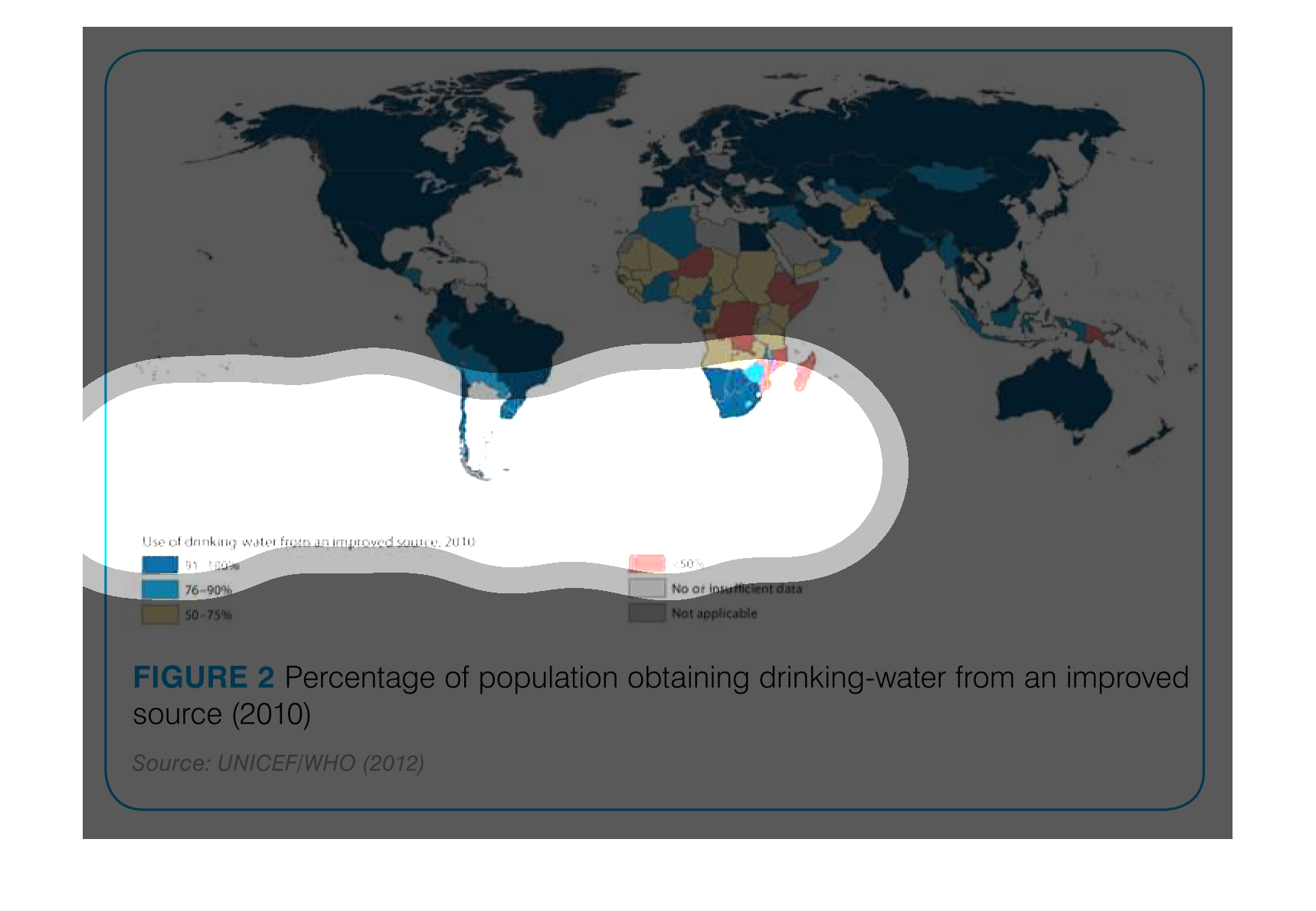
This chart describes percentage of population obtaining drinking-water from an improved source
for the year 2010. different categories on the chart are represented by different colors.
 This chart makes no sense because there is no context and it is hard to read. It looks like
it is about the population of people in the country that get sanitized drinking water
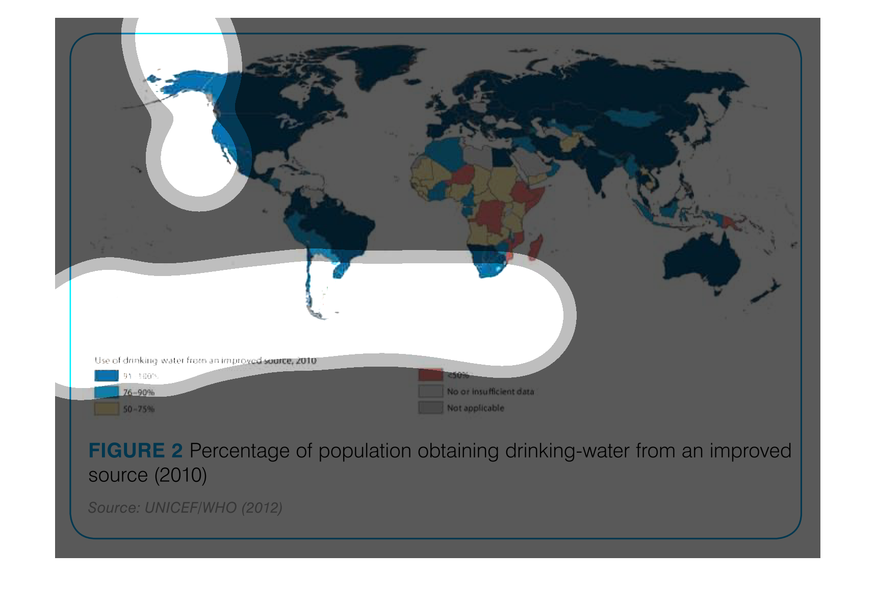
 This image shows the use of drinking water from improve source in the year 2010 .  Using
percentages of the global population based on location.  Is color-coded on a map