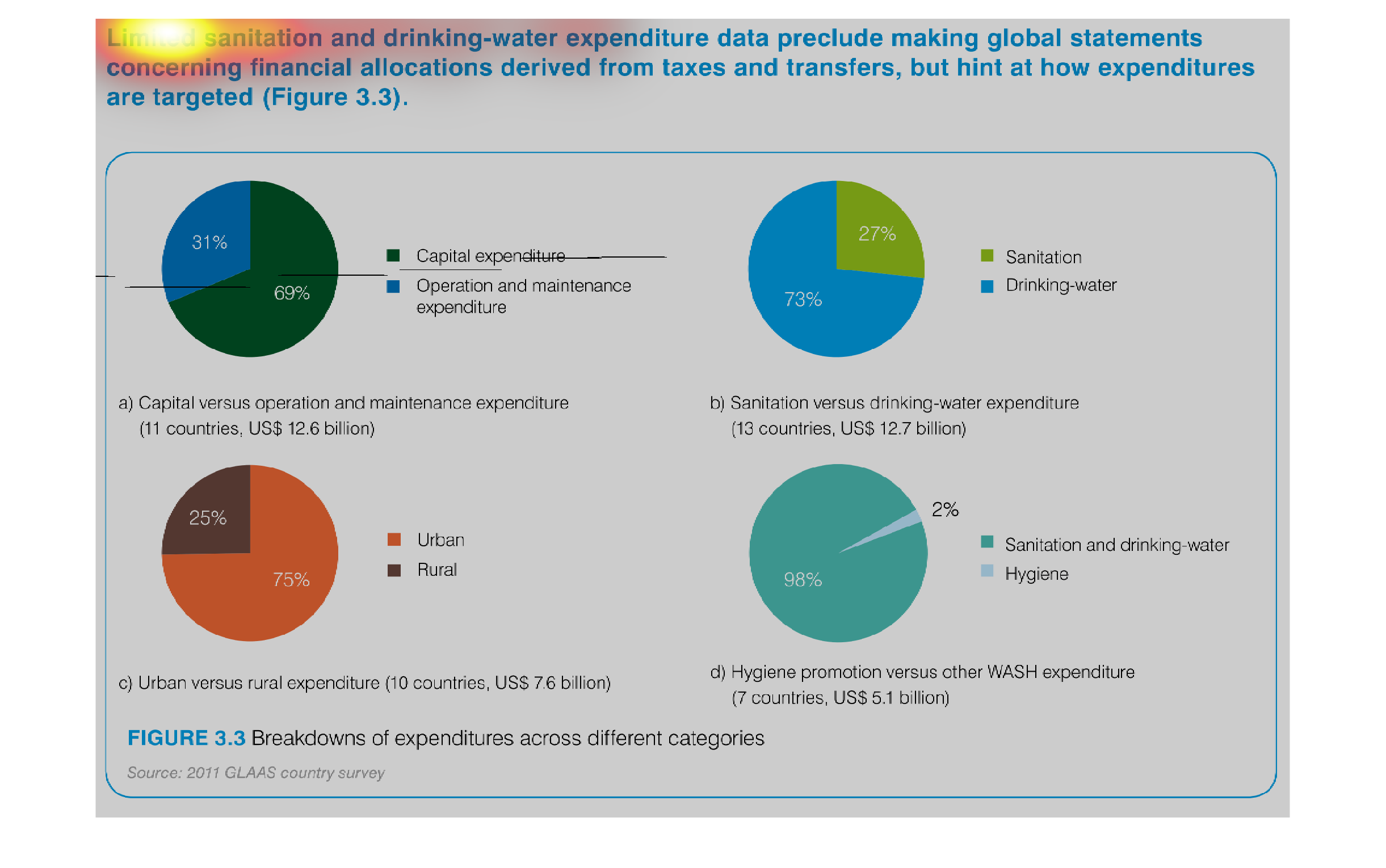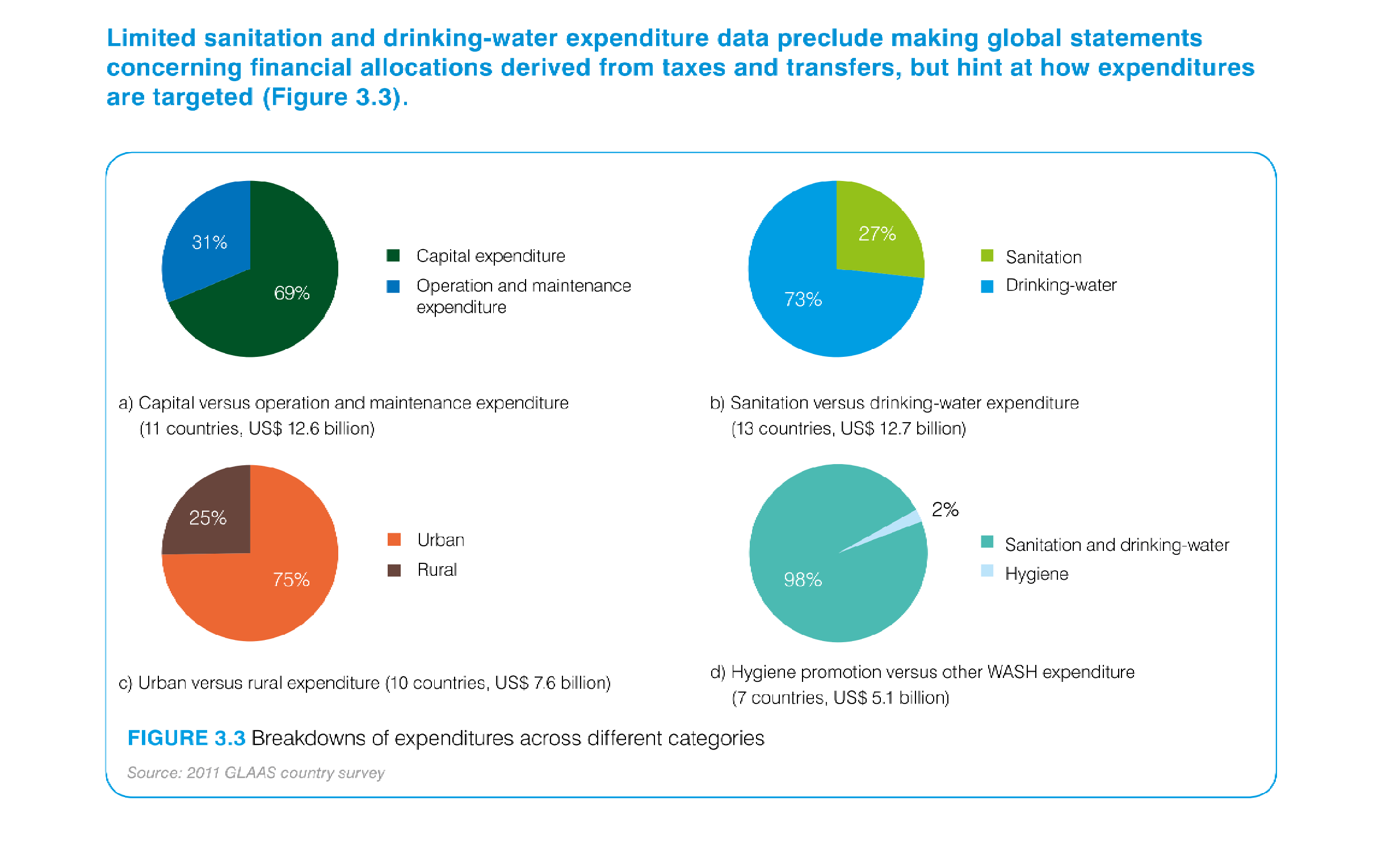
This is a graph of how countries use sanitation and clean water expenditure from taxes and
transfers. There is then four pie charts that are shown with the percentages of both.
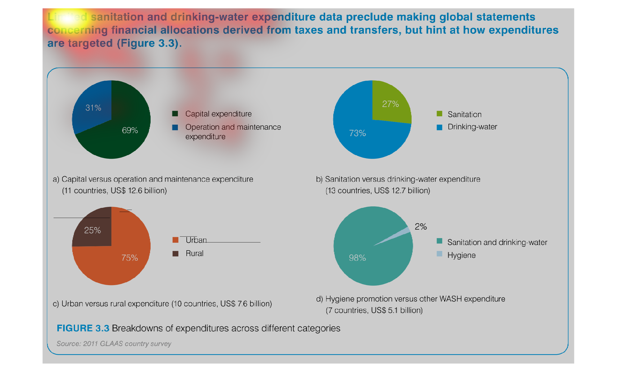
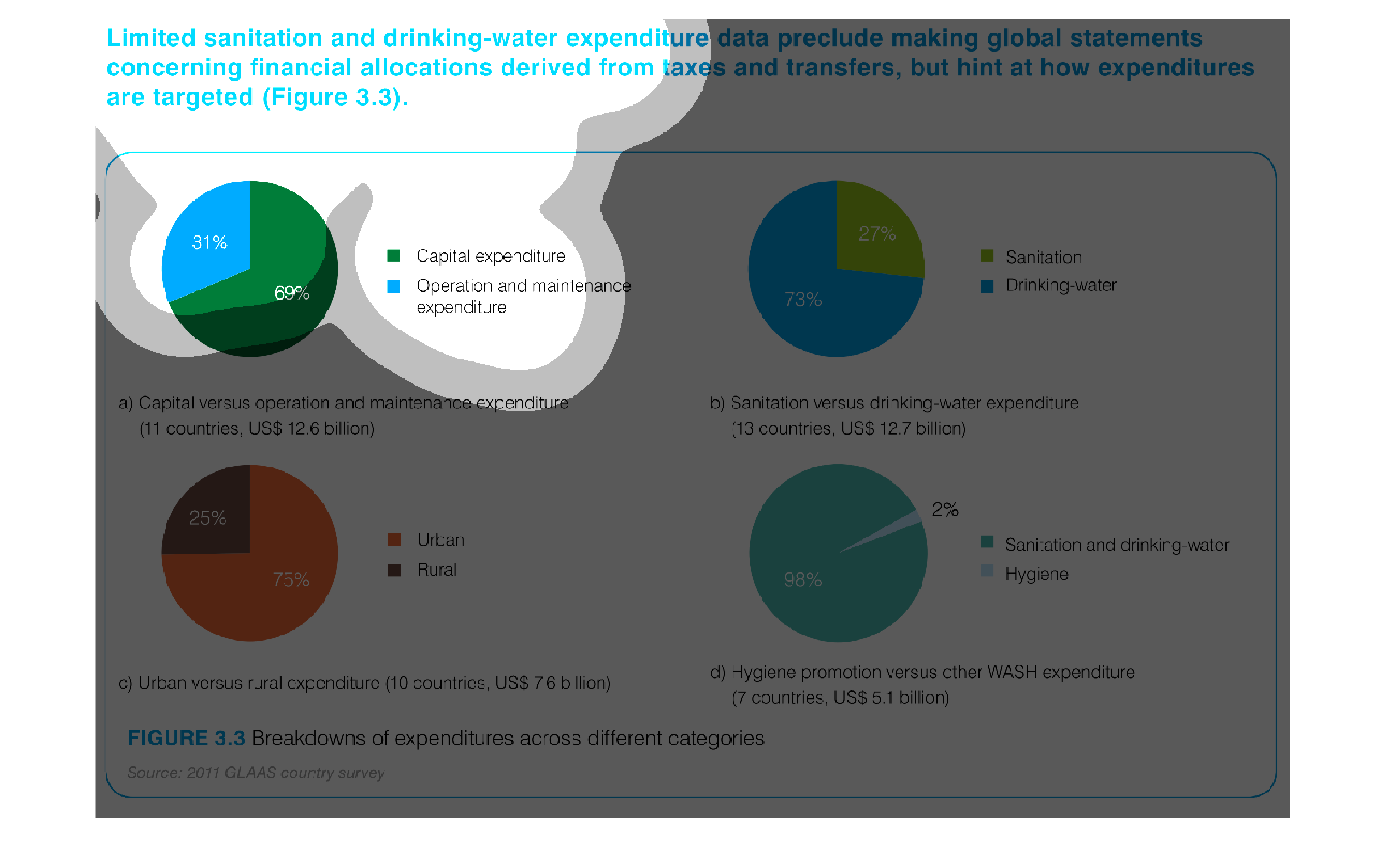
A pie chart infographic for showing water sanitation expenditures for the world. SAanitation
vs drinking water expentiures, costs of maintenance for urbal vs rural, etc
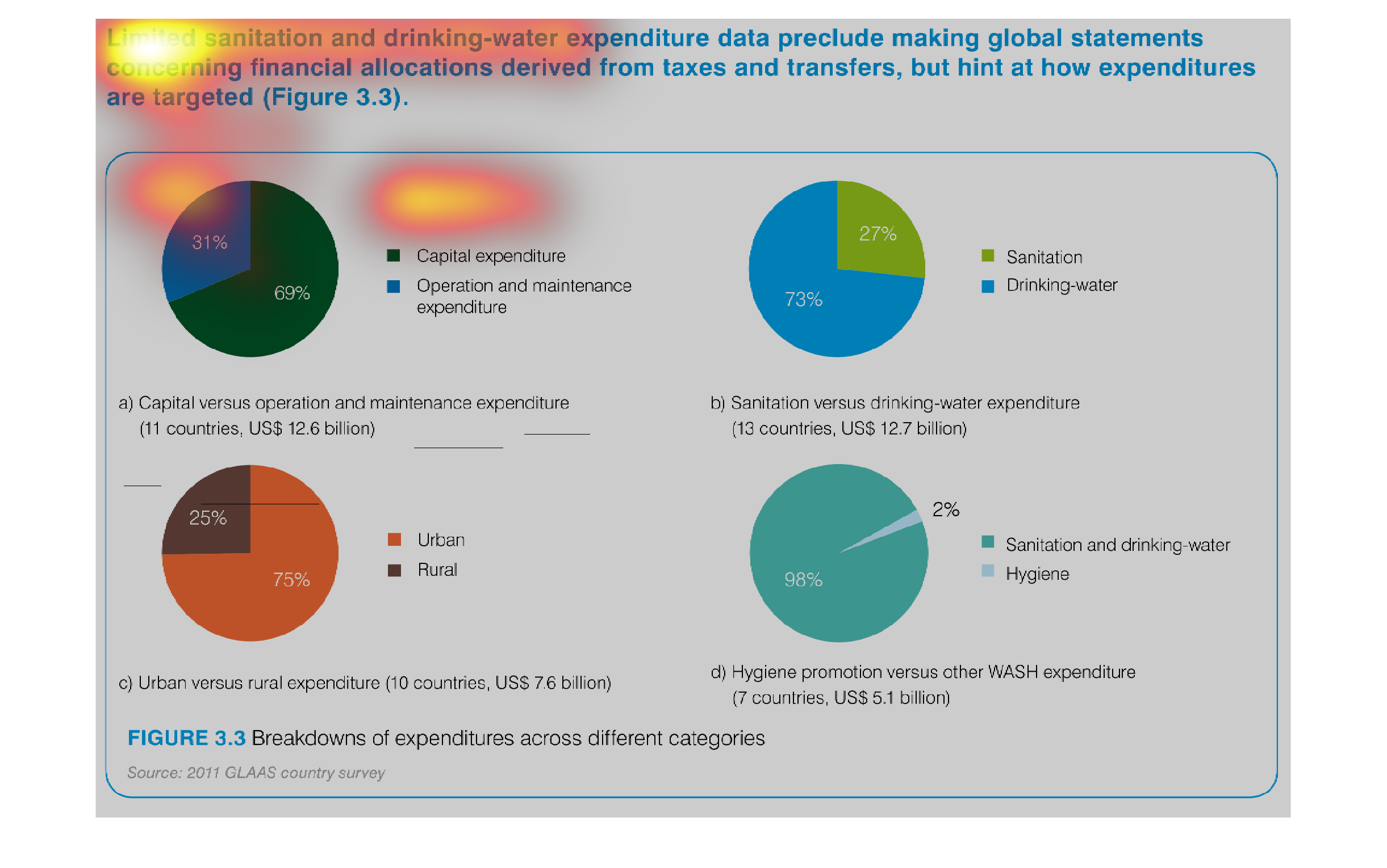
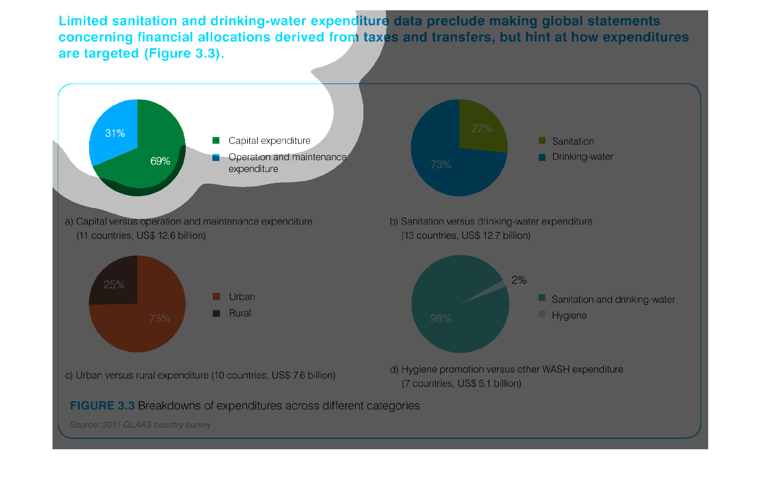
There are four circle graphs that show how the countries measured spend fund drinking water
and sanitation programs.  One of the graphs shows countries spend more on drinking water than
sanitation.  Urban expenditures are higher than rural areas.  Countries spend way more on
drinking water and sanitation than hygiene.
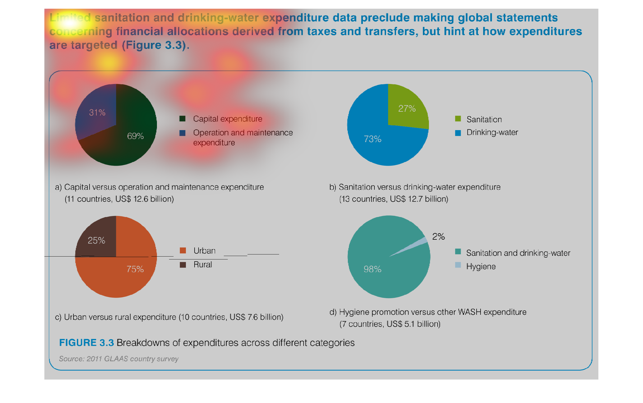
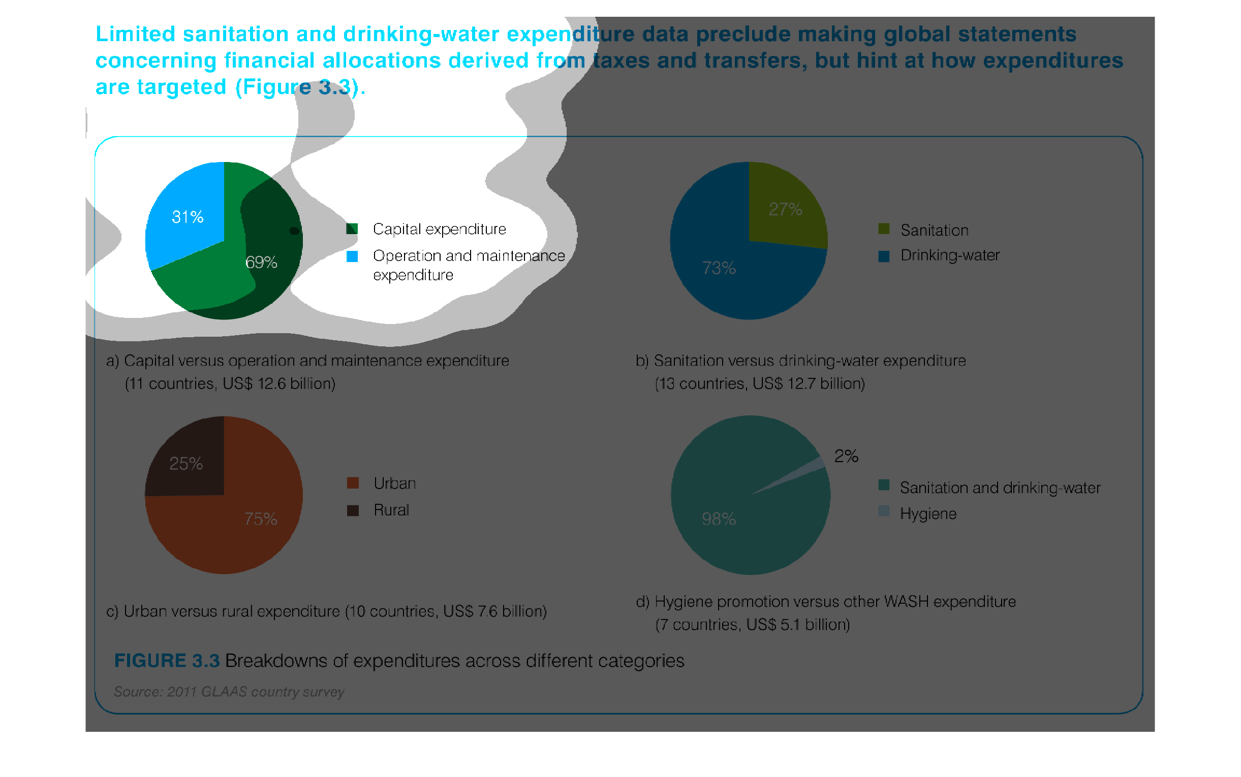
This series of pie charts illustrates breakdowns of expenditures for different categories
including: santiation and hygiene, capital and operational expenditures, santiation and drinking
water, and urban and rural.
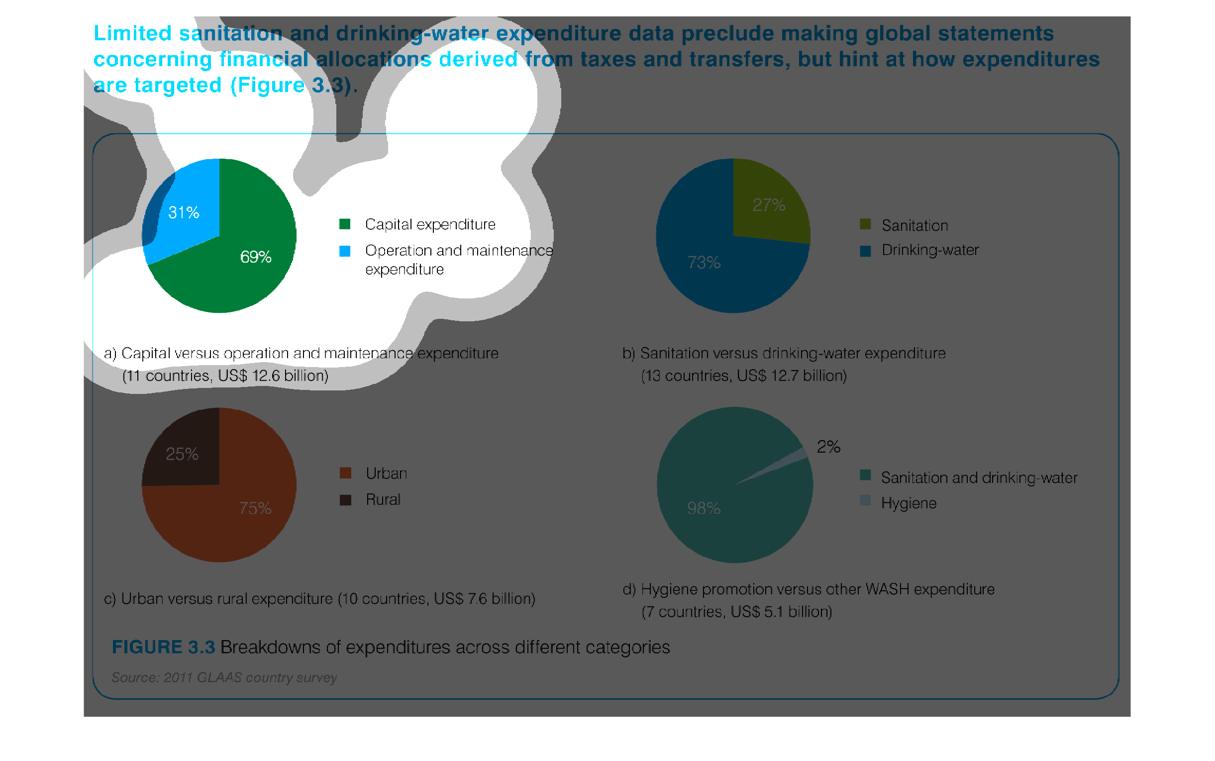
Graphs contrasting sanitation and drinking water expenditures. The first graph indicates that
capital expenditures are greater than operation and maintenance. The second graph shows that
drinking water expenditures are greater than sanitation expenditures. The third graph implies
that spending is greater in urban areas than rural areas. The fourth graph portrays that much
more money is spent on sanitation and drinking water efforts than hygiene.
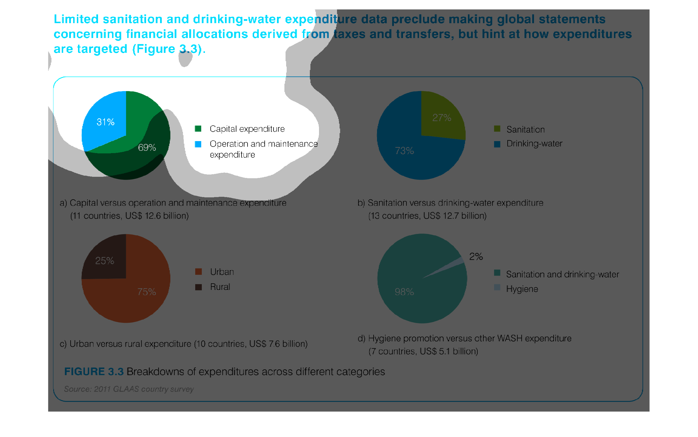
This image depicts 4 pie charts comparing different aspects of water sanitation expenditure:
capital experience vs. operation and maintenance, sanitation vs drinking water, sanitation
and drinking water vs. hygiene and urban vs. rural expenditure.
It is hard to tell where the money is spent, due to limited data. In the first chart, operations
and maintenance only makes up around a third of the total money spent.
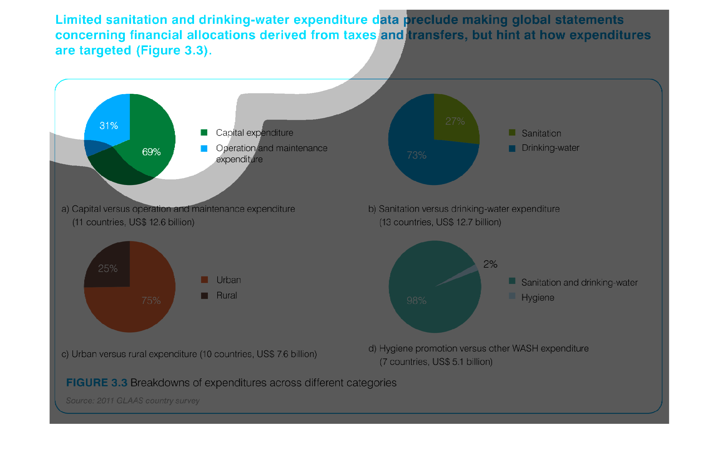
This graph is showing a breakdown of expenditures across different categories. there are 4
pie graphs with 2 categories in each. Each pie is showing cost analysis.
This chart describes limited sanitation and drinking-water expenditure data preclude making
global statements concerning financial allocations derived from taxes and transfers.
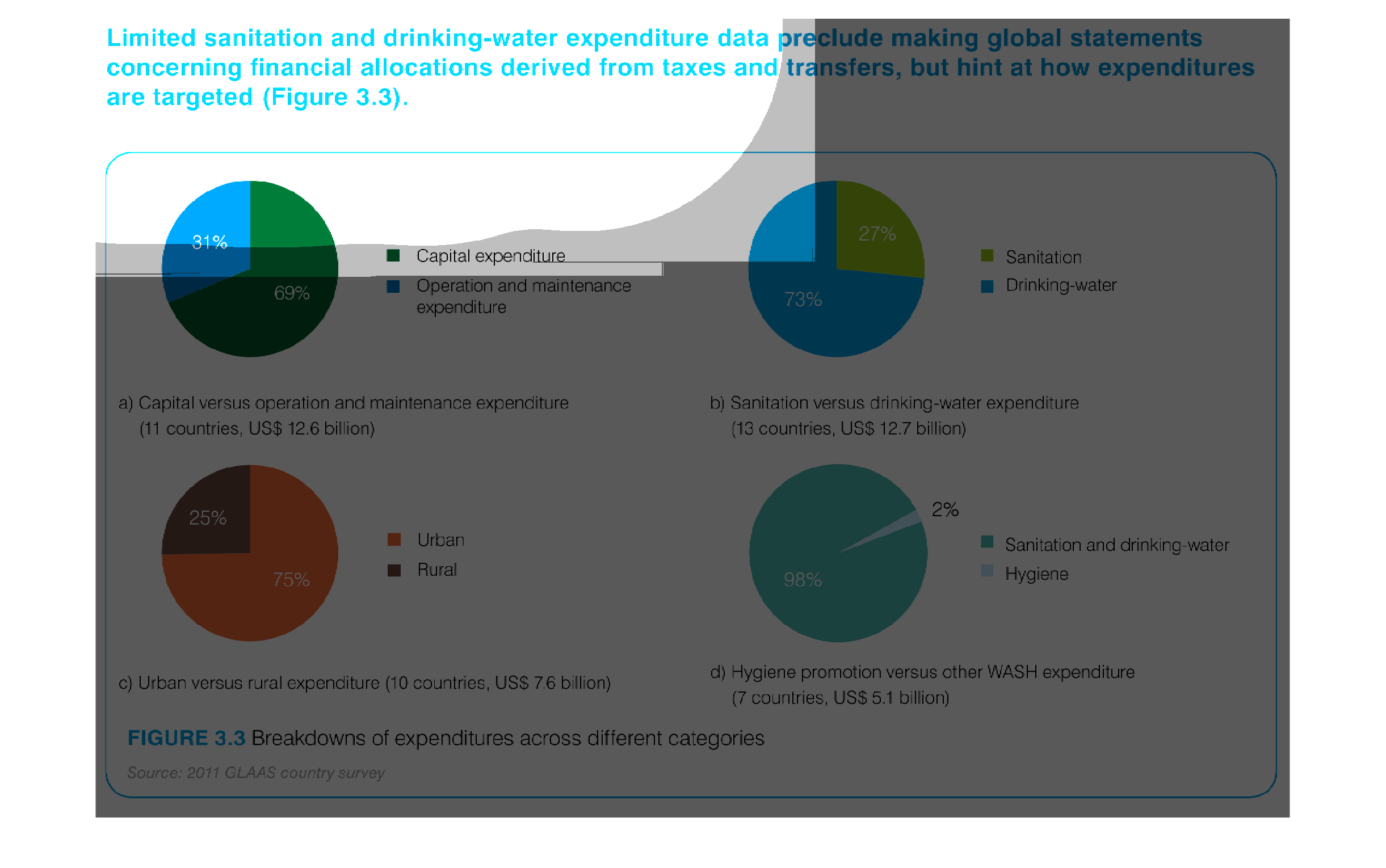
The chart shows sanitation and drinking water expenditure data.  There are four pie charats
and each one shows different data - there is urban vs rural, capital vs maintenance expenditures,
etc.
This is a series of pie charts depicting limited sanitation and drinking-water expenditure
data preclude making global statements concerning financial allocations derived from taxes
and transfers, but hint at how expenditures are targeted.
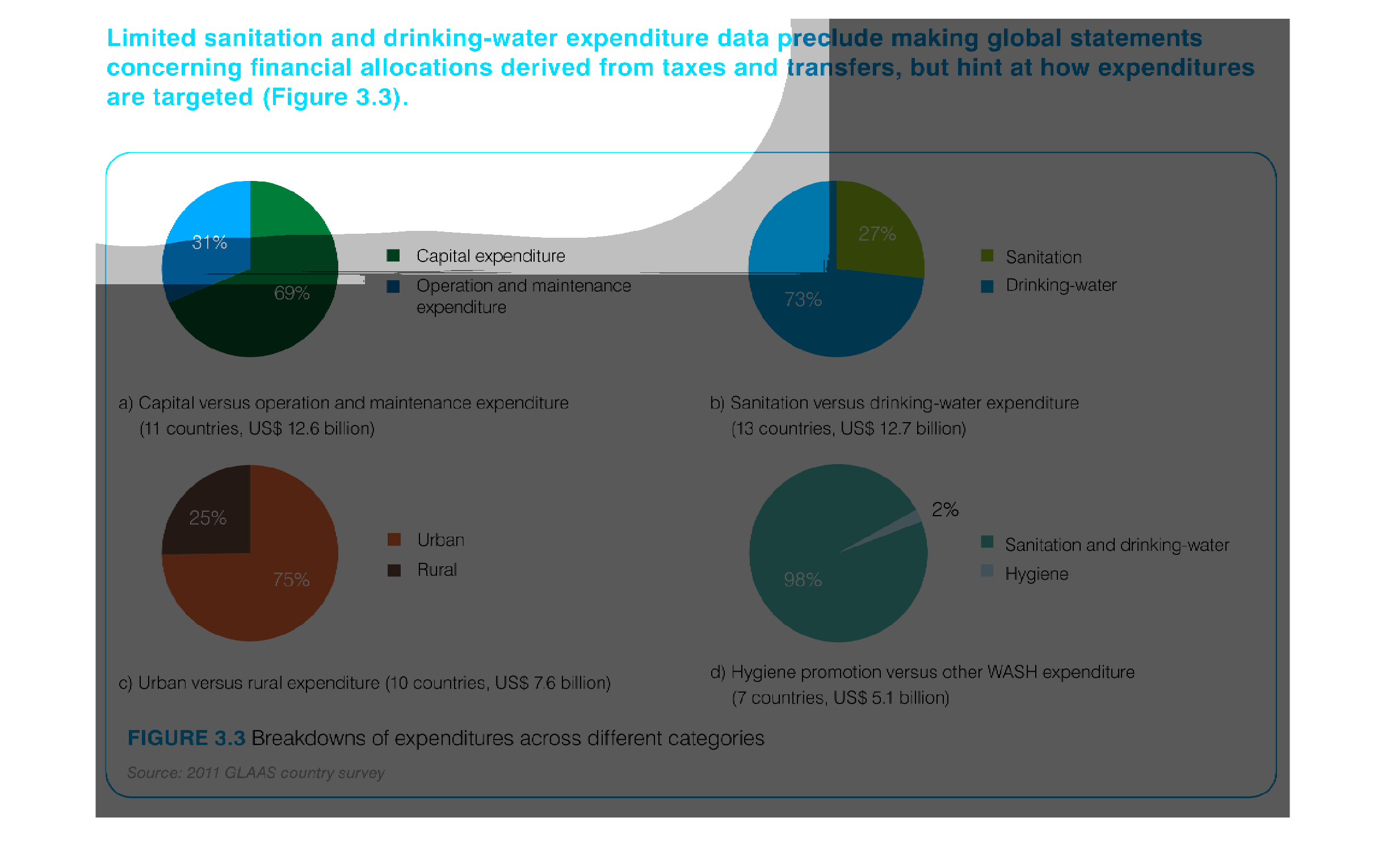
This is a series of pie charts depicting limited sanitation and drinking water data preclude
making global statements concerning financial allocation derived from taxes and transfers
but hint at how expenditures are targeted.
This handmade chart shows something about sanitation and clean water but is so hard to read
that I cannot read the details or even grasp what it is trying to do
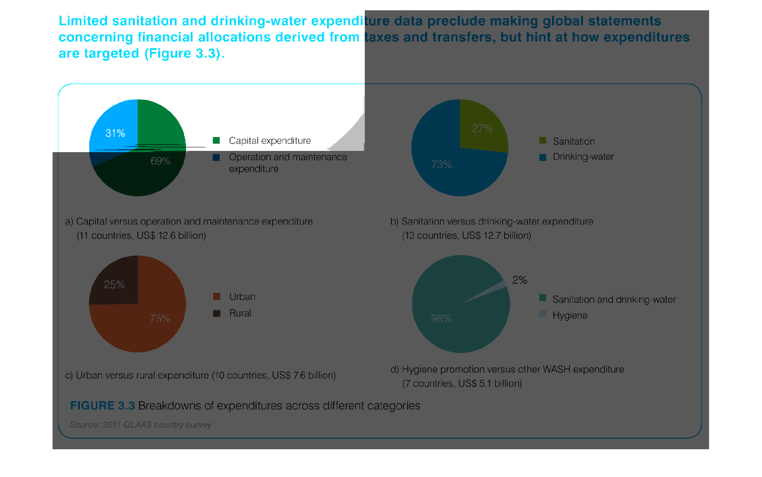
The figure presented is titled limited sanitation and drinking water expenditure data preclude
making global statements concerning financial allocations.