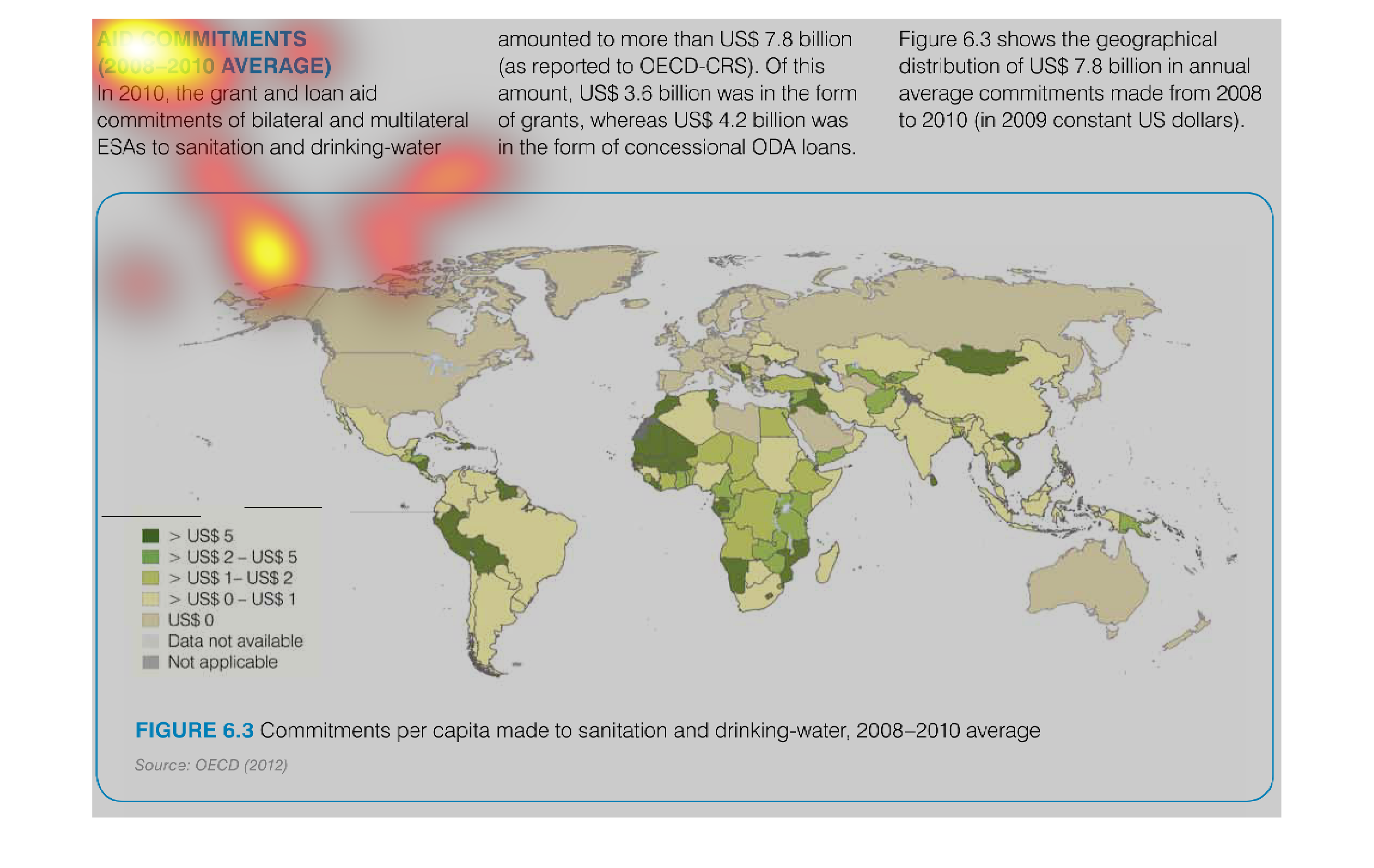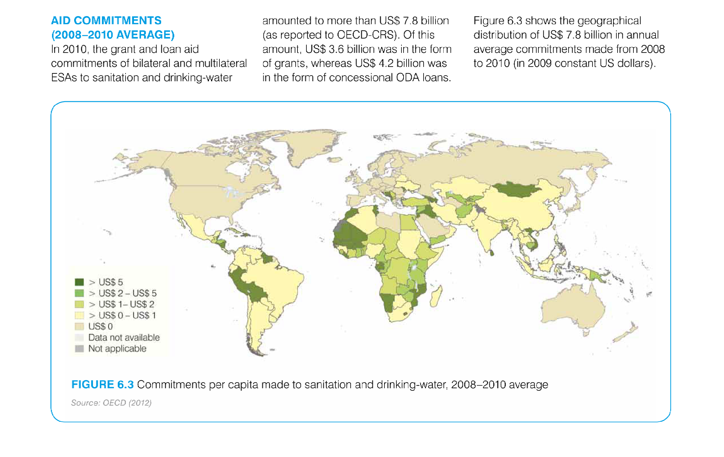
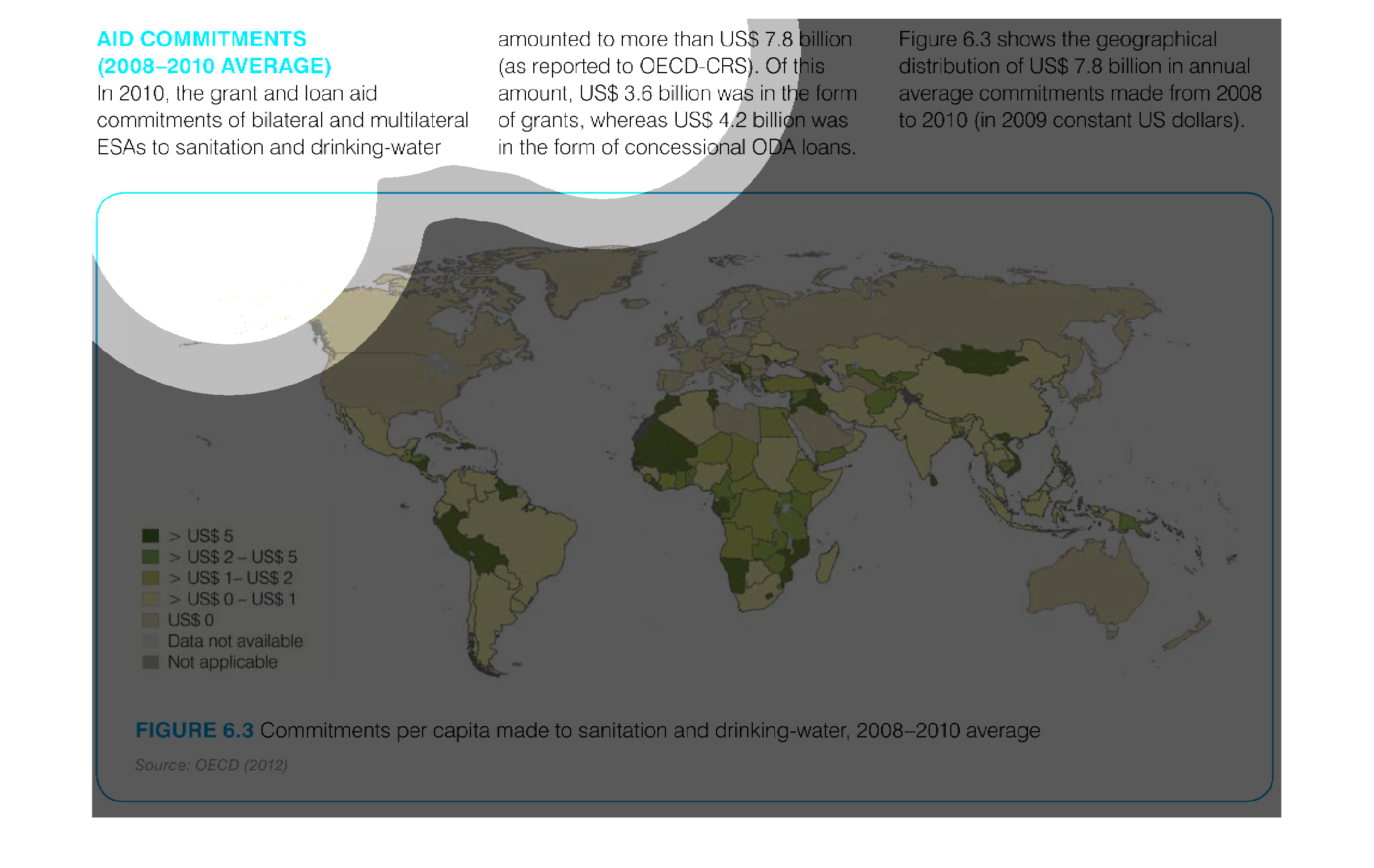
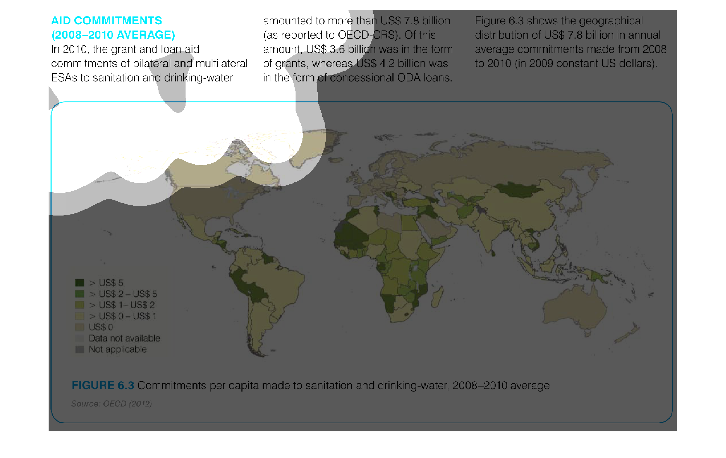
This is a map that shows the levels of global aid commitments by various players to various
parts of the world. It covers the years 2008 to the year 2010.
This image displays the average aid given to countries over the world by the USA out of the
7.8 billion in funds set aside for the aid program. The middle east and Africa has the highest
concentration of aid dollars between 2008 and 2010.
This chart describes aid commitments for the year 2008 through to 2010. Specifically, in 2010,
the grant and loan aid commitments of bilateral and multilateral ESAs.
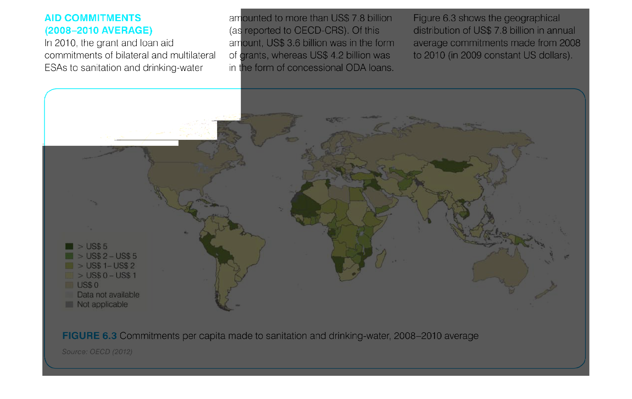
Aid commitments from 2008 to 2010. A map infographic showing amount of aid commitments. Largest
commitments go to war torn countries and subsahara africa
This graph shows the geographical distribution of grant and loan aid commitments to sanitation
and drinking water from 2008-2010.  The total loan/aid was 7.8 billion US dollars. The darker
the color, the higher the dollar value of aid.  According to this map, South America and Africa
received the majority of funding as well as portions of Russia.
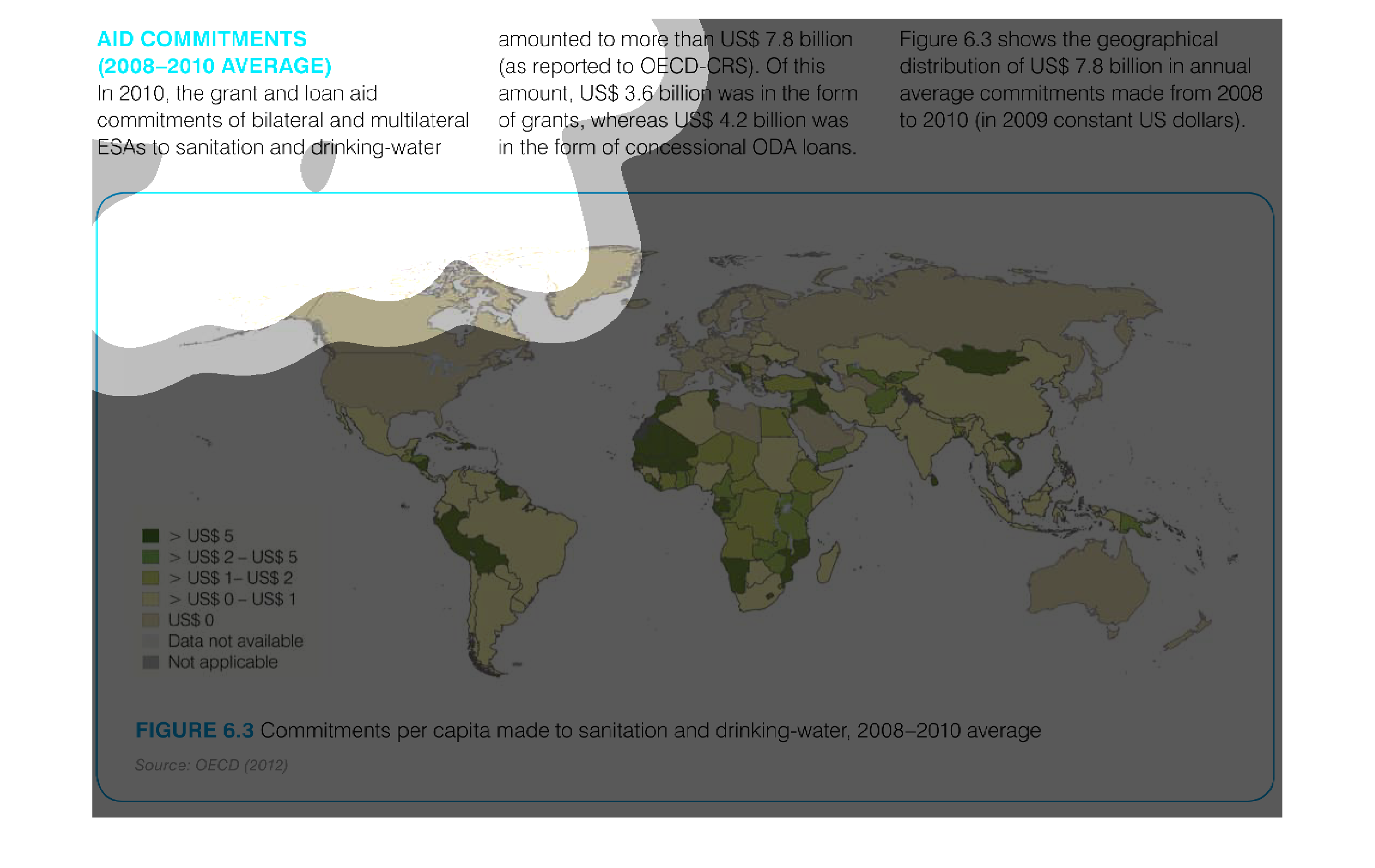
This image is a map of the world with the various countries colored in different shades to
represent their amount of aid money committed.  You can see that the highest concentrations
are in southern and western Africa.  Lowest concentrations are in the US, Canada, Russia and
parts of Europe.
This image shows the geographical distribution of $7.8 billion in annual average commitments
made from 2008 to 2010. Much of the commitments were made to Africa, with large amounts also
in the Middle East, Central Asia, and parts of South America.
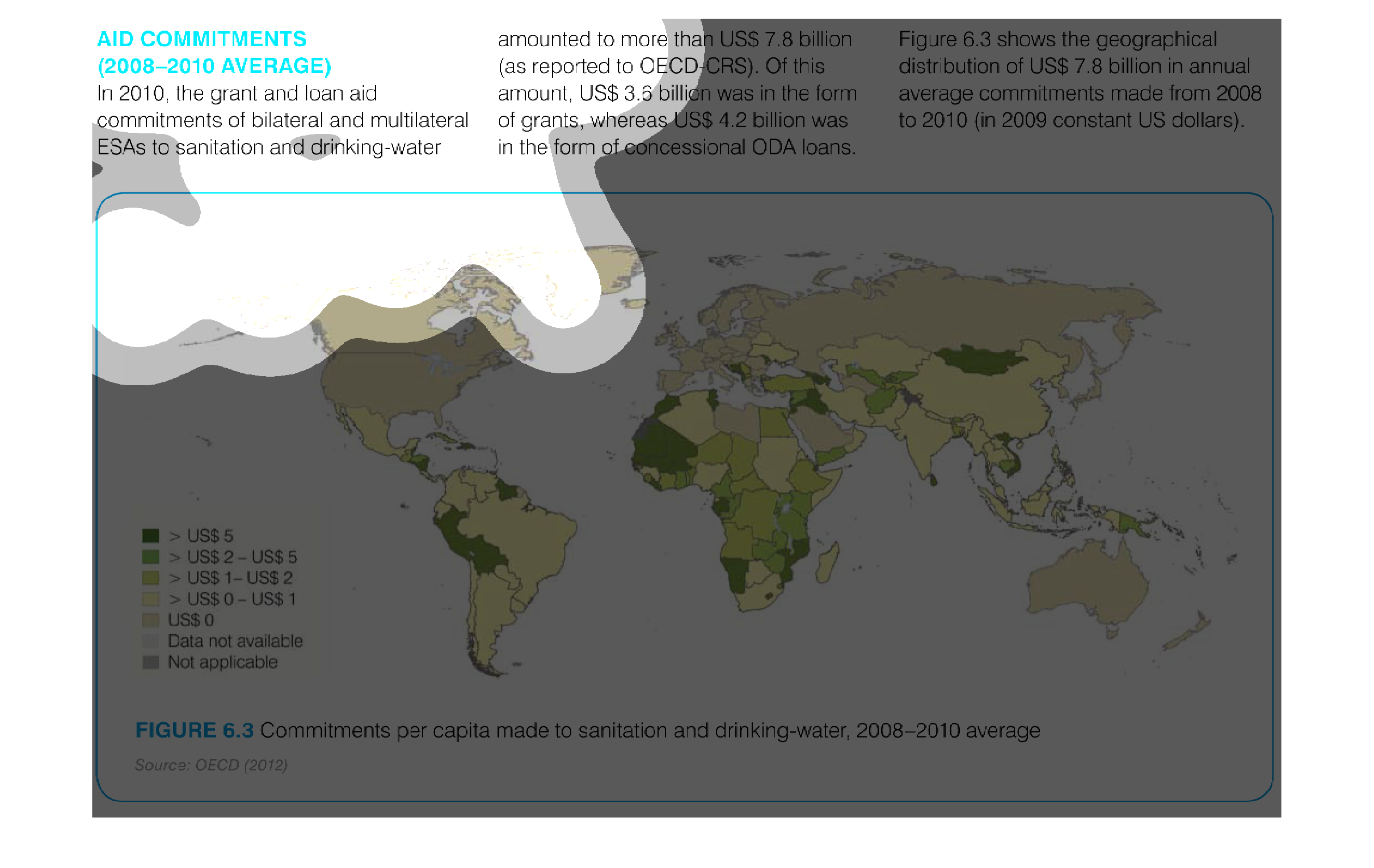
This study shows the discernment of aid from 2008-2010 around the world, for a total amount
of 7.8 billion. The illustration goes into greater detail as to the actual spending of those
funds.
The image describes US donations from 2008-2010 in the form of sanitation and drinking water
aid to countries worldwide. The areas with the most aid are western South America, northwest
and southern Africa and Eastern Europe.
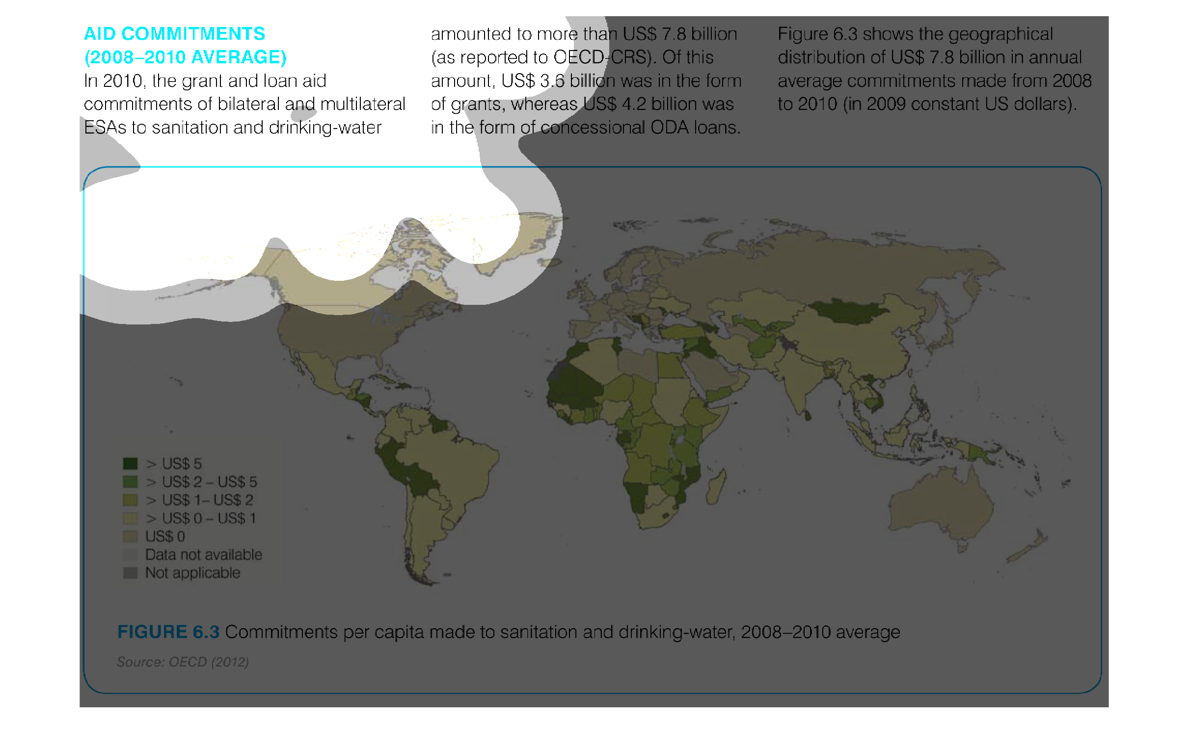
This is a world map showing commitments in US dollars to sanitation and clean drinking water,
divvied up by country and region. It shows many places spend little on ensuring things are
clean.
This chart shows the map of the world and the AID Commitments Averages from 2008-2010.  Looks
like Africa has received the most because a lot of dark green and yellow can be seen on the
whole continent.  After that, it looks like it is Southeast Asia and South America.
Sanitation and good clean water are essential parts of a well functioning society, and when
one lacks something as basic as those two things, there is definitely something majorly wrong.
This illustration goes into great detail of how spending in this ears has gone up and who
spends it on a global level.
aid commitments, 2008-2010 average. We see the highest prevalence according to a color coded
world map, to be in africa and select asian and south american countries.