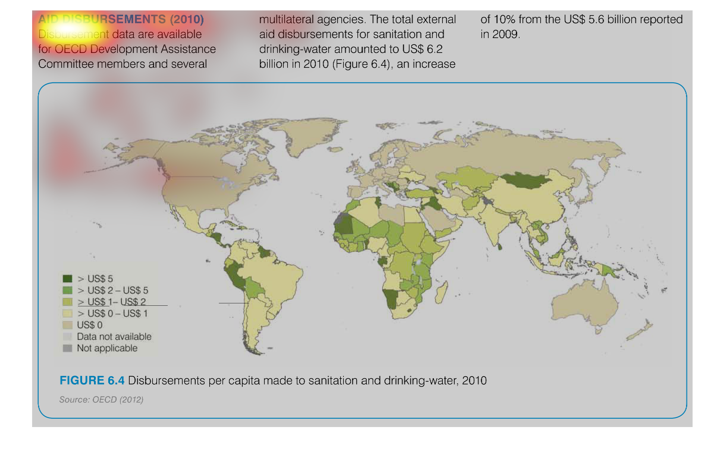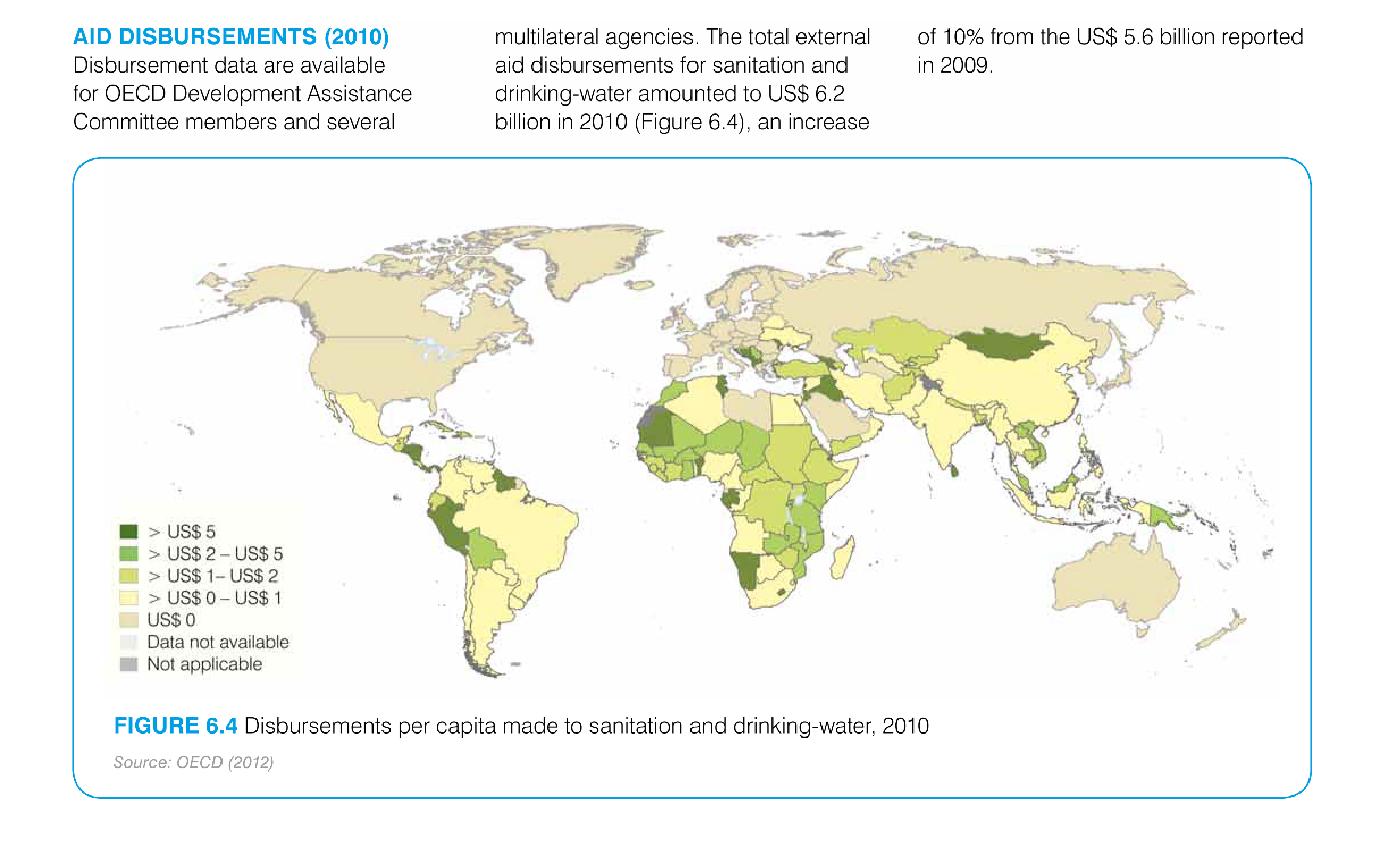
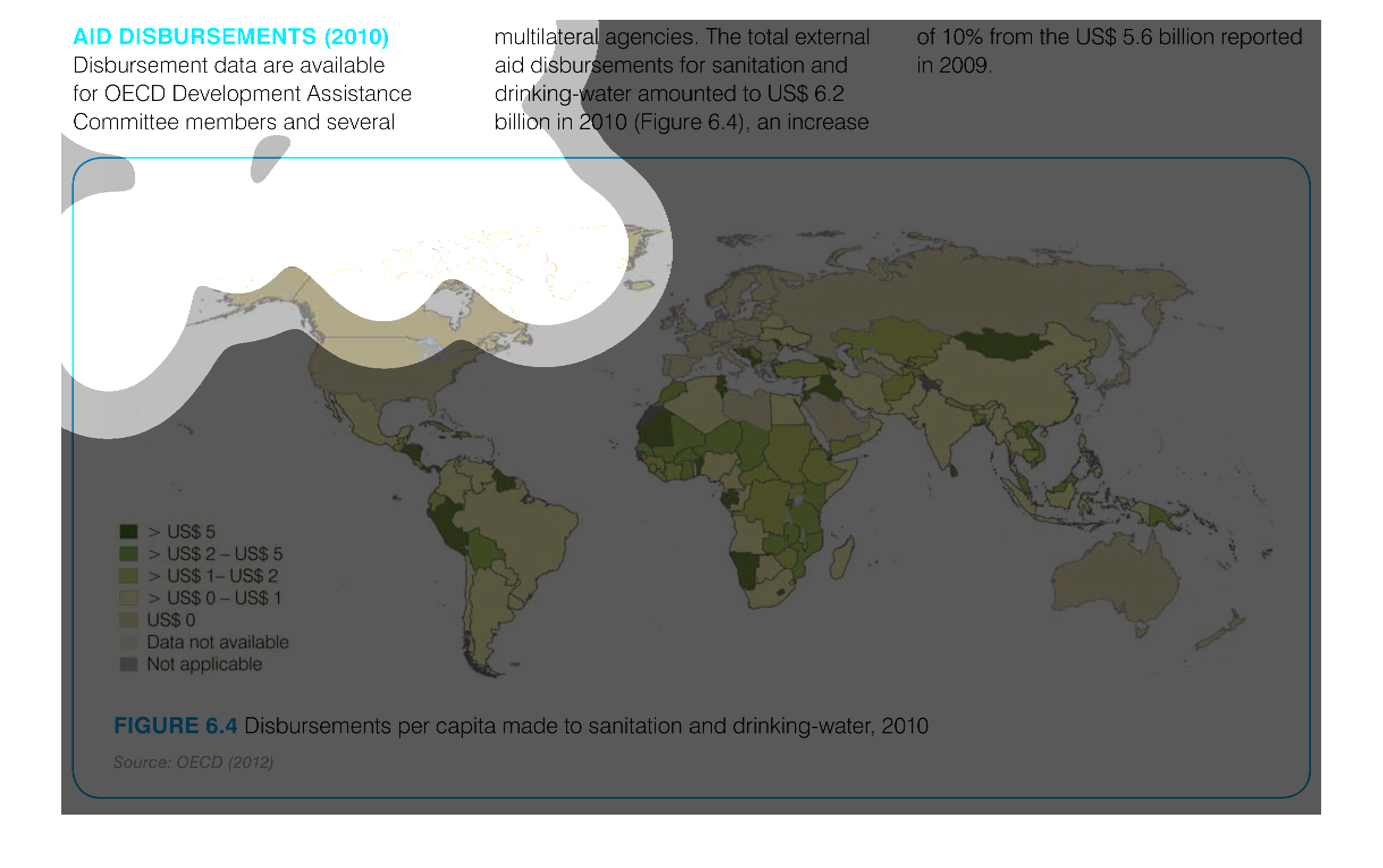
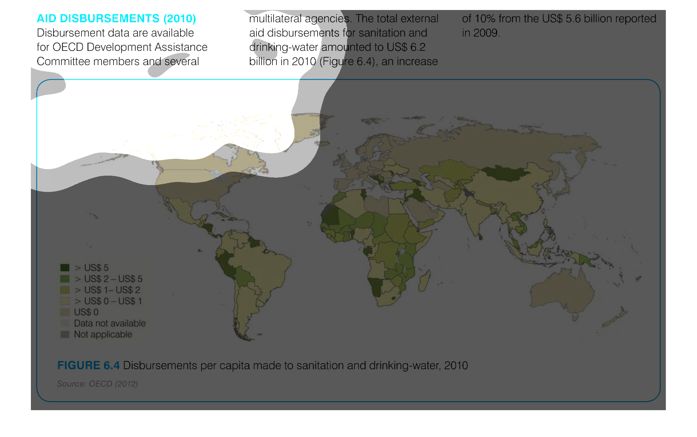
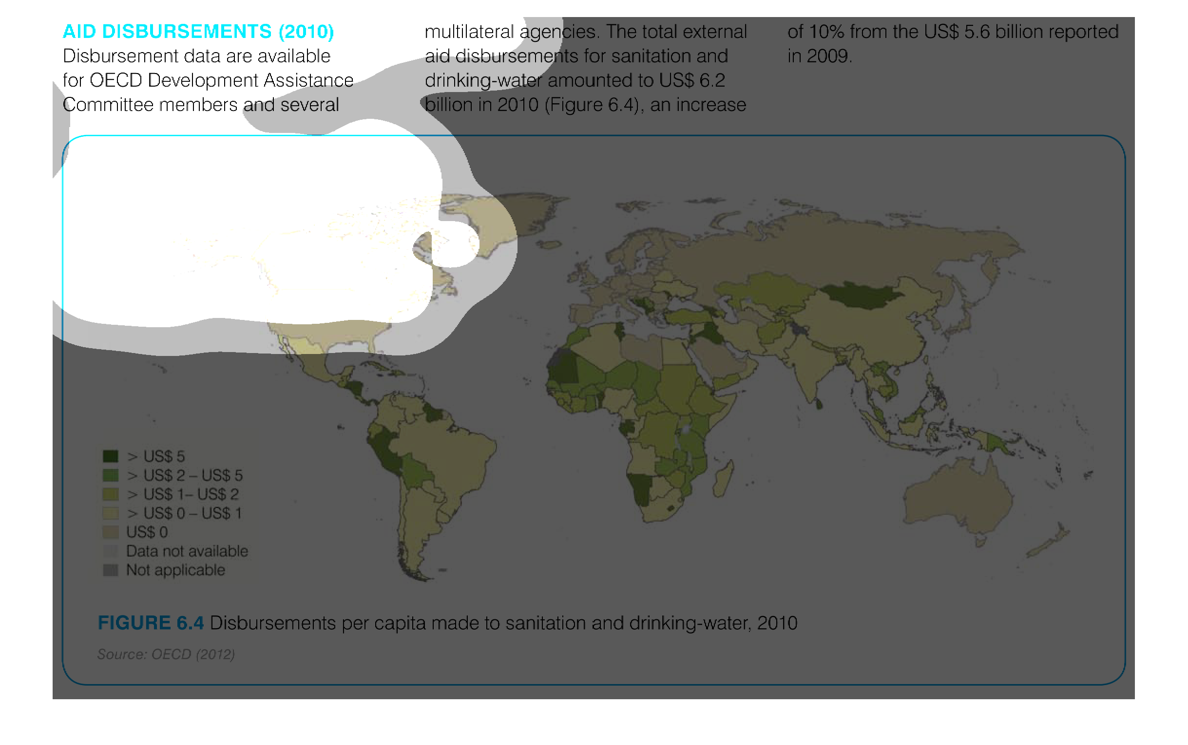
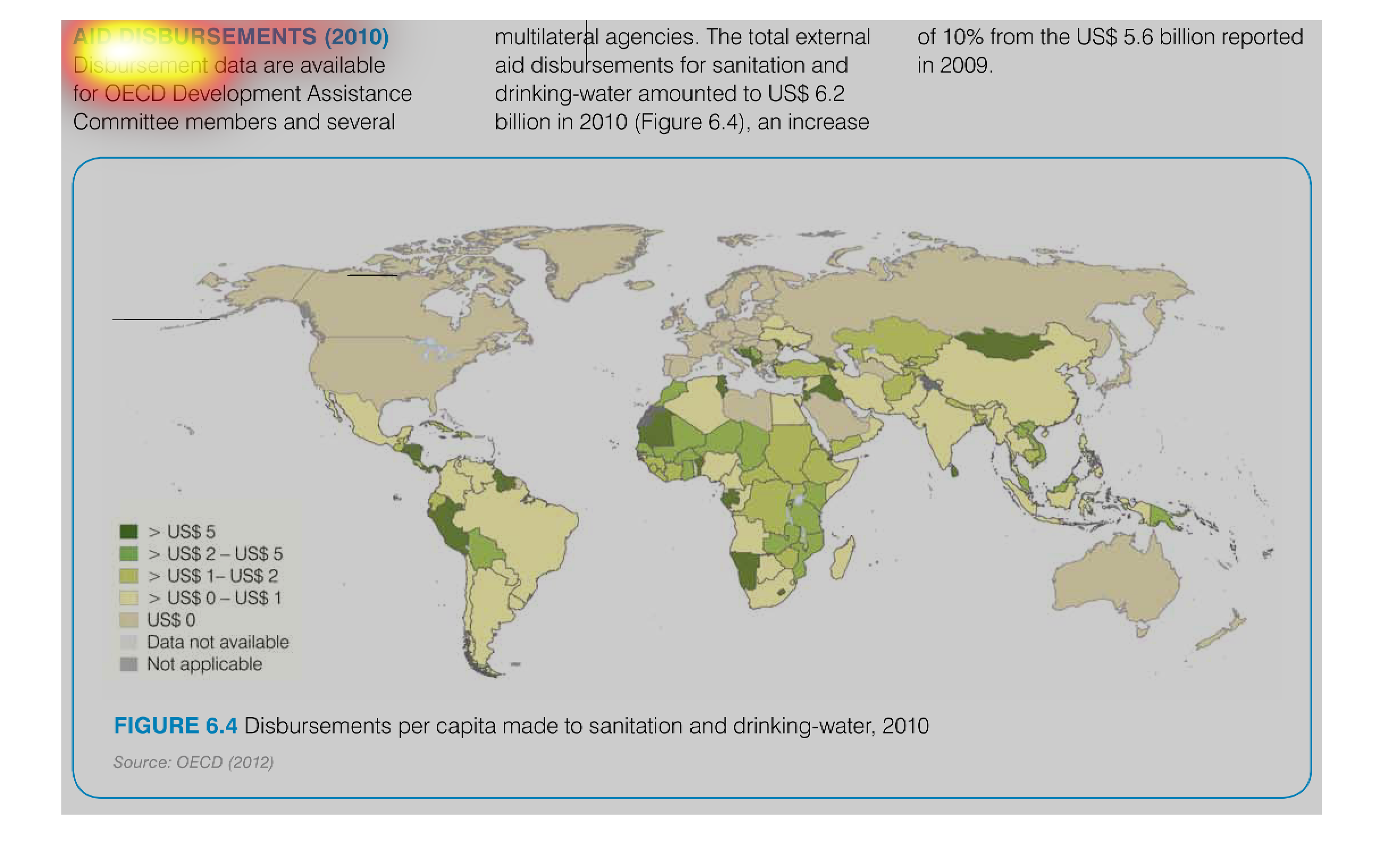
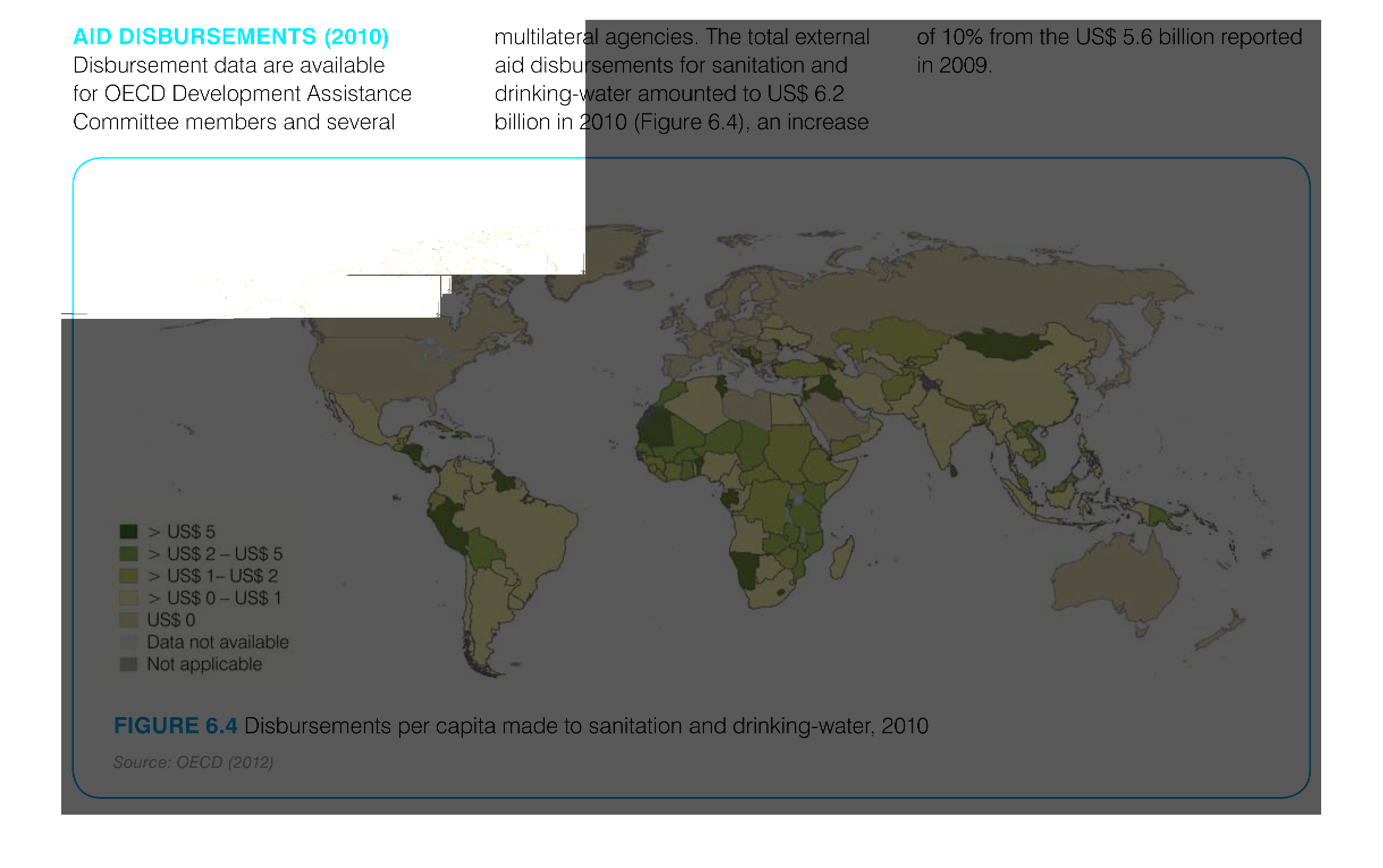
The image depicts aid disbursements for sanitation and drinking water in 2010 increases by
10% from the prior year of 2009. Africa appears to be a primary area of disbursement, with
parts of the Middle East, South America, and some island nations included.
This is a map of the world that shows the aid distribution for 2010. It shows which countries
of the world took in the most aid for that year. Most aid goes to African countries.
The graph shows figures of Aid Disbursement in 2010, for OECD committee members, over a global
map. The map is color coded with darker green areas receiving more funding. Areas in South
America, Africa, and Central Asia received the most aid disbursement.
this is a graph of the world and what is around us today the graph has a lot of different
colors on it and it sucks what are we to do in todays world.
This is a map of aid disbursement globally in 2010. India has received between 0 and 1United
States (billion) dollars in aid. Parts of Africa have received between 2 and 5 united states
(billion) dollars.
This is a global map showing the disbursement of AIDS throughout the world. The greatest concentration
of AIDS is in the countries in Africa and West South America.
aid disbursements 2010 in Us dollars seen in a color coded map of the world, most aid going
to african countries, some asian countries, and a few south american countries.
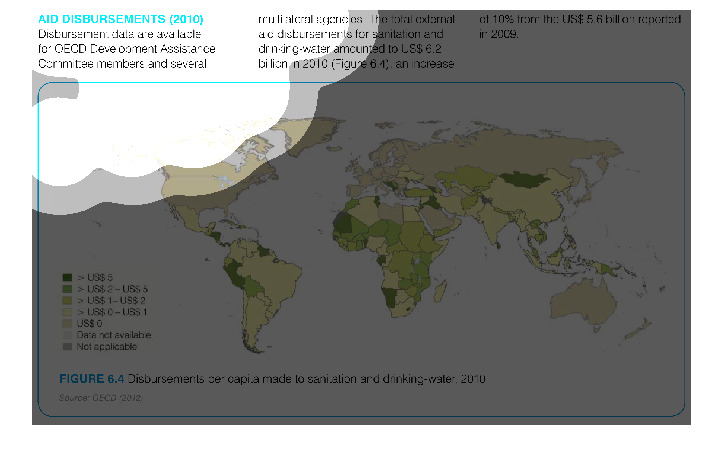
The image shows the disbursement per capita to sanitation and drinkable water in 2010. The
US spent $6.2 billion in 2010 which was an increase because they spent only $5.6 billion in
2009.
This chart describes aid disbursements for the year 2010. Specifically, disbursement data
are available for OECD development assistance committee members.
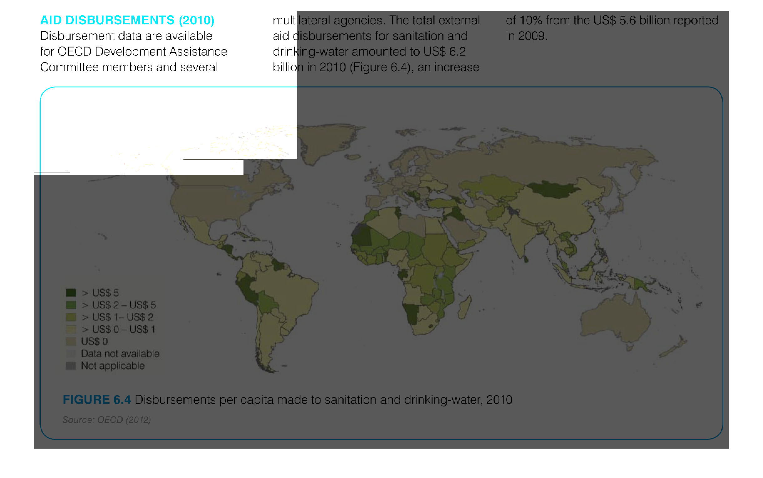
This world map shows a 2010 picture of worldwide aid disbursements, colored and shaded by
how much money received. Data is for sanitation and drinking water aid.
This chart describes air disbursement. Specifically, disbursement data are available for OECD
development assistance committee members and several multilateral agencies.
This is an image of a global map depicting donations made for aids research and treatment.
The color code is in $USB and is in shades of beige and green.
This chart shows world-wide AIDs disbursements for sanitation and drinking water in 2010.
 The total disbursements for were US$ 6.2 billion in 2010, an increase from US$ 5.6 billion
in 2009.  Locations in Africa had the highest percentage of disbursements per capita with
a rate of > US$ 5.
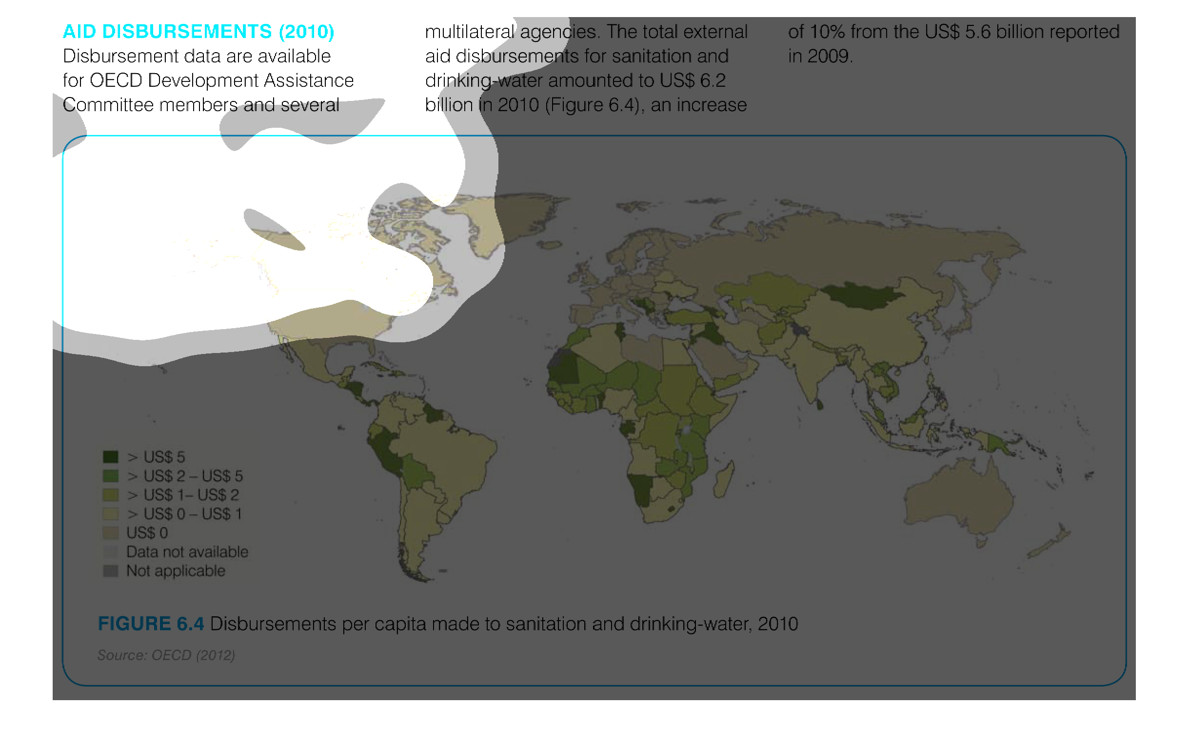
THIS MAP SHOWS THE AID DISPERSEMENTS MADE PER CAPITA FOR DIFFERENT COUNTRIES FOR DRINKING
WATER AND SANITATION IMPROVEMENTS. THE DARKER THE COLOR GREEN, THE HIGHER PER CAPITA AID.