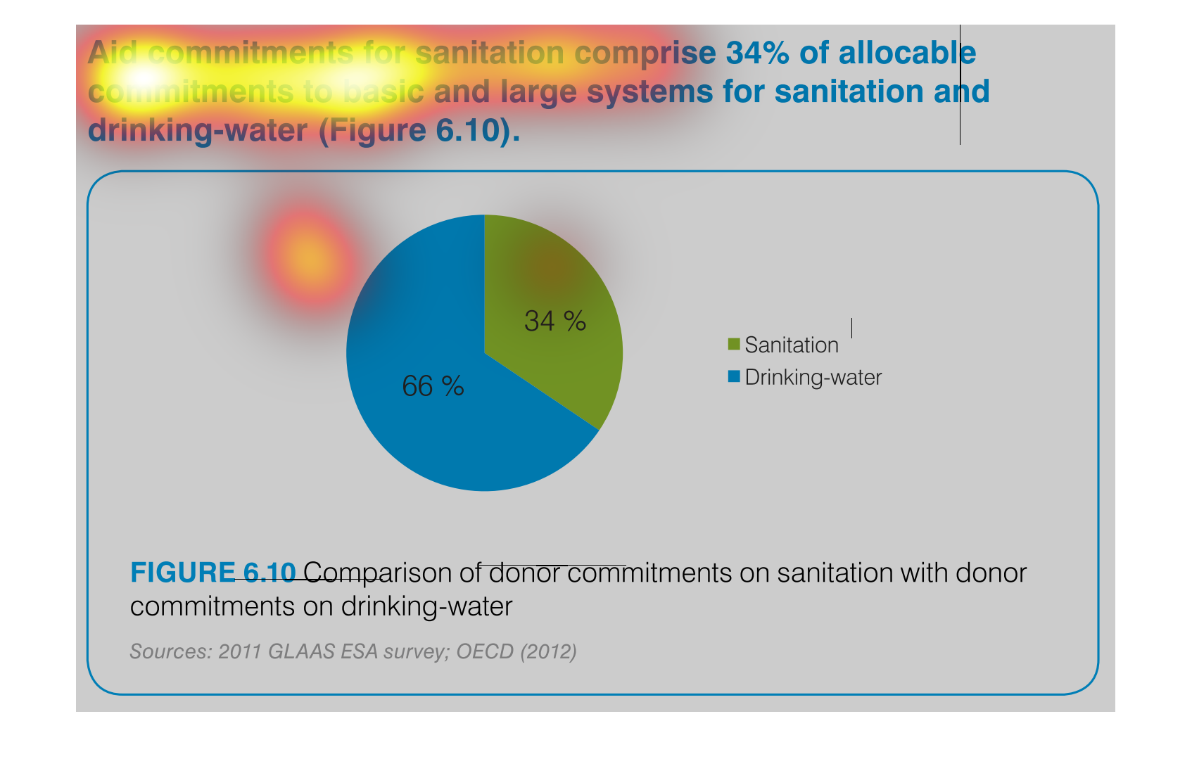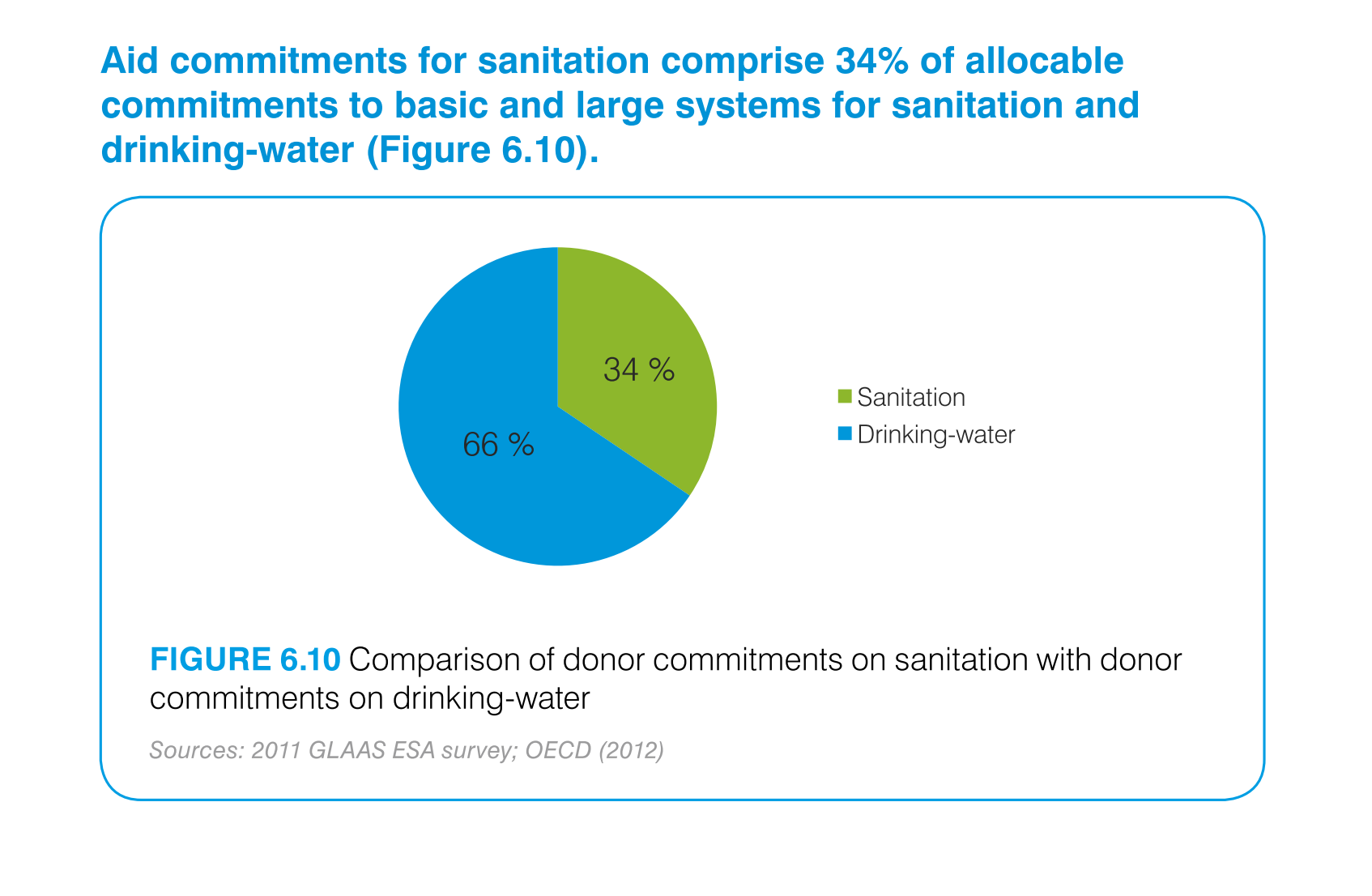
This is a chart that shows the amounts of aid commitments that have been made with respect
to sanitation and drinking water and it shows this with respect to small and large systems
affected.
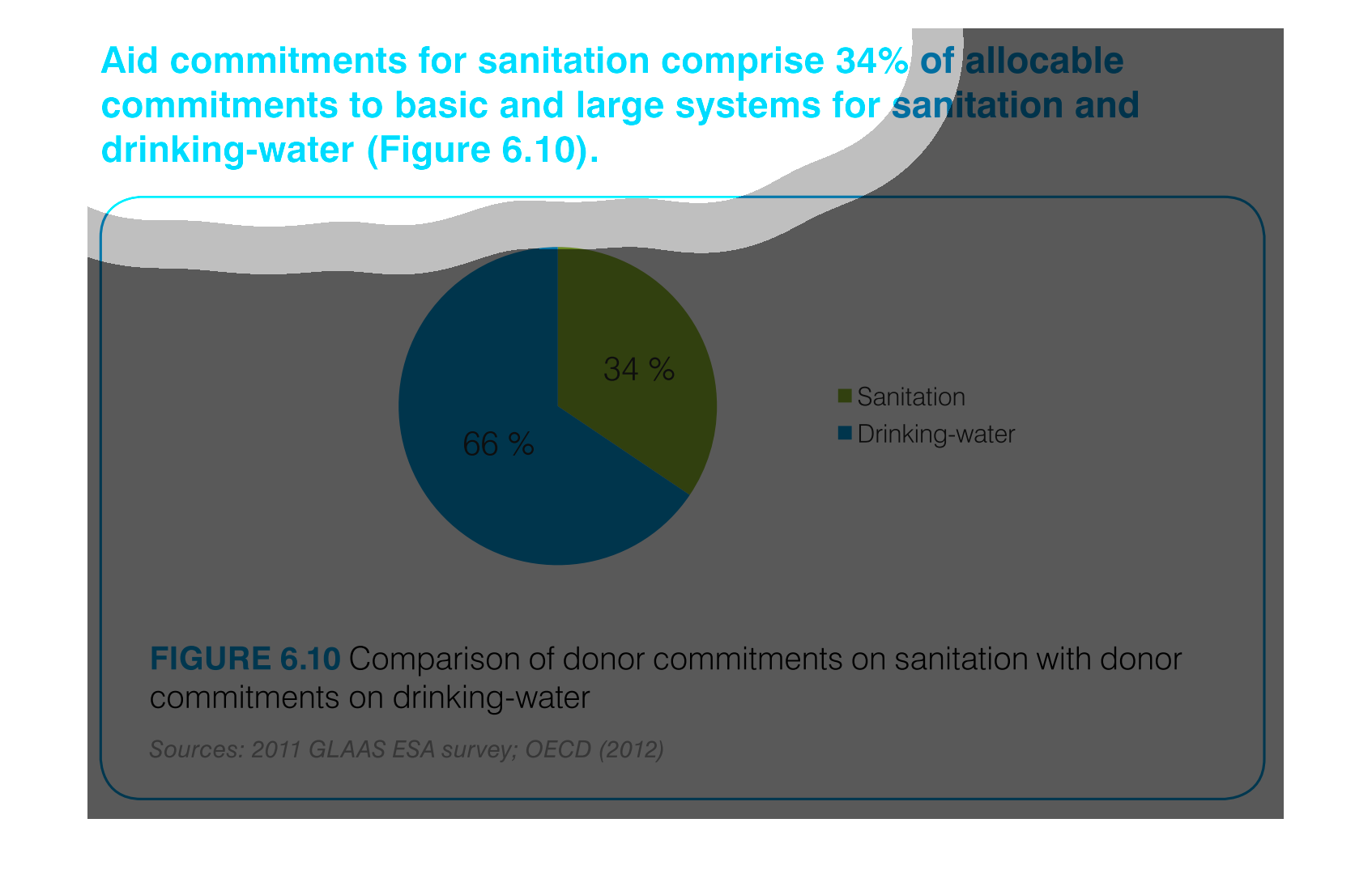
Aid commitments for sanitation comprise 34% of total commitments for santitation and drinking
water. It other words 66 percent goes to mainting clean water
The image is a pie chart showing the percentage of aid that was distributed to either drinking
water or sanitation.  The blue portion represents drinking water, and the green portion represents
sanitation.  66% is colored in blue and 34% is shaded in green.
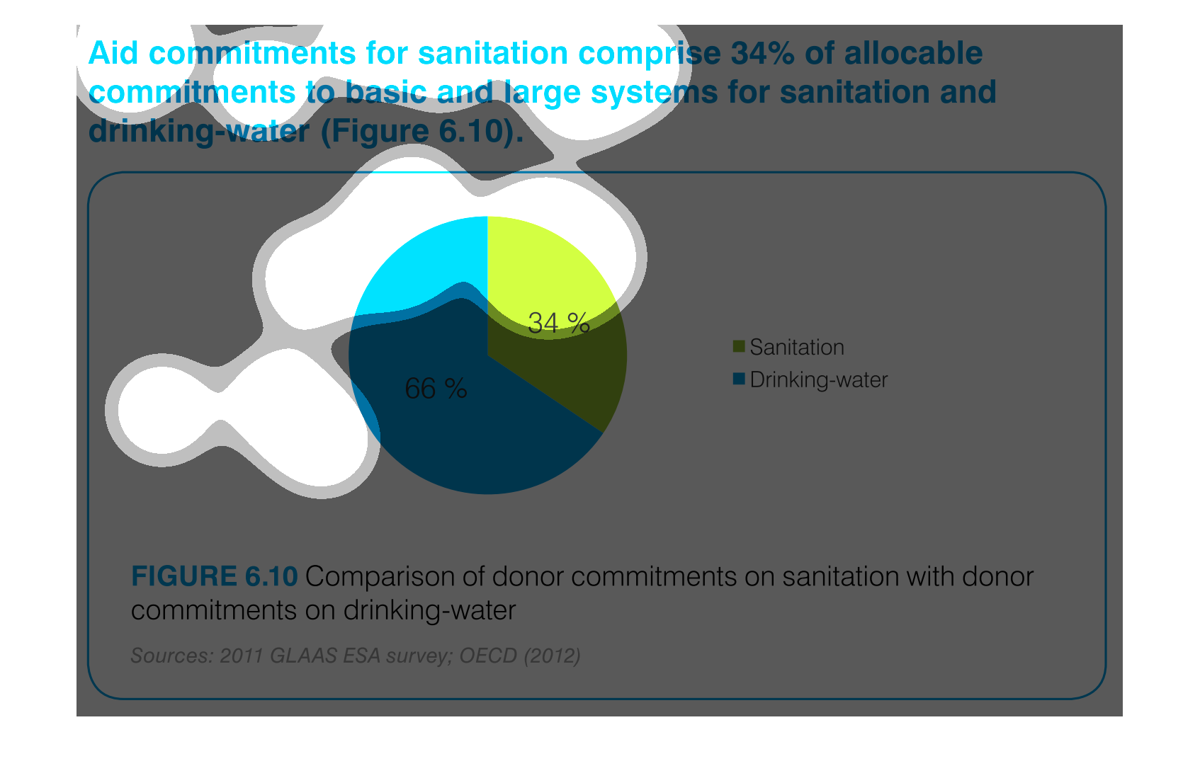
This pie chart compares commitments of aid by donors for sanitation and drinking water. About
two thirds of the aid commitments were for drinking water.
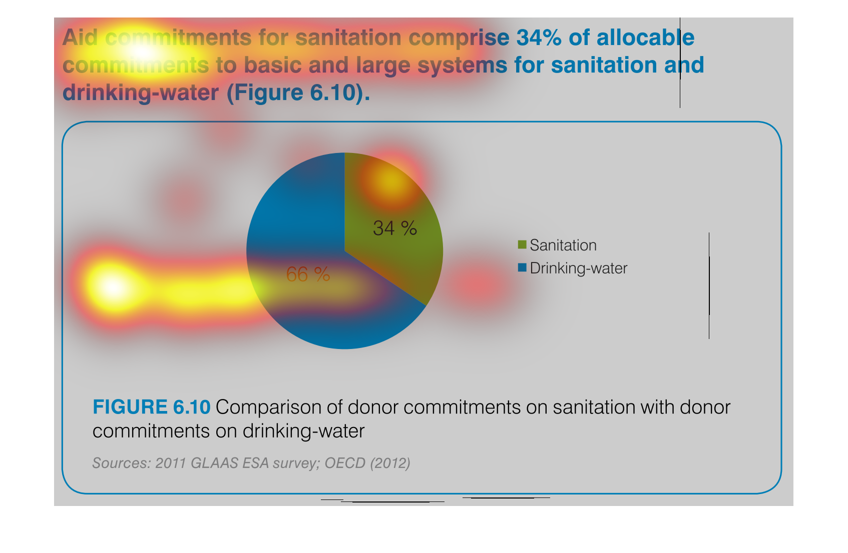
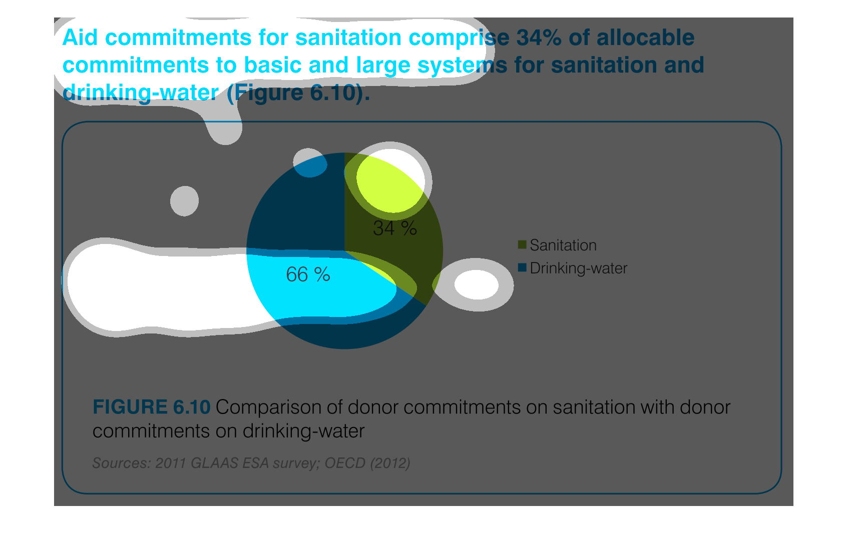
This chart describes aid commitments for sanitation comprise 34% of allocable commitments
to basic and large systems for sanitation and drinking water.
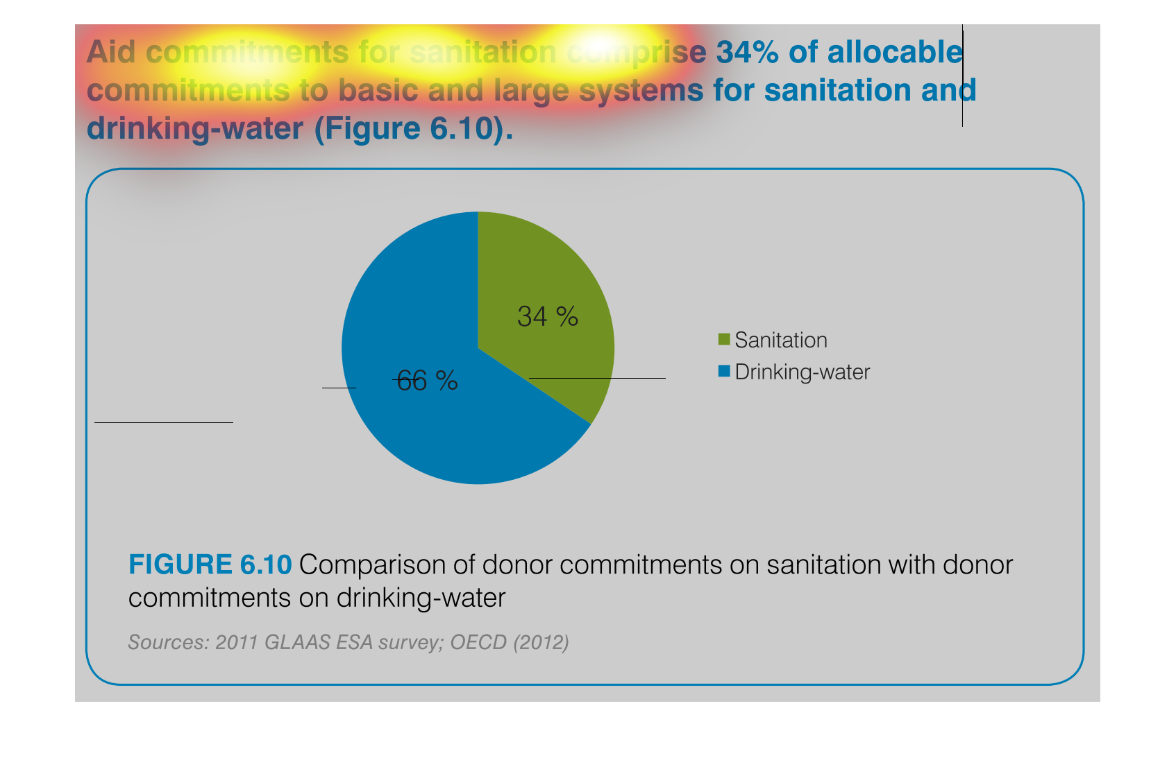
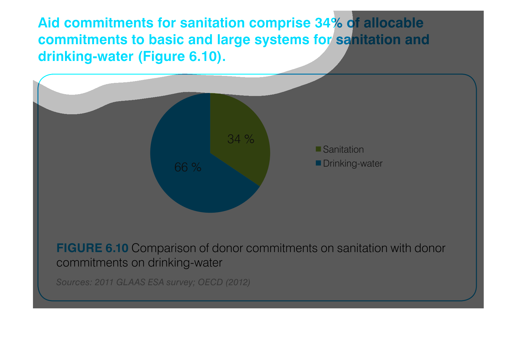
The chart/graph shows the donor commitments on sanitation with donor drinking water as of
2012. The 66 percent of drinking water and 34 percent is sanitation
The figure presented is titled Aid commitments for sanitation comprise 34% of allocable commitments
to basic and large systems for sanitation and water.
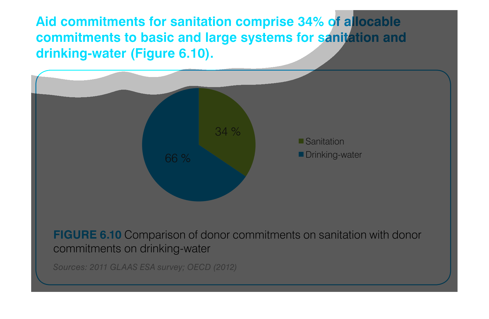
The graph compares donor commitments in the form of aid to sanitation, basic and large systems,
(34%) to donor commitments to drinking water (66%).    Sources include: GLAAS ESA 2011, and
OECD 2012
The image depicts the difference in donor funding for sanitation services versus water treatment
services. Water aid, shown in blue, comprises sixty-six percent of funding, while sanitation,
shown in green, comprises the remaining thirty-four percent.
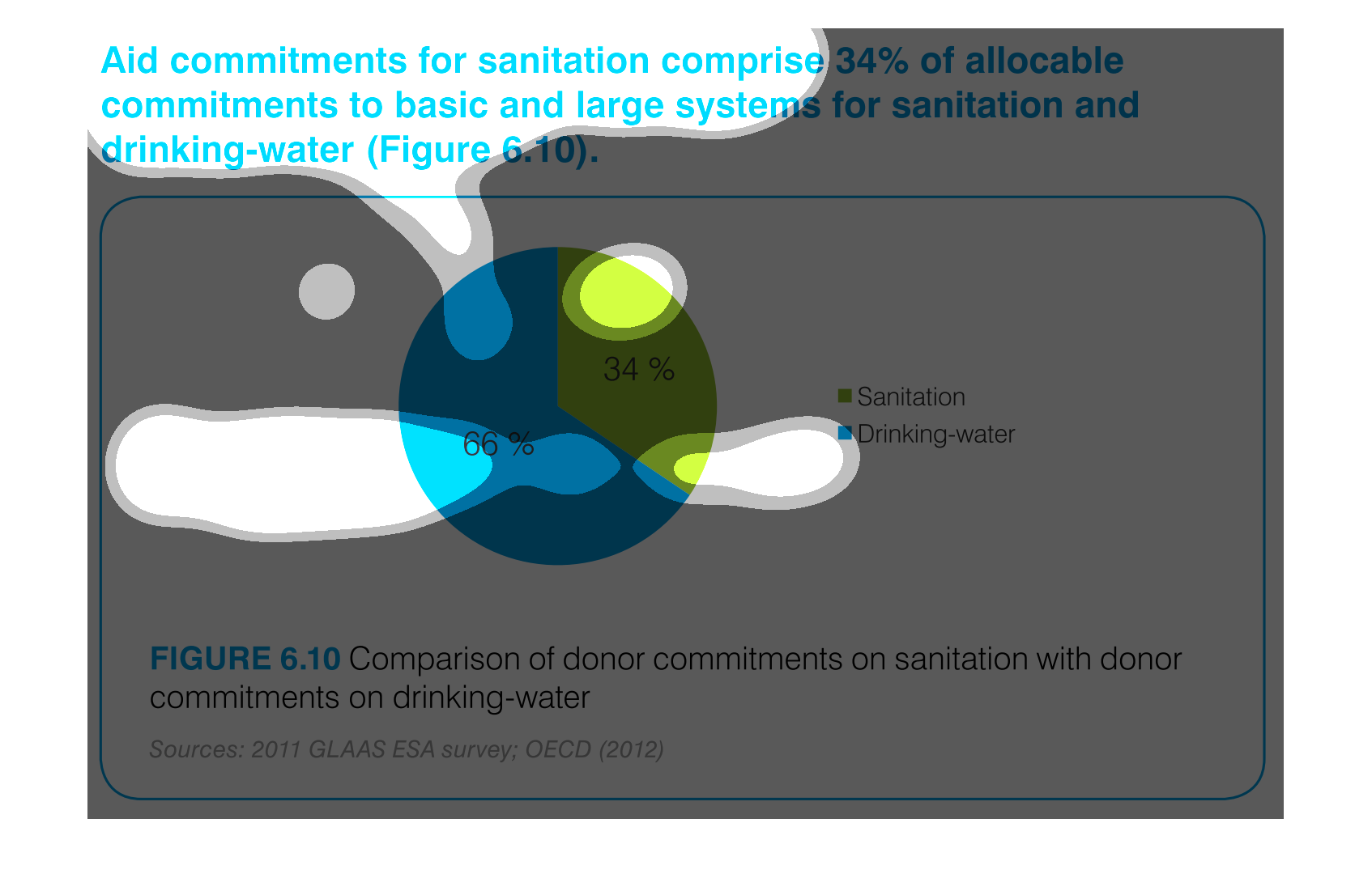
This pie chart shows the percent of allocation of budget commitments to sanitation and drinking
water supplies with sanitation being at 34% and drinking water at 66%.
This chart shows the Aid Commitment of sanitation vs. drinking water.  The donor commitments
comprise of sanitation which makes up 34% while drinking water makes up 66%.
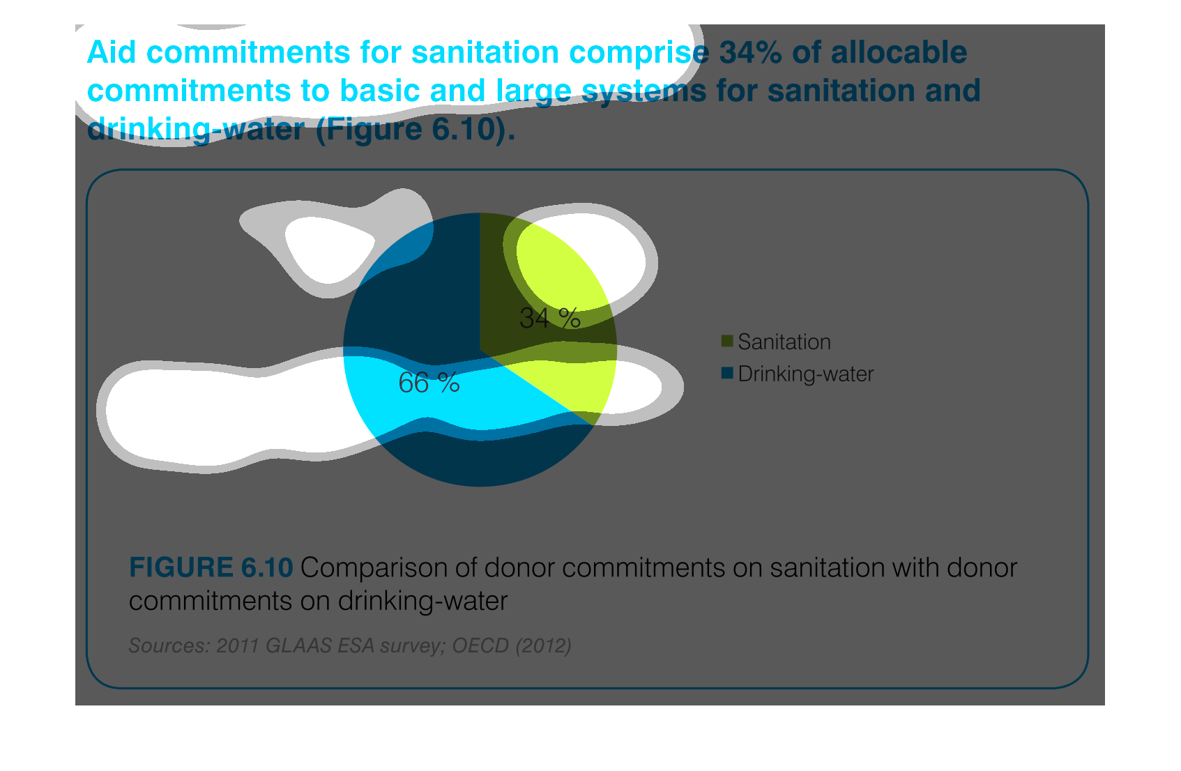
AID commitments for sanitation compromise 34% allocable commitments to basic and large systems
for sanitation and drinking water. It shows a circle graph and the correlation of the components
of a whole.
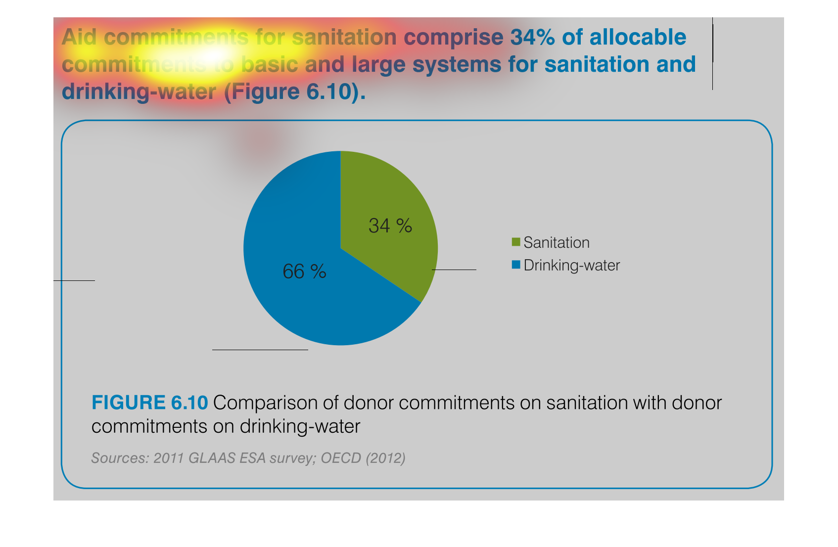
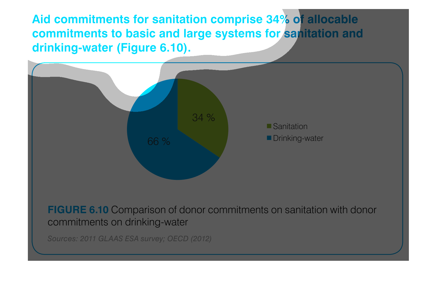
The efforts to keep things nice and clean are paramount if a society wants to evolve and leave
a better world for future generations. This graph shows the efforts of clean water and sanitation,
the commitment of donors to such a cause.
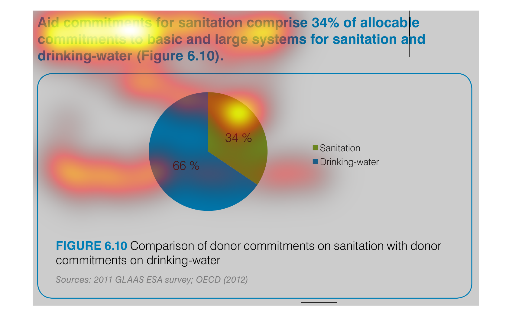
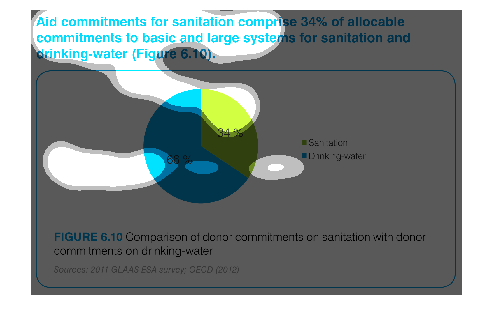
The pie graph is describing the distribution of donor committed money between Sanitation and
Drinking Water.  The pie graph clearly identifies that roughly 1/3 goes to Sanitation while
the remaining go do Drinking water.  It is easy to get the conclusion of the graph without
reading fine print.
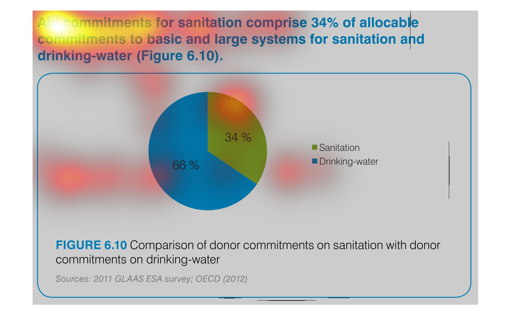
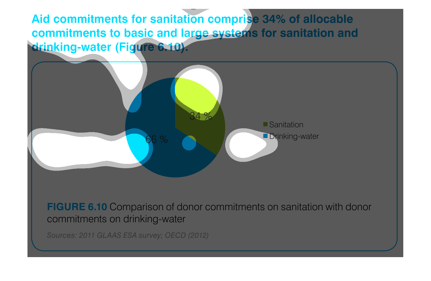
aid commitment for sanitation comprise 34% of allocable commitments to basic and large systems
for sanitation and drinking-water (figure6.10) the other 66% is fro drinking water as seen
in the pie graph