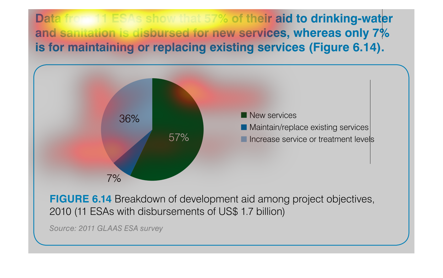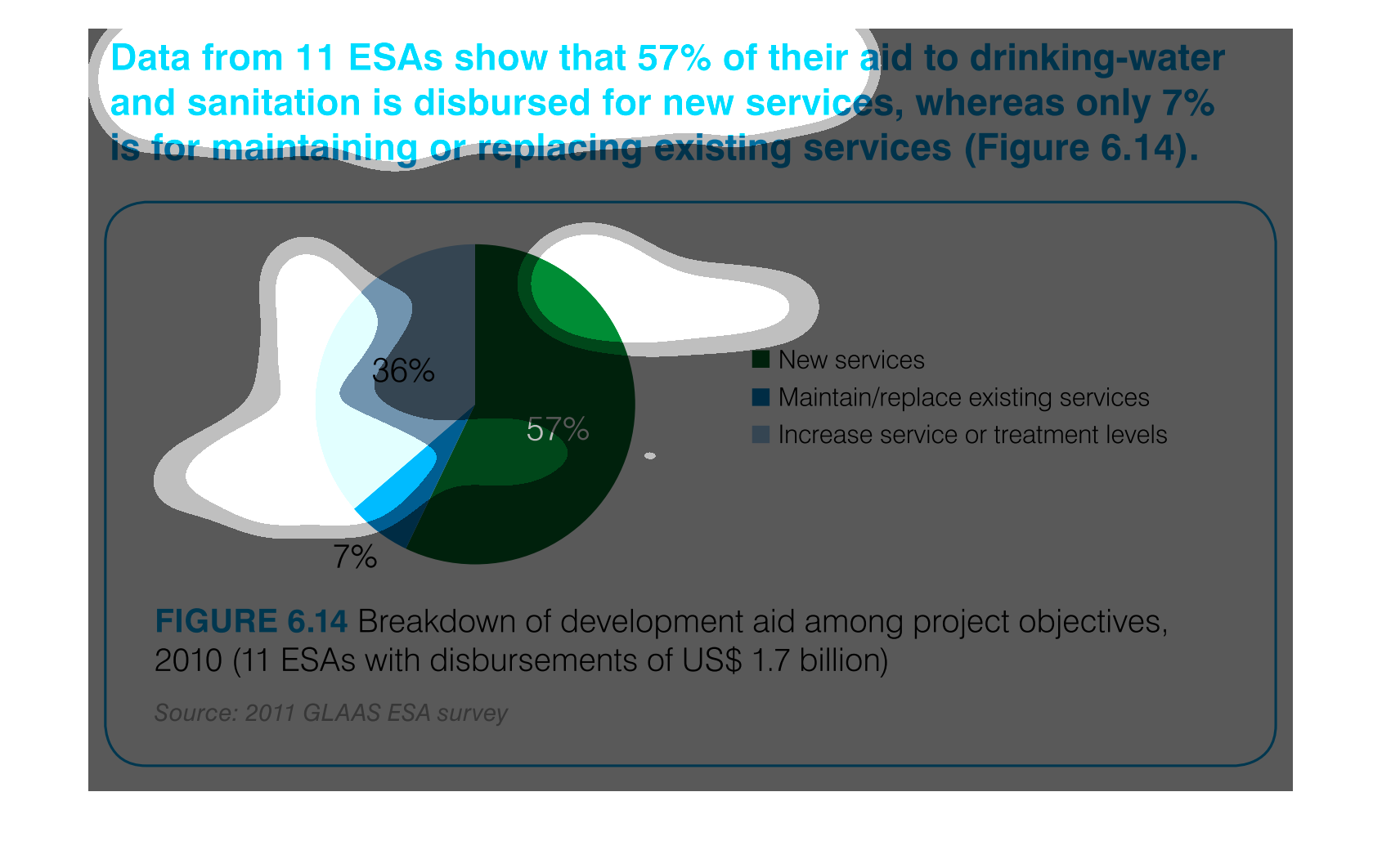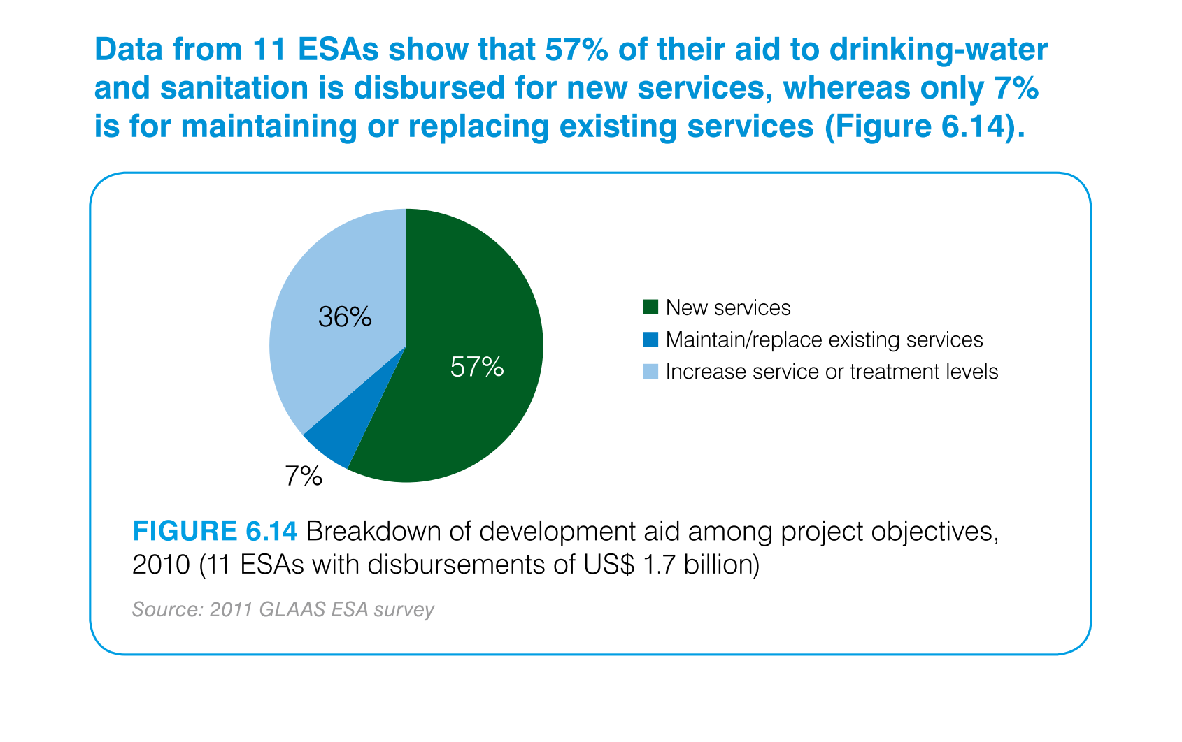
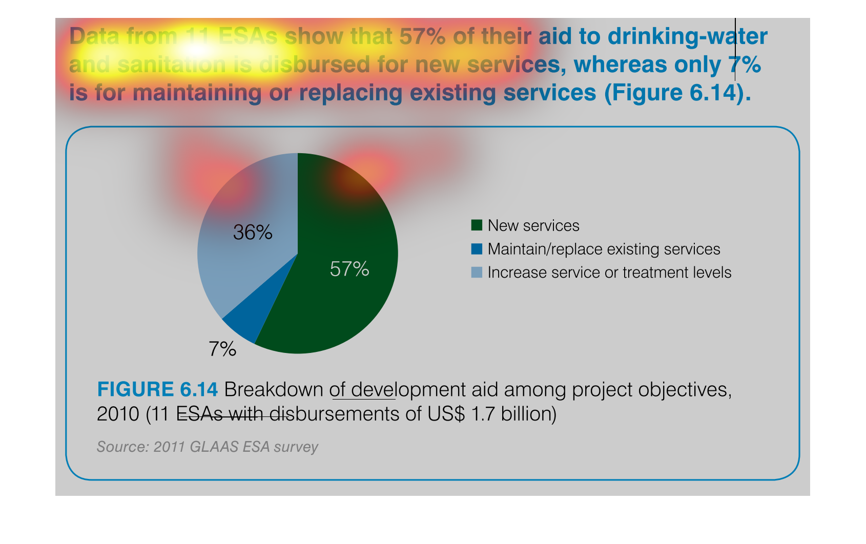
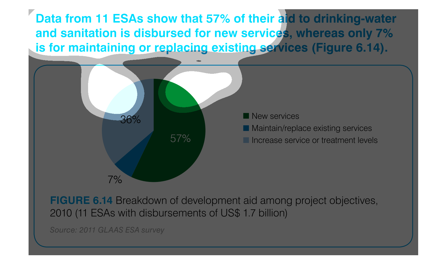
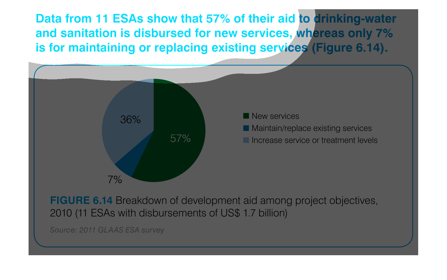
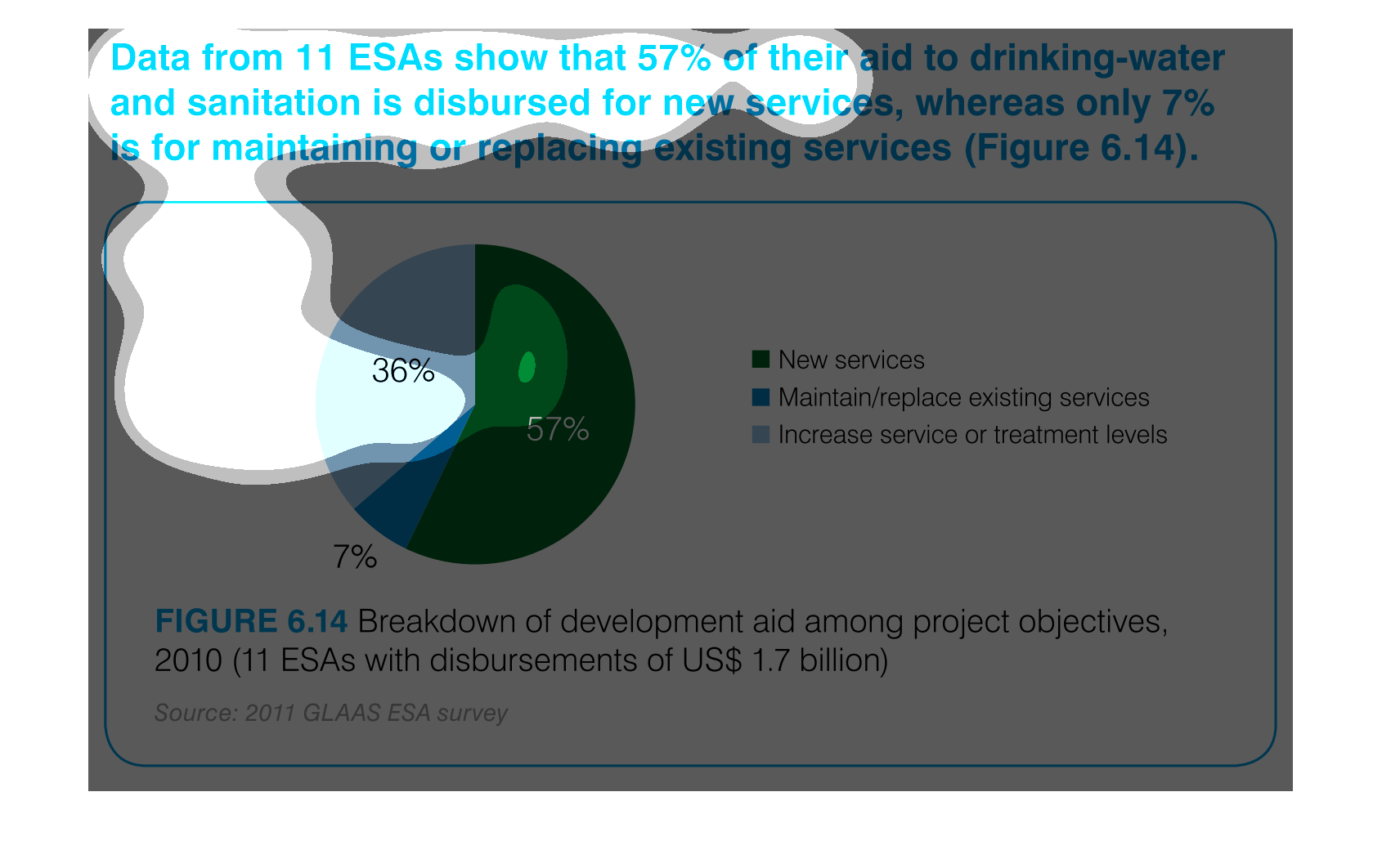
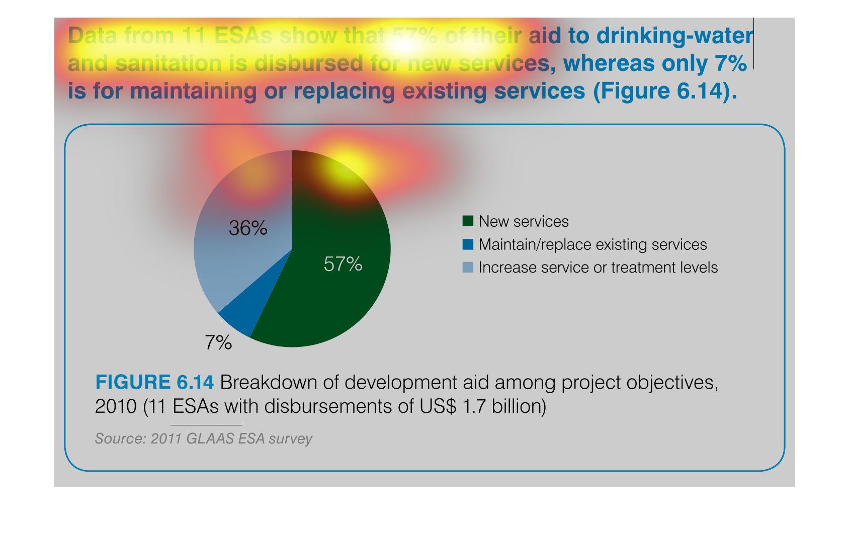
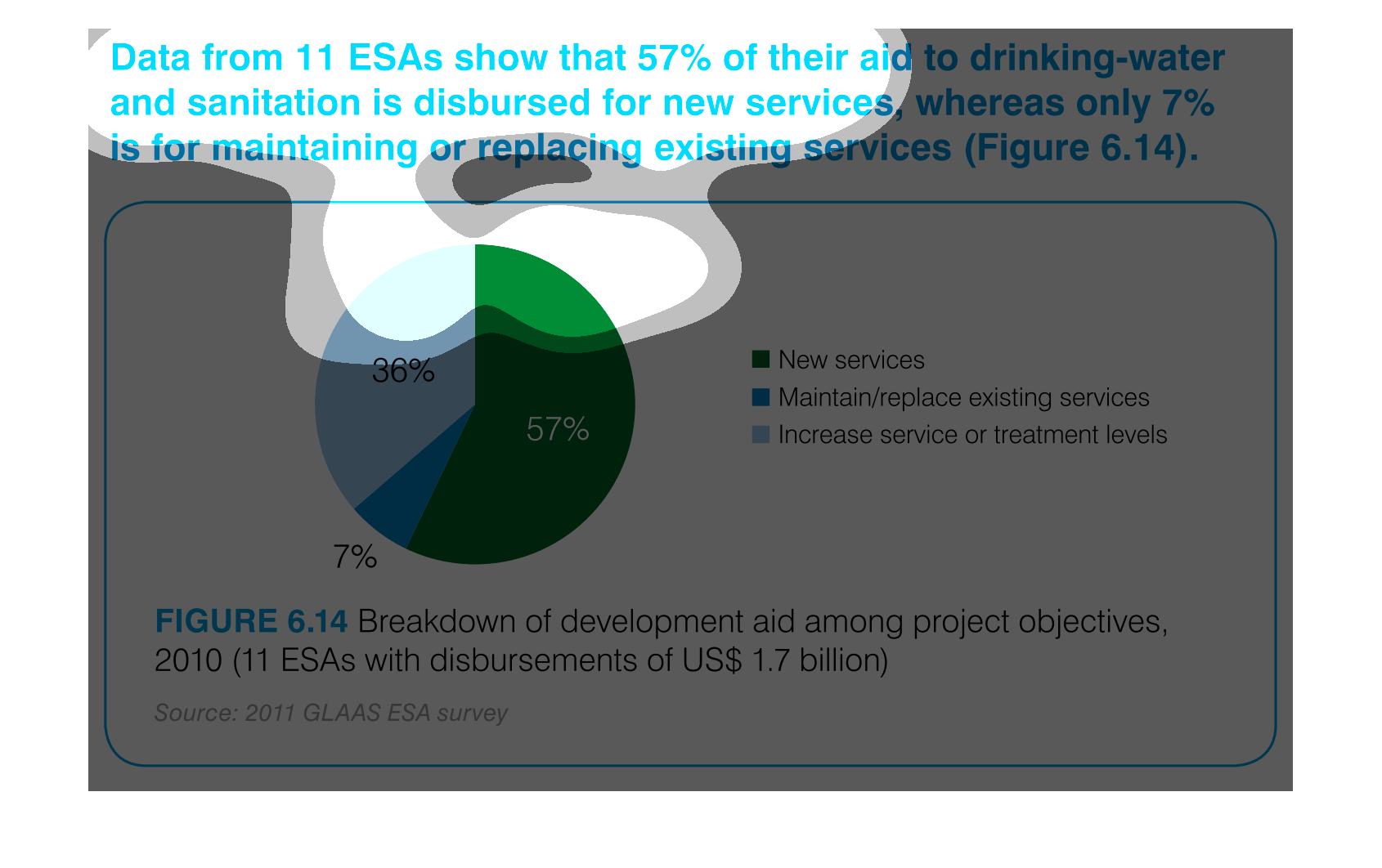
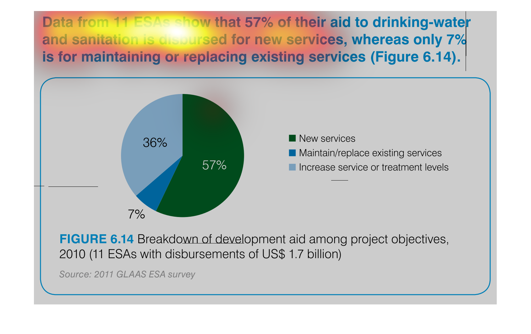
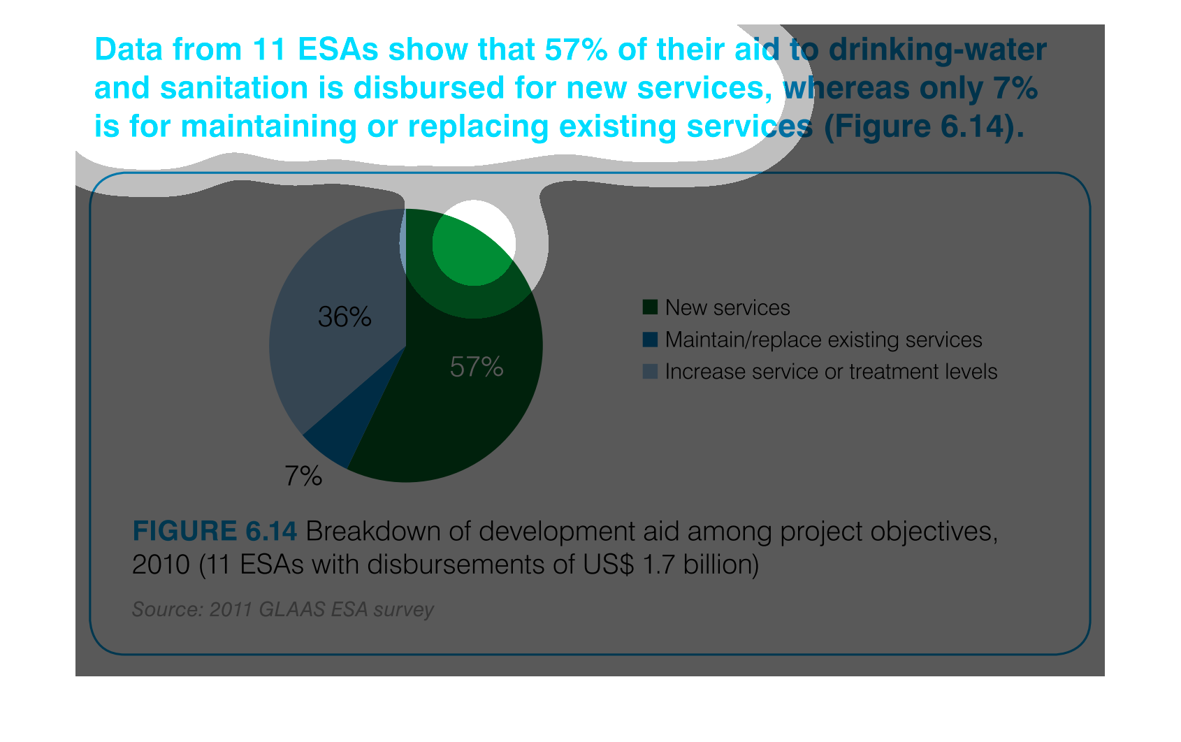
Data from 11 ESA's show that 57% of their aid to drinking-water and sanitation is disbursed
for new services whereas only 7% is for maintaining or replacing existing services (figure
6.14). We see this displayed in the form of a pie chart.
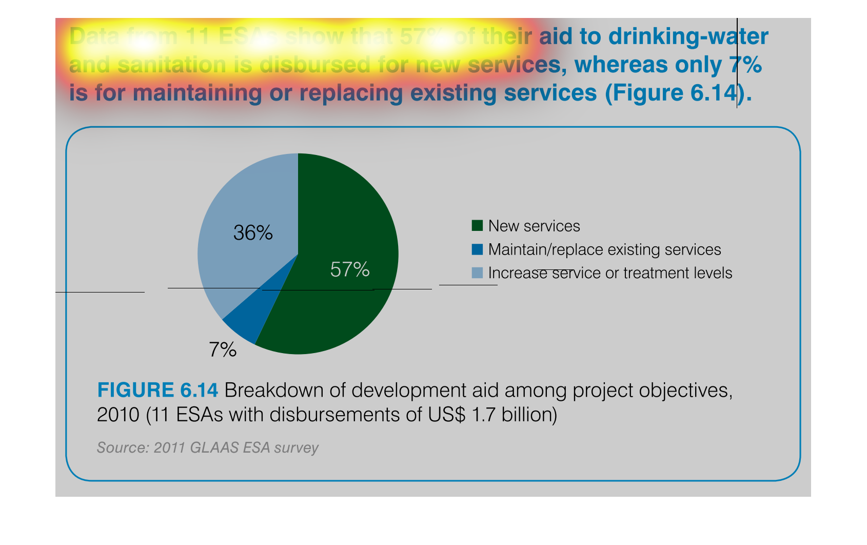
This is a pie chart for drinking water customers, how much of the sanitation goes to the customers.
The largest percentage of customers are new services, then those increasing their service
and finally the smallest is for those maintaining their services
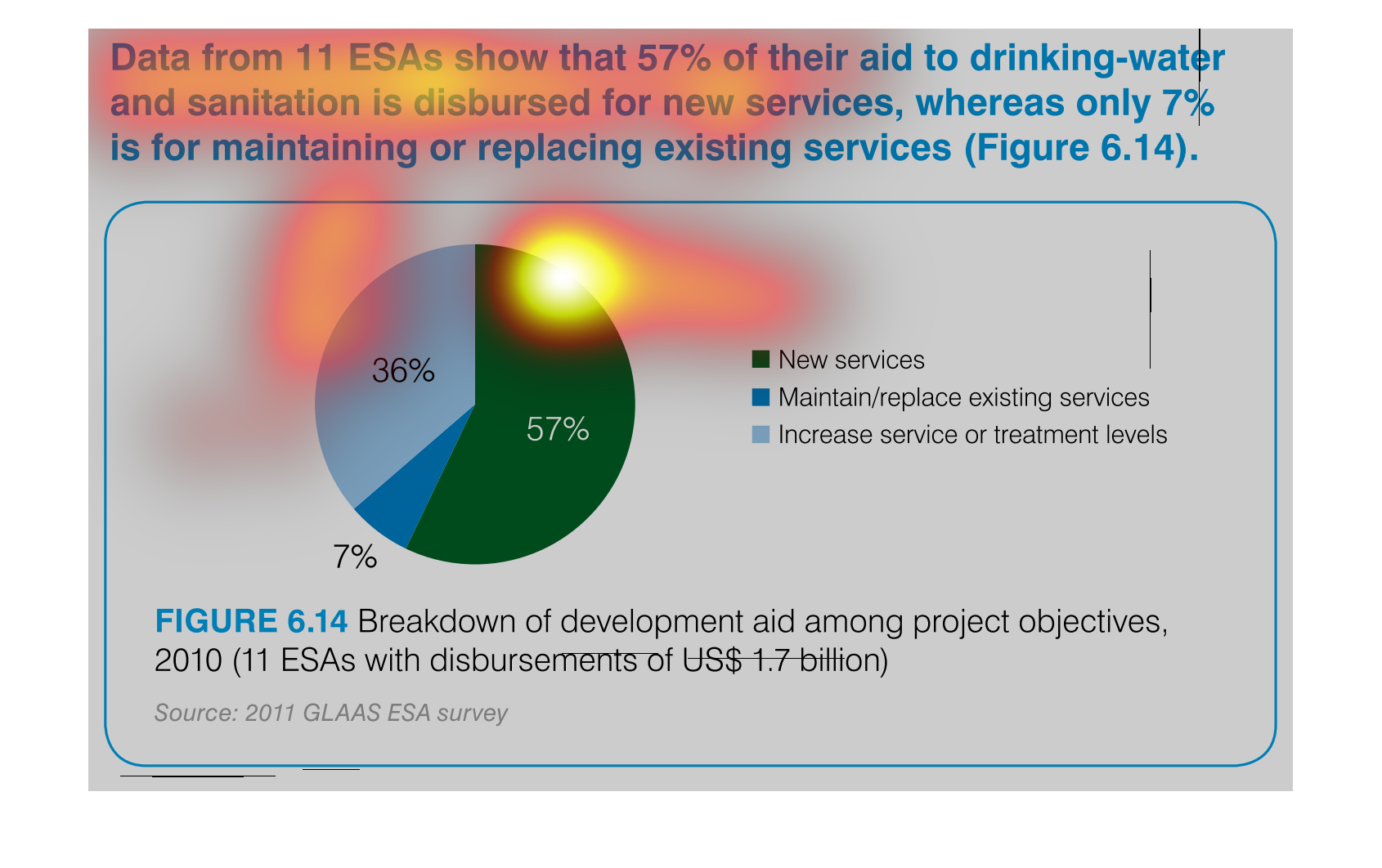
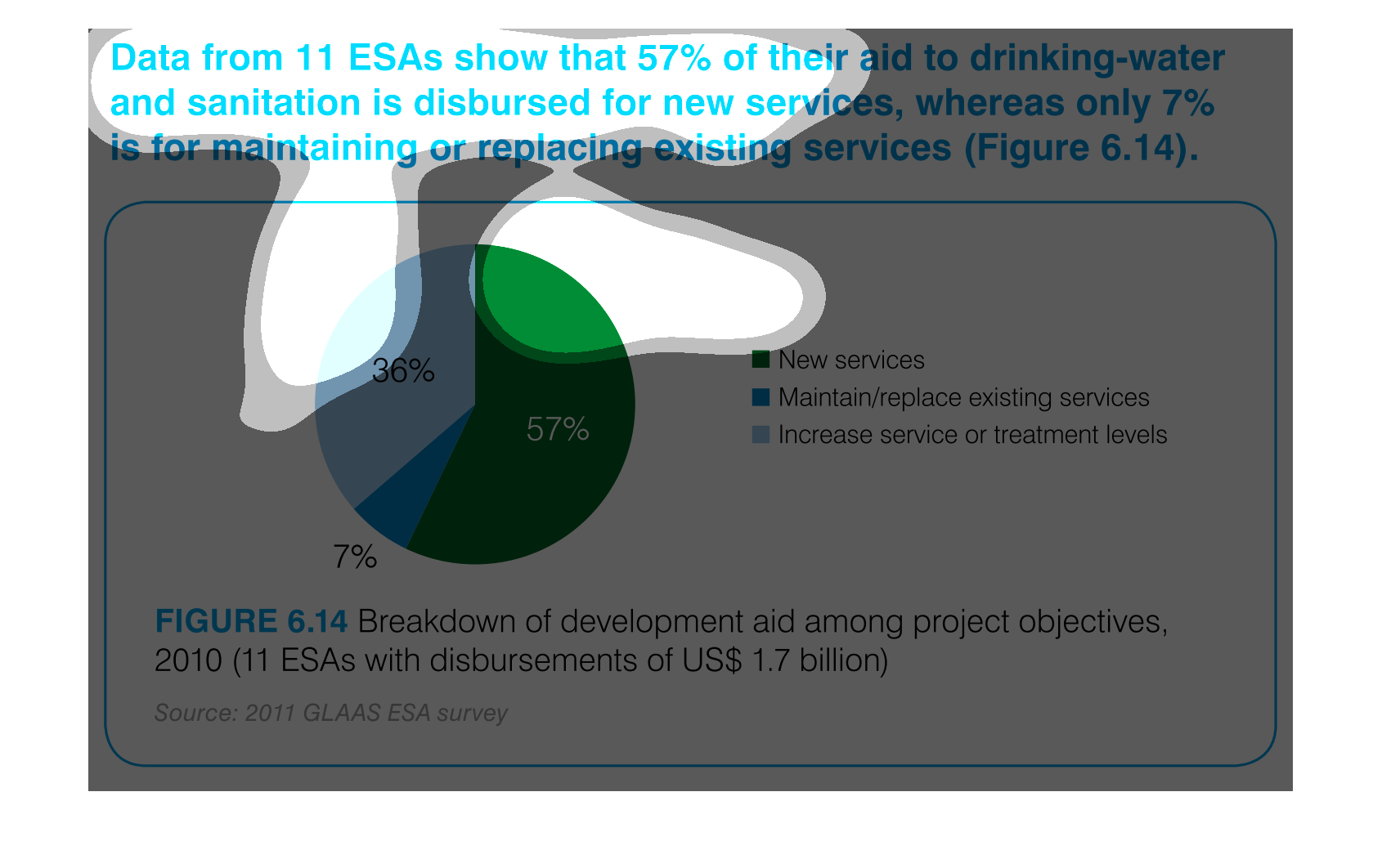
The figure presented is titled Data from 11 ESAs show that 57% of their aid to drinking-water
and sanitation is disbursed for new services.  The figure shows data for water.
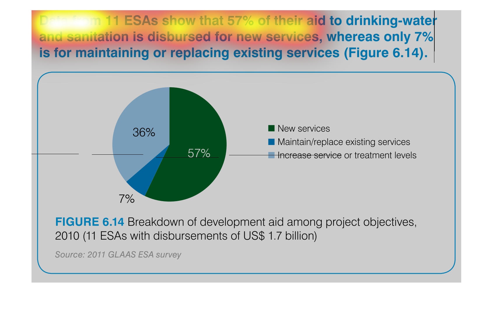
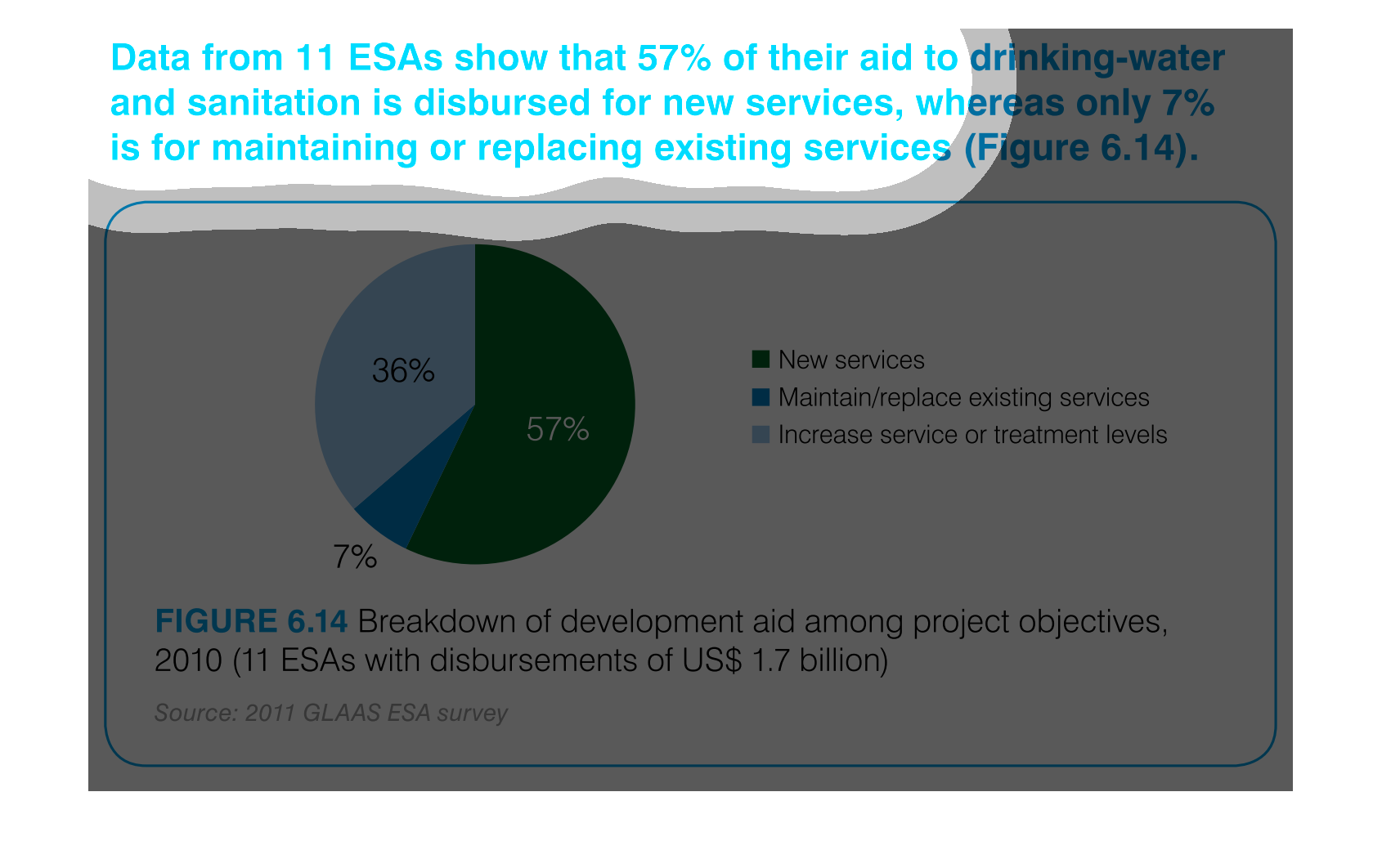
This image shows how 11 ESA's are distributing their costs of aid drinking water and treatment.
57% of costs goes to new services, 36% to increasing service or maintenance levels and 7%
to maintaining or replacing existing service.
This chart describes data from 11 ESAs show that 57% of their aid to drinking water and sanitation
is disbursed for new services, whereas only 7% is for maintaining existing services.
The image compares the results of services. It shows the difference on a pie chart of new
services versus maintaining existing services versus increasing service treatment levels from
where they stand.
In this graph we see that there is not an ample distribution of adequate resources in these
areas, and that instead of investing in already established clean water stations, they are
just spending on new ones.
This chart clearly displays the percentage of drinking water that has received aid and sanitation,
as well as new services. 57 percent of drinking water has received  new services.
data from 11 ESA's show that 57% of their aid to drinking water and sanitation is disbursed
for new services whereas only 7% is for maintaining or replacing existing services figure
6.14. this is shown with a pie graph
This chart is showing how the ESA's funding is being utilized. The great thing is that only
a small percentage, 7% according to the chart, is used to maintain existing water service
and a whole 57% of the funding is used to help set up water for new people who need it.
This is a pie chart that shows the data from 11 ESAs. The chart shows that 57 percent of their
aid to drinking water and sanitation is disbursed for new services and only 7 percent is for
maintaining existing services.

This handmade chart shows that aid given to countries for clean and sanitary drinking water
is used in certain ways. It is a dense chart and hard to figure out more
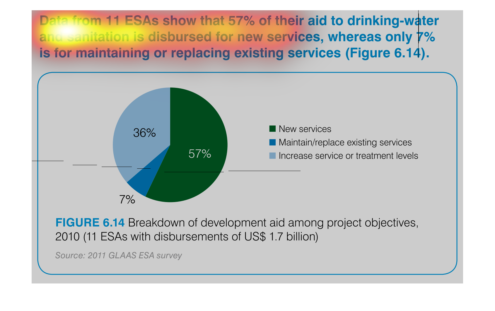
This chart describes data from 11 ESAs show that 57% of their aid to drinking water and sanitation
is disbursed for new services, whereas only 7% is for maintaining.
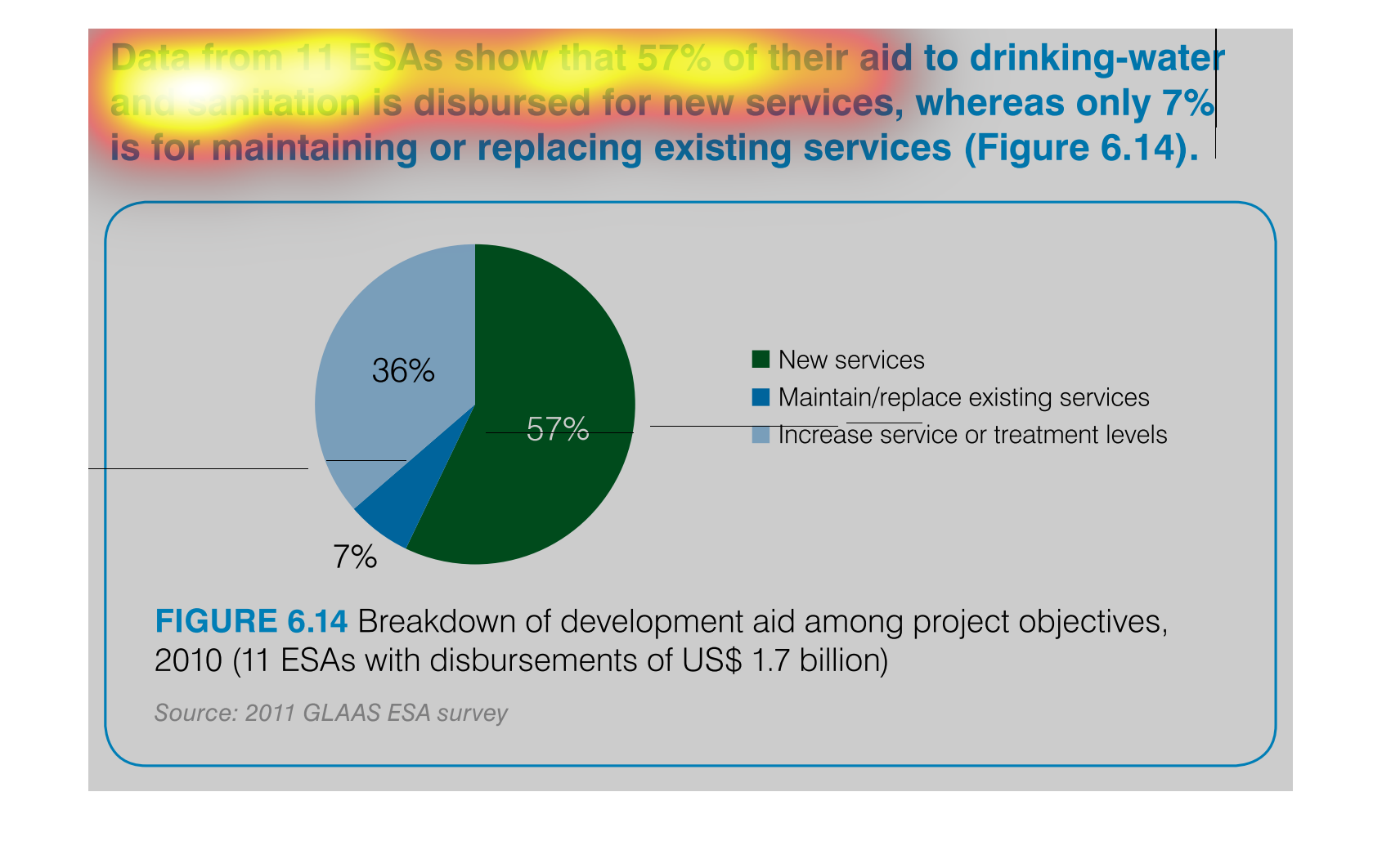
The center has failed. This informative graphic illustrates how funds are poorly dispersed
in relation to installing new sanitation and water ways as opposed to maintaining and repaired
ones that have already been established.
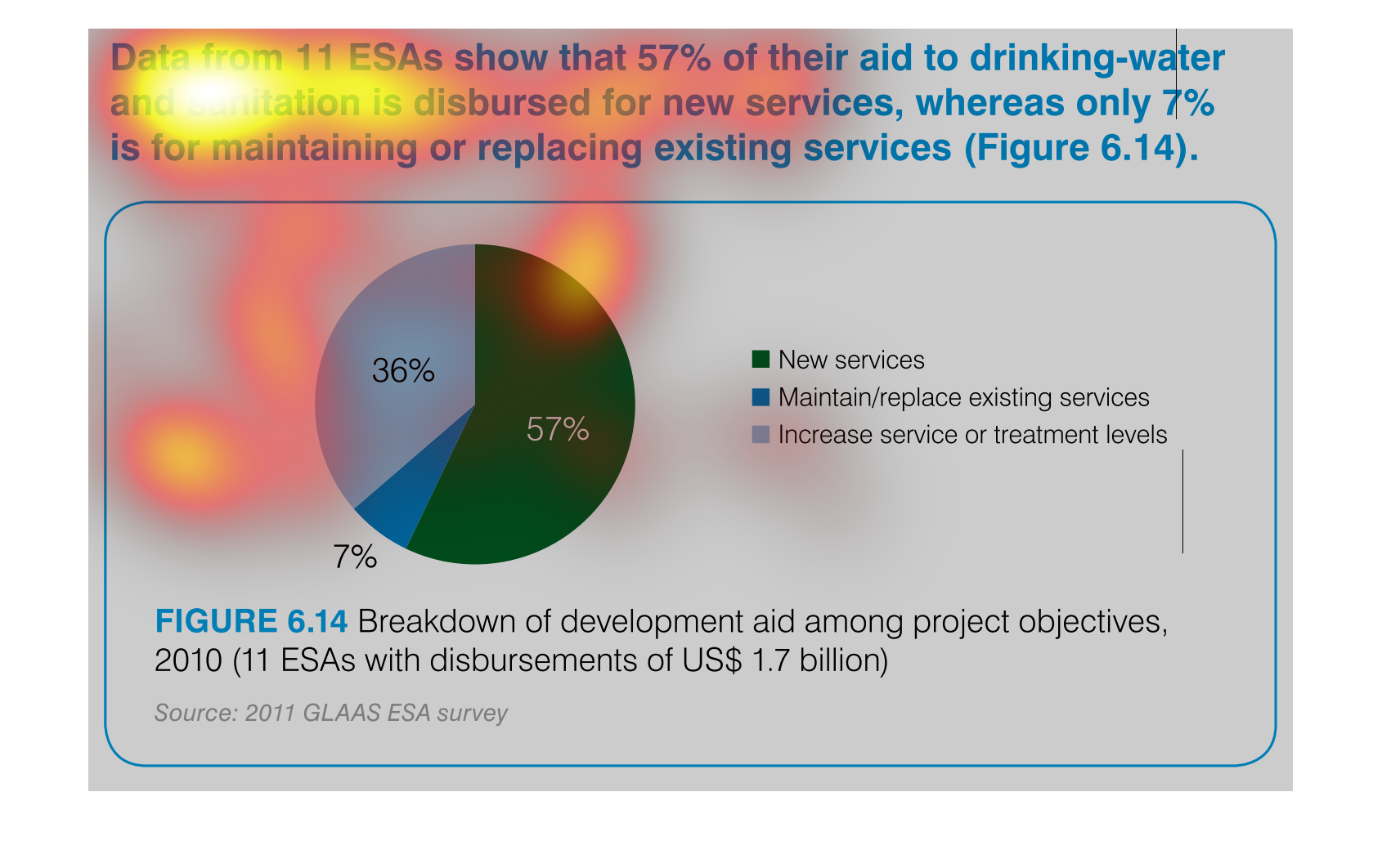
The image depicts data from 11 ESA's, citing that 57% of their aid to drinking water and sanitation
is distributed for new services, compared to only 7% distributed for maintaining or replacing
existing services. 36% is for increasing services or treatment. Data is from GLAAS, 2011.