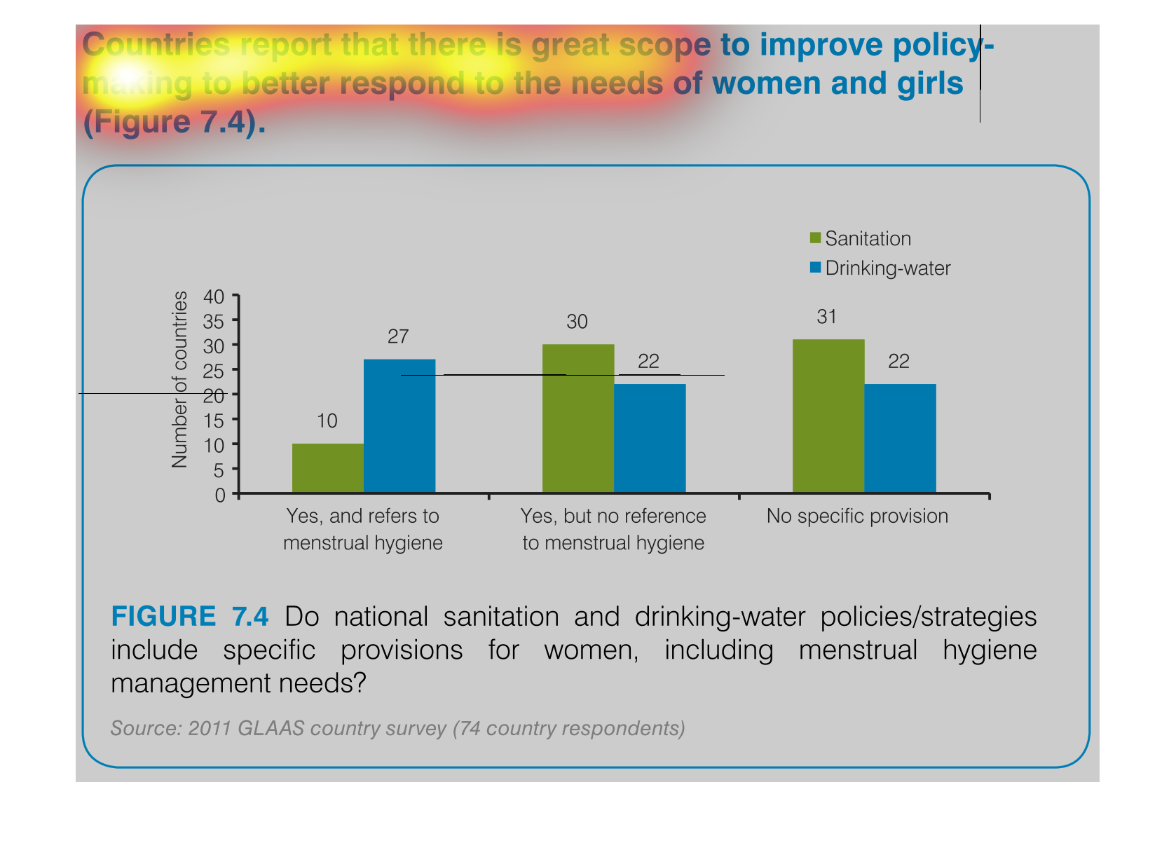
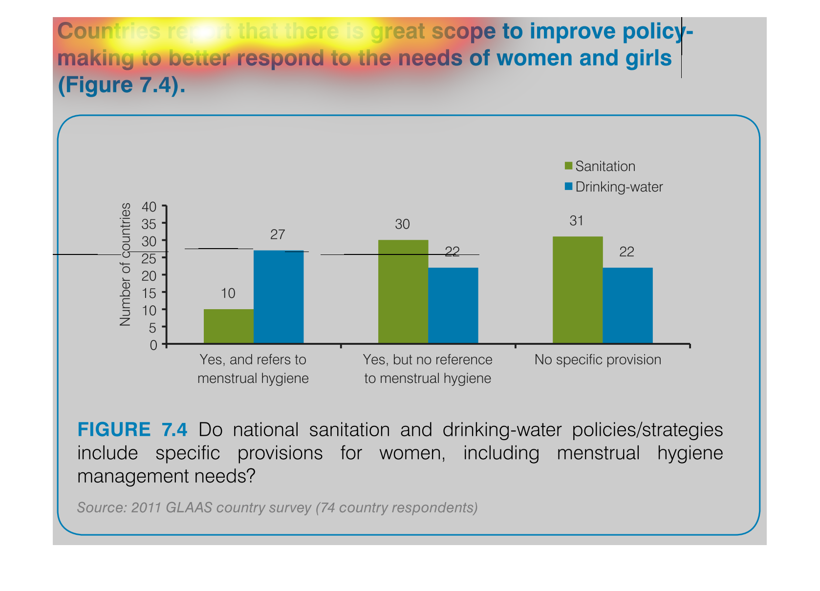
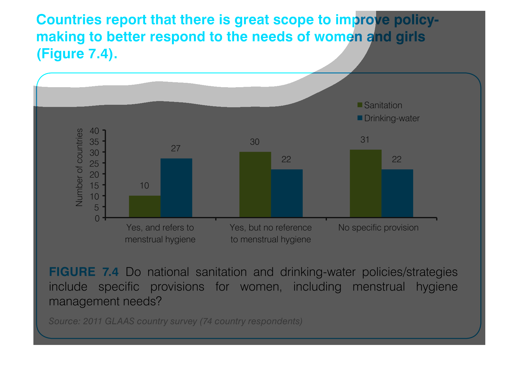
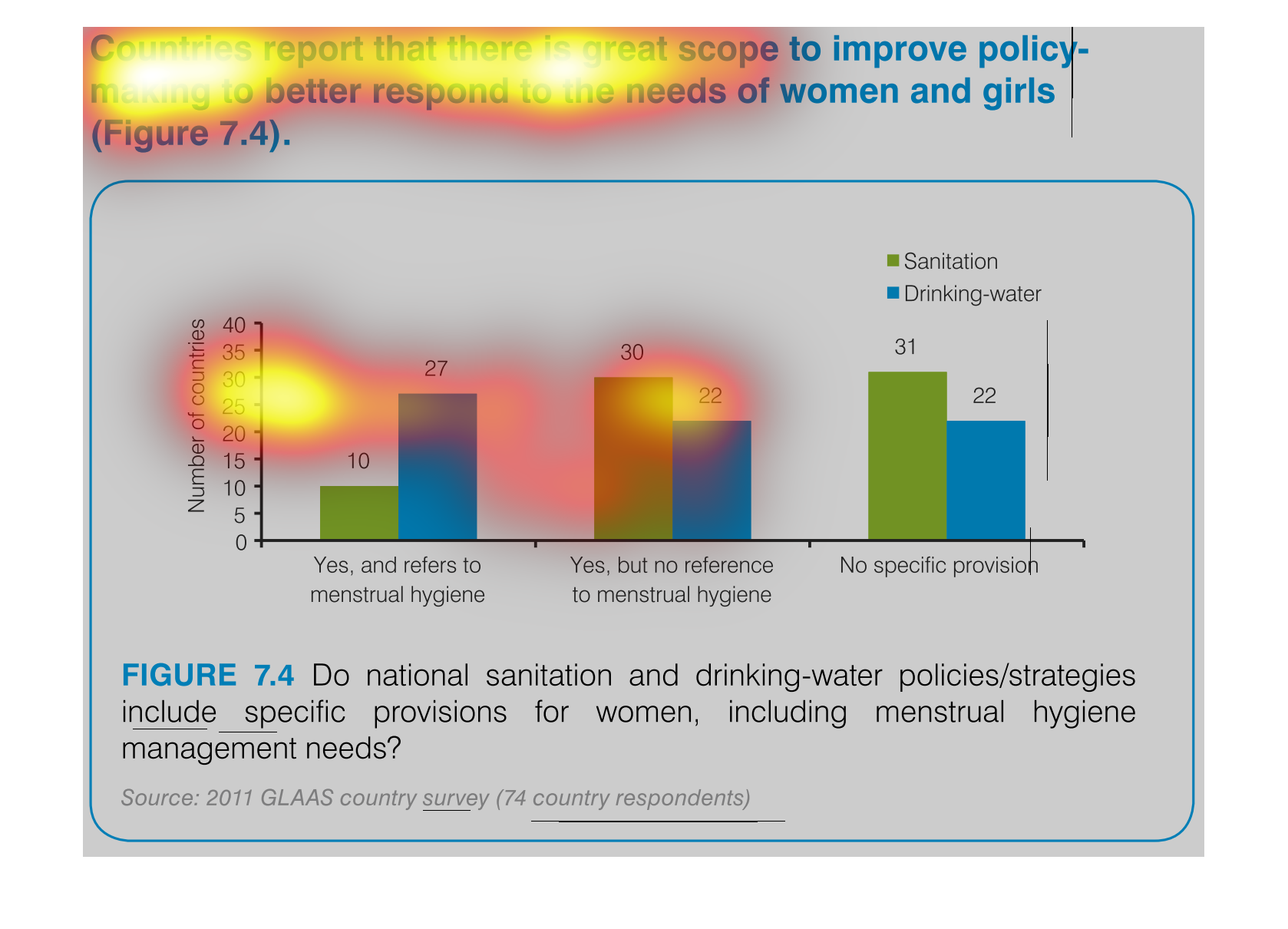
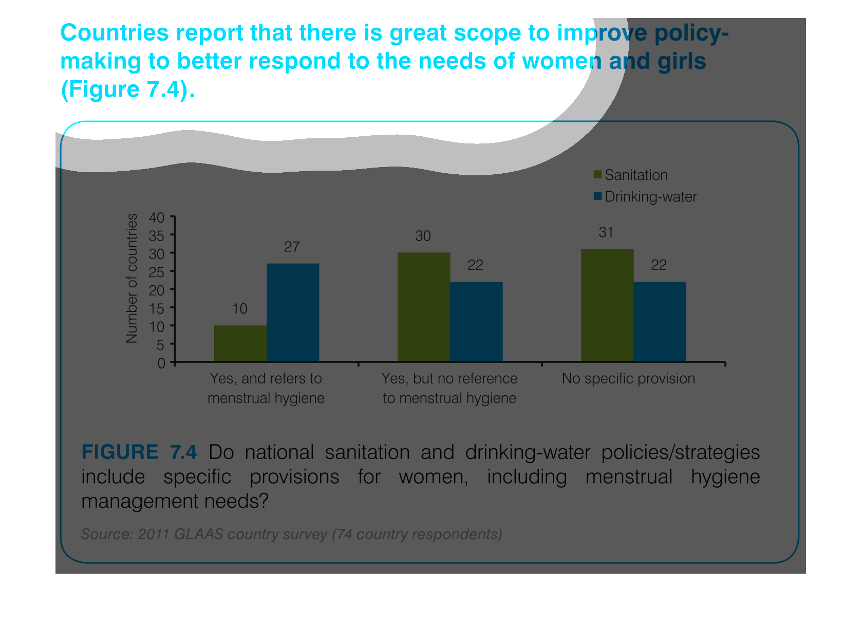
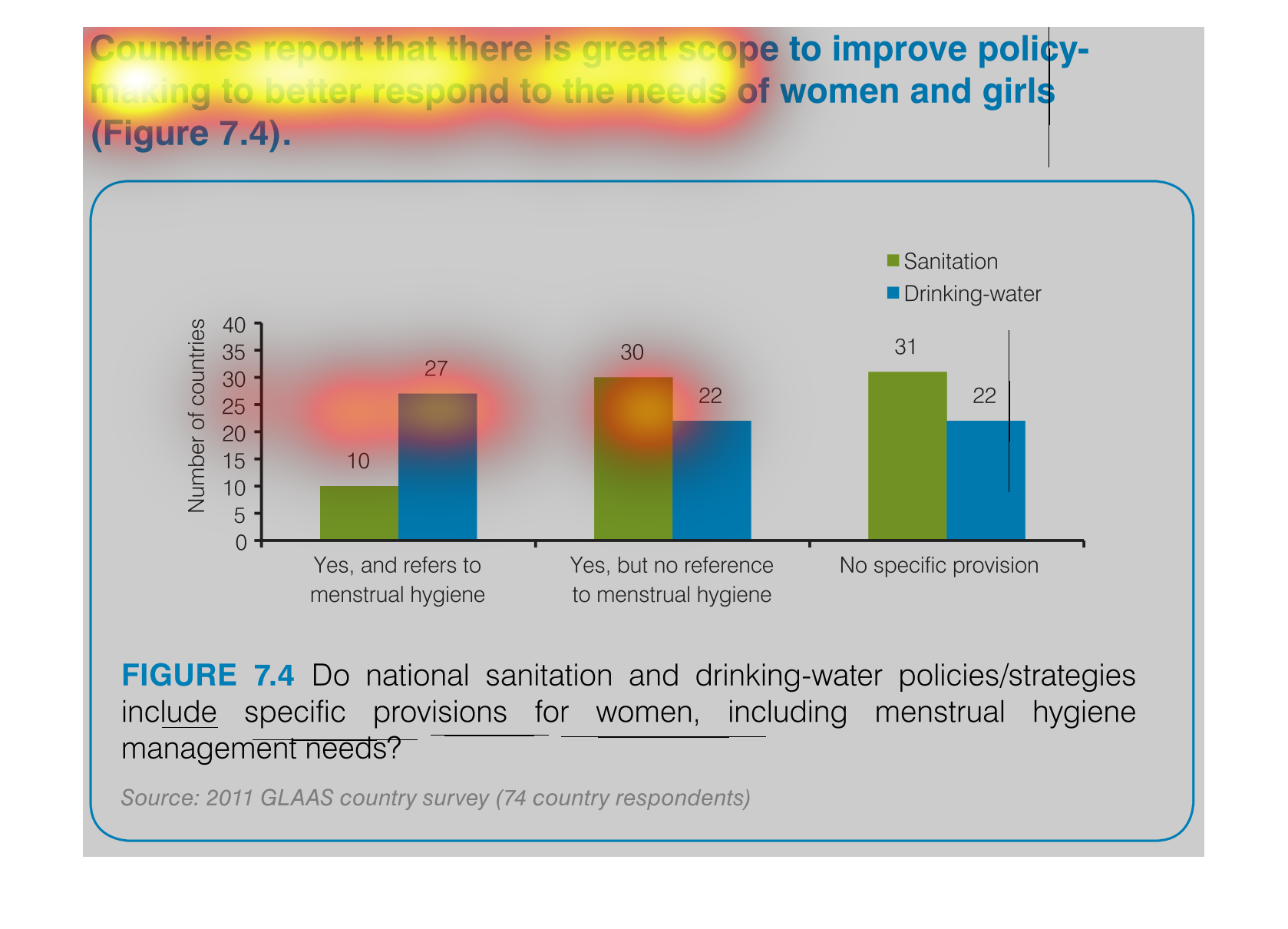
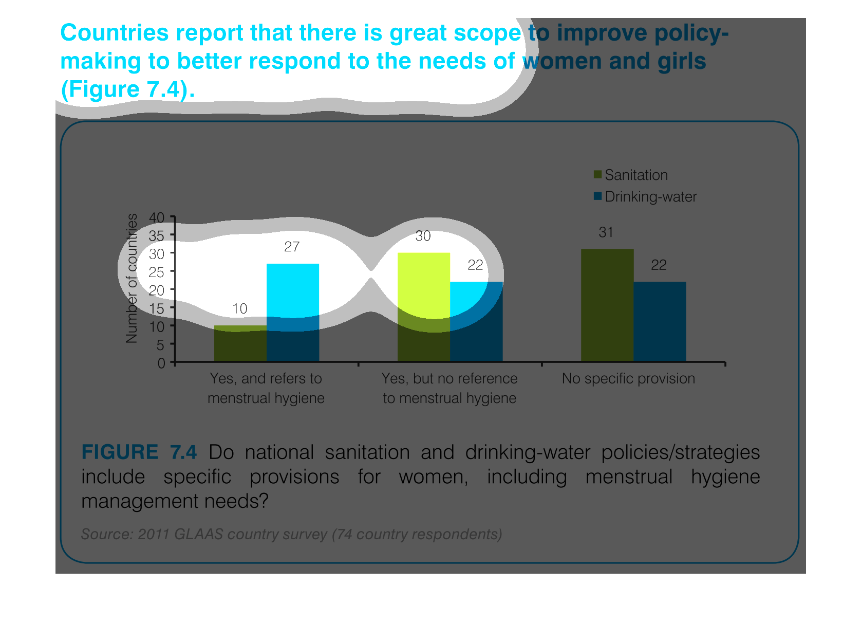
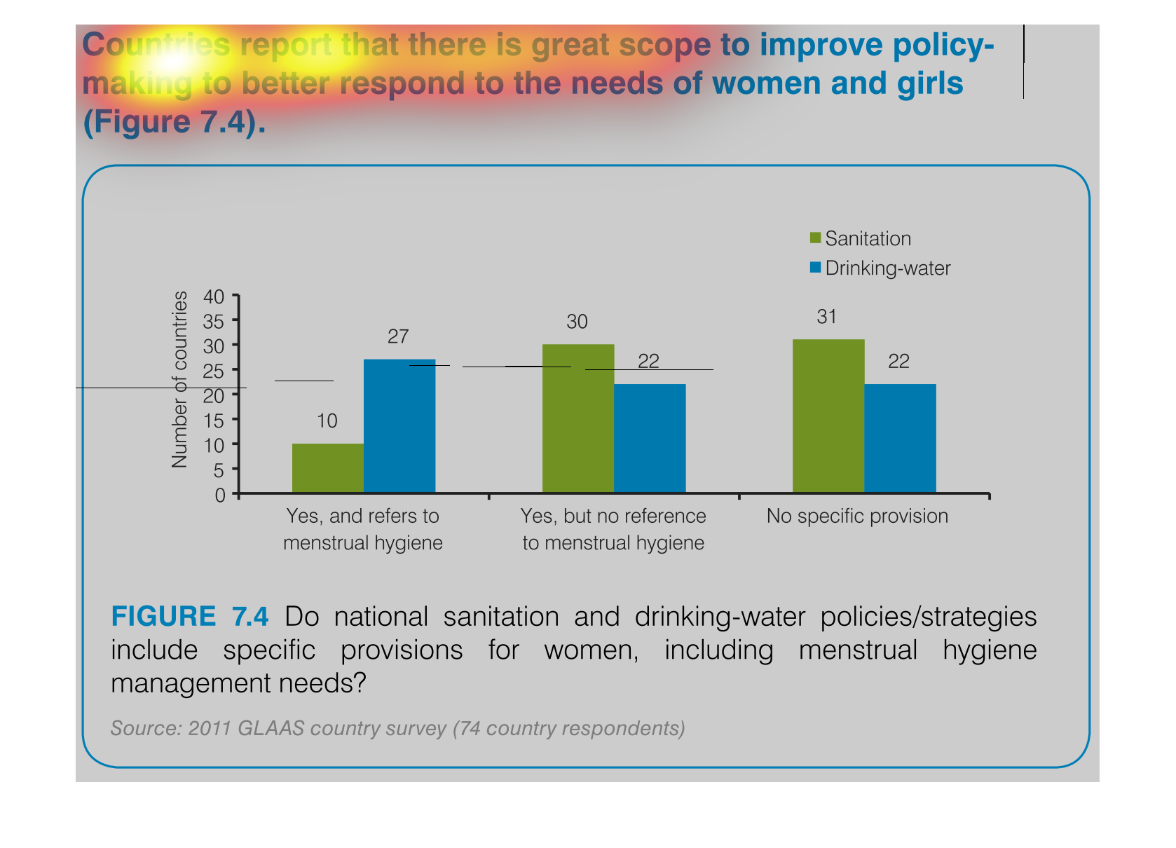
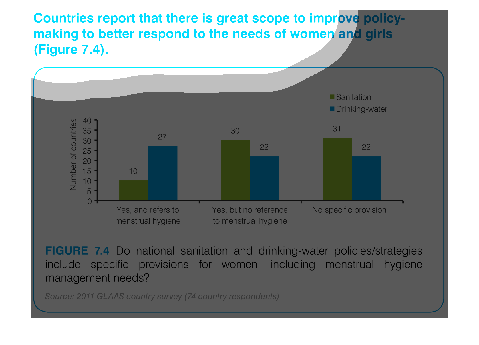
This chart describes countries report that there is great scope to improve policy making to
better respond to the needs of women and girls. Categories include different colors.
An infographic showing that countries report there is an increase in policies and attempted
policies aimed at improving the lives of girls and women.

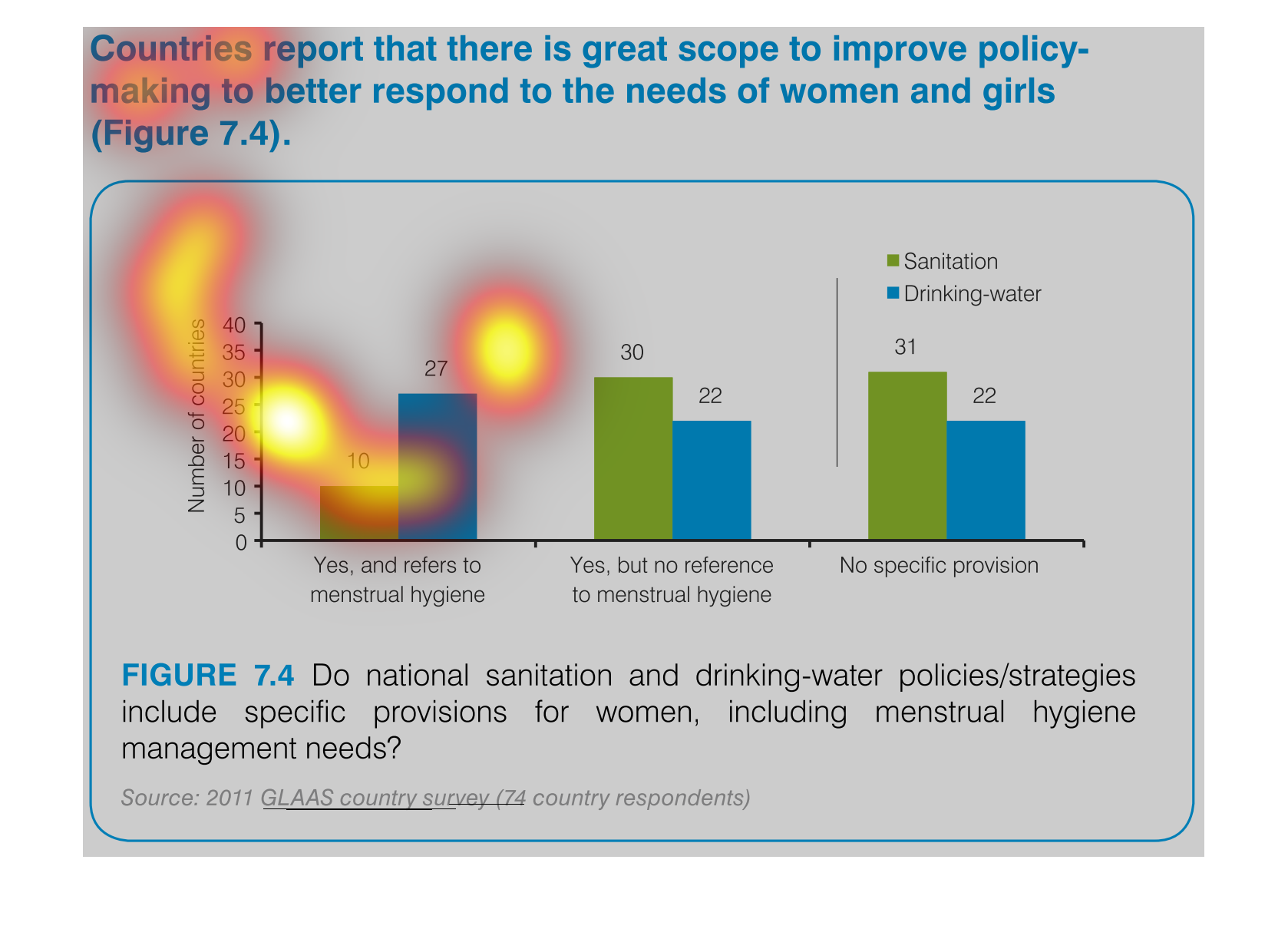
This is a bar graph this graph has no name right now and the colors of this bar graph is blue
and green. There are three bar graphs and it's about how many countries sanatorium their hands
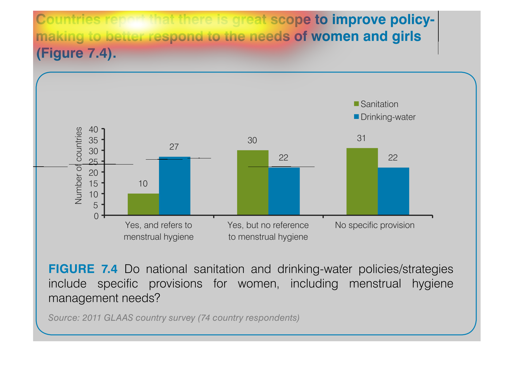
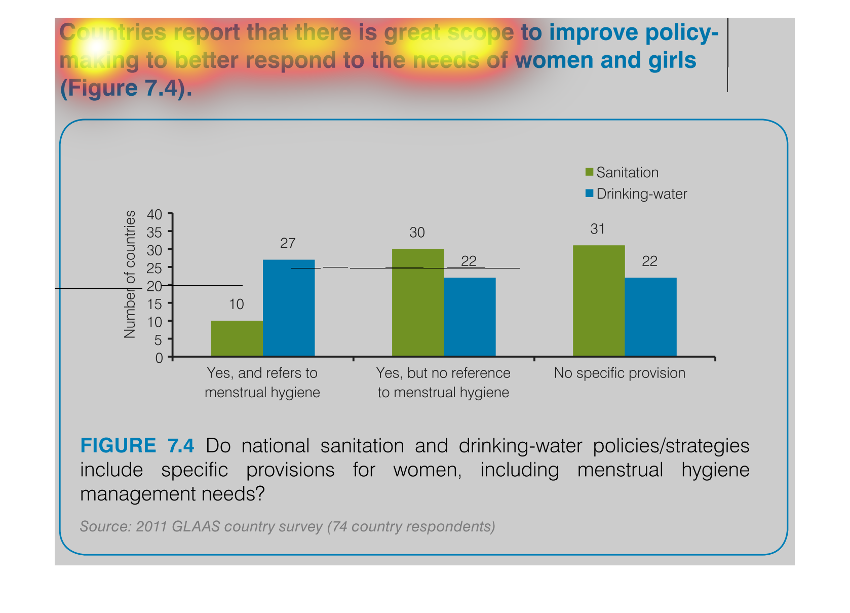
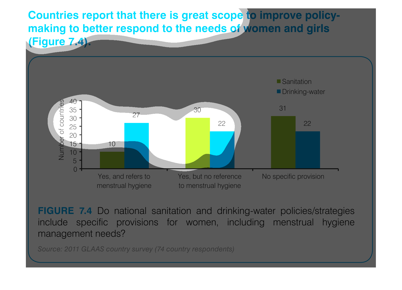
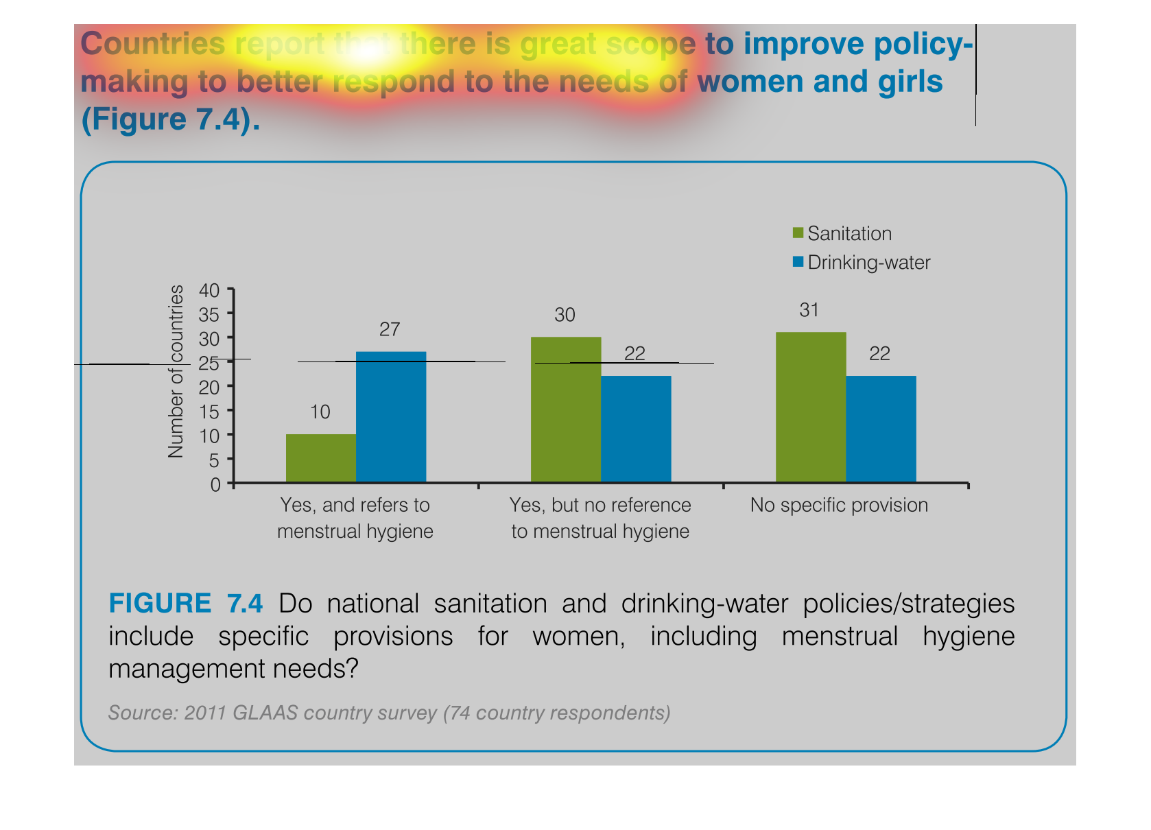
This is a set of bar charts for countries that report if there is a great scope to improve
policy making to better respond to the need of women and girls. The data is sorted by if it
is relevant to menstrual hygiene or not.
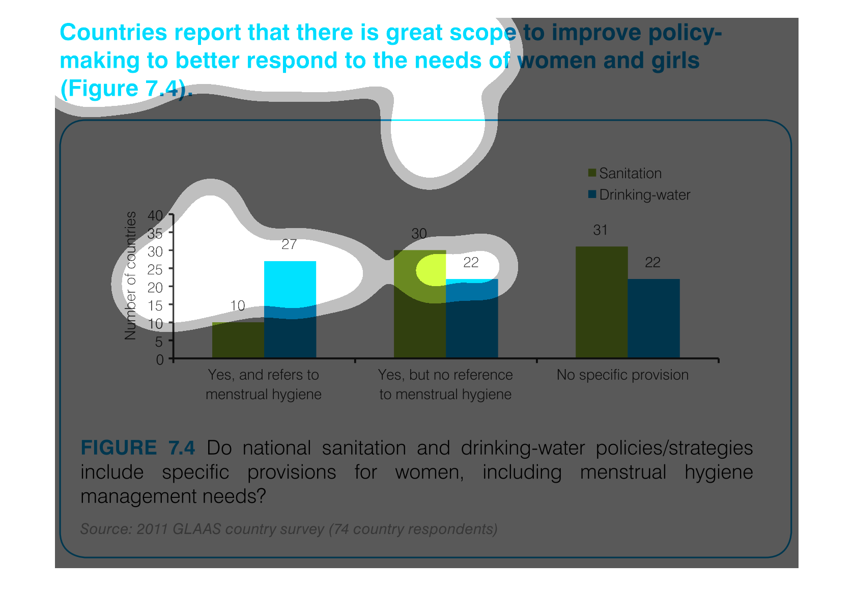
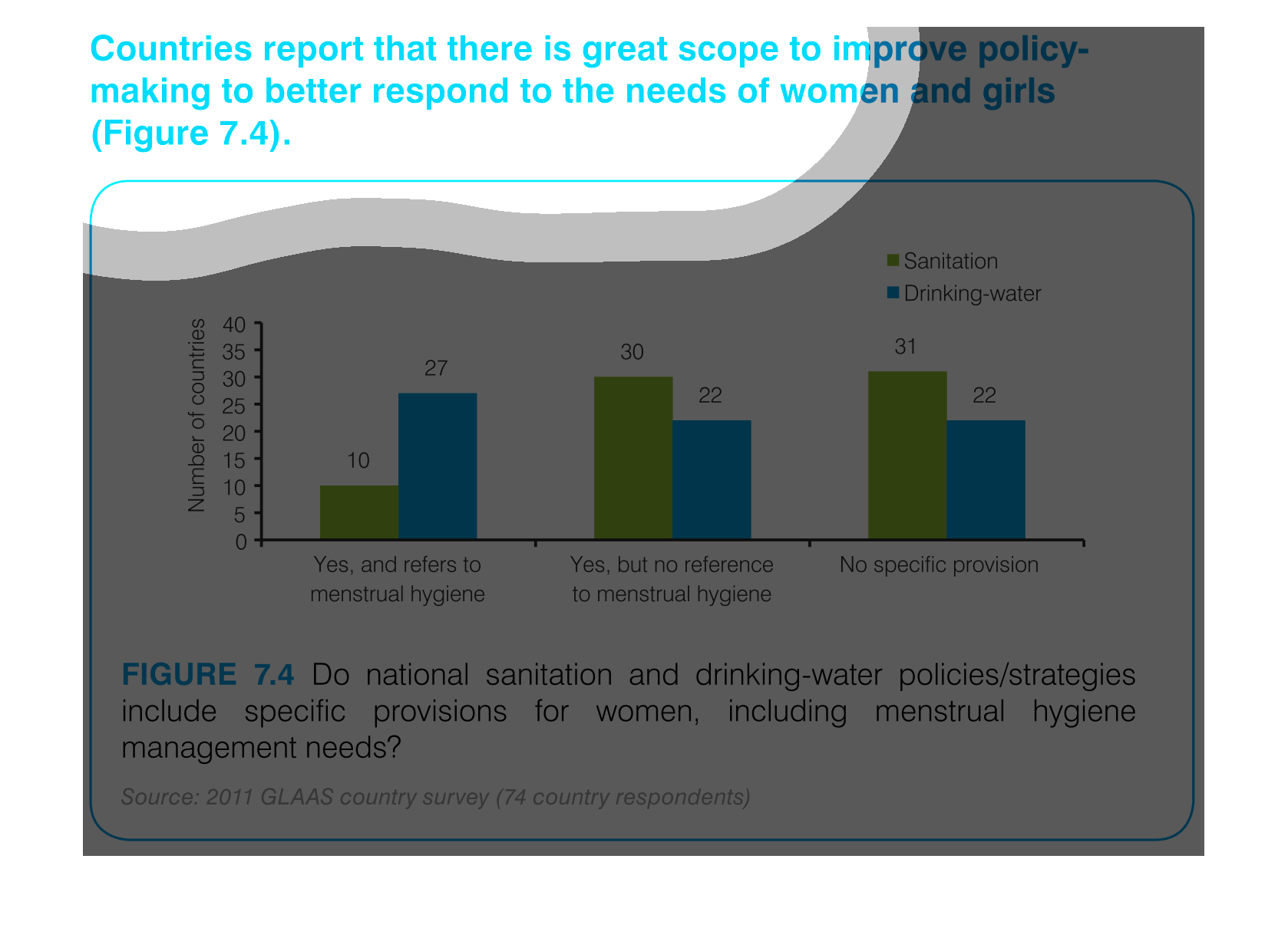
This is a graph that is meant to illustrate that countries report that there is great scope
to improve policy making so as to better respond to the needs of women and girls.
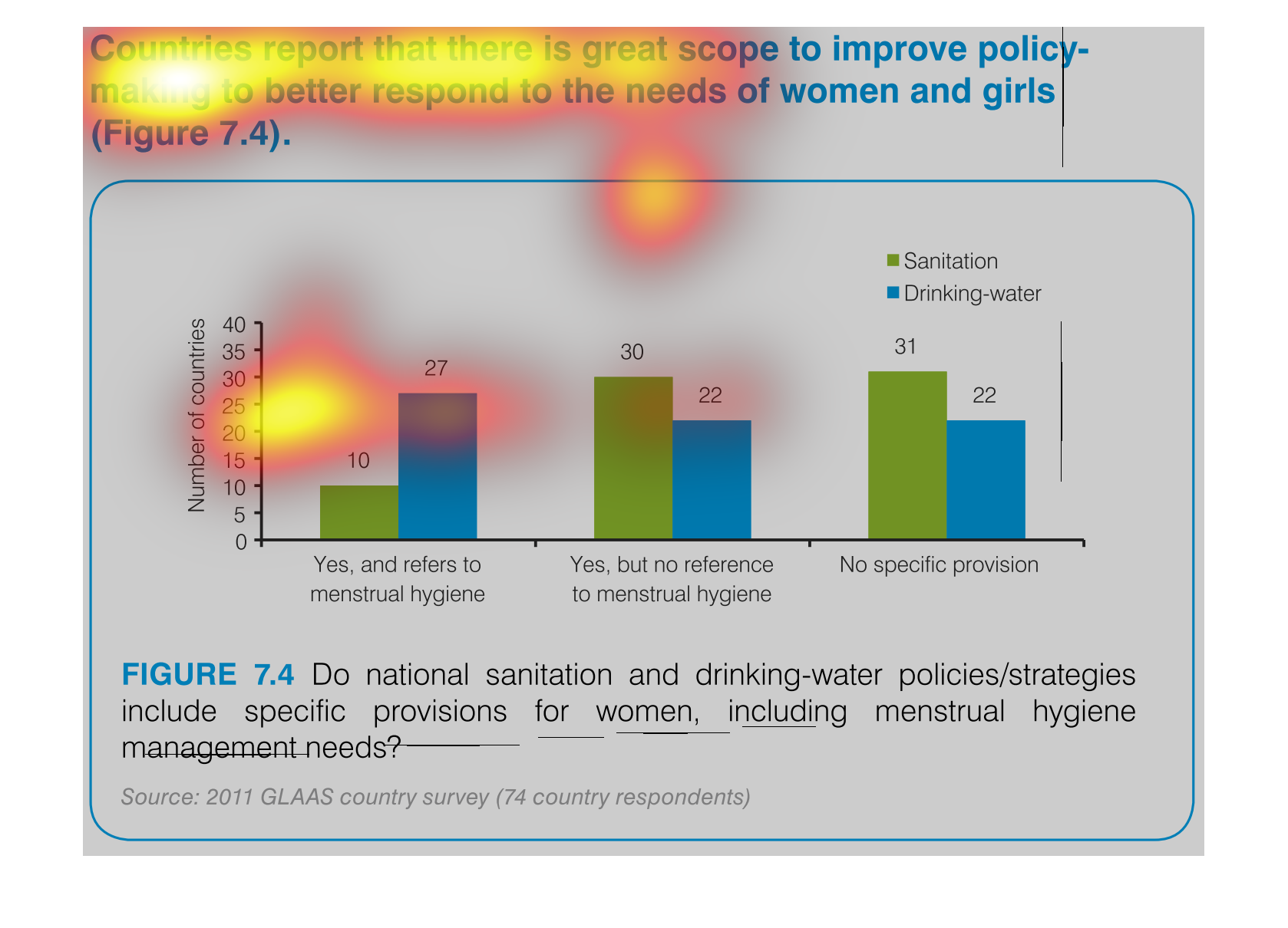
It is a graph between countries and their ratings on dealing with needs of women and young
girls. The graphs deal with the surveying of issues, mostly noting about menstrual and hygiene.
In this graph we see the efforts to improve women's rights within a small section of the populace.
This firmly illustrates the need for change and hopefully they implement more of these measures
in the future.
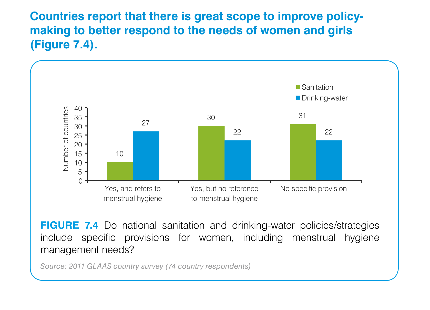
The figure presented is titled Countries report that there is great scope to improve policy-making
to better respond to the needs of  women and girls.
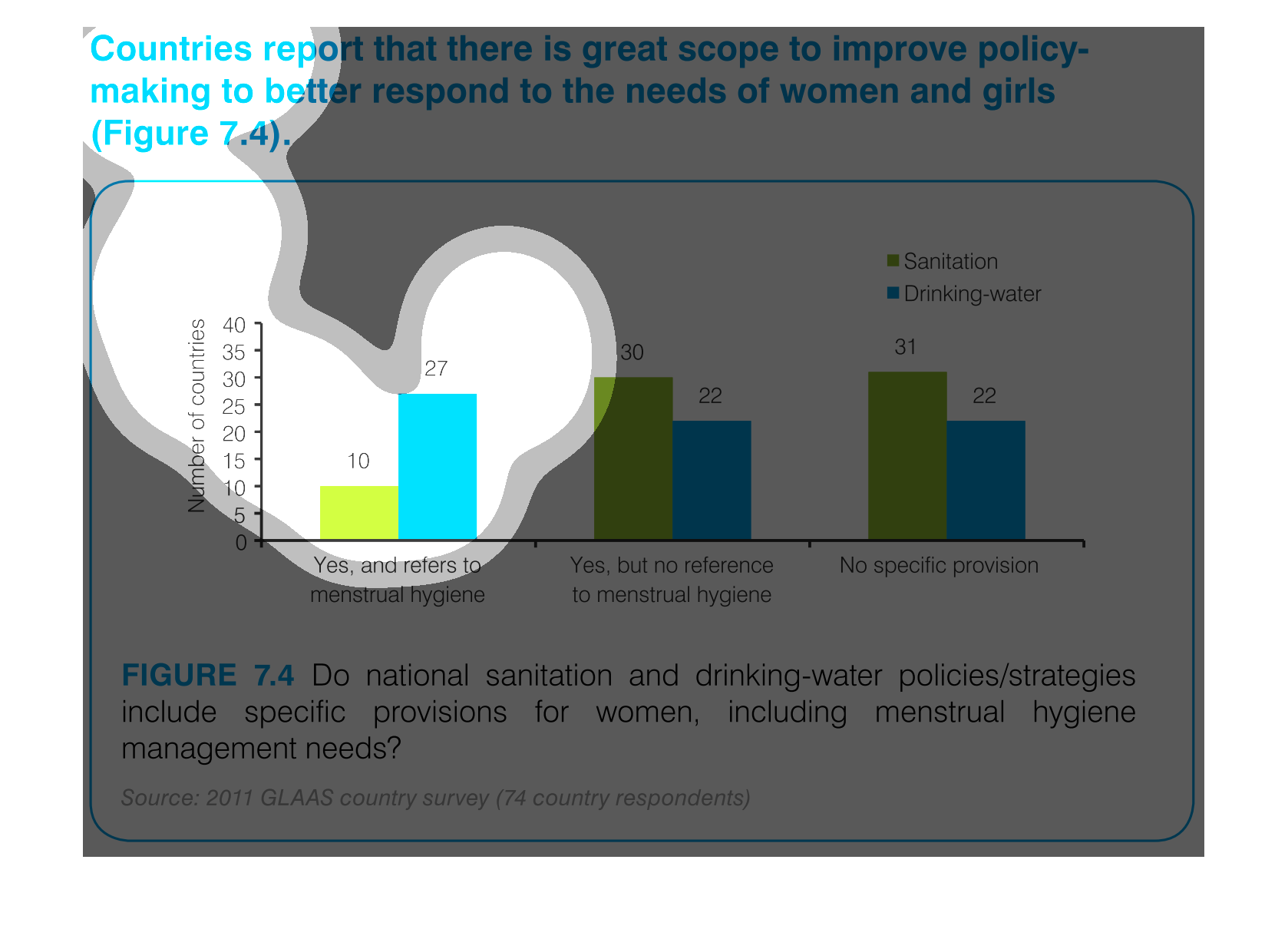
This handmade chart shows which countries have the best policies to respond to the needs of
women and girls. It seems to reference mainly hygiene issues
The graph contained within this images seems to detail various countries and that rising demand
to improve policy making in response for the needs of women and girls.
This chart describes countries report that there is great scope to improve policy-making to
better respond to the needs of women and girls. Different categories om the chart are represented
by different colors.