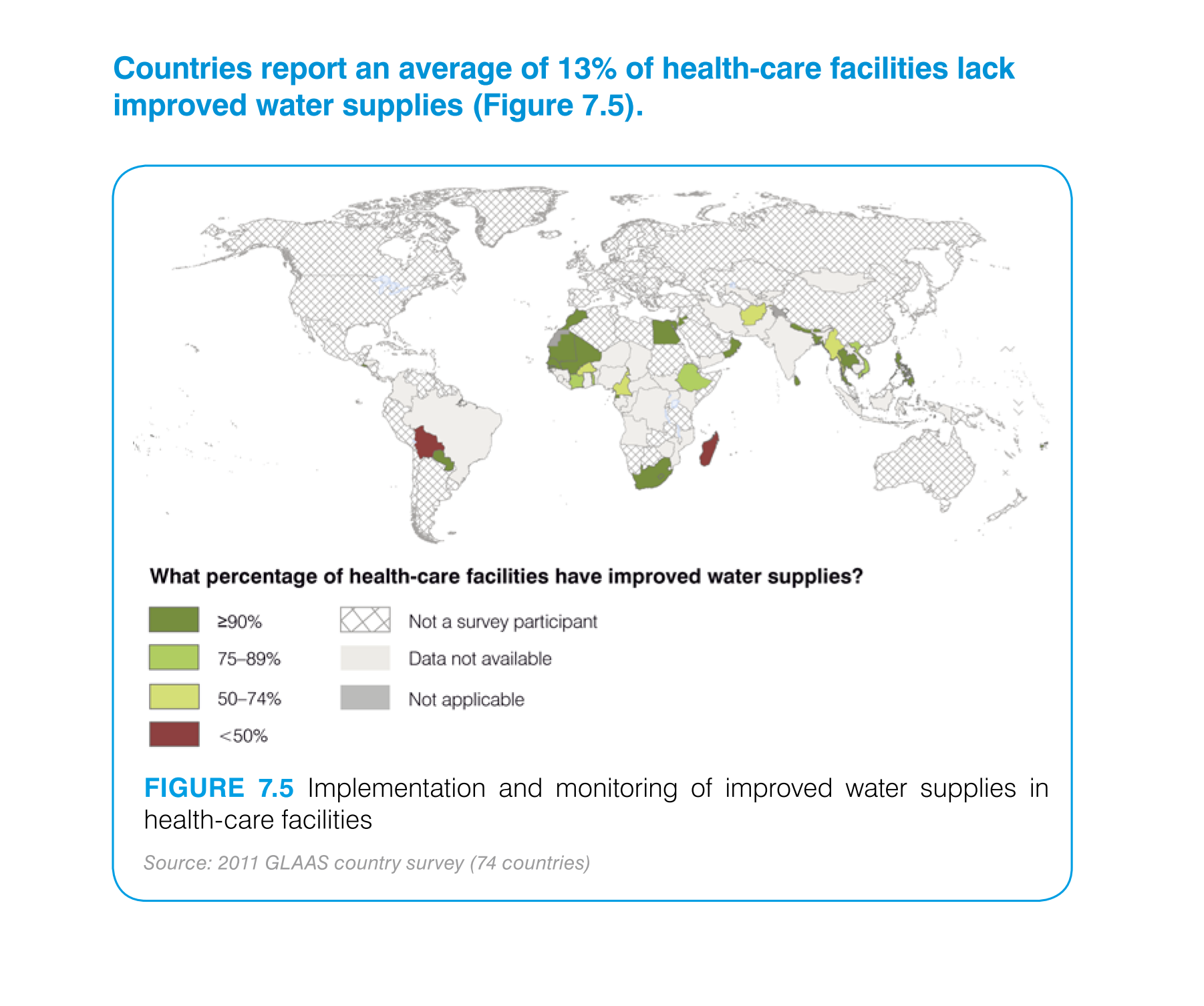
This is a regional color map showing how the medical industrial areas are tending to there
water supplies and how they are making sure that every area is getting the proper treated
water to help aid in the industry.
The chart shows the map of the world with different colored countries. The color of the country
indicates the percentage of individual countries possess improved water supplies.
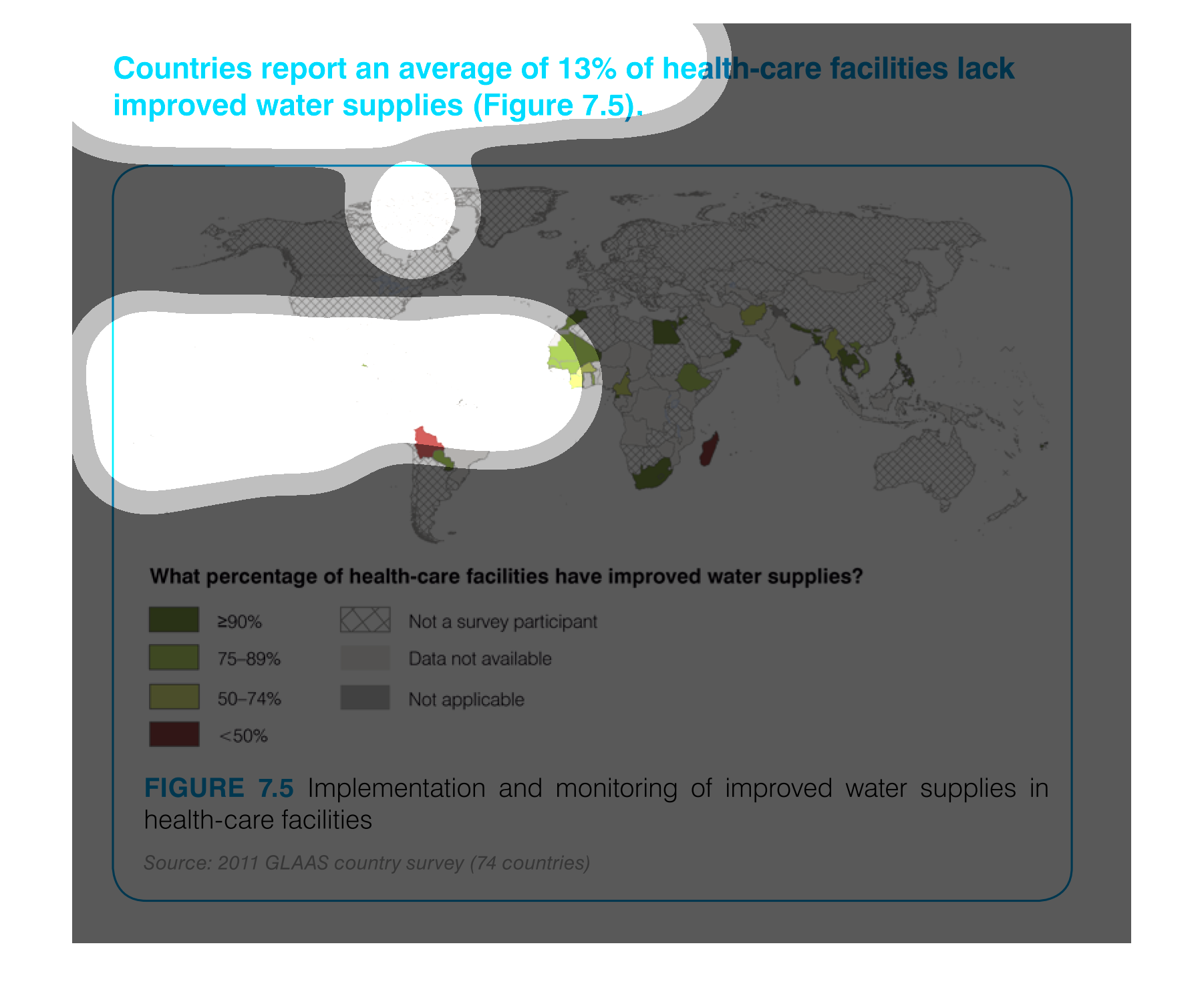
This chart describes that countries report an average of thirteen percent of health-care facilities
lack improved water supplies. Different categories are represented by different colors.
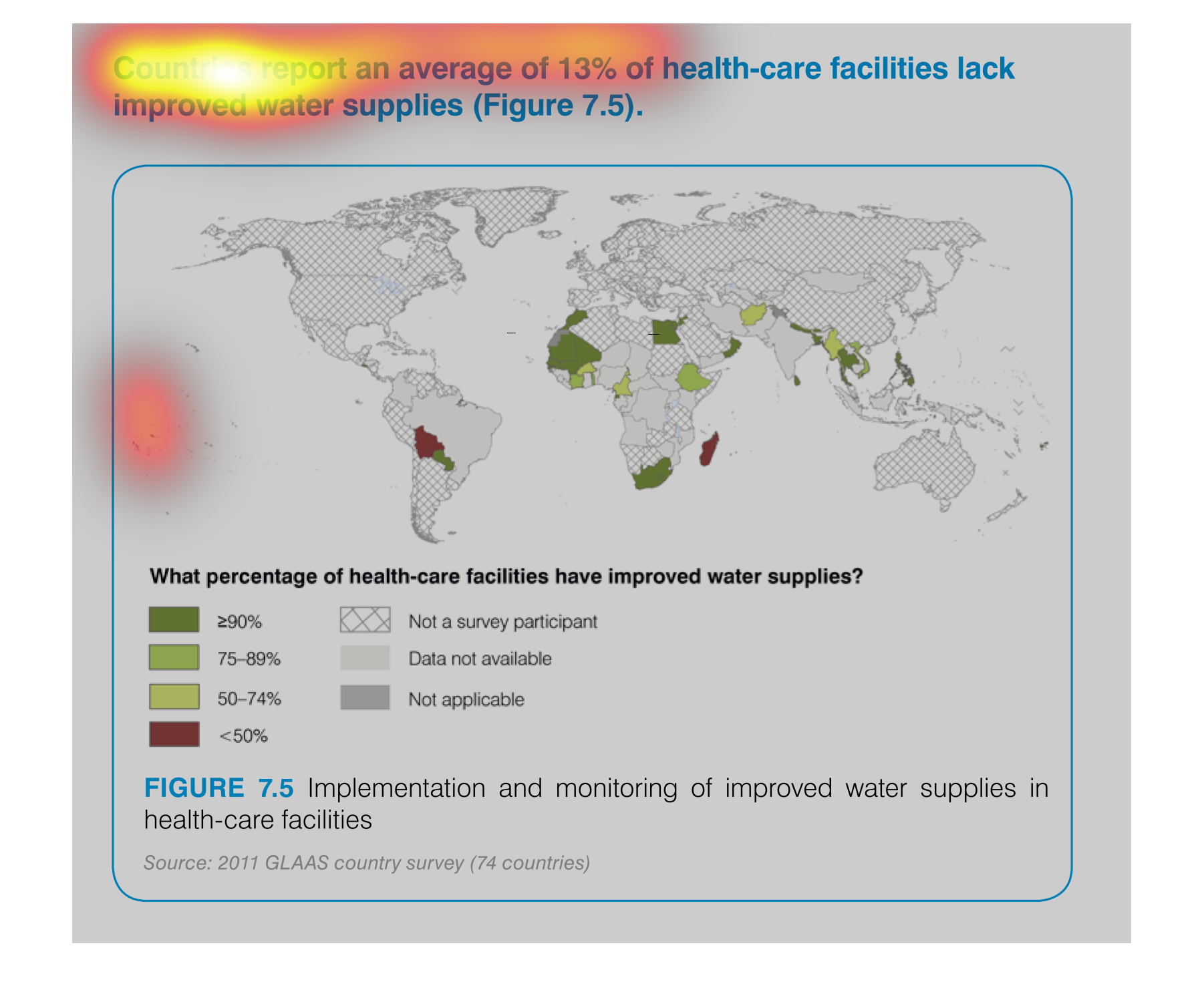
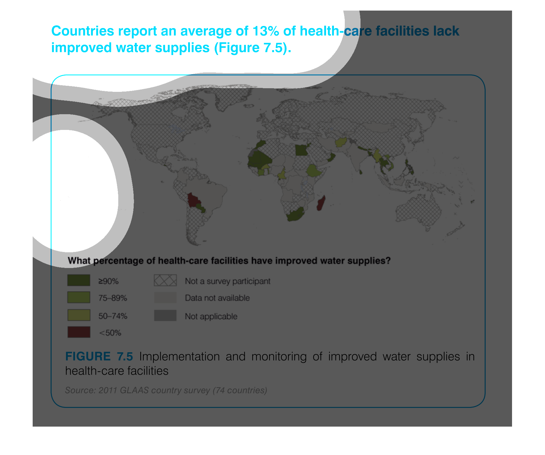
THIS MAP SHOWS THE PERCENTAGE OF HEALTH CARE FACILITIES WITHIN EACH COUNTRY WITH IMPROVED
WATER SUPPLIES. OF THOSE COUNTRIES PARTICIPATING, GREEN SHOWS THAT MOST HAVE IMPROVED SUPPLIES
WHILE RED IS LESS THAN 50%.
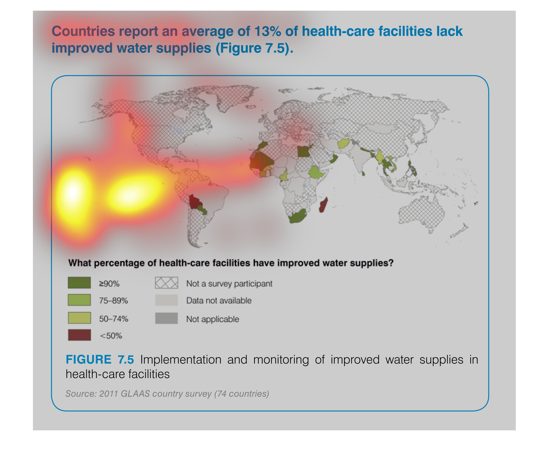
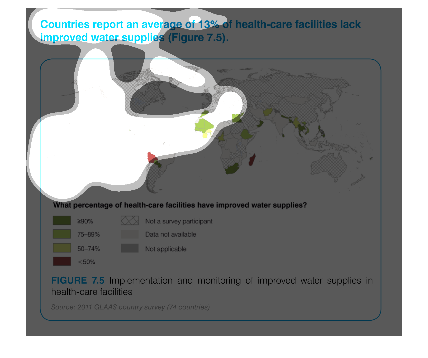
The maps is showing what countries have health care facilities with improved water supply.
the list ranges from improved water supply to 90% to below 50%.
This graph in the form of a map is used to identify which healthcare facilities, in certain
regions of the world, have improved water supplies. This map shows a region in Africa improved
the most.
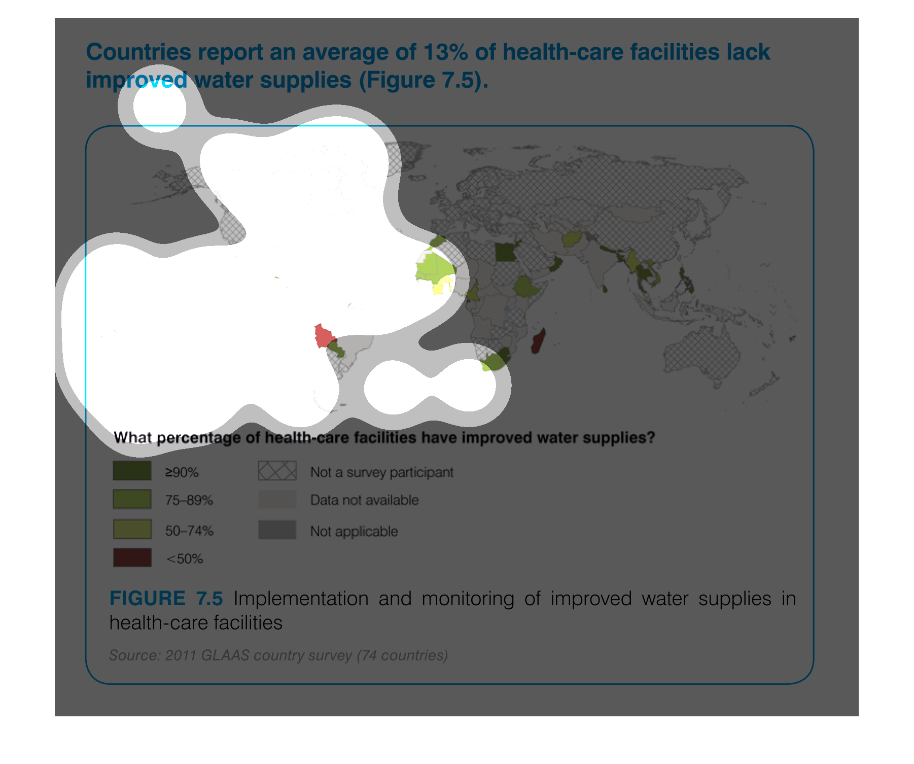
This chart describes that countries report an average of 13% of health care facilities lack
improved water supplies. Different categories are represented by different colors.
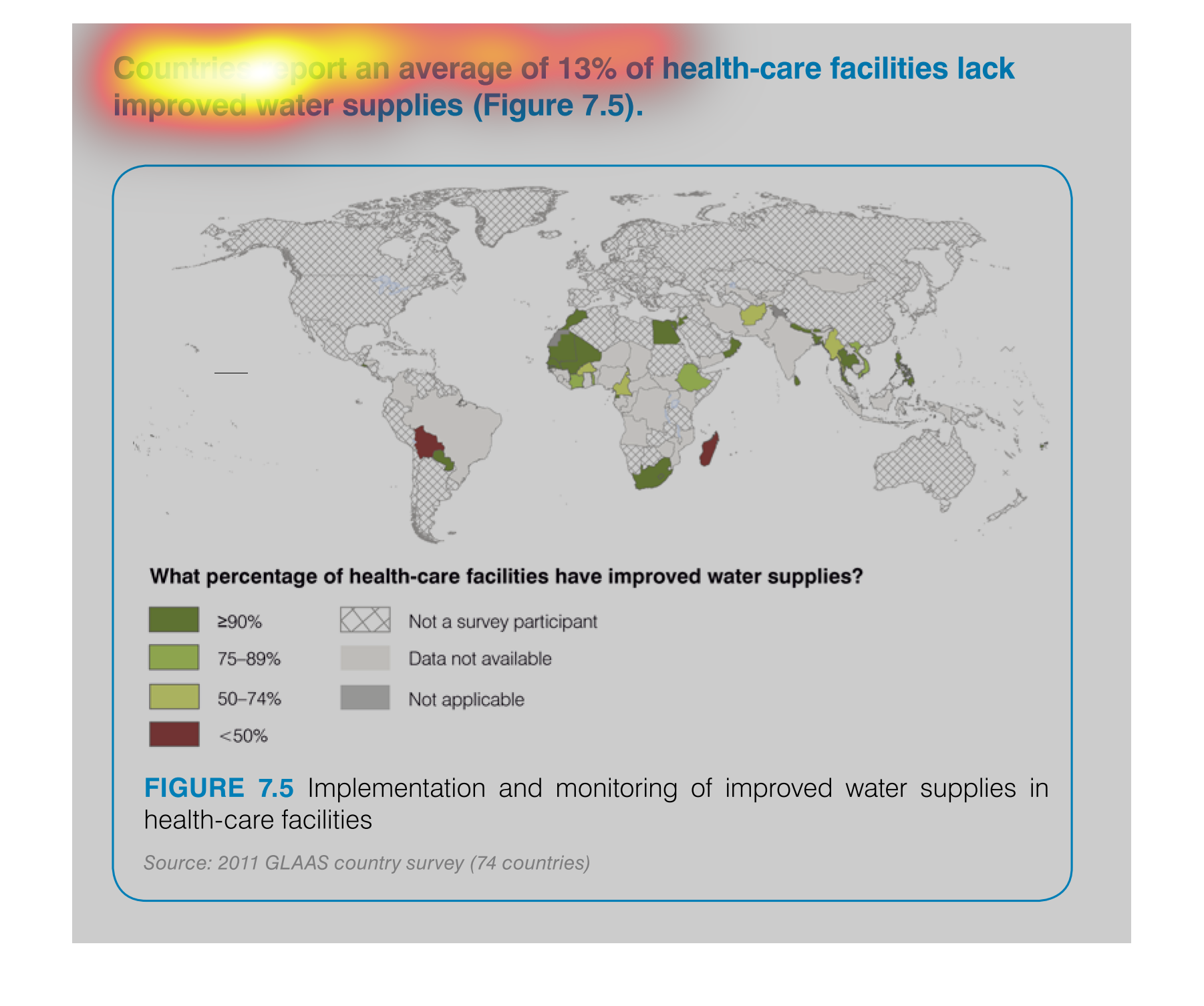
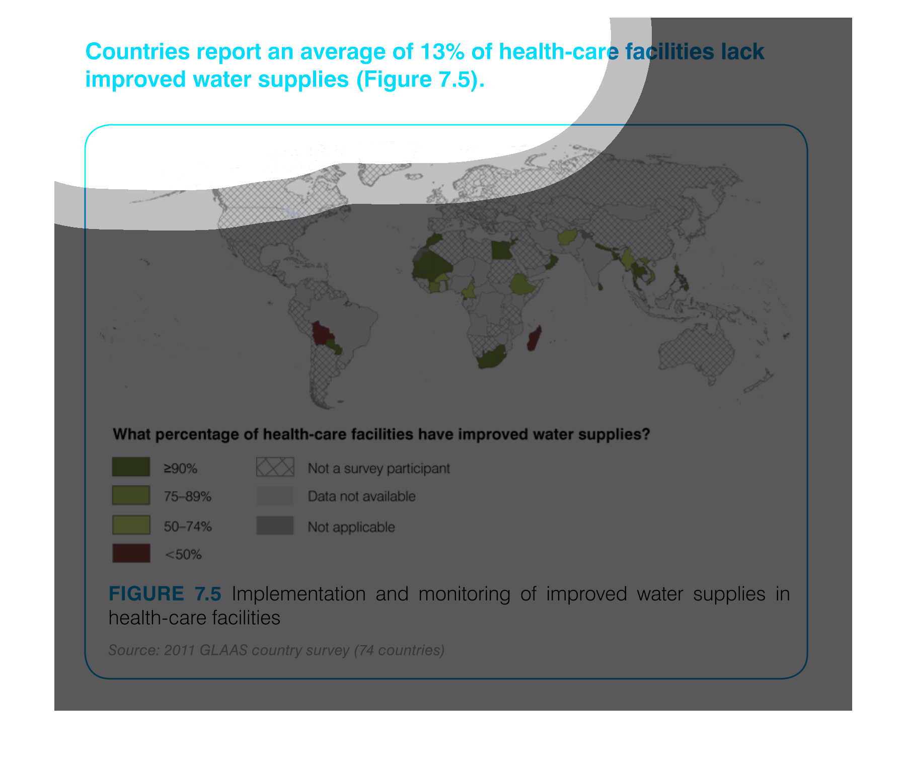
Countries report an average of 13% of health-care facilities lack improved water supplies.
The map shows a graphic with different colors that represent the various percentages of improved
water supplies that hospitals have around the world.
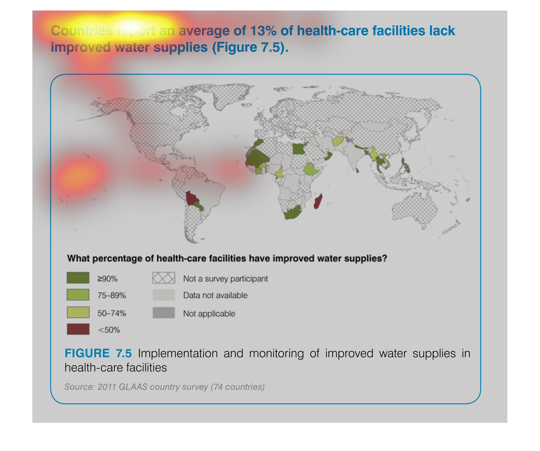
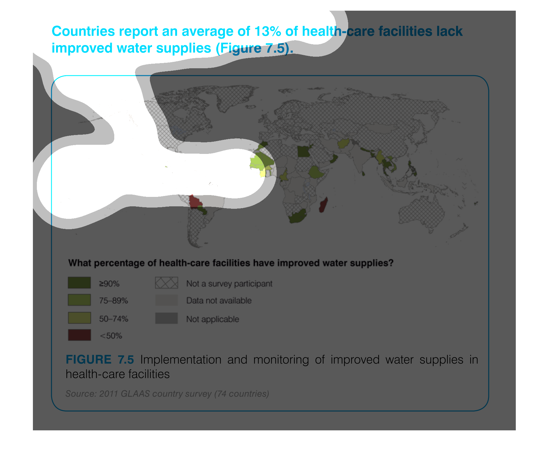
The figure presented is titled Countries report an average of 13% of health-care facilities
lack improved water supplies.  The figure is a map of the world.
This graph shows countries with improved water supplies. Africa shows the greatest improvement
with 290% increase in water supply, with South America coming in second place.
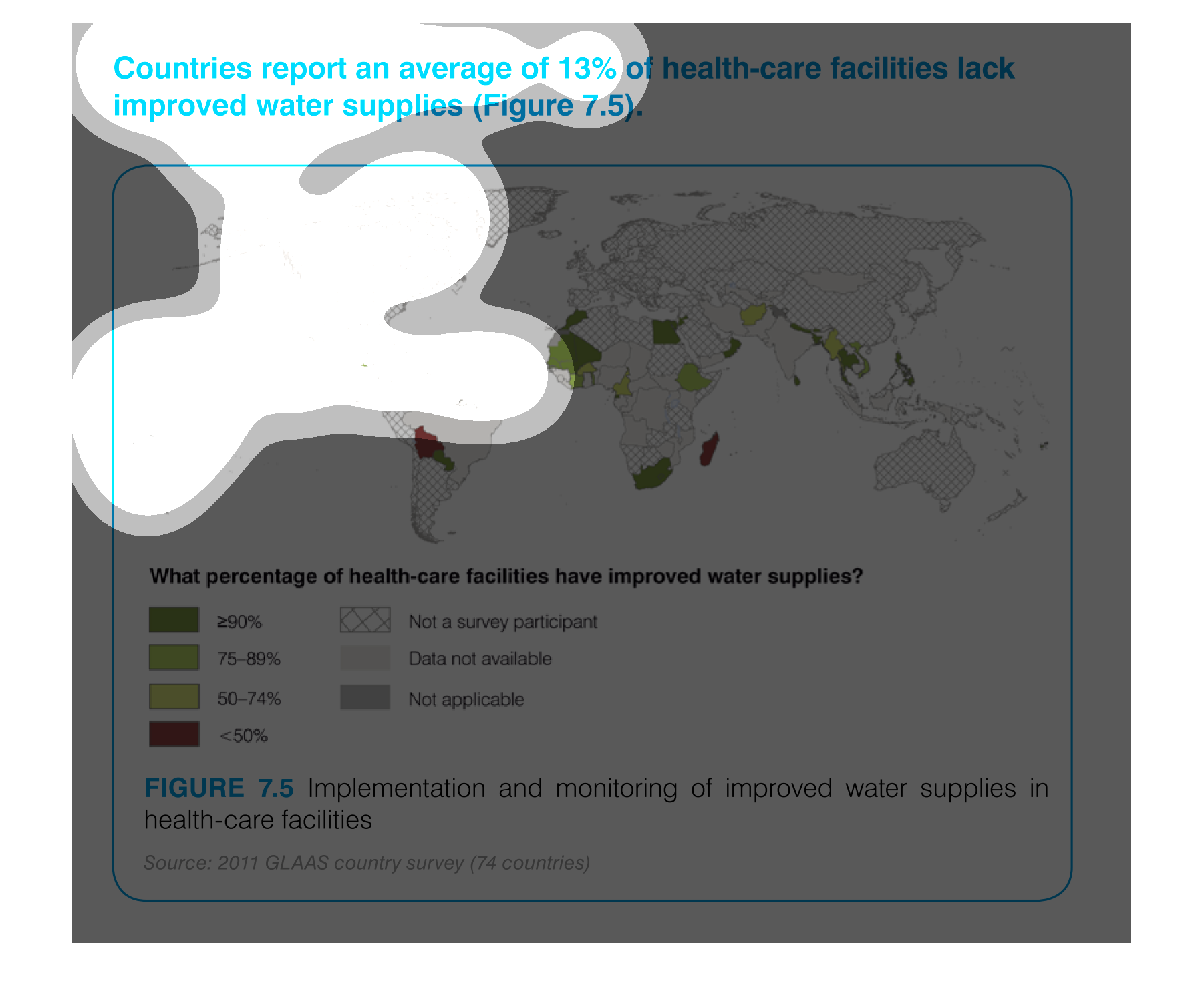
countries report an average of 13% of health care facilities lack improved water supplies
figure 7.5. a world map showing that this is not incredibly common and only really occurs
in some african and south asian countries
This chart/graph is a representation of Health care facilities that lack in water supplies.
The 90% increase in improvement is in Europe. United States was not a surveyed participant.
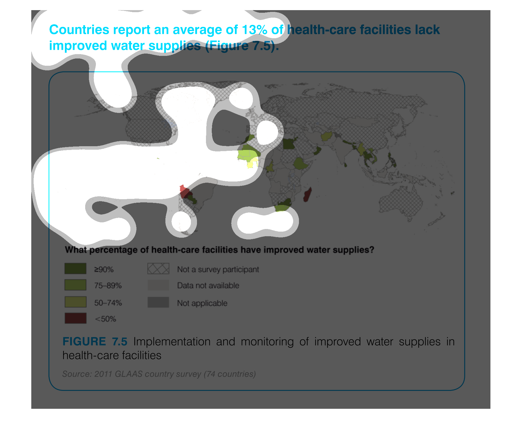
It is a highlighted map showing countries who have health facilities lacking proper water.
Based on the color chart you can see how much those particular countries lack the water improvement
in their health care facilities.

