This study is measuring the level of water supply in countries in Africa as well as the improved
quality of the water they are drinking starting in 1995 and 2010.
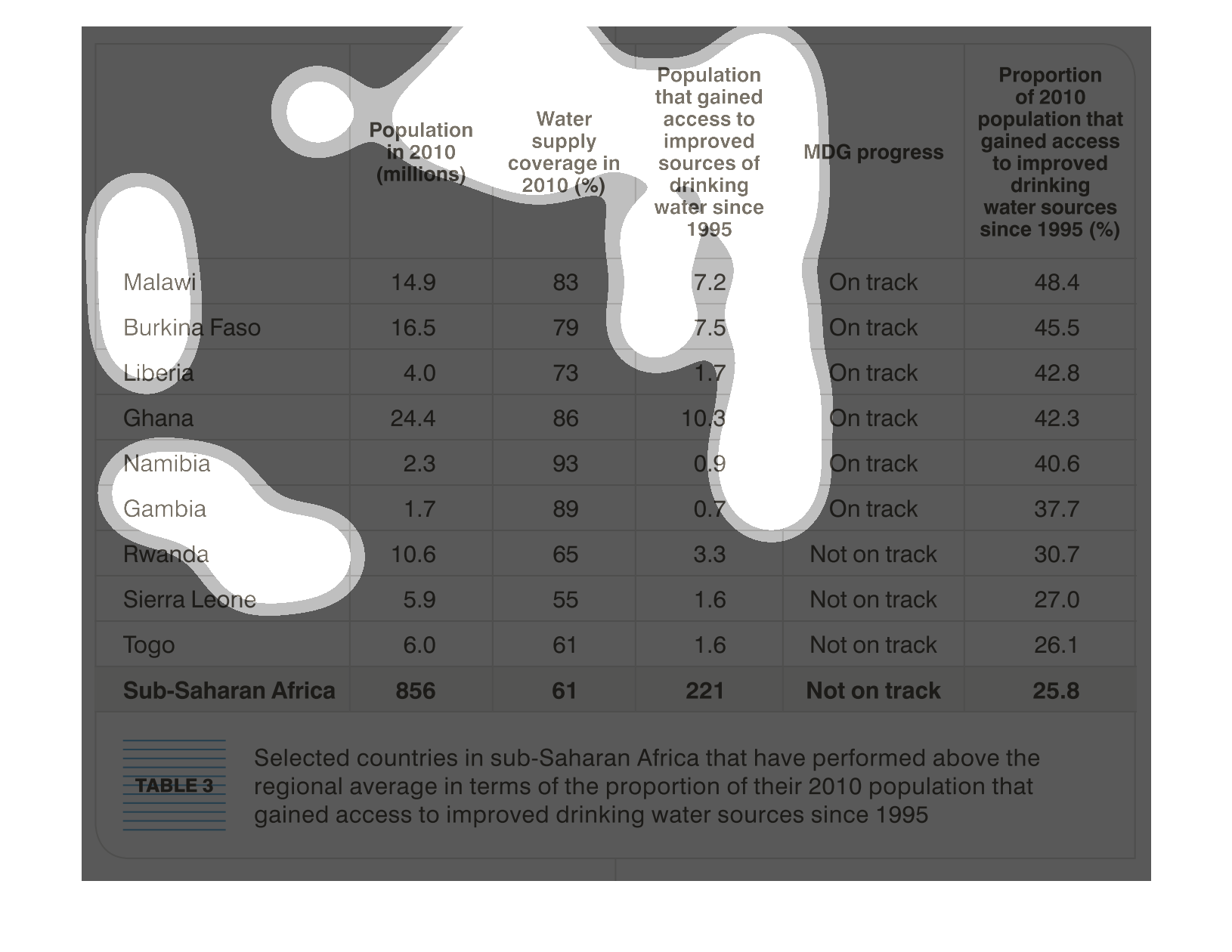
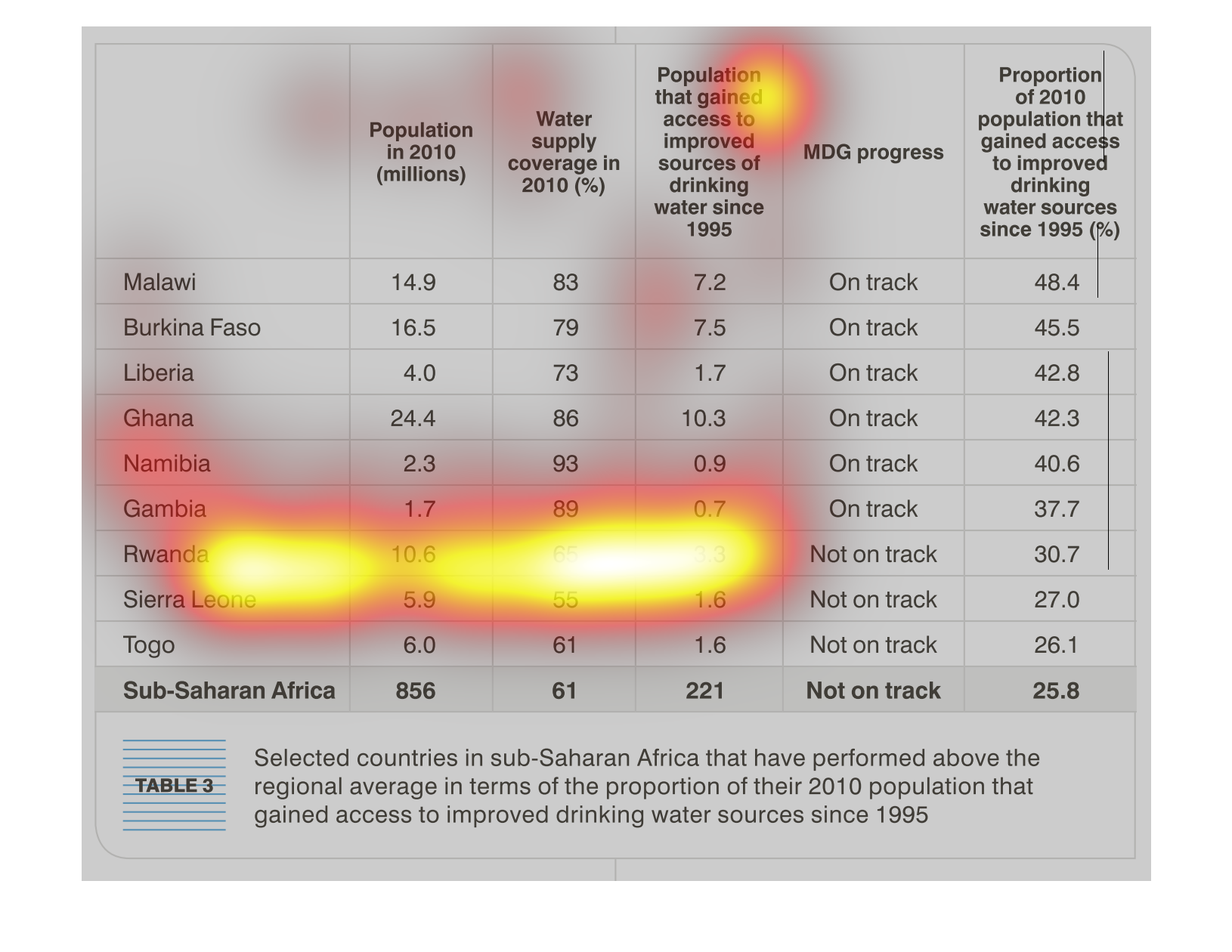
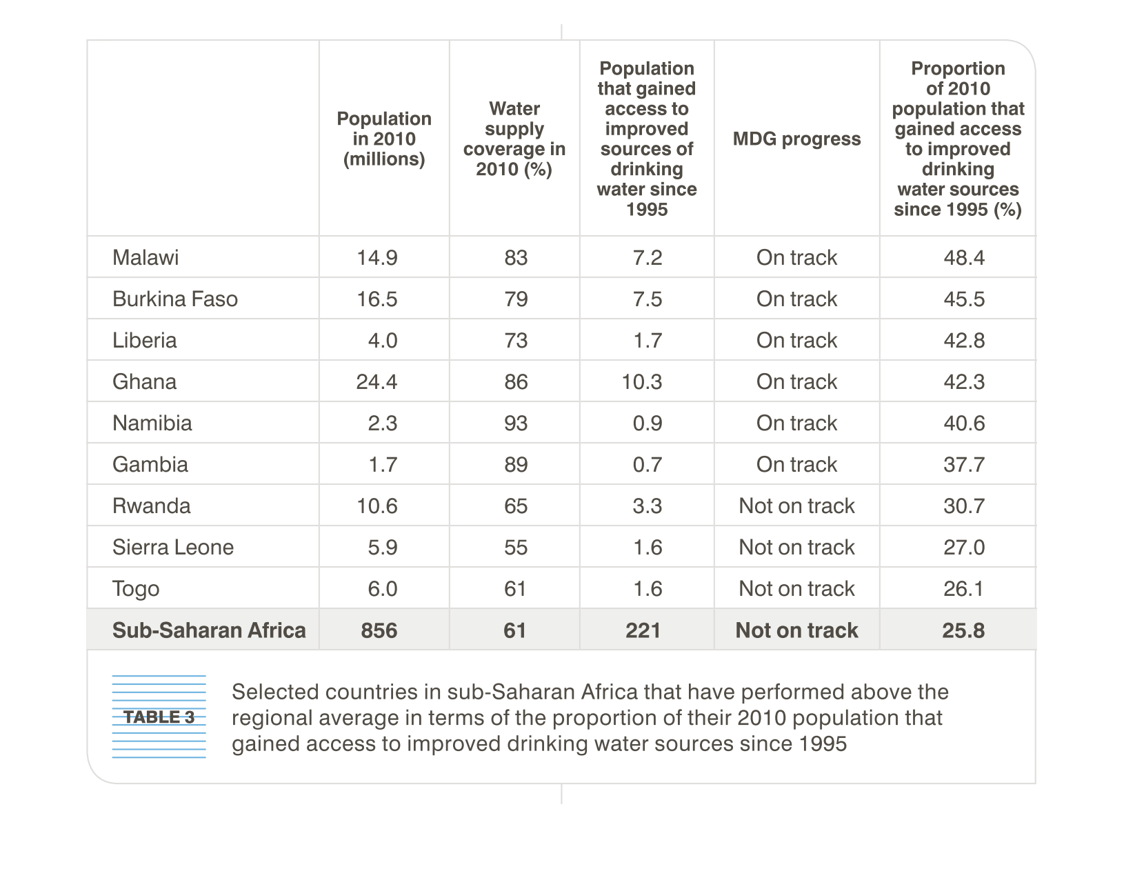
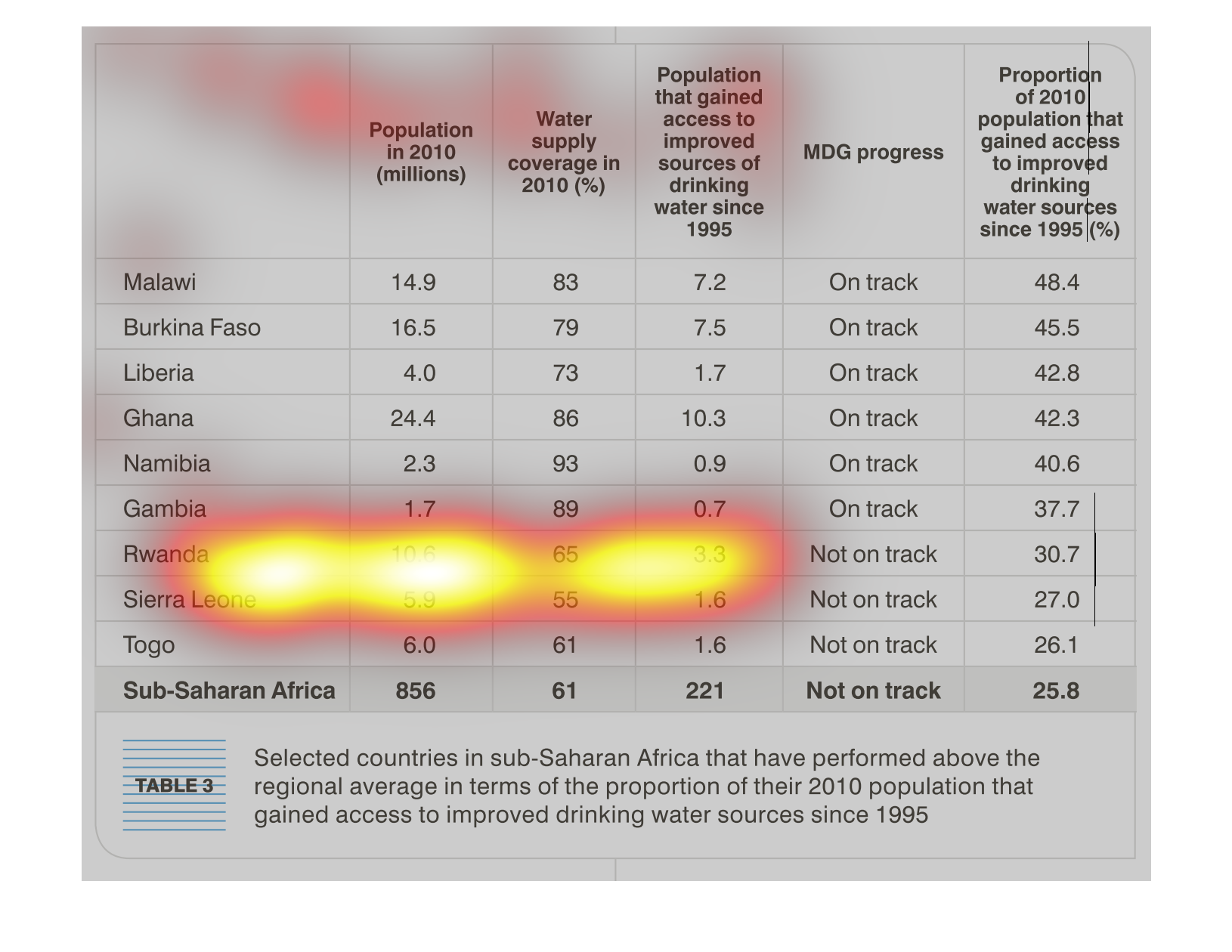
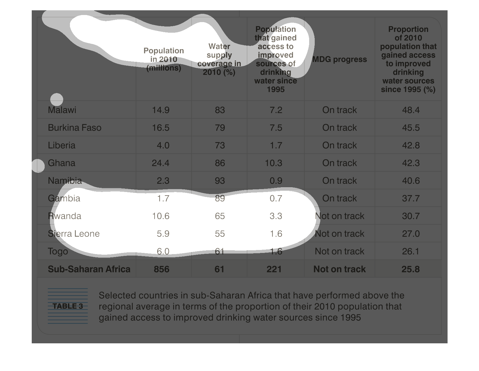
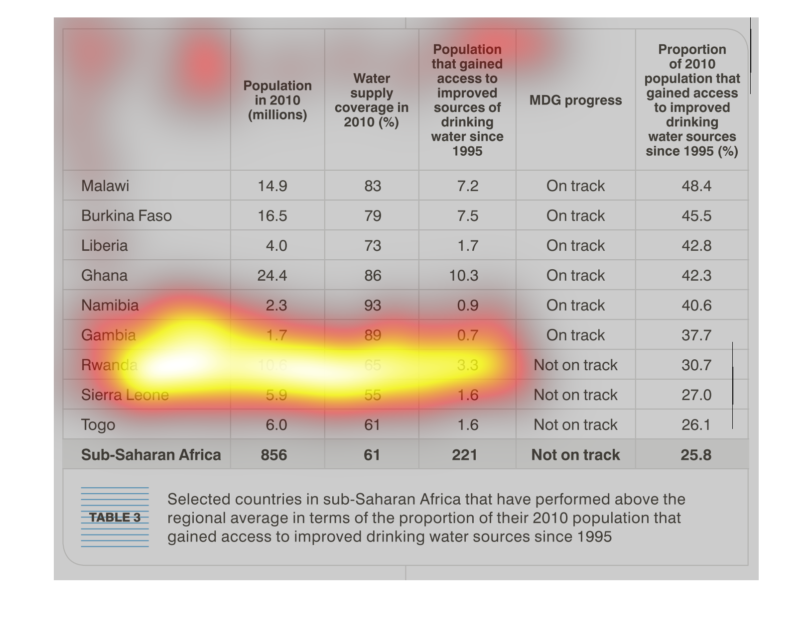
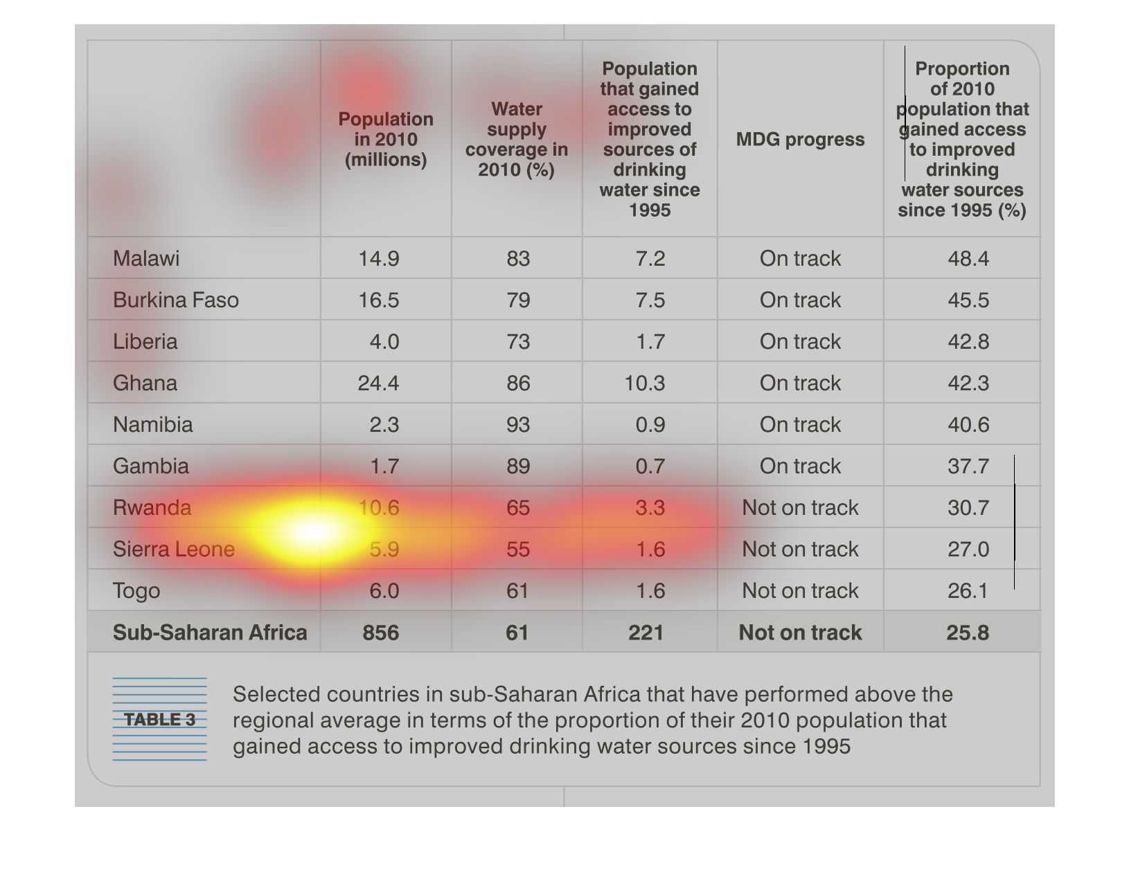
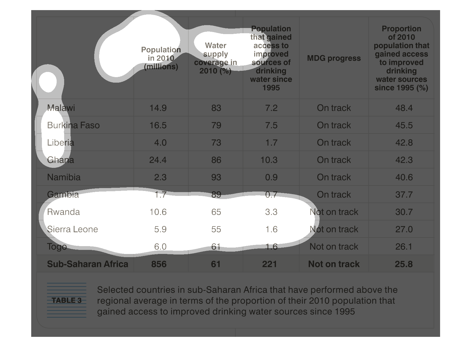
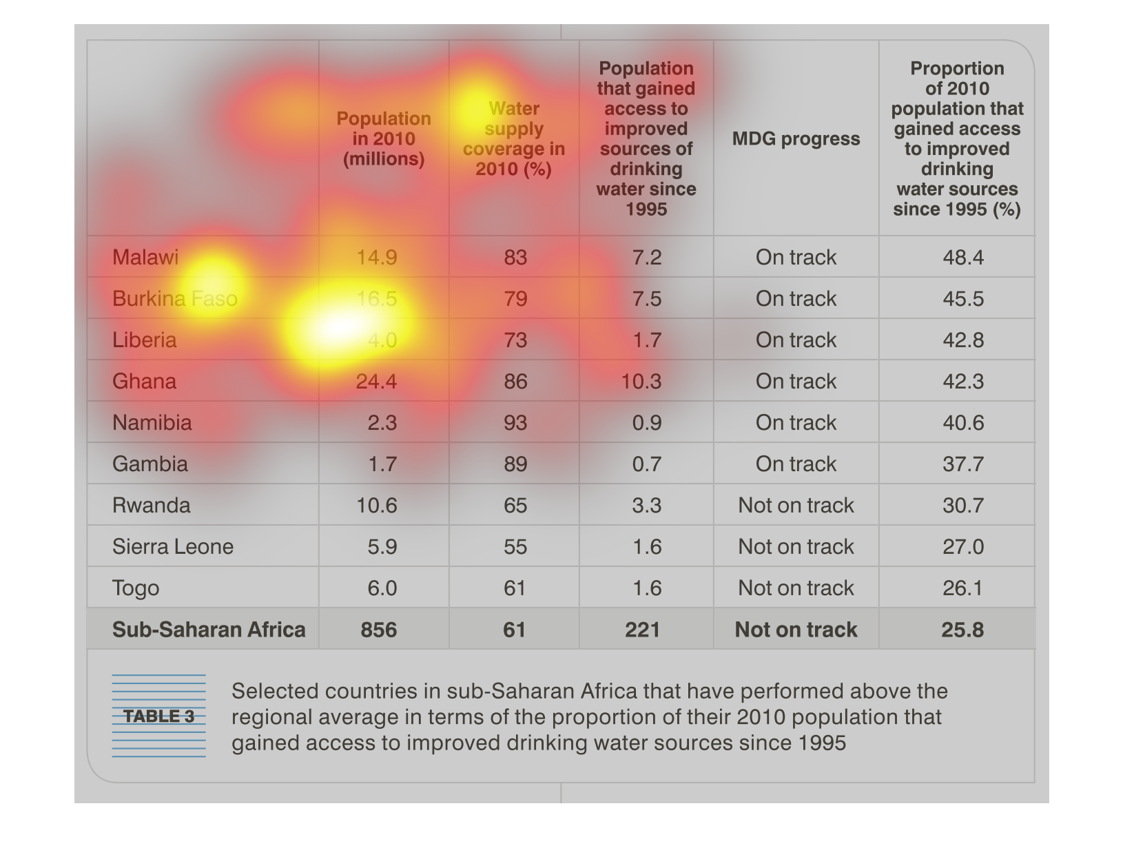
This table shows the countries in sub-Saharan Africa and the percentage of their population
that has gained access to improved drinking water sources since 1995.
This graph shows the population in certain countries and the year it corresponds to. Also,
in the graph it shows whether they are on track or not on track.

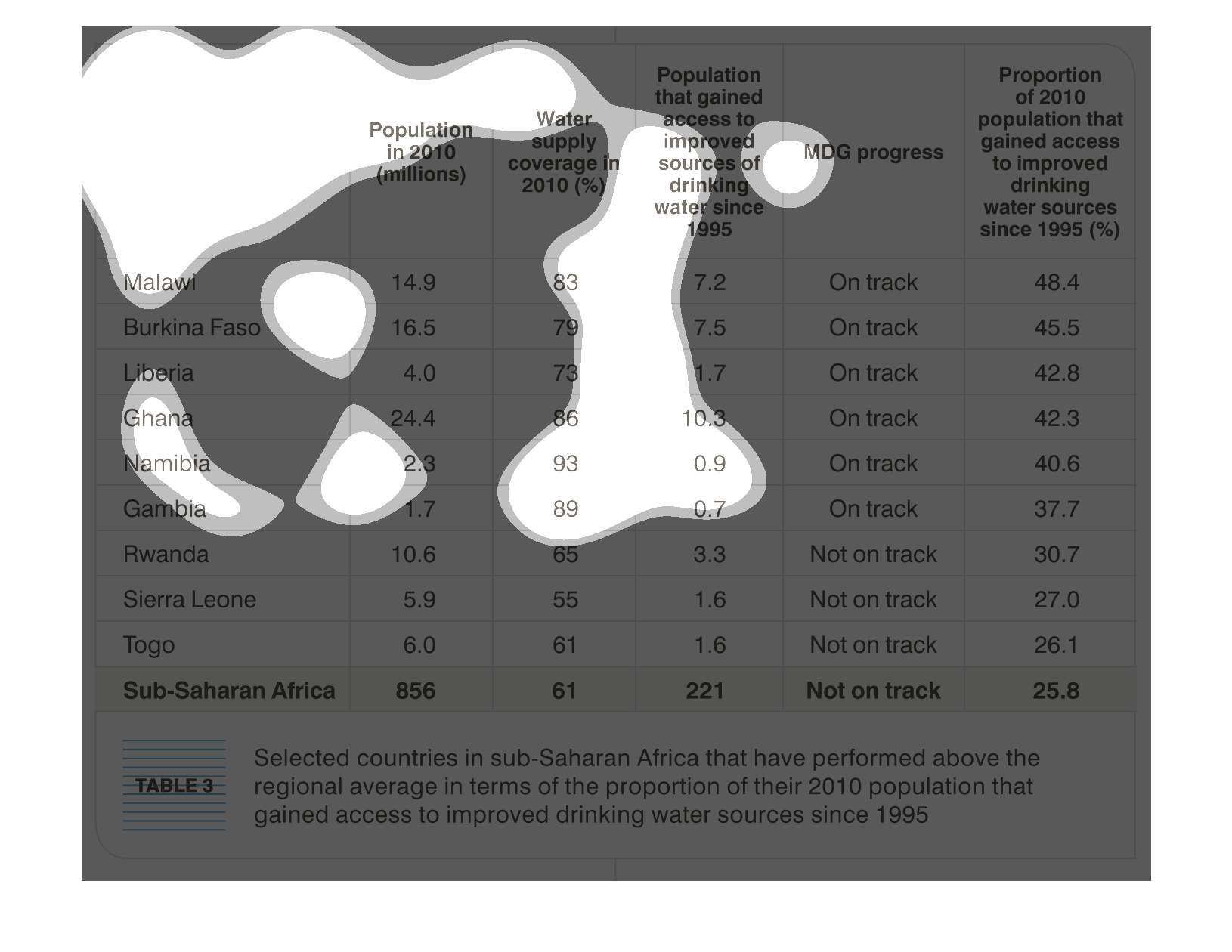
This chart shows some countries in Sub-Saharan Africa that have performed above the regional
average in terms of the proportion of their 2010 population that gained access to improved
drinking water sources since 1995.
This chart describes population that gained access to improved sources of drinking water since
1995. Countries on the chart include Gambia and Namibia.
The figure presented is titled table 3: selected countries in sub-Saharan Africa that have
performed above the regional average in terms of the proportion of their 2010 population.
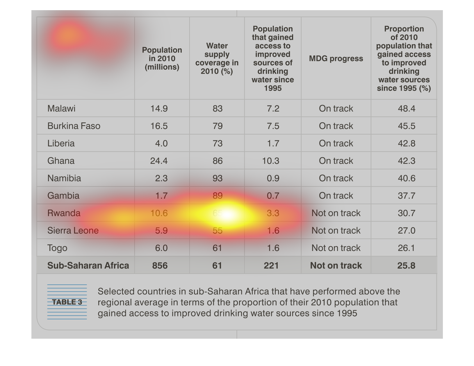
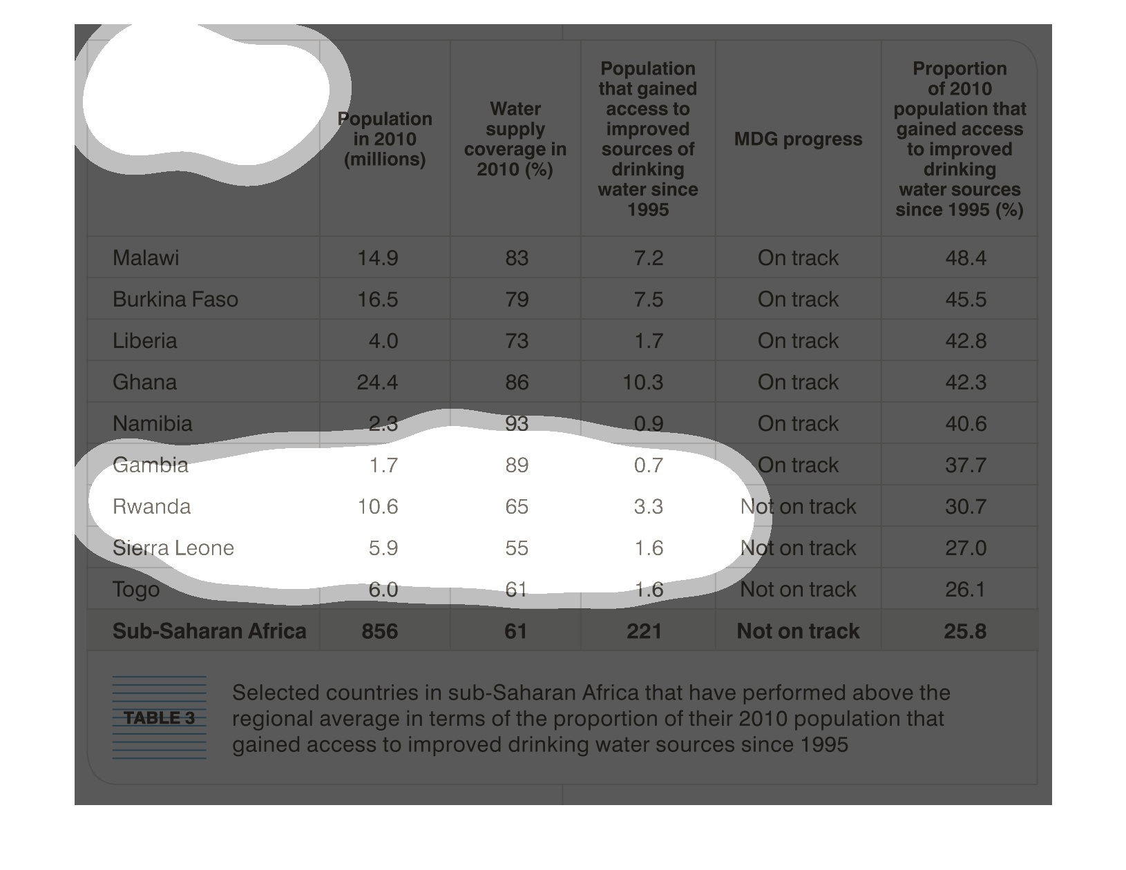
This is a table that lists sub-Saharan African countries that have done better than average
in terms of providing access to drinking water. Data comes from 2010 and there's about 10
different countries.
Water is the source of all life, without water we cannot survive. In this graph we are shown
the steps these countries took to provide better drinking water for their populace, and in
what areas they improved the most.
This graph shows the countries of Africa and their populations and access/improvements to
access of water. There is no correlation between population and access to water, some countries
with high populations have good access to water (such as Ghana) while others have poor access
(such as the Sub-Saharan Africa). Other smaller countries have the same predicament. Namibia
with a population of 2.3 million has the highest water percentage among all other countries.
While Togo, with a population of 6 million has a very small percentage of 61%
A chart is featured here with data from 2010, The first column shows various African countries,
following columns are population in (millions), water supply coverage in %, population that
gained access to improved sources of drinking water since 1995, MDG progress, proportion of
2010 population that gained access to improved drinking water sources since 1995 %.
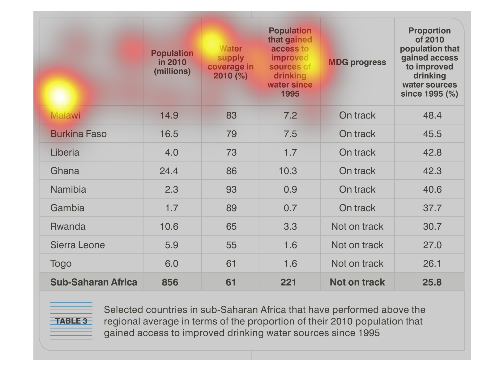
This chart describes selected countries in sub-Saharan Africa that have performed above the
regional average in terms of the proportion of their 2010 population.
In this study- conducted from 1990 to 2005- we see that the researchers are trying to show
that with the betterment and easier access to clean water, there were significant population
growth within the countries listed.
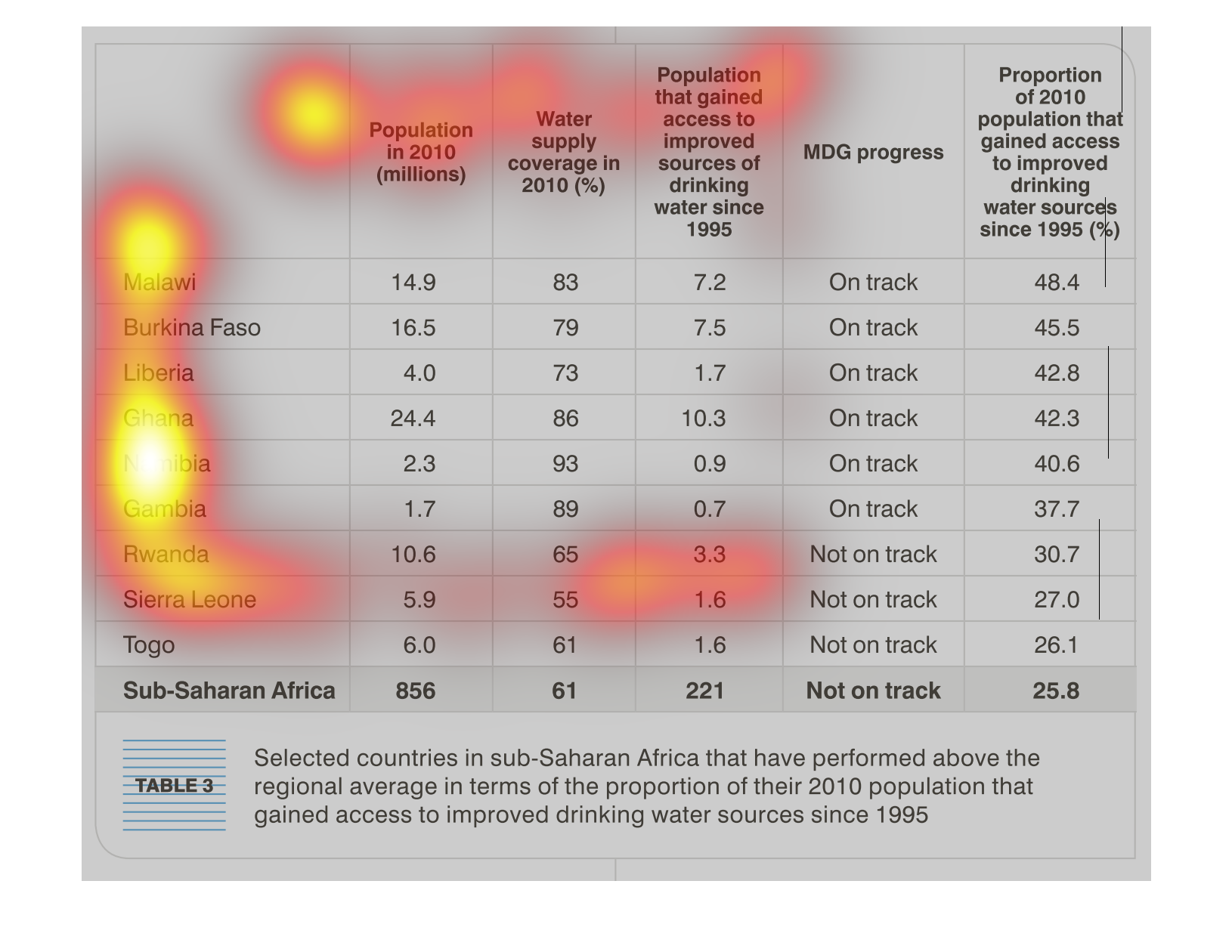
This chart shows coutries in sub-Saharan Africa that have performed about the regional average
for proportion of their 2010 population that have gained access to improved drinking water
since 1995.  25.8 % of sub-Saharan Africa's 2010 population has gained access to improved
drinking water since 1995.  Malawi shows the largest change, with 48.4% of their 2010 population
gaining access to improved drinking water sources since 1995. Burkina Faso, Liberia, Ghana,
Namibia, Gambia, Rwanda, Sierra Leone, and Togo are also included in the chart as having above
average gains.
The image depicts countries, populations, and populations access to drinking water in Sub-Saharan
Africa. Years compared are 1995 versus 2010. Sub-Saharan Africa countries appear to be outperforming
the regional average, in terms of their population in 2010 gaining access to improved drinking
water sources since 1995.