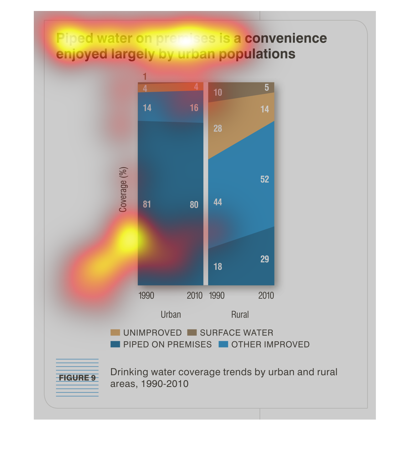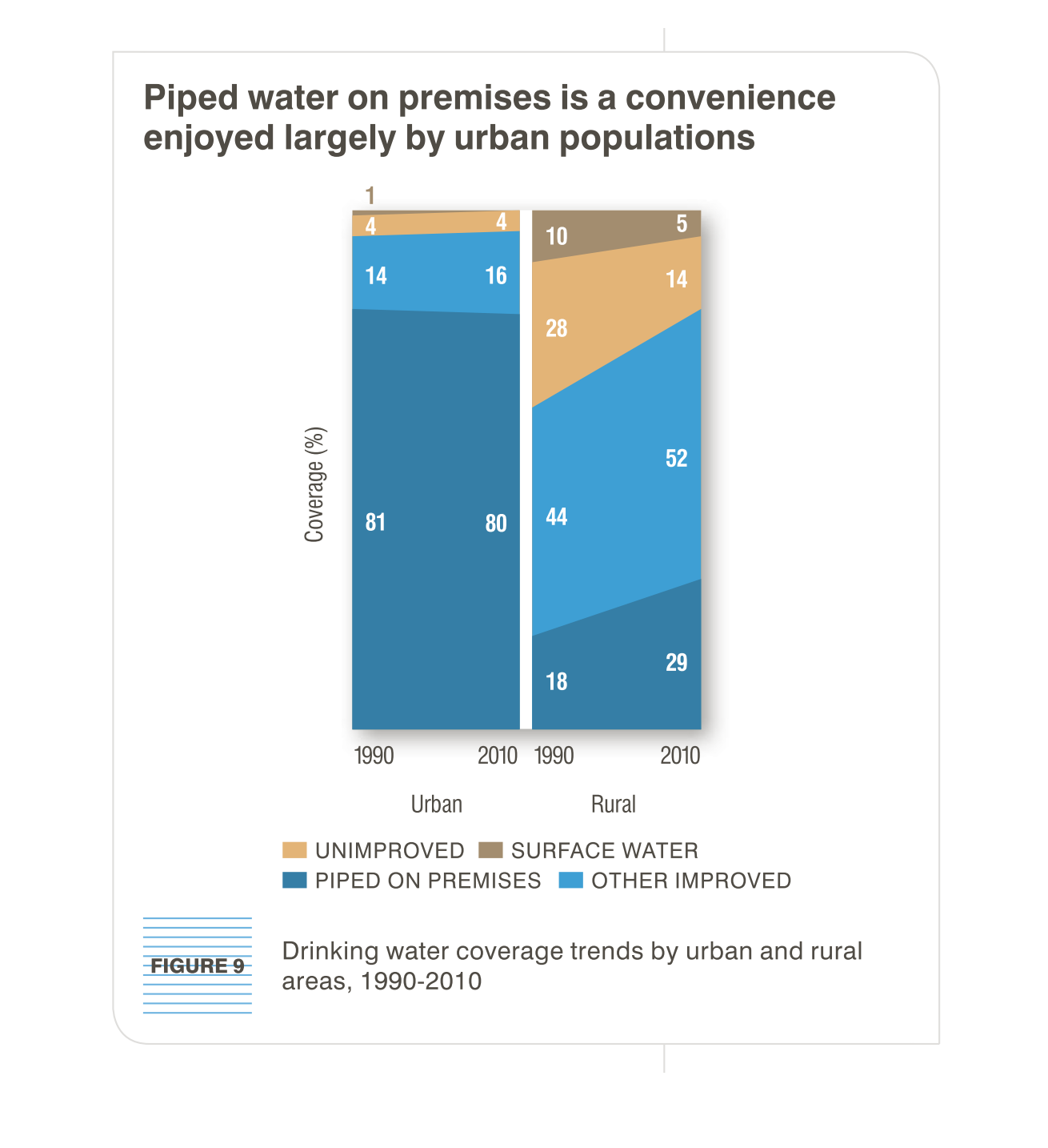
The image depicts piped water on premises is a convenience enjoyed largely by urban populations.
Data is from 1990-2010. Rural areas appear to be lagging greatly behind in piped water on
premises, and lagging noticeably in unimproved and surface water, with a large number in the
"other" category vs the majority of piped water present in urban areas.
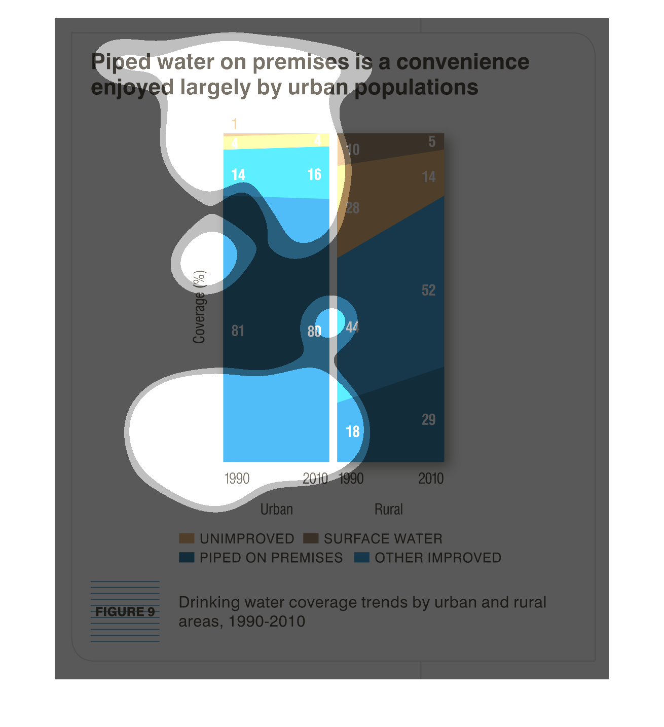
This is a set of bar charts that described the qualities of piped water. It shows what sort
of locations,(urban, rural) receive what sort of water for the purposes of drinking.
THIS PLOT SHOWS THE BREAKDOWN OF WATER PIPED ON PREMESES VS. NOT HAVING WATER PIPED ON PREMESES
FOR URBAN AND RURAL AREAS.  THE TYPE OF WATER IS SHOWN AS PERCENT COVERAGE.
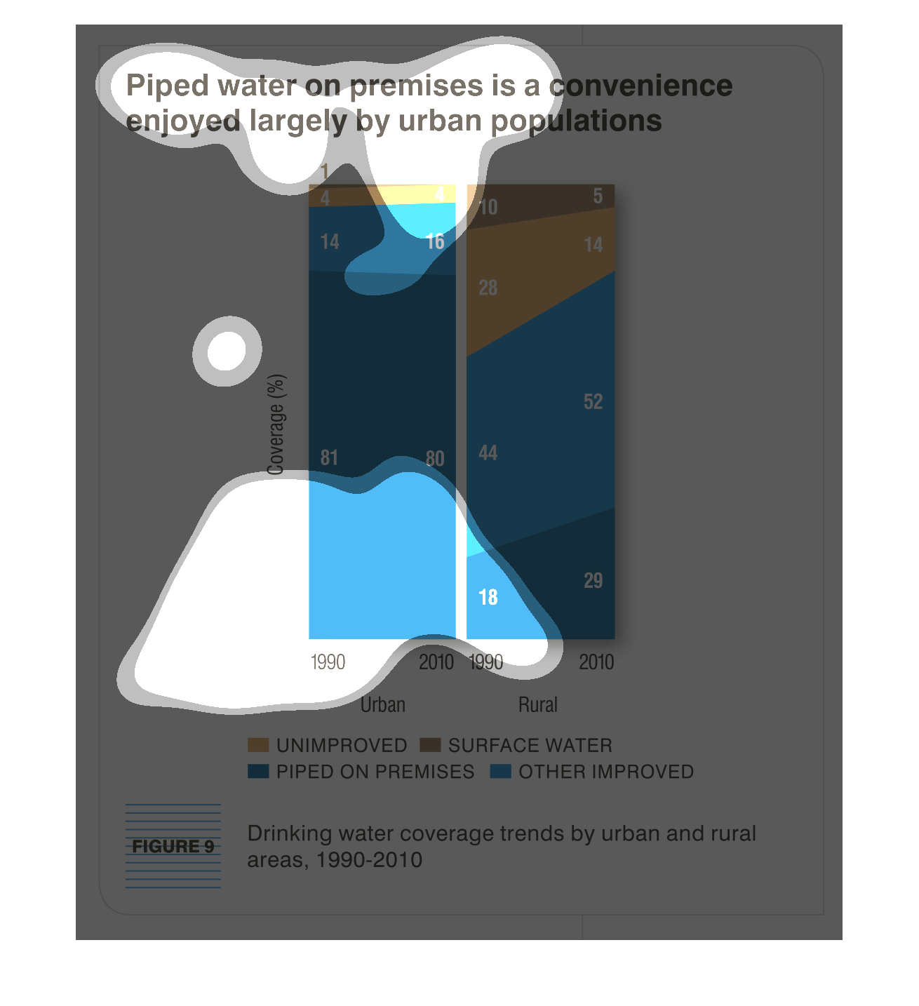
piped water on premises is a convenience enjoyed largely by urban populations. Y axis is coverage
percentage, X axis is two columns of urban and sub urban by years between 1990-2010 Urban
always sees the best promotion
This is a graphic that illustrates that having piped water within the premises is a convenience
that is only enjoyed by the urban population and not the rural populations.
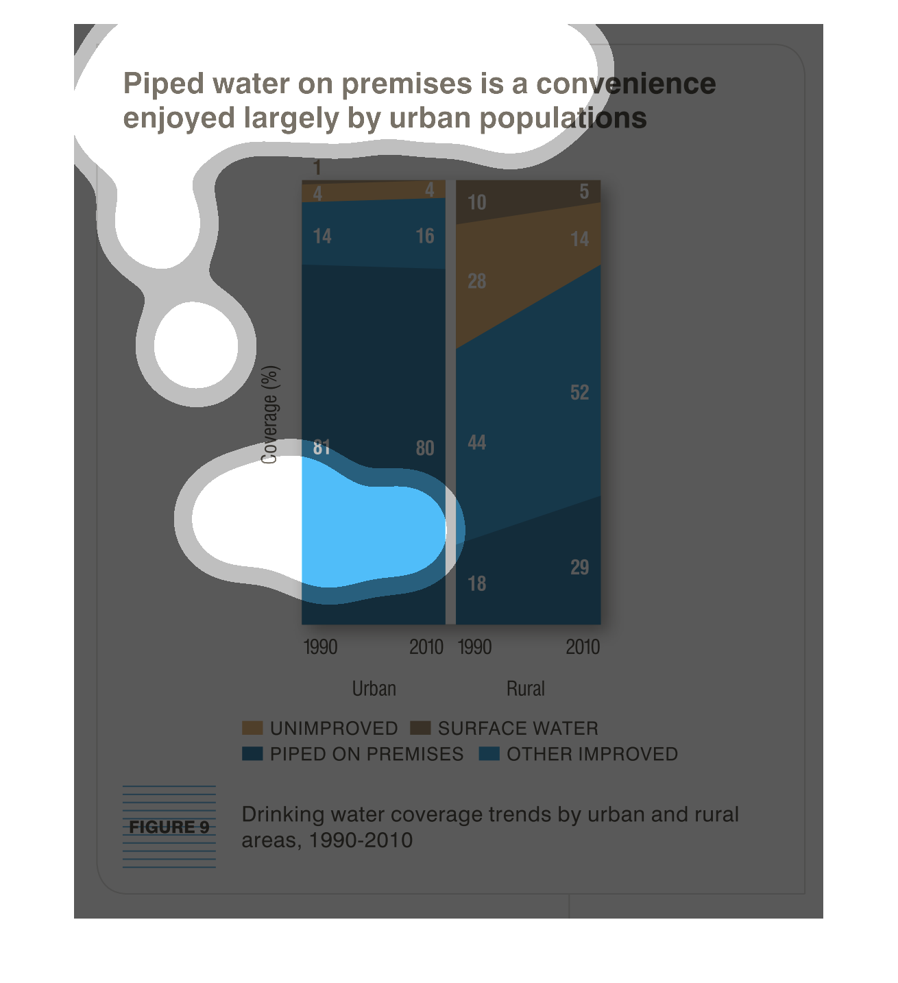
the name of this graph is called piped water on premises is a convenience and urban people
enjoy the piped water. orange is for unimproved blue is for
This is a graph titled "pipes water on remises is a convenience enjoyed largely by urban populations".
The graph covers drinking water coverage trends by urban and rural areas from 1990 to 2010.
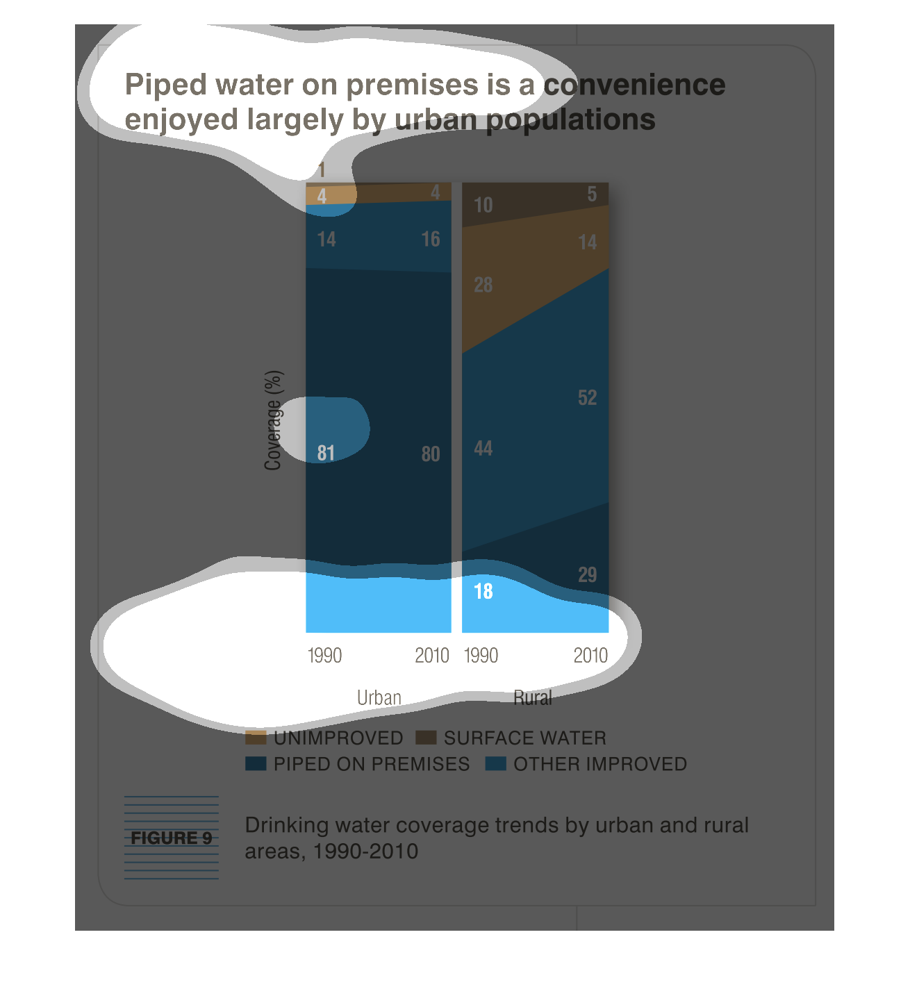
The chart shows drinking water trends from the years 1990 - 2010.  Urban populations, per
the chart, enjoy this convenience the most. Piped water was a vast majority to other types
in 1990 but  other types of water have become more prevalent by 2010.
These two vertical graphs represent the luxury of piped water, and its availability to urban
and rural areas, from 1990 to 2010. Trends in improve and color coded.
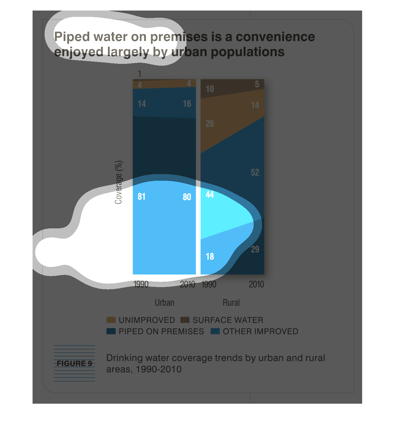
This chart describes piped water on premises in a convenience enjoyed largely by urban populations.
Categories on the chart include unimproved, and surface water.
The figure presented is titled piped water on premises is a convenience enjoyed largely by
urban populations.  The figure is a representation of data for piped water.
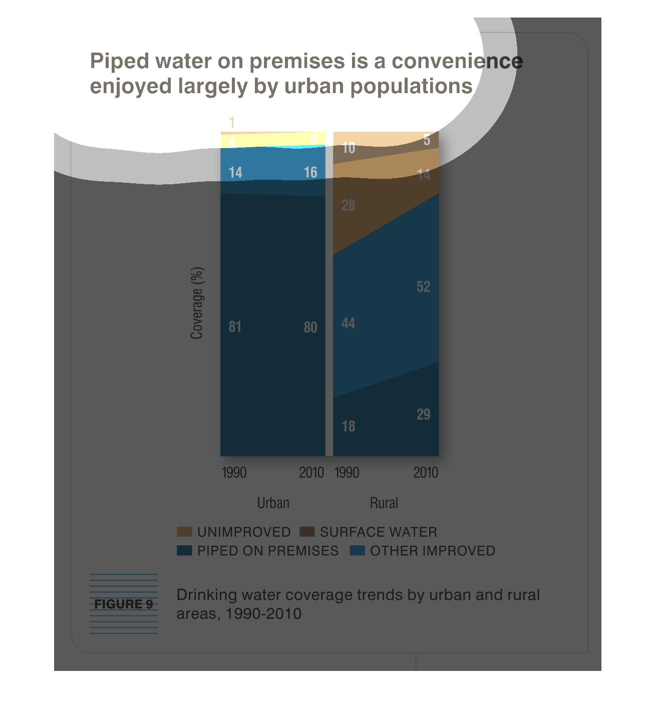
This graph is used to support the statement that piped water is used mostly in urban areas.
The graph compares drinking water coverage between urban and rural areas between the years
1990 and 2010.  In urban areas, the percent of unimproved drinking water remained the same,
while in the rural areas it decreased from 28% to 14%.  The percent of drinking water piped
on the premises in rural areas increased and decreased by 1% in urban areas.
This chart describes piped water on premises is a convenience enjoyed largely by urban populations.
Different categories are represented by different colors.
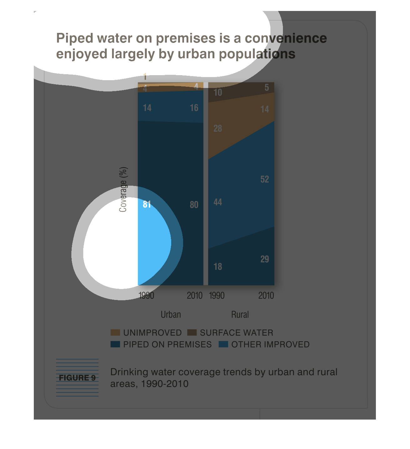
Image shows trends in drinking water covers in urban and rural areas between 1990 and 2010
Image is a side by side graph with percentages for Urban areas on left and rural areas on
right.  Dark blue area denotes piped in water.  Light blue denotes other improved water delivery.
Tan denotes no improvements to delivery.  Brown denotes use of surface water.
These graphs shows the distribution of piped water, attributing as a convenience limited mostly
to urban population locations. From left to right the chart denotes year from 1990 to to 2010,
and the verticality is colored denoting improvements.