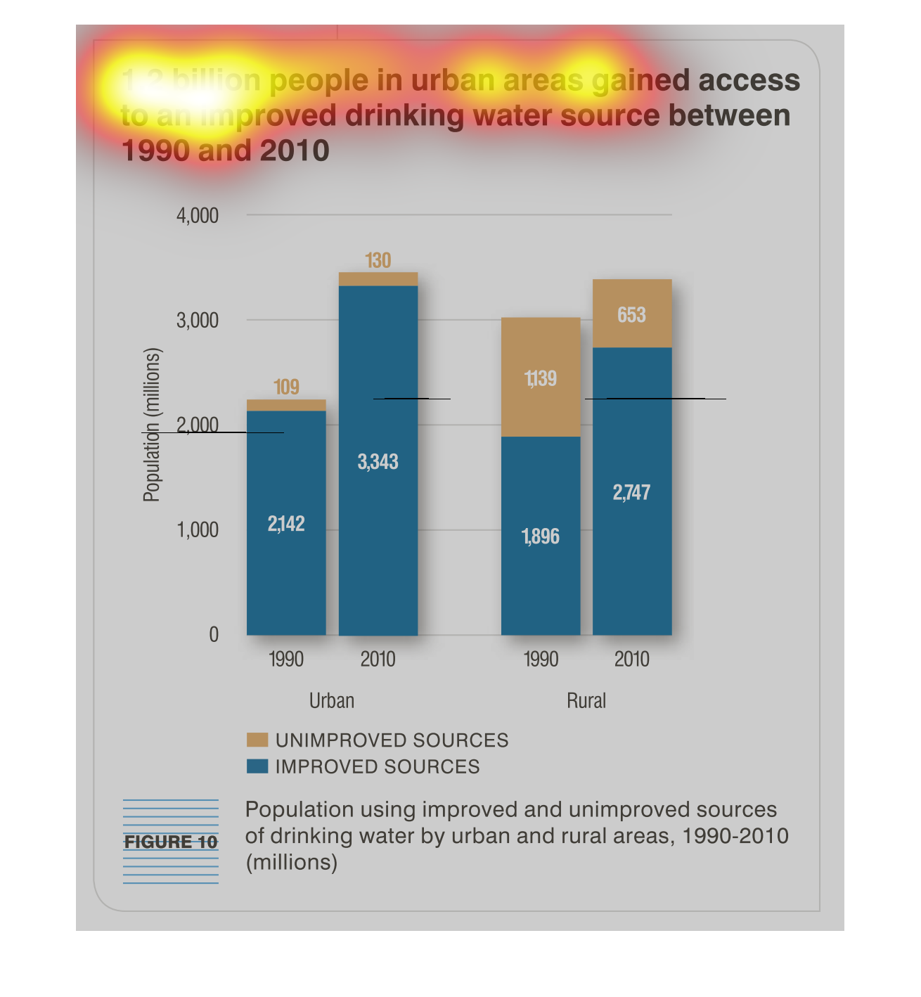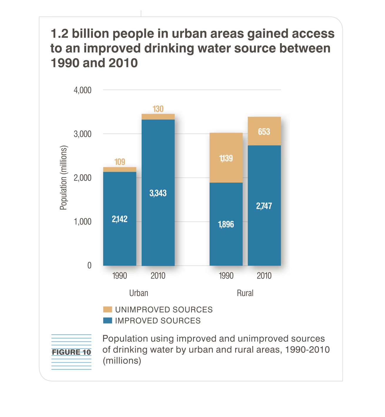
This graph is about the access of drinking water to people living in urban areas  between
the years of 1990. and 2010. It compares urban to rural areas.
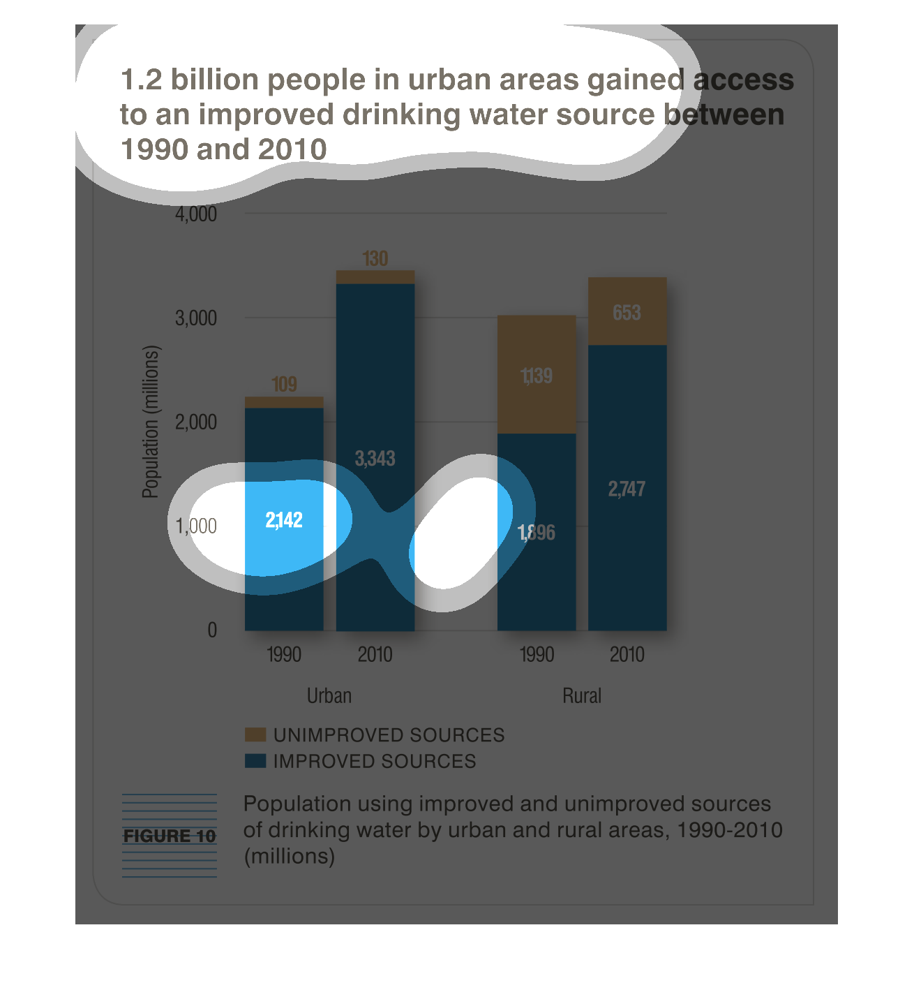
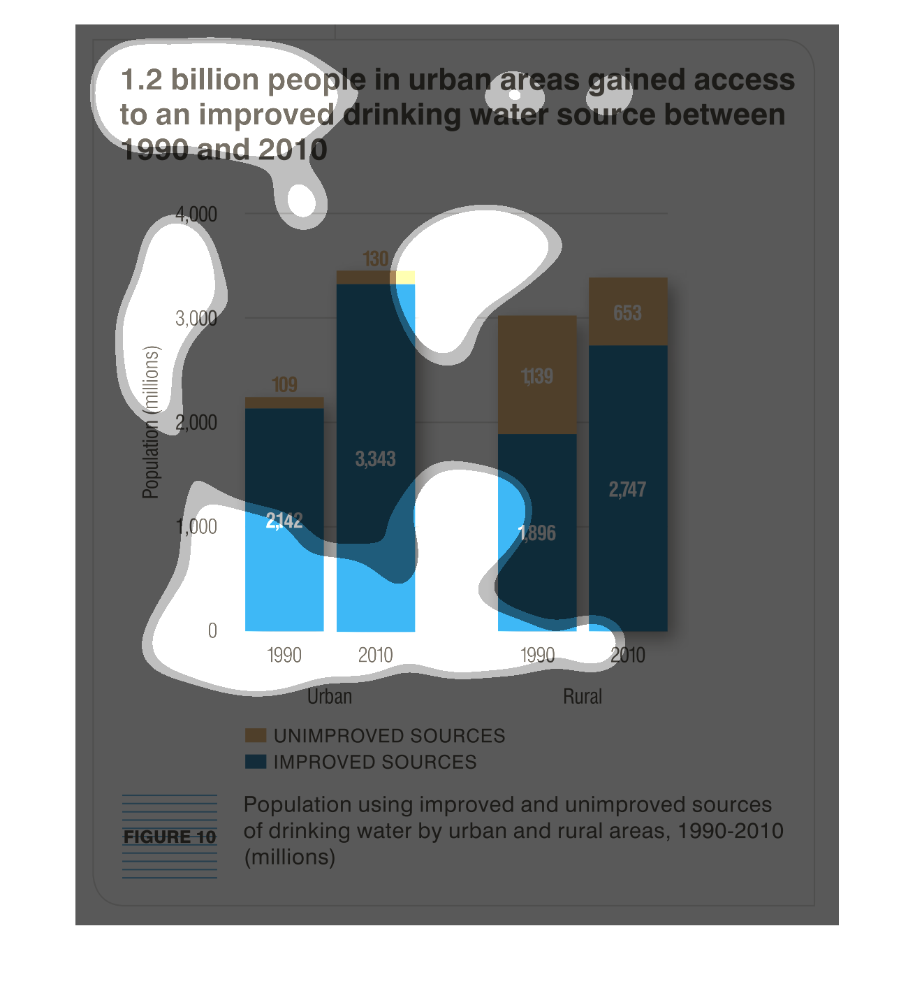
This chart shows the change in access to improved and unimproved drinking water sources for
urban and rural populations from 1990 to 2010. Urban populations moved from 2142 million people
to 3343 million people with improved sources over this period, with little change in unimproved
sources (109 to 130 million). Rural populations saw a smaller total change, with a decrease
in unimproved sources from 1139 million to 653 million, and a change in improved sources of
1896 million to 2747 million.
This bar graph shows the difference in access to safe drinking water between the years of
1990 and 2010.  During this 20 year period there was more access granted in rural than urban
areas.
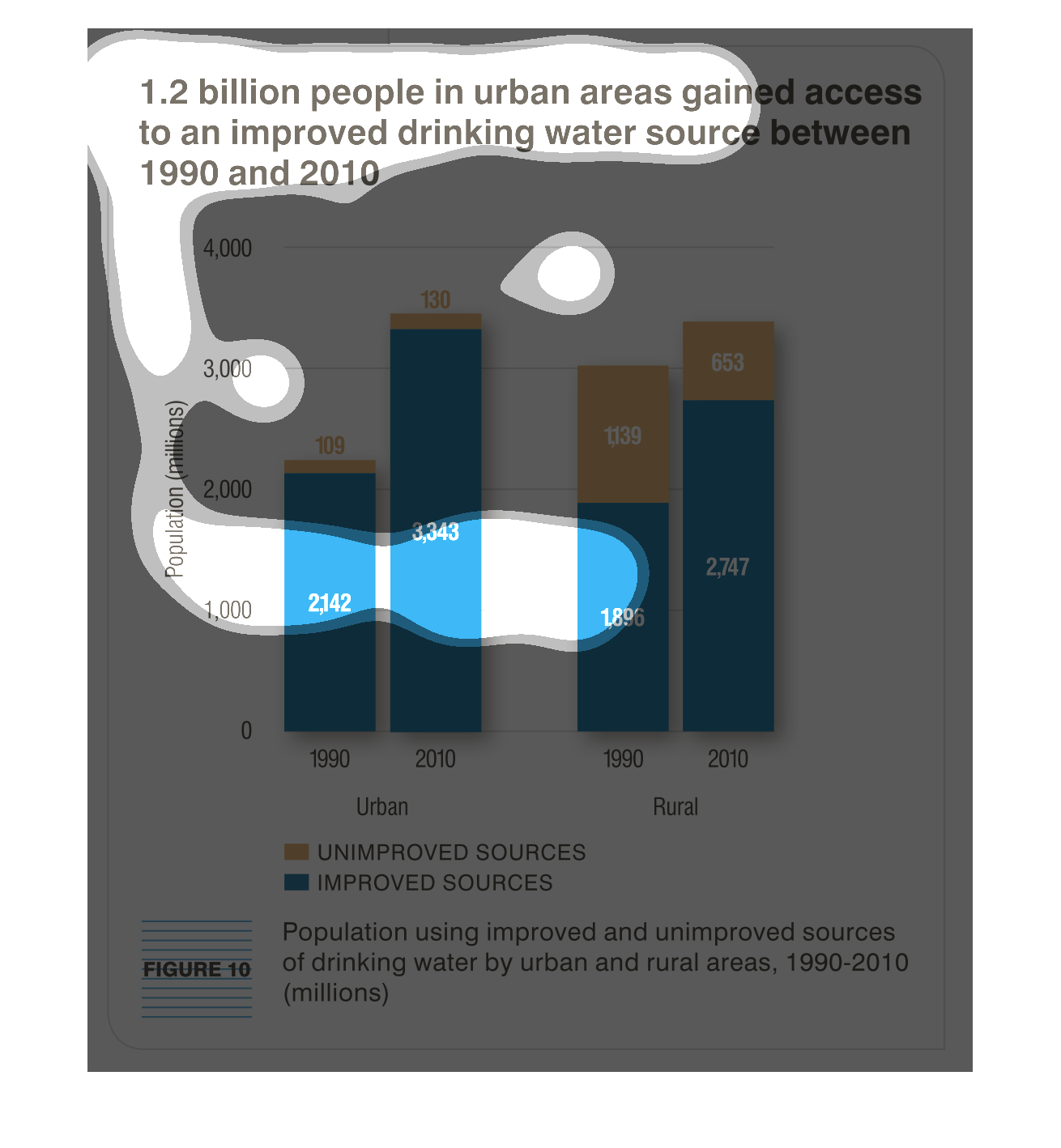
This chart shows the urban improvement in quality drinking water over a 20 year span of 1990-2010.
This figure shows the relation of rural areas obtaining water from lesser sites.
This chart describes 1.2 billion people in urban areas gained access to an improved drinking
water source between the year 1990 and the year 2010. Different categories represented by
different colors.
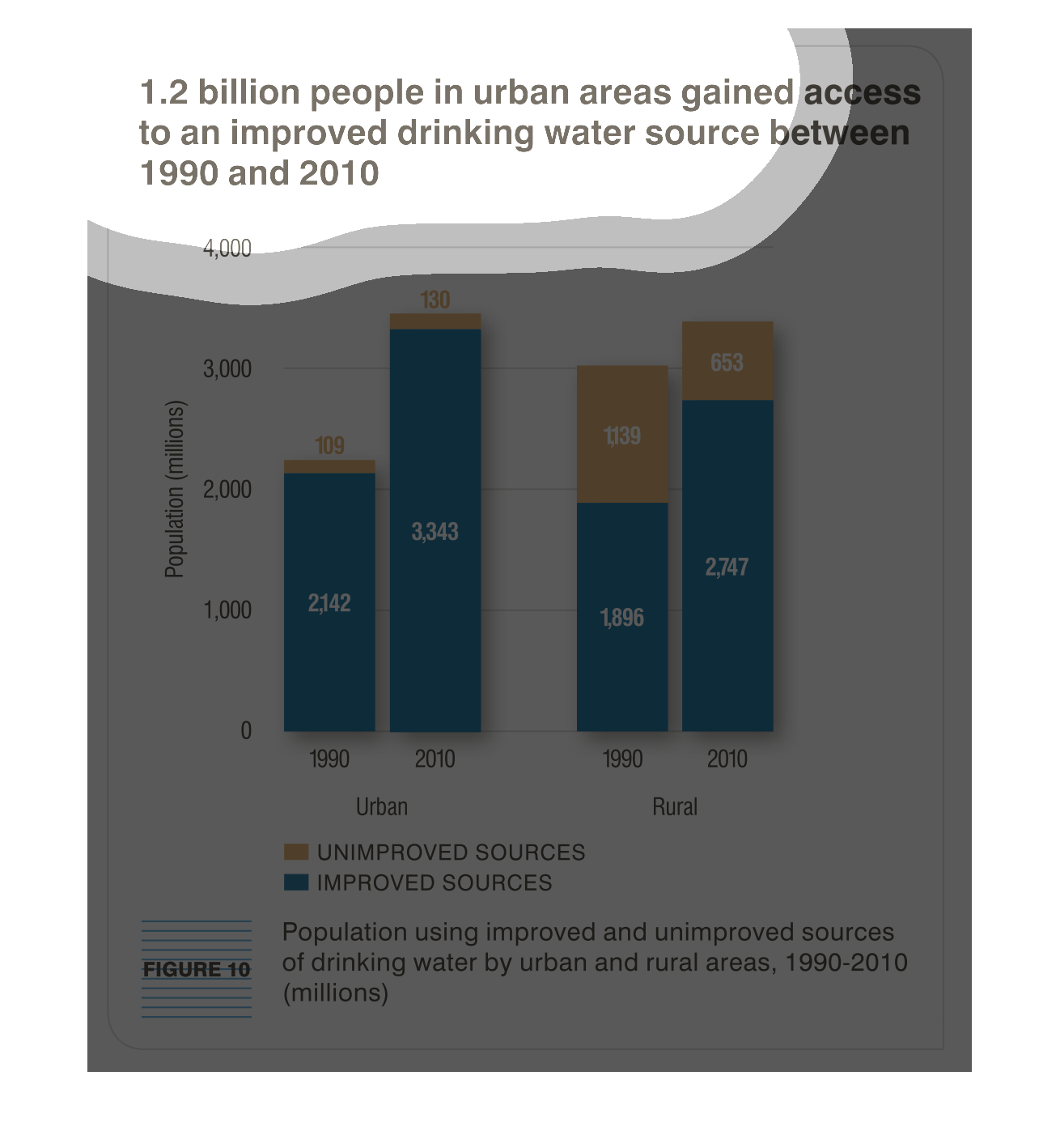
1.2 billion people in urban areas gained access to an improved drinking water source between
1990 and 2010. The bar graph shows the urban and rural population (in millions) versus time
between 1990 and 2010. The blue sections of the graph show the population for improved sources
and the orange sections show the population for the unimproved sources. Urban areas have the
greatest population for improve sources.
This chart describes 1.2 billion people in urban areas gained access to an improved drinking
water source between 1990 and 2010. categories on the chart include unimproved and improved.
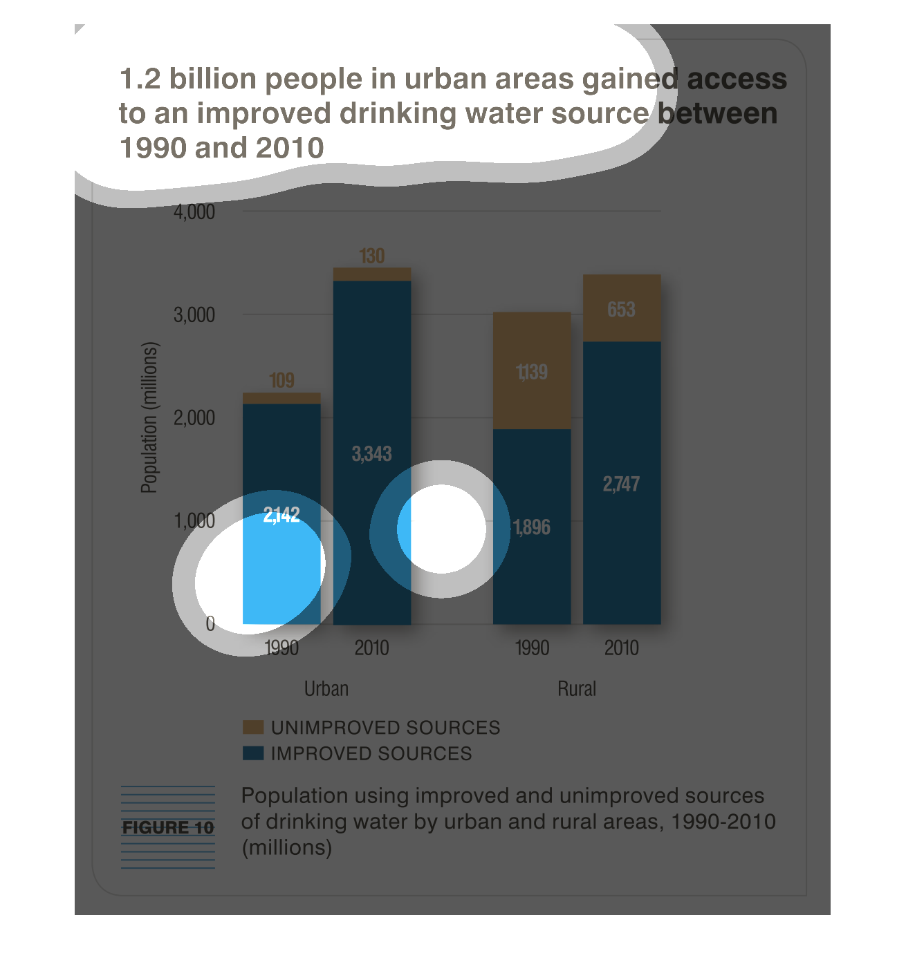
1.2 billion people in urban areas gained access to an improved drinking water source in the
20 years between 1990 and 2010. In 2010, 2,747,000,000 people had access to improved drinking
water systems compared to 1,896,000,000 in 1990.
This chart shows that 1.2 billion people in urban areas gained access to improved drinking
water sources between 1990 and 2010.   Rural areas had less improvement.
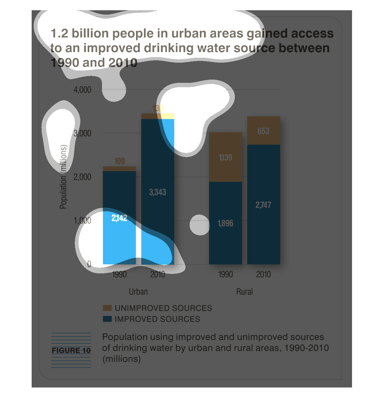
The graph shows the number of people who gained access to improved drinking water facilities
over the course of 20 years, from 1990 to 2010. The graph is depicted as those who use improved
facilities versus unimproved facilities.
The graph shows how many people have received increases in water quality. This totals up to
1.2 billion people. The bar graph shows that the information is measured by year.
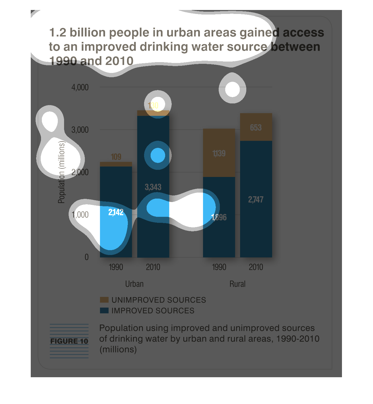
1.2 billion people in urban areas gained access to an improved drinking water source between
1990 and 2010. We see population in millions on the Y axis, and on the X axis there are two
separate graphs, One for urban and one for rural, each graph has two bars, one for 1990 and
on for 2010. We see the prevalence more in urban areas but theres is still progress in rural
areas as well.
This is a graph showing the unimproved and improved drinking water sources for rural and urban
areas. It shows it over the course of twenty years. It shows both increased over the years
but rural still had a lot of unimproved sources.
The figure presented is titled: 1.2 billion people in urban areas gained access to an improved
drinking water source between 1990 and 2010.  The figure is a bar graph.