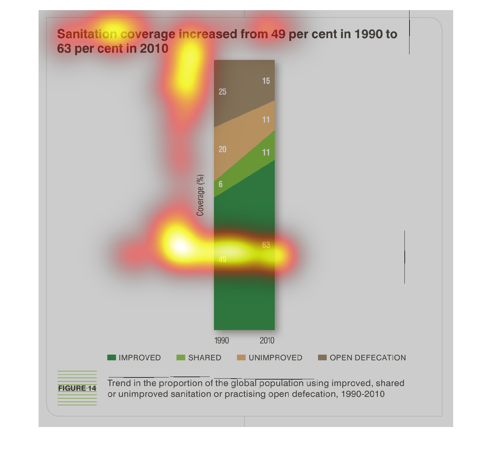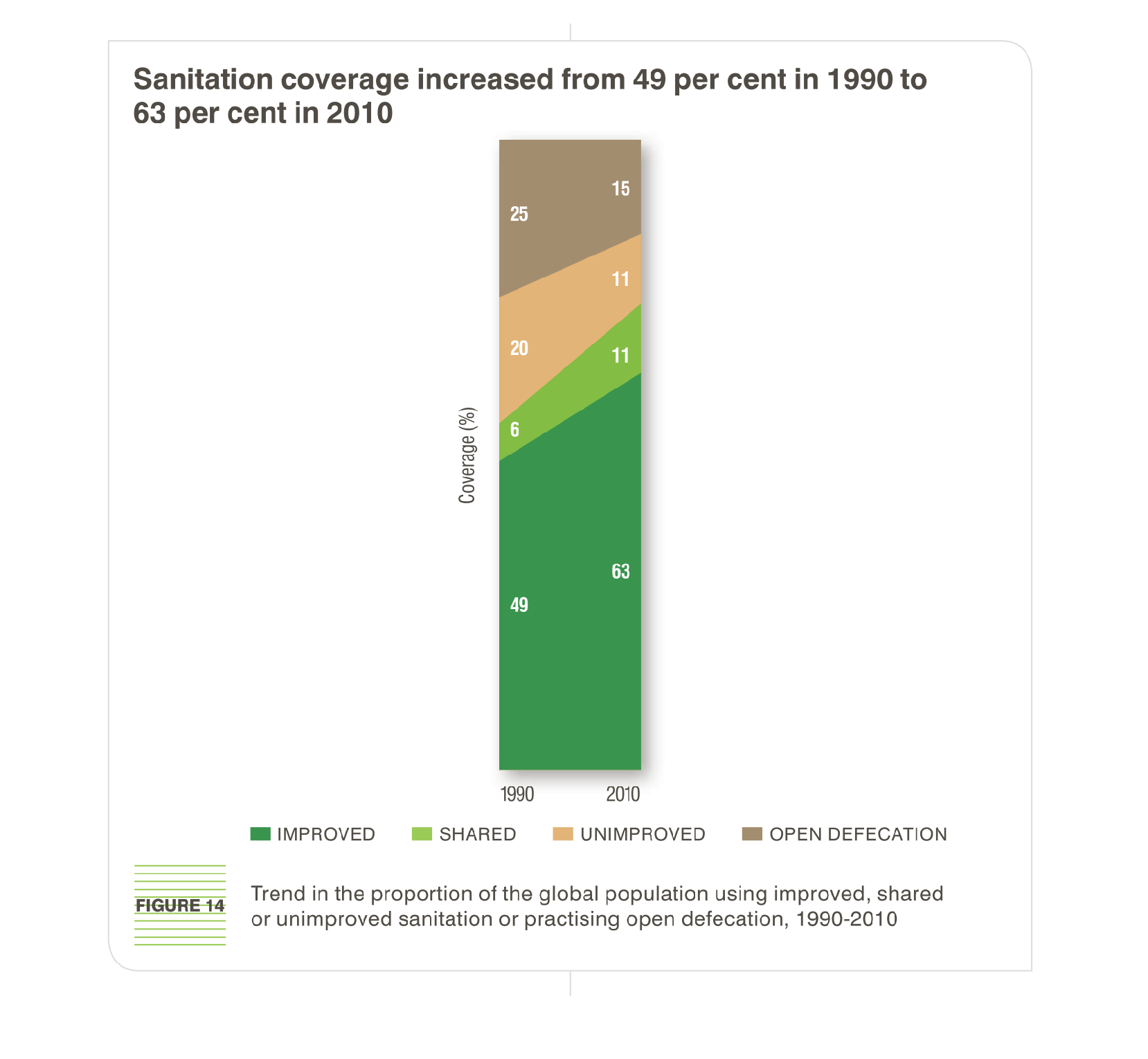
The figure presented is titled Sanitation coverage increased from 49 percent in 1990 to 63
percent in 2010.  The figure is a representation of sanitation coverage.
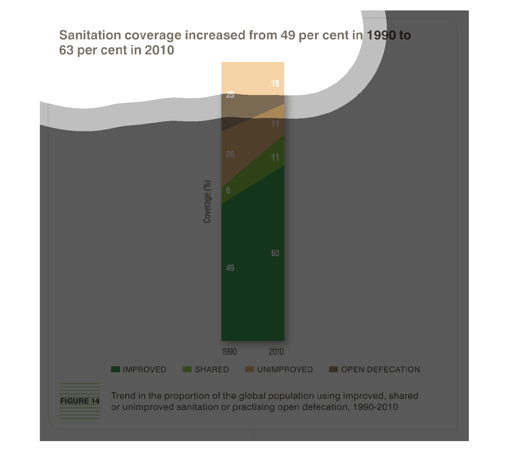
The image depicts sanitation coverage increasing from 49% in 1990 to 63% in 2010. Trend in
the proportion in global population is taken into account, and sanitation outlets include:
shared, improved, unimproved, and open defecation. Trends indicate that sanitation has improved
and shared sanitation facilities as well as improved sanitation facilities have increased.
The image depicts how sanitation coverage increased from 49% in 1990 to 63% in 2010. Noticeable
improvement have occurred, while open defecation still appears to be an issue.

This is a bar chart of the Sanitation coverage. The graph shows how it has increased 49 per
cent in 1990 to 63 per cent in the year 2010. The improvements are broken down to four categories.
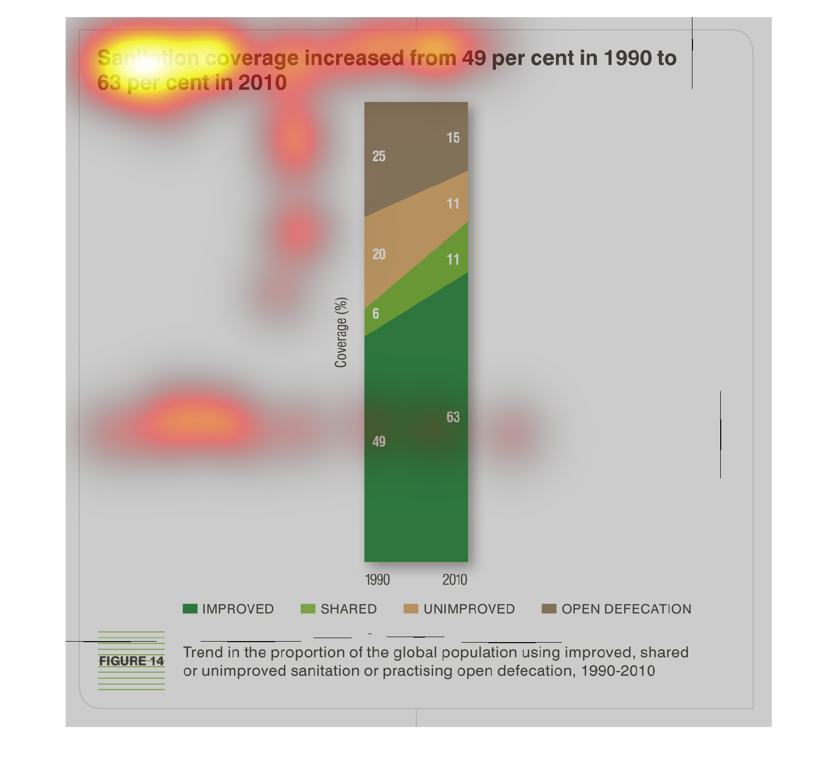
sanitation coverage increase from 49 percent in 1990 to 63 percent in 2010. Y axis is coverage
percent x axis is the aforementioned years. there has been slow progress of improvement in
private and public facilities, unimprovement and open defecation are slowly decreasing
This is a chart of sanitation coverage increased from 49 percent  in 1990 to 63 percent in
2010. This graph shows that there has been an increase from 1990 to 2010 improvement.
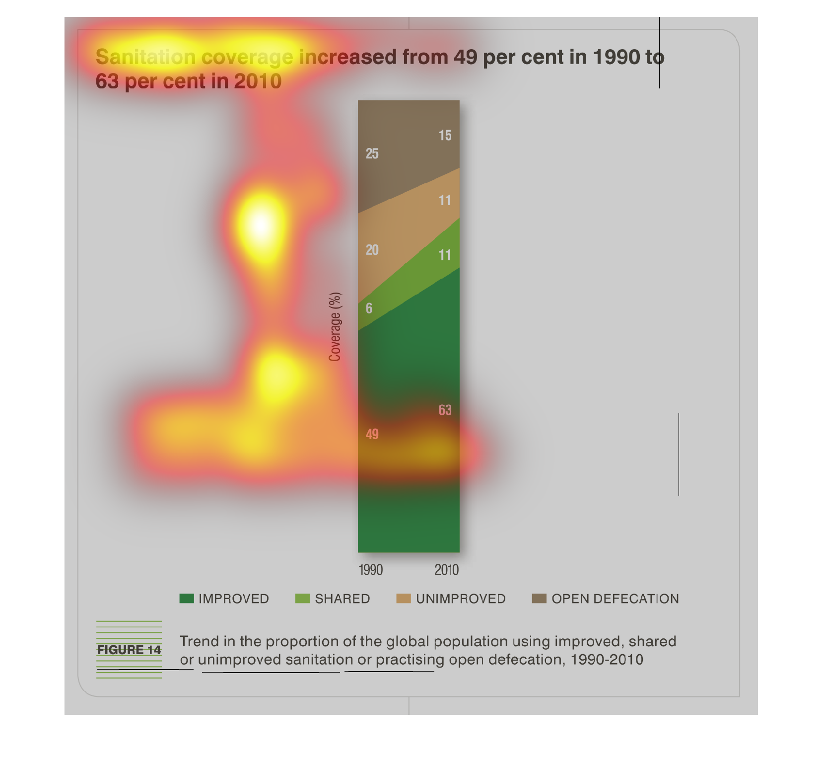
It is not surprising that this graph shows an increase in sanitation worldwide. As the world's
population has increased, so has it production of waste.
This is a coverage chart for sanitation. It's brown, orange and two shades of green. There
is a key at the bottom labelling the sanitation coverage. There are some statistics at the
top.
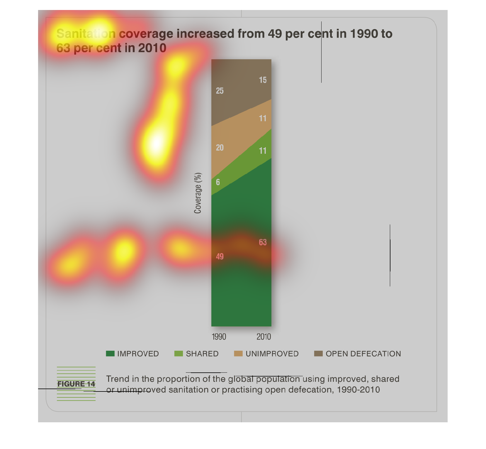
This is a graphic that illustrates that there as a significant increase in sanitation coverage
in the year 2010. It shows that this increase was 49 percent from the year 1990.
This vertical bar shows the 1990 to 2010 increase in sanitation coverage. The improvement
categories are different colors, trending upwards across the top of the graph.
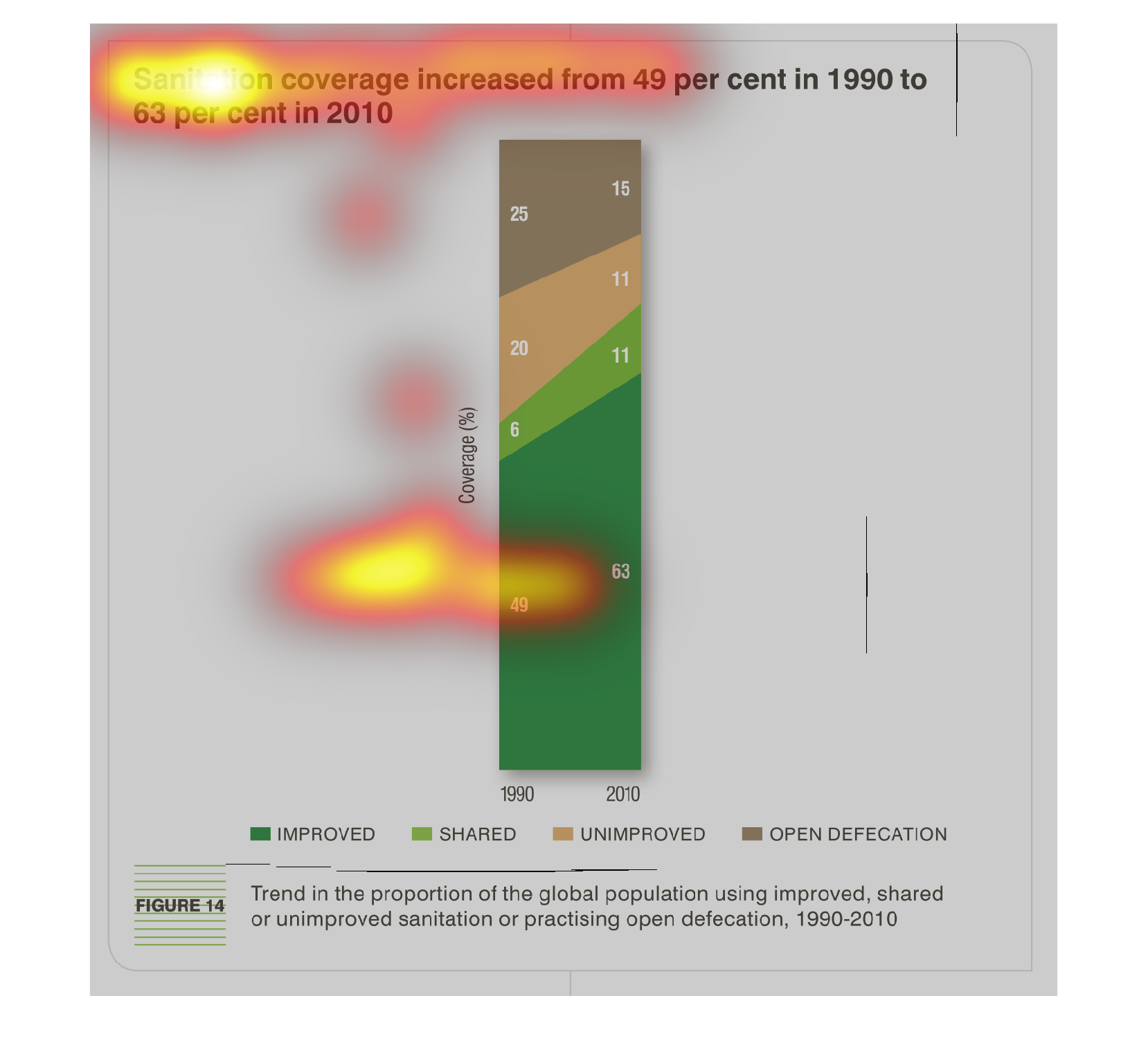
This chart describes that sanitation coverage increased from forty-nine percent in 1990 to
sixty-three percent 2010. Different categories are represented by different colors.
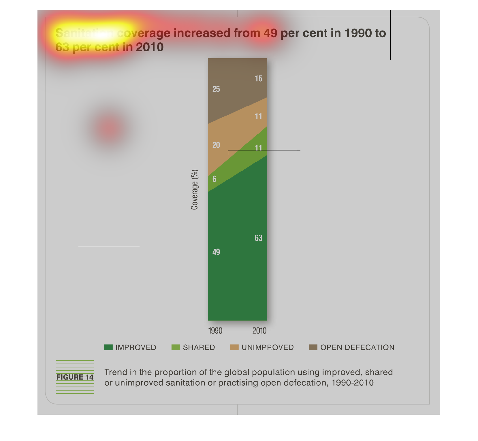
This chart describes that sanitation coverage increased from forty-nine percent in the year
1990 to sixty-three percent in the year 2010. Different percentages are represented by different
colors.
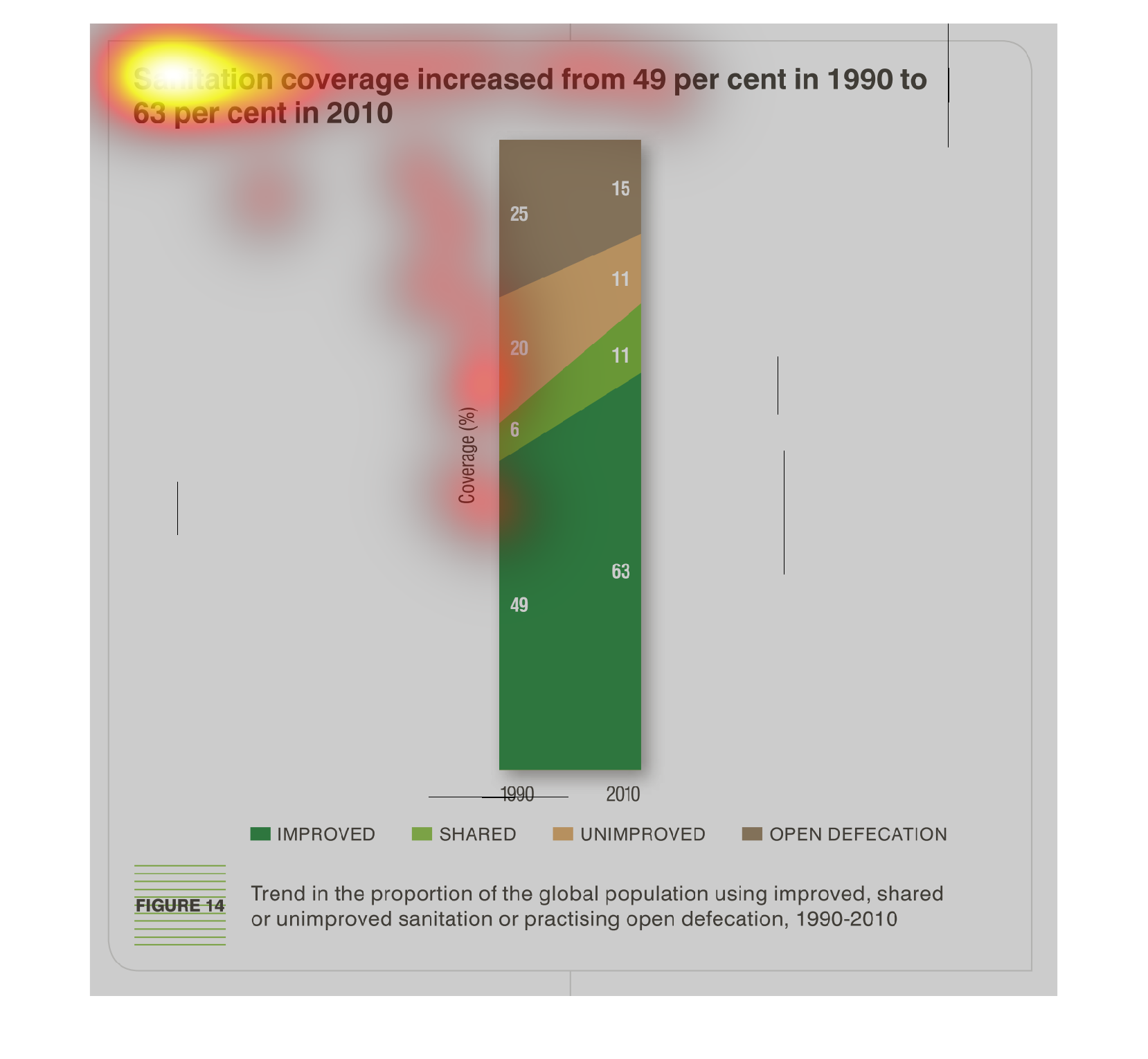
The spiral bar graph depicts how the improvement of sanitation has significantly increased
from the time period of 1990-2010, specifically in regards to defecation.
Sanitation coverage is shown to increase here from 49% in 1990 to 63% in 2010. 11% remains
unimproved, with 15% pertaining to open defecation. Green represents the covered, orange for
the unimproved, brown for the openly obscene.