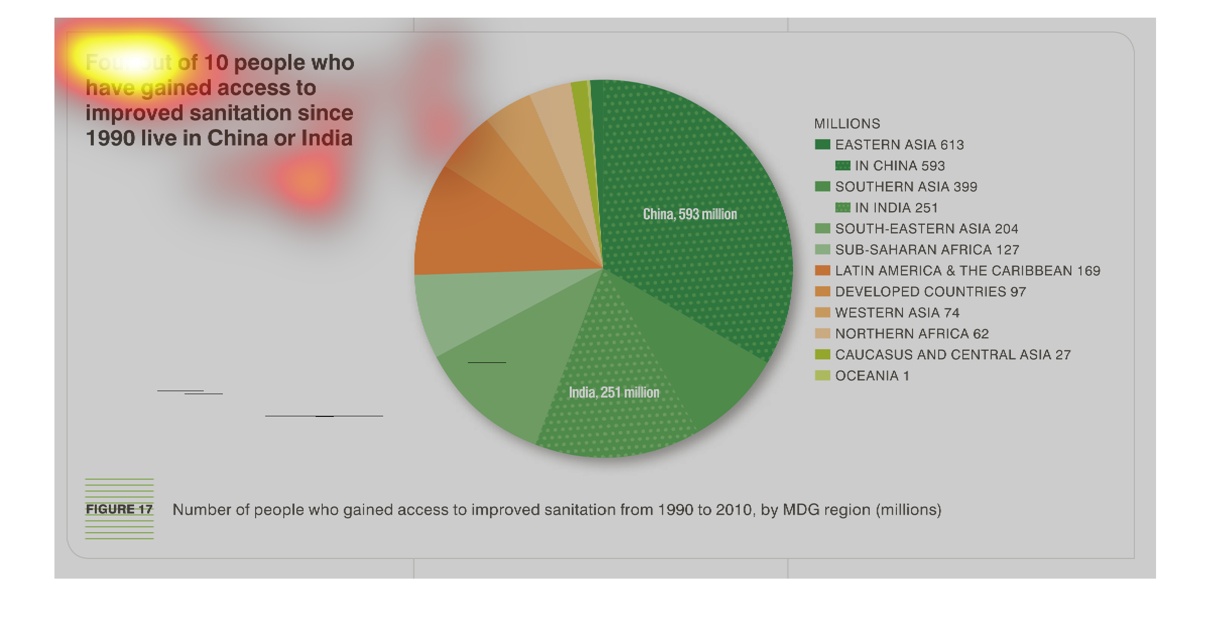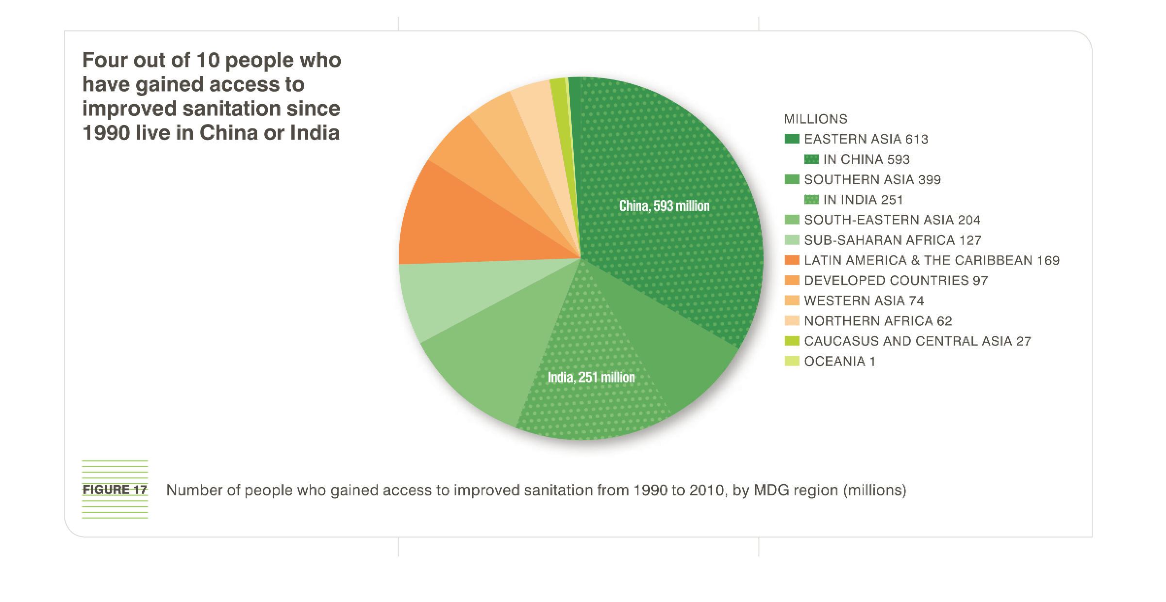
This is a pie chart depicting that four out of ten people who have gained access to improved
sanitation since 1990 line in China or India from the years 1990 to 2010.
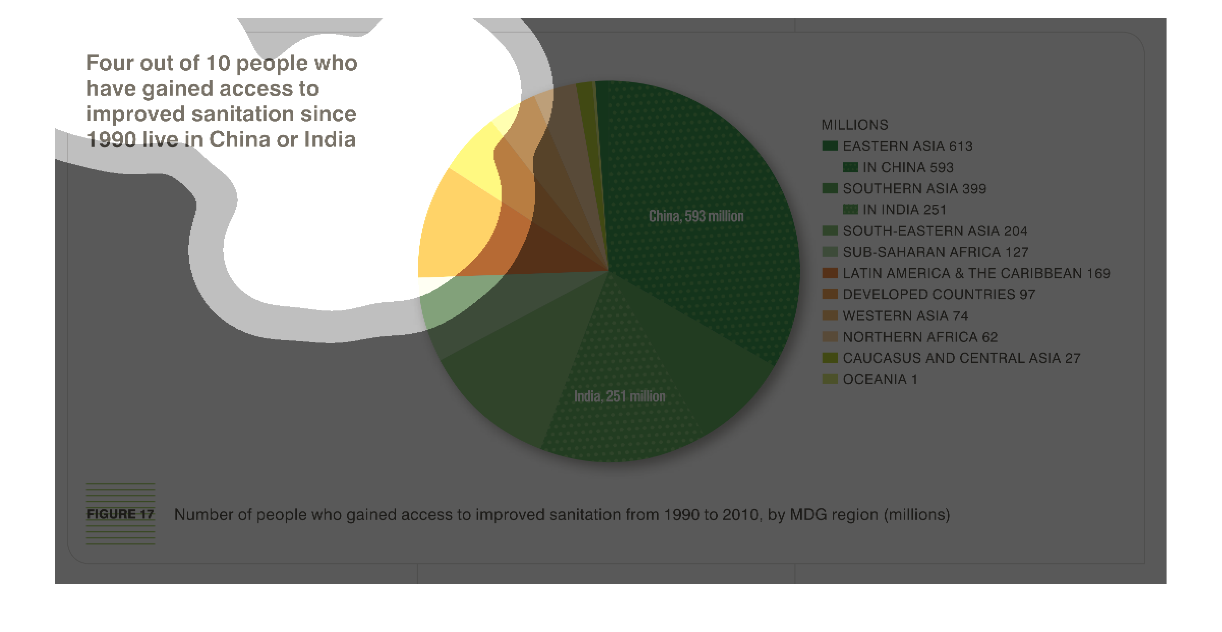
This chart shows where sanitation has made the greatest leaps since 1990.  Showing that China
and India have out paced other countries in the increase of sanitary conditions, not necessarily
in total or actual sanitary conditions but in the increase based on previous levels
This chart/graph shows that four out of ten people who have gained access to improved sanitation
since 1990 in China and India. All in all, the incline in my opinion is improved.

It's a pie chart of people who have gained access to improved sanitation since 1990. 4 out
of 10 of them live in China or India. Other countries include those in latin and central America.
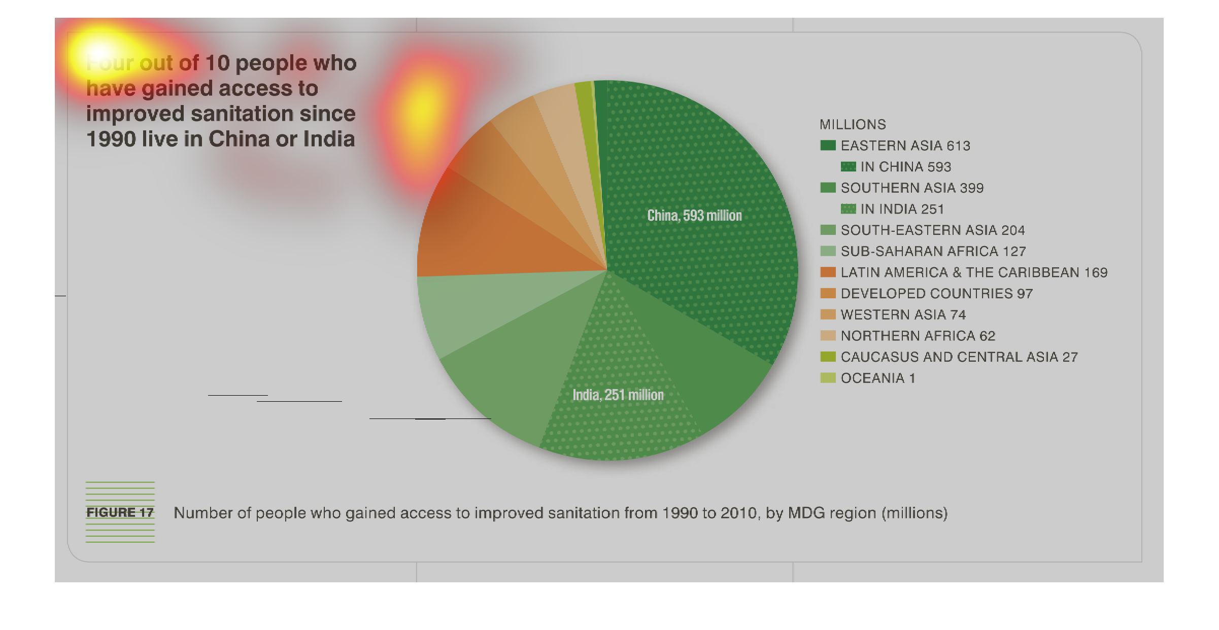
This study- conducted from 1990 to 2010-  showcases the vast improvements of sanitation in
India, and the growth of the distribution of drinkable water to the masses.
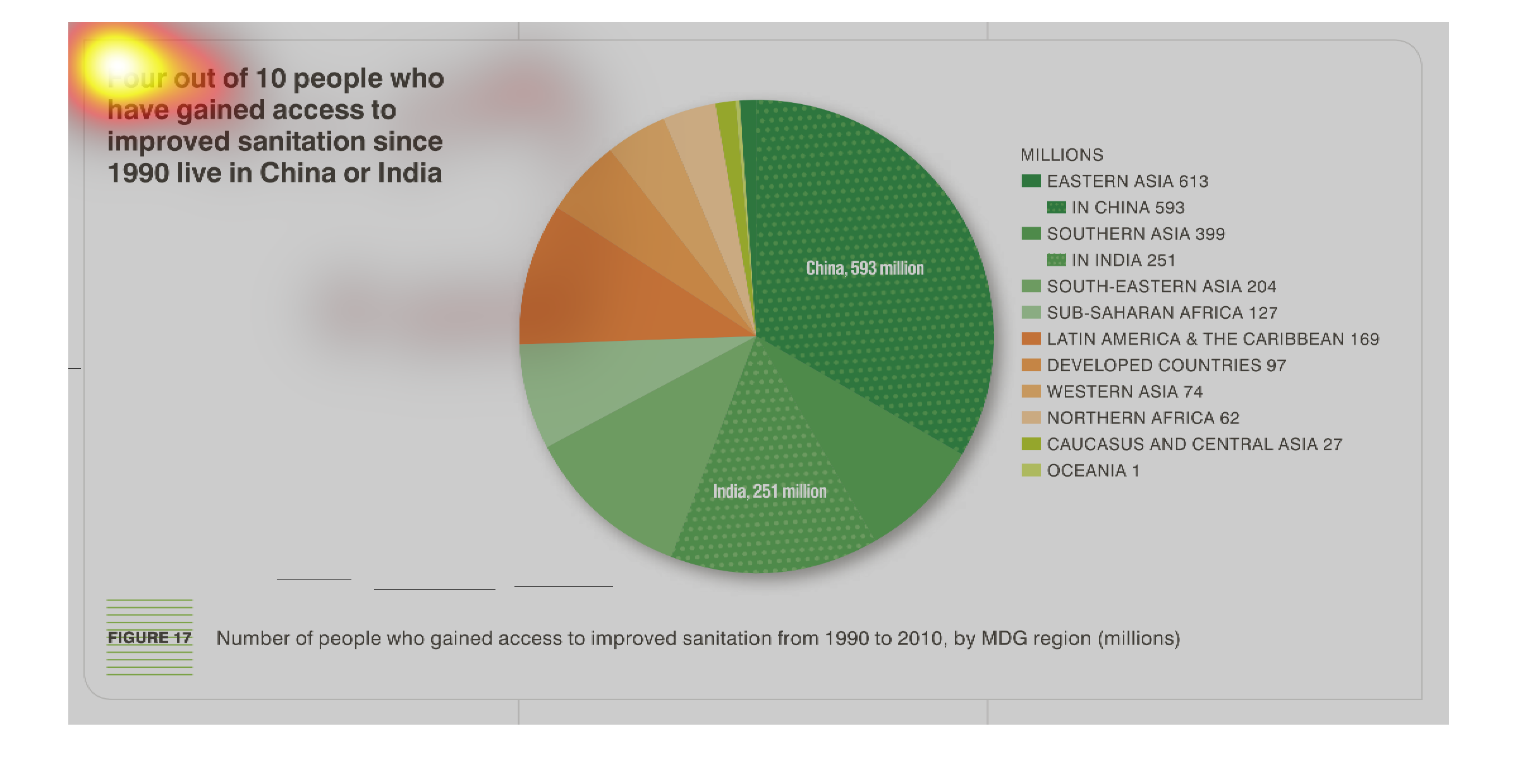
this chart shows a circle graph and the circle graph represents people who gained access to
important stuff to help get information anround to other people.

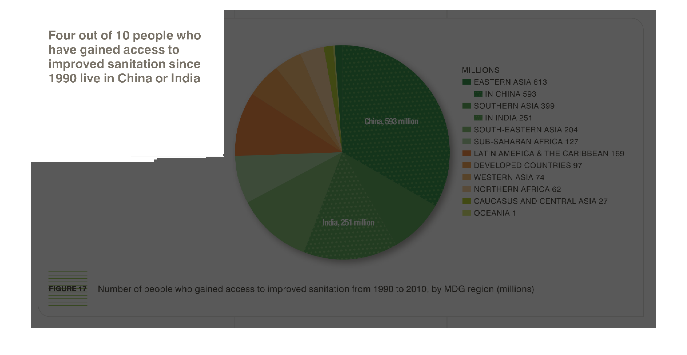
This pie chart is showing that 4 out of 10 people in India and China have better sanitation
than they did in 1990. The pie chart is split off with different regions of China, India,
and other developing countries.
Four out of ten people have gained access to improved sanitation since 1990 live in China
or India. Number of people who have gained access to improved sanitation from 1990 to 2010.
By MDG region (Millions) Eastern Asia 613, In China 593, Southern Asia 395, In india 251,
South Eastern Asia 204, Sub-Saharan Africa 127, Latin America and Caribbean 169, Developed
countries 97, Western Asia 74, Northern Africa 62, Caucasus and Central Asia 27, Oceania 1.
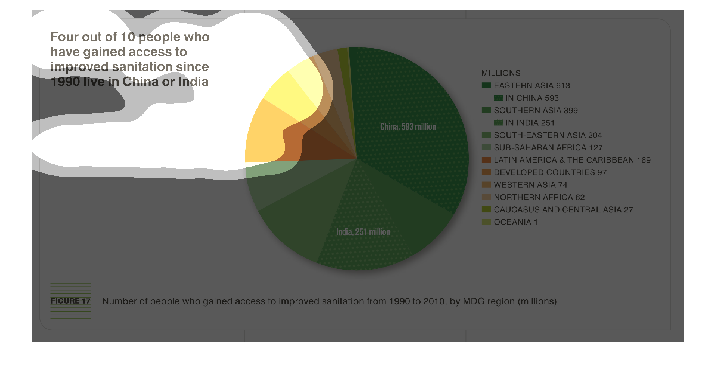
4 out of 10 people who have gained access to improved sanitation since 1990 seem to live in
China or India. The regions have been separated by MDG regions.
This image deals with sanitation in China and/or India  this graph is a circle graph and lists
several countries.  The graph illustrates the number of people who have gained access to proper
sanitation from 1990 to 2010
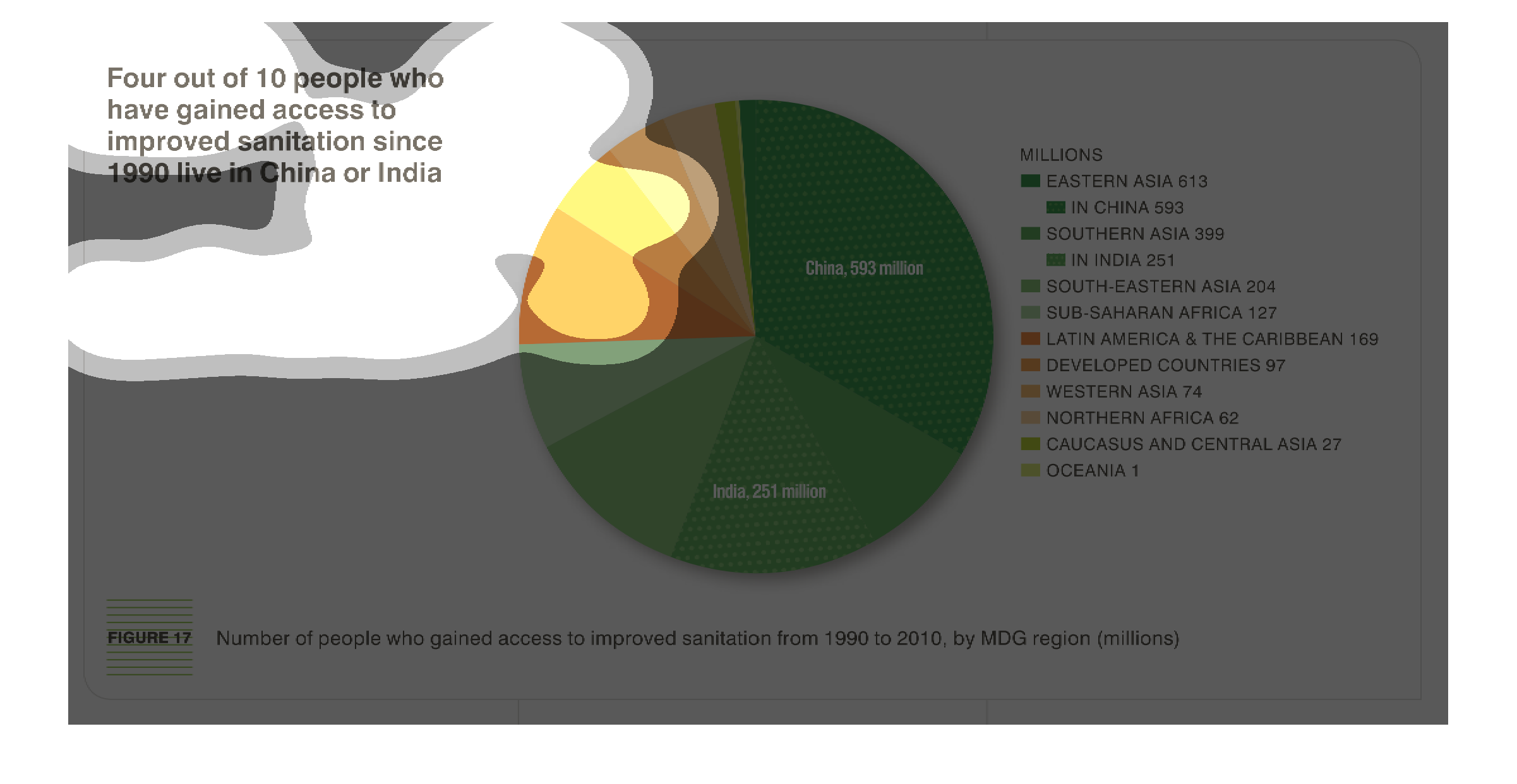
The figure presented is titled: four out of ten people who have gained access to improved
sanitation since 1990 live in China or India.  The graph is a pie chart.
This chart describes that four out of 10 people who have gained access to improved sanitation
since 1990 live in China or India. Categories are represented by different colors.
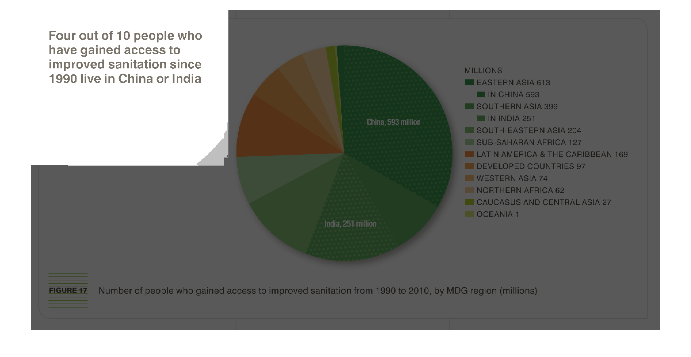
the chart is all about Four out of 10 people who gained access to improved sanitation since
1990 live in China or India. China is the Highest on the chart than India.