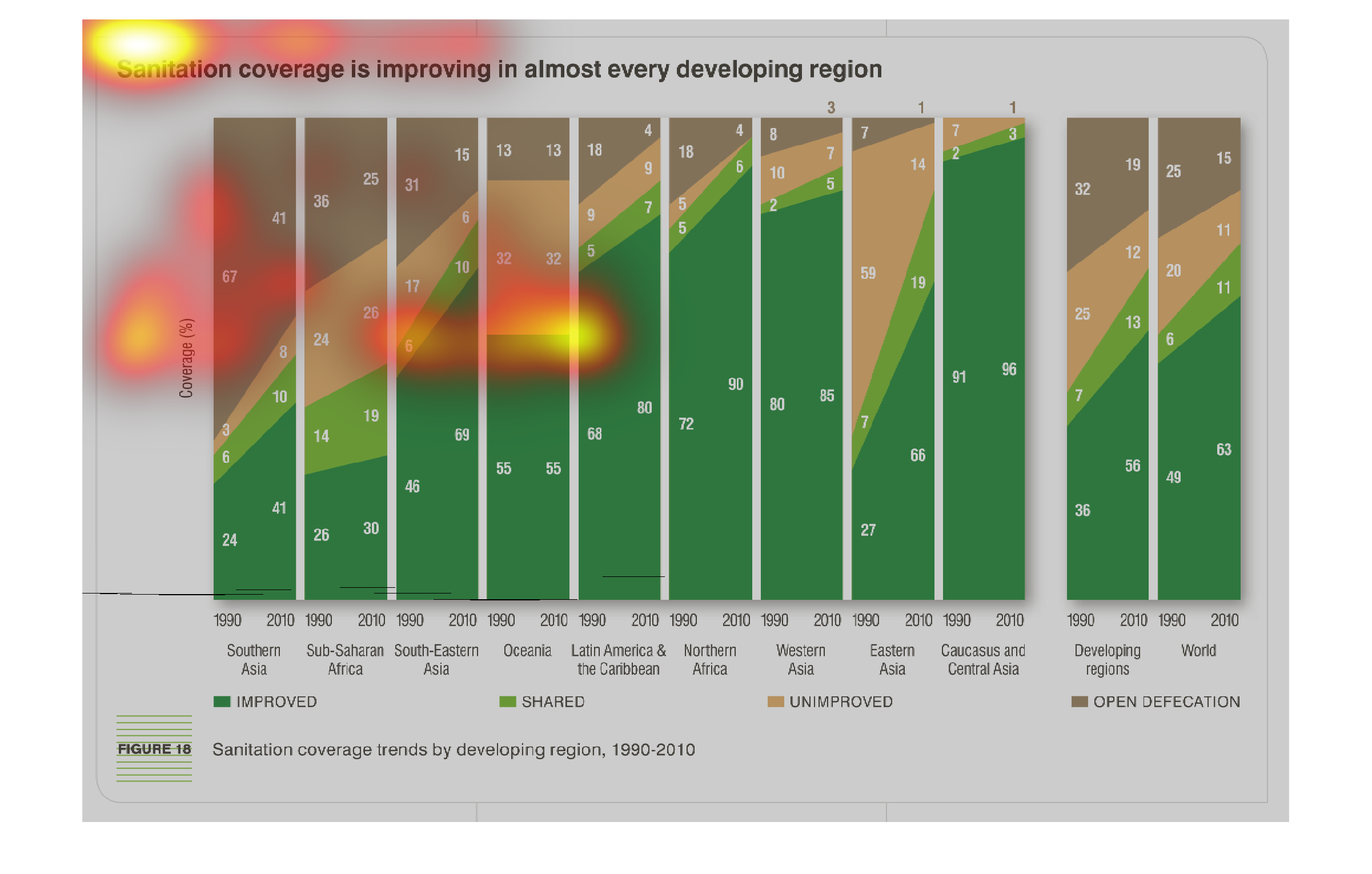
This chart shows the improvement of sanitation coverage in developing countries. Vertical
bars track yearly from 1990 left to right, with a rising green shade indicating improving
conditions going, with orange shading indicating lack of improvement and brown denoting open
defecation.
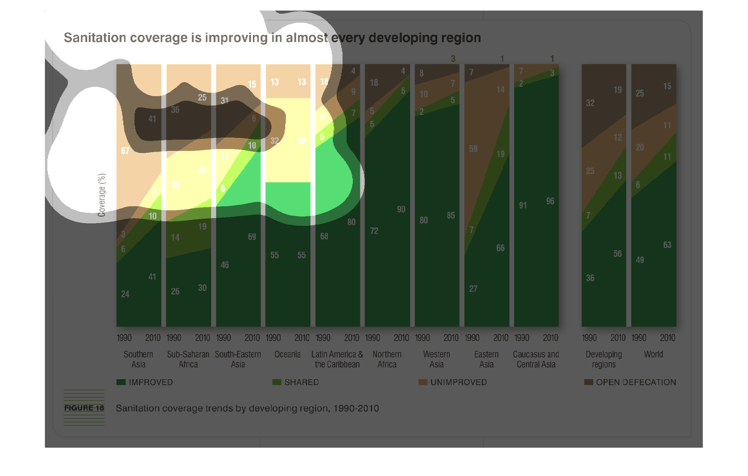
This chart shows sanitation coverage improving in developing regions. Green indicates which
regions have improved the most during years 1990 though 2010. While brown shows nothing being
improved.
This is a graph that is meant to illustrate the good news that at last we can report sanitation
coverage is improving among every developing region of the world.
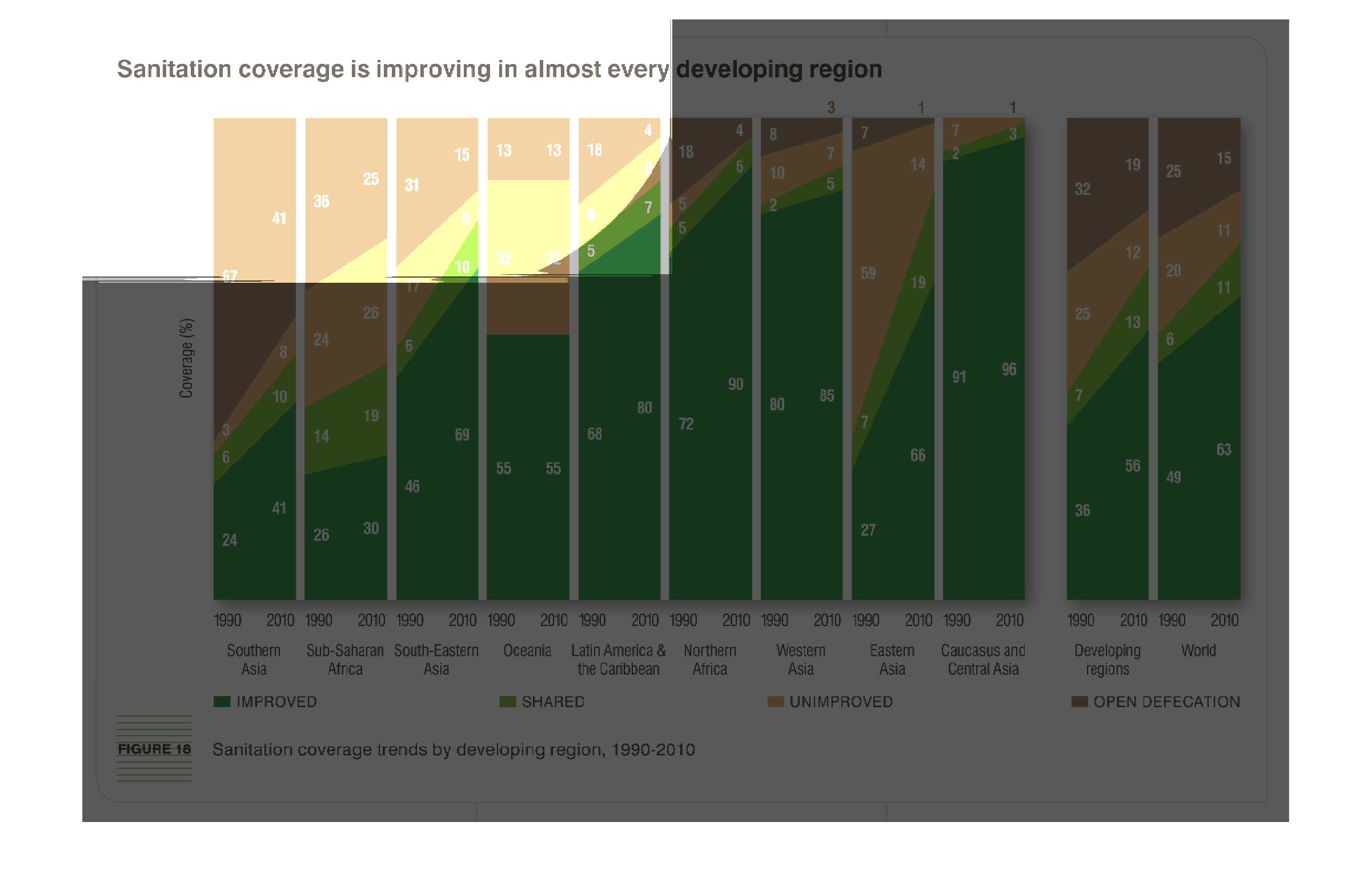
This graph is showing the improvement of sanitation around the world.  Showing the most improvement
would be Caucasus and Central Asia.  The graph also depicts the worlds over all improvement.
This is a graph showing how the sanitation coverage of certain countries has improved. It
gives examples of each country from the year 1990 to the year 2010.
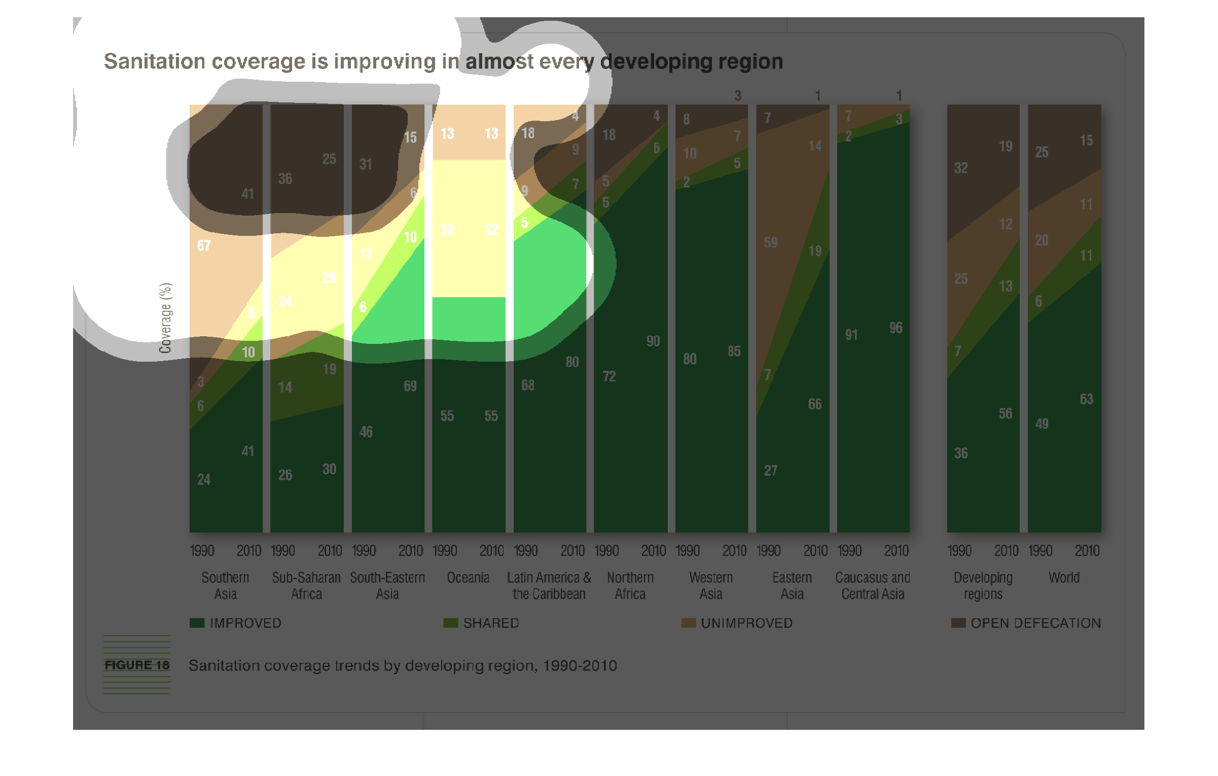
This chart describes sanitation coverage is improving in almost every developing region. Different
categories on the chart are represented by different colors.
Sanitation is improving in almost every developing country. It shows the sanitation coverage
trends by developing regions from 1990-2010. Caucasus and Central Asia are the most improved
91 in 1990 96 in 2010. Southern Asia has the most open defecation 67 in 1990 and 41 in 2010.
Sub-Saharan Africa has the most shared 14 in 1990 and 19 in 2010.
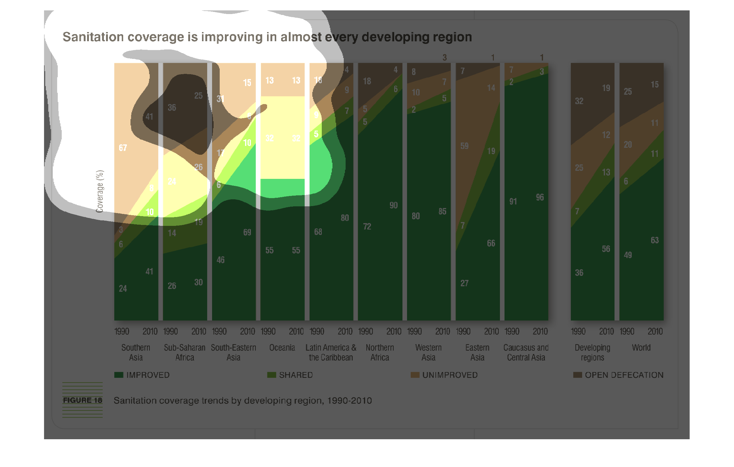
This chart describes that sanitation coverage is improving in almost every developing region.
Regions on the chart include Sub-Saharan Africa and Southern Asia.
The graph shows that developing countries are improving in their sanitation coverage.  The
graph lists several countries and the percentage of sanitation facilities which are shared
and adequate  in the country, those that are unimproved and percent where open defecation
still takes place.
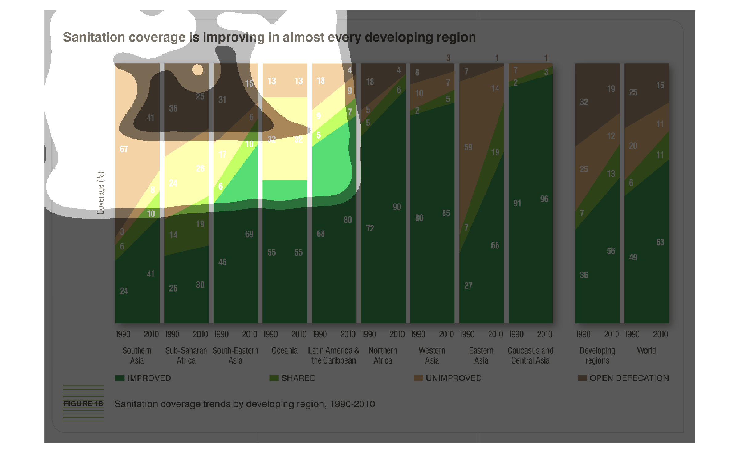
This study conducted between 1990-2010 shows the effects of the global concern and efforts
to better the sanitation of every location on the man, so people can live better lives.
As we can see from the graph, sanitation conditions are improving in almost every developing
region. Y axis shows coverage, X axis shows individual columns for each region of the world
according to year
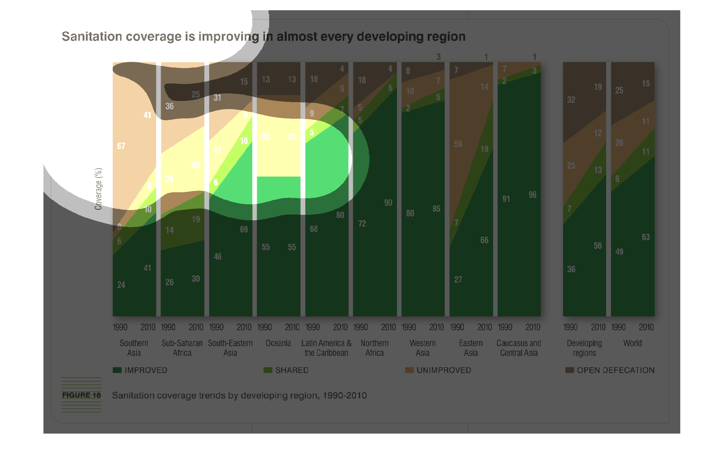
This shows the sanitation coverage in developing regions. Each type of sanitation coverage
is represented by a different color in the bar. Each bar represents a different region