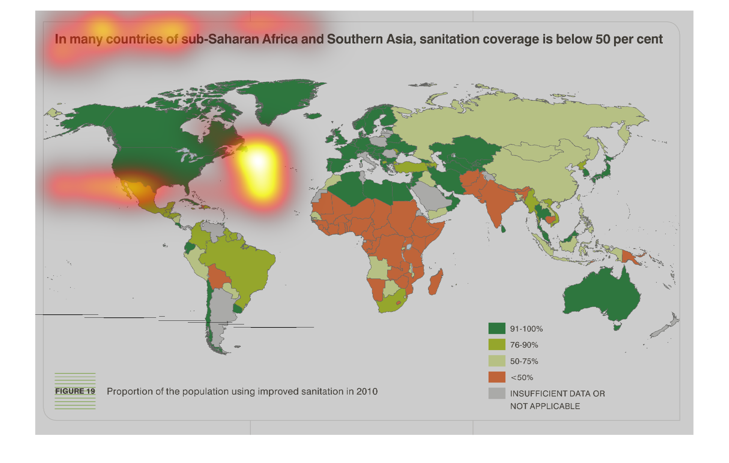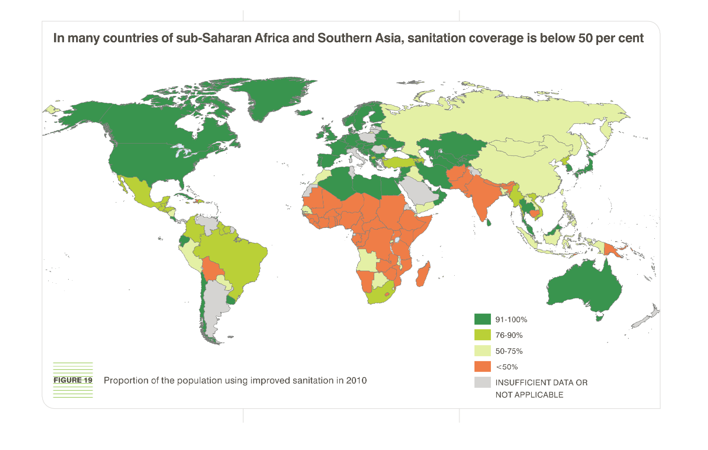
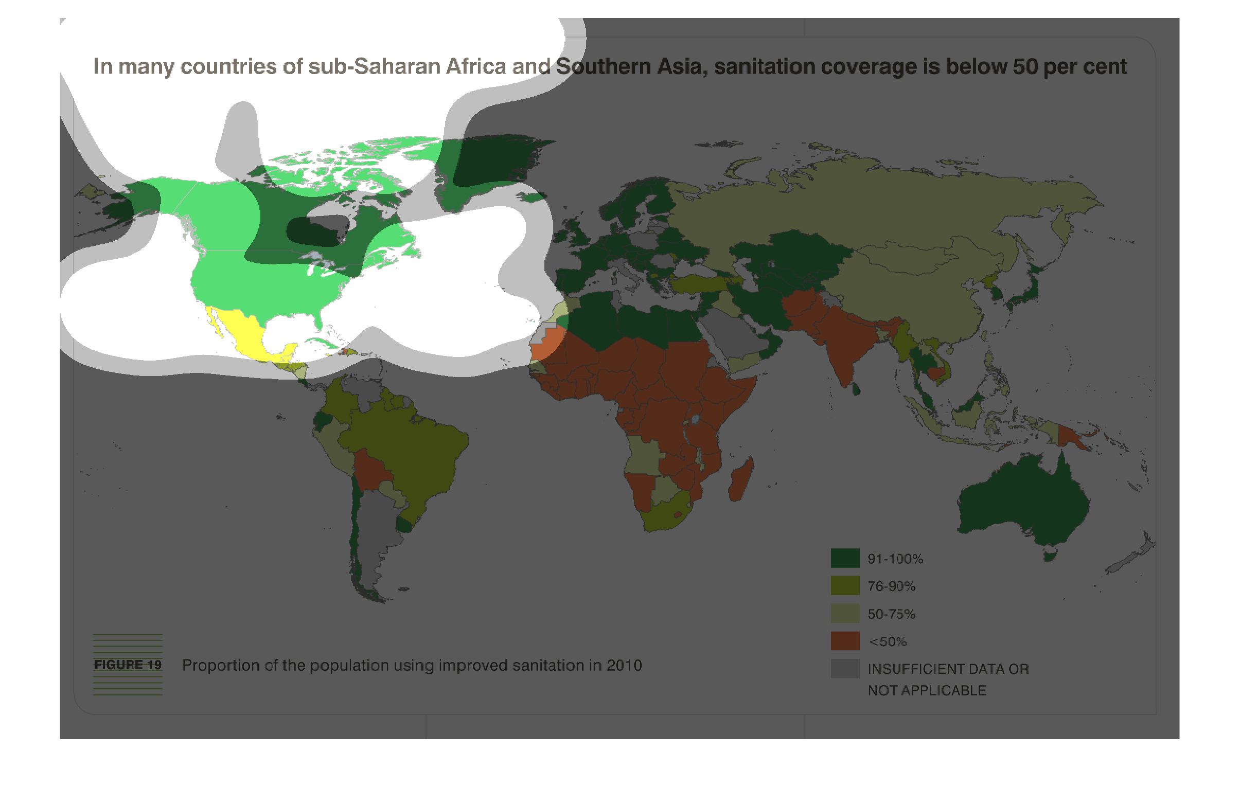
The image depicts a global map of the proportion of population using improved sanitation in
2010. Advanced countries are far more likely to use improved sanitation, versus less developed
countries such as Africa.
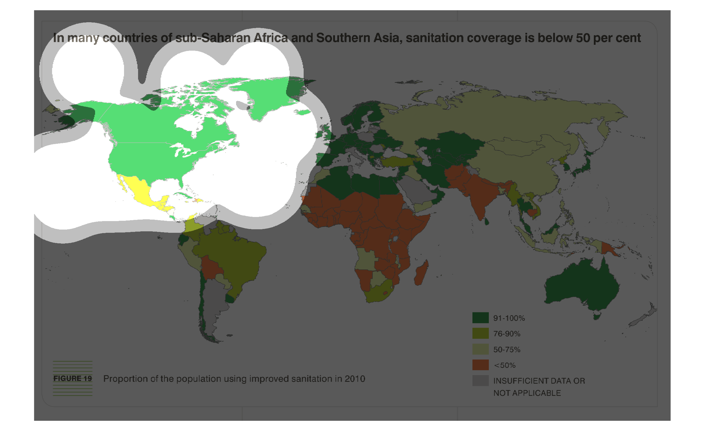
THIS MAP SHOWS THE SANITATION COVERAGE AS A PERCENTAGE BY COUNTRY. COUNTRIES ARE COLOR CODED
BY PERCENT SANITATION. SUB-SAHARAN AFRICA AND SOUTHERN ASIA HAVE THE LOWEST PERCENTAGES.
in many countries of sub sharan africa and southern asia, sanitation coverage is below 50%.
We see a color coded map. Highest percentages are seen in westernized places
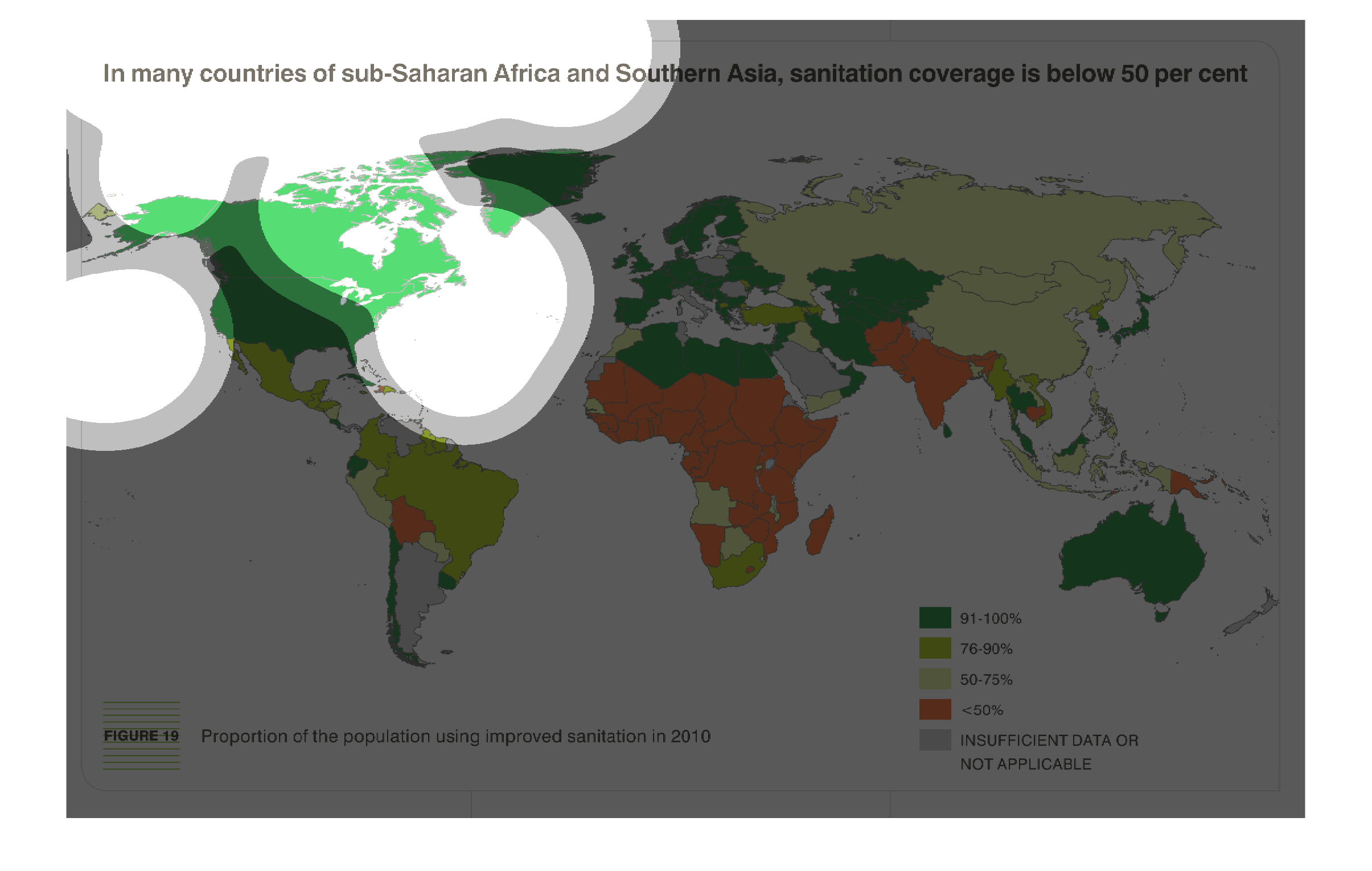
This is a map that shows that in many countries in sub-Saharan Africa and southern Asia, sanitation
coverage is actually below 50 percentage of the population within those regions.
In many countries of sub-Saharan Africa and Southern Asia, sanitation coverage is below 50
percent. The chart shows the proportion of  the population using improved sanitation in 2010.
North America, Australia and Europe show the greatest improvements.
This chart describes that in many countries of sub-Saharan Africa and Southern Asia, sanitation
coverage is below 50 percent. Different categories on the map are represented by different
colors.
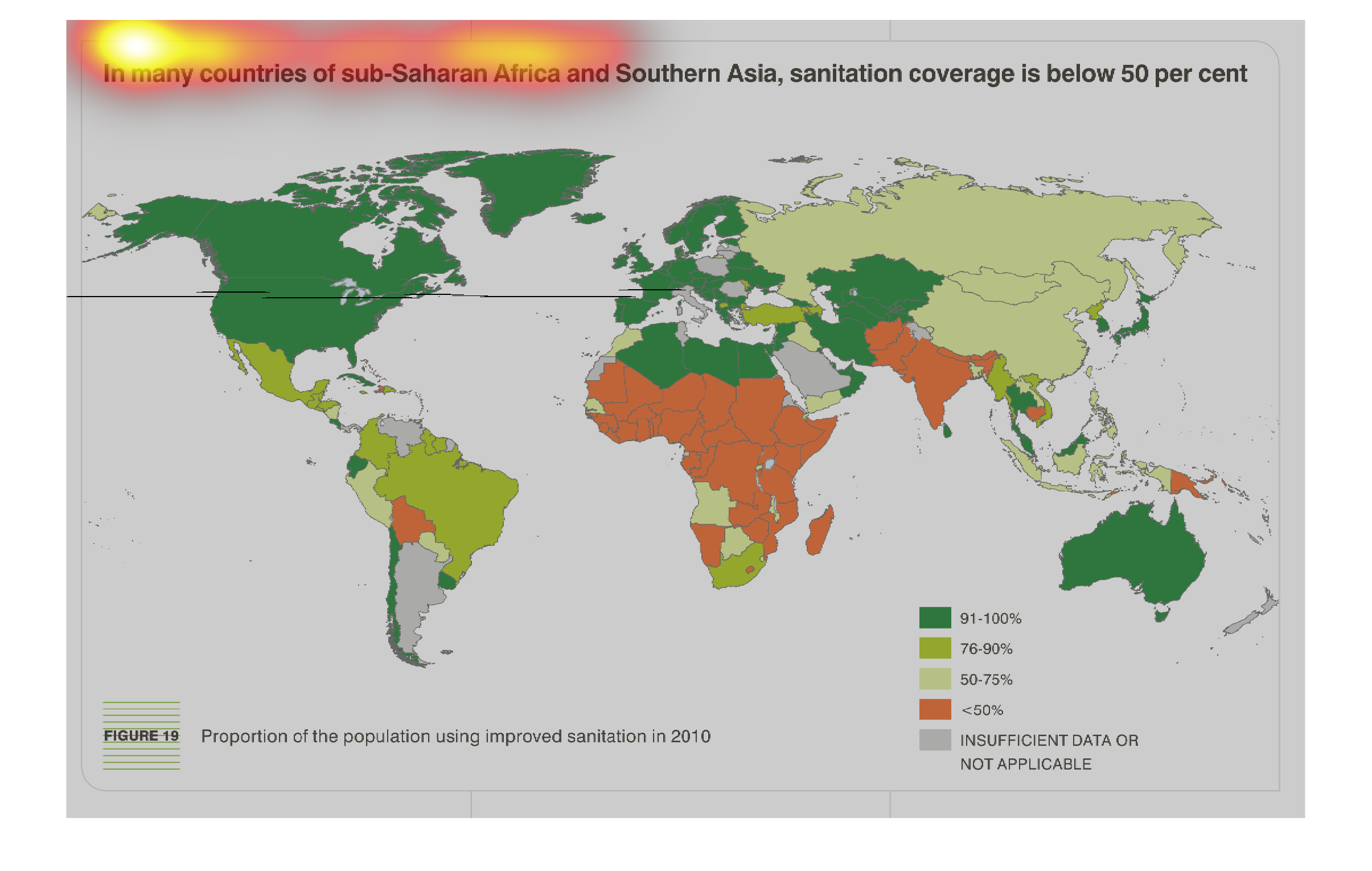
in many countries of sub-saharan Africa an Southern Asia, sanitation coverage is below 50%.
We see this displayed in a color coded world map, there are select South American countries
that also fall into the categorization.
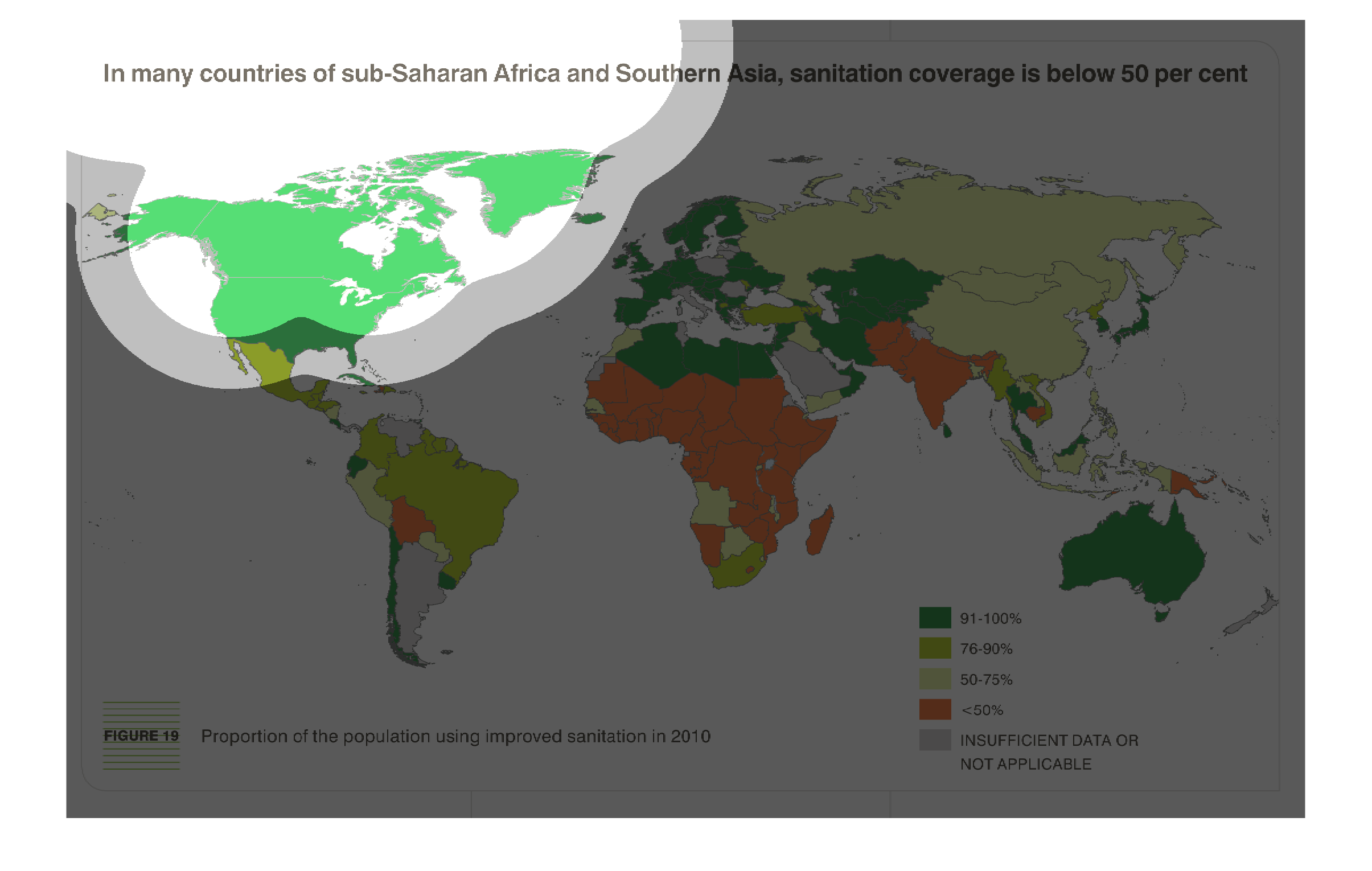
The chart shows the proportion of population using improved sanitation through out the globe
in 2010. Sub-Saharan Africa by far is the area using the least amount of improved sanitation,
at under 30%.
This tries to show the viewer that there is a great ill plaguing sub-Saharan Africa, and that
is the poor access of drinkable, clean water as compared to the rest of the world.
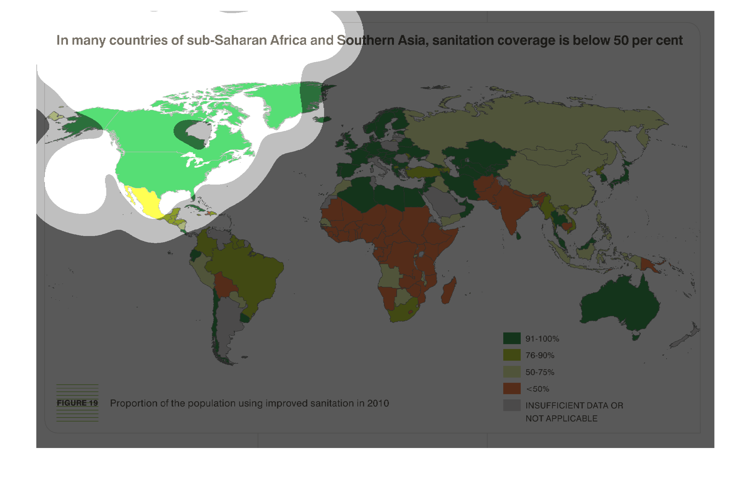
The figure presented is titled In many countries of sub-Saharan Africa and Southern Asia,
sanitation coverage is below fifty per cent.  The figure represents sanitation.
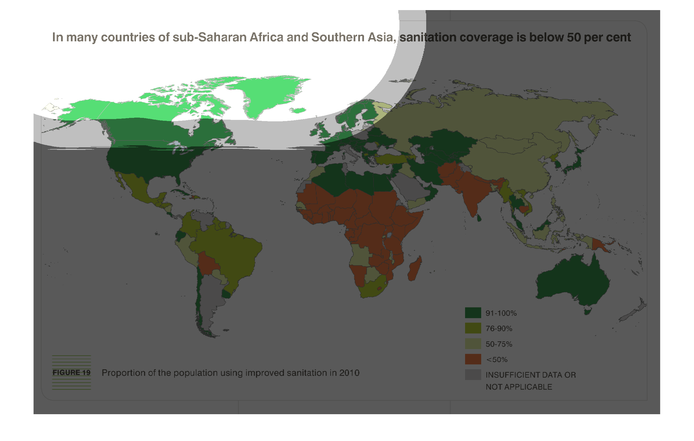
This graph demonstrates the percentage of population using improved sanitation in 2010. This
graph shows that much of Africa, less than 50% of the continent uses improved sanitation.
It also shows the while much of much of the world uses 91-100% improved sanitation, there
is a larger portion that only uses 90% or less.
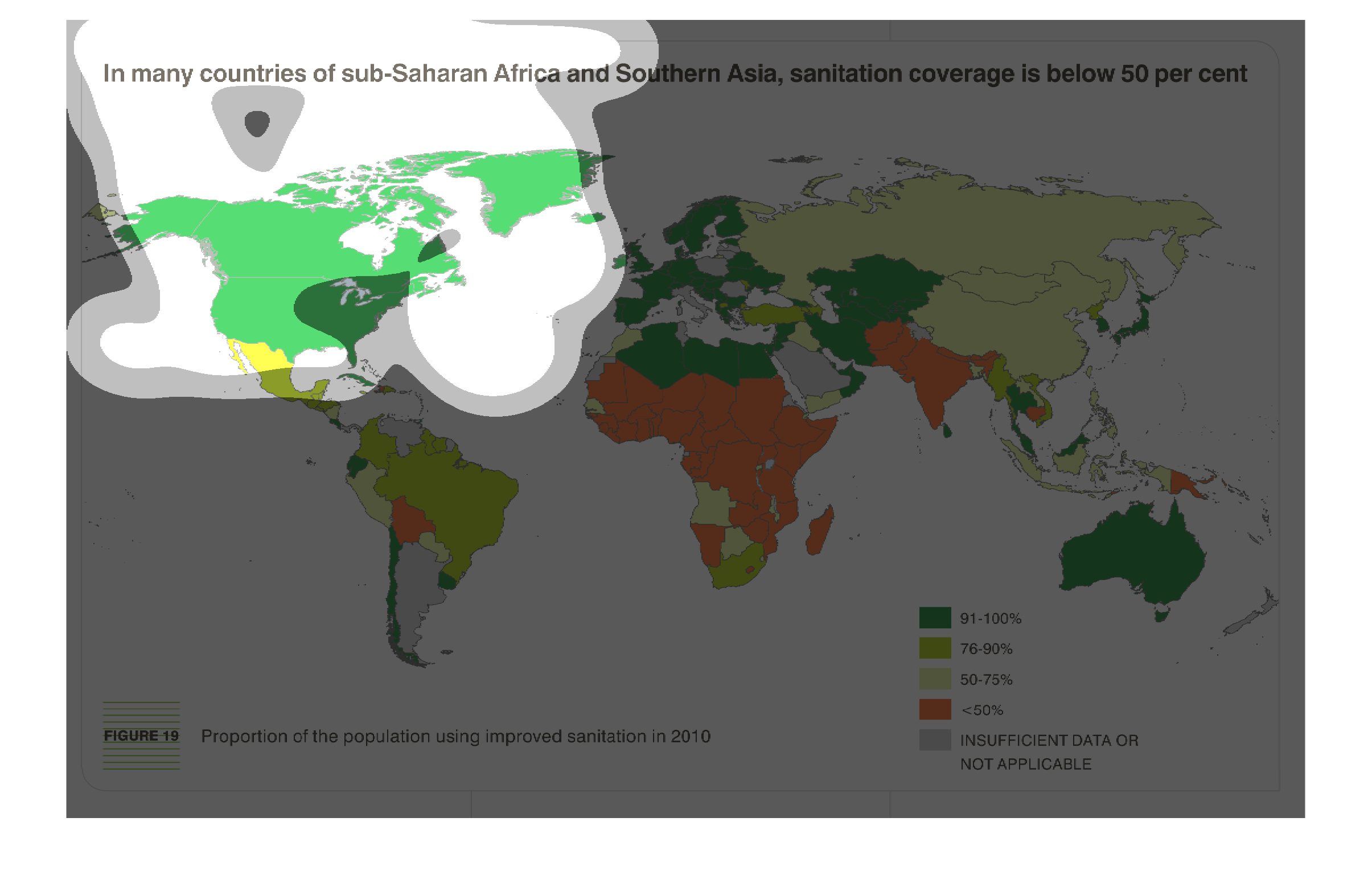
This chart describes that in many countries of sub-Saharan Africa and Southern Asia, sanitation
coverage is below 50 percent. Different categories are represented by different colors.
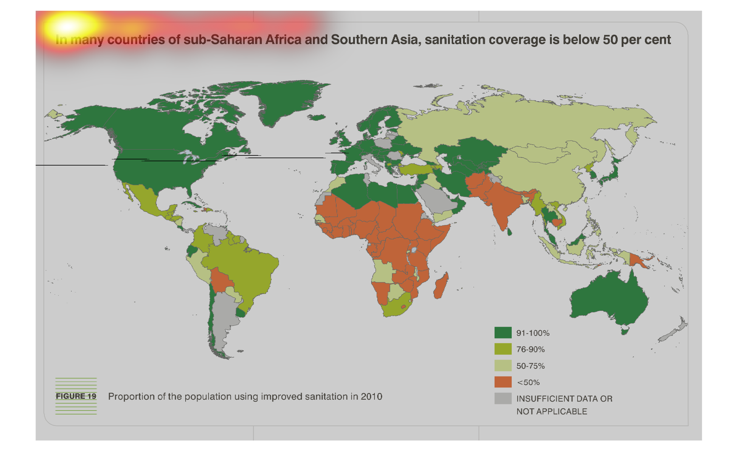
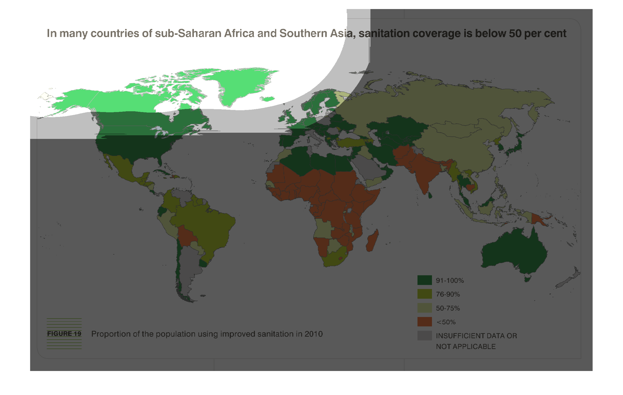
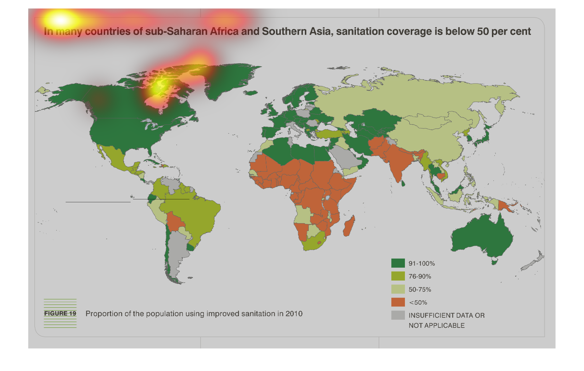
The image is a color coded wold map that shows what percentage of the population in each country
uses improved sanitation practices in 2010.    Dark green shows that 91-100% of the population
used improved sanitation.  Light green shows that 76-90% of the population used improved sanitation.
 Grey shows that 50-75% of the population used improved sanitation.  Red shows that less that
50% of the population used improved sanitation.  The creator of the image wishes to show that
many countries in Sub-Saharan Africa and Southern Asia are below 50&.
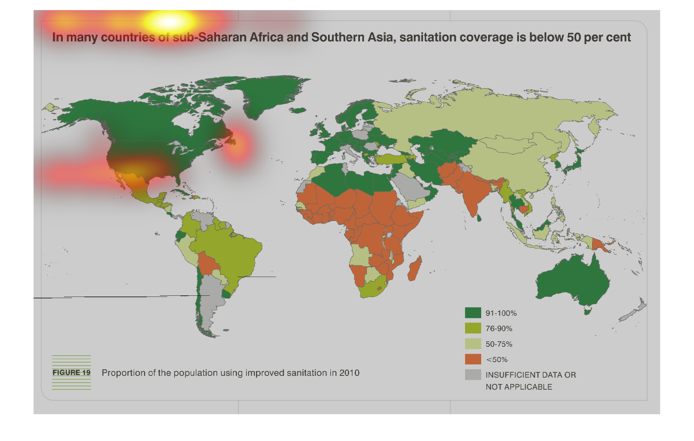
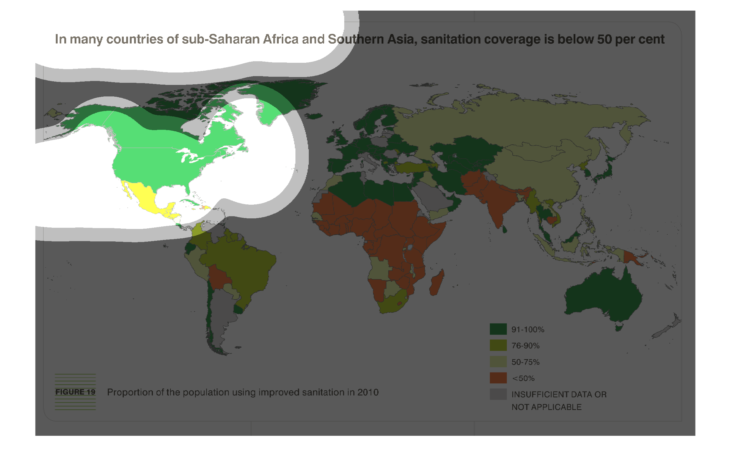
This world map shows the state of sanitation coverage, with sub saharan africa being of particular
concern. Again, the countries are shaded by percentage.
This world map addresses the problems of global sanitations, and shows how in many countries
in sub saharan africa, it is still a big problem. Countries are color and shaded by percentage
of the populations using improved sanitation.