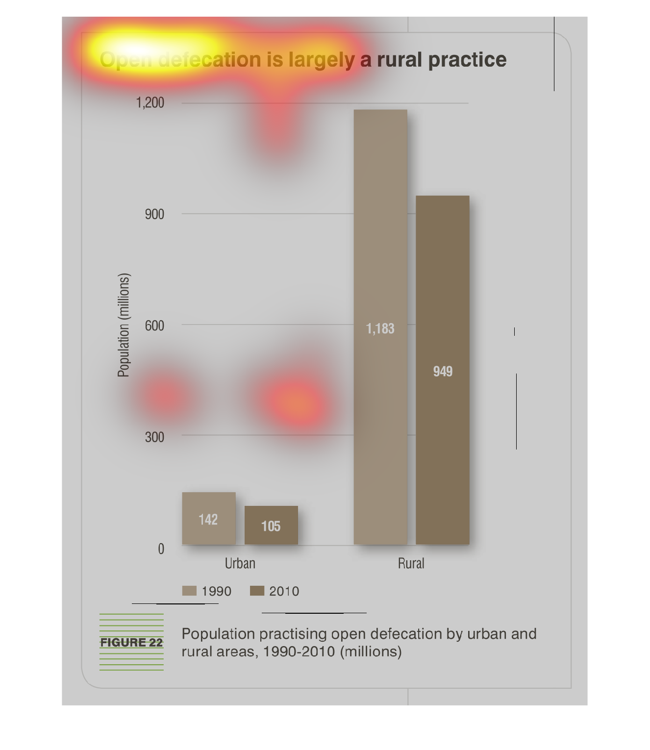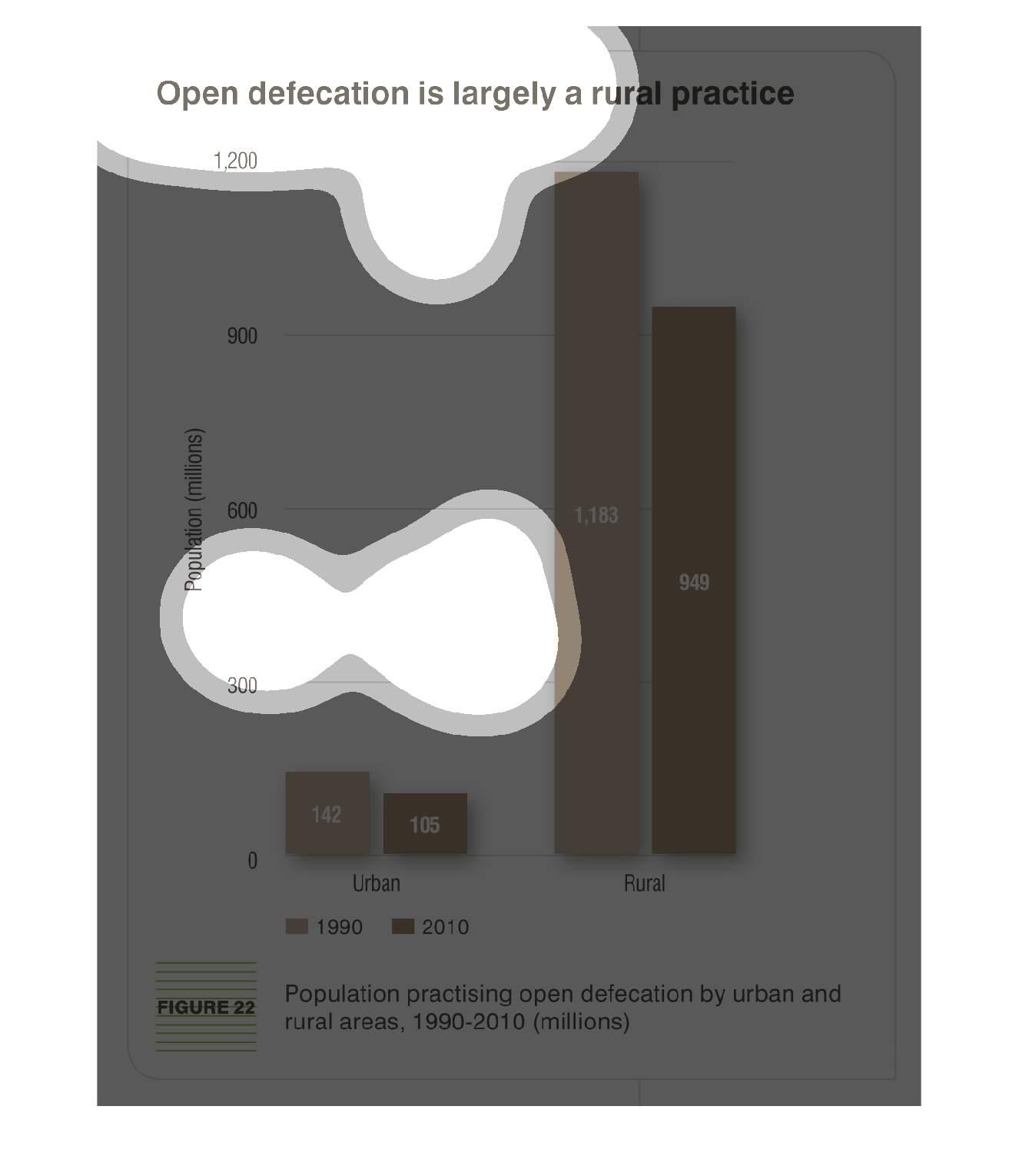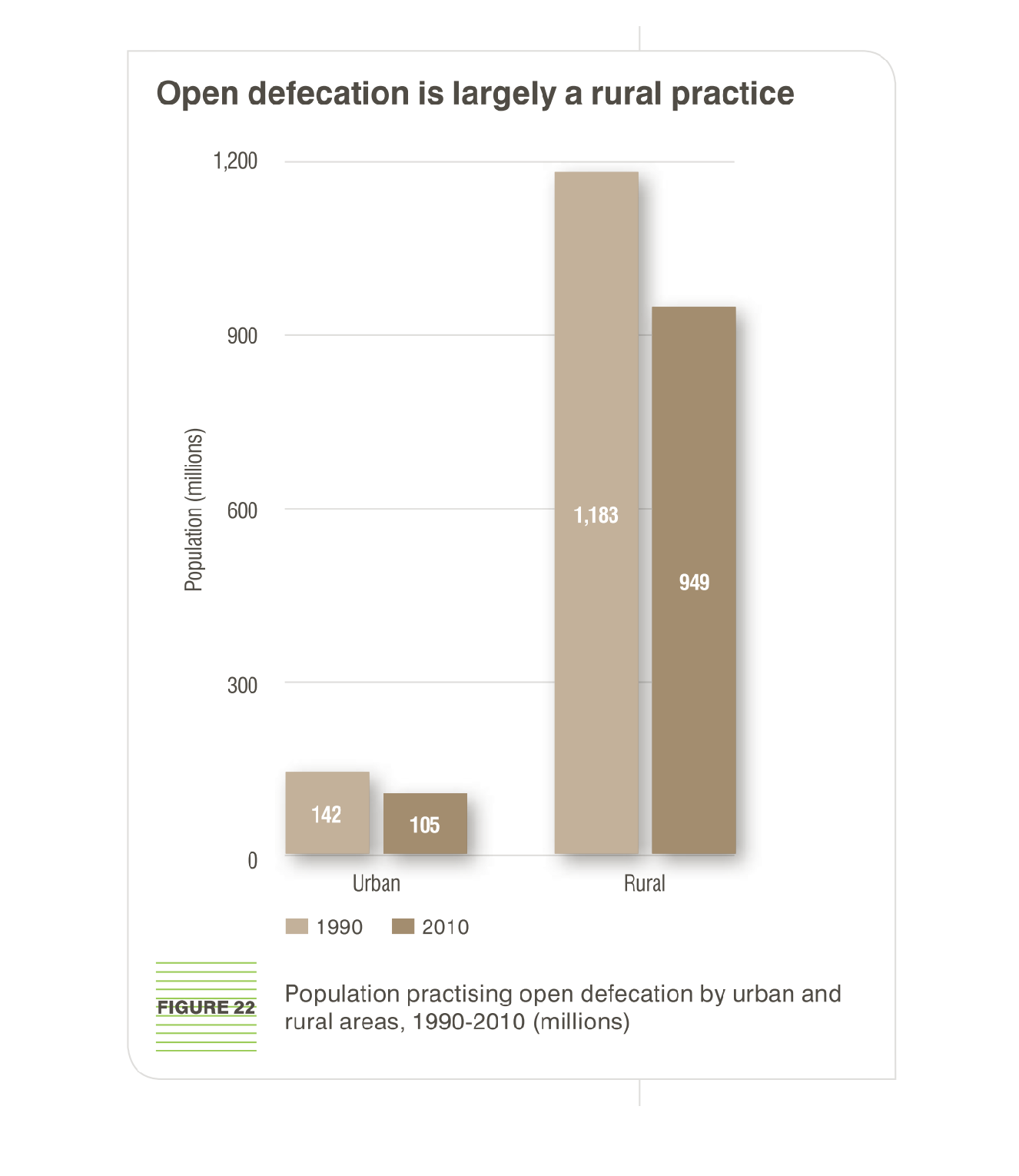
This graph compares open defecation in open areas. It compares the occurences between urban
areas and rural areas. The vertical bars represent the occurences of open defecation
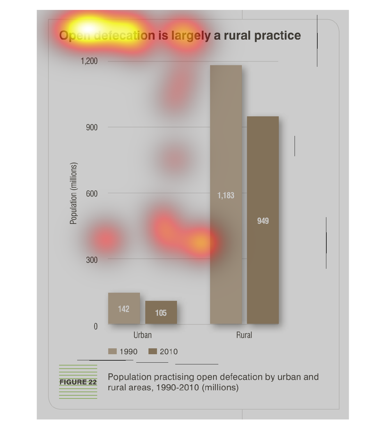
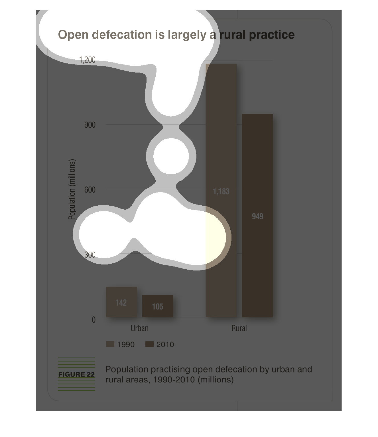
The bar graph shows the numbers in millions of those who admit to open defecation in urban
versus rural populations,  There is no time frame that I can find not does it indicate what
the two different colored columns represent.
This bar graph is based on open defecation being a largely rural practice. It compares open
defecation in rural areas vs urban areas, and specifically compares how common the practice
was in 1990 vs 2010. The graph breaks down the percentage of people performing this practice
based on population sizes recorded in the millions.
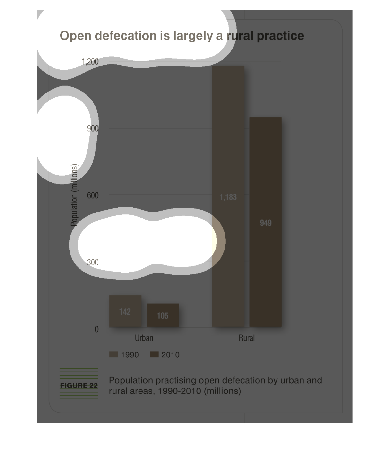
The figure presented is titled Open defecation is largely a rural practice.  The figure is
an actual representation of the data of open defecation as a rural practice.
This chart describes that open defecation is largely a rural practice. The chart is divided
between urban and rural areas. Different categories are represented by different colors.
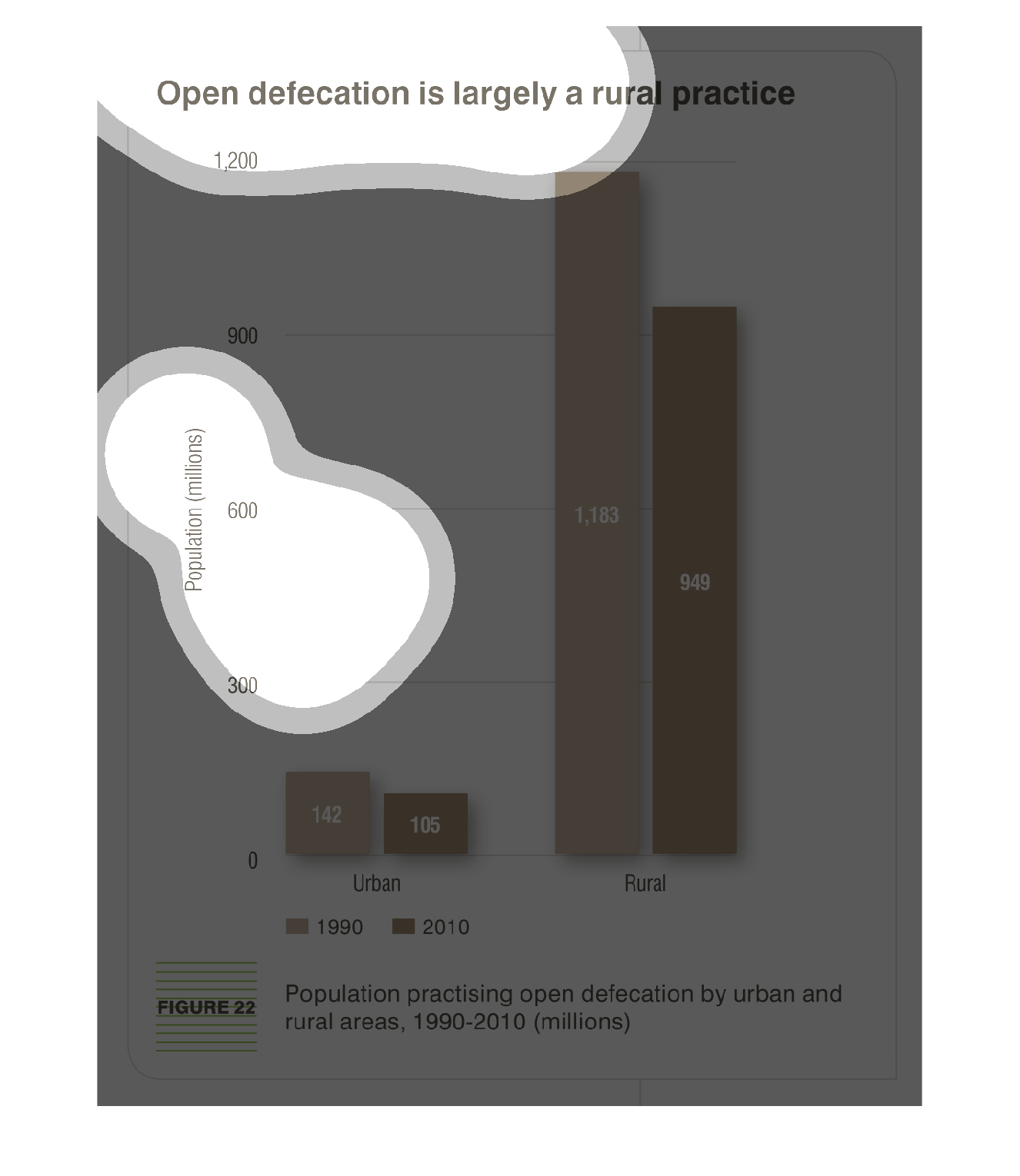
This graph represents the phenomenon of open or public defecation with regard to where it
is typically practiced and how its frequency has changed overtime. Overall, while the practice
is much more common in rural areas, in both rural and urban areas, it has decreased in frequency
across the board between 1990 and 2010.
This is a series of bar graphs depicting that open defecation is largely a rural practice
as seen in data in the years 1990 and 2010. The practice is seen in rural areas far more than
in urban.
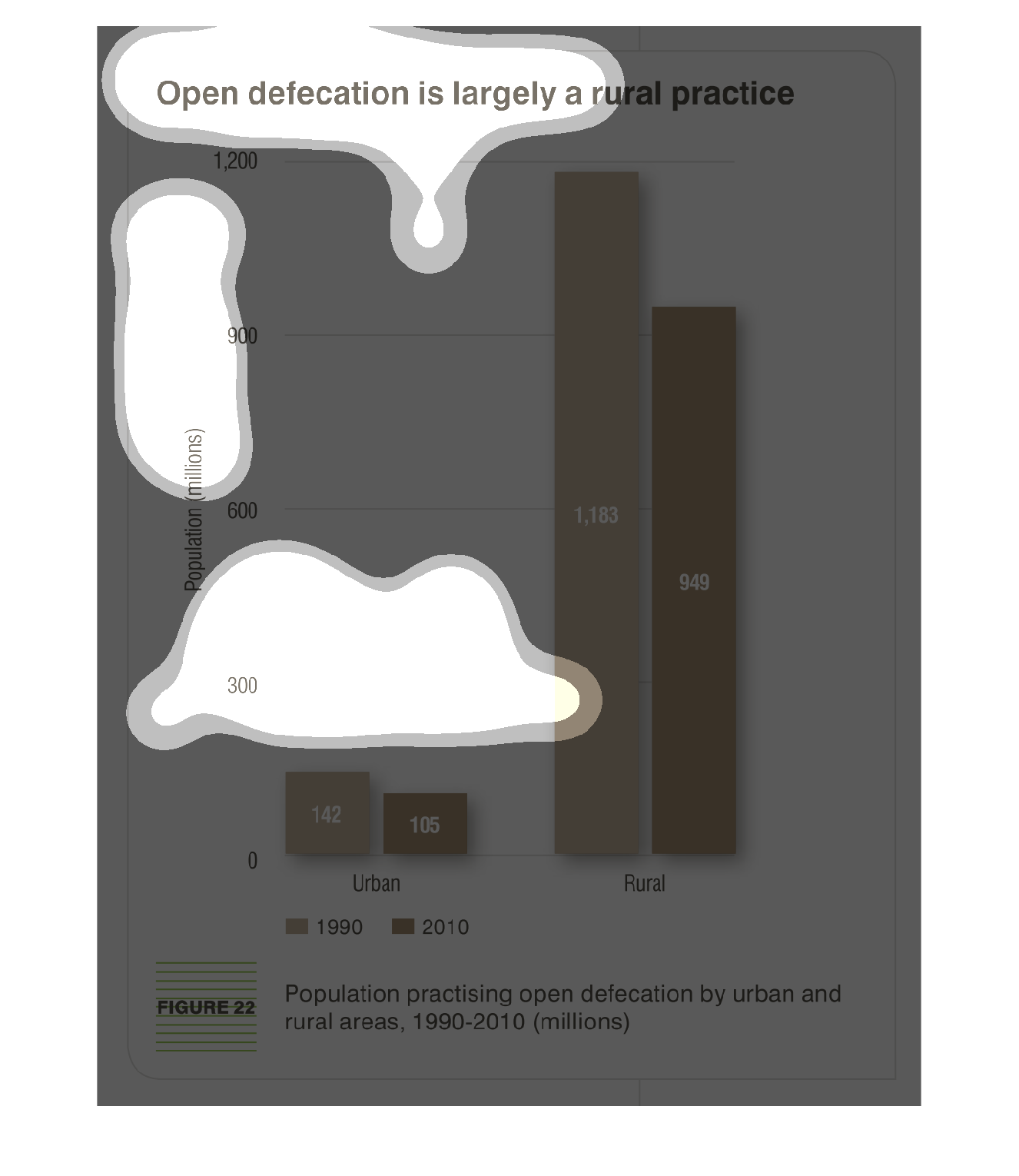
This is a graph that shows the extent to which open defecation is widely practices with the
population. It divides this problem between those in urban areas and those in rural areas.
This image or figure shows or depicts in statistical bar graph format data concerning open
defecation is largely a rural practice as opposed to an urban one.

This chart compares open, meaning, public defecation. It is a bar graph that compares the
total amount of the action divided by rural and urban occurrences.
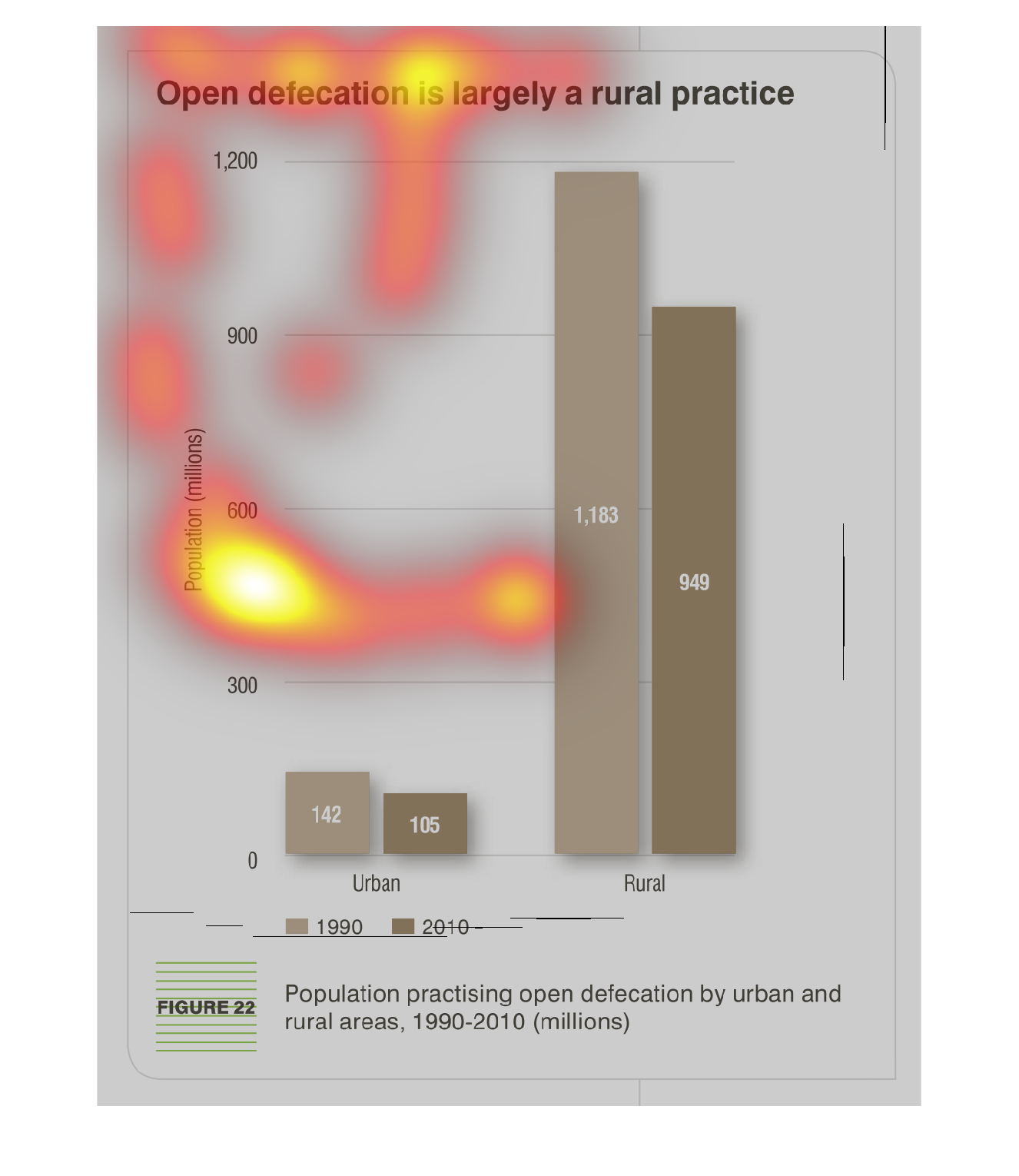
The image depicts a bar graph showing that open defecation is largely a rural practice. Years
compared are 1990 versus 2010. Urban practice of open defecation is very small, and has decreased
in the years studied. Rural defecation is massively high, but has also decreased somewhat
in the years studied.

A more than 20 year study on human defecation. From the urban streets bustling with movement
and sounds, to the rural areas where you can see for miles of open country; this study sets
out to learn why we defecate in the open more than we do in an urban setting. A lack of indoor
plumbing and toiletries might be the issue.

This chart shows that open defecation is more prevalent in rural areas. The chart shows statistics
from 1990 to 2010. The amount calculated uses millions as the numerical count.
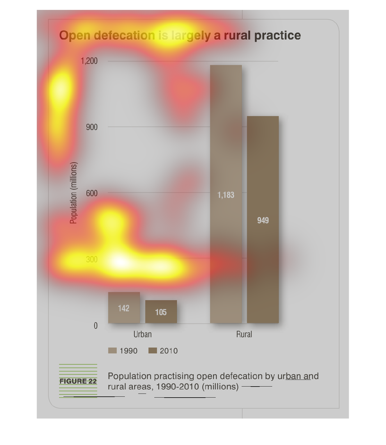
This chart describes that open defecation is largely a rural practice. The chart is divided
 between urban areas and rural areas. The highest spike on the chart occurs in the rural area.
This chart clearly displays the amount of open defecation , and shows that it is a common
rural practice. There is more than 5 times as much open defecation in rural areas than in
urban areas.