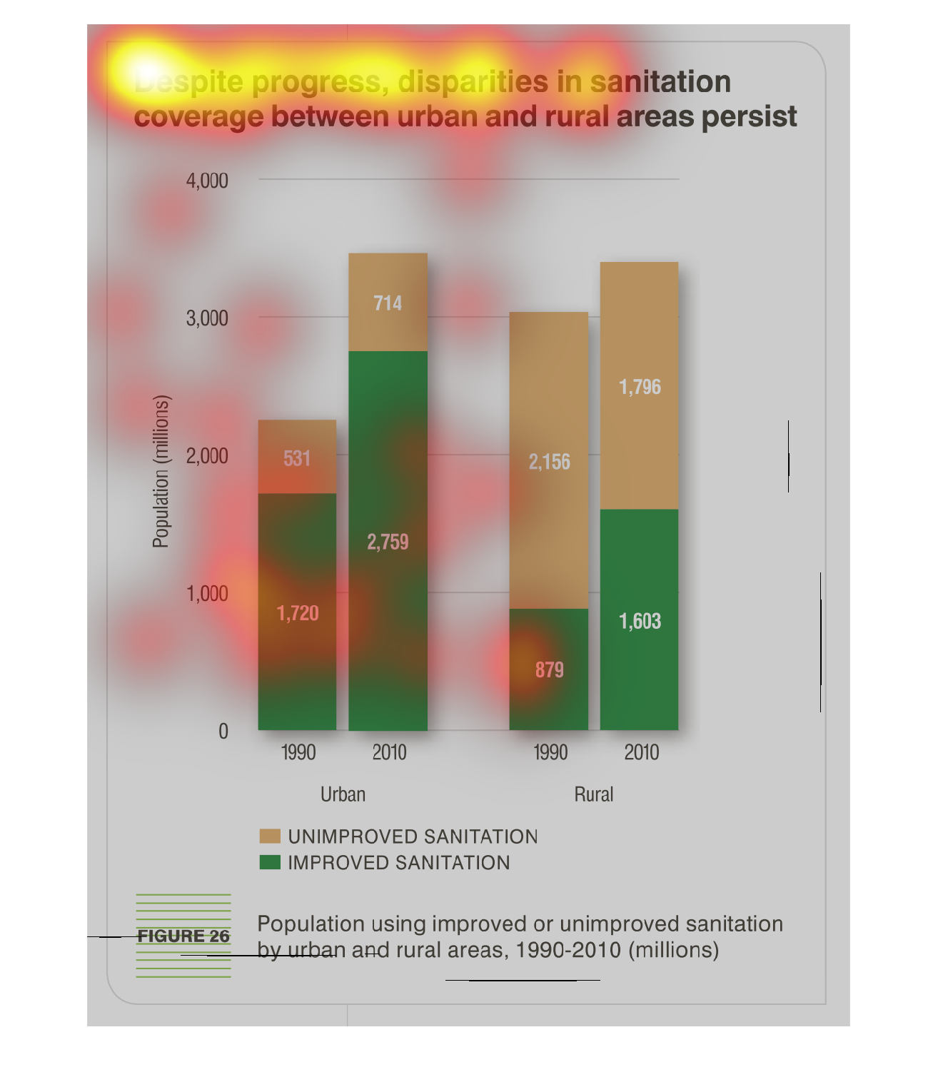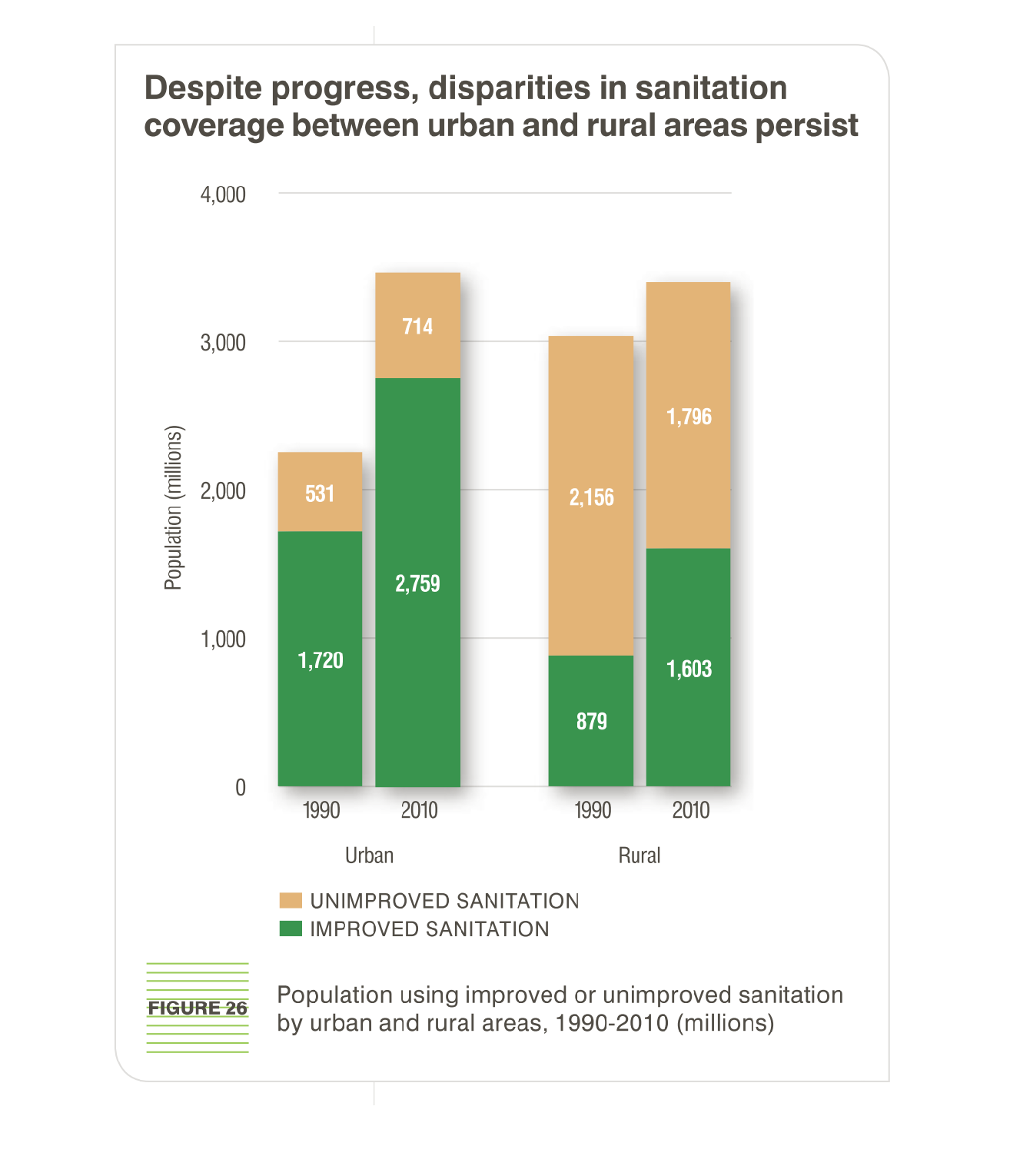
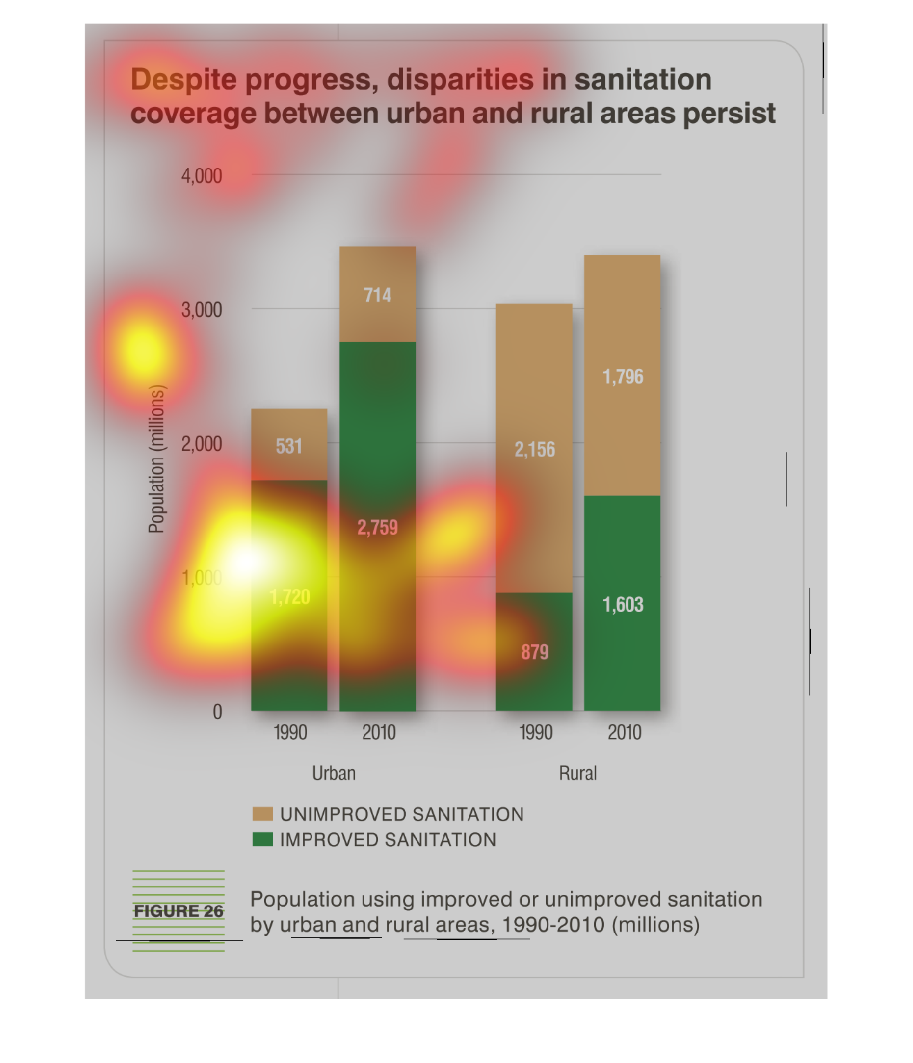
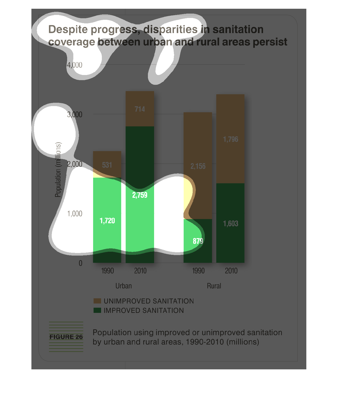
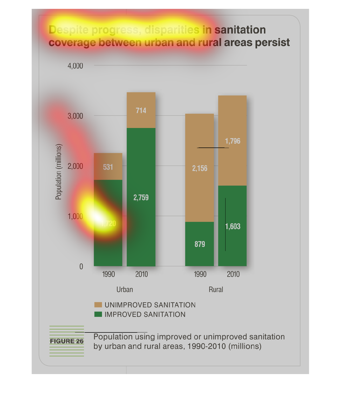
This is a bar graph showing improvements in sanitation for urban vs. rural areas in 1990 and
2010.  It shows that many more improvements have been made in the urban areas than have the
rural areas.
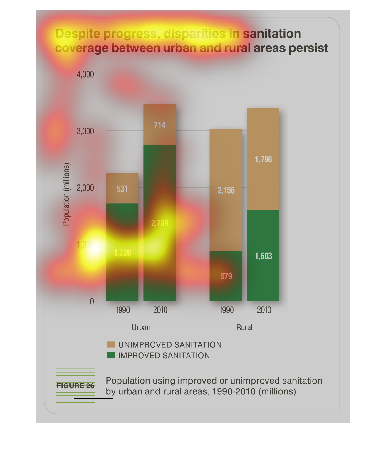
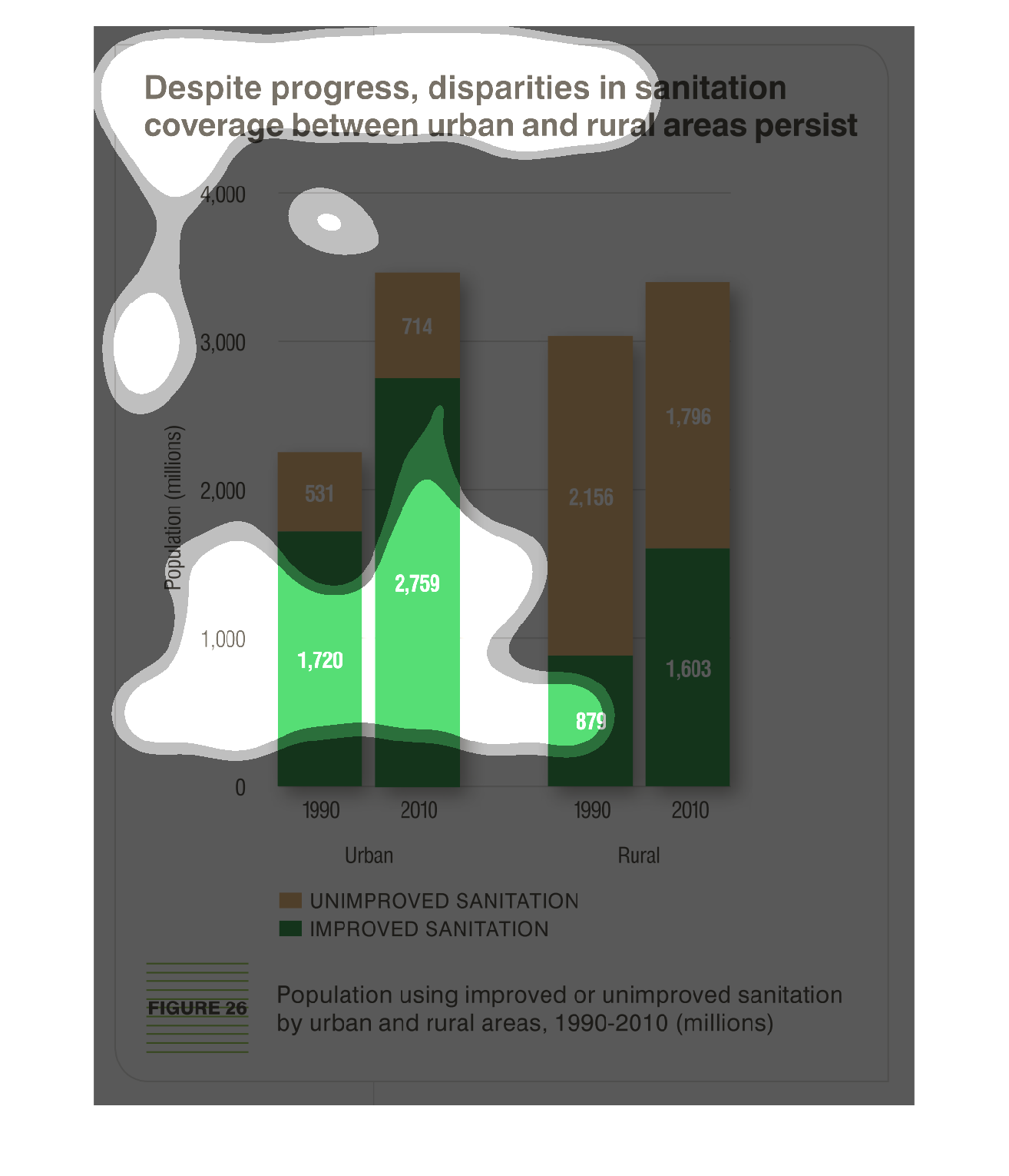
Graph shows unimproved and unapproved sanitation by population ( in millions) in rural and
urban areas from 1990-2010. The graph shows improved sanitation in rural areas out numbers
the unapproved sanitation.  In  rural areas the opposite is true.
The image depicts the disparities in sanitation coverage between rural and urban areas persisting.
Data cites years 1990-2010. Urban sanitation has improved greatly, while rural sanitation
still lacks improvement to quite a noticeable degree, with improvement in rural sanitation
lacking greatly when compared to urban improvements.
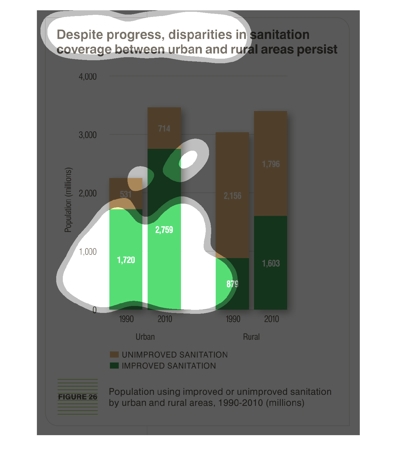
This graph shows the difference between places that have improved on sanitation and on places
that have not improved on sanitation. Over a period of 10 years the population has grown and
the sanitation has gotten worse
The compares the sanitation levels between rural and urban communications by populations.
The green represents the improvement and the orange-like color demonstrates unimprovment,
which seems to be more of the case for both.
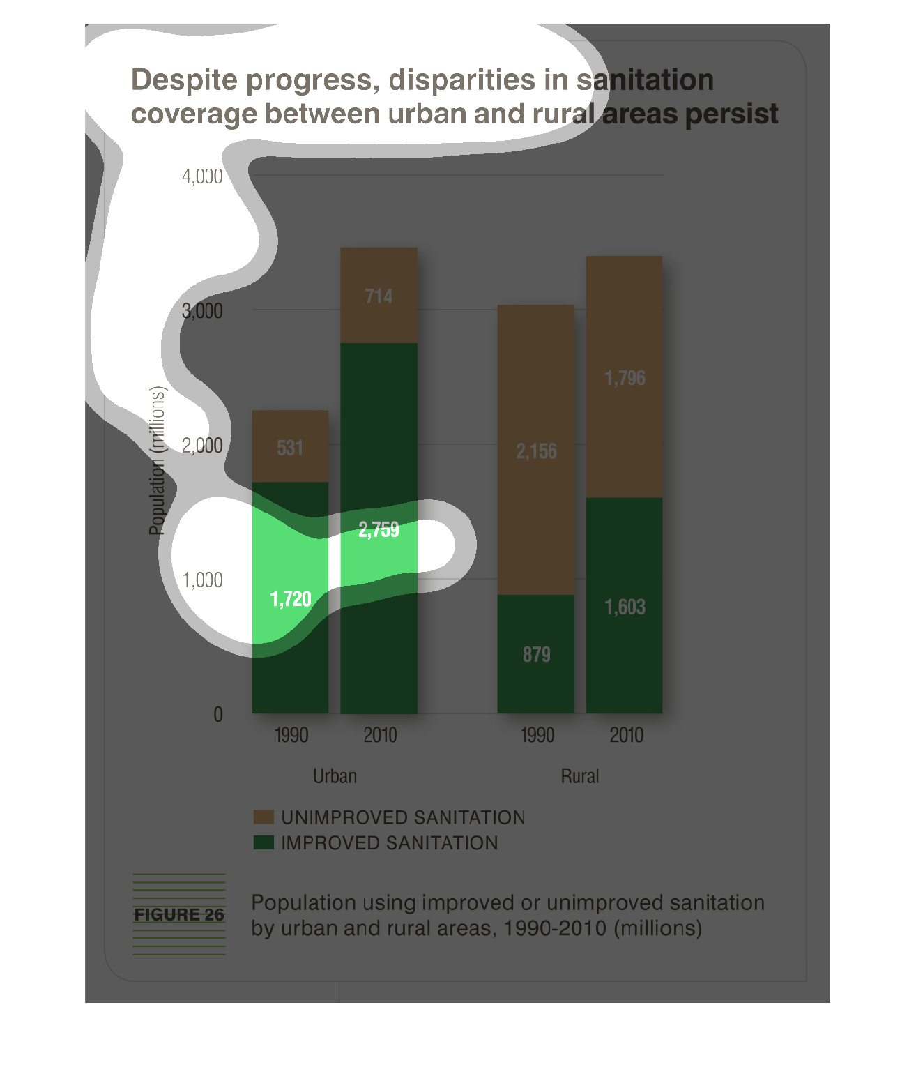
This is a graph that shows the extent to which there is a problem with sanitation despite
the progress in disparities in sanitation coverage between specific urban and rural areas
This chart describes that despite progress, disparities in sanitation coverage between urban
and rural areas persist. The chart is divided into two categories, improved and unimproved.
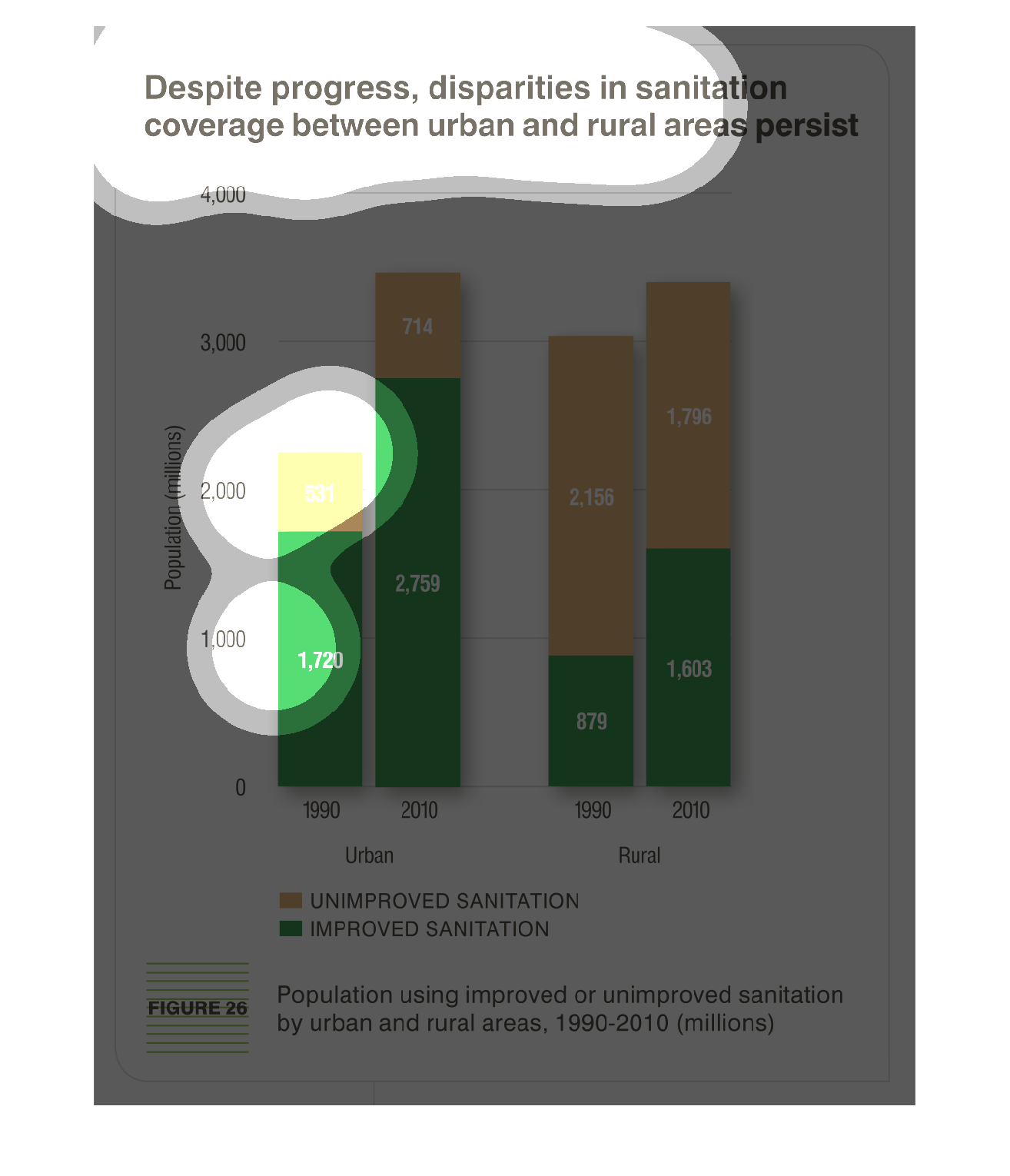
The distribution of sanitation funds is completely out of wack and is not evenly distributed
between urban and rural areas. This graph illustrates that point very well with the conclusion
that rural areas are getting the raw end of the deal.
This is a graph showing the differences between sanitation standards between urban and rural
areas. Urban areas have a greater percentage of the population with improving sanitation standards.
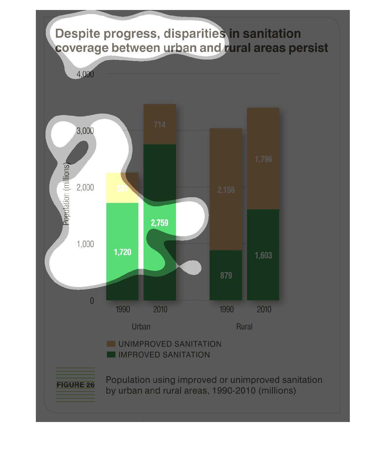
THIS PLOT SHOWS THE POPULATION IN MILLIONS IN 1990 AND 2010 WHOSE SANITATION SYSTEMS HAVE
BEEN IMPROVED. EACH BAR IS BROKEN DOWN BY IMPROVED/UNIMPROVED, AND THE TWO PAIRS OF PLOTS
COMPARE URBAN AND RURAL DWELLERS.
This chart describes that despite progress, disparities in  coverage between urban and rural
areas persist. The chart is divided between unimproved and improved sanitation.
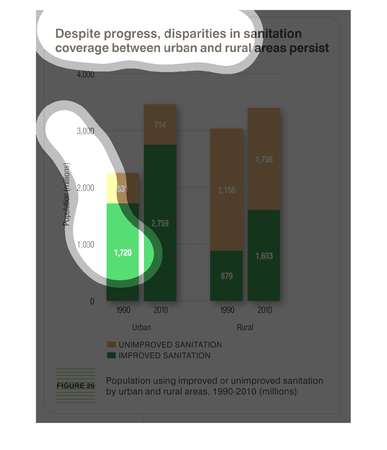
Continued progress with in sanitation, disparities remain between urban and rural areas.
Based on million population numbers, there is significant areas of no improvement still versus
areas of improvement.  Comparisons are based on data from 1990 to data from 2010 from figure
26.  Urban:  1990 improved 1,720 million and unimproved 531 million.  2010 improved 2,759
million and unimproved 714 million.  Rural:  1990 improved 879 million and unimproved 2,156
million.  2010 improved 1,603 million and unimproved 1,796 million.
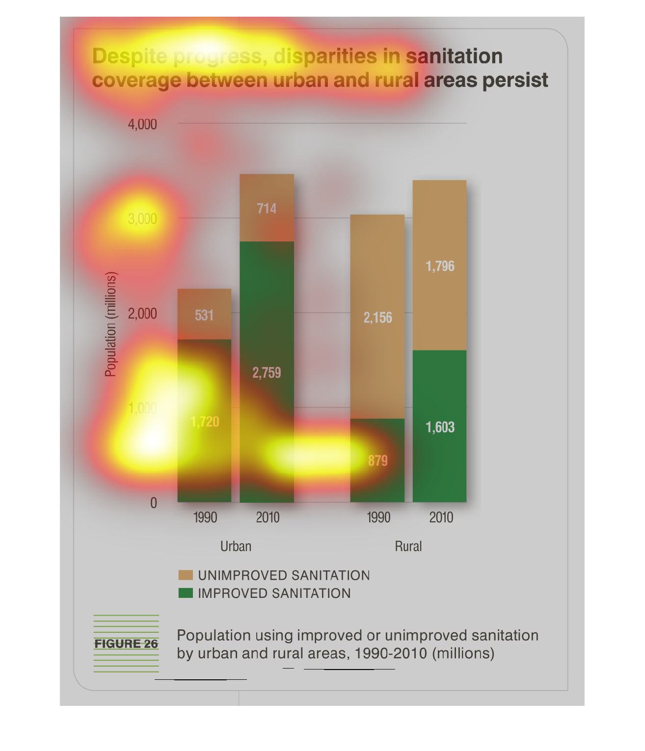
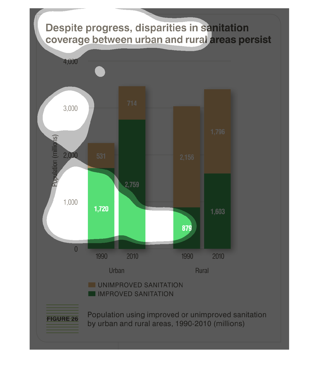
This chart shows that despite improvements in sanitation technology and procedures in sanitation,
problems still exist in both rural and urban areas. It shows that unimproved sanitation measures
are used in rural areas, while improved sanitation measures are practiced in urban areas.