Warning: Image is too big to fit on screen; displaying at 50%
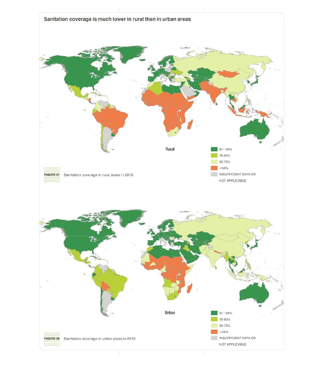
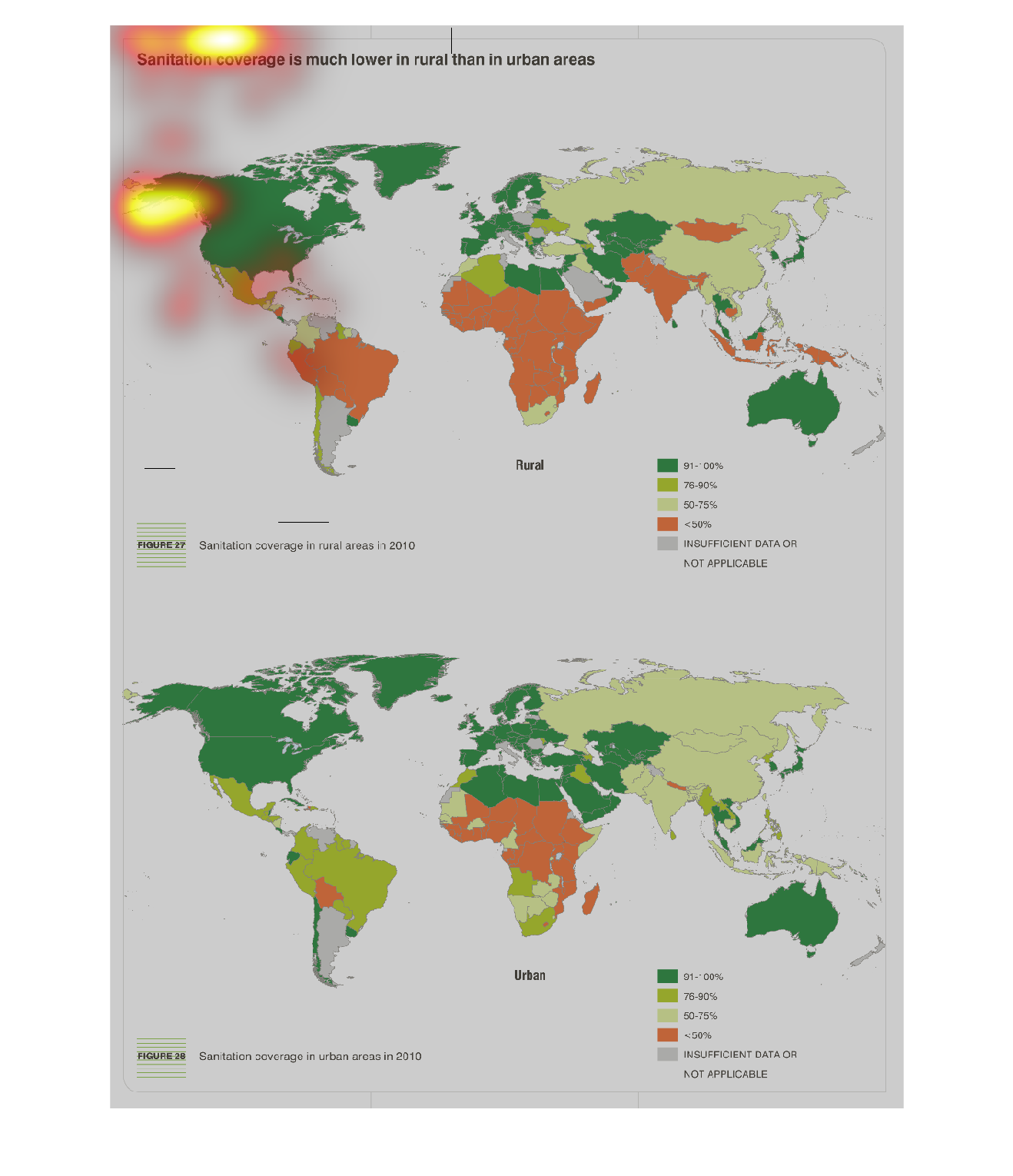
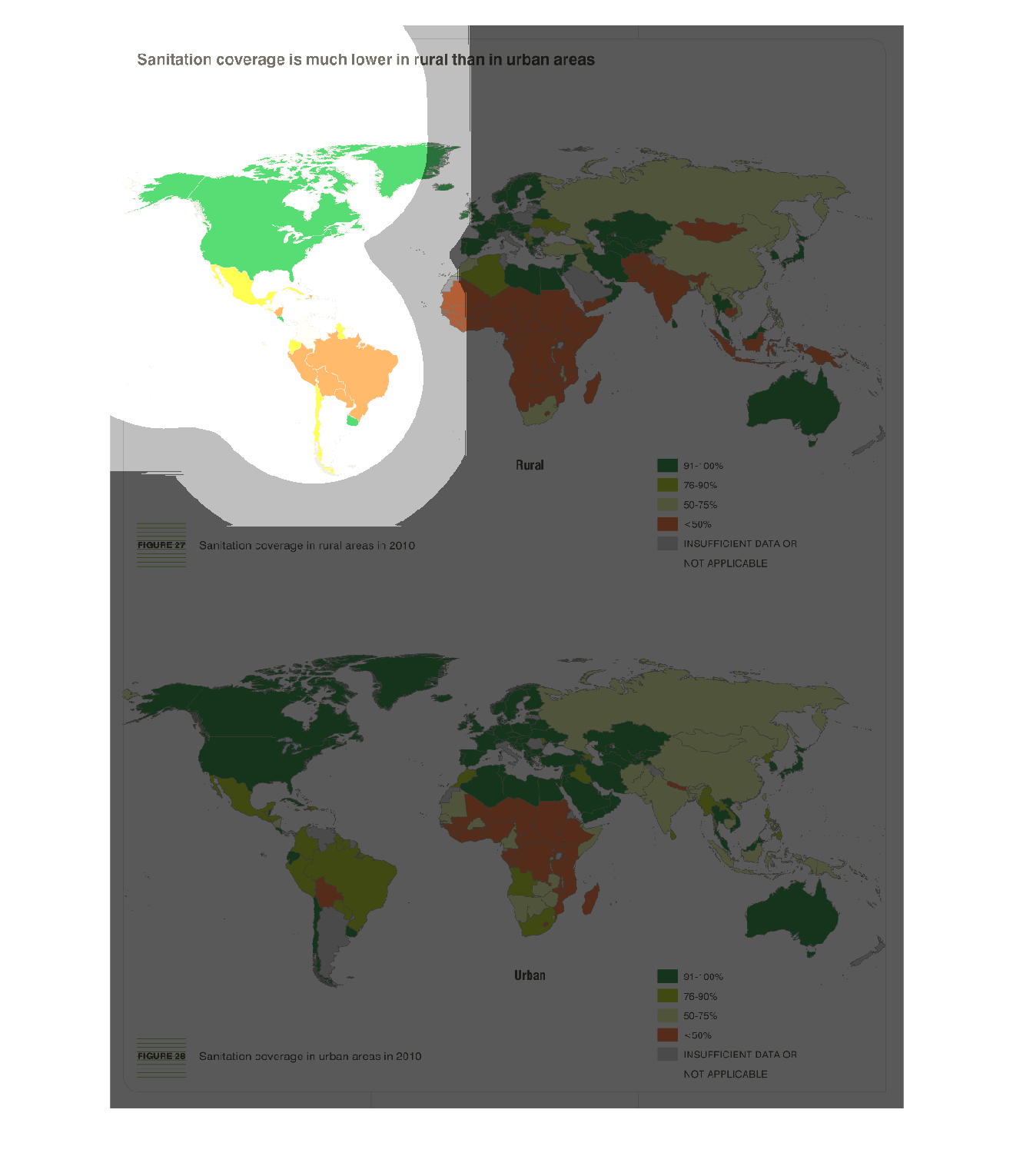
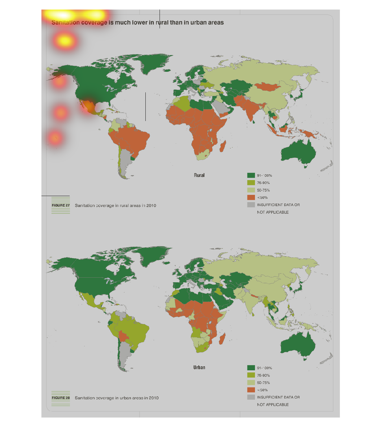
This chart describes that sanitation coverage is much lower in rural than in urban areas.
Different categories on the chart are represented by different colors.
Warning: Image is too big to fit on screen; displaying at 50%
Warning: Image is too big to fit on screen; displaying at 50%
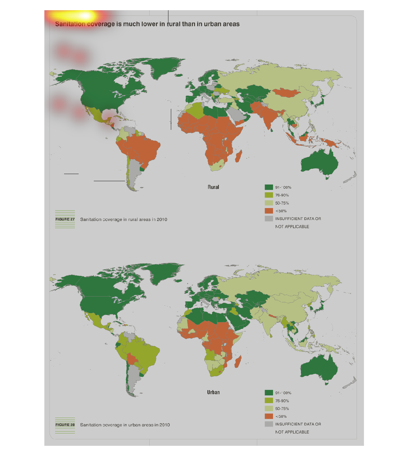
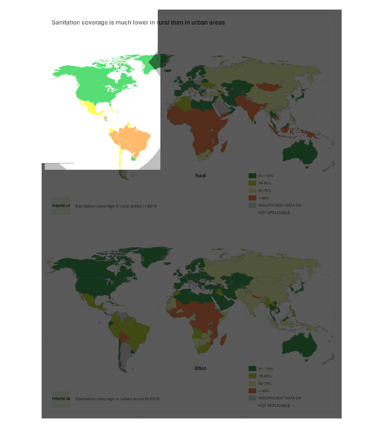
This chart shows that sanitation coverage is much lower in rural areas than in urban areas
in 2010.  It shows coverage for the multiple countries and is color coded with multiple shades
of green and orange.
Warning: Image is too big to fit on screen; displaying at 50%
Warning: Image is too big to fit on screen; displaying at 50%
it shows the increase in the urban area coverage that correlates to the sanitation conditions
around the world. Also the green colored areas indicates the place where sanitation is not
an issue.
Warning: Image is too big to fit on screen; displaying at 50%
Warning: Image is too big to fit on screen; displaying at 50%
The graph contained within this images seems to detail the difference in sanitation coverage
throughout the world. The chart seems to suggest that rural areas recive far less coverage
than suburban and urban location.
Warning: Image is too big to fit on screen; displaying at 50%
Warning: Image is too big to fit on screen; displaying at 50%
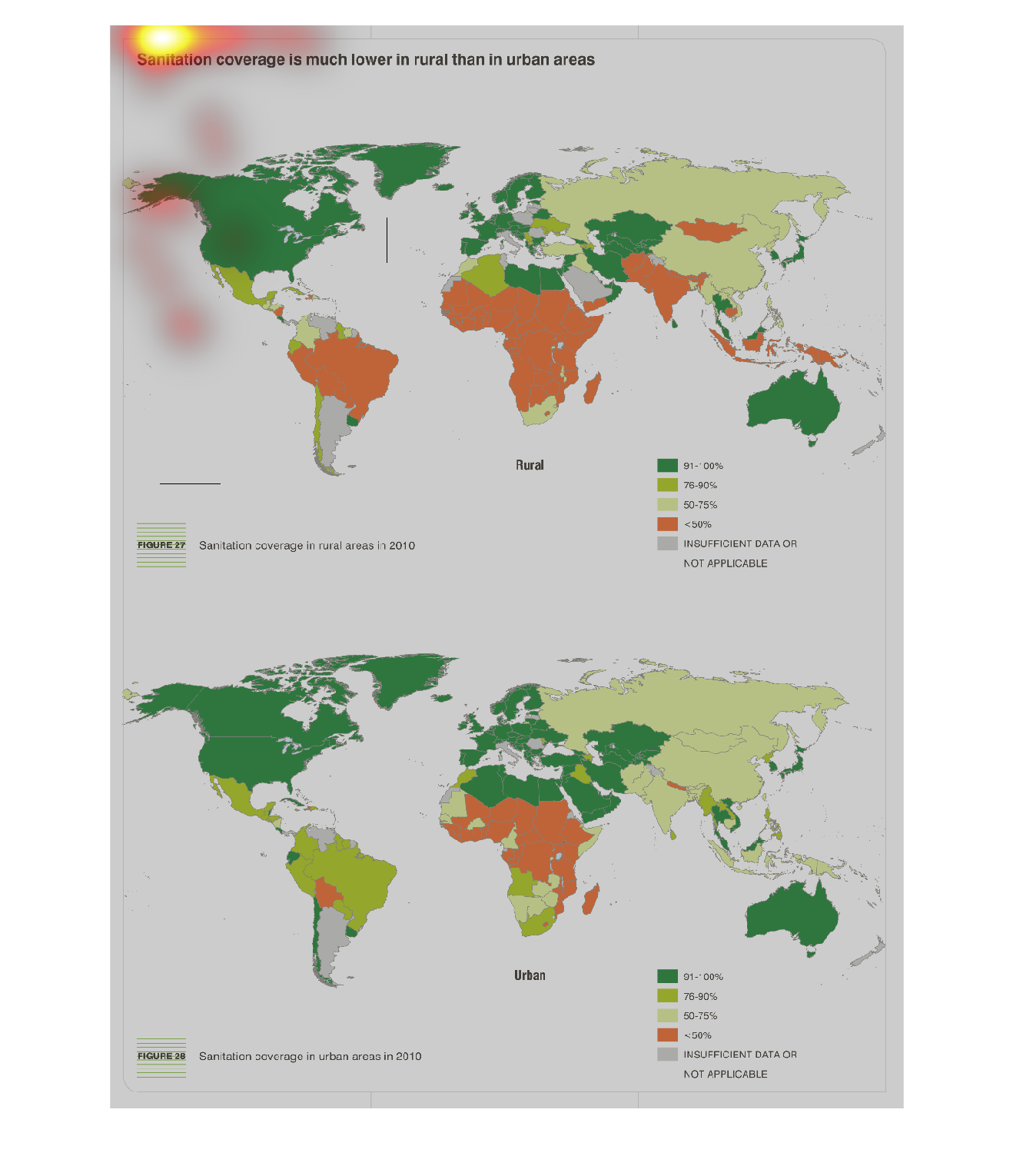
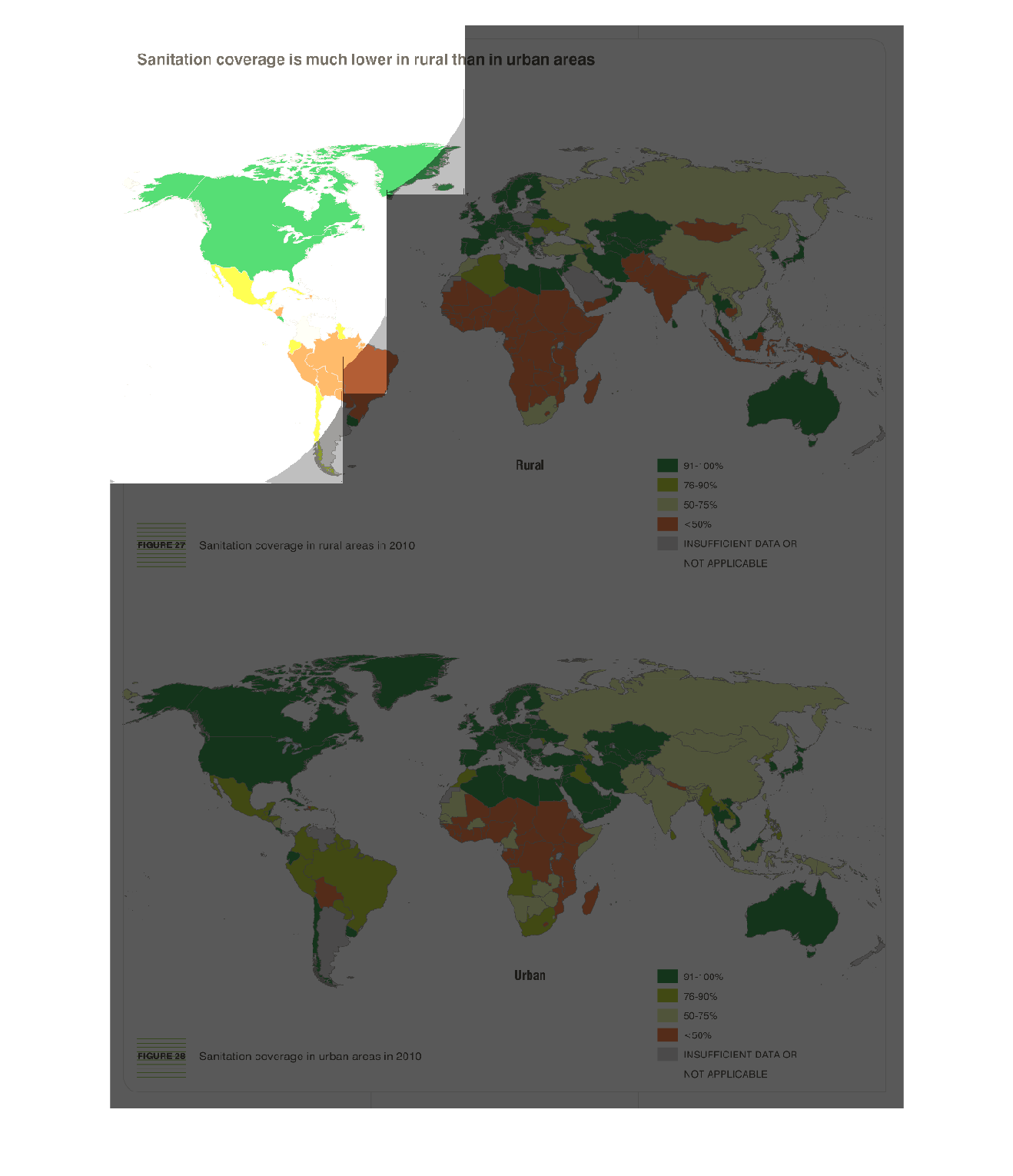
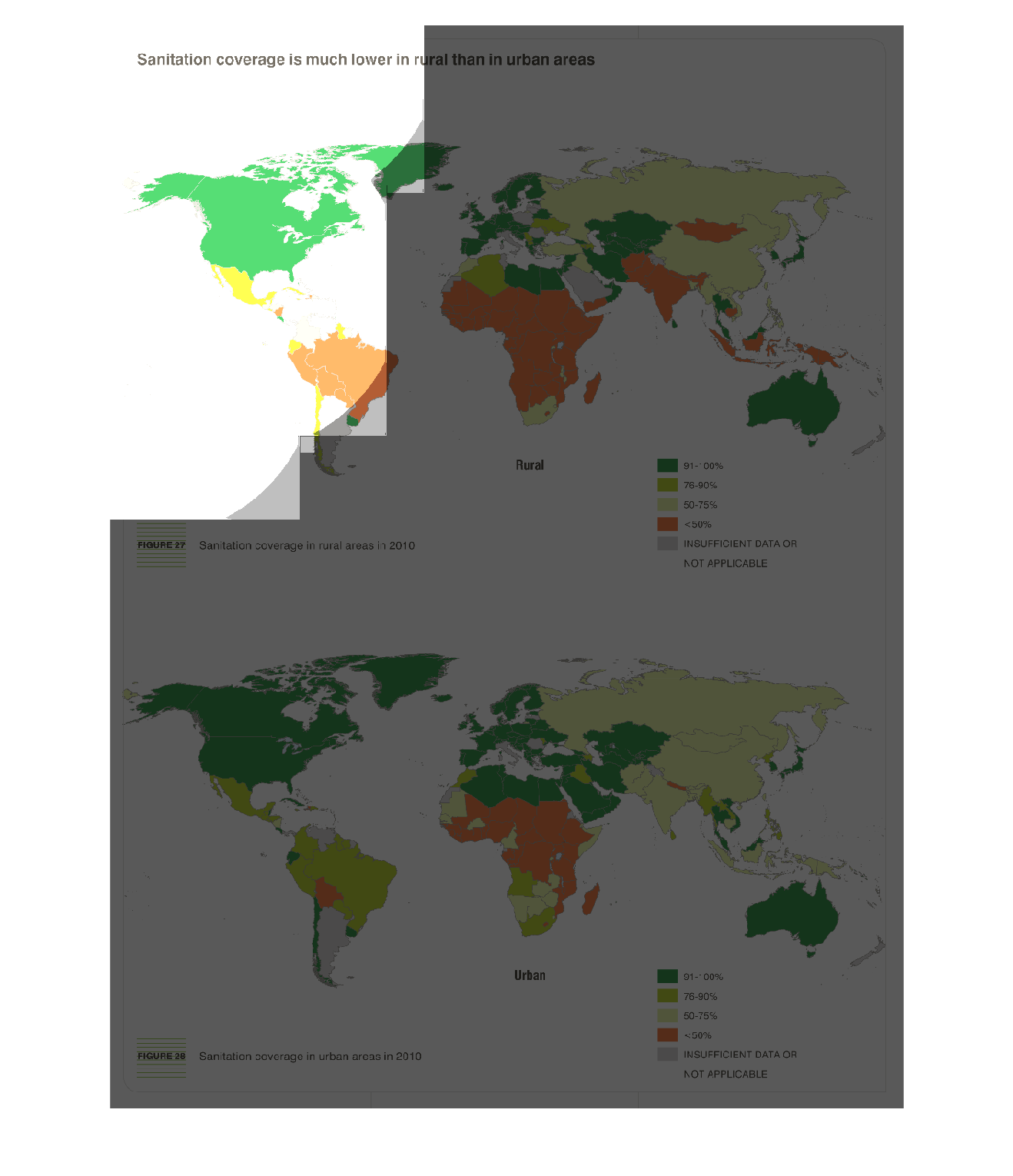
There are two maps that are color-coordinated which describe where sanitation is much lower
in rural and low-income areas, as well as sanitation coverage in rural areas. The two maps
look very similar.
Warning: Image is too big to fit on screen; displaying at 50%
Warning: Image is too big to fit on screen; displaying at 50%
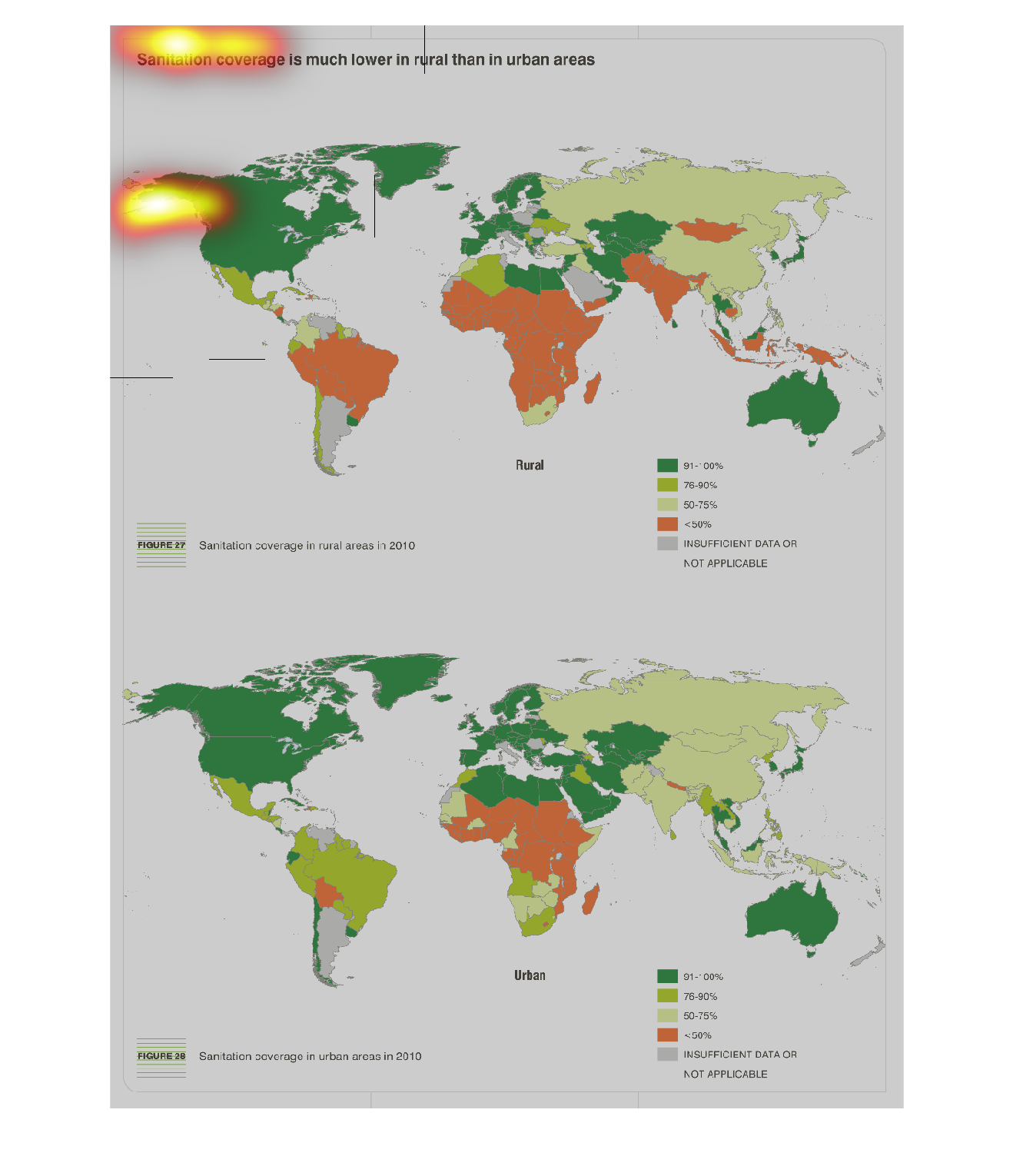
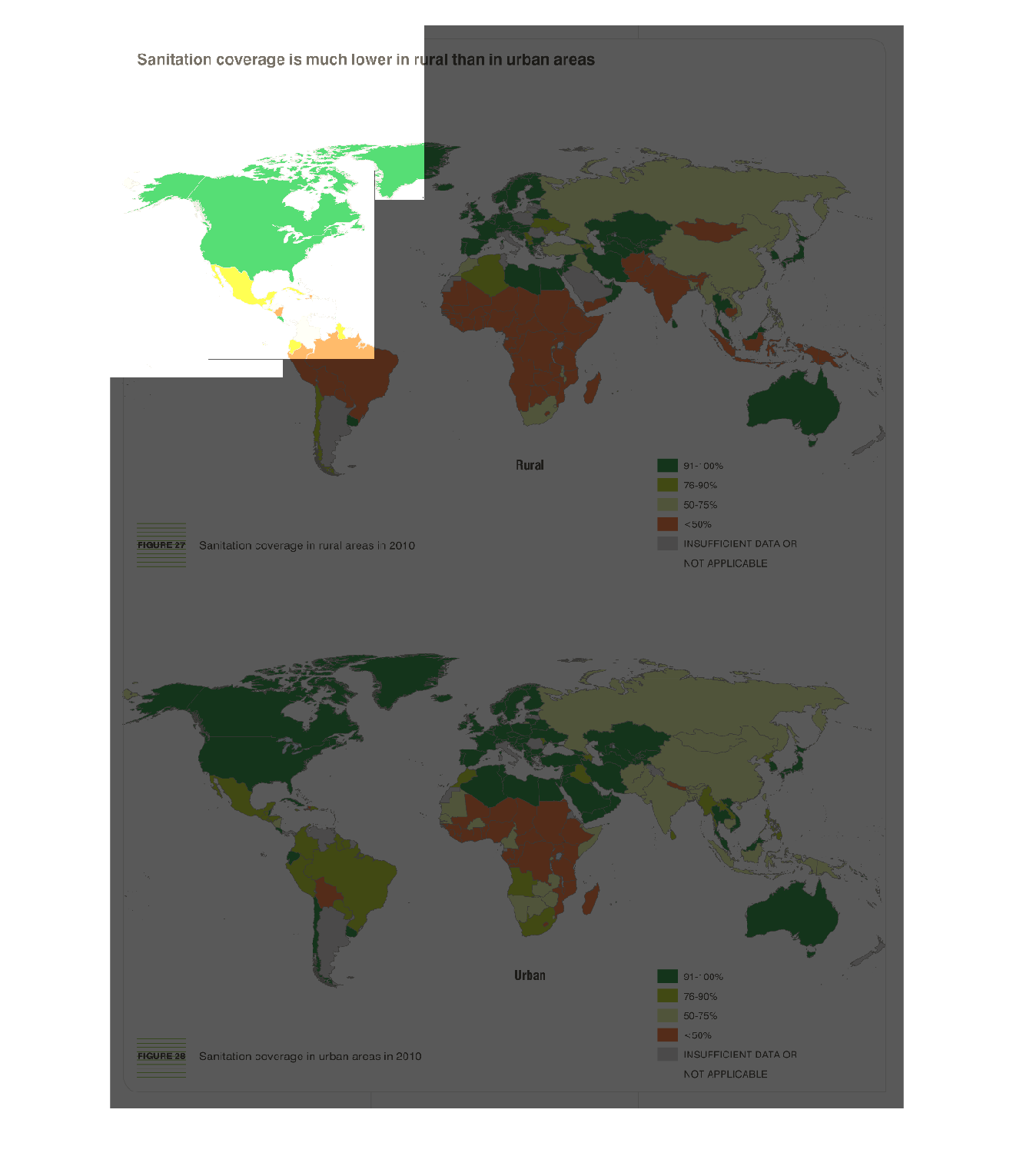
As seen by two color coded world maps, sanitation coverage is much lower in rural areas compared
to urban areas. One map shows coverage in Urban areas, and the other shows coverage in rural
areas.
Warning: Image is too big to fit on screen; displaying at 50%
Warning: Image is too big to fit on screen; displaying at 50%
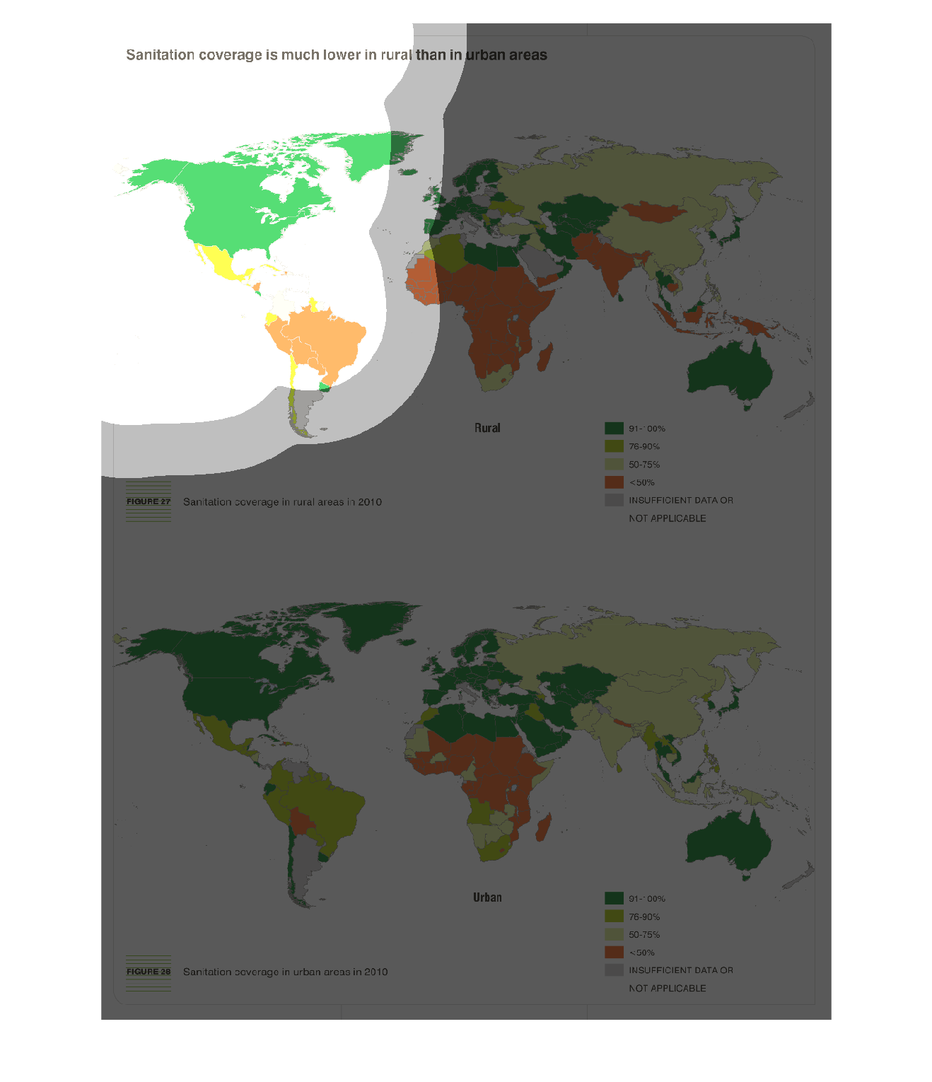
This is a set of two maps of the world that show countries where sanitation is much lower
in rural than in urban areas. These maps are for two different years, one of them being 2002.
Warning: Image is too big to fit on screen; displaying at 50%
Warning: Image is too big to fit on screen; displaying at 50%
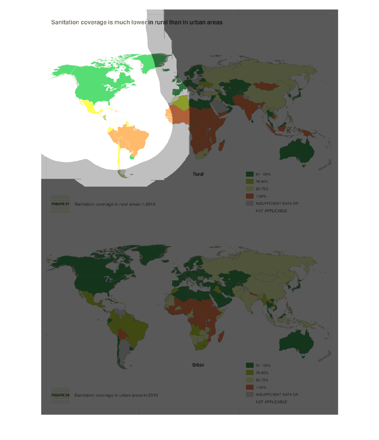
This is a graph that tends to illustrate the sanitation problem around the world. It shows
that the sanitation coverage in rural areas is much lower than in urban areas.
Warning: Image is too big to fit on screen; displaying at 50%
Warning: Image is too big to fit on screen; displaying at 50%
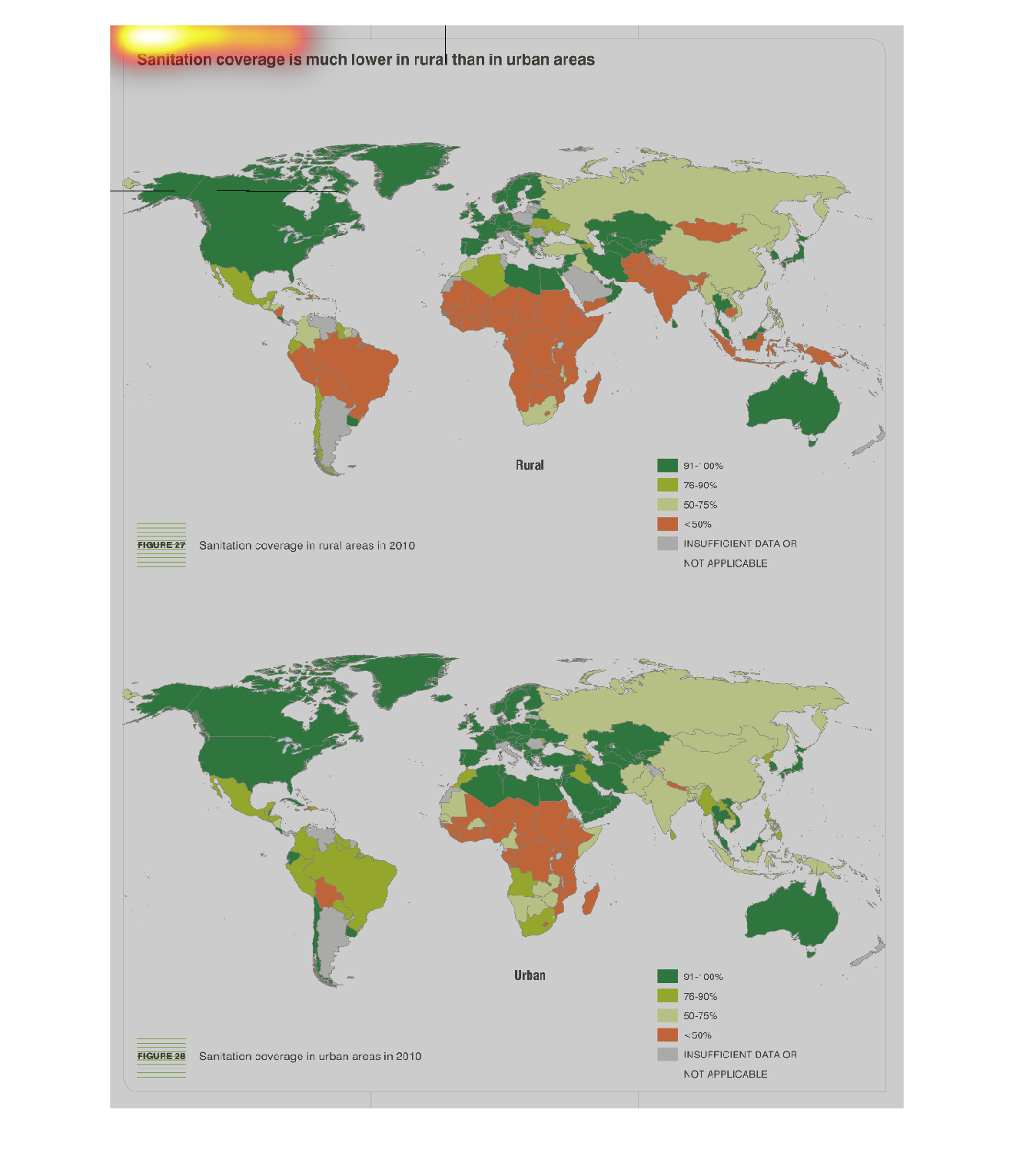
Sanitation coverage seems to be much lower in rural than urban areas. The difference between
sanitation coverage in these areas is most apparent in the northern areas of South America.
Warning: Image is too big to fit on screen; displaying at 50%
Warning: Image is too big to fit on screen; displaying at 50%
This handmade chart talks about sanitation access around the world. It looks like the developed
world has high access and Africa has low access, but it is too small to read
Warning: Image is too big to fit on screen; displaying at 50%
Warning: Image is too big to fit on screen; displaying at 50%
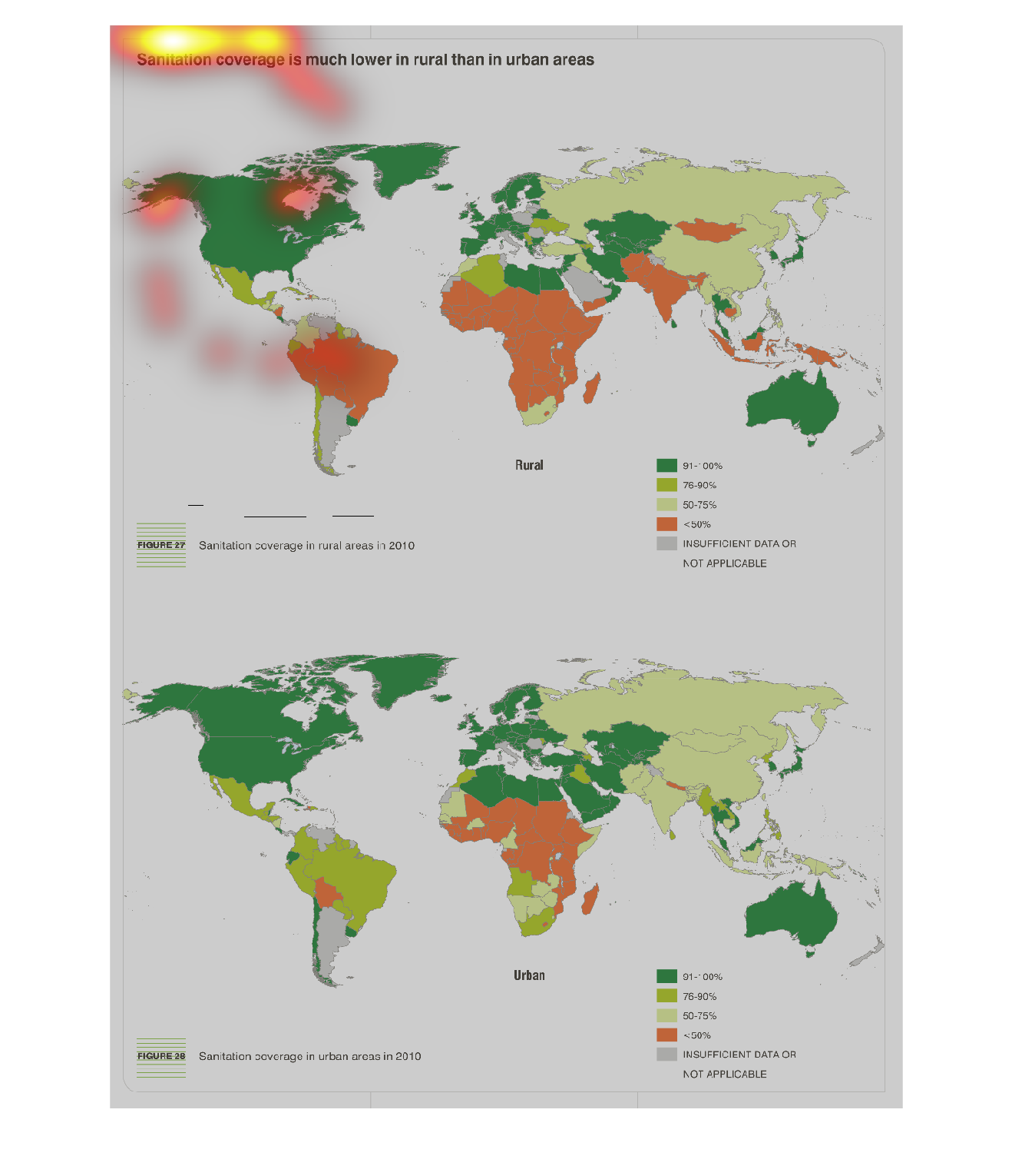

This chart describes that sanitation coverage is much lower in rural than in urban areas.
Different regions of the world on the chart are represented by different colors.
Warning: Image is too big to fit on screen; displaying at 50%
Warning: Image is too big to fit on screen; displaying at 50%
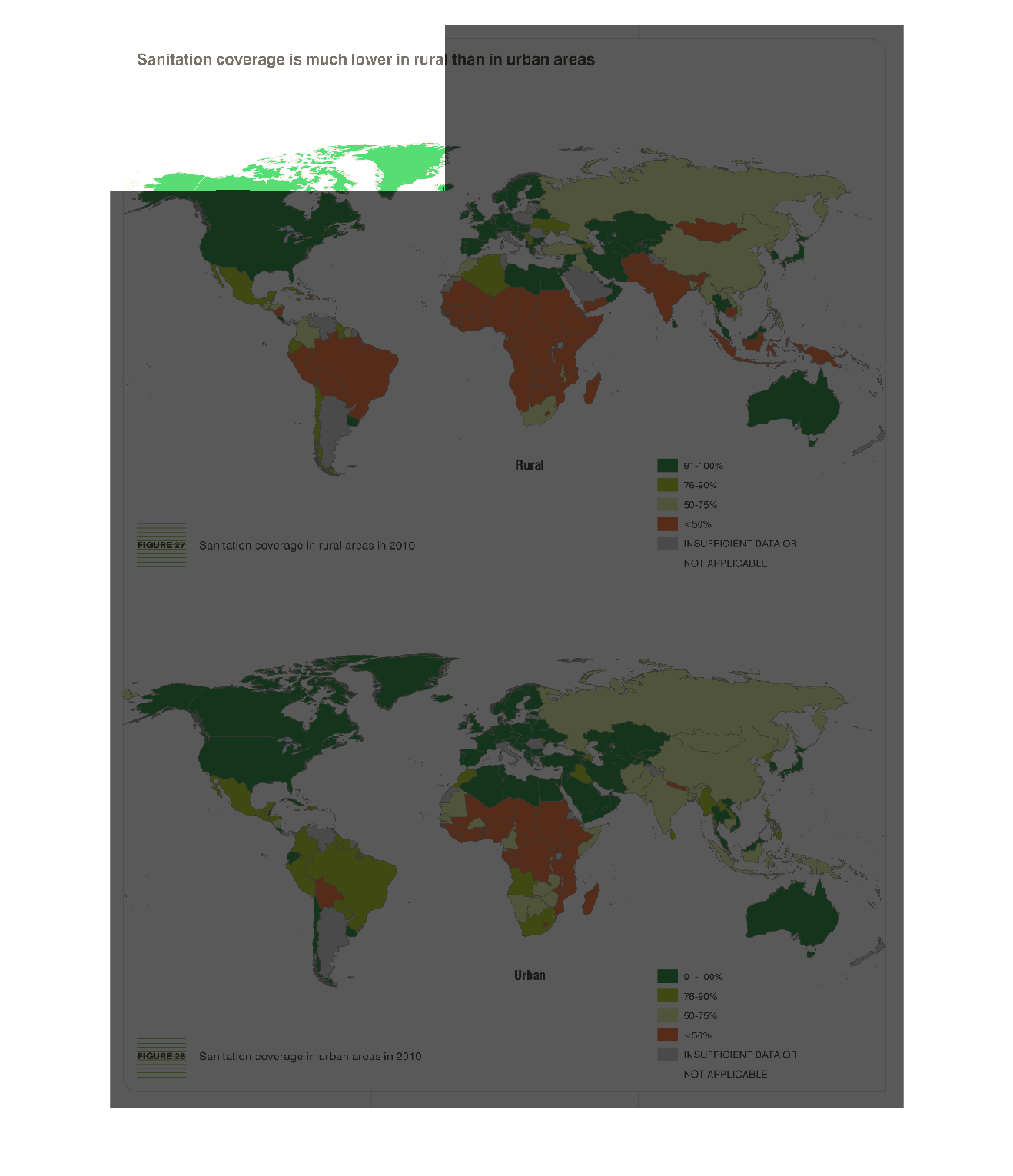
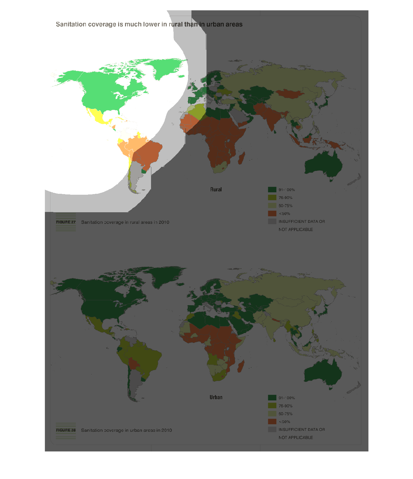
this is a map of the united states of america and it has colors on it to represents sanitation.
there are green orange yellow  the colors dont show what they represent
Warning: Image is too big to fit on screen; displaying at 50%
Warning: Image is too big to fit on screen; displaying at 50%
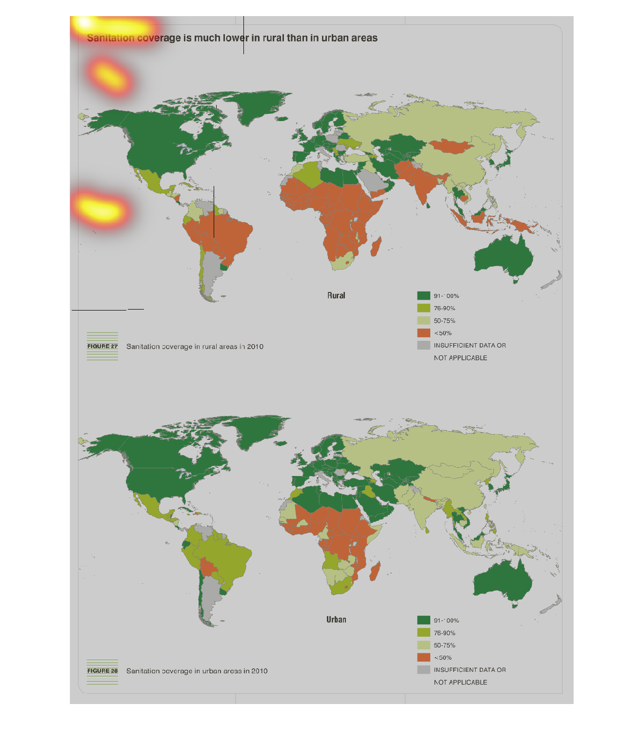
sanitation coverage is much lower in rural than in urban areas. Two world maps showing changes
over the course of an undisclosed amount of time, ending data in 2010
Warning: Image is too big to fit on screen; displaying at 50%
Warning: Image is too big to fit on screen; displaying at 50%