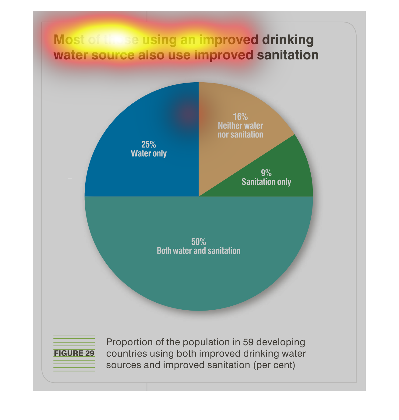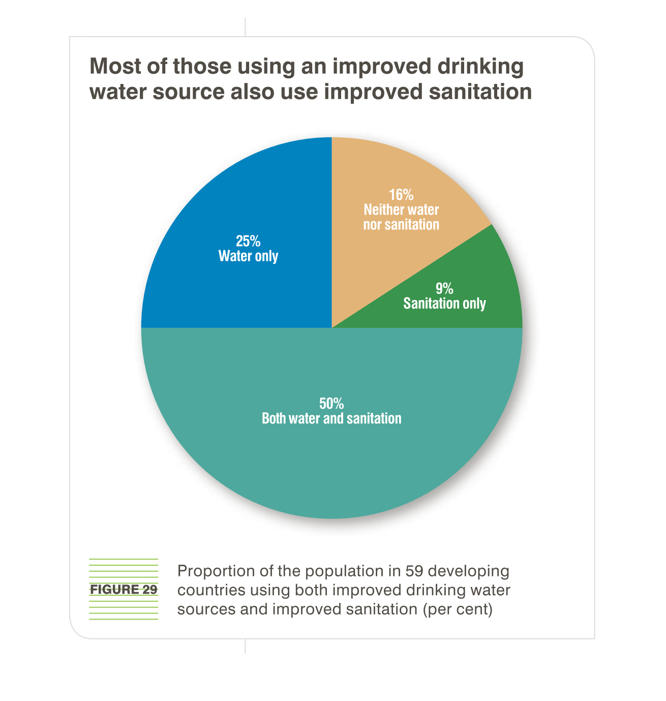
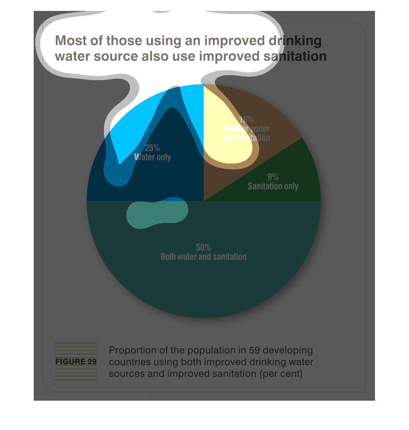
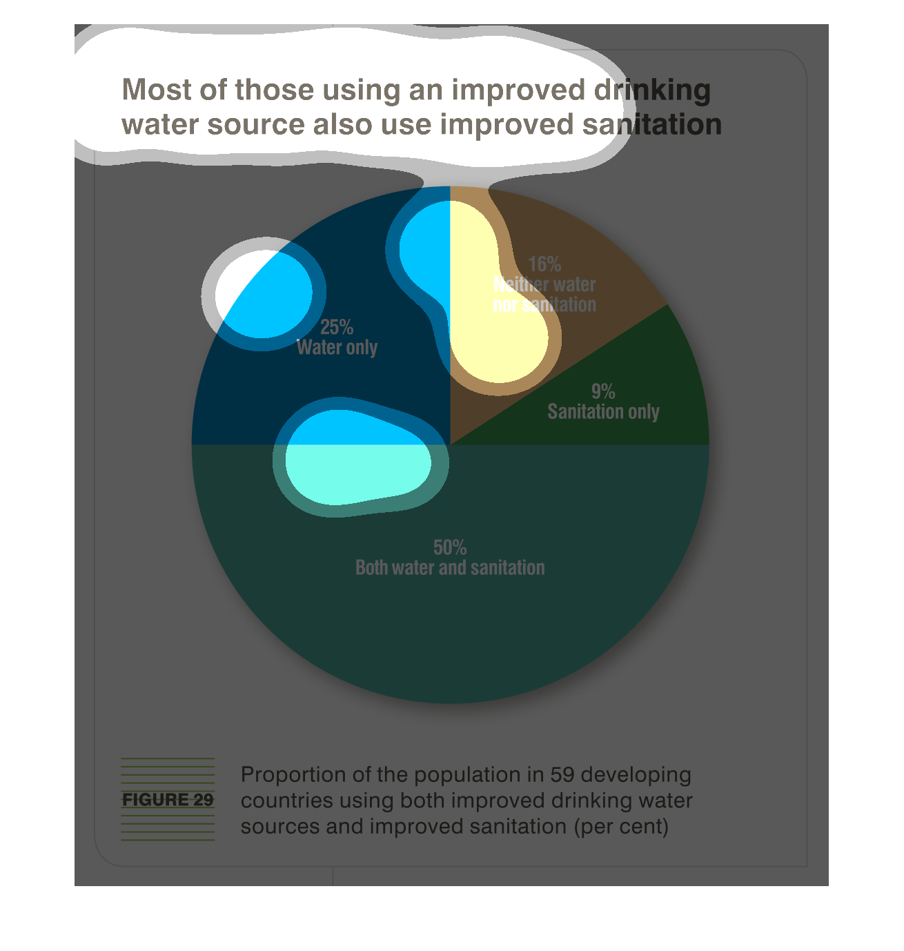
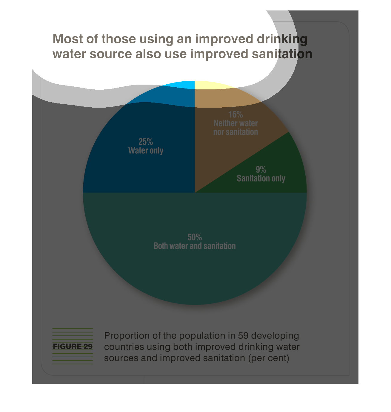
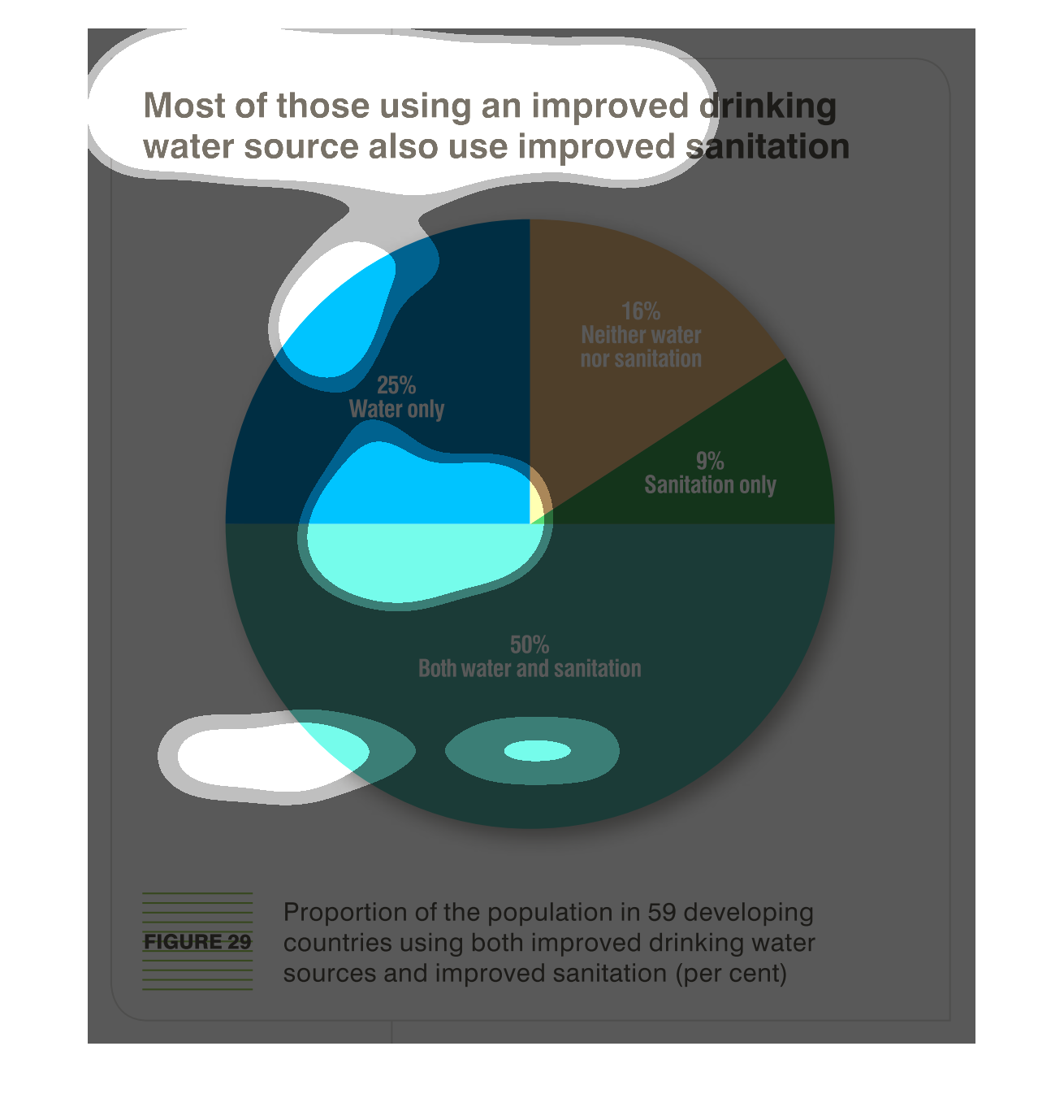
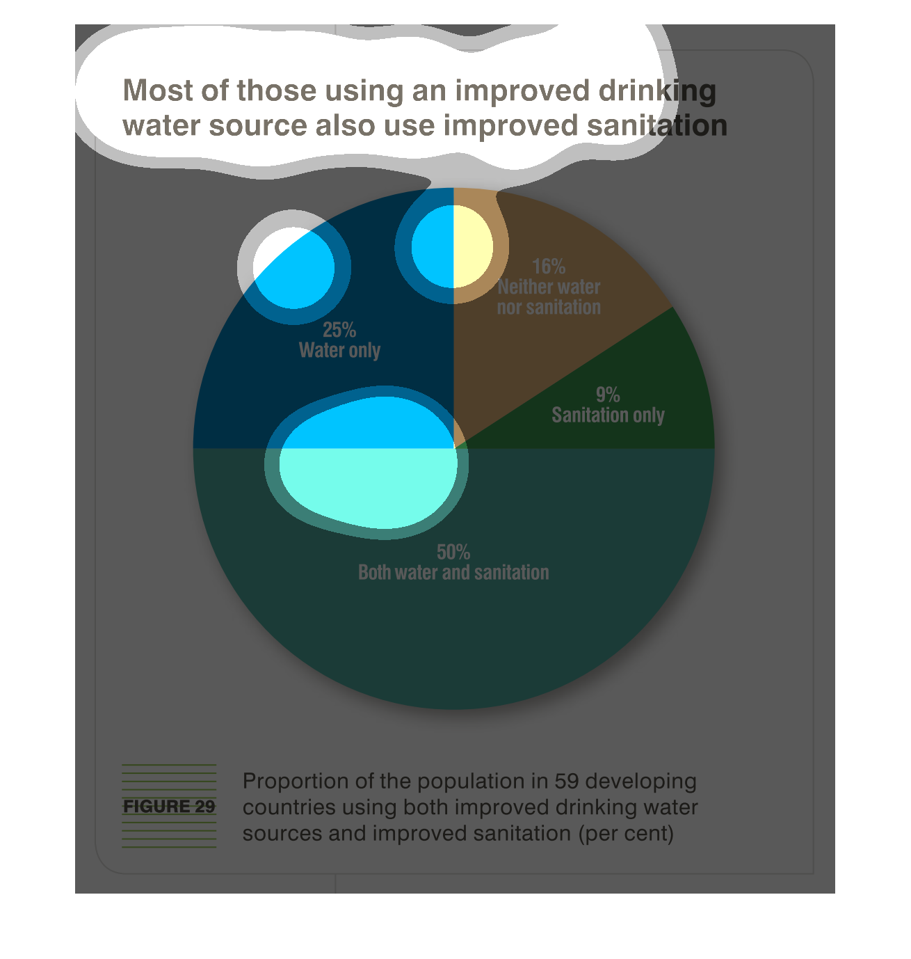
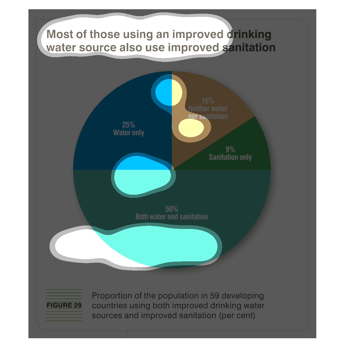
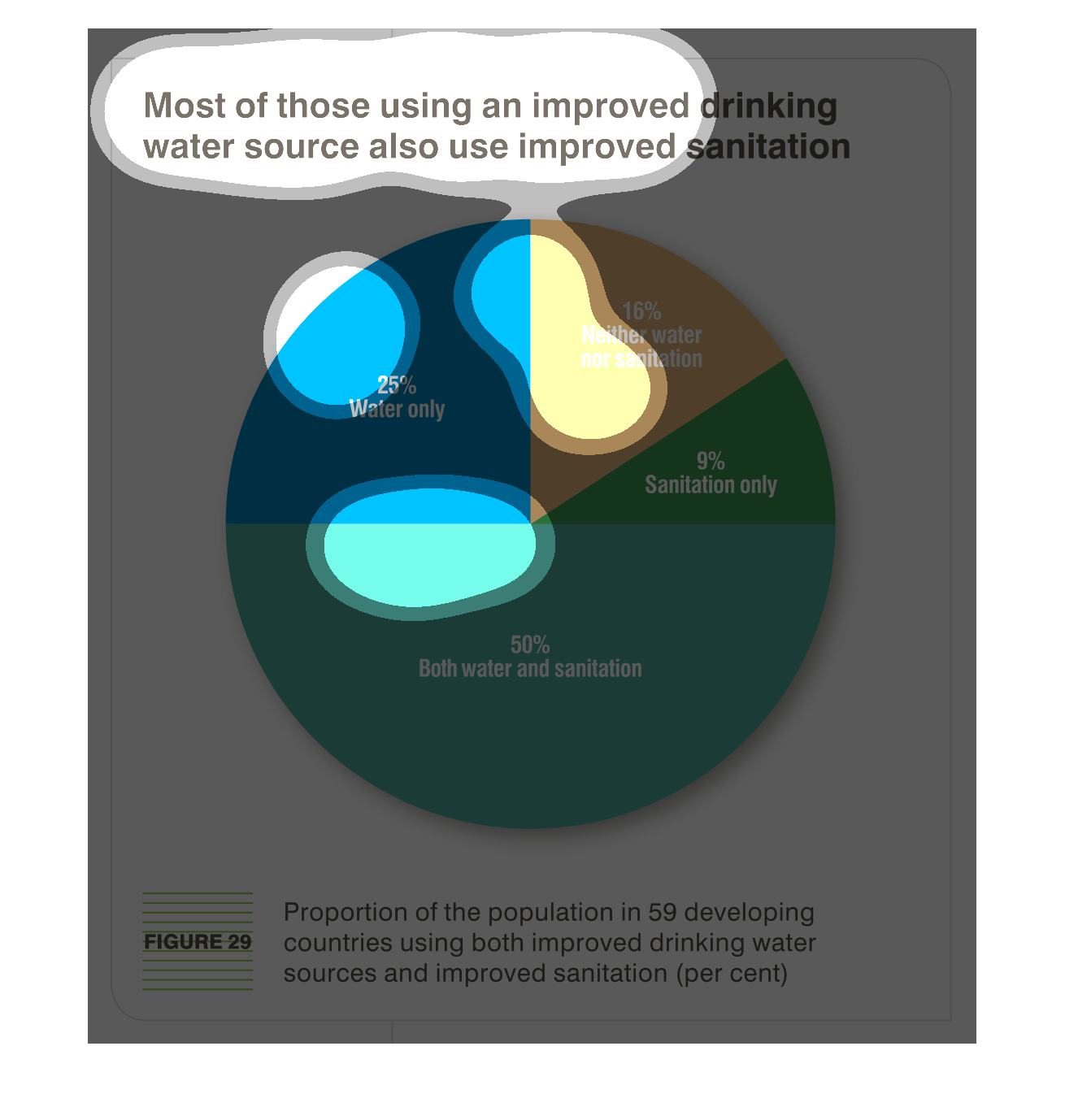
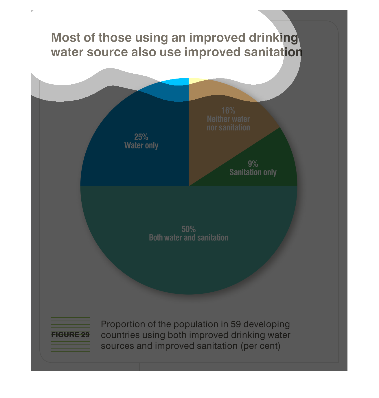
The chart claims that there's a correlation between improved drinking water conditions and
improved sanitation by examine the percentage of people in 59 developing countries who enjoy
access to both better drinking water and better sanitation. Almost all people in these countries
(84%) have access to either or both improved water or improved sanitation, and 50% of these
people have access to both.
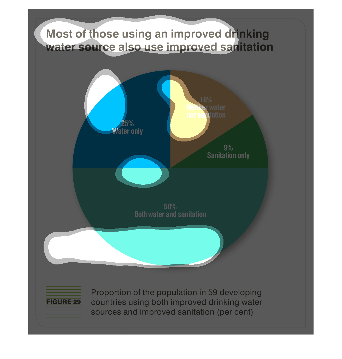
Most folks using improved drinking water also utilize better sanitation, as depicted in the
pie chart. 25% use only improved water, 50% use both improved water and sanitation, 9% use
improved sanitation only, and 16% utilize neither.
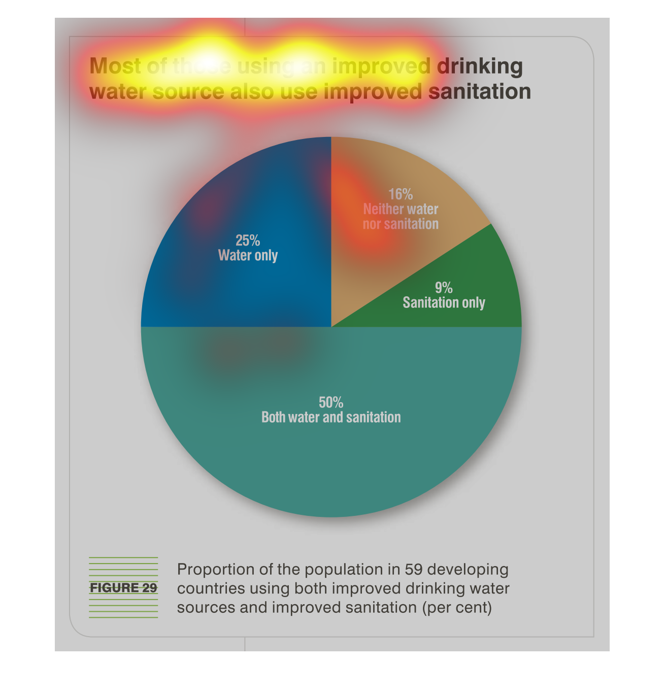
most of those using an improved drinking water source also use improved sanitation as indicated
by this pie chart. 50% use both improved amenities, 25% water only, 16% neither, 9% just sanitation
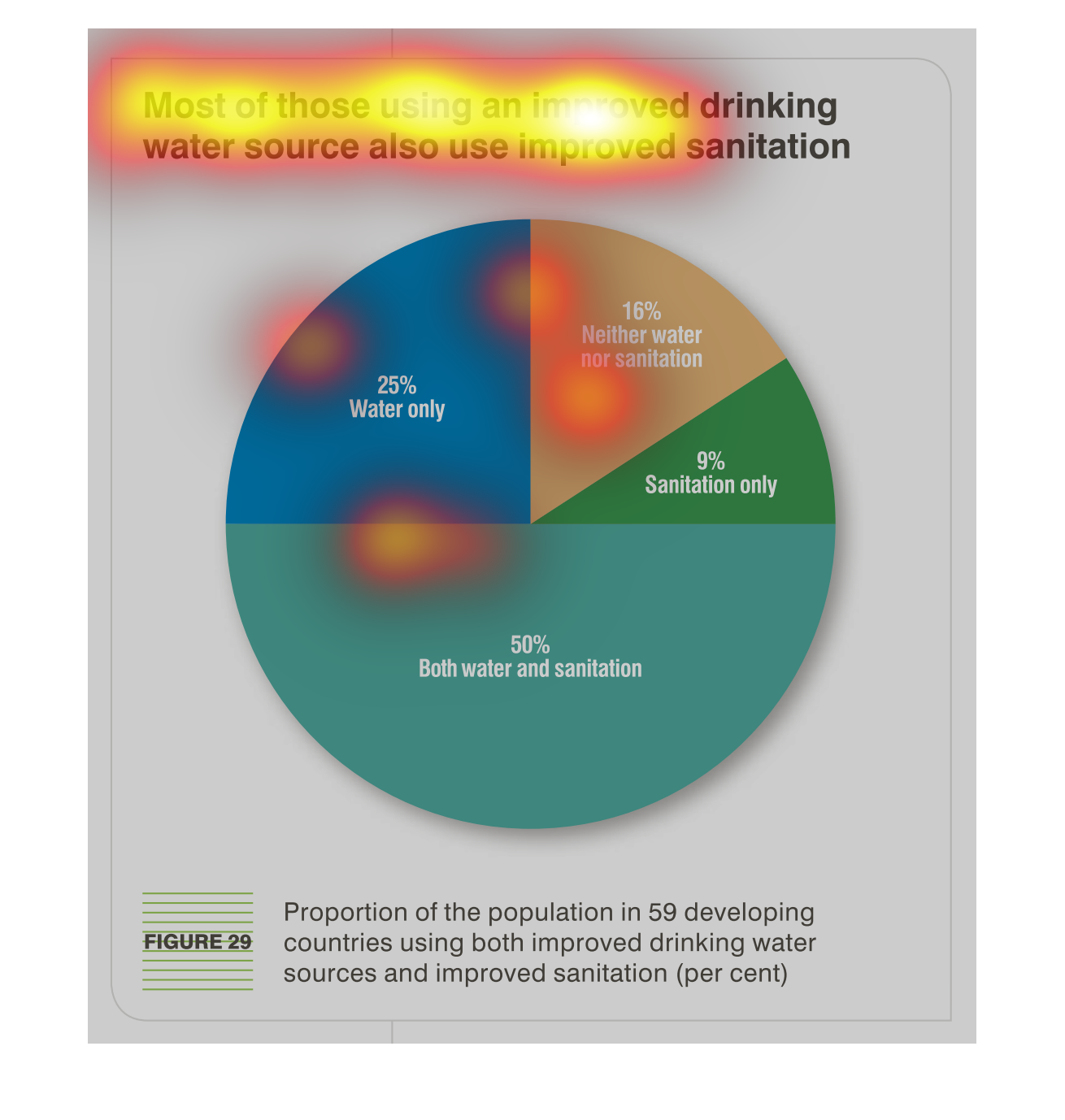
This chart describes that most of those using an improved drinking water source also use improved
sanitation. Different categories on the chart use different colors.
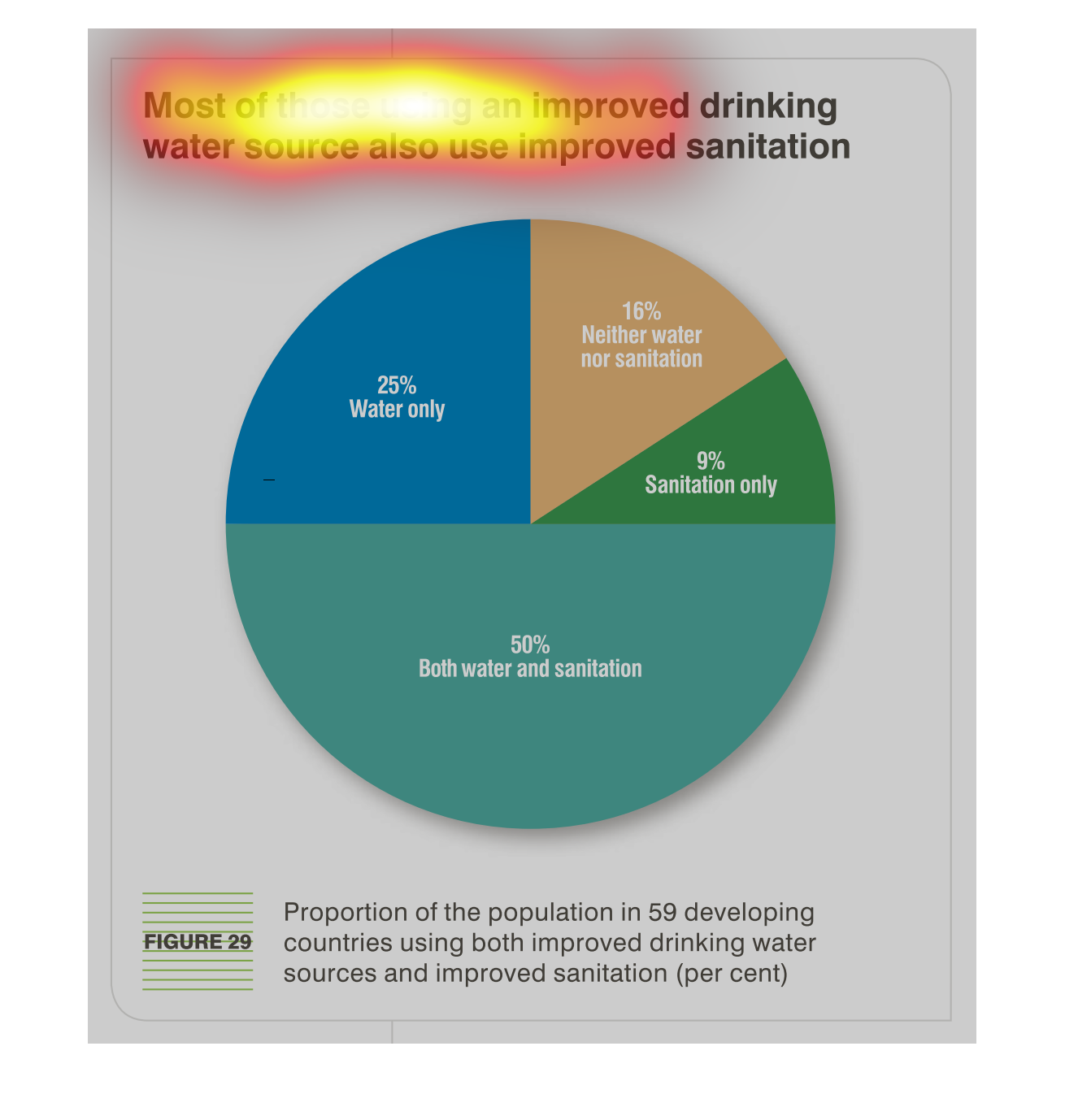
The chart is demonstrating the proportion of the population in developing countries that's
consuming the most water and their sanitation standards. 50% is using the most water and sanitation.
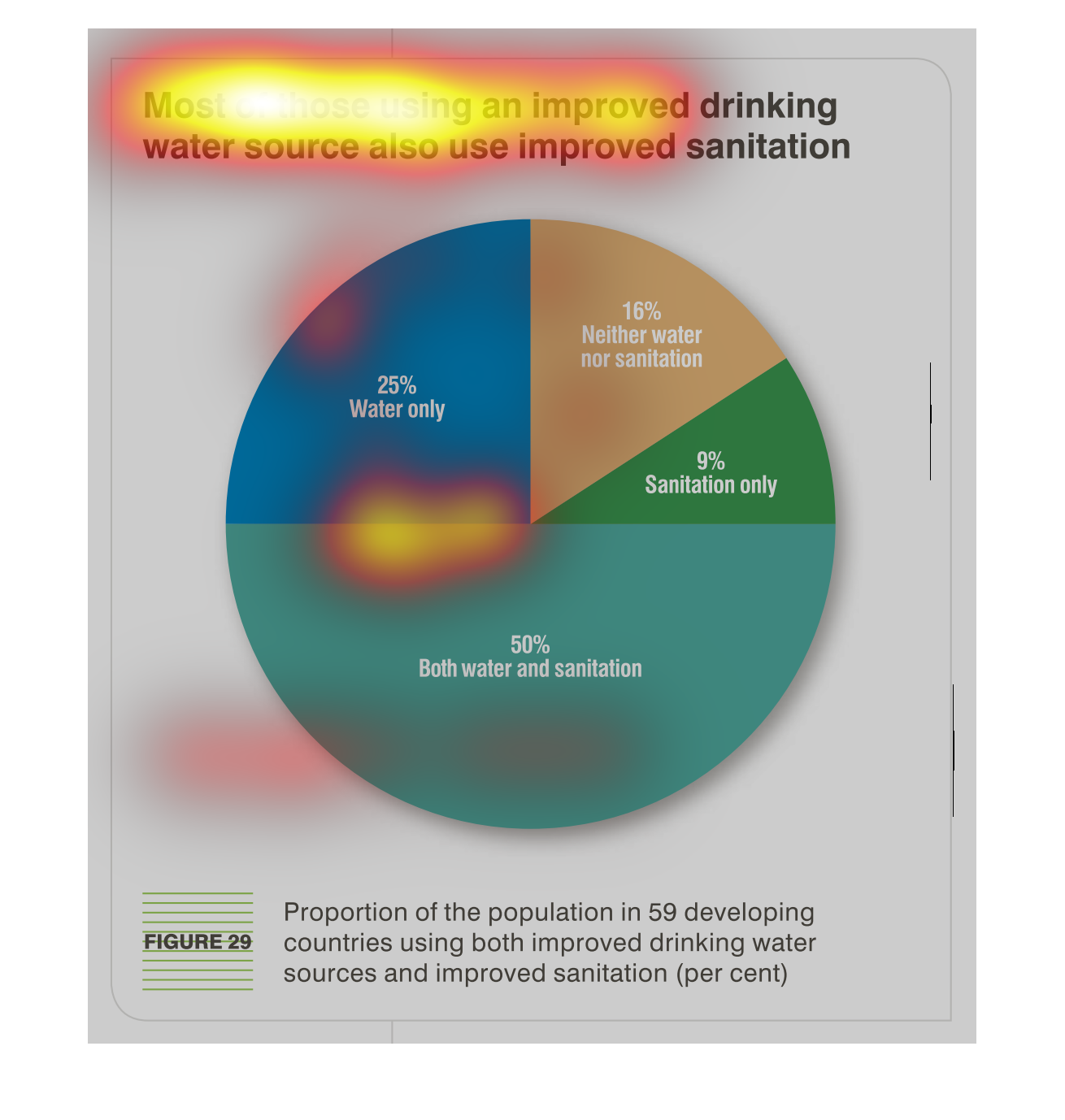
This is a chart that is used to illustrate the finding that most of those found to be using
approved drinking water sources also naturally tend to result to the use of improved sanitation.
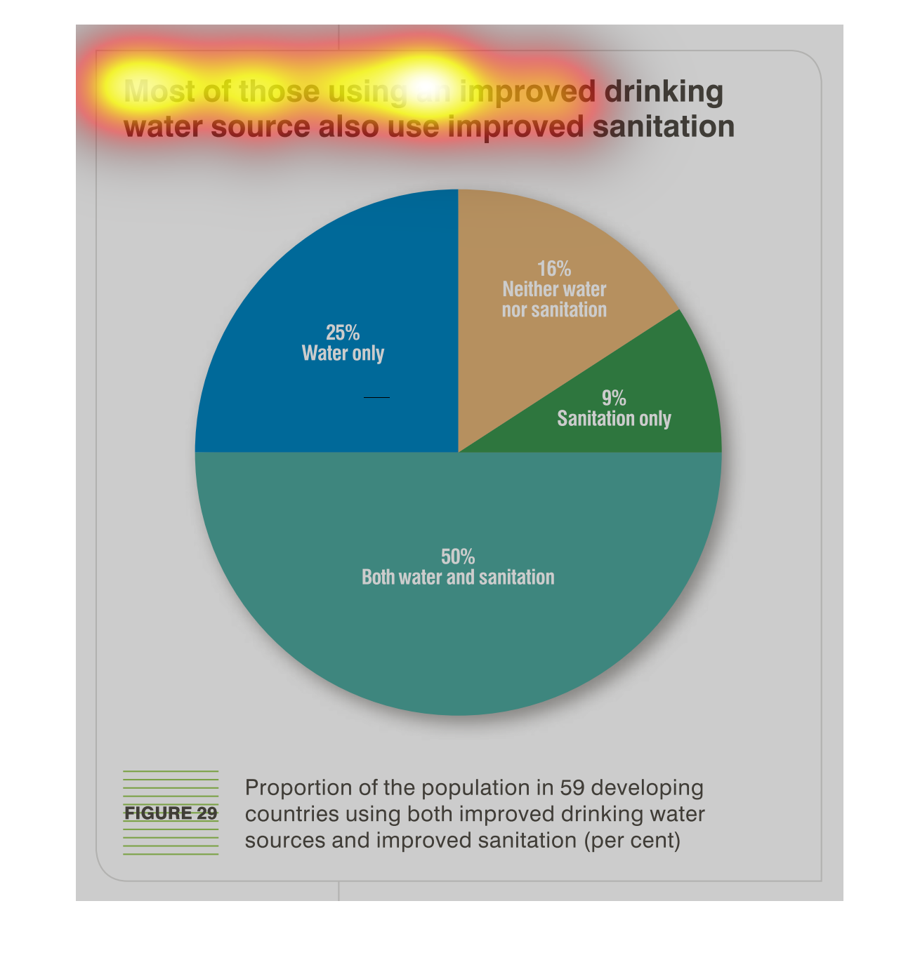
This is a color coded pie chart depicting that most of those using an improved drinking-water
source also use improved sanitation. Only 16% have access to neither.
This is a color coded pie chart depicting that most of those using an improved drinking water
source also tend to use improved sanitation practices as well.
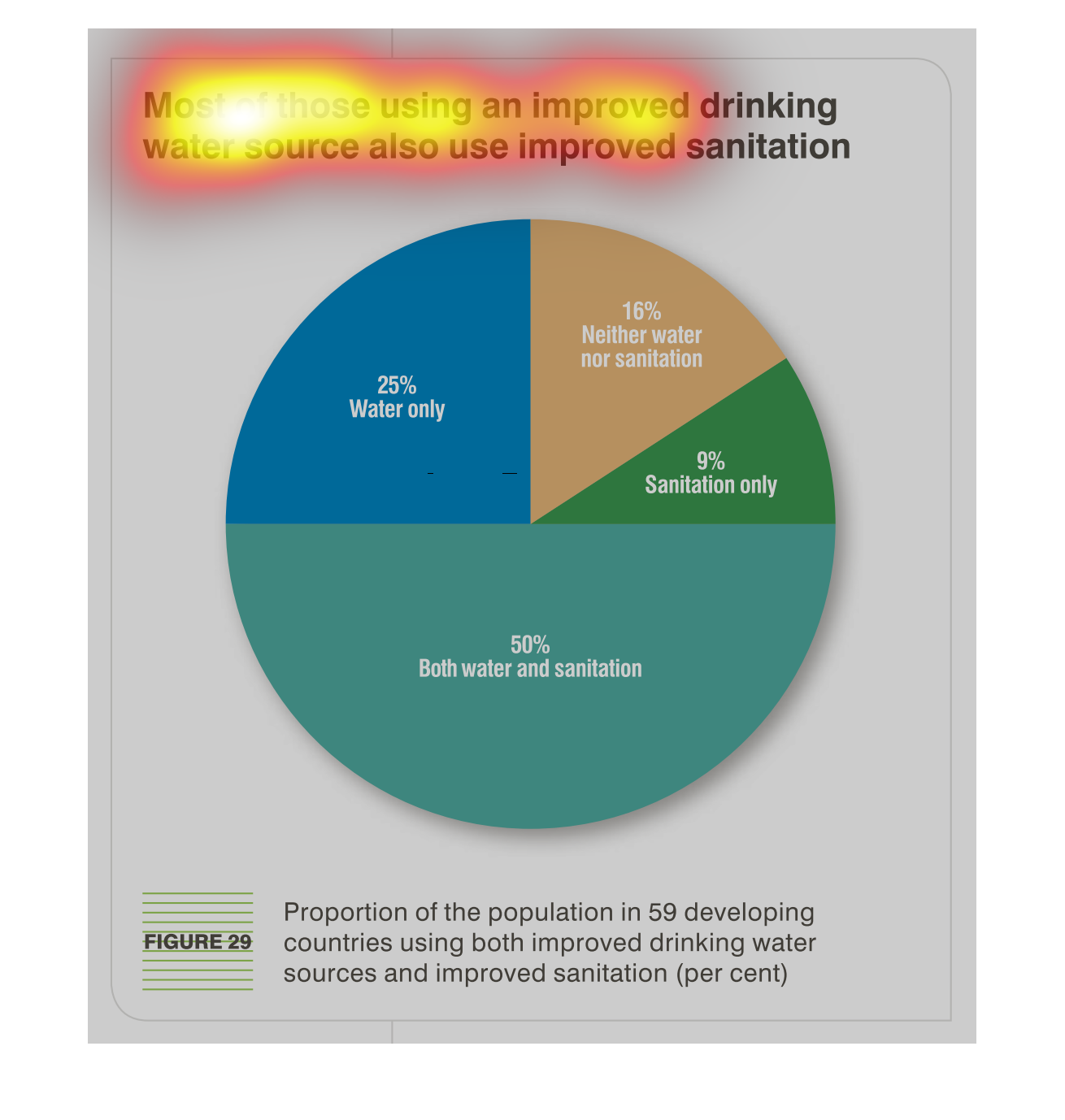
The image shows a pie chart indicating that most of those using an improved drinking water
source are also using improved sanitation. Developing countries are cited. 50% use both improved
sanitation and water, 25% water only, 10% neither water nor sanitation, and 9% sanitation
only.
According to the graph, 50% of those surveyed in developing countries who used an improved
water source also had improved sanitation. Another 25% only had improved water sources, 9%
had improved sanitation, and lastly 16% had neither.
Most of those using an improved drinking water source also use improved sanitation at a rate
of 50%, 25% report water only, 16% report neither, 9% sanitation only.
The figure presented is titled Most of those using an improved drinking water source also
use improved sanitation.  The figure represents data with a pie chart.
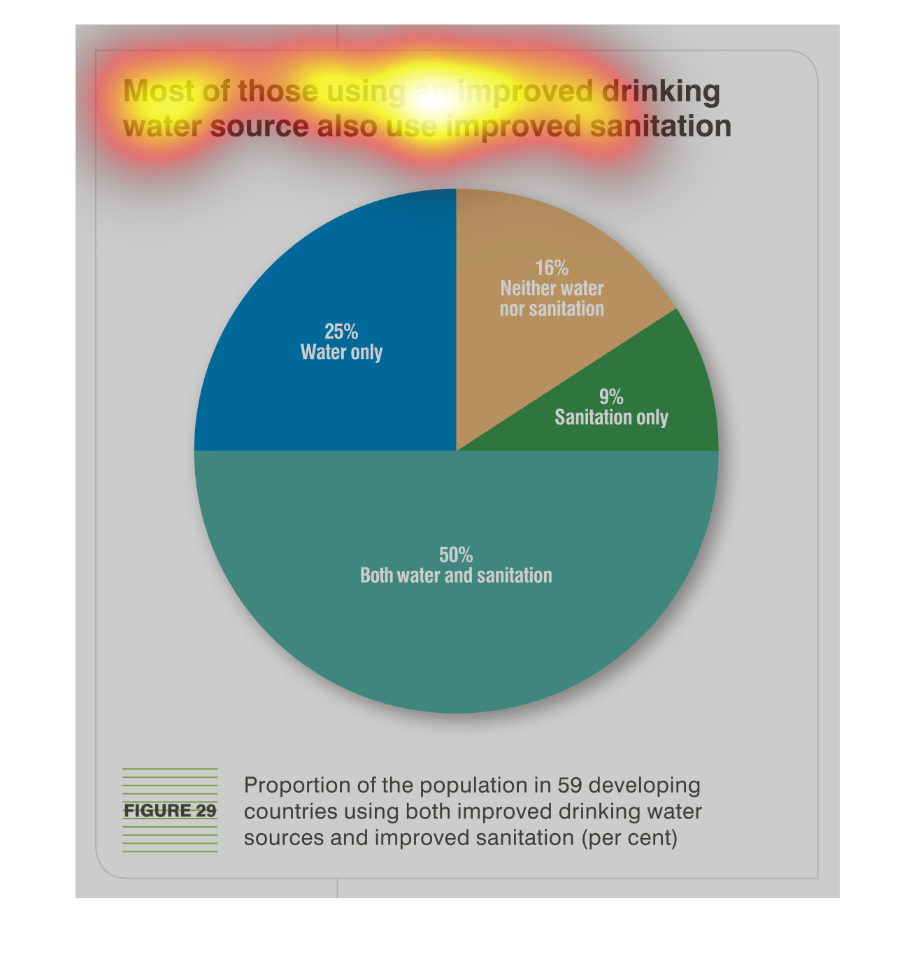
This graph talks about how most of those that use an improved water system, also use improved
sanitation.  Exactly half are shown to use both improved water systems as well as sanitation.
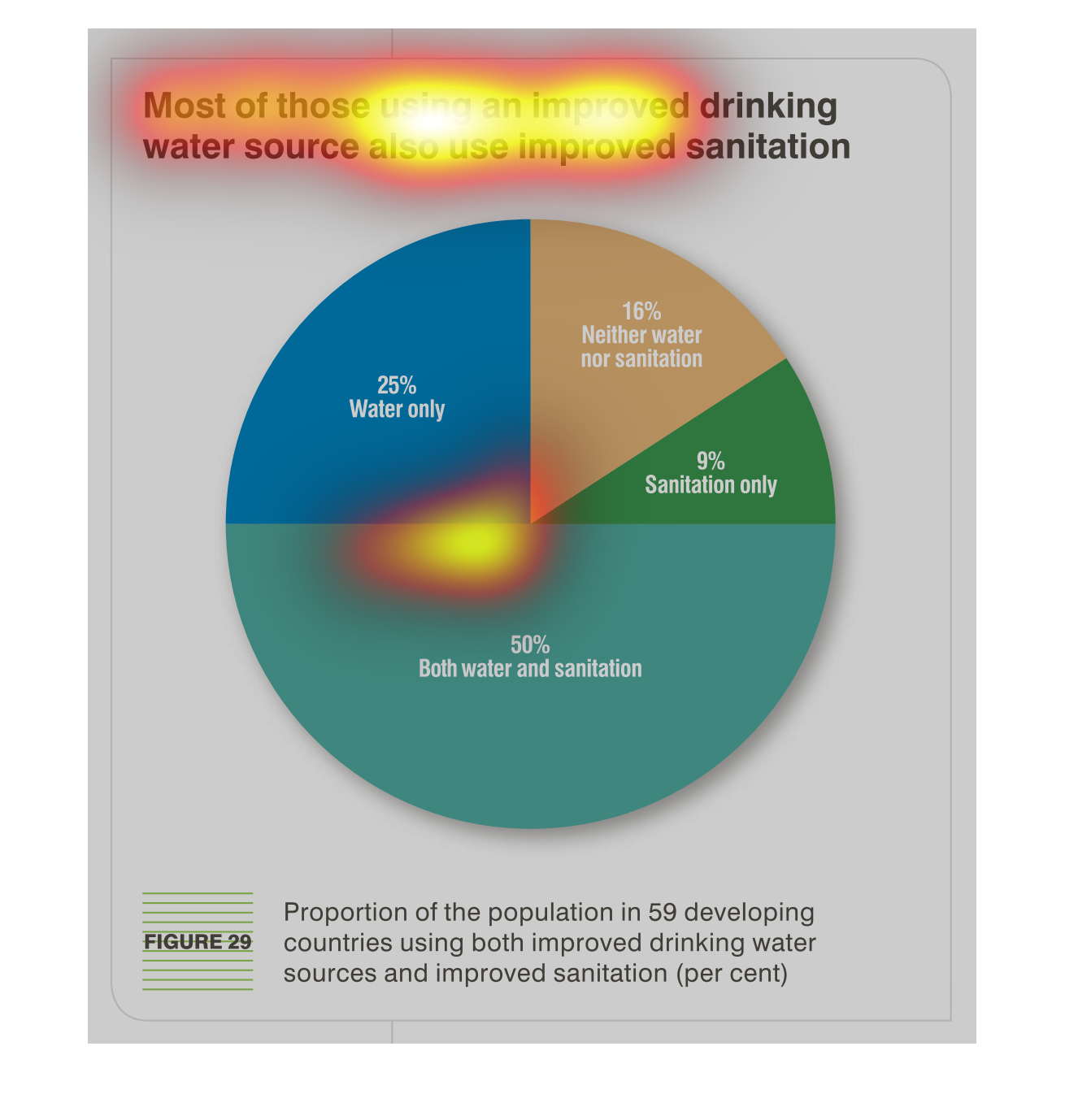
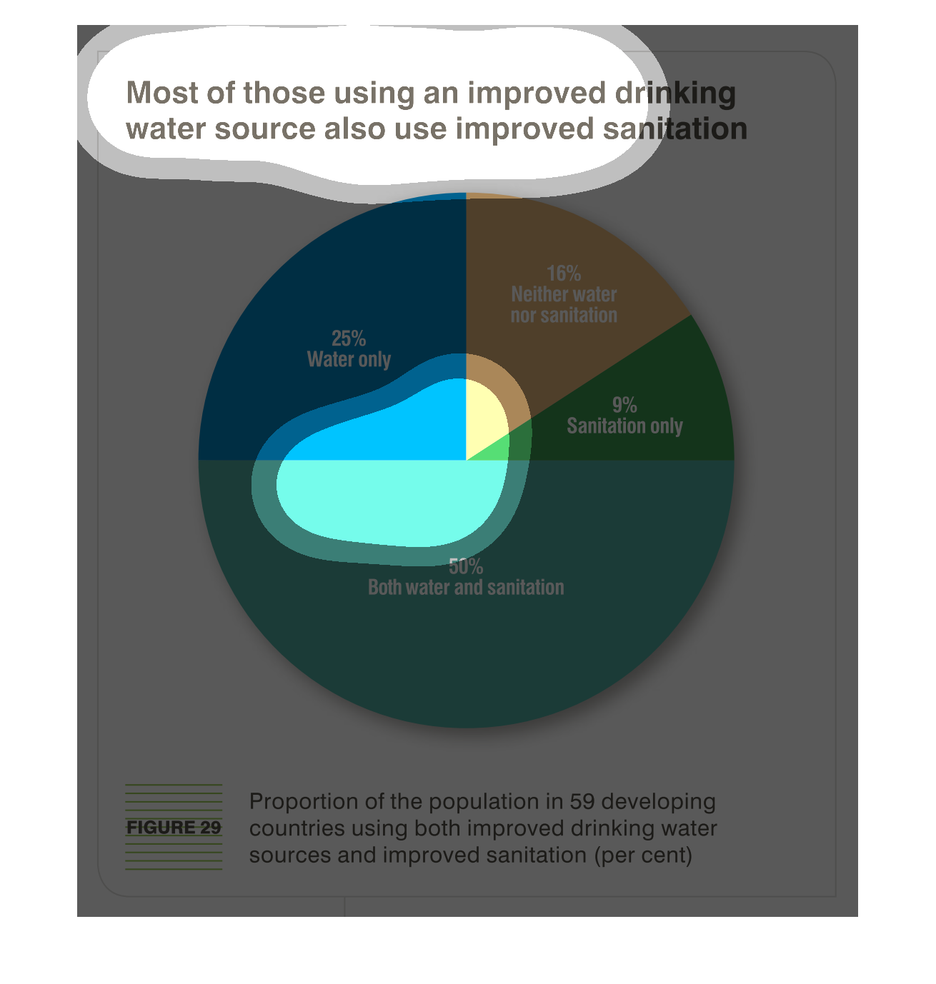
Most water sources in developed countries us a sanitation system as well as their water system
for safe drinking water. but 16% have neither a water not sanitation system, while 50% have
both, 25% have only a water system, and 9% have only sanitation.
This chart describes that most of those using an improved drinking water source also use improved
sanitation. Different categories are represented by different colors.